WiP in WiP, post your screenshots!
- Thread starter Arhurt
- Start date
You are using an out of date browser. It may not display this or other websites correctly.
You should upgrade or use an alternative browser.
You should upgrade or use an alternative browser.
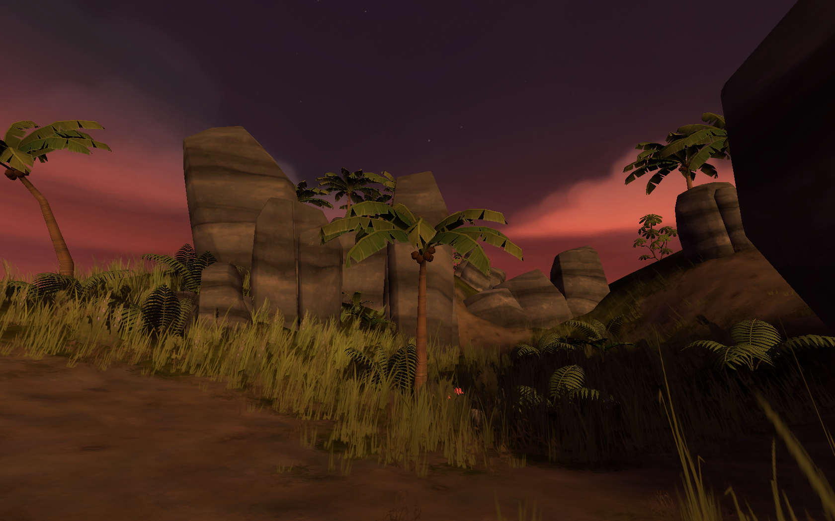
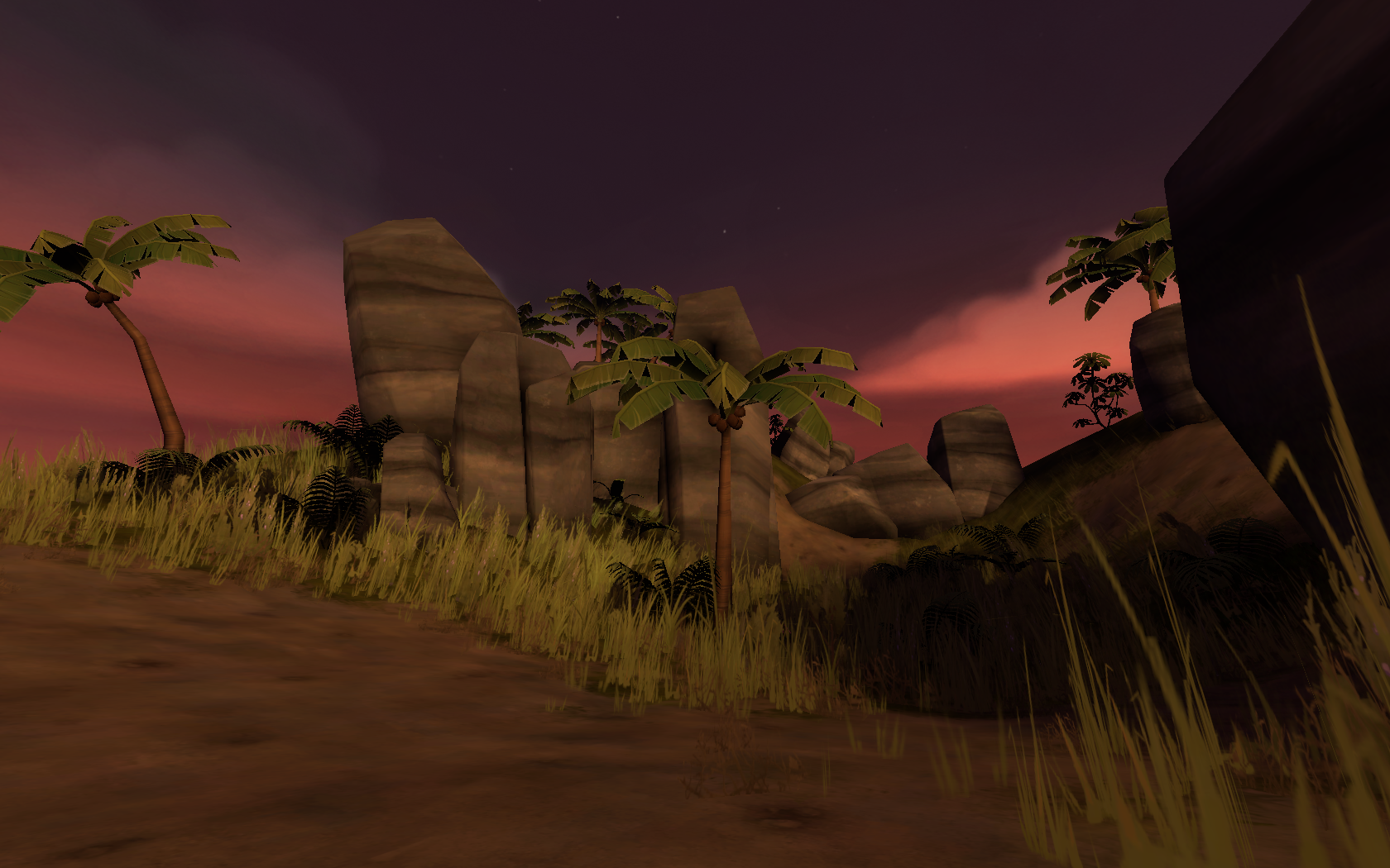
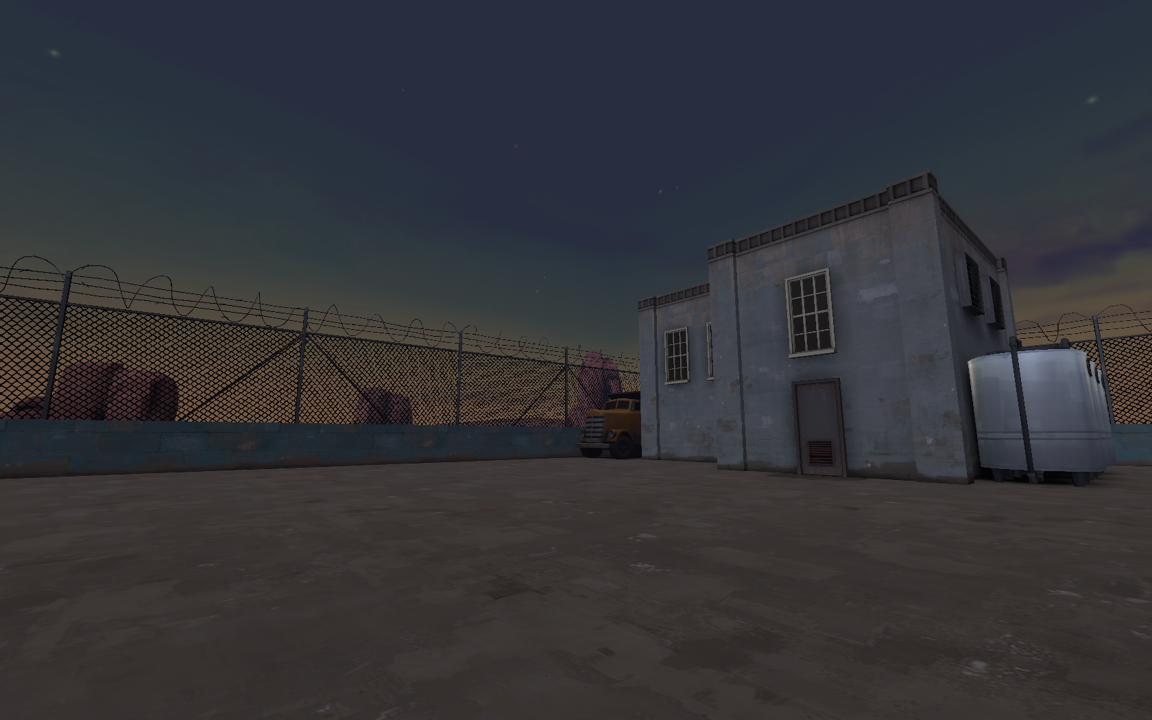
Like many people like this version of Ixem im thinking on uploading with other name and ill keep updating this map and the other...
What do you think?
I really think you should do it. Both version of Ixem were very popular, or so I'm told. I've only played some recent versions, but I really liked them!
I want to belive

Like many people like this version of Ixem im thinking on uploading with other name and ill keep updating this map and the other...
What do you think?
Did you recreate every single one of the fences with
yes, why?Did you recreate every single one of the fences with?
If you compile with -staticproplighting and -statyproppolys VRAD will automatically take those fence posts and give them a nice shadow to cast on the ground (if you want to see them on the ground turn down the lightmap scale to like 4 on your ground brushes). What you're doing now can only work if you disabled the model's shadows entirely, otherwise it'll still use the collision box for shadows, which just makes it a massive solid wall, rendering the blocklight brushes useless.yes, why?
Rose Snowflake
L1: Registered
- Jul 27, 2016
- 10
- 8
Rose Snowflake
L1: Registered
- Jul 27, 2016
- 10
- 8
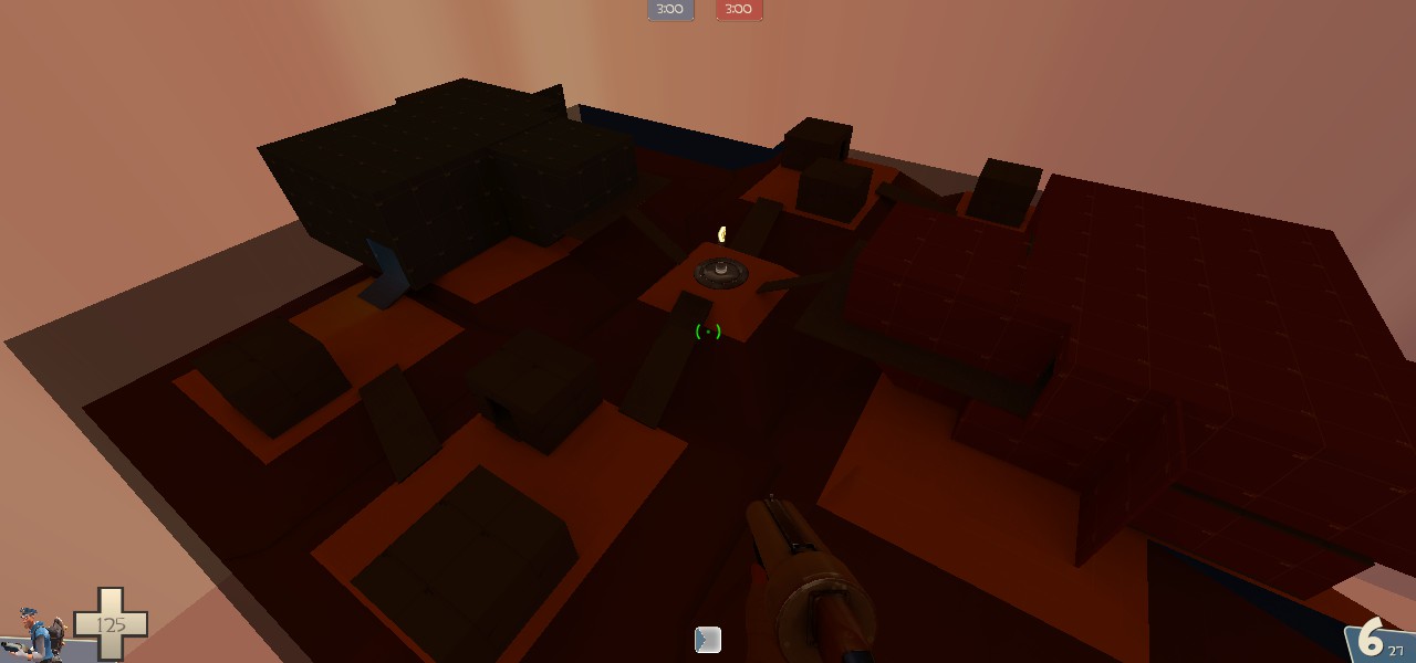
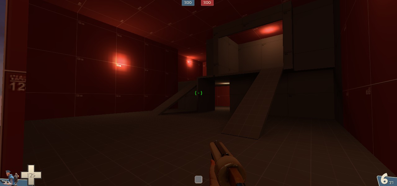
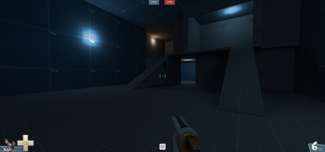
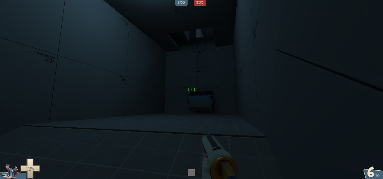
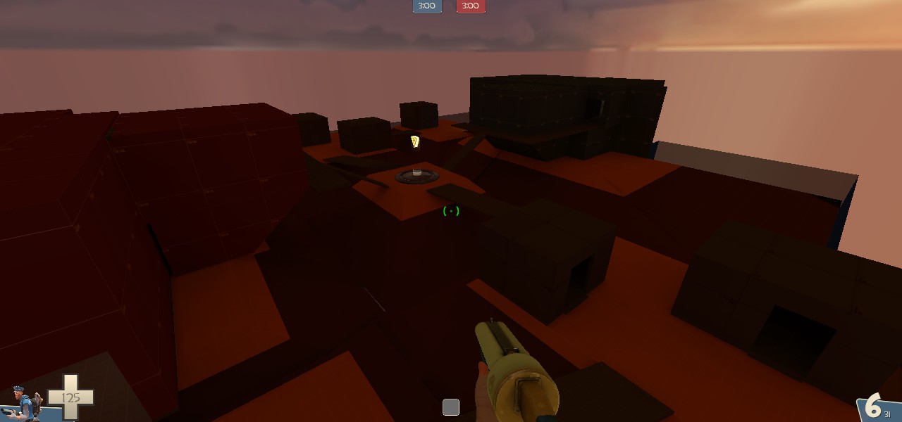
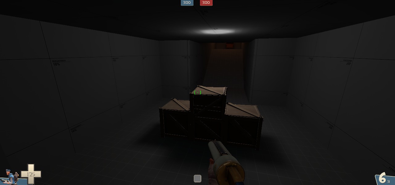
It looks pretty dark, you may want to add some more lights.this is a map I just started that I've called KOTH_Waddenzee
Waaay too dark, you're going to need to add a lot more lights, preferably non-coloured lights, in all the playable areas to stop 99% of any feedback you get being along the lines of "too dark", "can't see enemy", "spy heaven", etc. I also can't tell what the layout of your map is from your screenshots because they're so dark.
For Team Fortress 2 Classic.
4 teams Playload Race
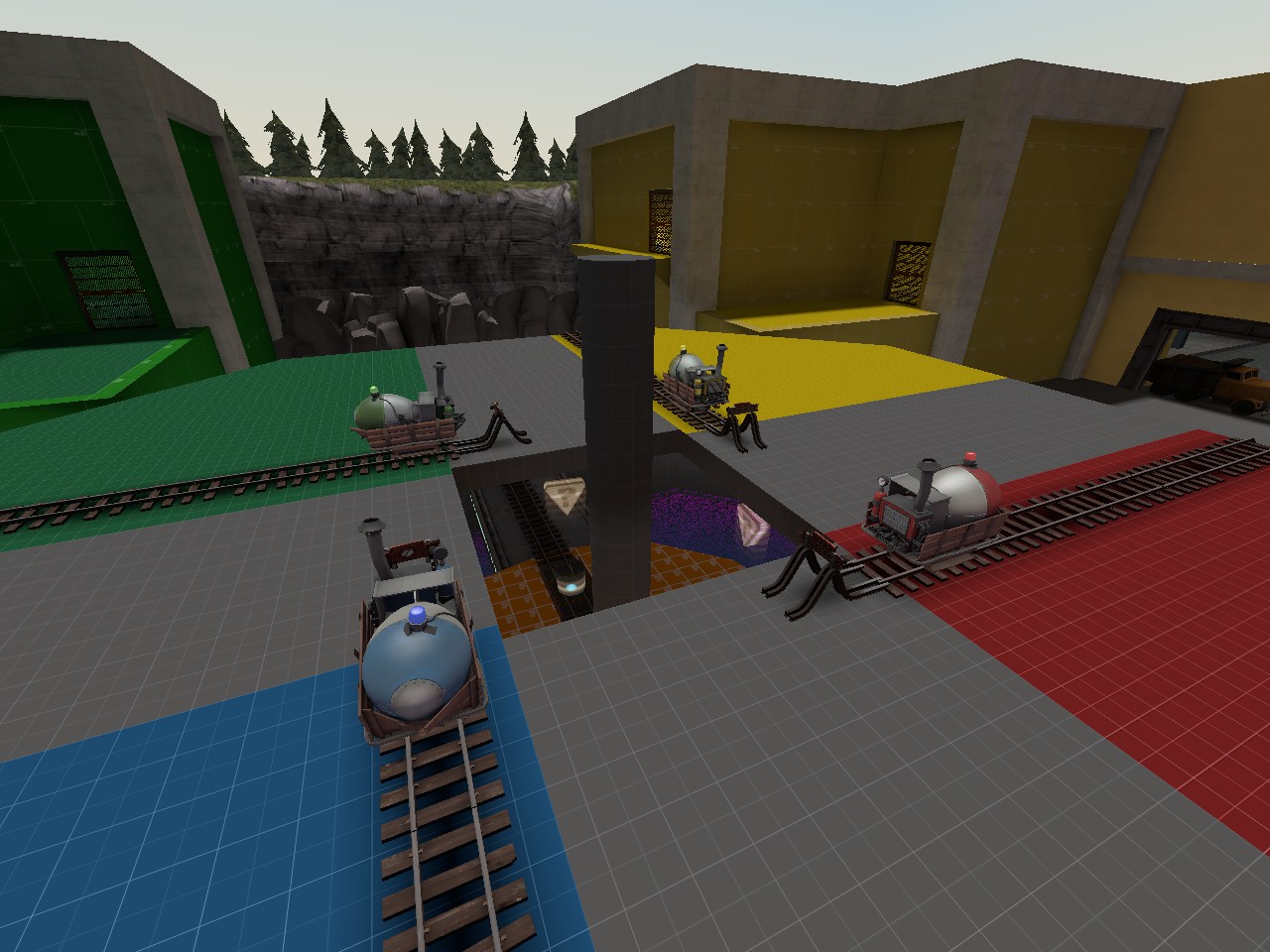

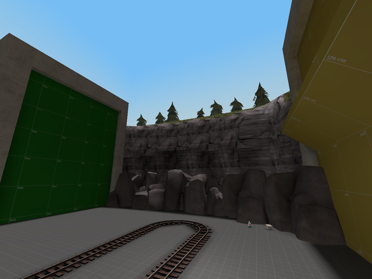
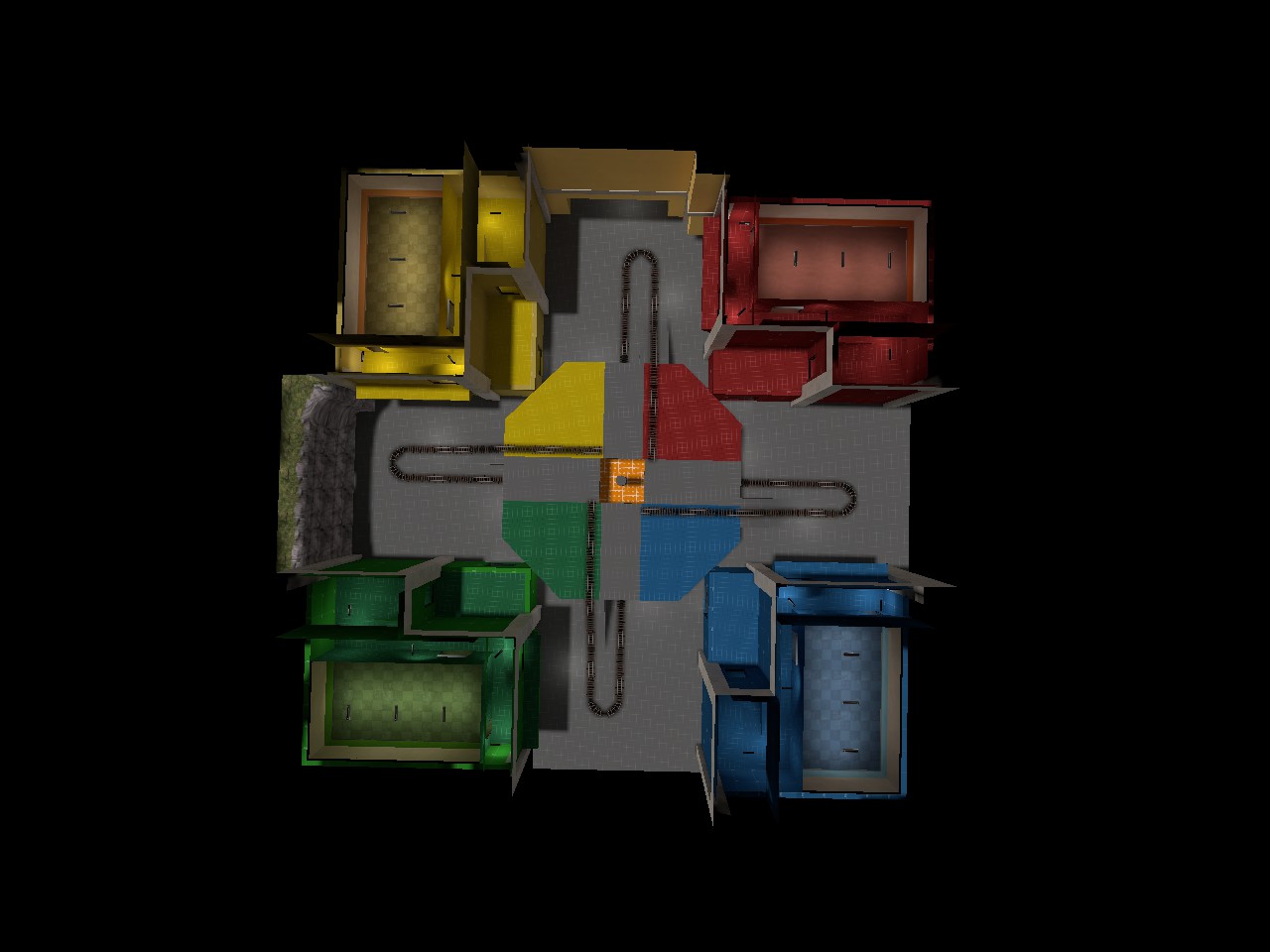
I just wanted to see how a chaotic game mode like payload race works.
In worst case scenario: Awful and Frustrating Gamemode
Best case: A Funny and Glorious Clusterfuck.
I don't think you need the team-coloured lights in the spawn rooms, you've done a good job of using team-coloured textures in each corner, and the coloured lights, while pretty in their own right, don't necessarily help in a multiplayer scenario.
I'm ignorant of tf classic gameplay, but those look like some long sightlines. The track layout looks a bit simple, and doesn't force teams to go past all the other 3 teams. I'd suggest a spiral design that puts the green cart past the blue building, then red, then yellow, and then leads into the middle capture point. as an example, i don't know what the cart layout is below the platform.
Last edited:
Rose Snowflake
L1: Registered
- Jul 27, 2016
- 10
- 8
I'm aware XDIt looks pretty dark, you may want to add some more lights.
Its a WiP after all
Well, Thanks for the feedback. There's about putting it in a spiral, the problem, what if there's no team in the blu, grn, ylw or red side. I chose this because for teams are more easy to defend. Also, the cart will go back if the cart wasn't pushed around 5 seconds, this is because It is really hard attack and defend due the number of players(which is max 6 players per team) and basically is a free for allWaaay too dark, you're going to need to add a lot more lights, preferably non-coloured lights, in all the playable areas to stop 99% of any feedback you get being along the lines of "too dark", "can't see enemy", "spy heaven", etc. I also can't tell what the layout of your map is from your screenshots because they're so dark.
I don't think you need the team-coloured lights in the spawn rooms, you've done a good job of using team-coloured textures in each corner, and the coloured lights, while pretty in their own right, don't necessarily help in a multiplayer scenario.
I'm ignorant of tf classic gameplay, but those look like some long sightlines. The track layout looks a bit simple, and doesn't force teams to go past all the other 3 teams. I'd suggest a spiral design that puts the green cart past the blue building, then red, then yellow, and then leads into the middle capture point. as an example, i don't know what the cart layout is below the platform.
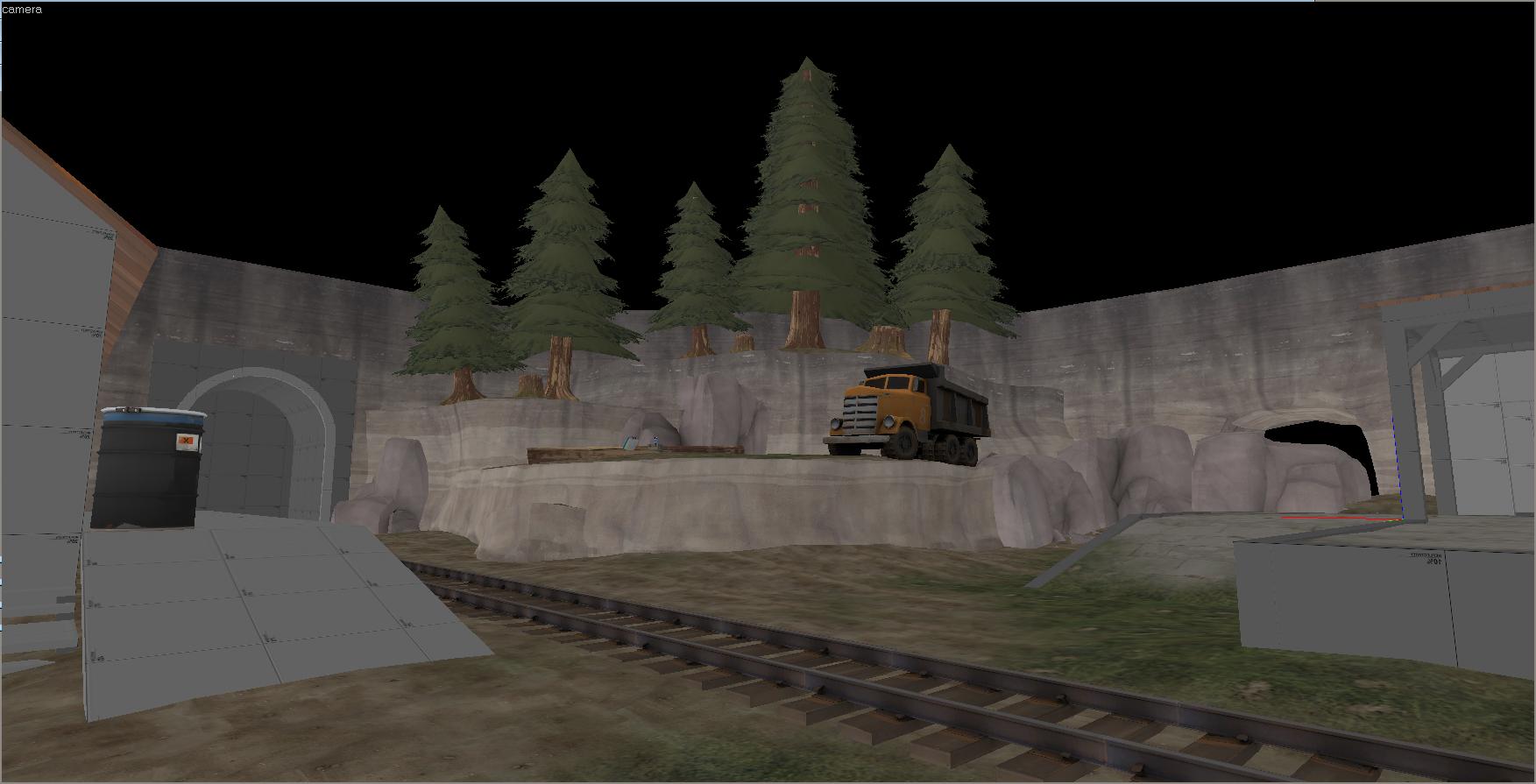
How did that truck get up there?
Nobody knows. It's probably a magic truck. OoOoOoOoO!


