WiP in WiP, post your screenshots!
- Thread starter Arhurt
- Start date
You are using an out of date browser. It may not display this or other websites correctly.
You should upgrade or use an alternative browser.
You should upgrade or use an alternative browser.
seth
aa
- May 31, 2013
- 1,021
- 852
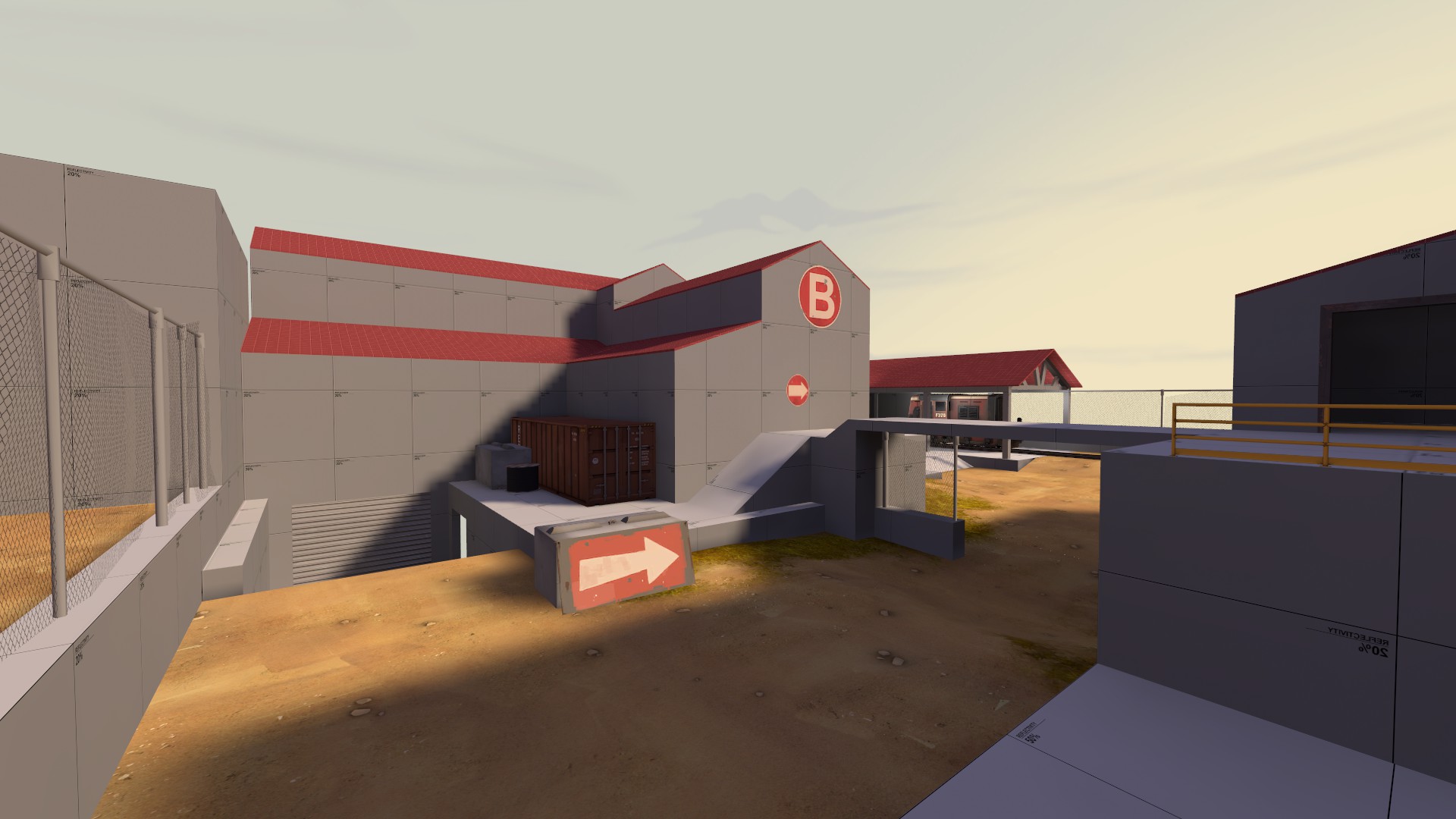
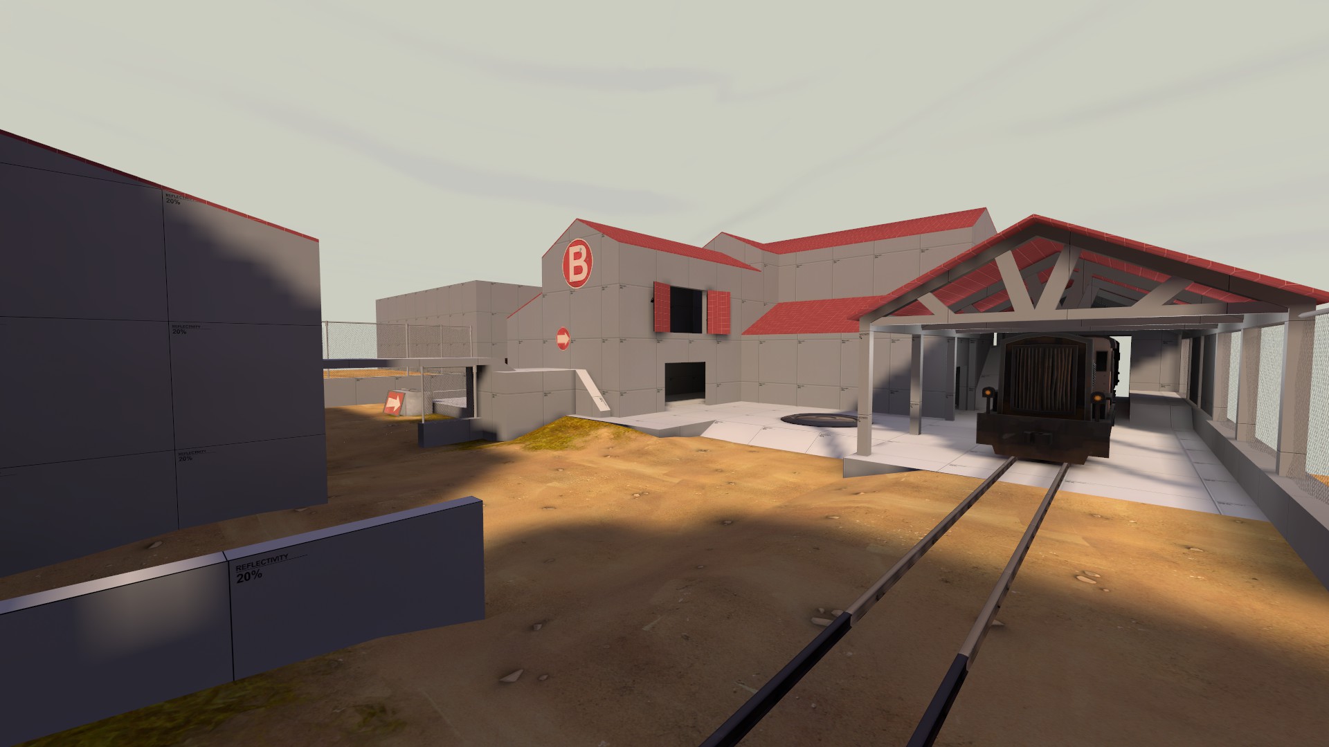
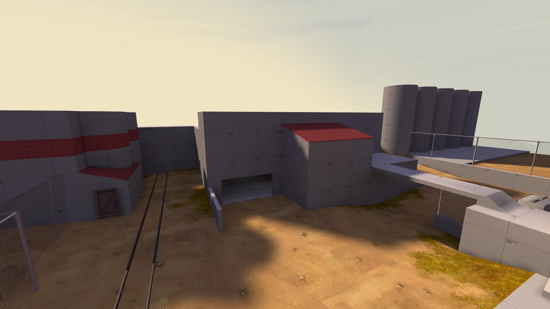
Working in a new spawn for ixem...

I was so bored that i decide to put this image...
Your point_spotlight's are a little low. The lighting looks nice and soft though, if a bit bright.
If only we'd have all the lights options that SFM has... Especially the überlights.IMO fluorescent lights shouldn't ever have point_spotlights. They're horribly suited for any fixture that's not circular.
All I'd really ask for is a few tweaks to the material system. Being able to manually crank the brightness of a self-illuminating texture above #FFFFFF would force bloom (if it's enabled) and let us do away with glow sprites, for example. As for light cones, all we'd really need is some volumetric light models to match every fixture, wouldn't we?
Dragonisser
L1: Registered
- Jul 12, 2014
- 37
- 18
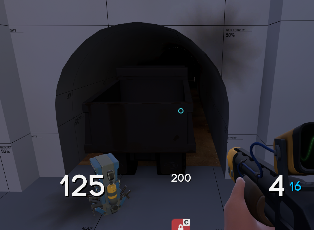
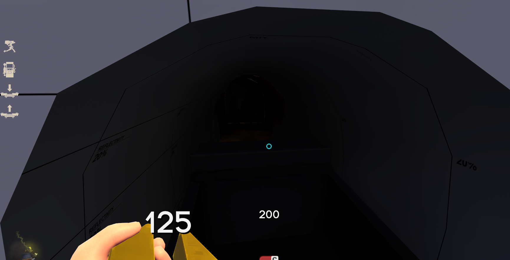
Does anyone knows how i can get rid of those light bugs? They only occur when im far away.
Also any good tunnel tutorials?
Also any good tunnel tutorials?

Does anyone knows how i can get rid of those light bugs? They only occur when im far away.
Also any good tunnel tutorials?

Light your map properly, and you shouldn't have those problems.
Does anyone knows how i can get rid of those light bugs? They only occur when im far away.
Also any good tunnel tutorials?

Are there any leaks in your map? On the top bar in Hammer, go to Map > Load Pointfile, and see if a file browser pops up. If it doesn't, you probably have a leak, which is a hole in your map to the void. Look for a red line that has appeared in your map; it should show you where the leak is. Patch it up, recompile, and see if these lighting bugs persist. Also, as @Mikroscopic suggests, make sure that tunnel is lit well enough.
For an alpha, that tunnel looks quite good, nice work. Just use the Vertex Tool
Are the gaps between 2 displacements? or is that brushwork? Because i do know that sometimes those gaps are unavoidable due to the way the engine does render. Many tf2 maps have such problems. but as the color of the floor is already relatively bright you just dont notice it.
Dragonisser
L1: Registered
- Jul 12, 2014
- 37
- 18
Dragonisser
L1: Registered
- Jul 12, 2014
- 37
- 18
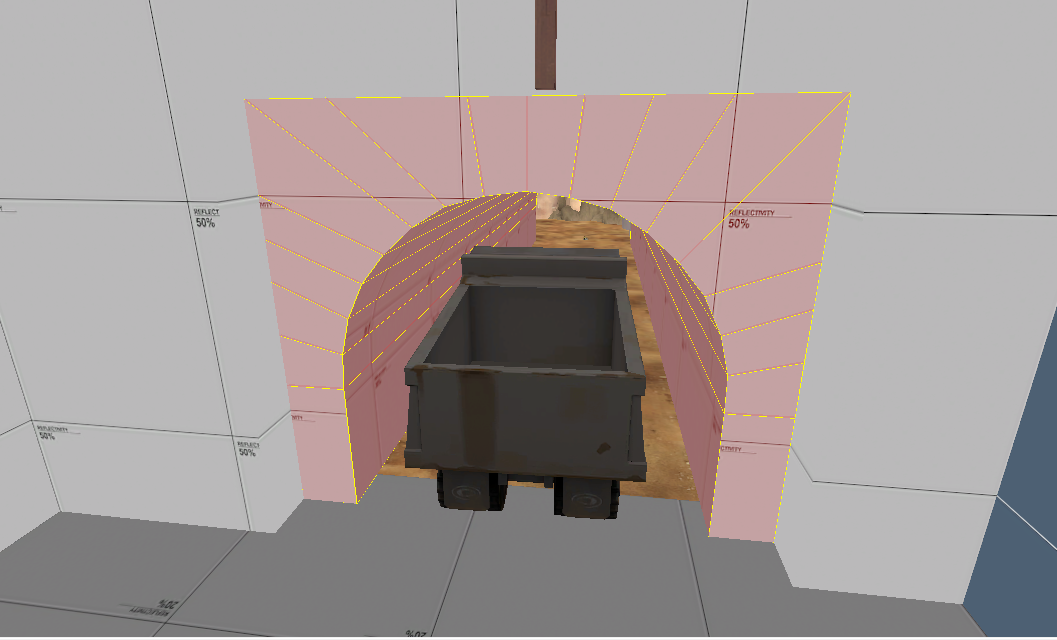
Nope i used the clipping tool, bit for bit. It's because of the lines going through the complete brush instead of just segments around the edges?Did you make that tunnel with the Carve tool?
- Oct 11, 2013
- 273
- 413
It kinda looks like this. The tunnel sliced and grouped, no leaks, sealed room, and aligned to the grid.
Also the tunnel should be dark, otherwise i would have thrown some lights there
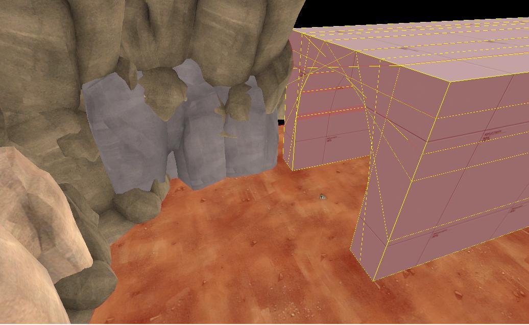
You should totally be cleaning up those brushes, it looks like you've carved that tunnel.
You should be using an arch here, and maybe some displacements instead of the props at the left?
Yeah there are some lines overlapping so it looks like you used the clipping tool. This can create excess brushes and issues though, and there's a much cleaner way to make tunnels than clipping or carving - the arch tool. Try to use the arch tool every time because it's much cleaner brushwork.
Here's a quick guide: http://www.interlopers.net/tutorials/2249
Here's a quick guide: http://www.interlopers.net/tutorials/2249
Those "cracks" are a side effect of how anti-aliasing (or MSAA, at least) interacts with the breaks between visleaves. It's only noticeable in very dark areas, but there's no fix for it except to complain to Valve about it and hope someone's listening. I think they've already fixed it in newer engine branches like Left 4 Dead.
Dragonisser
L1: Registered
- Jul 12, 2014
- 37
- 18
Even though it looks better now the problem still persists. Maybe some very dark lights will help
