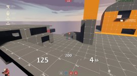
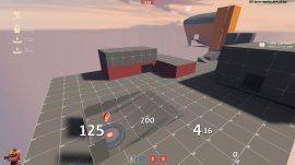
WiP in WiP, post your screenshots!

Uncuepa

aa
Oct 25, 2014
799
1,168
I really think that stone staircase needs some kind of a support, it looks weaky wonky so thin.

tfr_lodge_snow_night-jpg.6529

Checkmate
 

SnickerPuffs

(*single chuckle*)
aa
Apr 10, 2014
1,325
1,866
I was doing to do a detailing gag, but I decided against it. Here it is, if anyone wants to look at what could have been

D9GvyHa.png
 

Spipper

Former cheese man Gorgonzola
aa
Feb 18, 2012
246
407
Converted a certain map to passtime:
JUBwSaV.jpg

OD8HbRI.jpg

I'm excited to see if this even works out.
Getting the HUD to work correctly has turned out to be a bit tricky tho.
 

Zed

Certified Most Crunk™
aa
Aug 7, 2014
1,241
1,025
Is that pl_frontier? It looks like Frontier, but snowy.
1. It's a symmetrical map.
2. It looks nothing like Frontier.
3. How would one convert pl_frontier of all things into PASS Time?
 
May 25, 2015
390
307
1. It's a symmetrical map.
Well, it kinda looked a little like a symmetrical version of the 2nd point on Frontier to me.
2. It looks nothing like Frontier.
Idk, it looked a little bit similiar to one of the flanks...
3. How would one convert pl_frontier of all things into PASS Time?
Just remake the 1st and 2nd checkpoints, copy them, rotate them, and make them fit seamlessly togheter I guess?
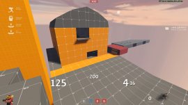
 

Pocket

Half a Lambert is better than one.
aa
Nov 14, 2009
4,701
2,583
Just remake the 1st and 2nd checkpoints, copy them, rotate them, and make them fit seamlessly togheter I guess?
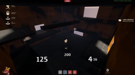
Or the last two. Someone already did that and made a CTF map out of it. I forget what it was called.
 

yelo

L1: Registered
Nov 8, 2015
9
4
Completely fresh mapper and member here (if that wasn't obvious).
Working on my very first map (thanks Crash for the amazing tutorials) currently just titled "farm", although that's subject to change.
Any stupid glaring weakness/errors or just criticism is welcome. Ignore the CP messup, I messed it a bit up, and I'll fix it.
2015-11-08_00001.jpg
Middle point, outside. Sorry, Soldier mains for the indoors mid point.

2015-11-08_00002.jpg
Inside, no lights as of yet. Also missing a few walls and obstacles.

2015-11-08_00003.jpg
Second point, with forward spawns inside the house on the left.

2015-11-08_00004.jpg
And finally, the last cap.
As a question to you experienced mappers, is it better to get this "done" and start working on a new map or keep polishing the same map until it's Valve quality? I'm thinking the latter.
 

yelo

L1: Registered
Nov 8, 2015
9
4
That's true. I think I'll move the last cap to the side, rotate it 90 degrees counter clock wise, and add a new "lobby" area where last cap is currently placed.
This'll also allow a typical secret path from the house near second to last cap.
 

ProfHappycat

Server Staff
Aug 2, 2015
153
356
btw you should also at least add some lights in your pics before your post
also i noticed that the platform inside the building is floating?
 

sooshey

:3c
aa
Jan 7, 2015
514
410
Hey everyone, i'm new-ish here and i just made a playable alpha of my first map, called koth_caribbean.
yAoGROM.jpg

YIuxuZY.jpg

KGJZ2Ue.jpg

The spawns aren't shown because they're kinda underdeveloped, but there's mid and one of the "connectors". Let me know what you guys think!