WiP in WiP, post your screenshots!
- Thread starter Arhurt
- Start date
You are using an out of date browser. It may not display this or other websites correctly.
You should upgrade or use an alternative browser.
You should upgrade or use an alternative browser.
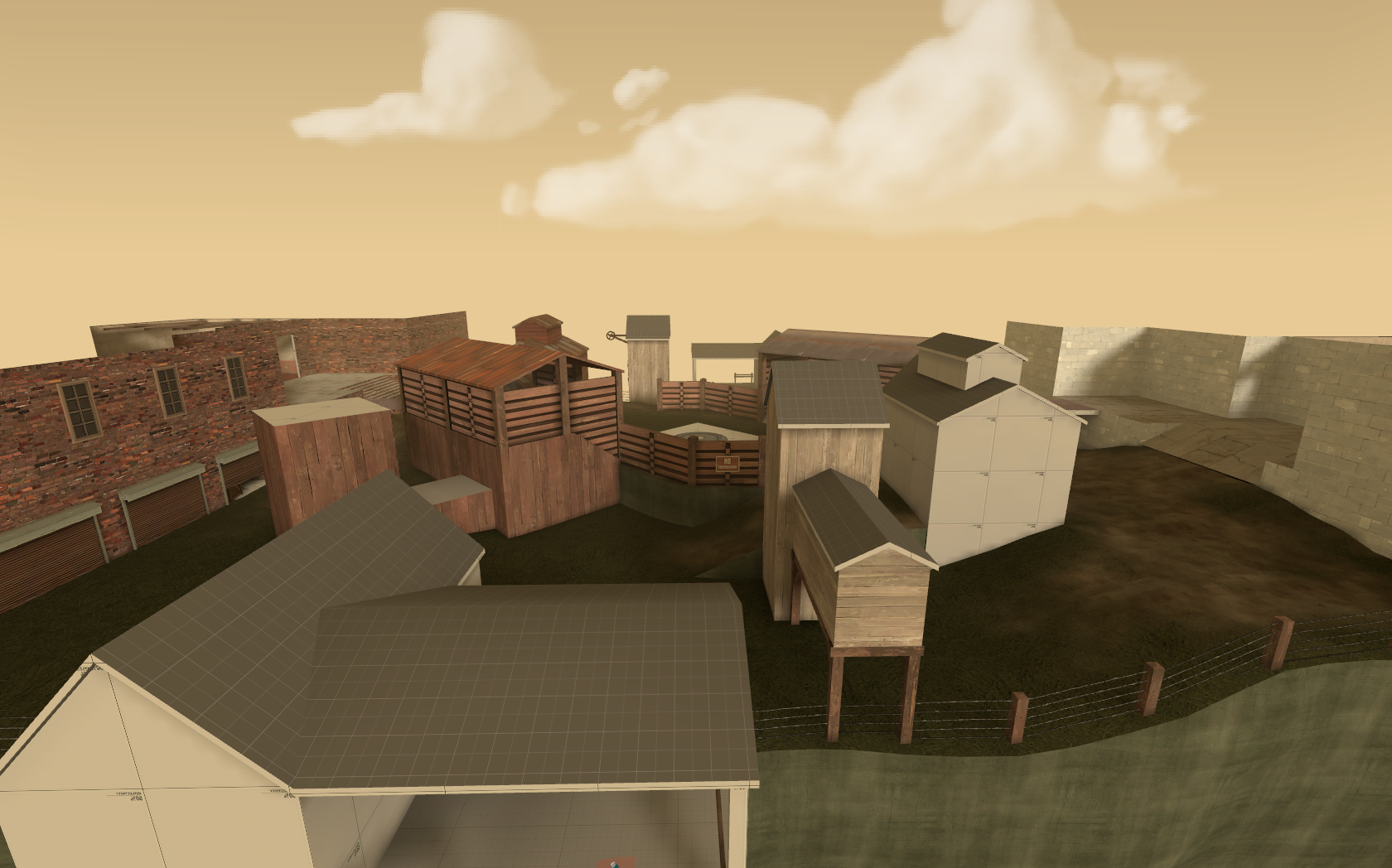
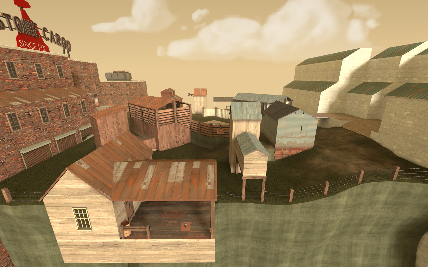
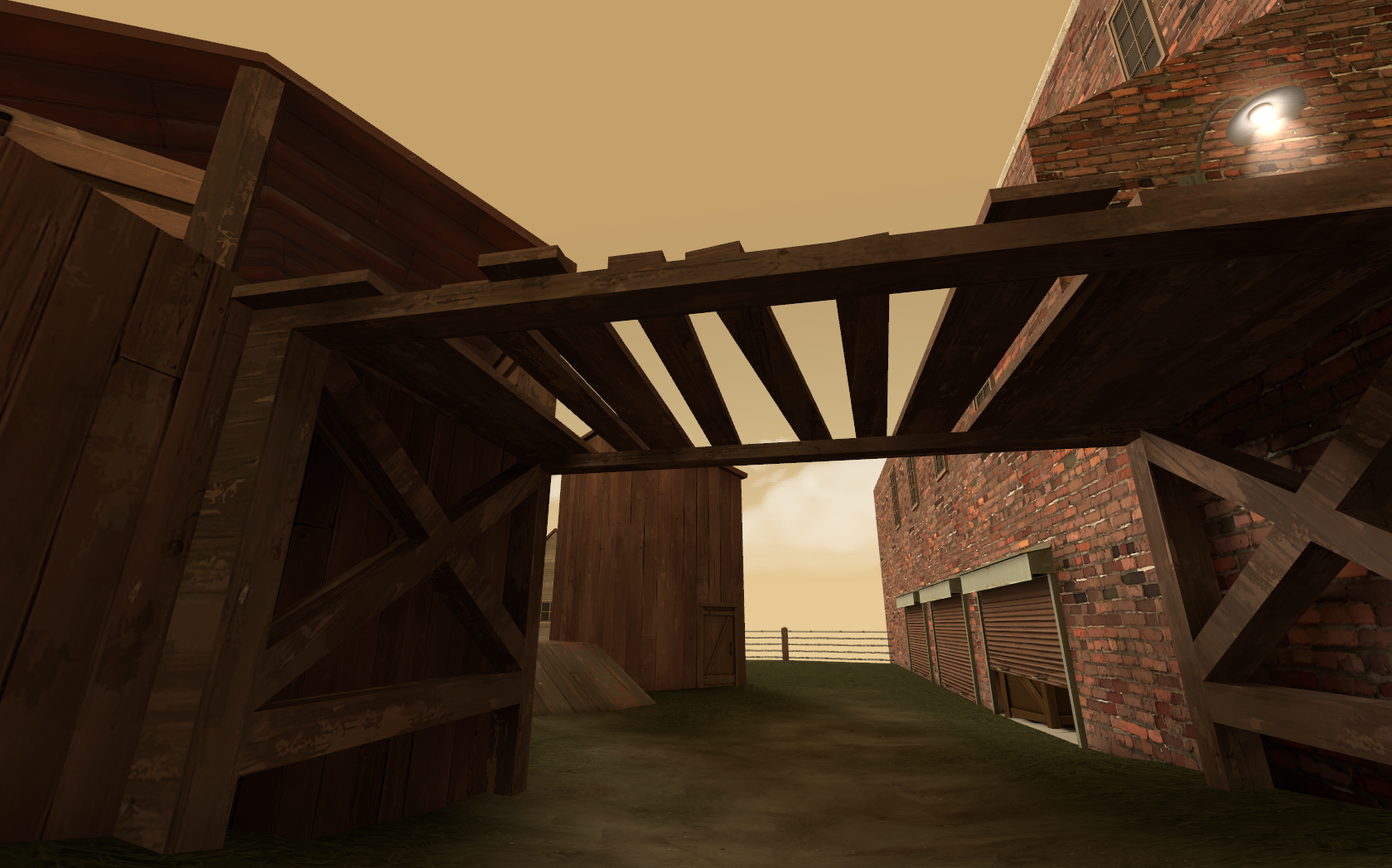
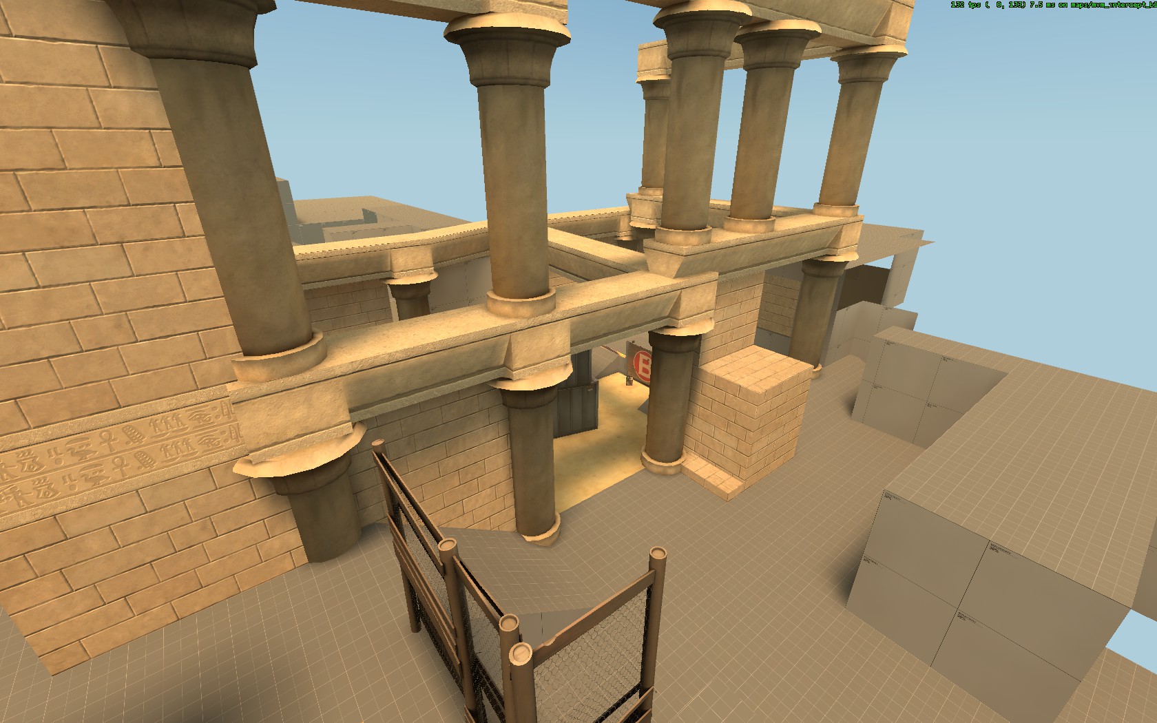
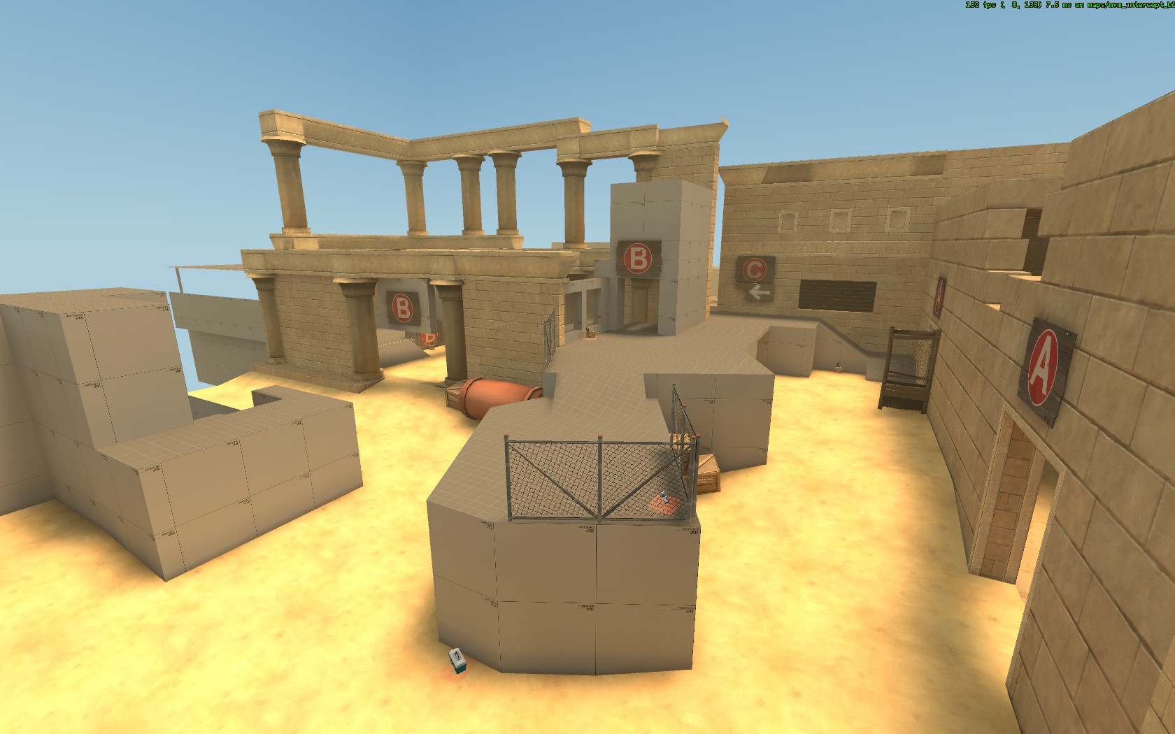
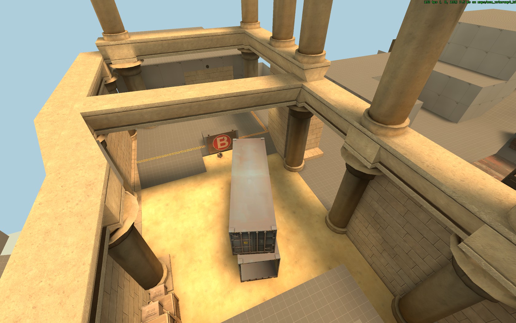
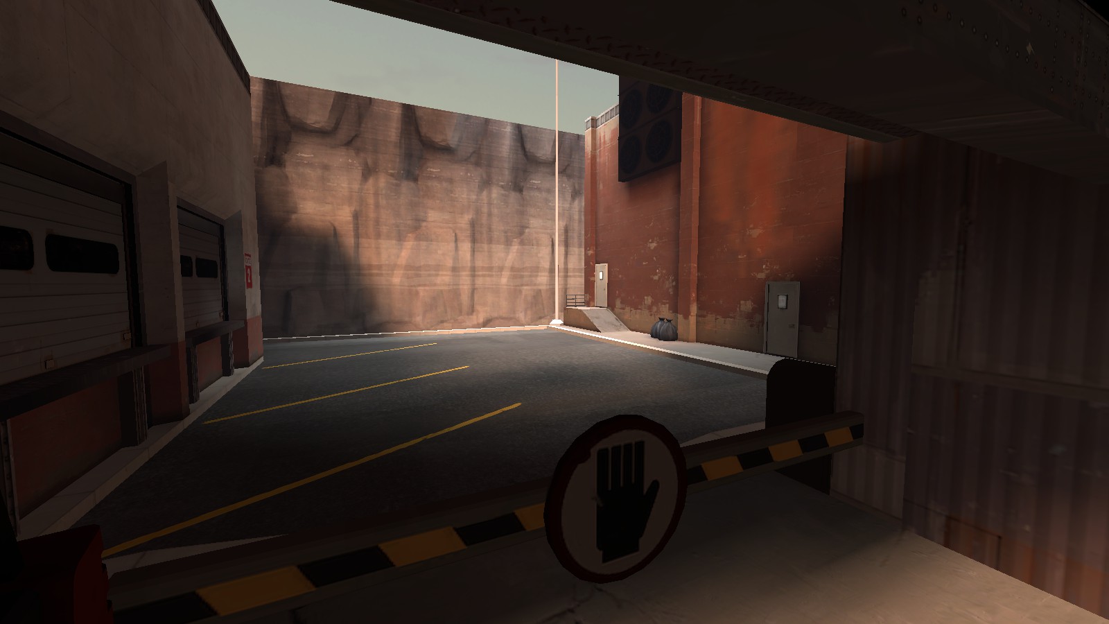
It's certainly detailed fairly well, but does it play alright?
Testing said a very sound yes, I adopted it from Idolon, he's better at the map making than I am.
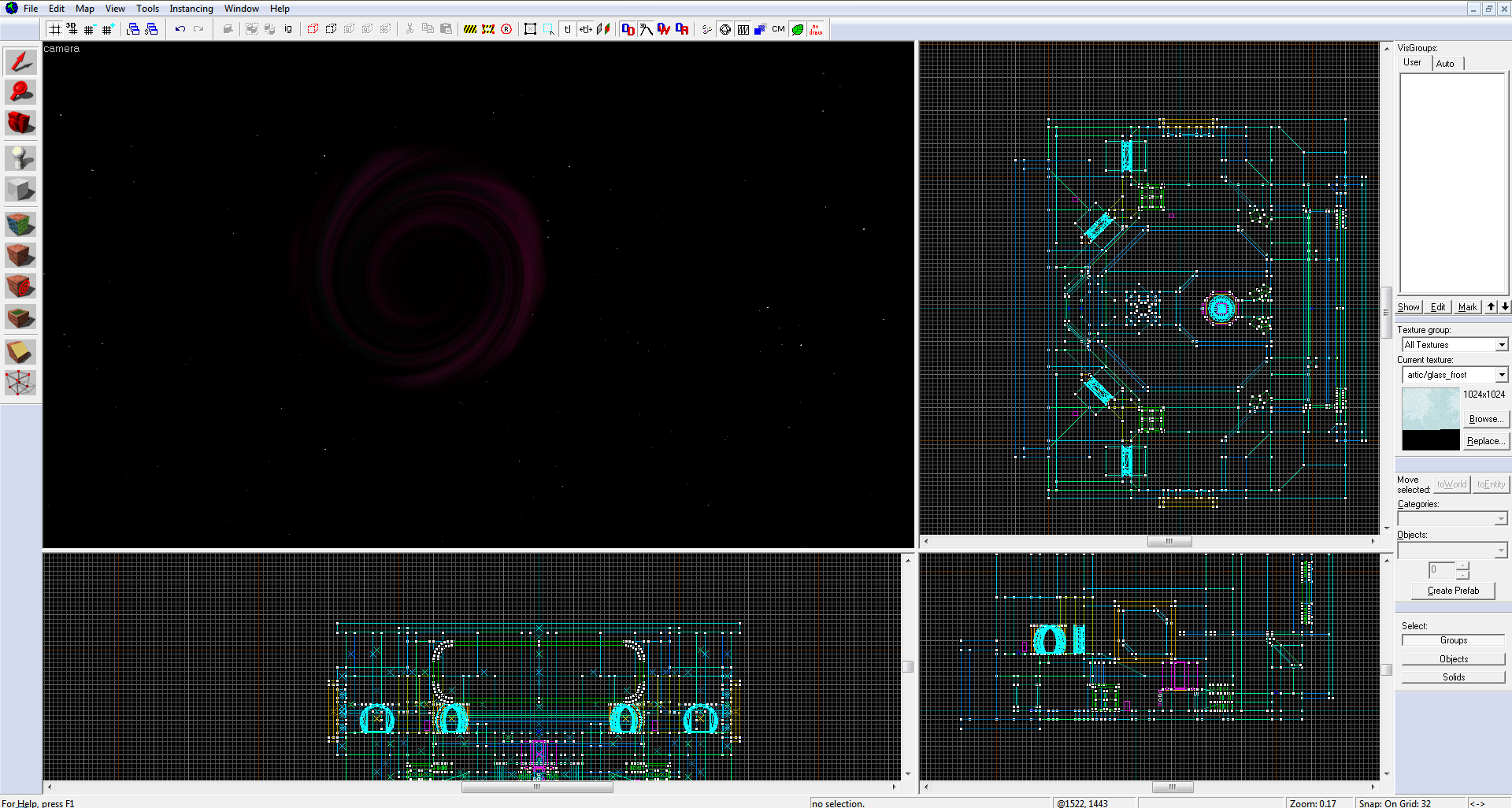
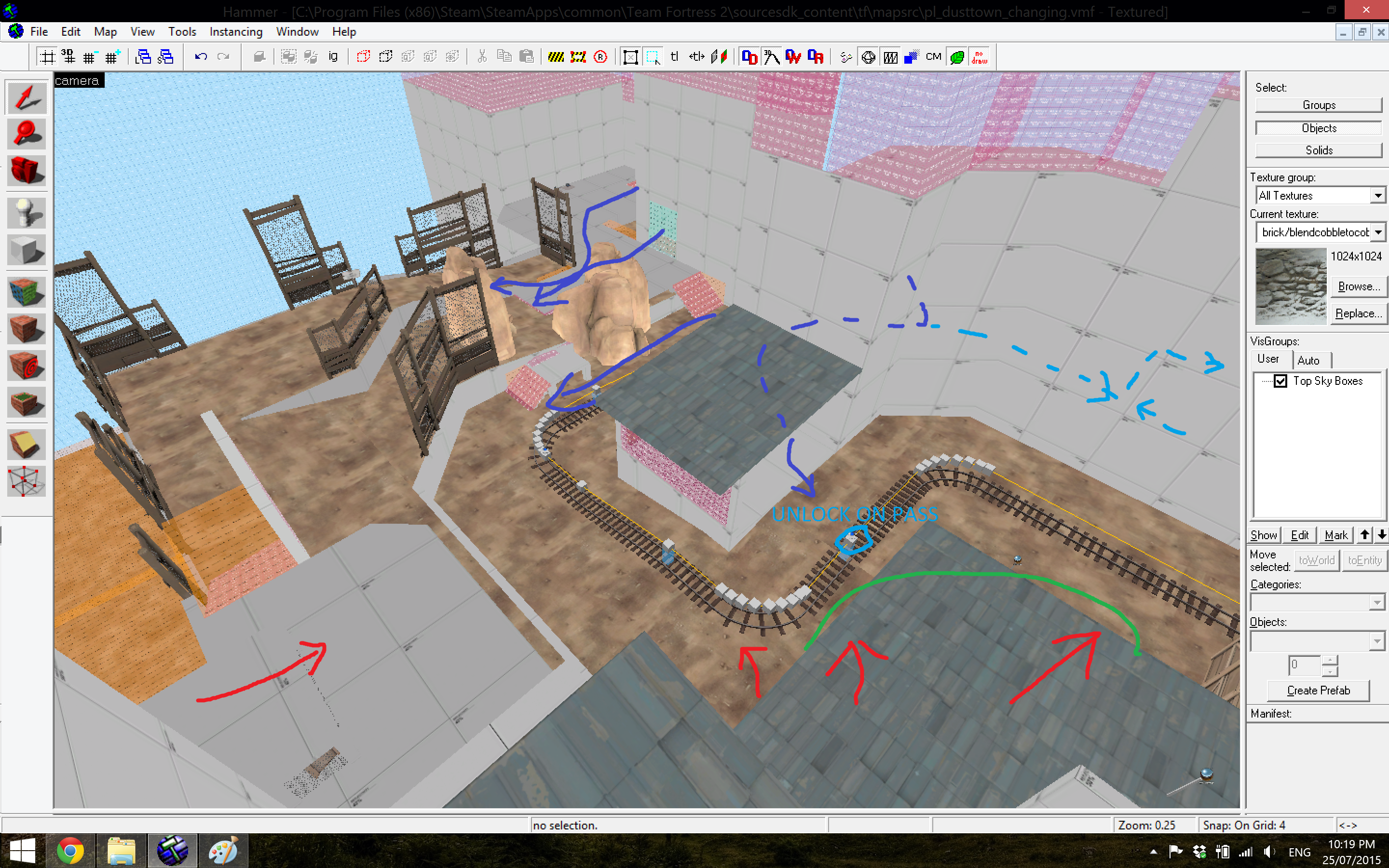
Blu comes from the dark blue lines at first, but then have access to the light blue lines after the cart passes the track circled in light blue. Red comes from the red lines.
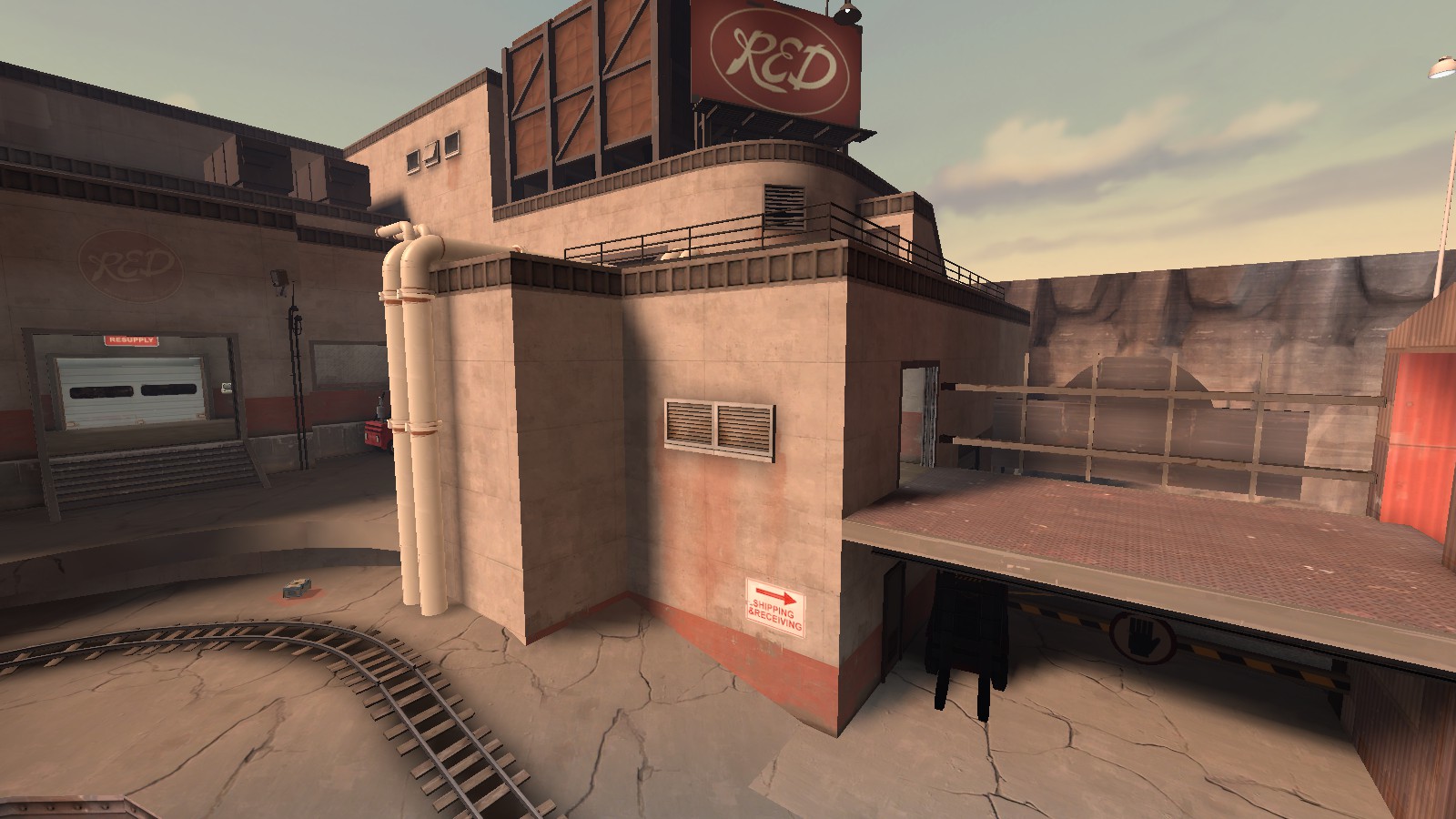
I've been thinking about what to do with the roof circled by green, but I just don't know. I still want to block the sight line from the roof accessible by the light blue line into the corridor that leads to Red's spawn and the sight line into the room with the 'c', 'd' and 'battlements' signs above the door leading to it. Any suggestions are appreciated.


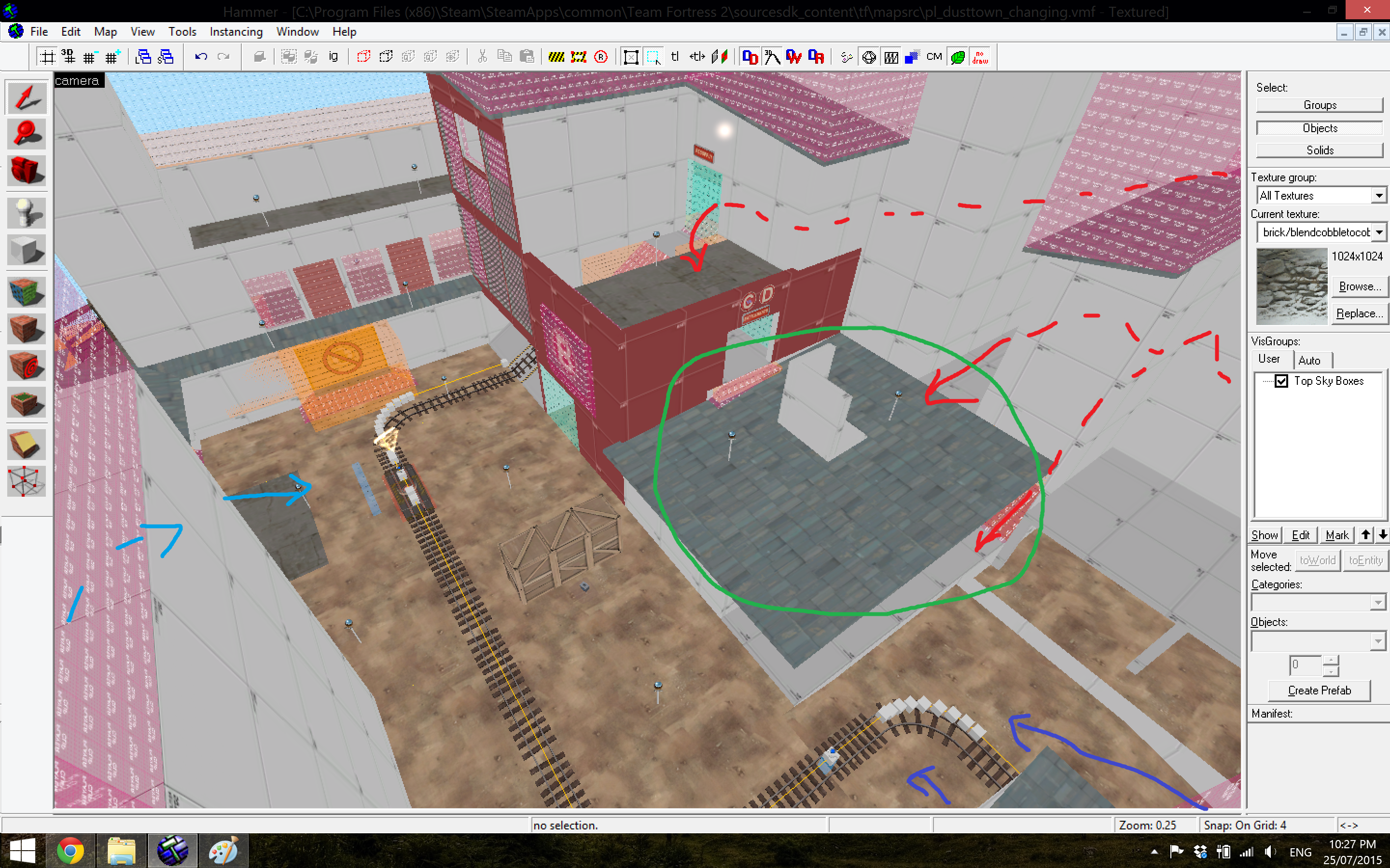
I've been thinking about what to do with the roof circled by green, but I just don't know. I still want to block the sight line from the roof accessible by the light blue line into the corridor that leads to Red's spawn and the sight line into the room with the 'c', 'd' and 'battlements' signs above the door leading to it. Any suggestions are appreciated.


- Mar 6, 2013
- 1,044
- 627
Is this the AD map where all 3 cps are together by differently elevated?
I'm going to guess dkoth.
Is this the AD map where all 3 cps are together by differently elevated?
I'm going to guess dkoth.
It's an a/d cp map where the point moves up each time it's captured. There's also a 30 second pause time after each capture to let Red retake ground (Blue won't have access to the upper levels until after the timer, unless they rode the CP up or explosive/scout jump up).
30 seconds to me is a realy short time to retake the ground. When people capure expect half the enemy team to be dead and the sentry defense to be down. And to get a solid defense takes more than 60 seconds in that situation (considering how setup time normaly goes).
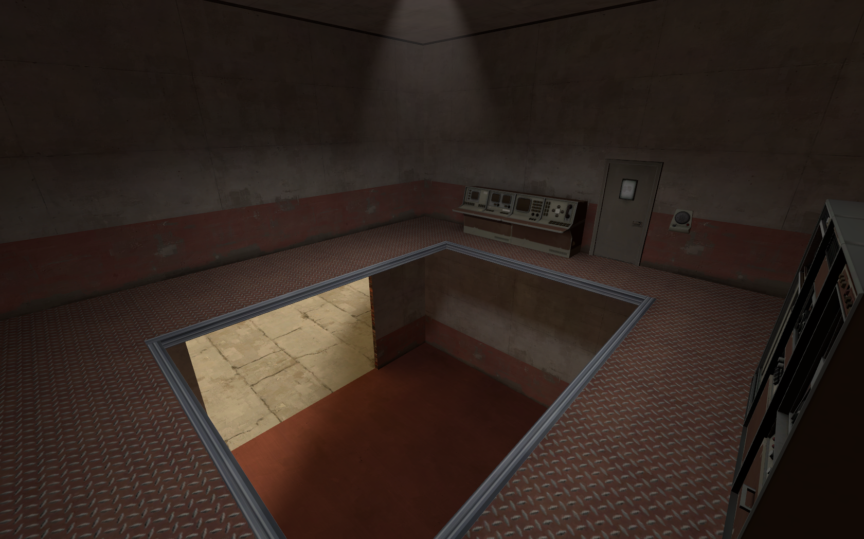
For the space theme i ran against a wall called valve.Real shame you ditched the space theme.
Im quite poor at creating new styles. I generaly need a resource to use as base for styling. From that i am able to create my own styles. rd_asteroid on that was a pain as the map was mostly prop based. And without them it just didnt look good. it was just a basic flat shape. At the distance of the screenshots it might look good, but standing close and you noticed it wasnt.
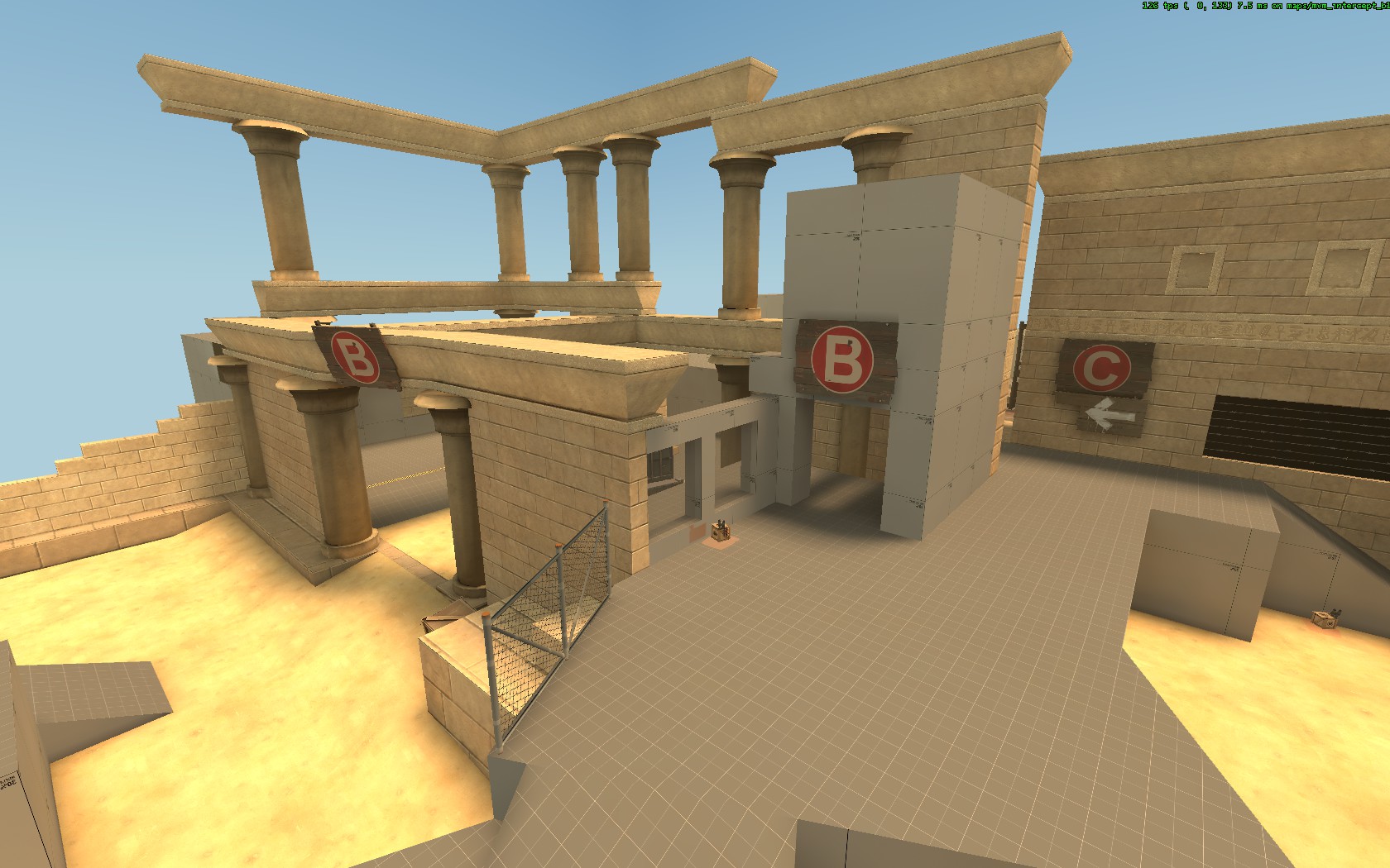
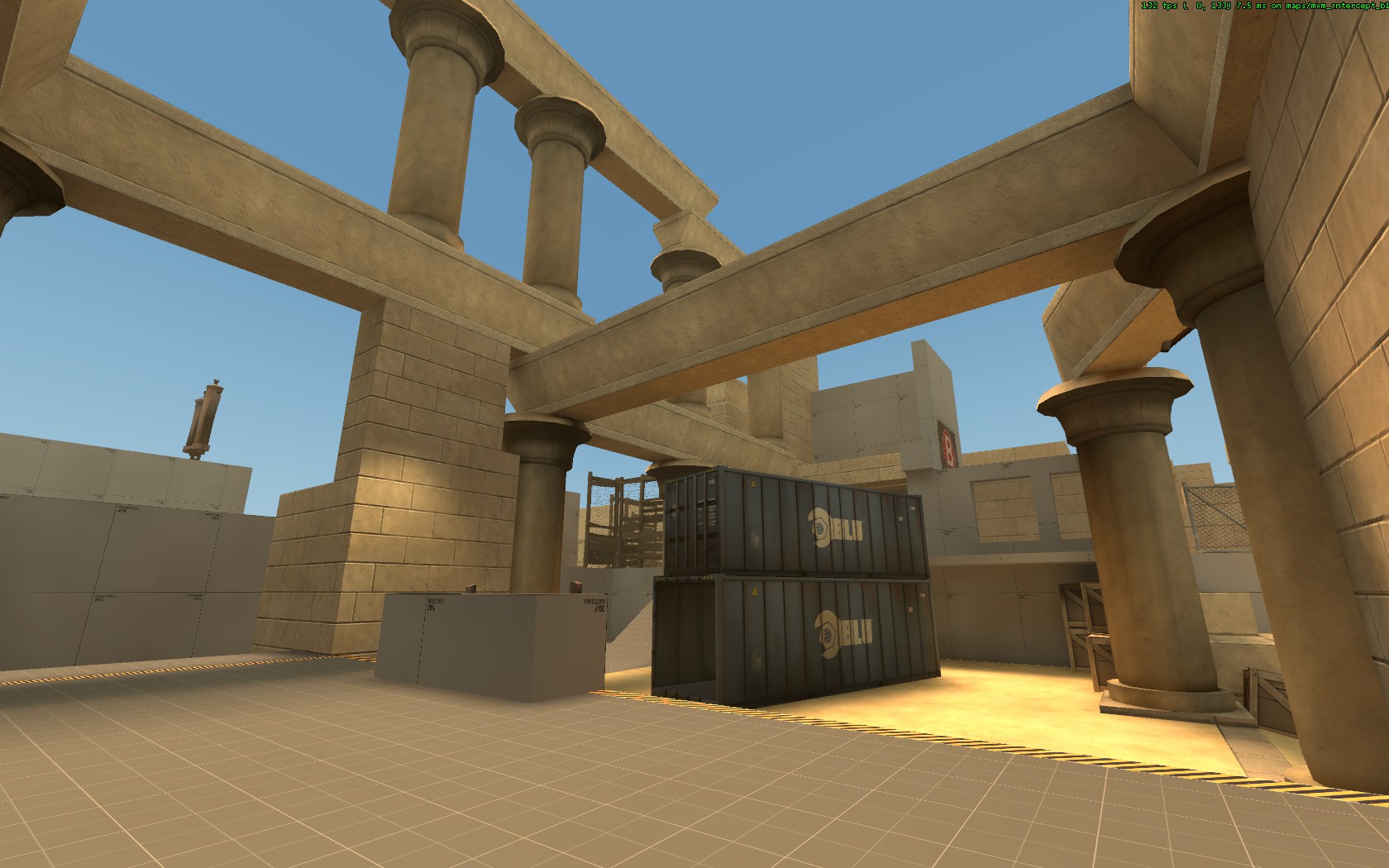
By waiting 1 year for new content so i potentialy could give it a more interesting look, i just lost patience and decided to search for a new theme i can work on, and have ideas for. Egypt was the result.
It might be sad, but its just as sad as a map that gets dropped. Sometimes you have to make some harder decisions. Chaning styles was one of those.
DioJoestar
L2: Junior Member
- Jul 1, 2014
- 71
- 169


