WiP in WiP, post your screenshots!
- Thread starter Arhurt
- Start date
You are using an out of date browser. It may not display this or other websites correctly.
You should upgrade or use an alternative browser.
You should upgrade or use an alternative browser.
Vaconcovat
L3: Member
- Jan 15, 2012
- 116
- 188
Doesn't the MvM icon guide on here deal with this? It's been a while but i think it does, let me go find it...And as a final note, valve still hasnt fixed some of the class icons to become fully seperated which made some look as just a single type (burst fire soldiers + rapid fire soldiers).
hmm, this was the thread I was thinking of but I cant see anything about it after skimming through it
The guide looks at the fact that you can differentiate between giants and normal sized enemies because they have identical icons with different names. In the wave UI, bots are sorted by their icon name alone, regardless of their crit / giant status. The icon you're using for the spammers, 'soldier_spammer' does not have a giant counterpart, as in valve's waves they are always giant.
It is possible, though, to make your own icon. It only means you'd have to pak it like all other custom content into your map. My guide does kinda touch on that a little bit, and if you'd like i can update it.
Oh and i also made mini set of custom mvm icons if anyone's interested, i'll put it up for download.
Sel
Banned
- Feb 18, 2009
- 1,239
- 2,570

... Or maybe i've been too social lately?
Or maybe it just looks good to you because you don't really do 3d modeling & texturing :3
TheBestUsername
L4: Comfortable Member
- Jun 25, 2013
- 151
- 96
I think it looks cool Sel, here's my crits: the number at the top looks blurry and that whiteish outline on the arrow needs getting rid of, the wear on the frame is cool but the actual flat gray of the door looks pretty plain, like pure base colour, maybe it's the bright lighting on it, idk. I'd add some wear to the post where things get rubbed past on the them, maybe a teeny bit of paint transfer and wear on the door edges and i'd call it done.
The thing that stood out to me is that the outline around the "03" appears to have been made after you degraded the edges. I get that the number would probably have been painted with a full layer of red followed by the yellow, so there would have been some spots where the yellow would have worn off more than the red, but it wouldn't be that perfect.
Leminnes
aa
- Jan 20, 2010
- 1,317
- 903
Started working on a new map yesterday night 
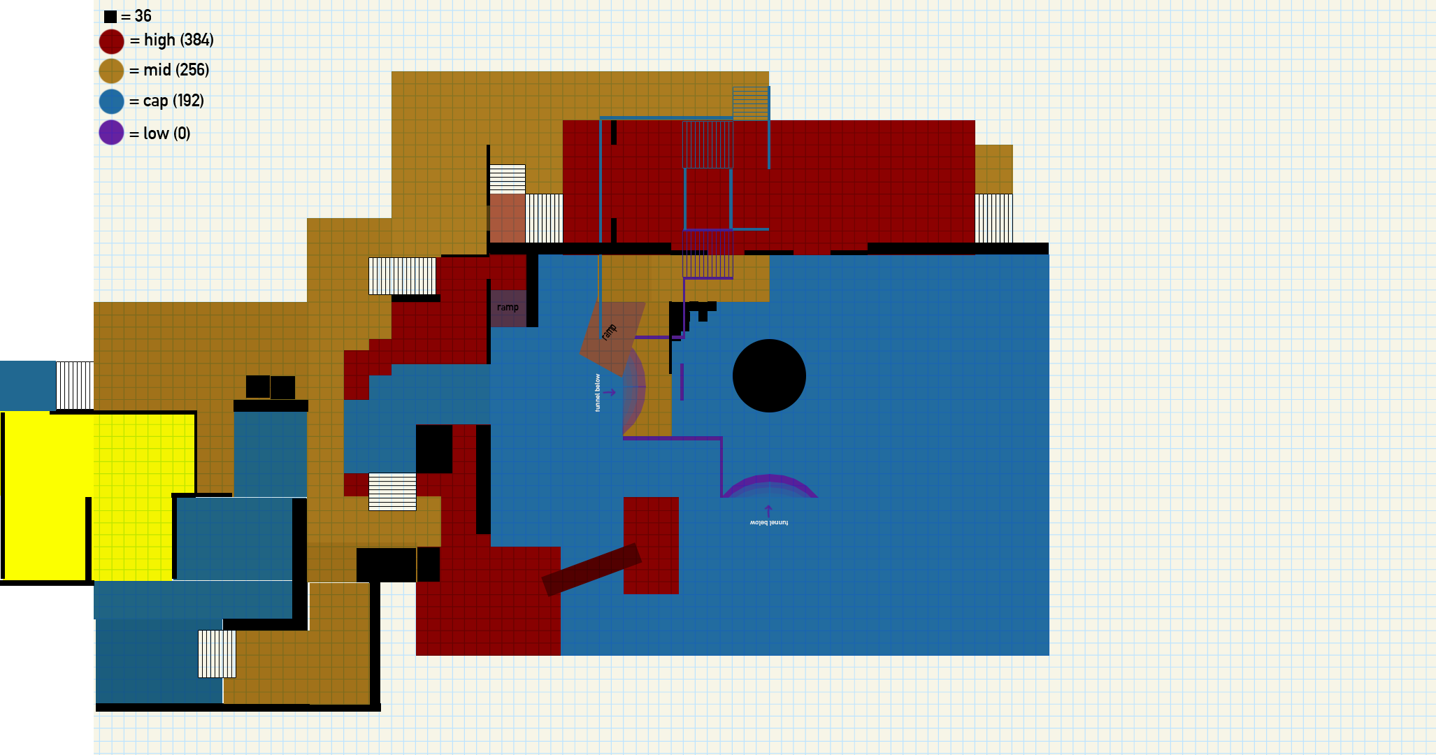
I'm calling it koth_sad_cyclops
Credit to hawk for that joke

I'm calling it koth_sad_cyclops
Credit to hawk for that joke
- Jul 31, 2011
- 872
- 1,021


Now with 100% more green!
Notes:
Not sure I like red spawn too much, probably will change
Not sure final will play out well, will check tests.
Forward spawn yet to be added (because I forgot I needed one)
EDIT: oh, this is my pacific pack map.
EDIT 2: The grey road will have a monorail, might not be in a1 though, because I'm interested to see how it will play out without it first. (Goal is to have it though).
Last edited:
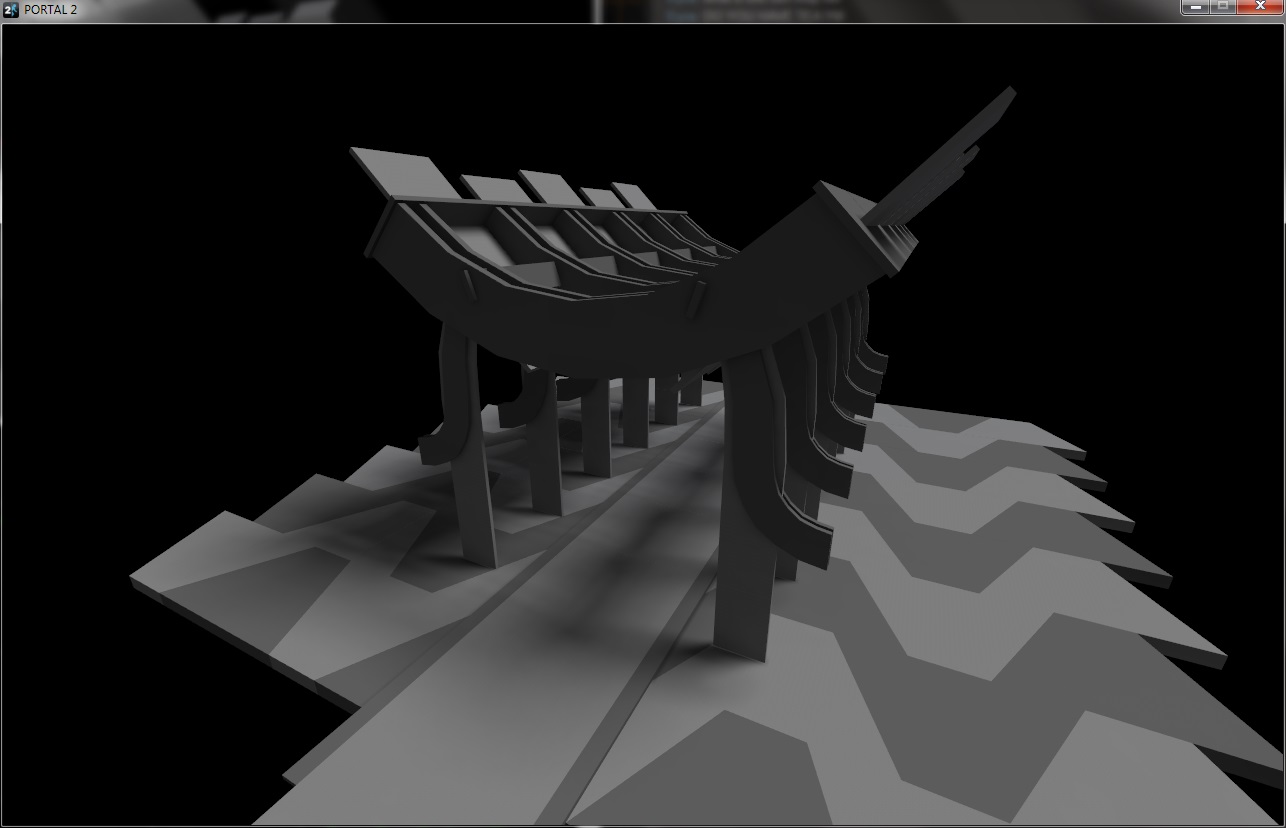
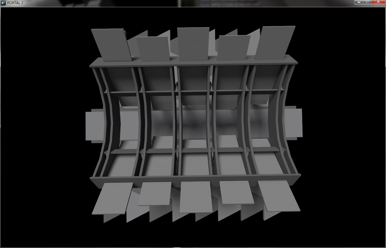
Random geometry test I did for fun. Here's something that I actually plan on releasing, in the same style:sooooooo uh
what is that exactly

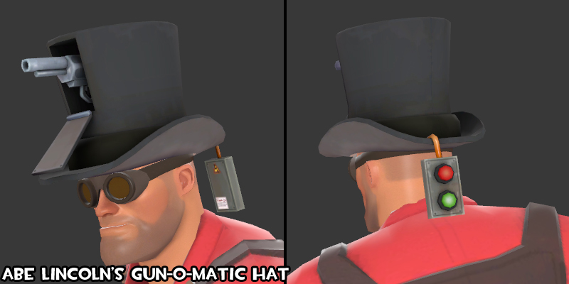
I dunno. While it is inspired by this Engineer Update page, I think it looks a little weird facing backwards.
I dunno. While it is inspired by this Engineer Update page, I think it looks a little weird facing backwards.
Oooohhh yeah, drop that cable down and hang the button over his shoulder so it rests roughly where his breast pocket is.


