WiP in WiP, post your screenshots!

tyler

aa
Sep 11, 2013
5,100
4,621
I never use shift + arrow keys, so it's probably closer to EArkham's suggestion. I just realized it is one large func_detail, splitting it into smaller func_details might do it.
 
Mar 20, 2012
391
806
Well, on another episode of "Godamn it, Valve - why does shit like this still exist":

6FF946D5ABBC3AF2F02647FE5F63E6F87D7247BD
 

soylent robot

L420: High Member
May 26, 2009
499
394
continuing the fine tradition of innovative not-really-a-guns in valve games, you clean that up with a special gun in HL3

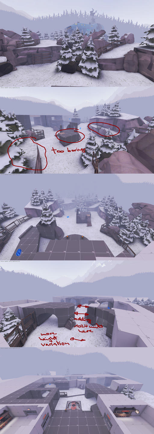
anyway, a2 of koth_loggerheads. made some massive changes to the overall layout, such as blocking off the horrendous sightlines and making it so that you cant get from spawn to centre point in half a microsecond.
216C6FBC63C2AE8B5F2DA7AA7F93EDAFB3CF2DD2

7450B1B94C1BA6252B4959B4783897586756900D

this building now contains the point. ive still not figured out doors for the trains, so there is one quite long sightline, though it is narrow and easily avoidable, and that'll be blocked off when i do figure out train doors
E92D1783C0B43DBE3E5B1BDFB76F34DDBE0CE440

and here is the new layout, almost twice the size of a1, which was tiny.
worries: the area with the shipping container is too big and open. there are still long "vertical" sightlines from the upper ledges to the container areas. the building has made the point go from too open to too enclosed.
 
Mar 23, 2010
1,874
1,699
a lot of stupid in this mvm map

1024x575.resizedimage

1024x575.resizedimage

1024x575.resizedimage
 

Pocket

Half a Lambert is better than one.
aa
Nov 14, 2009
4,701
2,583
use imgur/dropbox for picture hostin please. imageshack is annoying to use.

Or at least learn to properly hotlink images from it. That way it's only annoying to use for the uploader. It can be done without even registering an account if you're crafty.
 

grazr

Old Man Mutant Ninja Turtle
aa
Mar 4, 2008
5,441
3,814
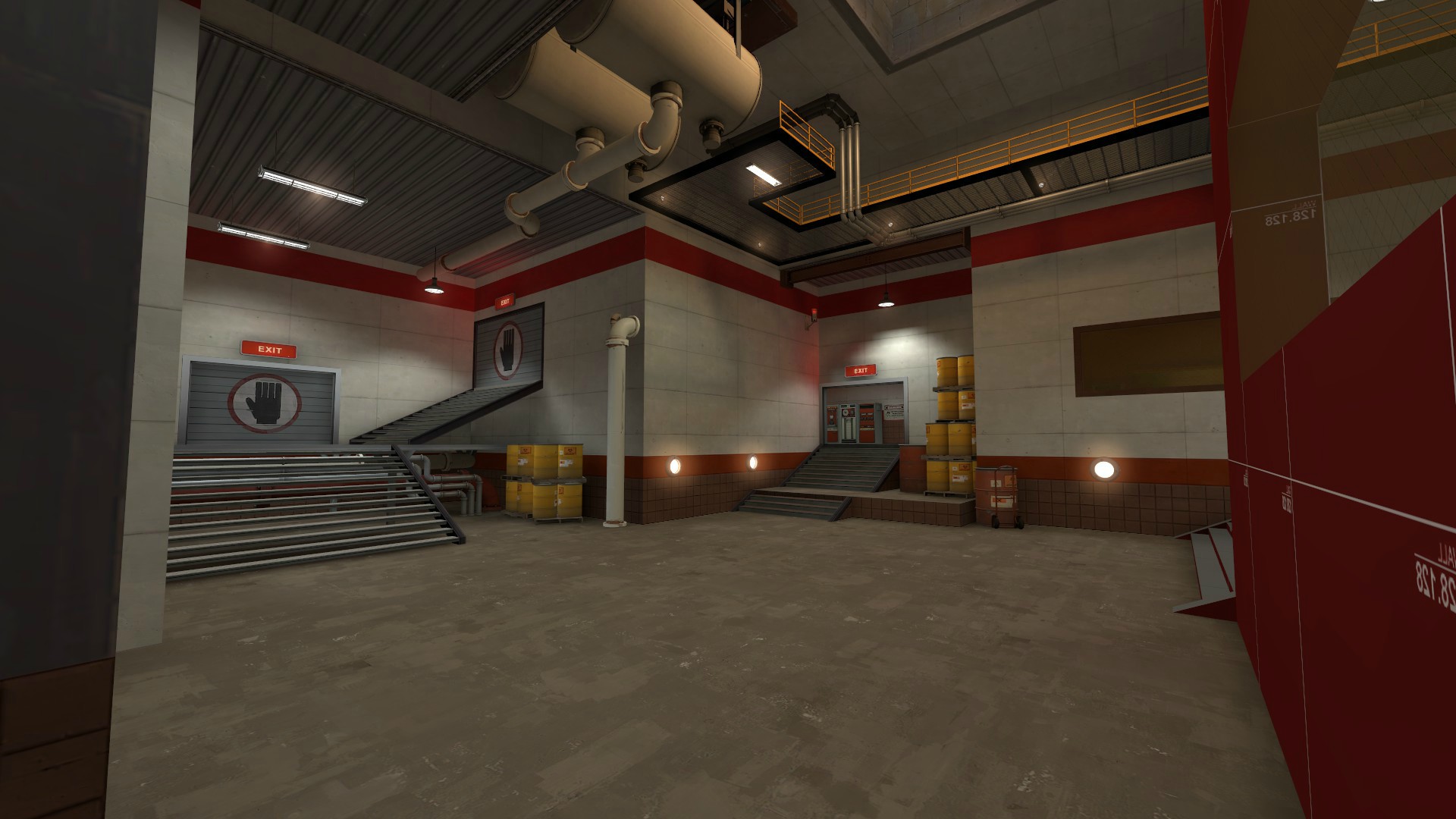
having a weird lighting bug, has anyone seen this before? the trim on the catwalks is all black but in other areas it's completely fine.
yTnag.jpg

You sure it's not just because there's hardly any direct/indirect light? Some textures, especially the really dark ones can be really temperamental in indirect light. This is common for textures used on ceilings facing down, when most light faces down and only illuminates ceilings with light bounces. Assuming it's not what Earkham suggested halfing the lightmap scale can help.

The length of a brush can also be an issue. Long, thin brushes sometimes don't register light like you'd expect.
 
Last edited:

tyler

aa
Sep 11, 2013
5,100
4,621
a lot of stupid in this mvm map

what's STUPID is how BRAZENLY you've STOLEN my BRILLIANT hanging piano but put it in a place that DOESNT MAKE SENSE

You sure it's not just because there's hardly any direct/indirect light? Some textures, especially the really dark ones can be really temperamental in indirect light. This is common for textures used on ceilings facing down, when most light faces down and only illuminates ceilings with light bounces. Assuming it's not what Earkham suggested halfing the lightmap scale can help.

The length of a brush can also be an issue. Long, thin brushes sometimes don't register light like you'd expect.

I'm positive. I'm wasting compile time lighting the ceiling in here for no real reason (those glows above the catwalk are also lights), and a similar catwalk in a similar place elsewhere in the map lights fine. The texture itself is the grey metal door one with wear (I'm actually using it for the platform on the left also,) so I don't think it has to do with how dark the texture is.
 

Seba

DR. BIG FUCKER, PHD
aa
Jun 9, 2009
2,364
2,728
medusa_knife1.jpg


I was expecting the snakezzz to cover up the knife more, but I think I'd have to make more of them to do that. Or make them thicker, which might look silly.

Oh, and it's this in case you don't know:
Medusa%20Knife.jpg
 

Seba

DR. BIG FUCKER, PHD
aa
Jun 9, 2009
2,364
2,728
I might normalmap this on an object similar in shape to the one in the photo. That'd mean sculpting though, at which I am bad and so is Mudbox.
 

Pocket

Half a Lambert is better than one.
aa
Nov 14, 2009
4,701
2,583
This just in: Humorously out-of-place hanging pianos are the new dogbread.

Funny thing is, Rexy started that one too. Remember Zinkenite's first alpha?