WiP in WiP, post your screenshots!

Gadget

aa
Mar 10, 2008
539
538
It's been a while....

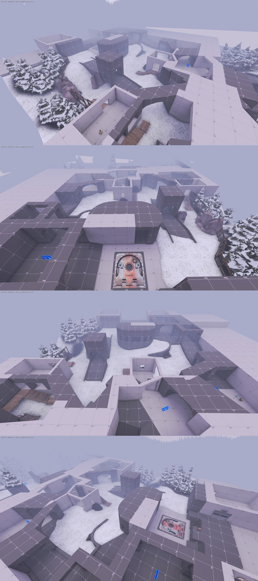
I'm returning to mapping after spending some time improving my modeling skills (check out my workshop items if you like). The MvM mode inspired me to start a new project (which I'm hopefully completing this time).

I've already slapped together a function complete version for testing (layout and game logic all set up and working). Figuring out the bot navigation logic has been a bit tricky. Some of the areas need to be changed though because they're too boring right now and I'm going to add another 1024 units to the second half of the map because it's a little too short right now.

I'm not sure about the snow style, yet. Maybe I'll switch to more halloween/swampy style. What would you prefer?

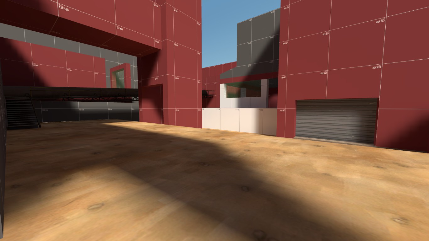
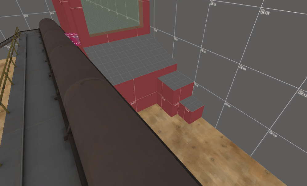
Here are some screenshots from a quick compile:

preview.jpg
 
Mar 23, 2010
1,874
1,699
can you take full size screens next time? can hardly tell what is going on
 

Gadget

aa
Mar 10, 2008
539
538
Maybe he has a 640x480 monitor.

Yes I do. Next time I'm going to stitch a few screenshots together to create a larger image.

No seriously, the full sized image was 1920x5400 and since it's only a preview I've decided to scale it down. Once the thread is up I'm going to add proper sized screenshots.
 

Seba

DR. BIG FUCKER, PHD
aa
Jun 9, 2009
2,364
2,728
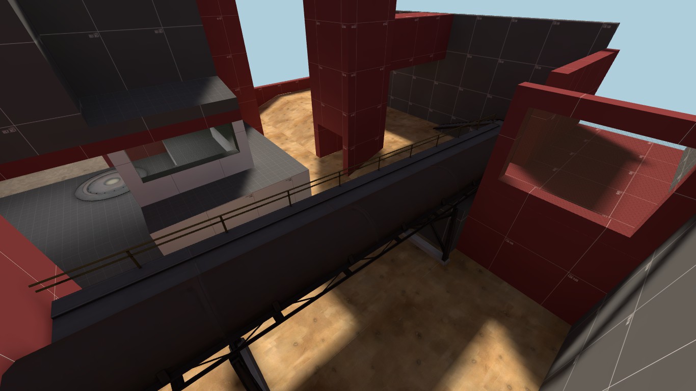
What's the point of a model i-beam if there's a brush one right above it? I don't like the red in the recessed doorway, same goes for the sideways computer bank (you could easily leave that face empty, the ramp up is detailed enough with the pipes and whatnot).
 

Ptimz

L2: Junior Member
May 8, 2011
61
61
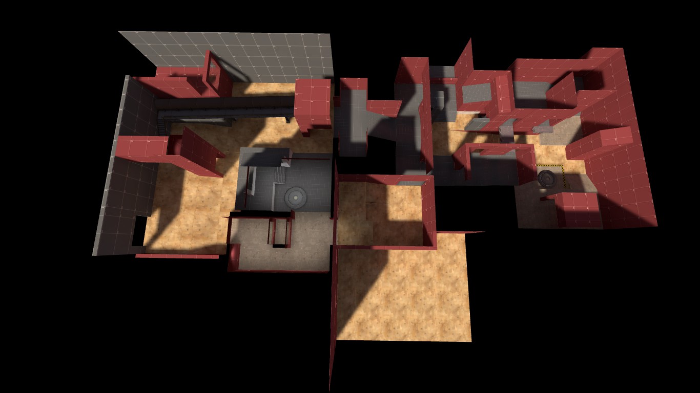
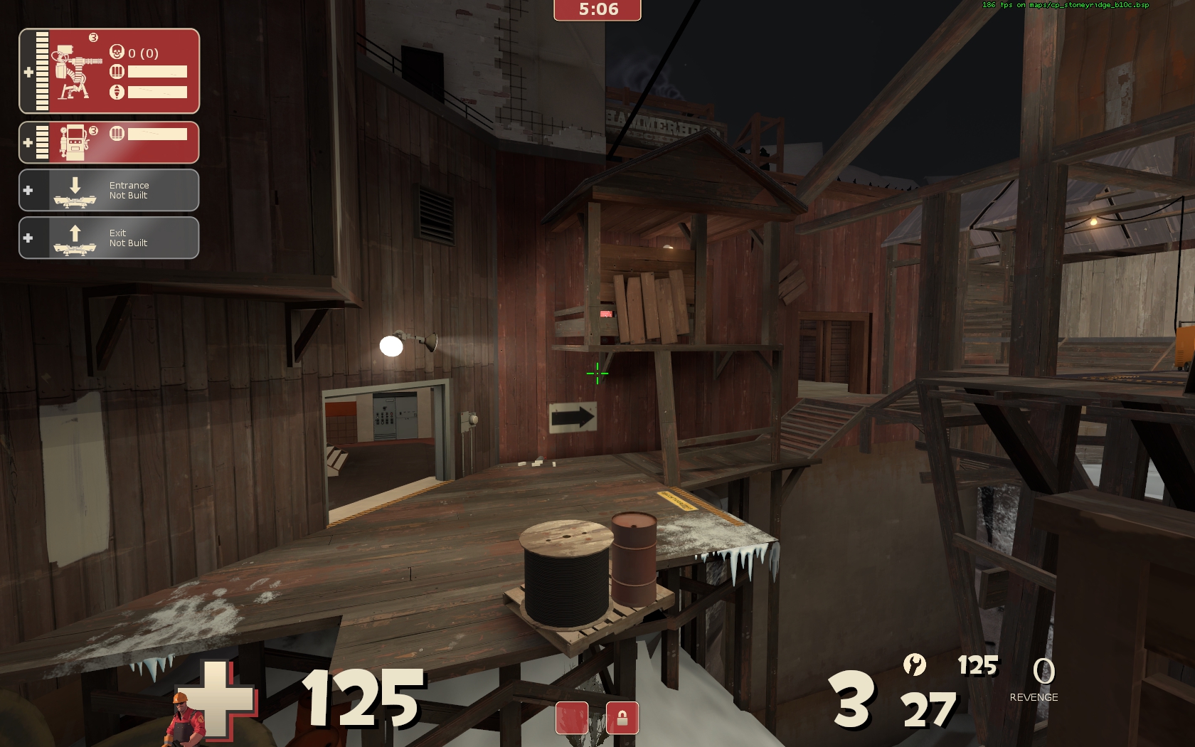
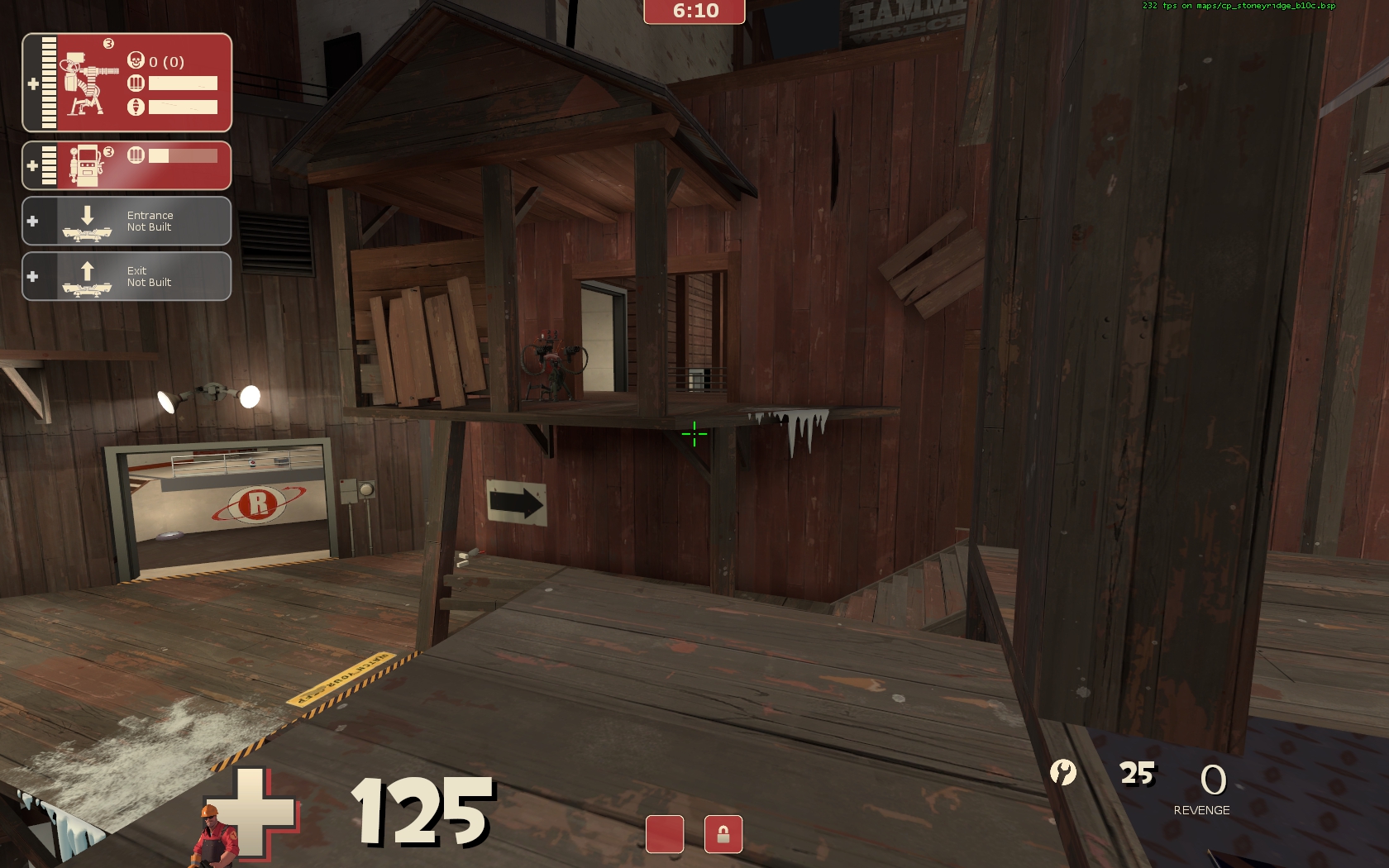
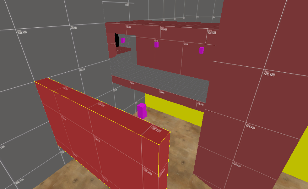
2nd point laid out! This is probably gonna be a 3 cp A/D?

Pf2LJ.jpg


a9OdU.jpg


C5yEG.jpg


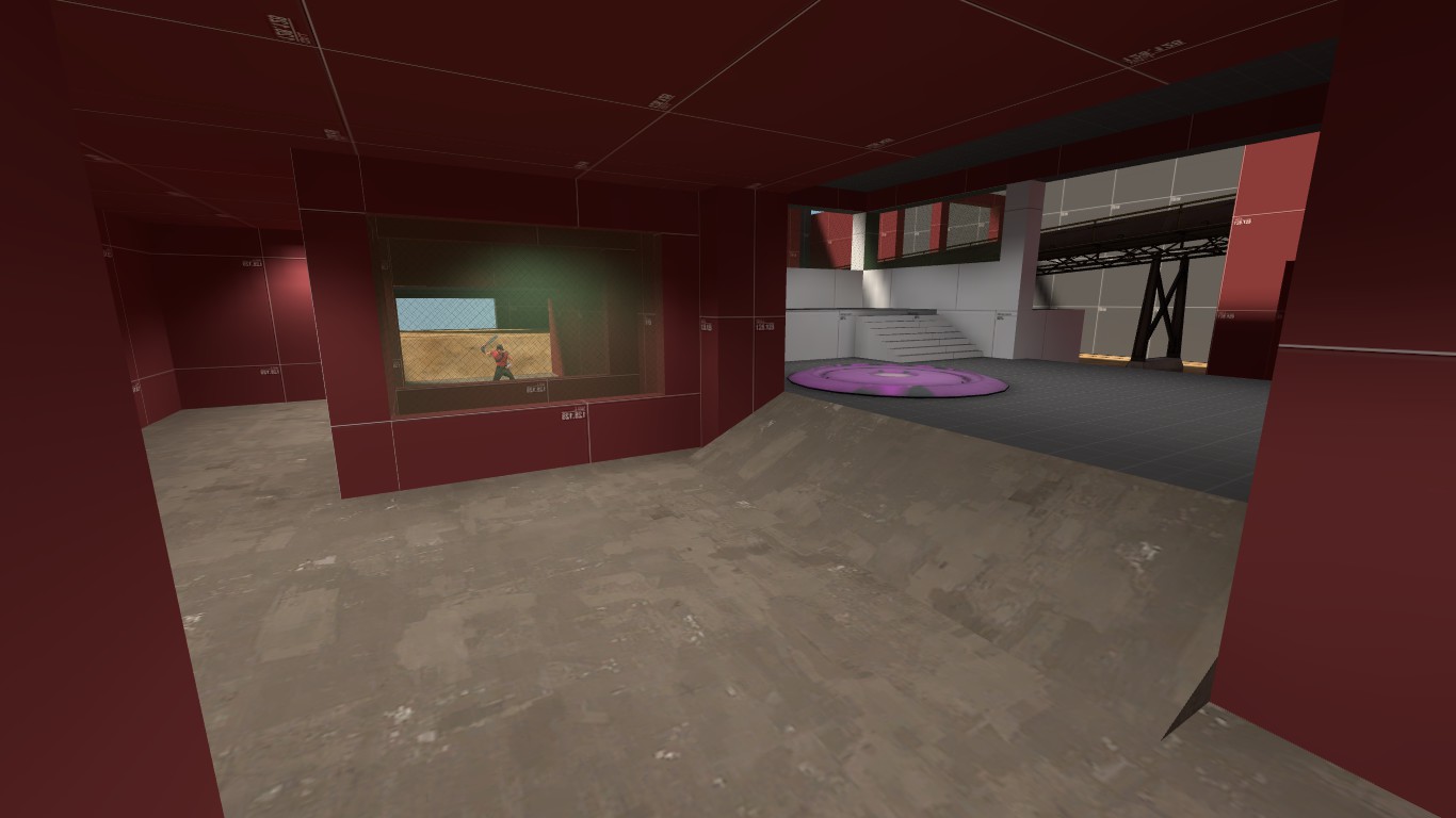
The scout's there to hold the door open.

MDU6b.jpg
 
Jan 8, 2011
397
393
The raised-up platform on the point looks like it'd be an overpowered sentry spot. Walls on 3 sides and no easy way to spam into it.
 

Ptimz

L2: Junior Member
May 8, 2011
61
61
The raised-up platform on the point looks like it'd be an overpowered sentry spot. Walls on 3 sides and no easy way to spam into it.

That's extremely probable; I was intending it to be a sentry spot. Maybe shrinking the wall so the sentry can be edged easier would help. There definitely wont be much metal near there.
 

Fruity Snacks

Creator of blackholes & memes. Destroyer of forums
aa
Sep 5, 2010
6,394
5,573
Don't change it yet. Never, ever, EVER, be afraid to make a point TOO defendable for testing. It's easier to make something really defensible, and scale back... than to make something too easy, and force defense into an area.

Learned that doing Rust's final stage.
 

Ptimz

L2: Junior Member
May 8, 2011
61
61
It isn't that big of a change, and would be simple to revert, I think.

v01rW.png


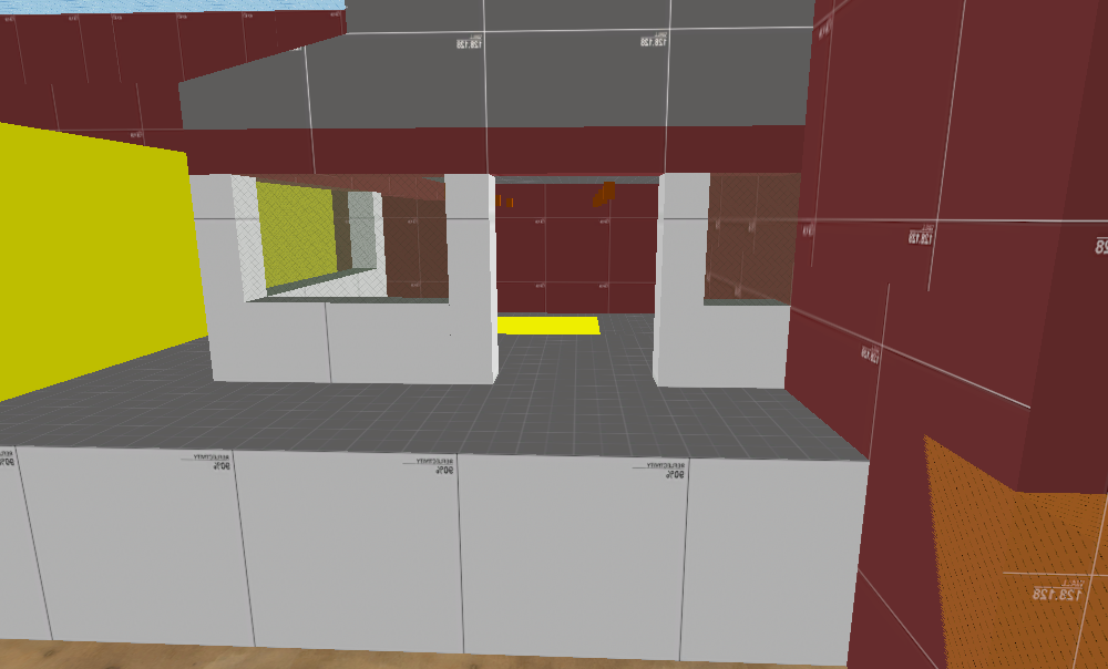
Also, put this in for spies or whoever.

QfvSA.png


This thing is a granary style dropdown now. you take 16 damage from the fall and there is a med health at the bottom.

hy6dA.png