Mappers Vs Machines: Public Scoring Thread

Status
Not open for further replies.

LeSwordfish

semi-trained quasi-professional
aa
Aug 8, 2010
4,101
6,597
TF2Maps.net Major Mapping Contest #14: Mappers Vs Machines
VOTING THREAD


Now that we've got the cream of the crop for you, it's time for you to have your say! This thread is your chance to vote for your favourite maps out of our shortlist of fifteen.

We want you to vote on four criteria: Aesthetics, Creativity, Fun, and Popfile. There are sixteen maps to be judged, and you can play them on the Potato MVM Servers here.

Shortlist
Judging

For each of the 16 maps, please rate each of the following categories from 0-10. Please keep them whole numbers. You must vote for at least six maps for your vote to qualify. In addition, if you vote any score less than 5/10, we want a comment that explains why - this is to help mappers identify what the problem in their map is.

Any votes not meeting this criteria will be disqualified.

Authors of maps in the contest may vote, but they may NOT vote for their own map.

  • Aesthetics: How pretty is the map? How nice does it look, how well does the detailing guide the gameplay?
  • Layout: Is the map fun to play? Can you navigate it easily? Can you find your way around easily?
  • Creativity: Does the map have unique ideas? Does it have an unusual theme? Does it have interesting or unusual bots? Does it spice up the game any other way?
  • Popfile: Are the popfiles fun to play? Are they appropriately hard for their difficulty? (Don't just vote them down because you can't finish them - that's exactly right for Expert!)

For your convenience, here is a table that you may copy/paste to keep all your votes handily organised. Simply replace each "xx" with your score, from 0-10.

MAPS | Layout | Aesthetics | Creativity | Popfiles
Affinity | xx | xx | xx | xx
Airdrop | xx | xx | xx | xx
Barren | xx | xx | xx | xx
Calico | xx | xx | xx | xx
Dockyard | xx | xx | xx | xx
Factory | xx | xx | xx | xx
Fiori | xx | xx | xx | xx
Havana | xx | xx | xx | xx
Kelly | xx | xx | xx | xx
Relic | xx | xx | xx | xx
Seabed | xx | xx | xx | xx
Sequoia | xx | xx | xx | xx
Spacepost | xx | xx | xx | xx
Steep | xx | xx | xx | xx
Teien | xx | xx | xx | xx
Waterfront | xx | xx | xx | xx
 
Last edited:

Freyja

aa
Jul 31, 2009
3,011
5,839

MAPS | Layout | Aesthetics | Creativity | Popfiles
Affinity | xx | xx | xx | xx
Airdrop | xx | xx | xx | xx
Barren | 7 | 7 | 8 | 8
Calico | xx | xx | xx | xx
Dockyard | 8 | 6 | 6 | 8
Factory | 2 | 4 | 9 | 5
Fiori | xx | xx | xx | xx
Havana | 7 | 7 | 6 | 6
Kelly | 5 | 5 | 6 | 7
Relic | xx | xx | xx | xx
Seabed | 5 | 6 | 7 | 6
Sequoia | - | - | - | -
Spacepost | 6 | 6 | 8 | 9
Steep | 8 | 9 | 7 | 7
Teien | - | - | - | -
Waterfront | 5 | 7 | 6 | 8

Comments:
To me, 5 is what score a "Good but nothing special" map. >5 is better than what I consider standard. I will try to use the full range, but please don't take it personally if I rate something <5. I might change these as I play them more before the deadline.

Affinity:
- Haven't played yet since the contest server wasn't loading the popfiles for some reason, but doesn't seem to be your fault.

Airdrop:
- Haven't played release version yet.

Barren:
I enjoyed this map a lot. The only gripe that I have is that the layout and detailing a very classic. That's not really a bad thing, and I still thought it was really well made, but it wasn't anything super special. Not that that's a huge problem. Your popfiles were really creative - pretty fun, though some things were a bit on the side of "why, other than being different?" For example, the laser boss was a great laugh, as was the explodey-rocket guy and vomit of scouts. But then, the 1-shot-bleed scouts were just annoying, there was a wavespawn of engineers that did nothing but drop level 1 sentries at the start that posed little threat, and the final boss, while very creative and I love the idea, ended up being a bit of a grind because of the engineer AI. Great job overall though.

Calico:

Dockyard:
A very solid entry. The layout is quite solid, I never found myself fighting against the map, but the grinder never, ever saw use in my games as it seems to be too far off the beaten path. Aesthetics are fine, but nothing overly creative, I wish the bot spawn was something other than a standard box building like everything else but the aesthetics are well polished and fit well within TF2 - they just don't do that much for me in terms of "Wow, this is pretty." I give you points for creativity for the way the tank works, it's the best implementation of any gatebot map, including mine.As for your popfiles - nothing super creative, but a solidly fun mission none the less. It felt well balanced and never frustrating, and I value that a lot.

Factory:
You clearly have put a lot of effort into this map, and your ideas a really cool. I'll preface this with saying that I really hope you take the ideas (and custom models) from this map forward into a future map that fleshes out the ideas further. However, I don't like the layout or general aesthetics in this map that much. The layout is really simple, even with the control point mechanic. There's only 2-3 defense spots across the entire map and they're all basically on the same level - the front raised part is really bad to defend from due to how hard it is to get up there and how quickly the bots leave your LoS (and no cover), and the platform above the control point has the same issue for bots attacking the point.

Your aesthetics are fine, in that they're not very bad, but really not special at all. This probably isn't helped by the really simple layout as what you have there currently is good for the layout, but there's very little visual points of interest and 1 colour dominates.

The conveyer belt mechanic is really quite a cool one, I'm a fan of the potential. The execution, however, is lacking for anything beyond the tanks, as the bots seem to be barely affected by it (and consequentially, using the heater death areas is next to impossible due to their positioning.) It's also conveyed badly to the player, as the point is not visible at the start of the wave, and even when it's open, it's hard to see from both the bot spawn and player spawn. Due to the lack or low number of gatebots in the earlier waves, I've had to explain to people in wave 3 or 4 what the control point actually does and where it is.

Your advanced popfile is fine, the custom bots are also pretty fun. I love the idea of pain train gatebots, however you should use the standard gatebot hat rather than the unusual effect (for consistency, and performance).
Normal mode is a bit boring, namely the 100 scout wave. Could use some more variety.
The tanks have way too much health - I get this plays into the mechanic, and it does, but even when you do it correctly, the tanks take a long time to kill of just holding down M1. You could achieve the same effect with less tank health.]

Fiori:

Havana:
Havana is pretty good. I know you guys had some strife with this one but I think what you ended up with is something to be proud of. My main gripe with the layout is that beyond the front it always feels like you're fighting the bots in a disadvantageous position, and that it feels like there's a lack of ways to get around or above them. This is especially prevalent on the rightmost and leftmost routes that the bots take that attack downwards at the hatch. Not that that in itself is a bad thing, but there's very little opportunity to head them off or combat them before they get that far.

Aesthetics are pretty good - your architecture is nice, however the lighting lets it down. I feel the night map doesn't serve the whole atmosphere very well as most of the colours in your map, and interesting geometry and architecture is in darkness, leaving the lit parts (the gameplay spaces) feel very bland and colourless. It's functional, but doesn't do much for making it feel good.

Popfile is much better now. The remaining problem seems to be too much money in the advanced mode which leads to the waves feeling more of a spam fest than a challenge - but that can be fun for some players. I think cutting out a total of 2-3000 money would make this a pretty great mission. Your bot choices are largely pretty solid, save maybe for the fact that you have fan scout support every wave (you could have mixed it up) and the final boss might have a bit too much health for being paired with a giant battallion soldier. A solid mission overall but lacking a lot of the creativity and challenge (due to the money) of other entrants into the contest.


Kelly:

A solid entry with a great use of a theme I actually don't like too much, but here I think it fits well. I still really enjoy the UFO dropping the tanks and the themeing of the robots so you get points in creativity from me for that. I enjoy how this inspired some unique robots like the woody bot and alien behemoth.

The layout is a very standard MvM affair and while it works perfectly fine, I don't find myself enjoying any particular aspect of it over anything else. You have improved it's similarities since the beginning of the contest but the map still plays very much like decoy and coaltown combined, and while those are perfectly servicable maps I wish to have a different experience when I go to custom MvM maps.

The detailing of this map is not to my tastes - it's really barren, and while you might argue that that's how MvM maps are meant to be, I think you can still have sparse detailing with a creative and interesting look, which I don't find here. Perhaps this has a lot to do with the lighting that mirrors a lot of what I feel from Havana's night lighting - the lighting takes focus away from what interesting detailing you have (the architecture) onto very a very boring colour scheme. To me, night lighting needs to play a lot more with interesting positioning and colours, such as doublecross.

Relic:

Seabed:

I find myself fighting more against the layout of the map more than the bots when I play this. I heard someone say this is the map where the bots know the layout better than the players and honestly I feel that's quite apt in describing my feeling for this map.

It has a creative layout and I give you props for trying something different, I definitely think the overlaying and weaving paths could be really cool, but I feel that this map has a combination of too many "player paths" (pipes, crates, etc) being too hard to navigate - leading to bots being able to overtake players very easily when players can't easily catch up - and detailing that very badly leads the player around. This makes the map end up being in a bit of a confusing state for me.

I think this map could benefit a lot from having a stronger progression in it's detailing, more focus on the gates and the bot spawn and a stronger way for players to navigate between the bot paths (buying jump height shouldn't be a necessity, only a luxury, as much as you may be surprised by me saying that.)

I think the popfiles are reasonably solid, I remember a good variety of bots, but I can't comment on much since I felt my focus was more on navigating the map than fighting anything.

Sequoia:

Hot shit

Spacepost:

Steep:

This is one of the maps that I think is solid in every box it needs to be. The detailing is basic - but varied and has interesting vistas and architecture that it doesn't feel bland

Teien:

Sushi go!

Waterfront:

I still think this layout is too small. I know that's what you wanted to go with but the indoor path has all of 2 defense spots and I think that's too little for an advanced mission as long and endurance as this.

I think the detailing is a bit too noisy and full-on. It's a good job but sometimes it's not particuarly clear where you can go or

 
Last edited:

Izotope

Sourcerer
aa
May 13, 2013
698
764

MAPS | Layout | Aesthetics | Creativity | Popfiles
Affinity | xx | xx | xx | xx
Airdrop | xx | xx | xx | xx
Barren | 6 | 5 | 7 | 7
Calico | CAN'T VOTE | CAN'T VOTE | CAN'T VOTE | CAN'T VOTE
Dockyard | xx | xx | xx | xx
Factory | xx | xx | xx | xx
Fiori | xx | xx | xx | xx
Havana | 6 | 7 | 6 | 7
Kelly | xx | xx | xx | xx
Relic | xx | xx | xx | xx
Seabed | 3 | 4 | 6 | 5
Sequoia | 7 | 8 | 8 | 7
Spacepost | 5 | 8 | 9 | 6
Steep | 9 | 7 | 8 | 7
Teien | 7 | 7 | 8 | 7
Waterfront | xx | xx | xx | xx

I didn't play as many maps as I had hoped to play, due to little available time.
I left out my positive comments because I feel like it adds nothing.
PM me, if you want my personal positive feedback.


Barren:
Outside-spawn area feels somewhat empty when you exit this well detailed spawnroom.
The metal hatch ontop of a wooden base seems out of place.
Some indoor areas could be detailed more.
The truck near botspawn can be built on and is immune to sentry busters.

Seabed:
The first thing I noticed was the missing soundscapes, it just makes the entire map feel empty.
Another thing that was off-putting is the concrete texture that has metal walking sounds, and the spiral slope next to it was very wobbly and has a nasty lighting issue on it.
The layout is very confusing at first and takes some time to get used to, I got lost very easily.
Some textures don't go together very well, specifically the lava and toxic textures.
The giant blue pipes in the skybox made me go "wait, what?".
I really hope you continue working on this map in the future, it shows potential!

Spacepost:
The little available assets you had only did so much to help me navigate the map.
It took me a little bit longer than usual to understand the layout.
I really wish you had more space assets to work with.

Steep:
The hatch area feels too cramped and some parts, although little, feel underdetailed.
Specifically the forward upgrade building and the pickup room to the left of the cave entrance.
Another rather nitpicky thing is the water dripping sounds with no visible water dripping anywhere. That didn't affect the score at all, but it really bothers me for some reason.
 
Last edited:

Fillmore

L5: Dapper Member
Jul 20, 2014
226
137

Map | Layout | Aesthetics | Creativity | Popfiles
Affinity | 6 | 8 | 6 | 6
Airdrop | 6 | 4 | 7 | 7
Barren | 8 | 7 | 8 | 8
Calico | 6 | 8 | 8 | 7
Dockyard | Can't | Vote | On | This
Factory | 6 | 6 | 8 | 7
Fiori | 7 | 8 | 7 | 6
Havana | 8 | 8 | 7 | 7
Kelly | 6 | 7 | 7 | 7
Relic | 7 | 4 | 7 | 6
Seabed | 7 | 9 | 8 | 6
Sequoia | 8 | 8 | 8 | 8
Spacepost | 8 | 8 | 8 | 8
Steep | 9 | 8 | 7 | 8
Teien | 8 | 9 | 7 | 7
Waterfront | 7 | 8 | 8 | 8

Affinity
I remember when this was looking like it was gonna be some kinda underwater base, kinda wished it would've kept in that direction. But I also think that this is probably one of the few maps that pull off that Mayann look without being too tacky due to the really gritty feeling that the skybox, lighting and the railings and more modern stuff give this thing.
One thing I noticed is that the map has no soundscapes and no observer points. Upon loading the map my first view was under the map, staring away at the void. The upper route also feels like it's a lot shorter than the bottom route.
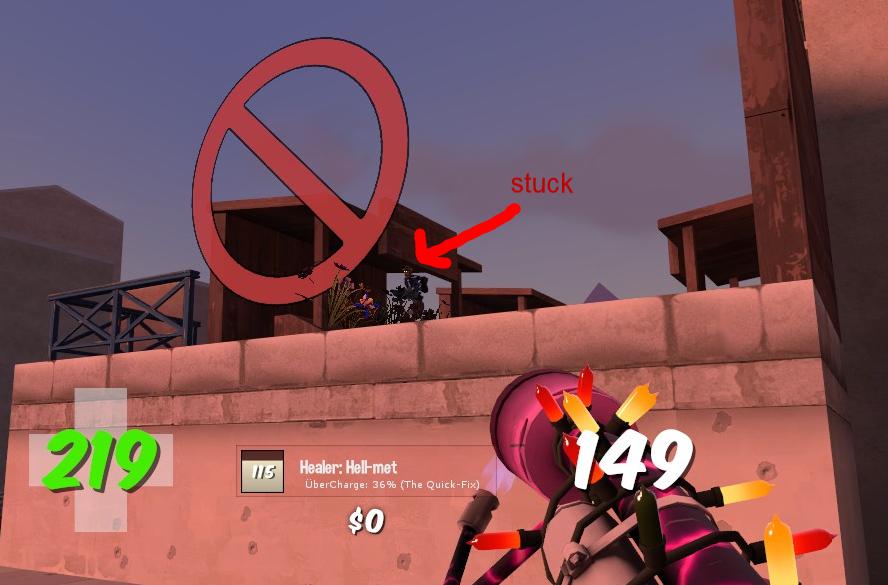
The Navigation Mesh is also a bit iffy in some parts, bots really love jumping in places they don't really need to jump (and the Sentry Buster seems to only be able to reach the higher areas of the front by jumping up to the platform players tend to camp), the bots seem to ignore bombpaths if they spawn on the wrong side of the bot spawns, there are a few locations where Giants can get stuck (this spot gets players stuck) and the mesh hasn't been analyzed so the bots don't even fight back!
Crit Demomen are something that really don't belong to normal mode, neither does that big bunch of Giant Medics on the very end of the final wave.
Intermediate starts off fairly okay-ish but then it devolves into a massive clusterfuck. The Tanks on wave 3 are really weak like they're made of cardboard, crit soldiers are something you shouldn't have to fight in Intermediate and Wave 6 took 10min to beat because the support probably kept taking the slots the wave bots would've used. It turns into Advanced from Wave 3 onward and the Giants that don't have movespeed penalty are really annoying to fight (except the Giant Bowmen, they just die instantly)

Airdrop
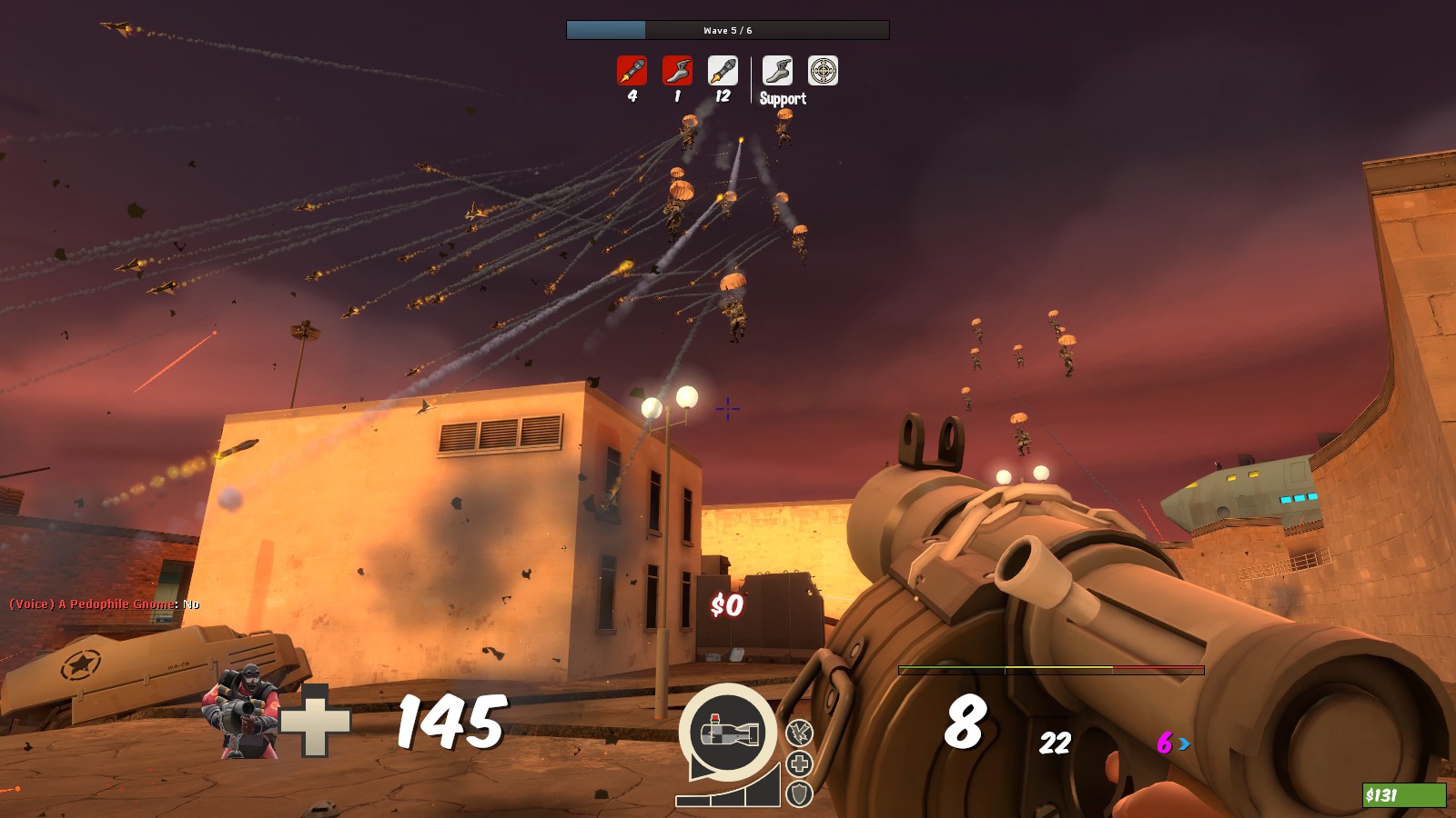
Right off the bat I'm gonna say that I absolutely love the bots dropping out of the sky like that, I didn't even know it was possible to do something like that! The air raid siren that plays to warn players about it is also a really nice way to use that mvm_siren sound valve added at one point, really adds to the map's feel.
The front has three spawns for the Robots to use and I think Advanced's Wave 4 is the only time the far-left spawn is ever used? It has a grand total of three windows and at first I figured they're used by Sniper-bots but they don't spawn in that place, they spawn in the other, far more visible spawn.
The layout is fairly flat in terms of where players wanna fight the bots once the front is breached since all higher elevation areas are a bit out of reach. And the detailing on the map is pretty mediocre, some of the detailing is out of sight and the buildings are pretty bland, I think they could use some color here and there.
Advanced is a fun little experience, although the part of Wave 5 with Giant and small airstrikers is a bit overkill due to the massive amounts of projectiles they rain down on you. You either have a Medic or you die to rockets and get pushed all the way to the hatch for the Scout boss to waltz in and deploy the bomb.
The Engineer-bots also seem like they sometimes build teleporters and sometimes they don't. I guess your Sentry Nest hints don't all have teleporter locations set to them?

Barren
This is a fun looking map, really has that Badlands vibe to its design.
Plenty of vertical space to exploit against the bots and even the tiny elevation advantage at the front feels really strong when you have a sentry and some firepower on the other side of it.
Add in all the different parts where you can push the bomb back and it's a layout that's really friendly to holding out at any point, really.
Advanced, holy shit. This mission pretty much broke ALL of my expectations for it and also did some wacky shit (my personal favorite was the 22 giant scouts and the dreaded boss at the end) It's that kind of Advanced mission that seems to have been designed with the overall purpose of messing with your head and has a bit of the silly stuff that Tropics had but it's an enjoyable level of insanity.
The custom Sentry Buster (or Baby Buster) is a bit tough to notice at times when shit starts flying everywhere and it doesn't have the big booming steps its big brother would have. Got me blown up a couple of times because of that.

Calico
It's on Beta1 and the detailing is not yet done but the bits and bobs that are there are really nice looking while there are some silly things like this light that's really damn bright when far away from it. I'm kinda anxious to see what this thing looks like when the artpassing is completely done.
Advanced is 4 waves long which is really short for any kinda mission and it still shows that it used to be Expert mode (400 starting money against a Giant Medic-Heavy combo and the Medic can pop, the overwhelming bumrush of battalions etc.)
Wave 1 also has a relay bug and it didn't fire wave_start_relay, which meant the holograms stayed on and so did the front upgrade station.
For some reason the Bonk scouts drop no money and the Battalions drop essentially all the wave's money, it feels really silly when it's like that.
Wave 2 has those Super Scouts and this one Tank and that tank is really annoying to go on when you have Super Scouts going for the bomb and an infinite supply of burst demos. When I was trying to attack the Tank around the middle area, I kept getting either bombed by the demos or shot by snipers.
And after you somehow beat the first 2 waves, the difficulty starts falling off since people start having money and the front's vertical advantage starts becoming stronger as players can dish out some serious damage. There are some nice ideas in there like the shields on the Tanks, didn't figure that was possible to do.

Factory
The layout is pretty flat on this one, no real advantage points besides the security room at the front. There are those upper walkways that pretty much allow you vision to all corners of the map but only folks that tended to be up there were Engineers and Snipers.
The control point gimmick is my absolute favorite, it pulls off the back-and-forth feel really nicely and the custom holograms for Mann Co and Robots are a really nice touch. However, I don't like how it also forces you to hold the point against Tanks, if you hold the point and the Tank hits the conveyor, it goes REALLY slow. So slow that I don't even think the conveyor should slow it down that much! Also if the Tank is on that conveyor while you take the point, it doesn't always slow down.
The hatch area is where the flatness really shows, there isn't really any cover anywhere and the Decoy-styled reset pit has a funnily placed health kit, too.
Advanced feels more like Intermediate in terms of difficulty, that's all I can really say about it. It felt like a decent mission, just under the wrong difficulty. We also got a case of "Spies in our spawn" during one wave, didn't snap a picture of that unfortunately.

Fiori

This is one of those maps that has a really wide front, like Mannworks except even wider. The city look is something you don't see much in MvM so it's a lovely sight to behold (so is the map due to the detailing) and the pack placement isn't something that enforces Engineer to exist on the team, either.
There are still a bit of funny things here and there, mainly the radar parts on the carrier aren't animated and the water seems to freak out occasionally. There's that part in the skybox where you see the mountains and a strange set of trees that just stick out like a sore thumb and the occasional visible nodraw and a brick wall that's been under the sun for too long.
Although my biggest personal peeve is that the bombpath displayed doesn't really matter: Whether or not bots go the way the holograms show depends entirely on which side does the bomb spawn from and I don't like that. Also, there are a couple of nav issues around the map has bots get stuck, most notably at the right-side spawn.
Advanced mode of this map feels like something out of Intermediate and Wave 4's Tank is probably made from cardboard and duct tape because it got smashed the moment it reached everyone's LOS and we didn't even have a Phlog Pyro for that. It took us less than 7 minutes to beat Advanced and that's a really short time for any mission, really.

Havana
Here's a fun little game during wave breaks: Find all the hint-hint-nudge-nudge bits and bobs hidden around the map!
The layout on this has the same kinda pros Steep has going for it: Really nice height advantage going on and has enough flank routes to allow RED to move around despite the bots possibly clogging up the main routes with sheer numbers and looks really nice, to boot!
The soundscapes at the front are especially nice, really sells the scenery (so does that bell everyone keeps shooting) The shiny vents look kinda weird, tho. I'd figure having vents like that exposed to the outside would not have them shine and reflect like a polished piece of bronze.
And Engineer-bots seem to be building their buildings facing the wrong way quite a lot and this one hint has the poor lad fall off a lot.
Advanced mode is quite a ride: It starts off pretty allright but kinda loses steam toward the end due to the incredible amount of money you give (around 10-11k?) which just mean players are gonna be spawncamping robots a lot.
Wave 3 is also a bit wonky, one giant pair with the swarm of soldiers feels a bit dull. I guess having one more pair of giants would work a bit more? The shotgun soldiers on that should also use the shotgun icon to differentiate them from the rocket launcher bots (heavy_shotgun is the icon)
As a final mention: The last wave having the boss trio and having Engineers be able to teleport them in feels like a dick move, especially when health-wise they're designed like they come out from the main spawn. They could easily make the wave unwinnable if they teleport in near the hatch.

Kelly
It feels like it's got a touch of Coaltown and Decoy on it. The detailing is pretty simple but nice at the same time, it's a bit like how Valve's mvm maps have done detailing. This left-side of the hatch is a bit nasty, the bots going up that hill get a height advantage all the way to the hatch and it also leaves you open to Snipers pretty easily. There's also this window that had a Spy get stuck on. Speaking of spies: I really would've wanted to see the Graylien on those guys.
I really like how you've used the UFO here: The big dramatic entrance, having it move around to beam in the Tank and some soldiers from the sky: really nice stuff!
Expert mode feels like Valve's Expert mode in terms of its design albeit with a lower payout: Doesn't spam too much bots or giants at you but doesn't give you too much money, either. Wave 3 felt a bit too easy since the second Tank waited for the giants to be alldead but other than that it was an okay Expert mode in my opinion.

Relic
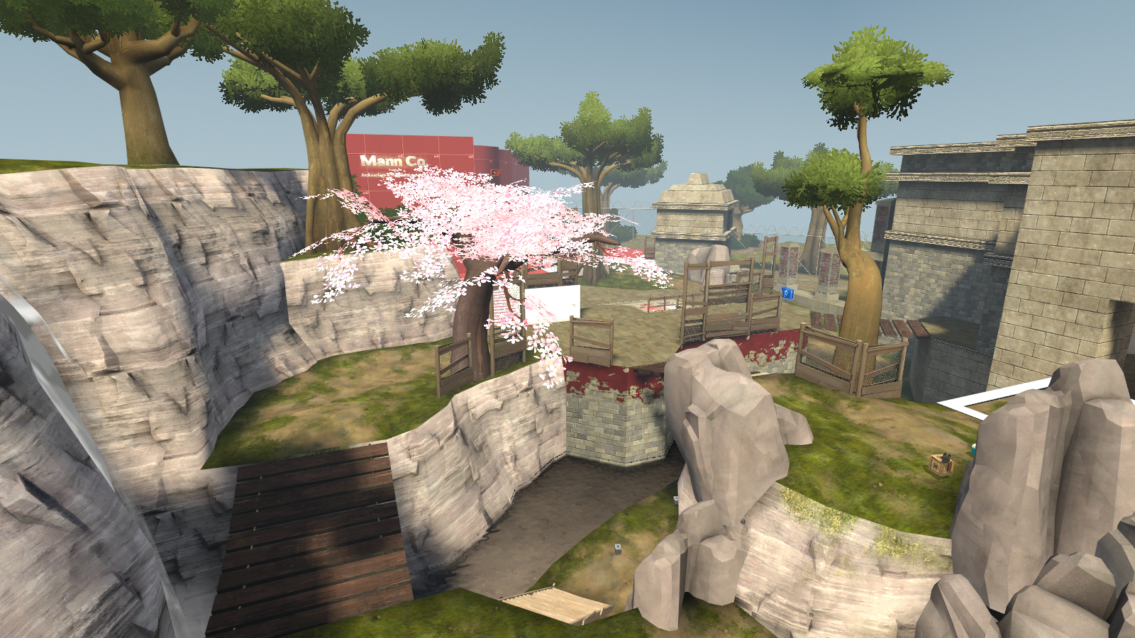
The layout on this is pretty forky: Plenty of sidepaths to use to flank the bots carrying the bomb and the medic at the front upgrade stations is a bit silly, but it works. There are really few locations where there seems to be a hint of detailing here and there (the cherry blossom tree at the hatch area feels a bit out of place) but apart from those select parts, it's in dev textures for the majority of its span and the weirdly fullbright crystals look really off.
I don't get get the idea behind being able to walk to the other side of this upgrade station, feels like unnecessary space.
Expert mode starts off promising enough but Wave 1 turns into a boring slog once the giants die due to the really slow way the Paratroopers come in. After that, the difficulty flatlines until the last wave where it just turns into Intermediate with a lot of robot spam. The bomb also got stuck in a lot of places which we exploited the hell out of. It also feels weird how instead of walking down the ramp, the bots just walk off it to go directly to the hatch.
The Nuke Demoman on wave 6 was amusing, tho. Bumped up creativity because of some of the custom bot ideas but expert mode it is not.

Seabed

It's good to see that folks did go through the hurdle that is making gatebot maps!
It has that Mannhattan style of A and B, has A LOT of different nooks and crannies you can use to go around the map and the front is pretty interesting, having three layers to its bot entrances. It's one of those maps you need to play a bit in order to understand the layout, tho. The branching pathways are a bit overwhelming for the many options the map allows you to take. And I don't like how open the hatch area is, feels like you just get shot from all directions trying to defend the hatch from the bombs coming from downstairs while there's one bomb coming in from the upper walkway. And maybe you could use the wave start alarm sound when the gate's capstun ends?
The missions really feel like you ran out of time to work on them and it shows best on Advanced mode, which is 2 waves long. The two waves of it are acceptably difficult for Advanced and we kept losing both gates for the 2nd wave because the bots just took the shortest path and kept sneak-capping gates while defenders were a bit perplexed on where to go.
Overall, it's a really nice map. It's a shame the missions don't really do much justice to this in their current form but I am eager to see their final forms.

Sequoia
The map that's name I kept mistyping and the map with too many trees.
The layout on this is really lovely, you have a lot of high ground to exploit against the bots and it has that backwoods look and feel to it that gives it that comfy feel (for the lack of a better term) and the foghorn to signal gatecap ending is a really nice touch.
There is, however, a bit of a bug with the alarm light where it switches off after Bots take the gate, leaving the particle flashing by itself. (the picture is awful, particle doesn't show on it)
Advanced mode REALLY is advanced, I don't think we had a single wave where we managed to hold the gate. We never had bots take the long way because the incredible amounts of Robots swarming the field just curbstomped us and then the gate got curbstomped almost instantly. There are waves with Giant Medics which sound like I could pick Spy but there's so many robots around that I can't get anywhere near them. I could pick Sniper and then the Shield Medics come in and tell me to pick Heavy and Knockback Rage the bots to hell and back.
People seemed to be okay with the support Super Scouts but I have never liked the idea of support 1 giants. Can't really dock point off of that just because I don't like it, tho. They seemed to be pretty tolerable.
As a final thing: There's a rather nasty nav issue on this wooden platform that makes bots (especially Giants) do this awkward jittering before they finally manage to walk off into the water.

Spacepost
Aka Spespot
MvM in space is something I've wanted to see happen ever since moonbase became a thing, really. I think this map pulls it off really well, too.
The middle building at the front seems to be the favored location of everyone, even if the teleporter exit being there is a death sentence. It has that number of sidepaths going on like Seabed, allows for some flanking when you wanna easily intercept the bombcarrier.
The detailing on the map really brings out that space feel to its current limits (due to the rather limited assets available on the space theme) and really has helped make it a bit easier to differentiate your routes from one another (that one branching path at the upper level no longer confuses players)
I haven't really spotted anything too awkward or out of place beyond the dumptruck at the front. The hatch area is a bit of a tough location to hold out on due to the hatch being a divider between the two spawns and being in a slump that is gonna get anyone standing there killed (and the right-side spawn is completely open from the corridor, leading to some possibly swift deaths)
The alarm lights at the hatch area look kinda weird, like they have both red and blue flashes going on? (maybe I'm just seeing things?) and this bombpath marker is floating.
Advanced is okay in my book, provides enough push for bots to breach the front and gives a lovely sum of money too. The crit Cappers on Wave 2 are a bit of a nuisance at that stage due to the amount of cash and no resistances available because of it, we tend to end the wave holding out at the hatch because the medics keep losing track of their scout who runs into a sentry and dies.
The bumrush of giants on Wave 6 really brings me back some awful memories of Broken Parts because of both me and my gear getting smashed near-instantly. The boss entrance is amazing, I have to give some points for that, too. Really nice stuff. One of my favorite maps for this contest.

Steep
The layout offers a lot of alternate routes and vertical advantages which is really nice. And the detailing is really nice, has that picturesque look to it (the radar parts not animating bothers me, tho)
The soundscapes on this map are lovely stuff, really makes the map feel like the mountainside it is and the cavern's random dripping sounds are the minor nice touches that this map has all over the place.
Advanced mode feels a bit like its payouts are more along the lines of Expert mode in my tastes and that's all I can really say about Advanced and the map itself.
Overall I don't have much that I can really say about this map, everything seems to work well enough that I don't need to force commentary on anything.

Teien
The trademark Freyja map, now with Mann vs Machines!
The theme of the map is really nice and the detailing is on the same level, too. Plenty of highground to use, lots of flanks to use in case the main paths get a bit crowded. And having a train that can wreck bomb carriers and even Tanks is something I haven't seen before (mainly since hazards like that are a bit tough to do on MvM without them either becoming a crutch or a nuisance)
The framerates are still a bit of a problem on this map, overlooking that hatch area to the big gates leading out of it kinda tanks my performance and it gets really frustrating when you have to endure that during Expert mode and all its brutality.
500 starting money with probably every wave giving 500 and the incredible amount of robots you have to fight makes this one frustrating mission to deal with. On wave 2 you pretty much can't let a single Giant Heavy-Vacc Medic combo teleport into the map or you're gonna get shredded by two of them at the hatch area. I could say more about it but wave 2 was pretty much as far as folks got, the 1100 credits you'd have to kill all of that feels really stingy in my tastes.

Waterfront
This map looks a lot bigger than it really is and that probably comes down to all the different pathways players can take on this map. Makes it fun to navigate and less frustrating for Scouts to go get money when they don't have to run through the bots to grab that $5 left by someone's stray rocket killing a Bowman.
The caustic bots are essentially bots that inflict a really long duration of Bleed but it does accomplish its intended purpose of having players take a dip in the ankle-deep water or die near-instantly since Bleed stacks. The water also removes other debuffs so it's good stuff.
Advanced is a three-wave Endurance mission and dear god is it Endurance. It's really freaking brutal in some parts and the last wave has that subwave of Giant Medic-Deflector combos that pretty much make or break the run for a lot of players and that comes after 7-8min of fighting.
Losing waves at the very end and having to do all of the entire wave is really frustrating and we had one run end just because we lost to the Giant Medic subwave and folks just threw in the towel.
At least the map gives you a pause to upgrade at the front station at some parts, has a separate introduction when the Caustic robots first appear and the dramatic boss entrance is a really nice touch, too.
 
Last edited:

Sir_Metaladon

L1: Registered
Apr 14, 2015
34
15
5 = Meh, it works but I'm not convinced I like it


Map | Layout | Aesthetics | Creativity | Popfiles
Affinity | 4 | 4 | 6 | 2
Airdrop | 5 | 6 | 7 | 7
Barren | 8 | 9 | 8 | 6
Calico | 6 | 5 | 7 | 3
Dockyard | 7 | 7 | 5 | 9
Factory | 4 | 4 | 8 | 5
Fiori | 5 | 5 | 6 | 3
Havana | 7 | 7 | 7 | 4
Kelly | 5 | 7 | 7 | 7
Relic | 4 | 5 | 5 | 2
Seabed | 4 | 7 | 6 | 5
Sequoia | 6 | 10 | 7 | 7
Spacepost | 4 | 8 | 7 | 9
Steep | 7 | 9 | 6 | 6
Teien | 8 | 9 | 8 | 7
Waterfront | 9 | 9 | 8 | 9

Voting is completed. My scores are more or less final, I will add an edit if I decide to change any values from here on out.

Notes:
Airdrop: Has a lot of odd routing, and useless side areas. Also, You get a 6 instead of a 5 for aesthetics because of the 3D skybox, and that's it.
Kelly: Ofc, it's a decoy clone. Also, more odd side areas (and nobody can find your forward station)
Spacepost: The only reason the asthetics aren't a 9 is because of the layout, and it's nonsensical-ness. Layout is a flying spaghetti monster's worth of confusing.
Havana: Looks nice, and has a solid layout, but the advanced pop was really bad. Wave difficulty is all over the place, bland albiet functional support, engineers teleporting miles behind you, 10k money by the end of the mission, wave 4 is undoubtedly harder than 5, etc
Affinity: Hastily converted to a patchy Mayann theme, map is broken, nav is garbage, bots are odd, layout is spaghetti, etc. RIP interesting original design.
Steep: Popfile score would be higher if it's advanced wave 4 and 6 were a little less "How exactly am I to beat this with 2k" and "Tank shooting simulator 2017" Other waves were fun and diverse, but it's painfully difficult. Advanced = Expert in a lot of ways (like the overly limited money)

Affinity
Layout: Confusing, at best. Odd area connections, and NAV was broken on first use.
Aesthetics: I liked the "Underwater" orginal, now it's an odd fusion of Enclosure and Ququmannz. Use more stone!
Creativity: Admittedly, you tried to be creative, and it showed a little in the robots and Mayann theme, so you get a 6 instead of a 5.
Popfiles:

Airdrop
Layout: Solid, albiet by-the-books, and has some fat to trim. Fairly long and straight + roofs don't make sense.
Aesthetics: Simple, but again solid. The 3D skybox bumps it up to a 6.
Creativity: It's rainin' robots? Sign me up! Besides the interesting spawns, it's a fairly bland military base. Nice bots though!
Popfiles: Another "Solid". Pop files are balanced and fun, but not exeptional. You could trade 1 creativity for 1 pop score and I'd be fine.

Barren
Layout: Layout is good and balanced, if conventional. It just works well!
Aesthetics: Bottom line: I'm a SUCKER for the "Red Rock Sunset" theme, like Furnace Creek. You sold it, and the containers and geometry look in-style. Overall, probably should be an 8 but I'm biased.
Creativity: I'm torn. This map's advanced population is a barrel of laughs with kechup, but the layout is quite conventional. But still, who doesn't love infinite weak tanks, lasers, scout blasts, mangler snipers, and SO MUCH MORE. Almost too creative in the POP department!
Popfiles: As mentioned, you pops are VERY creative. However, this detracts from the MVM-ness of it, and it hurts. Most of the score (2) from this went to Creativity instead.


Calico
Layout: Nice deathpits, and tank crossover, but overall bland.
Aesthetics: I can smell the copy-pasted Granary silos. Other than that, sparse and meh. But please, actually make a good grain elevator next time.
Creativity: Some unique bots, those sheild-tanks, and structures, but still somewhat meh.
Popfiles: This makes this map from "meh" to "Why would do you do this!?". It's generally trying to be NOT fun to play, and it's barebones and made difficult by VERY specific robot combos instead of actual balanced threats. Fighting super scouts is not hard AND you lose if 1 gets away. Not fun. Also, I admit I'm biased because I played it in earlier versions and all I can feel is the horrors from that era pouring onto me... (Izotope, you really hate your players)


Dockyard
Layout: The first area is better than the second, but both work. However, I feel a tear for that poor grinder that claims no kills...... Good execution of the gate mechanic!
Aesthetics: Solid, if standard, Mannhattan theme. That outside scene area looks nice, but nobody ever even sees it!
Creativity: Bog standard creativity.
Popfiles: This is where this map really shines... The missions are challenging, fun, balanced, and more! They aren't scared of being difficult, maybe too much so (there's your 9 instead of a 10), but other than that they're a ball. Brief summary: This is Manhattan with less unfair robots and one less gate, but with tanks! Valve quality in that regard.


Factory
Layout: Flat and plain Decoy style. It works, but it's odd and unconventional.
Aesthetics: Bare. The best part is by far the Barrier tanks outside. Fill up those plain walls, or lower the ceiling!
Creativity: From the Barrier tanks, to Raven pyros, to Conveyors and Smelters, This map is by far dominated by it's creativity. I mean, a KotH like center point that controls the Conveyors?? That's unique!
Popfiles: Bland, and somewhat slow, but redeemed by some of it's uniqueness. I just couldn't help chuckling as those little Raven Pyros went to work on sombody, or watching as the Bulletproof Soldiers/Demomen derped around capturing the point. A lot of broken logic, but very memorable.


Fiori
Layout: Interesting, if a little convoluted. Also, your bot navigation REALLY needed to be worked on. Kind of hard to test because even Advanced is a shutout.
Aesthetics: Dev textures. However, I can already feel the theme you're going for, and that's very good. Still, a lot of undetailed stuff, and odd geometry, so it's a 5.
Creativity: Bot names are nice, and the theme is of course interesting, but other than that not much to be said.
Popfiles: The pure facepalm of this map. The advanced is a fairly noticeable copycat of the normal, albeit with changes and mix-ups. Also, it's VERY bare, and some waves are very broken-feeling. Give us some warning about a giant scout running away with the bomb ON THE OTHER SIDE OF THE MAP, why don't you?

Havana
Layout: Very solid and playable. Areas are connected in a unique but concise way. The only thing making this not an 8 is that there's some nonsensical areas that neither bots nor players use.
Aesthetics: The idea of "Cuba, but MVM" is very unique. Lighting is good, and use of textures is also. It just feels genuine! Not particularly TF2-ey, but it's nice.
Creativity: There's a variety of interesting new robots, and of couse the map itself is quite creative.
Popfiles: The failing point of this map. Like many other maps, it just falls apart here...
I played the Advanced mission, and it was, to say the least, very odd... Wave difficulty is very all-over-the-place, money is exorbant, robots are usually very weak but some conbinations are almost unbeatable, etc.

Kelly
Layout: Of course, it's Decoy. Literally Decoy. It's so similar to Decoy, it shares Decoy's weaknesses, like odd side areas that make little sense. Still, it works, and I like that barn..
Aesthetics: Very good. Feels like it's right out of the Invasion trailer! Still, some areas are a little plain.
Creativity: This would be a 9 if this map wasn't Decoy. Unique bots galore, and the use of the spaceship even more creativley so!
Popfiles: I played on Expert, an honestly is was not very toothy... Still, the robot combinations worked, and the difficulty was very well modulated from wave to wave.


Relic
Layout: Interesting, but it's probably more or less random.
Aesthetics: The one thing making this NOT a 4 is that crystal cave. I love it. Other than that, it's a randomly arranged pile of Mayann and Japan assets, with no structure. I like your upgrade stations though, no matter how much that MeeM hates me! Also, DEV TEXTURES.
Creativity: The crystal cave is, again, a very small redeeming factor. The upgrade stations, and some of the bots, also contribute to this. It doesn't stop this from being a generic Mayann map though.
Popfiles: The expert was VERY random. In EVERY way. Bots, Difficulty, Composition, you name it. That spy spam was brutal.....


Seabed
Layout: A weak part of this map. Overall, it's just too overconnected and confusing, and the bots have so many paths that getting back-capped is inevitable... Still, it's unique!
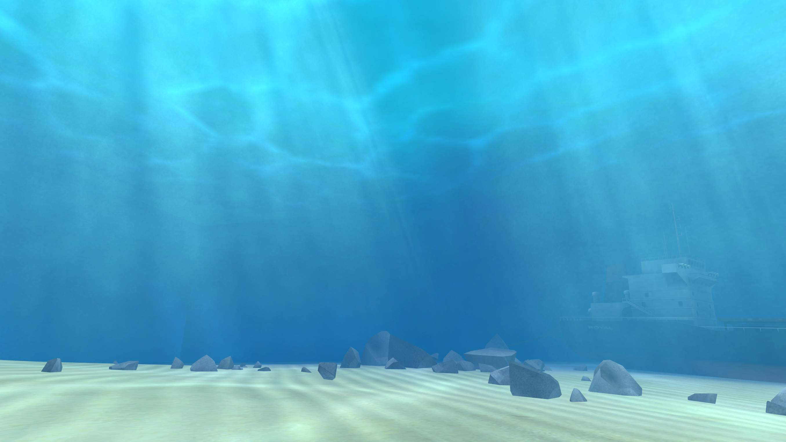
Aesthetics: Probably the best part of this map. Outside scenery is very nice, although the transition from "Underwater" to "Underground" is a little odd. Also, I'm not a huge fan of the pipe spam around the final area. Also, make that sunken boat a little less "I'm anchored to the bottom of the ocean!"
Creativity: Not absurdly creative, bar the scenery. Standard gate setup, with an "interesting" layout.
Popfiles: I played the Advanced. It's sad that it's so short.... Still, for 2 waves of Advanced it was remarkably well balanced! Would love to see longer missions of the same quality!


Sequoia
Layout: Most of my gripes with this map are because of it's layout. Mainly, because I very much dislike the Gate execution. I have NEVER (and I mean NEVER) seen the bomb take the long way. Ever. I would have much perferred an Area 52 style gate, where the robots have to get around before they can take the shortcut. Other than this, it's solid and functional, but the gate might as well not exist.
Aesthetics: Gold star here. This is a genuine TF2 environment, from the cartoony trees to the quiet lakes, it's beautiful. Also, not terrible on my FPS, so you get the only 10 on this list. Lighting is also VERY fitting.
Creativity: The scenery, layout, and hatch design are all very creative. Bots not so much, but they're still good. Boiii!
Popfiles: I played Advanced, and it's very difficult. A little too much, if you ask me. Other than that, it's good.

Spacepost (SHPASHEPOSHTE, not spespot)
Layout: Confusing and convoluted. To be blunt, it's bad. Too many twists and turns, and no focus on where the robots actually go. The worst part of this map by far.
Aesthetics: Probably the best part of the map. With limited space assets, it's still very nice looking. It's an 8 instead of a 9 because the layout doesn't serve the aesthetics.
Creativity: From robots to theme to lore, it's quite creative. Wormholes everybody!
Popfiles: Another great part of this map. I played on Advanced, and it's just the right blend of teamwork and determination for a satisfying experience. I loved it!


Steep
Layout: Solid, but It's a little hard to defend.... Really lends itself to the scenery tho!
Aesthetics: Another genuine TF2 aesthetic. Unique, if a little plain. 3D skybox REALLY sells the environment!
Creativity: Other than the setting, it's fairly standard. Uses a larger variety of bots, though!
Popfiles: The Advanced rides the line between Expert and Advanced. Very stringent on money, and has a tendency to be a little unfair. To win, you MUST get A+. Other than that, it's good.


Teien
Layout: Some areas are great, some aren't so much. The begining holds like the Hot Springs and the Road Corner are great, but everything from there to the rocks and the Hatch, you just get run over. Also, it's a bit large, but it works!
Aesthetics: Would be the second 10 on this list if my FPS wasn't 15... Still, a unique MVM style for sure!
Creativity: This map, besides the theme and custom assets, is accompanied by a positive mountain of custom bots. Every single one has a personality. I love it!
Popfiles: Played on Expert, and I never even got around to beating it. From what I hear (and can see) It's one of the hardest missions ever created..... Maybe a little too dificult, but the teamwork it requires is a joy to behold. Also, the bots are quite cool.


Waterfront
Layout: I think this is a testament to how a even a small layout, done well, can be VERY fun. And it's so nice not having to walk super long distances all the time! It's fair to both the players and the bots, while being simple and concise. I just like it.
Aesthetics: I don't know what it is about the aesthetics of this map, but I LOVE it... I think the sunny atmosphere + the bot palette complementing the map palette.... I don't know, but It's unique and cheery and cool. Also, I like the Spytech thrown in!
Creativity: The "Caustic" mechanic is quite cool, tho I'll say the small pools of water around isn't completley original (see Sundown). Still, Cool bots, very unique layout and aesthetic, what more could I ask for?
Popfiles: The Endurance Advanced is somewhat grindy, but overall the missions are very well designed. Use of caustic bots is minimal, but they're used when they count.


Last edited:

Idolon

they/them
aa
Feb 7, 2008
2,123
6,137

MAPS | Layout | Aesthetics | Creativity | Popfiles
Affinity | 6 | 5 | 4 | 5
Airdrop | | | |
Barren | | IN VIDEO | |
Calico | 4 | 5 | 6 | 4
Dockyard | | | |
Factory | 3 | 4 | 8 | 6
Fiori | | | |
Havana | 7 | 7 | 5 | 6
Kelly | 4 | 5 | 7 | 6
Relic | 5 | 3 | 7 | 6
Seabed | 6 | 7 | 9 | 4
Sequoia | 8 | 8 | 7 | 8
Spacepost | 6 | 6 | 6 | 5
Steep | this | is | my | map
Teien | 5 | 10 | 5 | 6
Waterfront | 5 | 7 | 7 | 7

 
Last edited:

Star Bright

L2: Junior Member
Jan 4, 2016
75
65
For the record, I'm using Freyja's rating system. 5 is sort of an "average/good".


MAPS | Layout | Aesthetics | Creativity | Popfiles
Affinity | 5 | 5 | 3 | 2
Airdrop | 2 | 3 | 7 | 7
Barren | 6 | 6 | 4 | 4
Calico | 3 | 1 | 5 | 6
Dockyard | 7 | 7 | 8 | 8
Factory | 2 | 2 | 5 | 3
Fiori | 5 | 8 | 4 | 1
Havana | 7 | 7 | 5 | 5
Kelly | 4 | 6 | 7 | 7
Relic | 4 | 2 | 5 | 4
Seabed | 3 | 9 | 6 | 1
Sequoia | 8 | 8 | 8 | 7
Spacepost | Not | allowed | this | one
Steep | 8 | 7 | 3 | 5
Teien | 7 | 10 | 8 | 7
Waterfront | 7 | 9 | 7 | 8

Comments
Affinity
-Took us a lot of work and headache to get this one up and running. Make sure all your files are working properly in the future pls.
-In terms of the layout itself, there's nice holding spots, I like the dropdown. The routes through aren't very well utilized, and that kind of brings us to the main problem of the map: In terms of technical, this map is a nightmare. The bots completely ignore certain routes they're meant to take (in particular, the little curves near the corner). They jump up slopes like crazy, which is normally fine for TFBots, but MvM bots are intentionally never allowed (well, supposed) to jump unless a player is blocking them. Some giant bots actually can't fit in narrow hallways they're pathed to go through, getting them stuck. This actually makes fighting them a bit unpredictable, which is not a good thing at all. I'd go back and take a look at what the bots are and aren't supposed to do if you revisit this. Most notably, a runthrough of the nav would work wonders.
-Aesthetics. Blegh. Why did you guys ditch the underwater base theme? It was certainly a unique spin on things, and while the lockdown alarm sound was always irritating as shit it really made for a cool, unique theme. Mayann is... eh. Not my favorite. And a bit overdone imo. That being said, the map does look pretty pretty, but there are all sorts of niggling little things which get in the way, like the one face near bot dropdown that's not flush against the wall and all sorts of weird unclipped things.
-Popfiles... need work. A lot of work. Intermediate in particular. While waves 1 and 2 are decent, nothing really all that much to them, wave 3 onward becomes a nightmare. There's a definite spam problem - lots of bots dropping down to the field in very short successions. Uber medics nearly every wave on small bots, which is quite the difficult task to ask of the players when wave 3 on suddenly introduce a ton of critboosted explosive classes. 32 crit black boxes on wave 3 coming in simultaneously with a 35k hp tank on a fairly short tank path? Ouch. And that's just the tip of the iceberg, sadly, as it never really gets easier from there with SpawnCount 5 heater heavies and SpawnCount 5 Sandman scouts and SpawnCount 5 capper scouts... It gets to the point where you exceed the 22 bot limit frequently, extending, in one instance, a maybe-5-minute wave past 10. Which is a slog.
Long story short, popfile pushes the enjoyment of the map down where the layout might have been fine if not technically buggy.

Airdrop
-Been playing this one for a good, long while now, seeing it come from A1. First, let me get the bad news out of the way: Dang the map's layout is not very good. The main geometry of the map can be described as "two rectangles, both with a blocked off middle area with some routes inside them". It's a lot better than it was when it had the Pit of No Return but that's not saying much. There are sightlines all across the map that snipers on both teams can abuse (Players more than bots, because the bot snipers have this weird fascination with the top of the middle building up front). Filling up these long sightlines are some fairly obvious displacements and props that pretty clearly say "I put this here to try to block sightlines". The whole map in general is pretty blocky and brushy and then has a bunch of props strewn about to make it seem better. The aesthetics don't fare much better either - not much that breathes life into this war-torn frontline. Bottom line, it doesn't feel like a believable warzone, it feels like an elongated level in a video game.
-Now, let me get to the better news: This map has a gimmick which is done very well. Heck, it lives up to its namesake: The airdropping robots that fall out of the sky are very well done. We were originally going to try something like it in our map but ultimately you did it first and better. A lot of comments have been made about how fast the airplane NYOOMs across the sky which I personally like, so I won't beat you over the head about that one.
-Popfiles are good. They're not overly spammy, they have a good difficulty, there's just a few minor things I dislike about them. For instance, the spies in advanced wave 2, not a big fan of them since spy AI is very wonky. Also, the one big scout boss coming at the end of advanced wave 5 instead of 6 seems strange, considering the timing for wave 6 means the giants aren't usually the last ones to die, it's typically the banner soldiers. But, these are minor annoyances at best. Wave structure in all is pretty good, it's mostly the map that's the core problem.

Barren
-I can't really say the map is flat, because it's not, but it bothers me how little the elevation changes in key gameplay areas, despite the noisy displacements trying to attest to it otherwise. It's strange. I feel like there's something that bothers me about the map's layout in general, but that's the closest I can come to describing it. Using an interesting variation of the spine formula is pretty cool. The front's a bit underutilized because there's little reason to hang out within bot dropdown, especially in the room with the ammo and health in the front right building. I want to like this map's layout, I'm honestly not sure why I don't though. I'll need to edit this if I can come up with what, concretely, I don't like. Sightlines are a bit crazy and there's a lack of significant cover, so it's probably something to do with that. I want to like this map's layout more than I actually do.
Later edit: Thinking back, I don't think the layout truly is that bad. It's just quite open in a lot of spots. I'll bump up my rating a little bit.
-I know exactly what you were going for with the aesthetics: Badlands. And to an extent you do it well. A little too well, actually. The spawn area for defenders looks like it was almost directly copy-pasted out of badlands, which can kinda hurt in terms of creativity. There's also the garage door near defender spawn which looks like a door you should be able to go through. On more than one occasion I saw a defender trying to go there to get back to spawn, only to be briefly confused by it. Not good. Aside from that, though, map doesn't actually look half bad at all, even if it does look a bit... barren. (*innocent whistle*)
-Popfiles are... mmh. There's custom waves, and then there's waves that are too custom. Custom to the point where it gets a bit goofy. These waves unfortunately cross that line. The spinning sticky demomen in particular are pretty "wtf"-y. Advanced wave 1 being only 30 FoS heavies is fairly boring. The advanced wave 3 tankathon is a bit exhausting and dull. The pistol engineers in advanced wave 4 are a bit silly (since Engineer AI is so bad, if they lose their squad they revert to default Engi AI. And forcing a number on them means that the rest of the wave's timing could be thrown right off if that happens). There's another major, major issue I need to address: Your spawn numbers. 22 simultaneous bat scouts on advanced wave 5? First off, that's not a challenge, because any class with any AoE can deal with that with zero problem. Second off, the maximum bot limit is 22, meaning if there are any snipers, engineers, sentry busters, anything like that, they absolutely cannot and will not spawn until the offending bots are dealt with, wrecking the pace of the wave. I simultaneously want to take away points and give you points for that final wave. While it's a really really cool concept having an Engi boss like that, the execution's a bit flat because the Engi AI doesn't give a shit about the bomb, and the super scouts intended to pose the main threat come too few and far between for it to work. So it kind of turns into a slog when the Engi's AI doesn't break entirely and force him to just stand there.
So in all, it's a map I sort of like, but feels kind of like I'm being joked at whenever I play, at least for advanced. Normal is fine if nothing terribly exciting.

Calico
-Here's my problem with the layout: The only hold spots I've seen used are the front, the hatch, and the building on the right assuming the bots go that way. I will admit a large portion of this is due to the popfiles, which I'll explain later, but from what I can see, there's a lot of large sightlines through the middle, and the top is hard to rotate up to. It's readable, which is good, but based on the fact that the holding spots were only at small spatterings across the map, that doesn't bode well. I dislike the front. Main reasoning above all being that there's only the one large health and ammo pack that almost requires a dispenser (yes, I see the medium ammo but that's so close to bot spawn that if it's relevant the player taking it is likely to die). Also, while I like the right side entrance to break up a chokehold on the left dropdown, the fact that it's so much higher than the defenders puts them in a very awkward position if soldiers or demos spawn up there. Left dropdown is fine if not a bit bare, since you have to propjump if you want to get out.
-Aesthetics... seem very rushed and empty. There's nothing to look at past the playable boundaries of the map, which doesn't hold up well if you're looking to create an in-depth map for a mode like MvM. No visible story that can be told other than "hayfield. also somehow robots" The right side robot dropdown makes even less sense. Are they attacking from some sort of apartment complex?? The water tower in the middle of the map is not very obviously a deathpit at all. More than once I jumped into it consciously asking myself "Does this kill me?" There's visible z-fighting in one of the hallways near hatch on the floor. This map does not sell me on wherever it is I'm trying to defend at all.
-Need to mention creativity briefly. I was ready to slam on it and say "nah, there was nothing too unique about what I saw" but actually there was one gimmick I thought was weird but really liked: The vaccinator tanks. It wasn't immediately obvious that the shields around them were vaccinators. Was staring at the blue tank for a while thinking "wtf". But dang it that's really cool, would make for an interesting gimmick in future maps.
-Popfiles... I'll admit, they were better than I expected. Normal mode was fine, if not a little on the slow side, since there weren't a lot of giants to break up the waves of meleebots. Wave 1 in particular was a bit of a drag. Advanced was... could be better. The giants weren't actually so much of a problem, though it's admittedly a bit obvious this mission used to be more unforgiving. The main problem is that... for the most part, the mission consists of only giants, with not a lot of little bots to sort of break it up and apply little amounts of pressure to the bomb. I think with a larger spread of little bots we would've seen more of the map being used and it wouldn't have been such a giant stompfest. The waves were fine in length so I think reducing giant numbers and putting in littlebot numbers would've done some good work.

Dockyard
-When I went back and actually studied the map's layout, it occurred to me how blocky and brushy it is compared to when I remember playing through it. Some of the displacements still strike me as odd, considering they're using concrete textures. I mean, don't get me wrong, it doesn't exactly detract from the whole map in general, it's just little oddities that kind of affect the aesthetics score. Plus, there's still that huge stacked crate propspam over by the right side of bot dropdown that I really think could've been broken up with a few brushes here and there. Now, with all that said, there's a reason I constantly come back to this map when I want to play casuals. It is fun, plain and simple. Despite the openness of the front it actually works quite well, lot of high ground and cover for defenders to play around with. Inside the main warehouse is... interesting. Also a bit propspammy and the geometry is intriguing. A bit harder to hold in there. Bots get the high ground while they're capping? Not sure if I agree / disagree with that, but it does remind me of one thing I wanted to point out: The warning signs for something approaching the gate (tank or bots) needs to occur a LOT earlier. On Mannhattan the alarms start the moment they enter the low room which is quite a distance away from point, which gives defenders time to react and rotate. Here it happens like the MOMENT they're at the point, giving far less time to work with. Near hatch is again, propspammy but the layout works, so there's not much I can complain about.
-I guess for that matter I listed my main problems with aesthetics - a lot of props and a lot of blocky brushes. But I really really really like the out-of-bounds detailing and the soundscapes. I sure hope that demo's just passed out from being drunk and not actually dead...
-Waves are fun to play on! I reeeeeeally love the concept of gatebot maps in general so it's not difficult for me to like this one. Even love how the tank spawn moves forward if the robots cap! There are some tiny problems here and there. The nav is weird in a few spots. SCREW those crit backup soldiers in advanced wave 3. SERIOUSLY. SCREW THEM. THEY'RE WORSE THAN MY CAPPERS. Also tanks kind of clip a little bit with their exit? It's not enough to be noticable unless you're paying attention, but that always bugged me. You have a good balance of normal bots, giant bots, gatebots, and custom bots, so props.

Factory
-My problem with the layout is how flat and open it is. There's little cover in general, and there's some very questionable design decisions, such as the front being difficult to hold due to the lack of pickups and again, cover. The one large ammo pack that you have to parkour to get to or otherwise upgrade jump height is a bit of a silly idea to me. Small pickups in MvM are generally a nono (I think Mannhattan's the only one with one small ammo pickup) and your map has tons of them in out-of-the-way areas. Also, the three spawn exits for the bots are all pretty close to each other, leading to being a bit of stagnation during waves. An especially frustrating part of this is the line of where the bots lose their spawn immunity isn't very clear at all. Multiple times I think I've waited long enough, go for a backstab, and find they're still immune. The point is also rather obscure when just looking at the layout itself. (I also dislike how the point kills you if you're in it when the gates close... maybe teleport players out instead?)
-Asethetics are very blocky and flat in general. The lighting gets a bit straining on the eyes, especially looking out into bot spawn. There's an effort for it to make sense, like with the detailing at the very front, but it's all pretty flat in general and make me think of being in a map with a lot of brushes, not being in a factory.
-I love the main gimmick! Like Freyja noted above, though, its execution is a bit lackluster. The conveyor belts aren't all that significant in terms of hindering bot progress. They are great at hindering/helping tanks, but DANG 75k HP on a tank for a map that small?! It took a team of 5 phloggies and 1 buff soldier a good 60 seconds to destroy. That's a bit silly. Made for some fun fights on the point though.
-Popfiles... need work. Normal mode is fine, mostly because the bar is kinda set low for normal mode anyway. Giants on wave 1 is a bit odd, and I'm personally not a fan of tiny pyros like that. 60s bleed on crossbow medics is also excessive. Everything comes out too peacemeal, there's not a ton of overlap between robot spawns, so everything is just kinda easy and tedious to grind through. ESPECIALLY on advanced mode. I'd be willing to say advanced is even easier than normal mode, as there were just no big threats at all in the waves, and everything spawned so slow you had plenty of time to react and rotate. Definitely need to tune up the difficulty. More big bots and more templates would have been nice. Also, use gatebot lights, not unusuals, for the bots who go for the cap instead of the bomb.

Fiori
-I feel so bad about this map. I want to love it so much but there's an aspect of it that just lets the entire experience down. In terms of layout, at least, what we've had to see if it, it's pretty good in general? I like the canal route, kind of wish it was used a bit more than just a tank route, I think. There's a serious nav error on the right dropdown that keeps bots there stuck for way too long because the nav mesh for some reason generated a path through a thin brush. It likes to do that. Other than that, I can't comment too much on layouts for reasons I will get to soon.
-Map looks beautiful. I dig it. The whole rustic Italian setting is very nice. It does feel kind of boxy to an extent, which I guess is more layout than aesthetics, but I suppose it's worth mentioning here because it does feel a bit "video game level"-y.
-The bots are what let the entire experience down, unfortunately. They're too easy and come out way too peacemeal that the whole thing, even on advanced difficulty, is way, way, way too easy. Heck, I'm fairly sure I could do the whole thing solo as Spy. Will have to attempt that later, probably. Your bot templates were kinda cool, though the giant melee demomen should have had more health, not less. They weren't threatening at all. It's a shame, because the map felt so cool to look at and move around in but then the bots come in and you never have to move away from the dropdown for any reason except the rare tank or right side spawn. Really wish the missions were cranked up a few notches.

Havana
-The more I think about it, the more I like the layout of this map. Most of the layout is used by both bots and players, which I find as a plus. There's still that one weird area with the sand that looks like a dead end that is more or less completely unused (we never really had the opportunity to use it as some sort of blast-back point with Pyro, which seems like its strongest use), but that's about it. The one reset point hidden in that one extremely obscure area seems like a player trap more than anything - on our last playthrough I needed that full health and ammo under the stairwell, turn around, and suddenly I was in the sewers. Was a little miffed. The dropdown is... I find it fun to defend on, when there's not too much coming from bot spawn at least, more on that later. We found hold spots on almost every bend and corner, not something a lot of maps have, so that's a pretty big plus. It is slightly annoying that coming out of main spawn you have a big bush in your way that can block shots meant to defend the hatch. Also, the (facing bot spawn from defender spawn) right route is shorter and easier for bots to push than the right one. Also, having an engineer hint that close to hatch is a bit troublesome. These are kinda nitpicky but they are little things that add up a tiny bit.
-The map is very yellow. Most of the brighter lights give off this very yellow hue, which isn't a bad thing at all, it's just really the first thing that comes to mind. I like the way one of the bot routes is through that broken arch - neat little touch. I don't have too many other comments on aesthetics because they're all pretty good - believable feeling of being in some sort of war-torn town. Did I mention how much I like the soundscape? That constant ding-ding sells it being a port town.
-Waves are a bit all over the place. Normal mode is fine, although wave 2 seems a bit like filler. Advanced mode is where the trouble lies. For one, the money payout is way too generous. 900, 1200, 1400 for the first three waves gives the players too much power and can turn the rest of the game into a bit of a grind. The waves themselves can get a bit spammy. Advanced w2, 6 giant shotgun heavies that come out 2 at a time is pretty "ack", considering they're the one-shot variety that I personally dislike. Then w3 comes around and you're only dealing with a soldier-medic backed up by a bunch of littlebots. Then suddenly w4 you have some sort of medic fetish that rivals Freyja's, as well as crit demos, as well as two 30k tanks. With the money payout the previous waves give this feels more like a grind than a real challenge. The final wave is also a heck of a thing. The soldiers and heavy-medics aren't too much trouble, though again it feels more like a grindfest. The final boss has too much health though, mostly because of not only how relatively small the map is, but because you first have to take out the medic and backup soldier, so you're pelting him without crits for a while. If it weren't for the fact you forgot to reduce the rage amount Heavy generates off of them I'm not sure if the fight would be beatable. So less payouts and a few wave tweaks so the difficulty isn't everywhere and I think it would have been fine.

Kelly
-The first time I connected to the servers and saw this map in A1, I went to it and my knee-jerk reaction was "Oh hi coaltown mixed with a little bit of decoy". That sentiment hasn't really changed through to RC. The layout is very alike coaltown with the dropdown, two side routes along a central building, and very alike decoy with the upper areas both players and bots will occasionally use. Where it doesn't succeed unlike coaltown is due to how flat the front half of the map is. Once the bots get past their slight height disadvantage at dropdown, they have flat ground all the way to the hatch. Plus, the lack of cover or significant sightline blockers means there are very ridiculous angles you can hold as a sniper. Also, unlike coaltown, the middle building isn't really all that utilized, funneling defenders into the building up front on the left. Basically, main point is, layout's not too interesting and feels very familiar.
-Aesthetics are... I mean, I understand all the prior points made about it being bare, but MvM maps kind of need to be bare anyway to be able to hold all the bot edicts, so that's not too worrisome. The only real criticism I find myself agreeing with is that the lighting palette looks a bit garrish. Otherwise, well, I like nighttime maps! I like the detailing in spawn in particular, especially with that little room with the CAPPER in it. I dunno why, I just really like that room. Also, I really love that UFO. It crashes into the bot spawn on the first wave and pretty obviously moves to spawn certain bots and tanks. Neat touch.
-Popfiles are good. I don't know how much I agree with expert mode being true expert? It keeps fluctuating between advanced and above advanced but I still don't know if it's quite expert enough. Wave 6 of expert is a solid one though, you should be proud of that wave. Small annoyance, I do not like tiny bots, especially tiny scouts, since it means a nightmare for Scout, Heavy, and Sniper in particular to hit. Also, I wish the Max's head weren't so clippy with some of the bot models, but what can you do about that, really. Thank you for toning down the spy amount.

Relic
-I feel like the layout had more potential than was used, really. The one cave area in particular springs to mind. There's like no reason for anything to go in there. At all. That I can remember at all. The other pathways are pretty good. The bots really seem to favor the route going past the forward upgrade station for some reason, though. As far as I can remember they usually took that route if they weren't taking the route under the bridge. The rest of the layout is fine with a few oddities sprinkled in, like the one spire-esque route with four tiny ammo packs. That just seemed kinda silly.
-I mean. Aesthetics are mainly low because unfinished and dev textures. I don't have dev textures but their use suggests you ran out of time. The overall theme was consistent enough, though, and your temple... pyramid... whatever you call it (it's late while I'm writing this) looked pretty good. But... yeah, unfinished. This shouldn't be surprising.
-Normal mode was the weaker of the two missions, honestly. "Expert" was fine, though it felt more like advanced with an absolute ton of custom bots thrown in. Not much of a sense of normalcy when every robot is custom. I know I've said this about another map too. Also, your boss being a small bot meant they were 1-shottable by backstab. Normal mode is too peacemeal. There's no overlap in bot spawns, it's a rinse-repeat cycle of "kill squad of dudes, then wait for next dudes". Some overlap would have helped and made for less downtime.

Seabed
-Low score for layout, I know. Lot of people claimed it was confusing, which I can understand, some of the routes the bots take and others the players can rotate around aren't very intuitive. But that's not the main weakness of the map. That is the fact that there is no holding point, now that hurts the map way worse. The main dropdown serves to only slow the robot horde for a short while, but the sheer volume of robots that come out (more on that later) makes that unfeasible at best. Plus I noticed that there's actually a lack of consistency as to which bots come out where - I was prepared once for bots to come out the top path only for them suddenly to be on bottom. With the strange geometry of the dropdown area it was a long rotation for me back up. First gate is annoying to defend, as there is no reasonable place to attack any gatebots from consistently - that pillar serves to get in the way a bunch, and if you're approaching from the left you have to propjump on a barrel up. The climb up to second point offers no relief for defenders either, as we were never really able to establish a decent choke hold - once A fell B usually followed if not immediately pretty shortly after. B to hatch is... fine, I guess? The circular staircase is a neat place to go through in theory but the nav there is so poor giants love to get stuck.
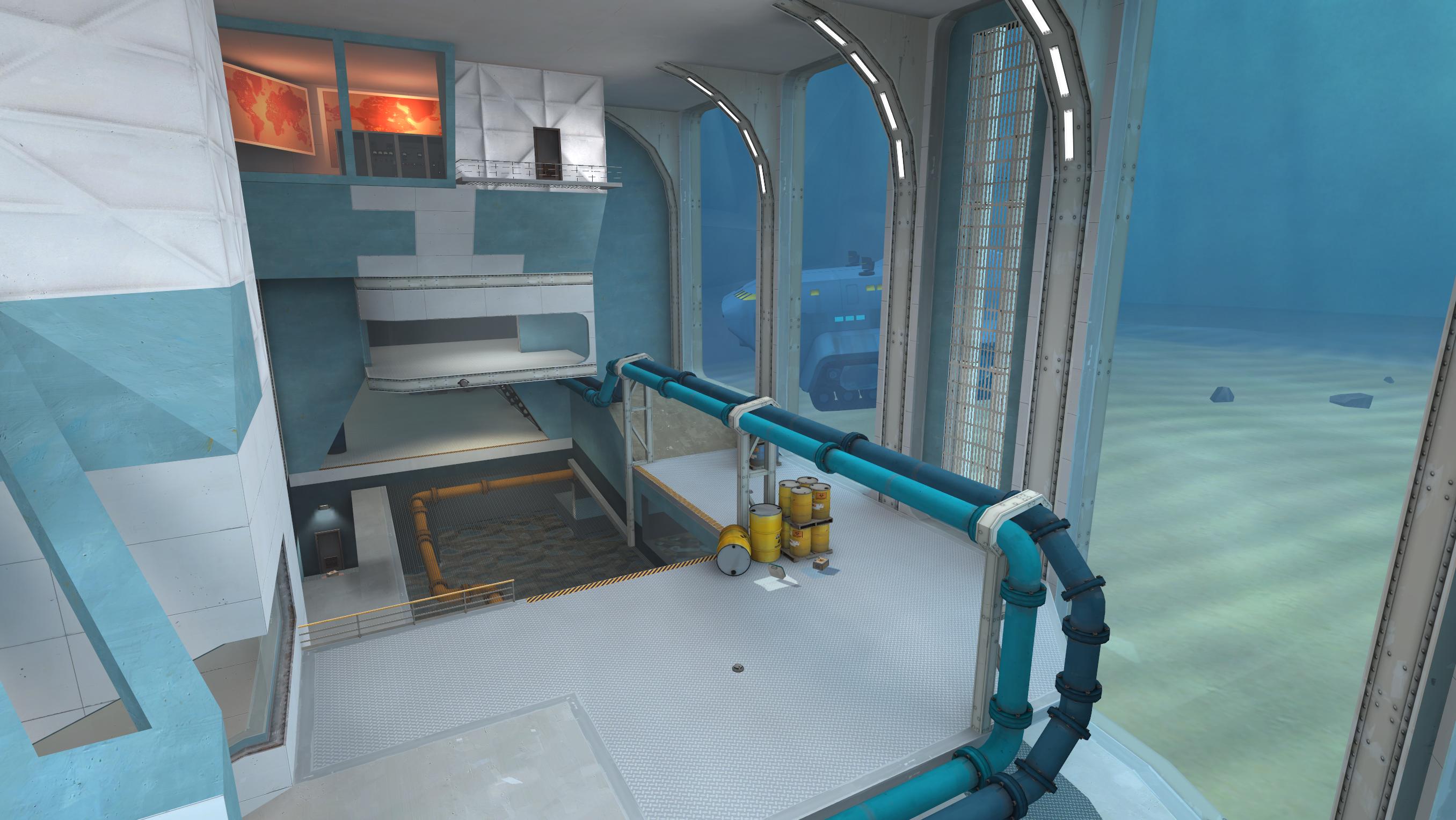
-The map looks Beautiful with a capital B. Absolutely gorgeous. You took the old theme that I think Affinity was going for and made it look absolutely amazing. The pipes, the pallete, the transition of colors from blue where the robots spawn to red where the defenders lie... I really love it. My one gripe is those green acid and lava textures - they're bright and I really don't like them, they do feel kind of out of place. Something a bit more fluid and less... jagged, I guess, would have helped. Also, your detail work outside the map is something to behold.
-Your waves are what kill this map for me. I'm sorry, but... they're really not fun to play. I feel like this would've been a much more pleasant experience for me with better waves. Rather than pick on every little detail in the waves, because I could sit for a while and talk about that, let me hit the main few problems your waves had. For starters, the missions are too short. 4 wave normal and 2 wave advanced is way too short, especially when there wasn't really an endurance theme evident in the waves. It's more obvious with a mission like Waterfront's advanced that that was what they were going for. Second off, spam. This is the key killer with your missions. With more well-crafted missions, the wavespawns are a delicate balance, letting certain robots go out at certain, predictable intervals which the defenders have to overcome. With your waves, the overall pattern seems to be "I'm going to vomit all the robots in my wavespawn out immediately, your job to deal with them." For a simple test, grab a medic, grab projectile shield, and do a runthrough of a mission. If the medic can easily block all the damage from a certain wave or wave chunk, there might in fact be a spam problem. Two Cities suffers from this greatly, your map does too. Especially when it comes to bots on the top right dropdown. You leave no room for close-quarter defenders to work with to begin with, so adding 20-22count robots up there makes it "hope you had soldiers or demos and medic shields!~", which is... yeah, pretty bad. Your mission payout is... ok? Not great, considering on advanced wave 2 the near constant pyro and crit-flaming-huntsman snipers that just never seems to end. But you really need to stagger out your wavespawns and mix up the challenge, otherwise people are going to complain about having another 2C spamfest. Having clear-cut wave chunks with minor amounts of overlap works wonders. Also, a minor note on your normal mode: Put the giants in the middle of waves, not at the end. Having giants wave 1 is generally "eh", but you kind of went for the "Bigrock normal" so it's not too big a deal. If you come back to this map I would say your number one priority is to make the waves better. It would help this map so so so so much. (God did I mention how much I love the visuals in the map? Yeah. It's that good.)

Sequoia
-Had to think for a bit about how strong the layout was. Eventually came to a list of pros and cons that I think explains my thoughts about it better. Negatives first, then. Fighting in the canal is a bit rough. No real flanking routes, height advantages, or pickups to work with when you're in there. You have to be a jumping class if you want to take advantage of this fight zone, otherwise you don't have a great time. The second weakness I kind of have to split into two. The outside route is very underused (by outside I mean the route the bots normally have to go without gate capture). Why? Because way more often than not, the robots capture the gate (I've only seen a handful of waves where the gate was never captured, outside of boss waves). Some of the geometry is a bit annoying to climb out of, specifically the spot just forward of the forward upgrade station, that little canal you have to crouch jump out of, but also rub your stomach up against the displacement in front of it becomes sometimes you don't get enough height for whatever reason? Yeah, that area. The one building you can access by going left out of hatch is almost completely unused, mostly due to the awkward geometry getting there. The positives? Those are really nitpicky negatives. Even if the route is the same every time, it's a route that gives defenders a lot of strong points, chokes, height advantage, strong pickup placement, and cover that makes playing the map quite enjoyable. Those sightlines to hatch are still kind of A Thing, but I've not noticed them as much lately.
-The alpine theme is good. Very believable gameplay space you're fighting in. The hatch area seems a bit odd. It's immediately obvious that it is a hatch area, but the surrounding area offers no explanation on why you're defending it save for the explosive barrels underneath it, which seems to make even less logical sense than the whole "bomb hatches at Mann Co. facilities" thing to begin with. But again, that's a nitpick at best.
-The popfiles are... Pretty good in all? Damn it it makes me smile that all the bots are named boys. One small weakness is that the way to breaking the front seems to be a lot of bot spam, especially on advanced, which makes defending front a bit annoying, for lack of a better term. Once we get past that, the waves are pretty good. Your medic fetish shows a lot though - once you get past wave 1 there are a lot of medics pocketing giants. Is that a problem? No, not really, it's just something really noticeable. I'm still not a fan of infinite giant support, mostly because of that bug that doesn't show them properly in the wave hud, but that's me. Bot templates are very nice, fun to play against... It's a fun map in all.

Spacepost
-Own map, can't vote

Steep
-The layout's probably the strongest thing this map has going for it. The geometry of the forward areas are spot on and give the defenders a really nice advantage for raining down damage on the bots. Plenty of cover, plenty of solid angles to hold from, I like the front a lot. The spine area is... ok. I'm not a fan of how if bots take the outside path you can go down that way fine or go into the middle building to have access to the high ground but if they go inside you have a looooooong detour to take through a weaving sort of staircase to get in there. Seems strange. Your hatch geometry is bonkers... at least comparing it to normal MvM. The bots don't have their choice of routes to get to the hatch, so you can anticipate where they're coming from and get the height advantage on them again. I quite like it, actually. Not sure that the third floor was necessary but it's pretty good. The left exit out of defender spawn, though, gets quite neglected since there's rarely a reason to go back there.
-Aesthetics. I quite like the whole "up on a cliff over a canyon river" thing. It works, quite well. The whole of the map isn't quite the looker, there doesn't seem to be a ton going for it, but for MvM that's fine, it works. Going through it again, I like the little detail of the train route going through the middle of the map. Nice touch. I don't really have too much to say over that.
-Main reason creativity is so low is because it doesn't offer too much in terms of new stuff to play with. It's nice, but that's about it. Nothing terribly new.
-Popfiles? Ehhh. They're not bad. I should preface it by saying that much. Normal mode is fine. Advanced... has a couple of problems, not minor, but not major either. The main weak point is timing. Your timing in the waves drags on for a bit in certain spots. See Advanced wave 3: Those soldier pairs wait for the tanks to die, when I really think they'd work better coming out a certain amount of time after the tank spawns, just to keep defenders on their toes. Otherwise there's a large lull in between the tank dying wherever it does and the soldier groups finally arriving to wherever the defenders have set up. Of course, if you watch the demos I was always playing Spy so they became less of an issue since I kept waiting exclusively for them, but it's something I should note. Wave 4 is the "that wave" of them all. And the main issue is the crit demos and how they come with infinite scout support and giant heavy-medic pairs when the meds have full charge. Yikes. A lot to micromanage, which, before I forget again, brings me to the other weak point of the mission: The money payout's too stingy. I get that you're trying to avoid the whole "bigrock spam" aspect but only having $700 starting + $1800 (+$300 in bonuses) in payout is seeeeeeeriously stingy, players on advanced should be closer to collecting $3,000 by this point. You'll see a lot of complaints in the feedback about all this because of how low the money is. Last criticism for now, not a fan of the infinite tank support on the final wave. Mostly because of how it works technically: Once you've killed all the remainder bots, there's a quiet period where you have to blow up the tanks to win. It's a bit of an anticlimax at that point.
Phew, that last paragraph went long. I didn't not like the waves, I just think they could be better. In all though, I like this map, on reflection, I think I liked it better than I thought I did. Good job.

Teien
-Honestly? There's no way I can't give it a 10 in aesthetics. It's beautiful. An absolutely gorgeous map. Everything has a purpose, everything makes sense, there's very few details or areas that don't fit if any, it's a gorgeous looking map. From the bot dropdown (I call it the spa, anyway) to the restaurants... heck even the train station looks cool. The riverbed, the dojo... this would make for a really quality map for, like, gmod folk to play around in and make their videos / posters in (I mean, they're doing it already).
-Layout is pretty good overall. I know the comparisons to bigrock have been done to death and it makes a bit of sense, the map really is that big. I wish the two paths the bomb carriers could take would have a little more intersection than they do? They split off after leaving spa and don't really see each other again until either past the dojo or the Hanamura Gates. Unfortunately, it's almost a bit too big. Engineer seems to be a required class on this map due to the sheer length you have to walk to get back into the action if you die. Granted, bigrock has this same problem so it's not one I can offer an easy fix for (best I can currently think of is the pipes a la pl_rocketravine), but it is a problem, unfortunately. Also, I know I've said this in the past before, but my frames hate this map. Looking out from spawn towards dojo seems to be the worst offender, with my frames regularly dipping down into the 30s when I can get 300s looking at smaller sections of the map. Despite the bots technically having the high grounds for streets there are quite a few holding spots for defenders, so that's fine. There's a few spots where the nav is still a bit wonky, but I'm giving that the benefit of the doubt with bot AI so I'm not too worried about that.
-Popfiles. Well, Expert is certainly expert. Even with its ludicrous difficulty expectations it might still be a bit too far? Wave 2 is just nuts, with how many big meds you have to pop and big heavies looking to prevent you from doing that, and all this with just $1100 credits oh and don't forget the Engineers looking to teleport them in... The difficulty kind of screams "Night Crew", and it gets fairly unpalatable for groups of good players who don't have that kind of dedication to get into. I really want you to make those advanced missions you said you would because even expert might just be a bit too harsh with how much it expects of the players. Regardless, though, they are well-crafted and flavorful enough that they're fun to play - especially normal.

Waterfront
-I've heard the complaints about the map being too small, but I understand your design philosophy as "it's supposed to be - it's sort of a tug of war with the robots". I think you perfectly summed it up with this map. The one thing I think is going a bit against the layout of the map is how flat the left route is - despite the dip in the water there is zero height variation on that route, and the fact that there's no easy way to rotate around it unlike the indoor route definitely hurts it a lot. The indoor route is much more holdable in that regard, with the huge sightline from hatch into it and a height advantage that makes soldiers drool. Plus there's that easy dropdown to play with if there's too much spam (a tad annoying that there's a propjump up in that room that you can't access from ground floor), so the indoor route is way better. Except for tanks. There's no room in there for tanks. I'm pretty sure it clips in there.
-Aesthetics are very nice. And blue. And bright. And very blue. Seems a little odd that we, the RED mercenaries of Mann Co, are defending such a blue base, but whatever. The details just outside of the playable area really make the whole thing believable. There's a few logical concerns, such as the room underwater under grate room or the electricity... things touching the water right up front, but those are minor details, really. That room where the bosses spawn out of is incredibly cool. Not sure how they got in or out of there, but ok.
-Popfiles are good. The wavespawns are separated into nice chunks, which isn't really how I personally structure waves but that's just a style choice, really. The one issue I have is that I'm not sure if endurance was really the best showcase for the advanced waves. Maybe this is more me not liking endurance in general, since going 13 minutes into the last wave and losing to giant medic spam (bit of a problem, that is, btw) NEVER feels good. That is a ragequit moment. Regardless, I do like the theming of the robots, especially some of the boss bots, and the caustic robots are a very unique touch that's well explained. Great job!
 
Last edited:

Quenquent the babysitter

L1: Registered
May 7, 2017
12
6
Note : I did not play the Normal mission of the maps, since I am and I play with high-level MvM players, and others here are mostly rating the Normal mission. I do play all the non-Normal missions tho.

18/08/17 : Added feedbacks on Affinity, Airdrop, Calico, Kelly and Teien.

21/08/17 : Added feedbacks on Factory, Spacepost and Steep.

4/09/17 : Added feedbacks for Dockyard, Fiori, Sequoia and Waterfront.

4/09/17 : Added the rest


MAPS | Layout | Aesthetics | Creativity | Popfiles
Affinity | 7 | 7 | 6 | 3
Airdrop | 6 | 7 | 8 | 4
Barren | xx | xx | xx | xx
Calico | 7 | 6 | 7 | 7
Dockyard | 7 | 8 | 6 | 8
Factory | 3 | 5 | 6 | 3
Fiori | 6 | 6 | 5 | 3
Havana | 8 | 8 | 5 | 7
Kelly | 6 | 6 | 5 | 8
Relic | 5 | 4 | 6 | 5
Seabed | 8 | 7 | 7 | 5
Sequoia | 5 | 8 | 5 | 4
Spacepost | 7 | 9 | 6 | 7
Steep | 6 | 8 | 5 | 7
Teien | 5 | 9 | 7 | 2
Waterfront | 6 | 8 | 7 | 7

Affinity

Layout
: Not a lot to say. It's an L-shaped map, which is rather uncommon, with a good use of high and low ground mix (I don't know how much the robot path is impacted when the bomb gets pushed back). But high-level beams do tend to block rocket jumping (I've hit one of these each time I rocket-jumped back to the front), and I do find clipping on certain parts of the map being questionable. There's also some parts of the maps that do deserve fences over railings (the access to the helipad for example), but it did not affect my rating.

Aesthetics
: There are some parts that have some problems and/or do deserve more details and fixes, but for a beta map, this is some really good job ! I heard people question the concrete building in the middle of the jungle, but I think it was a nice idea ! There is some pretty weird reflections on the windows tho. While it didn't affect my rating either, the deathpit at the start is rather weird : the bones aren't really a good indication that's a deathpit, and it was weird that you take drowing damage when falling in it.

Creativity
: Nothing out of the extraordinary. As I said, I do like the idea of high and low-ground mix.

Population
: It breaks my heart to give such a low rating. The mission itself seems nice and really well made, but the broken nav file just throw everything in the trash. Because you didn't do a nav_analyse after doing manual modifications on the nav file, robots cannot detect players that are even a bit too far. If I did not try to hug the robots, I wouldn't have got shot once in the entire mission, and I was in the robot's view range. Really sad, because the mission looks really well made, I'm sure I would have put something above 6 otherwise.
(I am surprised this map made it to the shortlist with a disqualification-worthy bug, but the judges made it clear that it was near impossible to judge every maps fairly)
Also, you pre-defined the path used instead of randomising them. It's a weird design choice to not randomize them. Maybe it's to compensate with the high/low path design ?

Airdrop :

Layout
: the layout of the map is rather simple, but it does the job well. It's rather easy to get from the right side to the left one, but not the opposite however, which is a bit weird. I like the abundance of cover (and how it affected the Tank's paths), and how they break the Sniper's sightlines. But the abundance of health and ammo at those cover points isn't that great. I mean, I couldn't walk 2 meters without falling on a medium ammo and health pack.

Aesthetics
: the map is really cubic by itself, which doesn't really make the map looks really professional, but you did a really good job giving it a war theme. The nice use of Frontline's props was the icing on the cake, and the sounds the cherry on top ! I'm sure if you put some time on detailing the map, it would be gorgeous !

Creativity
: I LOVE the idea of airdropping robots coming from a plane ! It really shakes up the game and force the players to be much more aware of their surroundings and adapt. The choice of robots in those airdrop however, aren't that great (this mostly affected my Population rating tho), and there wasn't any cover that allowed protection against them (this mostly affected my Layout rating). Just curious : how much does the bomb's position affect the position of dropped bots ?

Population
: the Advanced mission was rather bad. All the bots had Hard/Expert AI, which made the mission much harder than it was supposed to be, and ironically made the large amount of cover useless. You couldn't get close to the robots without getting shredded to pieces (good luck Scout/Pyro players). It was mostly visible on airdropped robots. The SMG snipers was basically sniping us and destroying us from afar, and the lack of projectile deviation on the airstrike robots gave us near to 0 chance of survival. The transition between the hard wave 1 and 2 to the mostly melee-based wave 3 was weird too. There was also multiple occasions where a single random bot would ignore the bomb and players and go straight to the hatch. I did like how the robots came from in front and behind us when the bomb was near the hatch, since there was a nice cover and height advantage for us.

Calico
Note : the robot's arrows were still here and the upgrade station was still active after we started wave 1, but it did not happen on the later waves. I put this here because it did not affect my ratings.

Layout
: Nothing exceptional. It's a nice and working layout. I do question the tight upgrade station's corridor, but it's not game-breaking. Nice Sniperbot spots. Good job !

Aesthetics
: Needs some work, but we can see the overall theme of the map. The weird wooden ramp at the robot's spawn are questionable. It's a nice little map.

Creativity
: The shield on the Tanks are a really unexpected and nice idea ! You did made someone curious about how it's made. It's some map-related logic ? Other than that, nothing exceptional. Good stuff there.

Population
: The advanced mission was fair and fun. But despite how creative and original the Tank's shield were, you didn't compensate it by reducing their health. We had a Phlog Pyro and a Carabine+Bushwacka Sniper on the Tanks, and we struggled with them. Also, it's me or the mission kind of lack Uber Medics ? Maybe you replaced most of them with Vacc Medics.

Dockyard

Layout :
The layout is pretty simplistic, but it works. I feel that the map is a bit flat, and it's weird how there's only one path (and two when you reach the hatch). I was scared first seeing that the Tanks spawned forward after the point get captured, but it's fine actually. It's weird tho that the gate is so close to the bomb's path : you protect the gate, you protect the bomb.

Aesthetics : It really reminds me of Mannhattan with a touch of Foundry. Nothing exceptional, but it's really good nonetheless.

Creativity : It's a pretty bland map when you look at it. The mid-way point try to save the creativity rating, but you don't flip over it when you see it.

Population : I think this is the kind of mission I can play over and over again. Sometimes, the beginning of the wave is a bit rough, but the point do help slowing that up, and there is plenty of space between the bomb and the hatch, despite the map being rather small. I feel that you do need a Pyro to take out the Tank before it reaches the first point, but not for it when it reaches the hatch. Good shit, I would love to see this replace Two Cities.

Factory

Layout
: There's a good reason why robots drops down from a ledge, it's because if they don't, it's complicated to know when the robots won't have spawn protection anymore. This is something I don't like about Bigrock too, but Bigrock at least indicates when the robots lose this invincibility, and Factory don't. Other than that, the overall Layout of the map is rather simple : it's simply two corridors that are exactly the same.

Aesthetics
: It needs some work, but I think you are in the good path.

Creativity
: I really wanted to test your map when I saw you tried to push forward a creative idea. Because, back before the shortlist was made, you were a direct contestant with my map, Pitfight, for the most Creative map, alongside Airdrop, Canyonpush, and Potassium. I did not made it to the shortlist, but you did, and I wanted to know why. And... I was a bit disappointed. You really pushed an idea that was trying to be creative, but in the end, it didn't brought a lot. At first, we always had a guy capturing the conveyor when it was available. But because the Advanced mission wasn't really an Advanced one, we ignored it and only went after it when robots tried to capture the point or already captured it. Also, the fact that it slowed down the Tanks to near 0 speed was almost making Tank fighting a chore rather than an actual Tank fight.

Population
: Did you mixed-up the missions ? Because, when we first loaded the map, the Normal mission had 3 of those Plague Medics at wave 1. We didn't play it because we wanted to play Advanced, and we did not even faced a challenge. The only thing this mission did was point out the flaws of the map due to how easy it was. It was switching between Intermediate and Steel Trap Advanced difficulty. Also, infinite bleeding ? It's more annoying than being an actual problem. And bulletproof bots ? Even if they are melee only, you are punishing the use of certain classes. I think if the mission was properly balanced with the robots you used, Heavies would have a pretty hard time. I do like the crow Pyros tho.

Fiori

Layout :
I feel that some part of the maps are a bit too large. Not sure since I didn't had the occasion to fight the robots closer to the hatch. It wasn't overwhelming to me. My problem was with the spawns : why is the smaller one the main spawn and the bigger one the side spawn ? You stuck yourself by making small squads only and didn't compensated the size of the big span with big groups of robots.

Aesthetics :
It's easy to see what you want your map to become. I like the idea of a somewhat Italian-themed map, it's almost poetic. Find a model maker and finish this ;)

Creativity :
Nothing worth noting. The use of Neon Pyros fail due to the mission. I liked that Tank going out of the water tho.

Population :
You shouldn't have rated your mission as Advanced. This wasn't even Steel Trap advanced, and I doubt it was even Intermediate level at some points. I don't think we even tried to play seriously due to how of a cakewalk it was. The robots also doesn't seems to respect the arrows pathing. I don't even know what the final boss did since it was stuck in his spawn.

Havana

Layout :
It's a nice layout. two distinct robot paths with plenty of buildings and space to flank them. It's a good one really.

Aesthetics :
That's a pretty map you got right there. I like the overall theme, and all the work put into it. There was spots I found rather cubic, but still, it's a nice looking map.

Creativity :
There wasn't a lot done creativity-wise and, despite my rating, it's for the best. It's a map best enjoyed like a good old MvM map.

Population :
I remember playing this mission when it was a Giant Medic spam fest. Glad this changed. And for the best ! This is a really enjoyable mission. You could have varied your support bots tho : Fan O War and Escape Plan bots goes old pretty fast. There also was a 200hp Giant Soldier on wave 3.

Kelly

Layout
: I feel that your map is a nice mix of Coaltown and Decoy, with a pinch of Mannworks. A good recipe in my opinion. But the large side paths and the middle barn do favor Snipers a LOT. Also, the roof on the left at the robot's spawn is really too powerful for any class there. And the forward upgrade station do seem a bit too far from the actual front. I also question the large health pack at the robot's spawn, it does favor Spy a bit too much. I would be more for a small one.

Aesthetics
: I had the feeling that the side paths were lacking in content, and the buildings do feel more like large walls rather than actual buildings. But it is good enough, this map deserve more detailing (you could have put much more cows to help with the overall's map theme, I don't think I saw a single one)

Creativity
: I had a big smile when I saw the spaceship dropping robots and Tanks, and the mission fit so much with the overall theme, I found it pretty creative ! And it did not hinder the gameplay at all ! But there wasn't any new idea being brought forward tho.

Population
: I don't remember having so much fun playing MvM. I absolutely love the Expert mission ! Especially when coupled with the map's theme. But I felt that the overall difficulty dropped down after wave 2, and it went from Expert to an up and down from TC/Mecha level Advanced and Steel Trap Advanced. The Sniperbots were also a bit shy : they were mostly on their own at the right spawn (which doesn't seem to spawn any other bot) with near no impact in the mission. Some had problems with the small melee Scouts, but I did not mind.

Relic

Layout : I feel like the left paths (where the bomb goes b the side buildings/cave) is much easier to defend than the middle one. I think this is due to the middle path being too much in favor for the robots : they get thrown in this path first, it's rather short, and it's pretty open (compared to the other paths at least).

Aesthetics :
I remember a version that seemed more detailed than that. What happened to it ? Now it's mostly a dev texture mess. The few textured parts are well done however.

Creativity :
The robots being thrown away is a nice mechanics to shake things up, forcing the players to be more aware of their surrounding. But it does become a victim of his own success : robots with parachutes tends to not use this mechanic to its fullest. Hell, we even had a parachute Giant getting stuck in the air by going in the trigger over and over again, staying in the air until a Soldier with Rocket specialist shot him.

Population :
It's not Expert. It went between Steel Trap advanced and TC/Mecha advanced. The only moment it was Expert was near the end of the last wave with the Giant spam, and it was Expert for the wrong reasons. If your vision of Expert is just faster bots, then just give them normal speed and make it Advanced. Also, all your banner robots didn't have banners active at the start. Is it normal ?

Seabed

Layout :
It was confusing at first, but then I saw how clear and unique the layout of the map is. Robots only have 1-2 paths, but players have so many more ! There's a lot of mobility for all the classes, even for Heavy. I really like it ! I was also surprised how the spawns, instead of being split up left and right, are just one above the other !

Aesthetics :
When I first loaded the level, I thought it was a dev texture map. Boy was I wrong. Even if there's work to be done, you have a pretty map. The theme is really unique too, and I dig it personally.

Creativity :
The map itself is the whole creativity of the map. The layout is unique, and the gates do work well.

Population :
This is where your map falls short. You only give us two well made waves and nothing with it. Only troubles I have is the big spam of wave 2. Also, Giants tends to get stuck under the ramp in their spawn on the second gate, I heard that was fixed now.

Sequoia

Layout : It wouldn't be that bad if the map wasn't so large. Not in the sense "the map is big", but there's no spots where there's close quarter fighting. Our Pyro couldn't even do anything at the robot's spawn due to how vast and open it is, and there's barely any spot to flank the robots. And the water, yes, because it's a layout problem for me. Why is it so high ? I could barely see anything due to how deep I was in the water. Lower it a bit, everywhere (or put the ground higher, just don't make us drink the water while we walk in it). I do promote the placement of medkits and ammo.

Aesthetics :
Seriously, this is a pretty map. I had performance issues, but I won't put that in my rating. I like the whole rainforest theme, it's pretty uncommon to see. Pretty original hatch too !

Creativity :
You try to do something with the gate that gives the robots a shortcut, but it fails short. The bomb doesn't even always use that path, and you just go back to the robot's spawn once the gate is captured. On other gatebot-based maps, gates do make the robots spawn closer, forcing the players to move back. Here, the gate just allow the players to go back to the front immediately and act as a helper than a problem.

Population :
It's Advanced level, let's agree on that. But it's a structureless one. All waves excepted the last two always had Support bots from start to end, and there were not occasional bots. There wasn't any form of subwaves and it was just one big stream. Wave 6 didn't have support, but you just thrown everything you had without trying to put some form in it. There was also a spot near the gate where robots got stuck, maybe because of a bad pop file. Also, there was occasions where the Tanks would simply destroy themselves on the gate : this is because the gate doesn't start opening soon enough. Oh and there's a difference between fun robot names and trying to rename everything with "boy".

Spacepost

Layout
: Spacepost got a pretty original layout that mixed both high and low ground paths without having a lot of common ground between those paths. This is neither a good nor a bad thing. The map is also a little bit confusing at first, but you get used to it easily. I have problems with the robot's spawn zone : you have two completely separated spawn points, but they end up in a single tight corridor. When we were defending, we just set ourselves on the left/front of the middle building (left/front when you comes from the player's spawn). It makes the rest of the robot's spawn zone a bit useless.

Aesthetics
: Holy shit ! That map is really pretty. I really feel like I'm in a true space station. A friend of mine had trouble making a correct moon-based map, but the custom props you brought are perfectly blending in ! (You are using custom props, right ?). Also, those upgrade stations, I love them !

Creativity
: The map itself doesn't bring a lot new to the table, but I do like the popfile's themes : a mix of sci-fi, pirates, prehistorical... It's almost like you decided to mix every B movies in existence in a space-themed map.

Population
: the advanced mission was fun. I do have the feeling it was going toward Expert at times, but nothing overwhelming. I wanted to add a bonus point for making a boss that counter sentry/body blocking, but the fact that he was affected by his own explosions kind of ruined it. Still, good stuff.

Steep

Layout
: I saw this map as two big lines, one on the side of the cliff, and one that goes in a cave. It's not a bad thing, but true that with a cliff-based map, you don't have a lot of space for imagination. I also found the ammo/health kit in the robot's path a bit weird, but the others were in a good spot. Finally, there was some inconsistencies with the fences near the cliff : they were all clipped excepted the ones next to the death pit. Weird, but not a critical problem.

Aesthetics
: It's a Valve map. Seriously, the environement, the style, the colors... It's a Valve map ! And I'm not saying this in a bad way, it's fucking good to look at !

Creativity
: It doesn't bring many creative things. It's not a bad thing however, the mission itself is still fun.

Population
: And I can guarantee you that I had a lot of fun in this advanced mission ! Honestly ? That's a Valve mission as well, with Vacc Medics brought in the mix. Oh about that, edit a Medigun to prevent the Vacc's model from breaking. The only problems were that, I felt that the early waves had a bit too much Support bots. I was better and better, then the Boss arrived with a good chunk of Support bots. Honestly, the mission was less enjoyable after the final boss arrived. Also the Tanks, you should stop them from spawning once the Boss arrives. Before, it's actually fun ! It's something to take care of, but not overwhelming when mixed with the rest. But after, they just stay behind the boss being useless, and we only care about them after the boss is dead, where they got nothing with them.

Teien

Layout
: The map really favor Sniper a lot : big long corridors with at least a safe spot for Sniper with ammo and health on each of them. I think it's way too open for an MvM map, and the big length of the map isn't used at his full potential. There is also multiple spots where we got crushed by Tanks on multiple occasions, like the big door on the left side and the last bridge.

Aesthetics
: Holy. Fucking. Shit. This is so freaking pretty ! The theme, the details, the custom content... If i was a bit younger, I would have said : "When I grow up, I want to make maps just like you !". Well I'm grown up, and I want to make maps just like you !
Something I did not have but my friends did : there is a lot of performance issues when playing. The size of the map, layout, details, and the large amount of cosmetics on robots is a bit too much for the Source engine, some servers and older computers. Also, a friend of mine said you only put a single areaportal. Is that true ? I'm not sure if performance issues should affect my rating tho.

Creativity
: I like the use of water in your map, and how it affected your robot composition (Neon Pyros). This is something that hasn't been done before and wasn't really exploited. The train looks like a fun idea, but I do wonder the impact of it on the mission. Also : BOOOOOOOOOOOOoooOOOoooOOOoooOOOooooOOooooOOooooOOoooooOoooooOoooooooooog.

Population
: Now the ugly part. The Expert mission have a lot of... questionable choices. There is a lot of robots for an Expert mission, but you don't give the money to allow the players to compensate for this (and the map size is not enough to justify this either). All the waves, excepted the final wave, pretty much went the same : lot of trash robots, with overpowered Giants, with high-health Tank, and barely any money, and the end of the wave have filler bots that just make the wave a minute longer. I seriously wonder if you managed to beat this mission yourselves without the use of a Medic. It took us around 2 hours and 30 minutes to beat this mission, and it was not with randoms, but actual pro MvM players, the 6 of them. This mission isn't Expert level, it's ABOVE IT ! The spam, the Giants, the Tanks, Spy support on every waves, all at once, without a proper amount of money, is not a good Expert mission. Speaking of spam and Spy, being Spy here is hell : a lot of Pyrobots, semi-Giant Snipers with Razorback, the spam... Did a Spy hurt you in your childhood ? And those Giant Soldiers with +70% damage bonus with crits, faster rockets and Battalion's ? This is way too much for a single bot. At first, we were surprised he had no health bar, because we thought it was a bot. But no, this was an "above average" Giant. Also, I say "NO" to grapple-like Heavies. Even if they were here for only one wave, movement-imparing bots are not fun to face. This is annoying for the money collectors, it's annoying for the Pyros, it's annoying for the Heavy... It's annoying without briging anything to the table. And why does the bowmens and that one Giant Soldier on wave 5 had bleed on hit ? If it's to go past resistances, I would say why not... if we had the money to buy them !

I would have put a 4/10, if it wasn't for wave 6. All the problems I've said above were doubled : permanent triple-banner support, trash bots spam, those Giant Soldiers, and the big health pool on the Tanks, with barely any money to help us with this... We spent most of our time on this wave. It was painful, and I want to say again that it wasn't with randoms. We struggled way too much for an Expert mission. This is far from normal ! And at the moment we actually manage to get near the end of the wave, you give us an other layer of difficulty on top of the army of robots and the other Tanks we have to face, and this layer is hell itself :

Sentries on a Tank.

Now you would have gave me this in a decent mission, I would have said "Oh, that's a nice idea" and put some points in creative, but here, you made people lose it. When we saw that Tank, we finally said "Screw this, we take a Medic". We only won that wave because the train took out one of the Tanks, and the sentries failed to spawn on the final Tank.
If you reduced the amount of spam, the mission would have been ok. If you reduced the power of the Giants, the mission would have been ok. If you gave us more money to cope with the increased difficulty, the mission would have been ok. Hell, if you invented a difficulty level above Expert, and said that this mission is above expert difficulty, the mission would, have, been, ok. But this is not the case.

The mission can be done, we did beat it, but if the jury had the time to judge properly your map, and so your Expert mission, I wouldn't have been surprised if your map got disqualified because the Expert mission couldn't be finished, I would have understood them.

Waterfront

Layout : I don't have a problem with the map being small, it's good to see to be honest. But I have troubles with the right path being so small. You can't even fit 2 Giants in there, and not only it's hard for robots to move forward, but for players too. The door in the left spawn that gives a direct access to the left side is too powerful in my opinion if the bomb was on the left : you can directly fight the carrier without him being at the hatch. And why are the Tanks coming from so far away ? I like the various spawns for the robots tho.

Aesthetics :
That is some pretty shit right there. It was nice to see a BLU themed map. I heard others finding the props in the map being too invasive, but I did not have that problem.

Creativity :
Honestly, you have ideas. I like those Caustic robots. It supported your map theme really well ! Speaking of those, nice use of the tutorial hint.

Population :
I was surprised to see an Endurance mission. A nice surprise ! Even if your robots were close to Valve ones, you did have some good robot compositions (avoid putting shield-based robots with slow Giants tho). Some were asking why the bomb reset, but I don't have a problem with it. But I failed to see the point of the mid-wave upgrade : why not simply end the wave ? It just enforced you to make the missions longer than they were supposed to be (even for Endurance), and it was simply frustrating to lose after reaching that point. The mission would have been so much better if you throw away that mid-wave upgrading and cut the waves in half.
 
Last edited:

Muddy

Muddy
aa
Sep 5, 2014
2,581
4,597
Havana: Looks nice, and has a solid layout, but the advanced pop was really bad. Wave difficulty is all over the place, bland albiet functional support, engineers teleporting miles behind you, 10k money by the end of the mission, wave 4 is undoubtedly harder than 5, etc
I get the impression you're judging this off an old version of the Advanced mission. All the issues (or at least most of them) you've mentioned have been fixed in the most recent version.

EDIT: On closer inspection, I guess I didn't fix most of those issues like I thought I did. Fairly certain the Engineer bots have been fixed though, didn't see them breaking in any recent playtests
 
Last edited:

Sir_Metaladon

L1: Registered
Apr 14, 2015
34
15
I get the impression you're judging this off an old version of the Advanced mission. All the issues (or at least most of them) you've mentioned have been fixed in the most recent version.
Sorry about that!

I watched it this morning being played, so if you've got a better POP to show off, you should make sure it's actually on the server!
 

Startacker!

WANT ME TO BE REAL? MAKE ME.
aa
Jun 15, 2013
649
1,198
I'll release notes and thoughts after the contest is over/I get all my votes in

MAPS | Layout | Aesthetics | Creativity | Popfiles
Affinity | 7 | 7 | 5 | 3
Airdrop | 4 | 4 | 6 | 8
Barren | xx | xx | xx | xx
Calico | 6 | 7 | 5 | 5
Dockyard | 7 | 8 | 6 | 8
Factory | 4 | 5 | 8 | 5
Fiori | 7 | 6 | 6 | 3
Havana | xx | xx | xx | xx
Kelly | 6 | 9 | 7 | 8
Relic | xx | 5 | xx | xx
Seabed | xx | xx | xx | xx
Sequoia | xx | 9 | xx | xx
Spacepost | xx | xx | xx | xx
Steep | xx | xx | xx | xx
Teien | xx | xx | xx | xx
Waterfront | xx | 8 | xx | xx

I'll update the list as I finish maps and missions, just rough stuff for now

Welcome to my feedback zone where I'm conflicted with myself ,':^|
Layout is good, somewhat confusing the first few times I ran through it.

Detailing is pretty nice, there's a lack of soundscapes though.

Nothing really new is tried.

Intermediate mission is too hard. Wave 5 you had a Major Crits which is, I assume, meant to be used as a last wave boss. Wave 6 took too long due to the sheer amount of support bots. Just to name a few.
Layout feels overscaled and long. There are only two routes to take that are just two roads leading from the drop site to the hatch.

Aesthetics feel bland overall. Nice 3D skybox though.

The plane that drops in soldiers is a fun addition.

SMG Snipers on the advanced wave are pretty annoying. And the heavies only wave was a slog to get through. Though the rest of it was enjoyable to play on.
There was a bit of bias on this one, due to apparently some weird playtesting before public voting. I’ll try to keep that in mind while I write this out.


The layout is pretty good, the front could be worked on though. One entrance way through the upgrade station makes it pretty hard for bots to get through. The tank path does improve the layout though. Pretty good in middle and hatch.


The detailing is nice, but early beta detailing does make it a bit boxy. No 3D skybox either.


Shield tanks are pretty cool, if a bit confusing at first. Not a whole lot else.


Pop files are, for the most part, enjoyable. Wave 2 of the Advanced mission is a bit brutal, but can be managed once our team got a strategy down.
Layout is good, if not a bit small. A getting captured seems to be the deciding factor of if the robots will win, and that's yes.

There's a lot of nice detailing on the map. Looks and feels like a dockyard. Needs a bit of polish.

Tanks on a gatebot mission. That's really it to vouch on creativity.

Waves were very enjoyable to play on. There were some sections that felt a bit too hard though.
Layout is alright, seems too straightforward. I wish there was more ammo strewn about. Found myself having to scavenge from my dispenser to resupply my sentry. The control point seems a bit far off from the robots for anything other than bullet resistance to get there. The pit between the hatch and control point also doesn’t get used. Snipers don't seem to get much use.


Not much to say about detailing, a bit bland overall. There are some areas that look nice though.


The moving conveyer belts and control point makes the otherwise small area a bit more lengthy, I like it.


The advanced mission is pretty easy. The bullet resistance bots do make the control point reachable. Last wave with 3 tanks was a blast.
Layout is nice, only got to fight in the beginning area though.

There's a lot of neat stuff thrown about. But it also seems too same-y, lots of concrete.

The advanced mission is really, really easy. Tanks have too low health, and the last boss is underwhelming. I really do like those names though.
 
Last edited:

Dayal

L3: Member
Feb 8, 2017
123
293
Ratings might change.
5 is the number for average.


MAPS | Layout | Aesthetics | Creativity | Popfiles
Affinity | 7 | 6 | 6 | 3
Airdrop | 5 | 4 | 7 | 4
Barren | No | can | do | sir
Calico | 6 | 6 | 7 | 5
Dockyard | 8 | 7 | 7 | 8
Factory | 3 | 3 | 7 | 3
Fiori | 6 | 7 | 6 | 2
Havana | 7 | 8 | 6 | 5
Kelly | 7 | 7 | 8 | 7
Relic | 5 | 5 | 5 | 4
Seabed | 7 | 9 | 6 | 5
Sequoia | 7 | 8 | 6 | 5
Spacepost | 6 | 9 | 6 | 5
Steep | 8 | 8 | 6 | 6
Teien | 5 | 9 | 6 | 1
Waterfront | 8 | 7 | 8 | 6

Added Calico/Dockyard/Factory/Fiori/Havana/Kelly/Relic/Seabed and Teien feedback
Also added a small criteria which I find to be quite useful if you want to make balanced missions.
(05/09/2017)

Will try to give feedback on Sequoia/Spacepost/Steep and Waterfront later.

Feedback
I have a rather difficult time writing criticism, so pardon me that it takes quite some time before I update this section.

Since there are quite a lot of problematic waves, guess I'll post my criteria here of how you can make a balanced mission around various team compositions:
(Note: this doesn't have to be all at once)
-Test the mission without a Phlog Pyro and Bazooka Soldier. This is to see if the tanks are manageable, since those two weapons tend to make most tanks a breeze.

-Test the mission without a Sniper. Sniper is the only ranged class, thus he's capable of making certain waves look way more easier than they are. Take wave 3 of Metro Malice as an example, this wave's first subwave is full of hard AI Heavies and can easily overwhelm your team. However Sniper heavily counter Heavy bots and can make this subwave a lot easier.

-Test the mission without Heavy. Heavy deals the largest amount of consistent dps, this makes taking care of giants a lot easier. Without a Heavy, it's possible that certain waves can become way harder than they should.

-Test the mission without a Medic. Spam can be quite problematic if there's too much of it. Medic can nullify this thanks to his Shield. But then you're building your mission around the Medic Shield. And when you suddenly don't have a medic, the mission can become unfun and too difficult due all the spam you have deal with.

-Test the mission without a Spy. Although this only goes for certain waves. Spy is the greatest giant Medic counter. So he has the tendency of making waves where giant Medics are the biggest threat to appear much easier than they should be. Take Decoy expert wave 5 for example. It's perfect difficulty for expert, but thanks to using a Spy, it can become rather advanced difficulty.

-Test without using refunds nor canteens. If you follow the previously mentioned criteria, your mission should be doable with any balanced team composition without using any refunds or canteens. A mission should NOT be designed around refund.

Affinity:
(Based on normal and somewhat intermediate mission)
The layout is certainly good and definetly plays well. Bot spawn is good, I think you can build further upon this layout. Although there are some things that can use polish. The upper route is just a straight line and rather narrow, it could use some more refinement. The deathpit still uses the drown death. Towers, walls and the cave block quite a lot of space in the sky, this hinders blastjumping Soldiers and Demomen. The latter isn't something that needs fixing per se, but it'd improve the flow of the map for said classes, since outside usually means freedom. I feel like the stair room next to the cave is rather pointless, haven't really gotten a chance to fully utilize it, I might be wrong here.

As far as aesthetics go, it's alright. Theme is unique. Shame you decided to ditch the underwater complex theme though. Saw a couple of texture errors here and there. No idea if you know of them already. But there is a visible nodraw brush face on the ramp left of bot spawn. And the steel beam texture is rather weird-looking when seeing them on brushes you can view from multiple angles. The detailing is quite pleasant, although not a fan of the tech-like room inside the ancient building. The lack of a 3D skybox is a bit of a shame, because it would have certainly liven up the map, but it's understandable it isn't there.

I don't really have to say a lot about creativity. It's nothing special.

Do keep in mind that after manually editing a nav file, to do nav_analyze, otherwise bots will act dumb. As for the actual nav file, it was a mess. Bots jumping in spots near ledges they can't jump on. Bots taking shortcuts. As for the normal popfile, eeeeeeeeeeeh... The basis is there, but could really use some more polish. If you want a good indication of what is alright, you should test it with only 2 people and keep adjusting it till it's beatable without too much trouble. As for the intermediate popfile, way too difficult for said difficulty. Also, don't pre-set bombpaths.

Airdrop:
(Based on advanced mission)
The layout is quite solid. A mix of Mannworks due how botpaths are set and Coaltown due how the flanks work. Health and ammo packs are scattered everywhere, there's a spot where if you look at a certain direction, you can see 4 ammo and 4 health packs. Try to tone it down a bit. There are quite some useless spots and rooms here and there, mainly at the edges of the map. Make it easier to reach high ground from the left side, since it's easier to do from the right side compared to the left side. And while you're at it, make high ground more meaningful, atleast, if you're planning on making high ground have an important role in bot fighting. Personally, I think the high ground in this map is quite pointless. The climbable building at the front is rather useless for any class, even Sniper. Map is also quite width, while props are filling in the gaps. Feel like the map would greatly benefit from narrowing down the roads, making it more compact.

The maps looks rather meh when it comes to aesthetics. I don't find it visually that interesting. Map is quite grey/dark orange and everything looks the same. I know you want to achieve the warzone look, which it kind of does, but I do think that making buildings and paths more distuingishable from eachother would help immensively in making the map look visually more appealing.

The bots dropping down from the sky is certainly creative, although there are some issues with it, I'll give more details on it later. The siren sound really helps you with the gameplay, since it warns you of a threat.

Now as for the actual advanced popfile. There are a couple of issues with it. First and formost, second wave is painfully unfun to play without a Medic Shield, the SMG Snipers just shred through you. The Air Strike Soldiers that spawn from above are also unfun to fight against since TF2 wasn't built around aerial combat, this gives any bot that spawns from above a huge advantage. And the absence of any kind of cover from those bots doesn't make it any easier for you either. I don't mind challenges in an advanced popfile, but they should be fun, not painful. And I'm not sure on this one, but apparently Engi bots also spawn from above? Spawning Engi bots without any warning (e.g. Announcer saying that one teleported in or visual indication (coming from spawn à la Botbash) is kind of unfair.

Callico:
(Based on advanced mission)
Layout works. A mix of Coaltown's side routes and the crossing paths (albeit on different layers) of Mannworks. The only problem I have with the side routes, is how easy you can lose them. Coaltown has this problem as well (although only for one of them), but I feel like you could add a holding point for both of them in your map. Spawn is unique and is certainly fun to play in. Although I question the design of the wooden brush that allows you to get on the side container, guess it's there as a temporarly way to get on it.

As for the aesthetics, I like the granary theme you're going for. Although a bit of a shame there's no 3D skybox, but that's understandable. Am definetly looking forward to see how the map will look when nearing its final version. Right now it's still a bit bland at some points though, but it's certainly going in the right direction.

The reason why I rated creativity so high is because of the Vaccinator tanks, an unique concept, although it had its flaws in the mission, which I'll come back to later. It also had some questionable bots? Like the giant Natascha Heavy having such a huge damage penalty and the giant Panic Medics, not exactly sure of what their purpose is, especially those of the Medics, who pop their über under 0.1 hp?

Before I post my feedback on the popfile, is it intentional that the upgrade station is still active in wave 1? Now as for wave 1, the starting currency is 400 credits. But it already throws you a giant Heavy/Medic combo paired with Battalion Soldiers, one of the annoying bots to fight against, especially with low money. Take Bavarian Botbash as example, it gives you 1200 starting money. But it throws you a giant Soldier Spammer/Medic combo at you, paired with Demomen. When looking at the threat level of both subwaves, Botbash's is a lower threat than Calico's by a lot. Not saying you should copy official missions. But they're a great example of what could be considered normal/intermediate/advanced or even expert. Now for wave 2, oh boy. First and formost, there's a reason why Super Scouts only have 1200 hp, but here you give them 2000 hp? And you pair them with one of the strongest common bots, namely Burst Demos? Along with a Vacc tank. Don't unecessarly increase stock bots' hp. As for your custom giant Scouts, reduce their hp to either 1200 or 1600.

As for the Vaccinator tanks. This mission is build around having either a Phlog Pyro or Bazooka Soldier. You see, when it comes to tanks, Phlog Pyro and Bazooka Soldier should make them easier, not be the average norm for them. Since if you don't have either of them, suddenly the mission becomes 5x harder. Now as for the concept, if you're going to give them a buff, they should atleast have a drawback, namely lesser hp since you're excluding certain classes from damaging the tanks completly. Wave 2's tank has 25k hp, which is pretty high for a wave that requires 5 other people trying to hold front. The Bigrock's missions try to balance this by throwing less bots at you when the tank arrives (aside from wave 2 Broken Parts since that wave is expert difficulty). Like Bone Shaker wave 2 gives you a 35k hp tank. But at that point, you have a lot of money and the bot composition isn't that difficult to take care of with 3/4 people, so you can sacrifice 2/3 people to go on tank duty. So you either heavily reduce tank's hp along with somewhat making bot composition easier, or you make the bot composition a lot easier so that you're able to sacrifice 2 players to go for the tank. Same principle goes for wave 3 and 4. No mission should enforce refunds.

Dockyard:
(Based on advanced mission)
I enjoyed this map. Its layout works very well. Although I feel like that the grinder pit is a bit too much out of place and thus too hard to utilize. It can stay, but I'm not expecting to see much use out of it, unless you put it closer to the actual bot path. Don't really have a lot to say otherwise about the layout, it's just that solid. I might even give it a 9 to be fair.

The aesthetics could see some more work, but as it is right now, they're alright. Some of the usage of wooden textures is a bit confusing and weird-looking to me and would look a lot better if they were stone/concrete or maybe even metal textures textures. Although I might be wrong on this since I'm not that good of a mapper, so yeah. Maybe it's just because I compare this map to Mannhattan and Foundry and visualize it more to be like them, I dunno.

I like the idea of improving the gate capture mechanic for tanks to be used to open up a new spawn rather than to create a shortcut for bots, like in Area52. It's also a neat idea to include a forward tank spawn in this.

As for the popfile, I enjoyed it. Has a good pace, makes good use out of subwaves, tanks aren't too tanky and don't rely on a Bazooka Soldier or Phlog Pyro to take care of them, no or atleast rarely annoying usage of support bots (I'm not really a fan of continious support throughout all the mission, because if used incorrectly, it can suck out a lot of the fun), difficulty is perfect. Although the only bit of criticism I can give is that the usage of Giant Charged Soldiers. They're only a challenge in early waves. You used them in wave 4, which at that point they kind of become redundant. I would suggest to change them into a different type of giant Soldier. Not necessary, you can keep the mission as it is, I enjoyed, but changing them would give that slight increase of difficulty and make the mission even more enjoyable, atleast in my opinion.

Factory:
(Based on advanced mission)
Layout is way too simplistic. Map is flat, no difference in route design, high ground aside from front building doesn't serve a purpose, death pits are way too hard to utilize, unless you have an airblasting Pyro.

Can't really say a lot about the aesthics of the map. While I like the new aproach of the upgrade station, the rest of the map is rather boring. Just a huge room with barely anything interesting in it.

The idea and concept of the capping point making the bots go faster or slower depending on the team owning the point is certainly unique, but it's badly implemented. Right now, there's barely any impact aside from tanks (who become completly useless as soon as Red owns the point). I feel like the concept can work, but in a map that's more designed towards it. Like a route to the point, with no interuption from conveyor belts, while the bomb route does have conveyor belts, but their impact is also greatly increased. Tanks should have a seperate route without any conveyor belts since they either become way too hard or useless depending on who owns the point. I'd say take this concept, start a new map from scratch and make it way more unique. I will certainly give this map a try.

Now for the popfile, oh boy. First, there's a reason why most official MvM maps use a drop down as a spawn. Factory's front was annoying due to not knowing when the spawn protection from bots would wear off, this is probably a problem because of a nav mesh overlapping in a func_respawnroom. As for the capping bots, it's better to use the gatebot hats instead of the unusual effect. And it certainly doesn't match advanced difficulty at all.

Fiori:
(Based on advanced mission)
While I think the interesting layout of spawn (although really buggy) can certainly work, the rest of the map is meh. I feel like it's a bit too complex. All of the official MvM maps have a rather simplistic design, while this one tries to implement a lot of different pathways for both players and bots to use. I don't find it that confusing, I just think it could be more simplistic. This is just an idea, but why don't you just remove the route in the canal and make it a reset pit (not a deathpit, just for bomb reset)? The front upgrade station is also in a weird spot. Could maybe placed somewhere else, or maybe make it into a custom upgrade station that fits in a sewer setting? I also think that the map is rather long. To be fair, I found the layout of the very first iteration of the map to be more interesting than the current one, but maybe I'm the only one who thinks that.

The aesthetics are alright, but could definetly see some improvement. The doors and chairs made out of brushwork look really weird. Especially the doors since they're gigantic, almost twice the size of that of the Engineer. Some of the buildings are rather flat looking, especially the ones outside the playzone.

The reason why the score of creativity is a bit above the average is because of the interesting spawn concept, sort of similair to Mannworks where you have 2 different spawn holding chokes, depending on which pathway the bots take. But sadly, we couldn't this, due to how bots just completly ignore bomb arrows and mostly used the left route anyway.

While I do find the creative approach on the names of the bots to be something chuckleworthy, the rest of the mission is rather bad. Advanced is more normal/intermediate difficulty. And bots completly ignoring bomb arrows, getting stuck on geometry (See Jaka's screenshots on where, they get stuck on the crates near hatch as well), this makes the mission anything but enjoyable.

Havana:
(Based on advanced mission)
The layout of Havana is solid. Length is good, pathways are decent, almost nothing seems obsolete, map is simple enough to understand fully with only 1 playthrough. Although I find that one area with the healthkit near the beach to be quite out of place, does it serve as a reset pit since it's a rather difficult one to use due to the railings? And that one flank in the building near the dumpsters and the wooden stairs, never saw it being used.

Aesthetics are great, although I think the Frontline tank(car) props don't really fit the map and that it would look better without them. But that's just my opinion.

For creativity, nothing really that special.

Now for the popfile. I like the idea of support debuffing the players, although, a minor inconvenience is that the Fan Scouts have 25 more health for no reason at all and that they become rather repetetive after 2 waves or so. Feel like the later tanks heavily rely on a Phlog Pyro or Bazooka Soldier. Most waves are alright I guess. The giant Crit Soldier paired with the giant Medic on wave 3/4? (can't remember) doesn't have increased health, it only has 200 hp. So you can't really say it's a giant. For the bosses, they're a bit unfair. Not in the sense of strength, but more in the hp department. First, they can teleport in, which is already unfair to begin with, imagine Captain Punch or Major Crits teleport in near hatch. And all 3 of them have 85000 hp combined, paired with the Battalion buff, that comes down to roughly 115000 effective hp and if the Medic pops, the number increases to 125000 hp. Which is quite a lot. Now I know it's less when you kill the Battalion Soldier first. But without a Heavy or Spy, this is a ridiculous amount of damage you need to dish out for classes that don't have the insane dps against giants that Spy/Heavy can offer.

Kelly:
(Based on expert mission)
While the layout is the exact same like Coaltown, atleast untill hatch area, it works (ofcourse it works, it works in Coaltown so why wouldn't it here?). Although it'd be better if it were more unique. And the large healthkit near the front is in a rather questionable place.

As for the aesthetics, it's simple looking, but that's not a bad thing. MvM maps by nature are rather shallow on detailing, so I don't see the need to make custom maps look all fancy and stuff. However, it could use some more work. Not a lot mind you.

What it lacks in an unique layout, it definetly makes up for it regarding creativity. I love the alien invasion theme it goes for, it's such an unique approach to it. And it does the airdrop mechanic a lot better than Airdrop. For starters, it only drops simplistic Cow Mangler Soldiers from a reasonable height where other classes can still damage them reliably and they're being dropped off before the first chokepoint.

Now the popfile could use a bit more polish. For expert, the first 3 waves are alright, but after that, the difficulty drops to advanced. Also, there some reoccuring bot compositions, namely the Buff Banner squads and Bat Scouts, could use a little bit more variety in my opinion. I still enjoyed it though.

Relic:
(Based on expert mission)
The layout is rather too... twisted, don't know if that's a word that describes it. The left building could be more simplified in my opinion. Also, the middle route is way harder to defend compared to the rest of the routes. The sheer amount of different routes work more against the map design in my opinion.

The aesthetics are meh, dev textures everywhere, tank tunnel isn't sewed properly, etc etc. Although I do think that if the map is finished, it'd look good, atleast if the stone brushwork by spawn is anything to go by.

There's nothing really a lot to say about creativity of the map aside from the rather funny bot launcher, but the sound it makes becomes quite annoying after a while.

The popfile could use some serious work. For starters, the mission isn't really expert and more advanced (aside from maybe wave 1). It feels like it was made to show off custom bots rather than trying to make a gameplay engaging mission. Oh and, it'd be better to make the nav avoid brushes to include common in their tag, this will make the less way less confusing than it should be, since it prevents bots from taking multiple paths and makes defending a lot easier. If you want bots to use side routes, do it via nav prefers, to simplify it.

Seabed:
Layout could use a bit more simplification, especially the area between gate A and B. I liked it, but I think some people might be a bit confused at first on how that specific area works. As for the rest, I really like the design of spawn, really unique to use 3 different layers, although do note that explosion damage goes through grate brushes. The players have a lot of shortcuts to take when trying to cut off bomb carriers. One thing that i did dislike is how the gates are implemented. In my opinion, whenever a gate is captured, the map loses a bit of its charm. Might sound a bit stupid, I know, but the main thing I like is the scenery and the design of front spawn and the forward spawns take that away. I'm not expecting you to change the whole layout to remove the gates, I understand that the gates are a part of the map now and that they're going to stay. Just felt like telling you this.

The map looks gorgeous. Simple in prop usage, yet outstanding in brushwork. The only drawback that is preventing me from giving it a 10 is the lack of soundscapes, which ruins the immersion a bit and the rather weird usage of magma/fluids in the glass containers.

Not a lot to say about creativity other than the interesting layout of bot spawn.

The popfile can use some work, but it's still somewhat enjoyable. Although if including gates in your map, you should build your mission around it. Wave 2's last subewave includes 4 giant Heater Heavies/Medic combos with 2 active at a time paired with Flare Pyro, which is a lot to take care of in such short timespan from gate B to hatch. And bots got stuck under the ramp in gate B, but you already mentioned that got fixed in the latest version, so yeah.

Sequoia:
Coming soon.

Spacepost:
Coming soon.

Steep:
Coming soon.

Teien:
(Based on expert mission (yes, we actually completed it))
The size of the map is way too huge. I think Bigrock is the maximum length an MvM map should be, since if you get pushed to hatch, waves can drag on for a long time. There seems to be only 3 holding points,spawn, gates to hatch area and hatch, which for the size of such map is not a lot.

Aesthetically, the map looks beautiful. I'm switching between an 8 or a 9 for the map in this category, because despite the map looking beautiful, it seriously is a mess regarding optimization. Almost the whole map gets rendered in spawn, which is quite a lot. I usually have around 220 fps, when defending hatch, it'd drop to 80 fps and when bots are around, a bit under 60. Still playable, yes, but a 160 fps drop is quite problematic. Same goes for bot spawn, but not this severe.

The train is quite interesting, especially that it's able to destroy tanks. The sentry tank was also interesting, but badly implemented. If paired with a lot of bots, you can't really sacrifice a lot of players to take care of the tank, so you need to have a dedicated tankbuster, like a Pyro or a Soldier (obviously there are other classes for this role). And a sentry tank quite punishes this. A Pyro will have a difficult time getting close to the tank in his ideal range, Soldier would get hurt by his own rockets, same goes for Demo. So it basically hinders certain classes getting close, but also punishes other classes for getting close. This forces a Medic Shield to reliably take it out.

As for the popfile, oh boy. Not trying to be rude, but it was a horrible experience. There's a difference between a fun challenge and a challenge that wants you to pull your hair out. And sadly, the mission is the latter. This mission has a lot of unfun bot compositions, a lot. Feels like you decided the difficulty by seeing how much stuff you can throw at the players while also getting away with it barely. Expert should be an enjoyable challenge, which should be entirely doable at spawn if the team is good. Not this nightmare of a mission where waves consist out unfun mechanics on top of unfun mechanics. Banner Soldier spam, support Pyro spam, giant Medic spam. We only won wave 6 because the sentry tank got overrun by the train. It forces you to have Medic Shield to handle the spam. So... much... spam.

Waterfront:
Coming soon.
 
Last edited:

Benoist3012

L3: Member
Dec 25, 2015
148
207
I get the impression you're judging this off an old version of the Advanced mission. All the issues (or at least most of them) you've mentioned have been fixed in the most recent version.
He was playing it with me, I can confirm what he said, we did have 10k money by mission end. I won't say what I think of the mission yet though, I'll make one post with all my judgement later in the week.
 

aaaaaa

L1: Registered
Aug 17, 2017
1
2

MAPS | Layout | Aesthetics | Creativity | Popfiles
Affinity | 5 | 6 | 2 | 0
Airdrop | 2 | 0 | 6 | 7
Barren | 8 | 2 | 2 | 6
Calico | 3 | 3 | 1 | 4
Dockyard | 5 | 4 | 0 | 8
Factory | 4 | 2 | 9 | 2
Fiori | 4 | 9 | 6 | cant remember
Havana | 4 | 8 | 6 | cant remember
Kelly | 8 | 1 | 1 | cant remember
Relic | 0 | 6 | 2 | 2
Seabed | 0 | 7 | 10 | 1
Sequoia | 5 | 8 | 3 | cant remember
Spacepost | 3 | 8 | 8 | 8
Steep | 10 | 4 | 3 | 10
Teien | 0 | 10 | 3 | 2
Waterfront | 1 | 4 | 6 | 5

I will obviously add my votes as I play the maps
 
Last edited:

Svode

Take a Chance on Me
aa
Jul 31, 2016
166
471
I will add onto this as I play more of the maps

MAPS | Layout | Aesthetics | Creativity | Popfiles
Affinity | 6 | 8 | 7 | 5
Airdrop | 5 | 6 | 6 | 4
Barren | xx | xx | xx | xx
Calico | xx | xx | xx | xx
Dockyard | xx | xx | xx | xx
Factory | xx | xx | xx | xx
Fiori | xx | xx | xx | xx
Havana | 6 | 7 | 8 | 6
Kelly | 4 | 5 | 4 | 6
Relic | CANNOT | VOTE | FOR | THIS
Seabed | xx | xx | xx | xx
Sequoia | 7 | 8 | 8 | 7
Spacepost | xx | xx | xx | xx
Steep | 6 | 7 | 5 | 3
Teien | xx | xx | xx | xx
Waterfront | xx | xx | xx | xx

Affinity
- The layout shows dedication, but could use some work in tight areas. But for most of the time, there was plenty of area for RED to use in order to counter the bots.
- This map shows it's beta phase quite well. The map feels as it is supposed to be and added a twist from what I was to expect from a jungle map.
- The Mayann/Jungle/Research Facillity theme is distinct
- On Intermediate, wave 1 was very easy. The bot selection throughout was very diverse but still fun to play with. Although we lost some waves, the overall mission was intriguing and required all the manpower possible. The giant buff banner and backup soldiers took a long time to come out for a wave, which was odd.

Airdrop
- The layout is bland, it's pretty much just 2 paths seperated by some buildings on the sides and middle. Some rooms and buildings are useless and are there just to fill in. No buildings are at a turn, the entire layout is on a 90 degree grid and there is no deviation from it. This could use some work and redesigning to perfect.
- The aesthetics aren't bad, but don't stand out. The city theme could be made alot better with a little work, for now it feels a bit lackluster. All the rooftops are flat, adding variety would be nice.
- A run-down city with frontline themes being invaded by robots is somewhat unique, but it could be better defined though. The robots dropping from the plane was a fun mechanic!
- The SMG bots on wave 2 of advanced were VERY spammy! They should either be cut out or lessened somewhat. There are also too many melee Heavybots on wave 4, a little variety would help greatly. Although the falling bots are a great idea, the Airstrikers are very overpowered. Classes like the Pyro are unable to deal with the rocket horde until they fall down, and by that time they would've been assblasted.
In short:
- Overpowered "airstrikers" ruined gameplay and were unable to counter for a few moments after being deployed.
-

Havana
- The layout was easy to navigate and creative. Countering bots was simple and as easy as jumping though a window or traveling in a side building. The ammo placement along the tank path was also swell, which was good for someone like me who doesn't upgrade their ammo at all :p
- This map is aesthetically pleasing to the eye, executing a Cuban theme very well. The wood and stone textures make it feel like a homey town on the beach.
- The amount of creativity is phenomenal. The town theme on the beach breaks from the ordinary and does it's own thing.
- Money was easy to find and get even without scouts, so A+s were achievable. Wave 3 felt like rocket and soldier spam, which isn't particularly bad but should be looked over. Other than that, the minibosses were easy to fight and weren't too much of a hassle. The Muddy bot was a nice addition!

Kelly
- The layout is flat and doesn't offer much variety along the bombpath. For example, there's a long, flat path where you can see from spawn to the forward station. A little variety wouldn't kill anyone (except maybe more bots!) Alternate routes from the main paths were great for countering the bots, the side rooms and the barn in the middle were great to recuperate in and use as alternate routes and flanks. In short, the flat paths didn't offer height advantages and were boring to play on. Fixing these would greatly improve the map.
- The aesthetics are alright for the theme, detailing seems to be a focus for this map. Playing this map, I can certainly call out the farm theme and the "alien invasion" addition.
- The soldiers falling from the moving UFO sure was a fun addition! This map has a creative twist with the Alien Invasion on the farm, which was fun to go around in and play on. Although having a unique spin on a farm-themed map, the farm portions were very generic and need modification to be improved.
- The popfiles were beatable, but the Expert mission felt like more of an Advanced one. The pipebots on wave 5 felt like they had more rounds than they needed. Atleast mama didn't get to our room!

Relic: No comment

Sequoia
- The layout is stunning, every area has a counter and alternate route to beat the bots on. No area felt too chokey, and every room has a purpose.
- The alpine and waterwheel theme is well-executed and there are no real problems with the theme itself. The map looks comepletely detailed and doesn't lack in any visible parts. Everything, from the waterwheel to the lock to the drop site at spawn, looks planned and beautiful.
- The lock in the middle of the waterway which opened once the point was capped was a nice touch. The alpine theme may not be the most original, but the waterwheel twist makes up for it.
- The advanced mission was challenging, but in a fun way. It required everyone's contribution to complete, and it couldn't be done without everyone. The big boys drove us back to spawn at times, but we were still able to defeat them.

Steep:
- The layout is pretty well-defined, I never got confused as to where to go and it never felt chokey. Alternate routes were great for countering the bots.
- The maps works well with it's theme. Nothing felt out-of-place and most areas were pleasing to the eye.
- Although this map does fare well in aesthetics, it doesn't in creativity. Everything goes with the "badlands and mining" theme and there is no real twist on it.
- The advanced popfile was unbeatable at some waves, requiring an admin to shut them down at times to continue testing. Some miniboss hordes and overall overpoweredness in the popfile was the cause of this, tweaking the popfile to make the waves easier to complete would greatly help.
 
Last edited:

Flipy

I like foxes
aa
Jul 20, 2016
170
1,019

You've got a lot of low scores on that list, feedback and reasoning for that would help all of us entrants out immensely
 

Hole

L1: Registered
Aug 18, 2017
1
4
For your convenience, here is a table that you may copy/paste to keep all your votes handily organised. Simply replace each "xx" with your score, from 0-10.

MAPS | Layout | Aesthetics | Creativity | Popfiles
Affinity | xx | xx | xx | xx
Airdrop | 5 | 7 | 8 | 5
Barren | 3 | 2 | 3 | 3
Calico | xx | xx | xx | xx
Dockyard | 8 | 7 | 7 | 8
Factory | 7 | 6 | 7 | 5
Fiori | 5 | 6 | 6 | 4
Havana | 6 | 8 | 7 | 5
Kelly | 8 | 7 | 8 | 7
Relic | xx | xx | xx | xx
Seabed | 3 | 7 | 5 | 3
Sequoia | 6 | 8 | 7 | 7
Spacepost | 6 | 7 | 7 | 7
Steep | 9 | 8 | 7 | 8
Teien | 5 | 7 | 5 | 5
Waterfront | 7 | 8 | 8 | 8
[/QUOTE]
 

Drolrevo

L1: Registered
Aug 16, 2017
3
3

MAPS | Layout | Aesthetics | Creativity | Popfiles
Affinity | 7 | 8 | 5 | 2
Airdrop | 3 | 5 | 8 | 4
Barren | 5 | 6 | 2 | 5
Calico | 4 | 5 | 4 | 1
Dockyard | 5 | 5 | 4 | 6
Factory | 4 | 6 | 10 | 2
Fiori | 4 | 5 | 0 | 0
Havana | 8 | 7 | 1 | 0
Kelly | 1 | 7 | 6 | 6
Relic | 6 | 4 | 5 | 0
Seabed | xx | xx | xx | xx
Sequoia | 0 | 7 | 4 | 4
Spacepost | 5 | 8 | 5 | 5
Steep | 8 | 10 | 6 | 7
Teien | 4 | 8 | 5 | 0
Waterfront | 6 | 8 | 7 | 6
 
Last edited:

Jakapoa

L1: Registered
May 6, 2017
19
12
Edit 9/3: Everything has a score
Edit 9/4: Everything with a score below a 5 has a write up.

MAPS | Layout | Aesthetics | Creativity | Popfiles
Affinity | 7 | 3 | 6 | 2
Airdrop | 5 | 4 | 9 | 4
Barren | 8 | 8 | 9 | 8
Calico | 6 | 5 | 4 | 6
Dockyard | 8 | 9 | 8 | 9
Factory | 4 | 5 | 10 | 3
Fiori | 5 | 5 | 6 | 3
Havana | 7 | 8 | 5 | 6
Kelly | 7 | 8 | 10 | 7
Relic | 5 | 4 | 8 | 4
Seabed | 9 | 9 | 8 | 5
Sequoia | 8 | 8 | 7 | 6
Spacepost | 6 | 9 | 8 | 6
Steep | 8 | 9 | 6 | 6
Teien | 5 | 4 | 9 | 2
Waterfront | 5 | 8 | 9 | 6
5 is the average "not bad, nothing new".

Notes:
Affinity (critique “based” on normal):
”Victim of an Identity Crisis”
Layout (7)
: Good length. I do like the layout, and there are a good amount of shortcuts for players to get around.

Aesthetics (3): In terms of jungle maps, I think this had the potential to be very good. The dark and gloomy look, coupled with the rain, works well with the dull-colored jungle textures (not calling the textures boring, just flat in terms of color).

While the map does look nice, there are a few areas where you placed conflicting textures. For example, you made an office type space with concrete walls and servers inside of a ruins with stone walls. The jarring transitions between the concrete and temple bricks isn’t helping either.
PAbaDyY.png


You do not have a 3D-skybox, which makes it look rough around the sides.
Another thing I noticed was the complete lack of any soundscapes. No jungle noises, no rain sound, absolutely nothing.
Finally, there is no hatch animation for when the bots deploy.

Creativity (6): Nothing noteworthy.

Popfiles (2): How this map even made it past the judges is strange. First is the issue with the nav mesh. The nav mesh for this map is so bad, during testing it for public voting, we had to stop and fix the nav mesh to make the bots function correctly. Bots have trouble targeting players outside of their nav area, and will immediately forget about a player if you break LoS for a second. This makes them completely useless.
View: https://youtu.be/J-PGlw2ygoY


The second thing I noticed was that the bot paths are not randomly set, and instead predefined in the pop file. While there is a relay in the map that will set a random path, it is never used in either of the two given missions. This is not something you would need to normally worry about, but it is something you should avoid doing, as different paths can make a wave easier or harder. Just a nitpick really.

Lastly and most important, your pop files were not named correctly and had to be renamed to load.
Airdrop (critique based on advanced):
Call of Team 4: Gears of Fortress

Layout (5): I’m going to simplify my thoughts on this as “Meh”, and just write some notes.
  • Front is rather open.
  • The second side spawn is rather far away from the front.
  • Simple layout with shortcuts.
  • That connection.
    5Wt40xx.png
    Ki2FMQm.jpg
Not at all bad, but could use some improvement.


Aesthetics (4):

3BxxpU1.png


Brown. Literally everyone in the playtest said the map was brown at some point. I get that that color… style... is usually associated with war and what not, but when your map is the same tone, it gets dull fast. Spruce things up every now and then.


While the skybox is rather simplistic, you did include that airstrip.


Soundscapes were properly used.


Creativity (9): I can’t lie, the airdrop mechanic is new and interesting, albit if not executed perfectly* (see popfiles).


Popfiles (4): *I feel like you didn’t fully think through the airdrop mechanic; specifically the bots themselves. I realize that you can’t make bots rocketjump and therefore activate the airstrike’s attributes, but simply giving them an outright increase in their stats is not a good idea. That leaves players with 14 boosted, spammy soldiers to deal with. Not like it’s fun fighting them from the air either.
NZyn97a.jpg


Also, one wave was stuck, to which an admin replied, “yeah, it happens sometimes”. That’s not good.


I took a look though the popfile (while I was looking at the airstrike soldiers), and noticed that not a single one of your custom bots were stored as a template. Rather, you just copy-pasted them wherever you used them. That’s something you should really avoid in the future, as it wastes space and can make editing duplicates of the same bot a chore.
If you think I’m nitpicking about this, please realize that the same airstrike soldier bot is used in 6 separate wavespawns, all exactly identical.
Barren:
”Flavor text”
Layout
:

Aesthetics:

Creativity:

Popfiles:
Calico (critique based on advanced):
”I AM BULLET PROOOOOF!”
Layout (7):


Aesthetics (5): Meh. Could use some more polish.

Creativity (4): The vaccinator tanks. These tanks force players to follow a strict class lineup, or to abuse refunds. To take away the ability for most classes to deal damage to the tank (barring melee) is a bad idea.

Popfiles (6):
Dockyard (critique based on advanced):
”Mannhattan’s little brother”
Layout (8)
: The layout is very well done. Good size, player shortcuts. Plenty of choke points along the path.
The front area could be improved a bit by changing the middle block. It’s too close to the robot spawn to hold out on top of, and it takes up a rather large amount of the front, restricting the movement of players.

Aesthetics (9): Honestly, with a few touch-ups and a rework of the front area, this would look almost like a valve map (mvm_mannhattan2_mannhattan_harder). Good use of props, and decorations are non-intrusive and kept minimal. Although this poster on the door irks me for some reason.
Xn8blzO.jpg

Good soundscapes too.

Creativity (6): It’s a scaled down version of Mannhattan with tanks.

Popfiles (9): Honestly, a very well put together mission.
Factory (critique based on advanced):
”Switch it up now”
Layout (4):
The layout itself is fine, there's just a few technical issues. Robot spawn protection extends out too far, and the nav mesh bugs out in a few areas.

Aesthetics (5): Meh.

Creativity (10): I find the whole conveyor belt idea quite interesting, especially the part where you can recapture the point.

Popfiles (3): Waves drag out way too long. The difficulty did not feel much like advanced. The capture bots do not push the bomb after the point is caped, and instead just defend it. While that seems like a fine idea:
  1. Capture bots will continue to spawn even after the point is captured.
  2. Almost all capture bots are not support, therefore must be killed to progress.
Put the two together, and you can manipulate most of the waves to stall by just never killing the capture bots.
Fiori (critique based on advanced):
”Facile is italian for “easy”
Layout (5)
: Good length. Paths are fine.
Side note: the area behind the human respawn room is not blocked off.

Aesthetics (5): This map felt very unpolished and rough around the edges. Blocky objects, and simplistic use of textures. 90% of the buildings use the concrete texture, which just feels weird. Even the clock faces use a dev texture. The buildings(?) next to the carrier only contain concrete textures, no windows or distinguishing features at all. However, the amount of detail that went into some areas does look really nice. The lighting also looks quite nice.

The city soundscape sounds fine near the human spawn, but sounds out of place at the river. Try adding a relevant soundscape for the area. There are quite a few you can chose from.
9m5LmIo.jpg


Creativity (6): The map’s concept is good, just a bit more work and it could be something special.

Popfiles (3): The pop files were too easy. An advanced wave consisted of a single tank that only had 17.5k health (very low) and minimal support. All other waves had similar difficulty. Bots do not follow the indicated path. A couple of nav issues also.
fJjczWv.jpg

rwjItAW.jpg
Havana (critique based on advanced):
”Cats, apparently”
Layout (7)
: Easy to follow. Good length. Two main paths, each with a secondary side path. A bit cramped at times. There is an issue with a badly placed engineer hint.
LTBmUv2.jpg


Aesthetics (8): I quite enjoy the style of this map. However, I feel that you went a little overboard with the decorative props. There’s a very fine line between just enough and too many decorations, and this map is straddling it.

Nicely done with the soundscapes.

Creativity (5): Nothing new.

Popfiles (6): I quite like your idea for support where they're focused on debuffing the player rather than moving the bomb. However, they do very little in that regard as they die fairly fast. Some waves tend to only have one type of damage, which refund abusers will take advantage of with resistance upgrades.Also, you gave WAY too much money.
Nav issue however.
hKSQKNE.jpg
Kelly (critique based on expert):
”Strange things happen in the middle of nowhere”
Layout
(8): Very similar to Coaltown, which can be a good thing. Front area is a bit open, odd placement of a health kit. Has shortcuts.

Aesthetics (8): .

Creativity (10): The same sort of mechanic from airdrop, but it's actually thought out and balanced. The robots dropping from the ship aren't overpowered, and they drop within the first choke, rather than halfway though the map.

Popfiles (7): Balanced, no super specific class setups required. Does have some support spam, and waves can tend to drag on.
Relic (critique based on expert and normal):
”beep beep beepbeepbeep beepbeep”
Note: I did see that the dev noted that he had to rush this out for the contest, so I’ll assume that most of the problems are due to that.

Layout (5): It’s an okay layout. Map is surprisingly small. The cave section feels rather pointless and long. The area behind the upgrade station is pointless. Some health and ammo kits are in odd places.
Don’t know what to say about this one. Has potential to be good.

Aesthetics (4):
jZgmIy0.png

Dev textures. Everywhere.
The map contains no soundscapes, the only noise is created by the waterfall.
The medic saying something every time you use the station gets annoying. Fast. (Although the “Hellooooo” did make me chuckle)
The crystals in the cave feel out of place.
Some health packs/ammo kits have the color mat underneath, while some do not.
Lighting looks good though.

Creativity (8): The “bot launcher” was an interesting idea. Lots of interesting custom robots. The bomb throwing demo was pretty cool, and got a laugh out of some of us. And then you made a revengence joke, which is worth a point in my book.

Popfiles (4):Broken cosmetics, and the “expert” mission felt much more like a advanced mission.
Every time a robot exits the top spawn, it makes a beep. Thanks for the heads up, but it just gets annoying after a while.

Normal mission: Missing triggers on wave 6 & 7, bomb paths and station door did not reset.
Seabed (critique based on advanced):
”So close”
Layout (9)
: This by far the best layout for an indoor mvm map I have ever seen. Each spawn is designed well, as well as the paths between them.

The map is very small, smaller than Waterfront. However, Seabed’s path takes multiple turns to get to the hatch, which greatly increases the length of the map. This allows for more choke points throughout the map, and bot path length close to that of decoy. Seabed managed to cram a normal sized map into a compact size.

Seabed can appear to be “confusing and hard to navigate". However, seabed’s open space, combined with it’s plethora of player shortcuts, makes it insanely easy to navigate. One or two sharp turns and a straight line, and you can be at gates 1 & 2 and the robot spawn.

Maybe adding a few signs to help people get around would be best.

Aesthetics (9.999): Good. God. This map did so many things right.

This is the most gorgeous skybox I have ever seen. Everyone in the match spent a good couple of minutes just looking at it and taking it all in before we even started the wave.
Mp7DsJE.png


The coloring and lighting of the map is also spot on. Areas next to the water are brightly lit with a blueish tint, the steel flooring has a sheen on it to reflect the light, and the props are of a blue color that blend perfectly with the sea landscape. Areas with the lava background are kept dark to help with the cave aspect, the flooring is of a dark coloring, and the props are colored red and yellow that match the area. Wall accents are colored according to the area. The overall use of complementary colors really makes this map shine.
yRliTWM.jpg

8iM0auV.jpg


There’s just one glaring issue: there are zero soundscapes present in the entire map. It’s dead silent. So it’s not perfect.

tl;dr: This is a map that looks good without throwing an insane amount of props into it.

Creativity (8): Good use of the forward gates, each with a good layout. The three layered spawn is quite fun.

Popfiles (5): Unfortunately, there are a few issues with some areas of the map.
View: https://youtu.be/LA6q-10MOSg
Sequoia:
”Flavor text”
Layout
:

Aesthetics:

Creativity:

Popfiles:
Spacepost (critique based on advanced):
”Robots…. in SPACE
Layout (6)
: Same length as Rottenburg, and a similar layout as well. If you don’t know the map very well, it is quite easy to get lost. The player shortcuts are decent, but spaced far apart.
Little to no props on the upper route, while the lower route has a good amount.

Aesthetics (9):
JuupcNf.png

Very good use of textures. Nothing is overused, and everything looks properly used.
Your soundscapes are perfect. The attention to detail with them is amazing.
All the unique side-room designs look nice. Doesn’t go overboard with decorations.

Creativity (8): Some good bot designs, and the boss spawn is quite cool.

Popfiles (6): Boss did not have knockback resistance however. Was constantly pushed back into spawn by his own explosions.
Steep:
”Flavor text”
Layout
:

Aesthetics:

Creativity:

Popfiles:
Teien (critique based on expert):
"System overload"
Layout (5)
: The map is extremely large, possibly larger than Bigrock. That makes loosing the front extremely punishing, as that sets you back quite far into the map.
The stretch between the bathhouse and the gate has only one major choke, which makes pushing back up quite hard.

Aesthetics (4): I'm putting my foot down right now. This is a message that you need to learn now so that you stop doing the same thing over and over (and over) again.

It doesn't matter how much detail you put into a map if it runs like garbage.

This is yet again another map that you've published that is extremely un-optimized. The majority of playtesters complained about how badly the map ran. Look at how much of the map is being rendered even while inside of the closed spawn:
4JshBaD.png


And don't say
...buy a PC made in the last 5 years or don't play the map...
When people who play DOOM on ultra settings complain that they are loosing massive amounts of frames, then it's the map that definitely needs to be changed. The source engine has it's limitations, and this is really pushing those limitations.
It's a bit hard to appreciate the aesthetics of the map when you can't get a decent framerate.

Other than that, the map is amazing.

Creativity (9): Wide variety of custom bots, a sentry tank, and the first(?) mvm map I've seen with a kill train on it.
Unfortunately:
  • The bots were rather... over the top.
  • The train can kill the tank.
  • The sentries on the tank end up shooting the tank half of the time, blocking their shots.
Popfiles (2): If you want the full explanation, Quen said it best in his review. The tl;dr is:
  • High amounts of support spam.
  • Overpowered bots.
  • Low cash for the amount of bots being thrown at you.
  • Medic shield is a requirement.
By the end of the mission, nobody was having fun. Everybody left in a bad mood. This is not what you want happening.
Waterfront (based on advanced):
”Obsolete”
Layout (5)
: Waterfront is too small. Both bot paths consist of a single straight line and a turn. Losing the front pretty much meant you were instantly pushed to the hatch. The narrow spaces of the lower path makes it easier to hold than the other side.
Good amount of player shortcuts.

Aesthetics (8):
tzKCYLf.png

There's a high level of detail put into the map. I would call it too much, but it's all placed in areas inaccessible to the player, so it's not exactly getting in the way. There's a lot of extra details put into places that you would never look unless you were nocliping around.
Very nicely done on the skybox.
Soundscapes sound fine. The secret room is......odd.

Popfiles (6): I was rather “vocal” about this. It feels you tried to cram a standard mission into an endurance mission, but still make it play like a standard mission. If you’re going to give us breaks in the middle of the wave to upgrade and rebuild, why not just make it a new wave? It’s not blocking refund abusers, as most of the waves contain the same bot types. It’s rather pointless...

Creativity (9): ...but it's still a new idea. This map also uses caustic robots, which cause bleed that can only be stopped by med kits and water. Interesting concept, and it was executed well.
 
Last edited:
Status
Not open for further replies.