Infiltration

CTF Infiltration b15

Fruity Snacks

Creator of blackholes & memes. Destroyer of forums
aa
Sep 5, 2010
6,394
5,571
Lighting: Better! I'd just brighten up these two area's a smidge (specifically, up by blu spawn)
ctf_infiltration_b40000.jpg

ctf_infiltration_b40001.jpg


Bunkers, okay you got rid of them and added more routes. That could go either way, but need a test to determine fully.

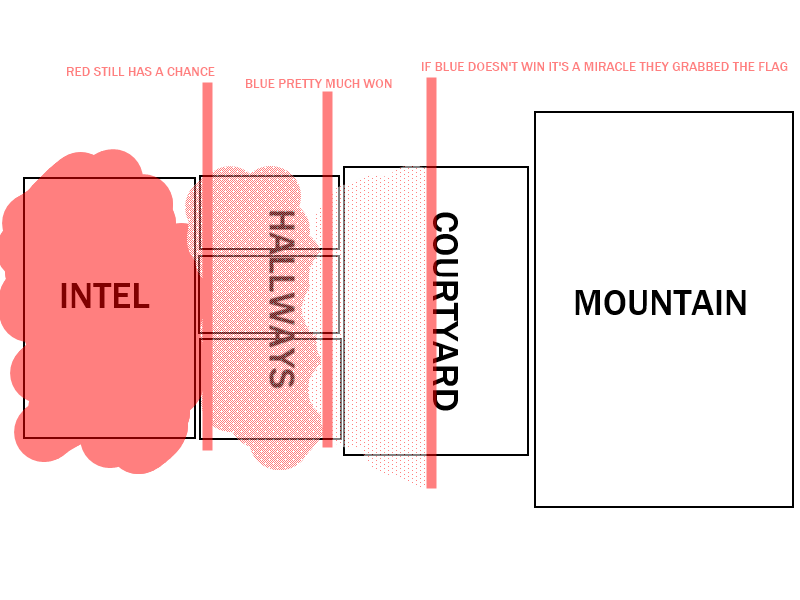
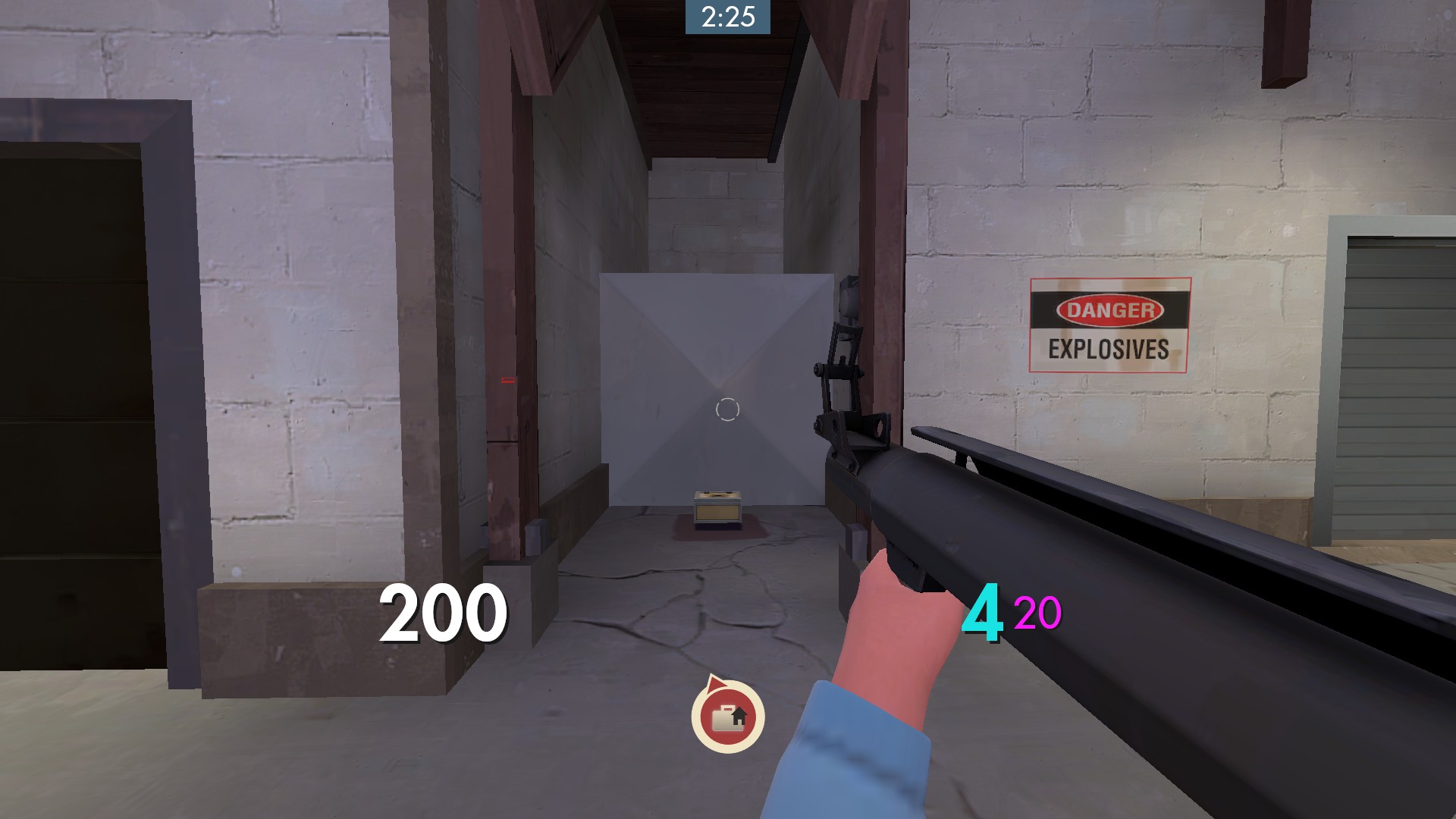
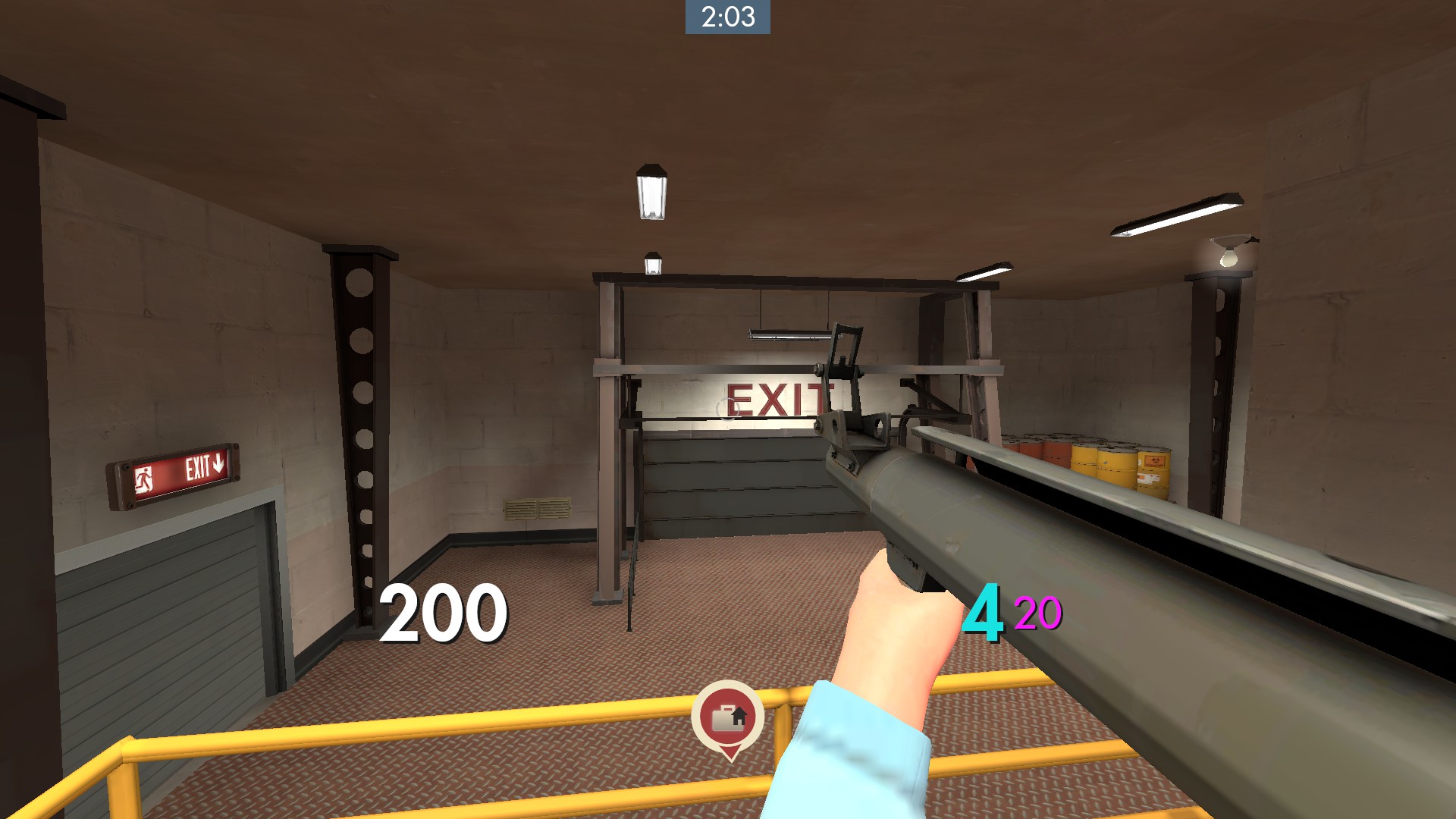
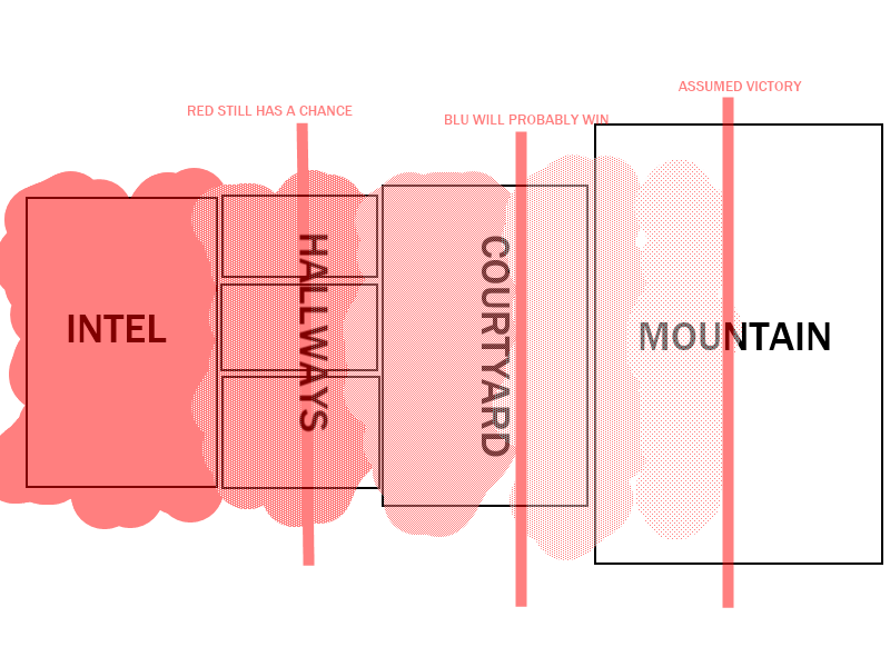
Sightlines, you appear to have cut down blu's outside. Good, but red still needs some more, so they aren't relying so heavily on sentry nests. (Ask yourself, if I didn't have sentries in this map, how would this play?)

But, the big thing is that I am still seeing the one-sided gameplay. You have red defending, blu attacking. Once blu get the flag, they can easily make it out (infact, maybe even easier now with all the cover). You need to add a second half of the gameplay for this type of gametype. You can't just have it so that it's "RED! DEFEND THE THINGS!!! Oh? Blu got the flag? Oh well, we lose!" You need to give them the easy ability to counter the capture and right now I just don't see it.
 

DonutVikingChap

L5: Dapper Member
Mar 15, 2013
233
139
It certainly looks a lot nicer, as I secretly always hated the aesthetic of your bunker + weird stair building. It looks a lot cleaner and more uniform in this new version, so that's a plus. One aesthetic comment that I would leave you is that you might want to reconsider how you've done the exterior mountain displacements - they don't really fit TF2's art style. Of course it's up to you in the end, but a blockier approach might work better.

I'm more concerned about the mountain texture, it looks really nice but it's very repetitive (see: all the mountain sides) and if I make it bigger it looks quite stretched out. Any idea on how to solve that?
 

DonutVikingChap

L5: Dapper Member
Mar 15, 2013
233
139
But, the big thing is that I am still seeing the one-sided gameplay. You have red defending, blu attacking. Once blu get the flag, they can easily make it out (infact, maybe even easier now with all the cover). You need to add a second half of the gameplay for this type of gametype. You can't just have it so that it's "RED! DEFEND THE THINGS!!! Oh? Blu got the flag? Oh well, we lose!" You need to give them the easy ability to counter the capture and right now I just don't see it.

I'm not sure if you've noticed but I've been trying hard to fix this issue in the recent versions by adding the forward spawn doors (and permanently opened one of them in this version), giving RED dynamic respawn times and reducing the intel reset time. We'll see how it turns out in practice the next time we play it, though.
 

Idolon

they/them
aa
Feb 7, 2008
2,108
6,119
I think there's a few main issues with the map: Where Red wants to be, and focus. Let's look at each topic individually:

Where Red wants to be
current.png

The shading indicates approximately where Red people usually are - mostly in the intel room, a fair number in the hallways, and a few people wander outside. This is mostly an indicator of how easily Red is killed in those areas. Going outside to the courtyard is usually asking to get yourself sniped, and being in the hallways means it's easier to get flanked, by the intel carrier. Being in the intel room is the best bet for someone on Red to be able to defend the flag.

Unfortunately, this means its a lot harder to chase the intel carrier, because being in the intel room makes Red more susceptible to being killed when Blue makes an attempt for the flag. Additionally, they don't have much room for flanking opportunities, as every route is about the same length leading to the same courtyard. The lines running up and down show the status of the game according to how far the intel carrier has escaped.

Here's what I think it should be ideally:
maybe_ideal.png

By letting Red safely spread out, you would let Blue have an easier time grabbing the flag, and having the chase out of the base be Red's focus, rather than preventing the chase from happening at all. You have to be careful, though. Expanding Red's territory out can also make Blue's job of getting the intel in the first place a bit harder. If done right, however, you could make it easier to grab the flag, and harder to get out with than it is currently.

Focus
The layout seems unfocused. No one path to the intel seems to be the "main" one, whereas most maps have a main route + flanks. You should change the layout so that there is one main path that is used for escaping, with many routes in. The flanks should be either one-way into the intel room, or branch off of the main route itself (rather than branching from Blue's courtyard). This way, you can make it easier for Blue to grab the flag, and make it easier for Red to focus their chasing efforts.
 

Fruity Snacks

Creator of blackholes & memes. Destroyer of forums
aa
Sep 5, 2010
6,394
5,571
I'm not sure if you've noticed but I've been trying hard to fix this issue in the recent versions by adding the forward spawn doors (and permanently opened one of them in this version), giving RED dynamic respawn times and reducing the intel reset time. We'll see how it turns out in practice the next time we play it, though.

I know you are trying to get it fixed. I have noticed, don't ever assume that I don't notice. I'm seeing "I think the layout works, and needs minor tweeks" when everyone is like 'no, no nonono!' But, the changes you are making really don't show any deep thought into what you're trying to accomplish. Thats fine, as this is your first map, but you need to start thinking critically and analytically about these things.

Idolon does a great job outlining the major problem with your map, I highly suggest you listen and chat with him and others about what he has to say. At the moment, you're going to have to do a major overhaul of your layout. You need to accept that and learn from what you've done already.
 

DonutVikingChap

L5: Dapper Member
Mar 15, 2013
233
139
I think there's a few main issues with the map: Where Red wants to be, and focus. Let's look at each topic individually:

Where Red wants to be
current.png

The shading indicates approximately where Red people usually are - mostly in the intel room, a fair number in the hallways, and a few people wander outside. This is mostly an indicator of how easily Red is killed in those areas. Going outside to the courtyard is usually asking to get yourself sniped, and being in the hallways means it's easier to get flanked, by the intel carrier. Being in the intel room is the best bet for someone on Red to be able to defend the flag.

Unfortunately, this means its a lot harder to chase the intel carrier, because being in the intel room makes Red more susceptible to being killed when Blue makes an attempt for the flag. Additionally, they don't have much room for flanking opportunities, as every route is about the same length leading to the same courtyard. The lines running up and down show the status of the game according to how far the intel carrier has escaped.

Here's what I think it should be ideally:
maybe_ideal.png

By letting Red safely spread out, you would let Blue have an easier time grabbing the flag, and having the chase out of the base be Red's focus, rather than preventing the chase from happening at all. You have to be careful, though. Expanding Red's territory out can also make Blue's job of getting the intel in the first place a bit harder. If done right, however, you could make it easier to grab the flag, and harder to get out with than it is currently.

Focus
The layout seems unfocused. No one path to the intel seems to be the "main" one, whereas most maps have a main route + flanks. You should change the layout so that there is one main path that is used for escaping, with many routes in. The flanks should be either one-way into the intel room, or branch off of the main route itself (rather than branching from Blue's courtyard). This way, you can make it easier for Blue to grab the flag, and make it easier for Red to focus their chasing efforts.

But this is exactly what I have tried to accomplish in B4 by adding all the cover in the courtyard and eliminating all of BLU's good sniper spots. I think you'll see for yourself when we actually play the map.
 
Last edited:

Pocket

Half a Lambert is better than one.
aa
Nov 14, 2009
4,697
2,581
Hey.

ctf_infiltration_b40001.jpg


These window things? These orange window things with light in them?

If you're planning on keeping them there, try placing some light_spots facing out from them and angled slightly downward, so that they're casting light onto the environment. That way you've got more lights with real sources and won't have to rely on phantom lighting so much.
 

DonutVikingChap

L5: Dapper Member
Mar 15, 2013
233
139
Hey.

ctf_infiltration_b40001.jpg


These window things? These orange window things with light in them?

If you're planning on keeping them there, try placing some light_spots facing out from them and angled slightly downw, so that they're casting light onto the environment. That way you've got more lights with real sources and won't have to rely on phantom lighting so much.

Since several people have commented that they think the gate looks cool (and I do too), yes I will probably keep the windows. Placing lights like that definitely seems like a good idea, but I don't think I'd make the lights from the towers so pronounced that they'd light up the environment around them a lot, so I'd probably still add some blue-ish environment (phantom) lights around to compensate.
 

TheClaudioAmericano

L1: Registered
Mar 27, 2013
46
16
I think that the new gate looks great and all, but maybe it is too good for Red team, especially Demomen.
Maybe that is a good thing.
 
Sep 7, 2012
638
500
You seem to be generally comfortable with your layout, so instead of trying to persuade you to change it, I'll just let you know about a few minor gameplay and detailing things I noticed.

ctf_infiltration_b50000.jpg

^This lamp is usually used in outdoors areas, it doesn't really fit the indoors areas that well. Perhaps swap it with walllight001a.mdl or something similar?

ctf_infiltration_b50001.jpg

^This door is superfluous considering there's a doorway right next to it. By removing it, you may be able to eliminate an outrageous sightline to blue's spawn as well as improve your optimization greatly (right now there's a strip from blue's spawn to the intel room that is always getting rendered).

ctf_infiltration_b50002.jpg

^This vent thing didn't make a lot of sense to me, perhaps block the area off some other way and tie it in with the inside area of the wall.

ctf_infiltration_b50003.jpg

^I can tell you're doing that brush/propwork to give a credible structure for the door prop to fit into but it looks a little silly. You might be better off with a large "cement beam" brush the way that badlands and several other Valve maps do it.

ctf_infiltration_b50004.jpg

^This room is a huge detriment to attackers. They can be seen through the window so there's no point in hiding there, and it's really out of the way if you need to restock on health and ammo. Maybe make the whole area unusable or cut off the playable area in half so it's not as much of a dead end.

ctf_infiltration_b50005.jpg

^You use this texture quite a bit and it's very ugly by itself. In most official maps it's best used as a filler texture which is mostly covered by props and such, or as a ceiling texture where players don't look very much. You might want to switch this with one of the metal trim textures or even the rubber edging texture, I'm not sure.

ctf_infiltration_b50006.jpg

^This prop is usually used outdoors because it doesn't really make sense in an indoor environment. You might want to reconsider what you put here.

Also, I think your outdoor courtyard area has a lot of potential but that the towers are much too thick for the thin metal fence, just like Leswordfish said. In my opinion they could be a lot thinner, or the whole wall could be brushwork and a lot thicker.

Good work so far, it's interesting seeing this map progress (even if I don't particularly enjoy the gameplay aspect of it... :( sorry )
 

DonutVikingChap

L5: Dapper Member
Mar 15, 2013
233
139
Beta 6 is out now with the biggest, most important change being the small building thing on the hill getting extended so that BLU now has to go through it to reach the main gate, this gives both teams more cover from snipers since the huge sightline across the hill is essentially cut in half.

This, combined with the slightly raised fences, will hopefully give RED more balls to move out from their base without getting sniped and also make it harder to spawncamp BLU.

Other important changes include making a common sentry spot way more vulnerable, reducing ammo packs in the intel room and fixing a bit of weird detailing.
 
Last edited:

Seba

DR. BIG FUCKER, PHD
aa
Jun 9, 2009
2,364
2,728
http://steamcommunity.com/sharedfiles/filedetails/?id=175240329
http://steamcommunity.com/sharedfiles/filedetails/?id=175240351
http://steamcommunity.com/sharedfiles/filedetails/?id=175240391
http://steamcommunity.com/sharedfiles/filedetails/?id=175240412
http://steamcommunity.com/sharedfiles/filedetails/?id=175240441
http://steamcommunity.com/sharedfiles/filedetails/?id=175240469
http://steamcommunity.com/sharedfiles/filedetails/?id=175240491
http://steamcommunity.com/sharedfiles/filedetails/?id=175240540
http://steamcommunity.com/sharedfiles/filedetails/?id=175240563

Basically I hate the entire area on the flag platform and behind it. It all feels very cramped, haphazard, and odd. First, clip the computers in the freestanding terminals - you can leave them solid if they don't stick out in front of the wall. If they do, make them nonsolid and use blockbullets or something. Second, bring the computers away from the wall (or the wall away from the computers if doing the former will ake the room too small) so bumping into an enemy in that area won't mean certain doom and completely block your movement. Third, simplify the area behind the flag a lot. Make it a bit more open, give the player more freedom of movement, don't make it so claustrophobic. Also make sure it's evenly lit, like I mentioned in one of those screenshots. You generally want to clip everything you can to make the map as smooth as possible, especially in an area of vital importance like the flag zone - while rushing the flag the players are less likely to carefully maneuver the terrain and not get mad when they come across a ledge that looks like it should be walkupable (like the ledge from behind the platform onto it).

I didn't really pay much attention to the parts of the buildings that aren't the flag room, but one of the screenshots comments on the platforms. I love that gap because I can drop down onto the main floor to chase enemies exiting the room; however, either block it off completely with handrails (to show that it's not a suggested/optimised route) or make the gap a bit wider and bring the catwalk further into the room. I'd do the latter, but that's a personal preference.

The courtyard I can't really comment on because I didn't pay much attention to it either. However, I do think you can do some cool stuff with the wooden building on the main uphill path. Add a wooden floor, detail the inside and outside some more, stuff like that, and it'll look rockin'. Also do something to incite the player into taking the narrower route (right one when exiting the base). Right now the wide one has all the advantages: it's shorter, provides more protection from blast damage by offering more room for movement, and is more obvious. I suggest making the narrower path more winding but also more direct, with a sharp angle in the middle - that way an escaping scout or whoever doesn't have to worry about the twelve and a half tons of explosives and lead flying behind him. Kinda something like this I think.

The map is very fun to play, especially as BLU. However, I feel like encouraging RED to start defending much sooner would be a good idea (since the strongest defense position I've found was sitting in that dark corner with stickies hidden in the intel). Oh, and you might want to fix the intel - maybe put a blockbullets brush around it then disable it when the intel's picked up? Whichever way you do it I don't think demomen should be able to hide stickies in the flag.
 

DonutVikingChap

L5: Dapper Member
Mar 15, 2013
233
139
http://steamcommunity.com/sharedfiles/filedetails/?id=175240329
http://steamcommunity.com/sharedfiles/filedetails/?id=175240351
http://steamcommunity.com/sharedfiles/filedetails/?id=175240391
http://steamcommunity.com/sharedfiles/filedetails/?id=175240412
http://steamcommunity.com/sharedfiles/filedetails/?id=175240441
http://steamcommunity.com/sharedfiles/filedetails/?id=175240469
http://steamcommunity.com/sharedfiles/filedetails/?id=175240491
http://steamcommunity.com/sharedfiles/filedetails/?id=175240540
http://steamcommunity.com/sharedfiles/filedetails/?id=175240563

Basically I hate the entire area on the flag platform and behind it. It all feels very cramped, haphazard, and odd. First, clip the computers in the freestanding terminals - you can leave them solid if they don't stick out in front of the wall. If they do, make them nonsolid and use blockbullets or something. Second, bring the computers away from the wall (or the wall away from the computers if doing the former will ake the room too small) so bumping into an enemy in that area won't mean certain doom and completely block your movement. Third, simplify the area behind the flag a lot. Make it a bit more open, give the player more freedom of movement, don't make it so claustrophobic. Also make sure it's evenly lit, like I mentioned in one of those screenshots. You generally want to clip everything you can to make the map as smooth as possible, especially in an area of vital importance like the flag zone - while rushing the flag the players are less likely to carefully maneuver the terrain and not get mad when they come across a ledge that looks like it should be walkupable (like the ledge from behind the platform onto it).

I didn't really pay much attention to the parts of the buildings that aren't the flag room, but one of the screenshots comments on the platforms. I love that gap because I can drop down onto the main floor to chase enemies exiting the room; however, either block it off completely with handrails (to show that it's not a suggested/optimised route) or make the gap a bit wider and bring the catwalk further into the room. I'd do the latter, but that's a personal preference.

The courtyard I can't really comment on because I didn't pay much attention to it either. However, I do think you can do some cool stuff with the wooden building on the main uphill path. Add a wooden floor, detail the inside and outside some more, stuff like that, and it'll look rockin'. Also do something to incite the player into taking the narrower route (right one when exiting the base). Right now the wide one has all the advantages: it's shorter, provides more protection from blast damage by offering more room for movement, and is more obvious. I suggest making the narrower path more winding but also more direct, with a sharp angle in the middle - that way an escaping scout or whoever doesn't have to worry about the twelve and a half tons of explosives and lead flying behind him. Kinda something like this I think.

The map is very fun to play, especially as BLU. However, I feel like encouraging RED to start defending much sooner would be a good idea (since the strongest defense position I've found was sitting in that dark corner with stickies hidden in the intel). Oh, and you might want to fix the intel - maybe put a blockbullets brush around it then disable it when the intel's picked up? Whichever way you do it I don't think demomen should be able to hide stickies in the flag.

Thanks a lot, this was some really useful feedback!
I haven't been thinking a lot about the area behind the intel platform, I agree that making it more open seems like a good idea.

Also, the whole "stickies-in-intel" problem was something I didn't really pay attention to because essentially every CTF map has that issue. Now that you mention it though, I realize fixing it would probably be a good thing.
 

Toxindude

L3: Member
Aug 2, 2012
103
4
Well after reading all the problems and improvements I think I will download and check this one out. Looking forward to it.

Question are the screen shots on the first page up to date?

Quick edit here: If the screens are current I spotted a metal texture from HL2 I don't think blends very well. Don't get me wrong I'm all about trying to make HL2 textures work in TF. Its the Brown metal texture on the beam brush and some other areas. Just my picky opinion if you leave it you leave it :)
 
Last edited:

DonutVikingChap

L5: Dapper Member
Mar 15, 2013
233
139
Well after reading all the problems and improvements I think I will download and check this one out. Looking forward to it.

Question are the screen shots on the first page up to date?

Quick edit here: If the screens are current I spotted a metal texture from HL2 I don't think blends very well. Don't get me wrong I'm all about trying to make HL2 textures work in TF. Its the Brown metal texture on the beam brush and some other areas. Just my picky opinion if you leave it you leave it :)

Yes, I always update the screenshots after releasing a new version.
And no, that is not a HL2 texture. I always use the "tf" filter when browsing for textures, if you're referring to the "beam brush" that I think you are (the ones on the walls of the intel room), that's definitely a TF2 texture since it's used in cp_badlands and I personally think it fits.
 

Toxindude

L3: Member
Aug 2, 2012
103
4
Ahh well guess I was wrong on that one lol could have sworn . Anyway looking forward to trying the map out. I asked about the screen shots because some times people don't update them good to know though.

Edit: Nope they are the angled beams in the intel room right behind the Data Link Hubs next to Intel. HL2 texture there the metal sides. It don't look bad though and I see no need to change it :) Like I said if it works it works. Aside from a few visual things in the map and very minor stuff the map looks pretty damn Great!! :)
 
Last edited: