ARENA FabLab b7
- Thread starter Bunbun
- Start date
You are using an out of date browser. It may not display this or other websites correctly.
You should upgrade or use an alternative browser.
You should upgrade or use an alternative browser.

All I can think is maybe a little too cramped? Then again, my most common feedback is that I have too many wide open spaces, so what do I know?
If I could suggest anything, it'd be to add a few little nooks for people to hide in, especially spies. Other than that, maybe another route? For scouts to flank?
If I could suggest anything, it'd be to add a few little nooks for people to hide in, especially spies. Other than that, maybe another route? For scouts to flank?
I tried it out, and this is my feedback:
A lot of bad seams on the textures here
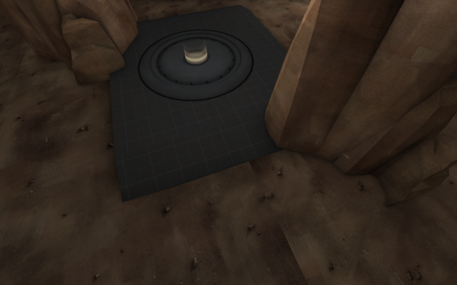
I don't really see the use of this, due to the small size making it bad for a quick getaway. I guess Spies could use it, but they would probably rather use the window, as they will be able to see what is waiting for them below...

This Ammo kit is a bit too close to the battlefield, not good for Engies. I'd recommend moving the small kit up here.

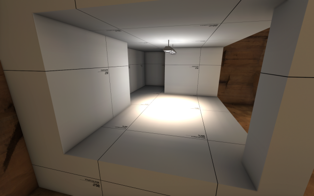
I don't really see the use of this building right here, it is too open to use as cover, and too far from the point to be of any good use.
I think the map as a whole is a bit too small, a Scout could clear it in seconds with no effort. Also there is no water or health kits, which makes Pyro a much more dangerous class to deal with. I think that with some good improvements, this would be a fantastic map to play in....
A lot of bad seams on the textures here
I don't really see the use of this, due to the small size making it bad for a quick getaway. I guess Spies could use it, but they would probably rather use the window, as they will be able to see what is waiting for them below...
This Ammo kit is a bit too close to the battlefield, not good for Engies. I'd recommend moving the small kit up here.
I don't really see the use of this building right here, it is too open to use as cover, and too far from the point to be of any good use.
I think the map as a whole is a bit too small, a Scout could clear it in seconds with no effort. Also there is no water or health kits, which makes Pyro a much more dangerous class to deal with. I think that with some good improvements, this would be a fantastic map to play in....
I tried it out, and this is my feedback:
A lot of bad seams on the textures here
snip
I don't really see the use of this, due to the small size making it bad for a quick getaway. I guess Spies could use it, but they would probably rather use the window, as they will be able to see what is waiting for them below...
snip
This Ammo kit is a bit too close to the battlefield, not good for Engies. I'd recommend moving the small kit up here.
snip
I don't really see the use of this building right here, it is too open to use as cover, and too far from the point to be of any good use.
snip
I think the map as a whole is a bit too small, a Scout could clear it in seconds with no effort. Also there is no water or health kits, which makes Pyro a much more dangerous class to deal with. I think that with some good improvements, this would be a fantastic map to play in....
While feedback is usually helpful, you're looking at all of this from a single player's perspective. Also, texture issues are of no importance in an alpha, especially a1. The drop down route is useful because it adds an alternate route, which is almost always good(most rooms should have at least 2 entrances/exits, but no more than 5).
Ammo kits are not just for engines. Any class could run out, even in arena. Not to mention, moving ammo close to spawn in arena promotes turtling, which is generally frowned upon in arena anyways.
That building, again, provides alternate routes and height variation, which makes the gameplay more fun all-around. I don't see why you would want Dr_Felix to simply remove it.
As for the healthkits, I do agree. Even though the idea of arena is to make staying alive a task, healthkits are essential so that the team isn't entirely reliant on medics and such.
Thanks ya'll, probably would change these things in a2(after gameday)While feedback is usually helpful, you're looking at all of this from a single player's perspective. Also, texture issues are of no importance in an alpha, especially a1. The drop down route is useful because it adds an alternate route, which is almost always good(most rooms should have at least 2 entrances/exits, but no more than 5).
Ammo kits are not just for engines. Any class could run out, even in arena. Not to mention, moving ammo close to spawn in arena promotes turtling, which is generally frowned upon in arena anyways.
That building, again, provides alternate routes and height variation, which makes the gameplay more fun all-around. I don't see why you would want Dr_Felix to simply remove it.
As for the healthkits, I do agree. Even though the idea of arena is to make staying alive a task, healthkits are essential so that the team isn't entirely reliant on medics and such.
I could make the drop-down route bigger so that demomans and soldiers can jump up.
That is a pretty nice idea, I'l recommend making it a kid of walk way thing.
Add some pits so that the health kits aren't relatively easy and free to grab.
Close some of thee smaller windows so that people don't get shot by something that they didn't even know was open. It happened to a lot of people on the second floor of the main buildings.
Maybe you should make mid a bit bigger so that the fighting isn't so cramped up for the land-locked classes.
Those are some suggestions I thought of...
A3 released, with the meaning of life explained.
No, the meaning of life isn't explained until Alpha 42!
- Feb 18, 2012
- 246
- 407
Played this in the gameday the other day. The layout feels more like it was meant for a KotH map, than for an arena map, since both teams are funneled trough the point area. This means the clash and most of the action between the teams will happen on/around the point, much like a KotH map.
Since you already know the enemy team is going to push the point at the start of the round, you don't really have to predict your enemies movement and positioning yourself in order to get an adventage (which is a big part of the arena gamemode). Therefore the map fells really stale after a few rounds and often develops some kind of push/pull mechanic instead, were one of the teams push the other team back to their spawnroom.
Keep in mind these observations are based on one test only.
B2! Aaaand nothing has changed!
Honestly, this might just be because you have such a good map on your hands. Keep it up! :thumbup:
Kill_the_Bug
aa
- Oct 6, 2008
- 1,949
- 446


Had a quick fly-around because there were a few detailing niggles I wanted to point out:
Your roofs are awfully thick. Ideally they would be no thicker than 4 units; these ones must be about 16.
This vent is floating...
... and it's only on one side of the wall!
The wooden beam on this building needs its texture rotated by 90 degrees. Also there's a wee bit of z-fighting between it and the lower roof of the building beside it. (Also pictured: more of the aforementioned roofs.)
Small complaint, but these windows look a little strange. Most likely because they've been rotated 90 degrees.
Had a quick fly-around because there were a few detailing niggles I wanted to point out:
Your roofs are awfully thick. Ideally they would be no thicker than 4 units; these ones must be about 16.
This vent is floating...
... and it's only on one side of the wall!
The wooden beam on this building needs its texture rotated by 90 degrees. Also there's a wee bit of z-fighting between it and the lower roof of the building beside it. (Also pictured: more of the aforementioned roofs.)
Small complaint, but these windows look a little strange. Most likely because they've been rotated 90 degrees.
Thanks for the feedback!