Cardinal

CP Cardinal rc1a

  • This map is featured! Our best maps, all together in one place for your viewing pleasure.

phi

aa
Nov 6, 2011
832
1,817
Cardinal - A 5cp map in a hybrid Frontline theme, focused on height and unique routage.

Ten-hut! Listen here, maggots, this is the most important duty your entire worthless existence here has ever been a part of! You're going to be fighting against some the scummiest, most detestable, most odorous men I have ever laid eyes and nose on in my life - so you better be even more scummy and odorous than them to win! Our team and our team only can own this base! Not even I know why we're here, but it looks expensive, and if it's worth something to them, then it's worth something to us!

Tanks? You're asking why we're not using the tanks? Son, if I had an answer to that, I'd know how to drive one. Get out there already!

---

Cardinal is a 5cp control point map taking place across a large military base "disguised" with a commercial agency's façade. Positioned in a tactically advanced position with nods to Cold War preparation and protection, only one team can own this base - and you'd best hope it's yours!

Focusing around height differences, unusual route arrangements, and a unique layout, Cardinal is a lot of concepts you're simultaneously familiar and unfamiliar with - creating a distinctly novel gameplay experience.

---

Any and all testing is appreciated and considered for feedback. YOU DO NOT NEED TO ACQUIRE PERMISSION TO TEST THIS MAP.
 
Last edited:

Idolon

they/them
aa
Feb 7, 2008
2,123
6,137
things:

I expected this door to lead me to last instead of 2nd. Add an arrow?

Weirdly aligned dev textures drive me crazy. I usually do a texture replace on my dev textures (with "mark, don't replace" on) and set everything to default settings. Looks still matter in alpha.

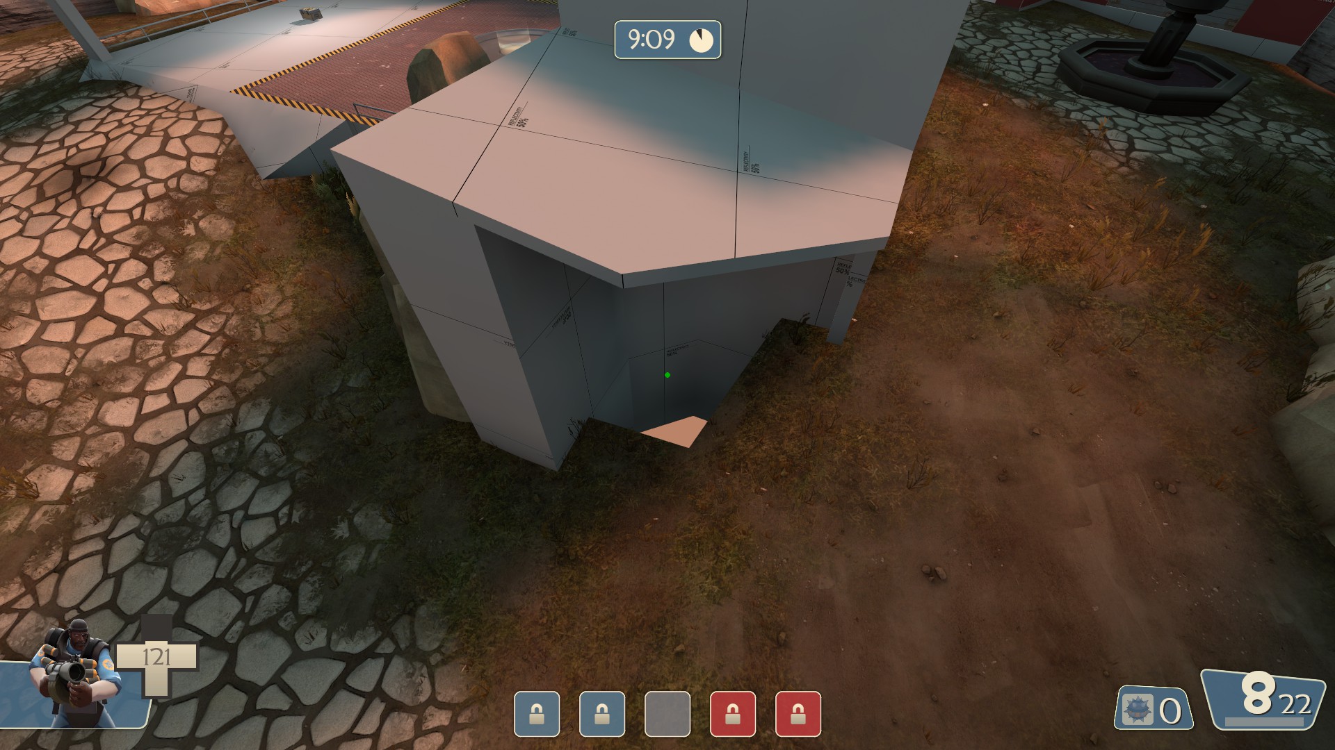
I want to be able to run directly over these. I don't really know what gameplay purpose they serve - they could probably just as well be non-solid with no clips. (Note: you can run over them from on the point, but not onto the point)

I want to be able to run directly onto the fountain base. This is specifically what I was afraid of when I said "These fountains want me to be stuck on them."

Could use a lighting cue to indicate the presence of a door on the right - I missed it.

Not entirely clear that this ledge is clipped.

Mid seems too defensible? Every entrance into mid has a good height advantaged position that scouts can pretty easily rotate between. Snakewater has height advantages like this, but it takes some time to rotate from shack to the roof looking over the far upper flank route.
 

Lain

lobotomy success story
aa
Jan 8, 2015
723
757
Blu side only
942446d056.jpg
 

Vel0city

func_fish
aa
Dec 6, 2014
1,947
1,589
What is it with you and beautiful looking alpha's.
 

theatreTECHIE

Yet another Techie for the net...
aa
Jun 19, 2015
455
458
The first forward spawn seems to be placed in a weird spot, with a lot of height disadvantage. I'd like to see it moved to a ledge up to the right of where you come out of the spawn. If you do keep it where it is though, have a look at this so that the path above isn't blocked when the door opens. (To get the no entry hand there still, use a dynamic prop, and disable on open, and enable on fullyclosed from the door the door)
 

Yellow

L1: Registered
Sep 10, 2014
24
34
Did a lil run around the map, I like what I saw! However I did notice a few things, mostly visual though.

A few lighting glitches with the cliffs here and here near Mid

A bit of ramp texture from inside the building sticking out here near Mid

This sign near Second should be clipped just because it is near a medium health and ammo.

A slight visual thing seen here and here on Second: Although minor, the side with the sunlight on it will see less than the side without sunlight due to the glare. Just something to think about if you place any more of those windows around, if anything.

And a little bit of a more potential gameplay influencing part here on Last: This high pillar near the point has the potential of shutting down the defending team entirely if, say, a demo or even a soldier gain that ground, as they can fire upon enemies comming out of spawn without being seen and have a decent amount of cover from the geometry to enforce it. On top of that, a demo can lay completely hidden traps at both spawn doors without too much exposure to threats that the demo can see, making spawn camping very easy from that safe position. My concern for this is that the last will be a fight over that one pillar due to the tactical advantage of having a demo or soldier hold it. I would suggest a way for the defending team to see from their spawn if someone is up there (a one-way window perhaps?) and/or to slope the geometry on top of the pillar towards the spawn in favor of the defending team so that soldier spam and scout fire can hit targets on top of that pillar much more easily.

This is just my two cents on it, the pillar concerns me but I haven't seen or tried any games on this map as of yet. Hope this helps and I can't wait to see more out of this map.
 

phi

aa
Nov 6, 2011
832
1,817
cp_cardinal_a2

Changes slated for a3:
• Changing forward spawn on 2nd to not be immediately under dropdown (thanks Citric)
• Various larger layout edits based off of higher-level testing

Changes released in a2:
• reduced size of sun to prevent blinding (thanks Zoma, Benroads, Gaz)
• made small jutting building next to second more obvious that it can't be jumped on (thanks Camper)
• Clipped left side (def. persp.) of last's barbed wire better (thanks Benroads)
• Blockbulleted and properly clipped various barricades across the map so you can't get stuck on their feet (thanks Benroads)
• Clipped door with wooden plank on top better (thanks Benroads)
• Clipped dragonteeth barriers better (thanks Benroads)
• Various barbed wires that weren't nonsolid were made nonsolid (thanks degu, Benroads)
• Attempted to fix certain displacements letting stickies through (thanks UstinDoppelQuinn, fahrenheit, Smyther)
• Removed weird oil under 2nd (thanks various people)
• Made shutter door frame nonsolid (thanks Googler, degu)
• Attempted to fix blue shutter door, weird bug (thanks Snape)
• Made last and lobby brighter (thanks Smyther)
• Raised captime for last to 2.4 from 2
• Changed spawnwaves to punish teamwipes slightly more (thanks Snape)
• Blockbulleted the picket fence next to fountain in second yard
• Added patches to health and ammo across the map
• Clipped tank a lot better (thanks Smyther, Benroads)
• Moved tank outwards and left slightly
• Marked where you must stand for the large shutter door to open
• Shortened fence around mid and clipped the outside so parts are walkable instead of jumpable (thanks Ynders)
• Changed explosive barrel models to standard oil barrel models

Read the rest of this update entry...
 

phi

aa
Nov 6, 2011
832
1,817
• Added small ledge to jump up in 2nd yard
• Made high ground on mid smaller so as to make it easier to spam and contest
• Added bit to the open-choke from mid to second to prevent incredibly large explosive jump plays and to segment bombers to individual point zones rather than spanning the choke
• Removed dropdown entirely
• Added small staircase room to the right (attacker's perspective) of where dropdown was, this way retreaters can go back up into lobby
• Reduced overall size of lobby, including pulling in back wall and ceiling
• Reduced whole length of second and yard by 80 units
• Reduced whole length of last by 64 units
• Moved the second point down, opening up the entire area
• Changed the area linking second point to second yard slightly
• Made small shack next to second able to be stood on
• Shifted around right side of second (defender's perspective) to remove cheeky sightline

Read the rest of this update entry...
 

phi

aa
Nov 6, 2011
832
1,817
• Expanded curve route from mid to second
• Removed glass pane on said route
• Added shutter door to side flank into last
• Moved last point forward a tad and added small bridge around hut side
• Honestly can't remember everything that changed - there was a ton of little things

The lighting isn't finished whatsoever and there's a lot of rough edges. Be patient with me. It'll all get fleshed out in beta 2; I just really wanted to push a version of this out with detailing to get gameplay testing.

View screenshots on the main page!

Read the rest of this update entry...
 

parkingturtle

L1: Registered
Aug 3, 2015
30
18
http://image.noelshack.com/fichiers/2016/48/1480812415-20161204014535-1.jpg
http://image.noelshack.com/fichiers/2016/48/1480812416-20161204014530-1.jpg
You can stand up here, not sure if it was intended

http://image.noelshack.com/fichiers/2016/48/1480812832-20161204015115-1.jpg
There's a prop coming out of the ground here (on second point, on defenders' side)

http://image.noelshack.com/fichiers/2016/48/1480813058-20161204015659-1.jpg
Nodraw here (on last point spawn)

http://image.noelshack.com/fichiers/2016/48/1480813554-20161204020446-1.jpg
Weird red textures on the fences (on second point, next to the spree)

The map looks great, I can't wait to see how it plays!

PS: I only added links to avoid taking too much space here.
 

phi

aa
Nov 6, 2011
832
1,817
• Fixed $envmaptint console spam, it was incorrectly formatted model textures within the Frontline pack.
• Removed paint can
• Quickly lit various incredibly dark gameplay spaces: still needs tweaking, but much easier to fight around
• Fixed clipping and blockbulleting on fountains

Read the rest of this update entry...
 

phi

aa
Nov 6, 2011
832
1,817
- Added full 3dsky (still a couple things to edit/polish up but it's there!)
- Lit map as a whole better
- Clipped various problem spots

Generally, this update is heavily visual, for players and casters alike. Gameplay changes will come after the New Map Cup and various tests for beta 3.

Screenshots can be found in the OP.

Read the rest of this update entry...
 

Idolon

they/them
aa
Feb 7, 2008
2,123
6,137

phi

aa
Nov 6, 2011
832
1,817
• Connected café/fishery/house with arch, will result in less wrapping and hopefully a general feeling of a smaller area

• Added pill to second balcony from fishery to support soldiers bombing and scout boston basher movement

• Shifted health around the arch area due to new path

• Fiddled with clipping around arch

• Generally started de-cluttering the map as a whole

• Removed lip clipping on various tiny fences

• Made lampposts on arch nonsolid, roamers beware

• Removed clutter ledge on ground of second

• Closed off room below second

Read the rest of this update entry...
 

Beater

L1: Registered
Nov 25, 2017
31
174
Congratulation, your map has been chosen as one out of three maps which will have the chance of winning the 130€ first prize in the Meet Your Map map making contest. See the main competition thread for the official announcement and make sure to ask about anything you might feel unsure about.

Congratulations once again!
 

phi

aa
Nov 6, 2011
832
1,817
- fixed invis props on 2nd
- fixed nodraw holes
- added shutter door to fountain-side of mid-second connectors
- made second cap slower
- replaced octagon on mid with fountain
- replaced fountain in second with crate stack
- opened passage through shed kind of like granary's Z
- added new barriers to block sightline on second
- added wooden boards to scaffolding on archway into second to let soldiers do wall jumps easily
- repositioned lamppost on second
- put boards over shutters under second
- various lighting and detail touchups

Read the rest of this update entry...