
Would be really cool if somebody did a TF2 map in CS:GO, probably just changing the art style of course, while keeping the layout. Unless we going to the real classic TF look.
After Train, Nuke gets an overhaul in CS:GO
- Thread starter Vel0city
- Start date
You are using an out of date browser. It may not display this or other websites correctly.
You should upgrade or use an alternative browser.
You should upgrade or use an alternative browser.
seth
aa
- May 31, 2013
- 1,021
- 852
Ironically, though, it looks like the first, outdoor screenshot was rendered with sharp shadows turned off, for some reason. Or is that something that automatically happens when you're far away?
Are you talking about the screenshot I posted? They do not disable at distance, the resolution simply falls off to save on processing power. You can see them on the buildings in my pic.

That's the one. I asked because they look as smooth as lightmaps, and I didn't realize the cascading light could get that smooth at any distance.
Something I'd always wondered, though... how does the cascading light work in conjunction with the static lighting cast by the light_environment? Like, if you just took an already-lit map and added cascading light on top of it, it would be too bright, wouldn't it? So does having a cascading light entity in a map affect how VRAD behaves, like maybe the first bounce doesn't commit or something?
Something I'd always wondered, though... how does the cascading light work in conjunction with the static lighting cast by the light_environment? Like, if you just took an already-lit map and added cascading light on top of it, it would be too bright, wouldn't it? So does having a cascading light entity in a map affect how VRAD behaves, like maybe the first bounce doesn't commit or something?
seth
aa
- May 31, 2013
- 1,021
- 852
That's the one. I asked because they look as smooth as lightmaps, and I didn't realize the cascading light could get that smooth at any distance.
Something I'd always wondered, though... how does the cascading light work in conjunction with the static lighting cast by the light_environment? Like, if you just took an already-lit map and added cascading light on top of it, it would be too bright, wouldn't it? So does having a cascading light entity in a map affect how VRAD behaves, like maybe the first bounce doesn't commit or something?
The cascading light entity (env_cascade_lighting or light_directional) is used in conjunction with the light_environment. The cascading entity does not actually cast light; I believe it simply enables the cascaded shadow maps. It is a bit confusing, however, as I've checked a few official maps (such as de_inferno), and they do not actually have either of the cascading light entities, yet the cascaded shadow maps are still present. I believe the shadow maps are in fact hardcoded and simply follow the angles set in your light_environment.
Shogun
L6: Sharp Member
- Jan 31, 2014
- 260
- 221
I think the art direction Valve took with this map is very interesting. Anyone who follows CS:GO's mapping scene knows that one of the most important things to consider while detailing your map is visual clarity. In the past, maps that have been aimed at the competitive audience promoted visual clarity by using very stark, white textures with low levels of detail. Examples of this would be the de_season remake and de_santorini, both by FMPONE. What makes the nuke remake different is that Valve chose to use lots of color, but kept the pallet washed out and pale. The dark player models stick out just as well on the desaturated background as they do on a flat white background, and you don't sacrifice visual depth as result.
seth
aa
- May 31, 2013
- 1,021
- 852
I think the art direction Valve took with this map is very interesting. Anyone who follows CS:GO's mapping scene knows that one of the most important things to consider while detailing your map is visual clarity. In the past, maps that have been aimed at the competitive audience promoted visual clarity by using very stark, white textures with low levels of detail. Examples of this would be the de_season remake and de_santorini, both by FMPONE. What makes the nuke remake different is that Valve chose to use lots of color, but kept the pallet washed out and pale. The dark player models stick out just as well on the desaturated background as they do on a flat white background, and you don't sacrifice visual depth as result.
I agree. Personally, I find FMPONE's style too clean and bright. His style doesn't make sense in the context of real life, though he's obviously a skilled mapper/asset artist. I'm glad Valve elected to introduce the color they did, especially the blue ambient tones.


seth
aa
- May 31, 2013
- 1,021
- 852
FMPONE's original de_cache was much more grounded in reality but realism doesn't play well and thats why it ended up being more clean and bright.
I'm not saying the map needs to look like someone ran around it with dirt in a seed spreader, but pretty much every other map in the game has some level of grunge in the textures. FMPONE's walls are out of a Mr. Clean commercial.
Shogun
L6: Sharp Member
- Jan 31, 2014
- 260
- 221
I agree. Personally, I find FMPONE's style too clean and bright. His style doesn't make sense in the context of real life, though he's obviously a skilled mapper/asset artist. I'm glad Valve elected to introduce the color they did, especially the blue ambient tones.
I absolutely agree, but whenever I mention this to my more "hardcore" CS playing friends I get torn apart. Still, every time I look through the workshop I see maps that have a great theme, but look half finished because the creator wanted to keep the visuals as simple as possible and remove all "clutter".
For anyone who wants an example of what I am referring to, here's de_neutron (which is a fantastic map, don't get me wrong)
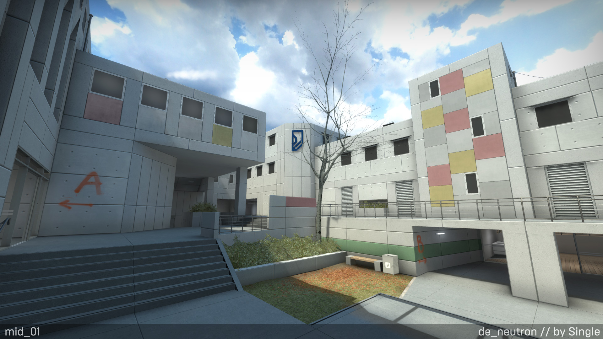
The map almost looks unfinished by how little detail there is, making the environment feel stark and lifeless.
I think Valve has found the "sweet spot" between beautiful visuals and promoting gameplay with de_nuke's detailing and I hope other mappers in the CS:GO community follow suit.
Someone already did that:I'm glad Nuke is getting overhauled. Somewhere around Left 4 Dead, Valve decided to tone down the grittiness of the textures and go for a more stylized look, even in their "realistic" looking games, but Nuke was basically copypasted straight from Counter-Strike: Source, textures and all, and it shows compared to the maps they actually redid like Office.
I'm not convinced that they do, but I'd love to see someone recreate a TF2 map in CS:GO and post some screenshots to prove me wrong.
Ironically, though, it looks like the first, outdoor screenshot was rendered with sharp shadows turned off, for some reason. Or is that something that automatically happens when you're far away?
Bogdy
L4: Comfortable Member
- Aug 13, 2014
- 187
- 208
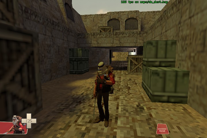
I don't remember on which thread, but someone posted a screenshot of a de_dust2 remake in TF2.Would be really cool if somebody did a TF2 map in CS:GO, probably just changing the art style of course, while keeping the layout. Unless we going to the real classic TF look.
sil-
L1: Registered
- Dec 15, 2014
- 20
- 37
Just decompiled the map and looked around, the grass is just models from what I can seeIs all the grass in Nuke part of the improved detail system, or are they all models? If it's all generated by the blend texture as before, they're getting into Frostbite foliage territory. Neat stuff.
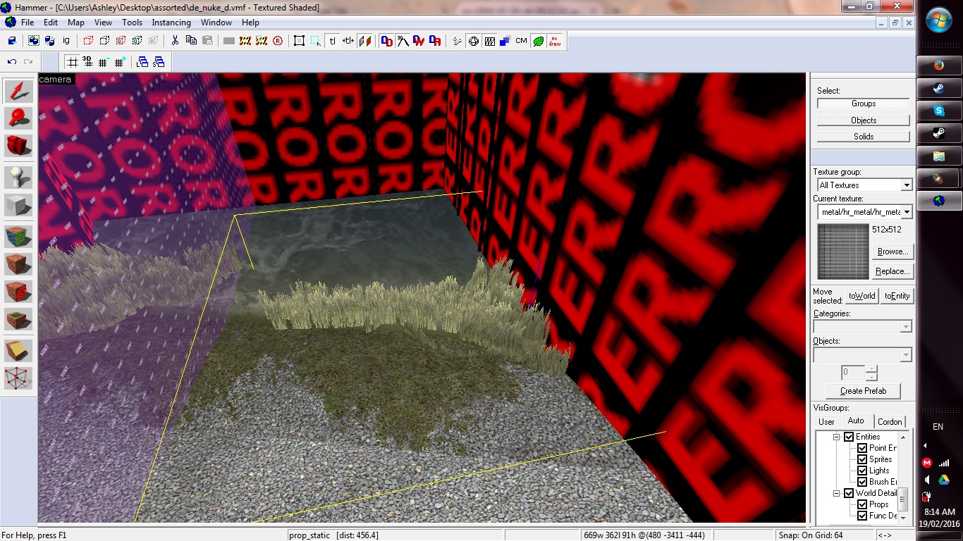
Also, the water is a displacement
seth
aa
- May 31, 2013
- 1,021
- 852
Yeah I checked that out after I finally downloaded the update today. Too bad.
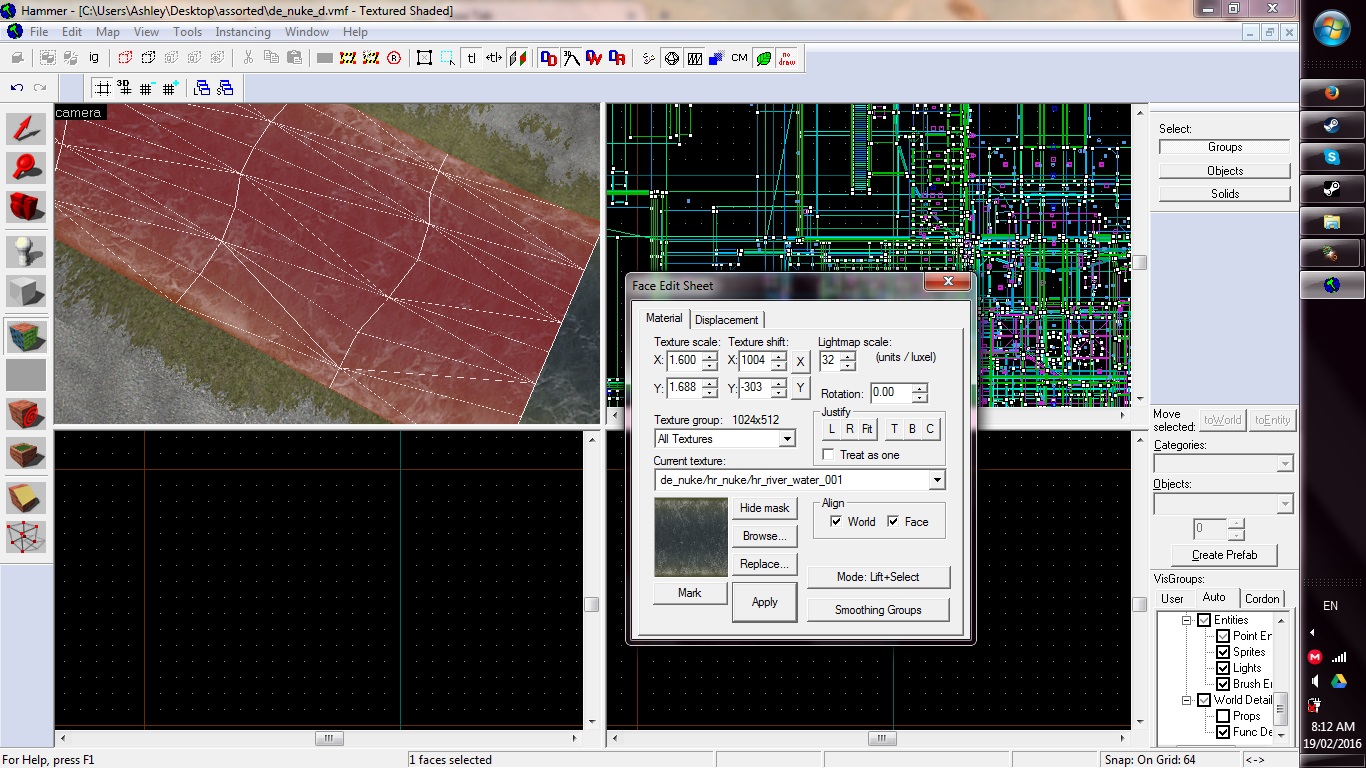
It seems you also have a bunch of errors in Hammer for CS:GO as well. I thought that was just something I caused when I setup my csgo_dev folder. Does Valve pack all the assets in their maps and not actually ship any of the content? 90% of the map is covered in errors for me.
It seems you also have a bunch of errors in Hammer for CS:GO as well. I thought that was just something I caused when I setup my csgo_dev folder. Does Valve pack all the assets in their maps and not actually ship any of the content? 90% of the map is covered in errors for me.
I don't remember on which thread, but someone posted a screenshot of a de_dust2 remake in TF2.
I might have to finally break down and buy this game someday just to have all the environments handy as visual reference, but in the meantime I gotta ask... Did they ever get rid of those pathetic explosions? That was something that was hilarious to me when I played the beta — TF2, a game that has to contend with limited physics, stickybombs that can't attach to dynamic props or func_brushes, and static lighting, has these impressive explosions when the bomb cart goes off, but a game that has none of those limitations couldn't muster more than token puff of black smoke.
seth
aa
- May 31, 2013
- 1,021
- 852
I might have to finally break down and buy this game someday just to have all the environments handy as visual reference, but in the meantime I gotta ask... Did they ever get rid of those pathetic explosions? That was something that was hilarious to me when I played the beta — TF2, a game that has to contend with limited physics, stickybombs that can't attach to dynamic props or func_brushes, and static lighting, has these impressive explosions when the bomb cart goes off, but a game that has none of those limitations couldn't muster more than token puff of black smoke.
I've had the game for about a year and I probably have less than an hour in real servers. The game is too competitively oriented for me. It's worth it just to walk around in. I don't know what you mean about the explosions. They look fine to me.