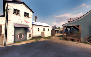
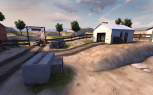
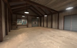
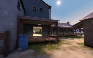
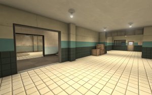
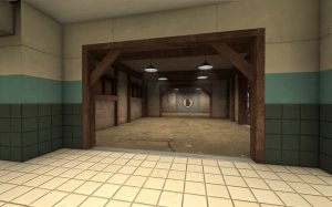
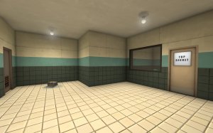
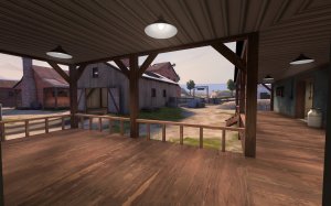
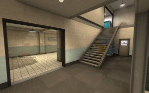
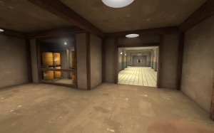
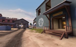
change up the dips a bit... grass functions a lot differently than leaves, and i feel there should be more grass than dirt... invert the alpha maybe?
WiP in WiP, post your screenshots!
- Thread starter Arhurt
- Start date
You are using an out of date browser. It may not display this or other websites correctly.
You should upgrade or use an alternative browser.
You should upgrade or use an alternative browser.
I'm thinking of making both sides in different styles.love those concrete. Is it same for red?
It would be cool to have a western theme. The Big buildings could be saloons or something.Actually looks better than the original, I'm burnt to the autumn theme


#replacetexture (gone wrong)
edit: and another

Looks fine dude just upload like that
Most likely my last screenshot before I decide to update my map sometime next week.
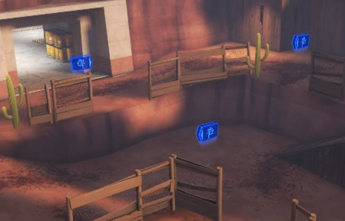
When the holograms turn off, it'll look like the robots will take a shorter path to the hatch by walking off the ledge closest to the concrete room. A handrail could take care of that.
Not sure what I'm seeing here; it just looks like two locations from the actual game?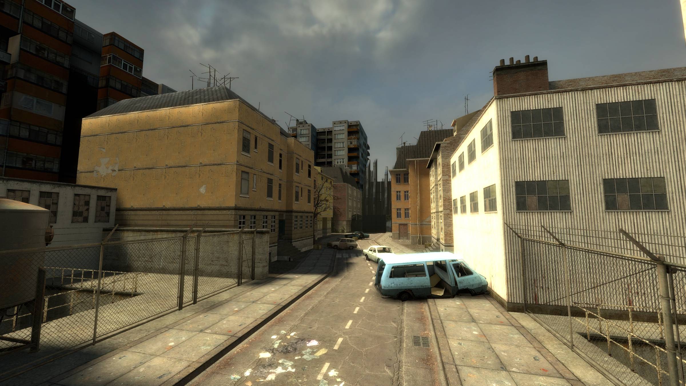
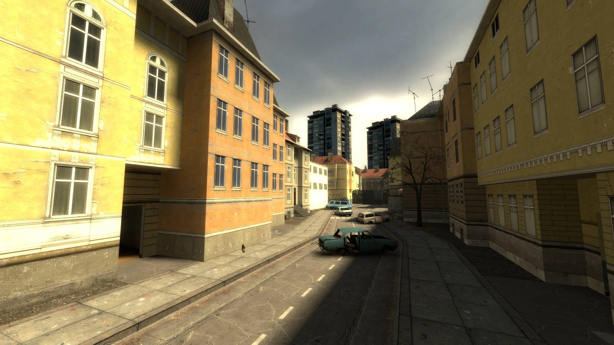
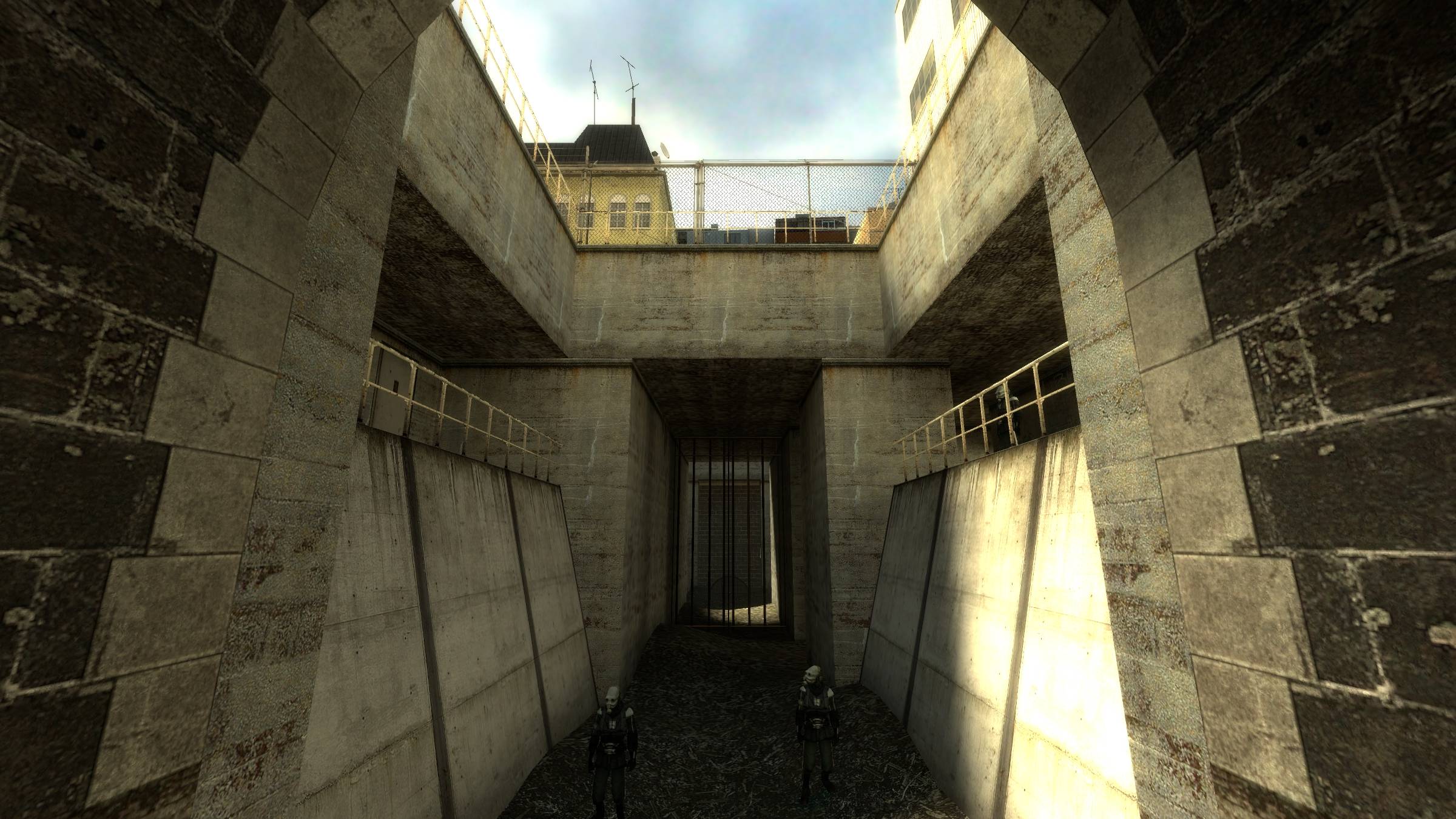
Technically not WIP but I have nowhere else to share HL2 work here.
Now that's a way to compliment a mapper.Not sure what I'm seeing here; it just looks like two locations from the actual game?
Had a go at remaking an old skybox after aui said a little trick for making your own clouds easily (the old one just uses the standard cloud overlay images).
(old)

(new)

The old one seemed to hit the mark on the shine more sadly. I tried to replicate it but it wasn't as easy as I'd hoped. Probably play about more tomorrow.
edit:

(old)

(new)

The old one seemed to hit the mark on the shine more sadly. I tried to replicate it but it wasn't as easy as I'd hoped. Probably play about more tomorrow.
edit:

Last edited:
I think the lighting on the old one is more vibrant and interesting (you can blend in a noise layer to help get rid of the banding btw).
Yea that's what I was trying to say, worded it really badly. The issue was I color-picked from the old one instead of going for a new cream, and I also did it slightly differently it seems (didnt have a long "flat" gradient at the bottom also).
Yea that's what I was trying to say, worded it really badly. The issue was I color-picked from the old one instead of going for a new cream, and I also did it slightly differently it seems (didnt have a long "flat" gradient at the bottom also).
Nah, you worded it fine, I just had a derp moment while reading.
Your skybox looks boxy. It's better if you assemble it in a 3D modeling software and render the six sides of the cube with a camera.


