WiP in WiP, post your screenshots!
- Thread starter Arhurt
- Start date
You are using an out of date browser. It may not display this or other websites correctly.
You should upgrade or use an alternative browser.
You should upgrade or use an alternative browser.
RataDeOrdenador
L5: Dapper Member
- Oct 12, 2015
- 230
- 105
I actually don't like that "building" near the CP,the grey one. It slighty reminds me of this Badwater section:
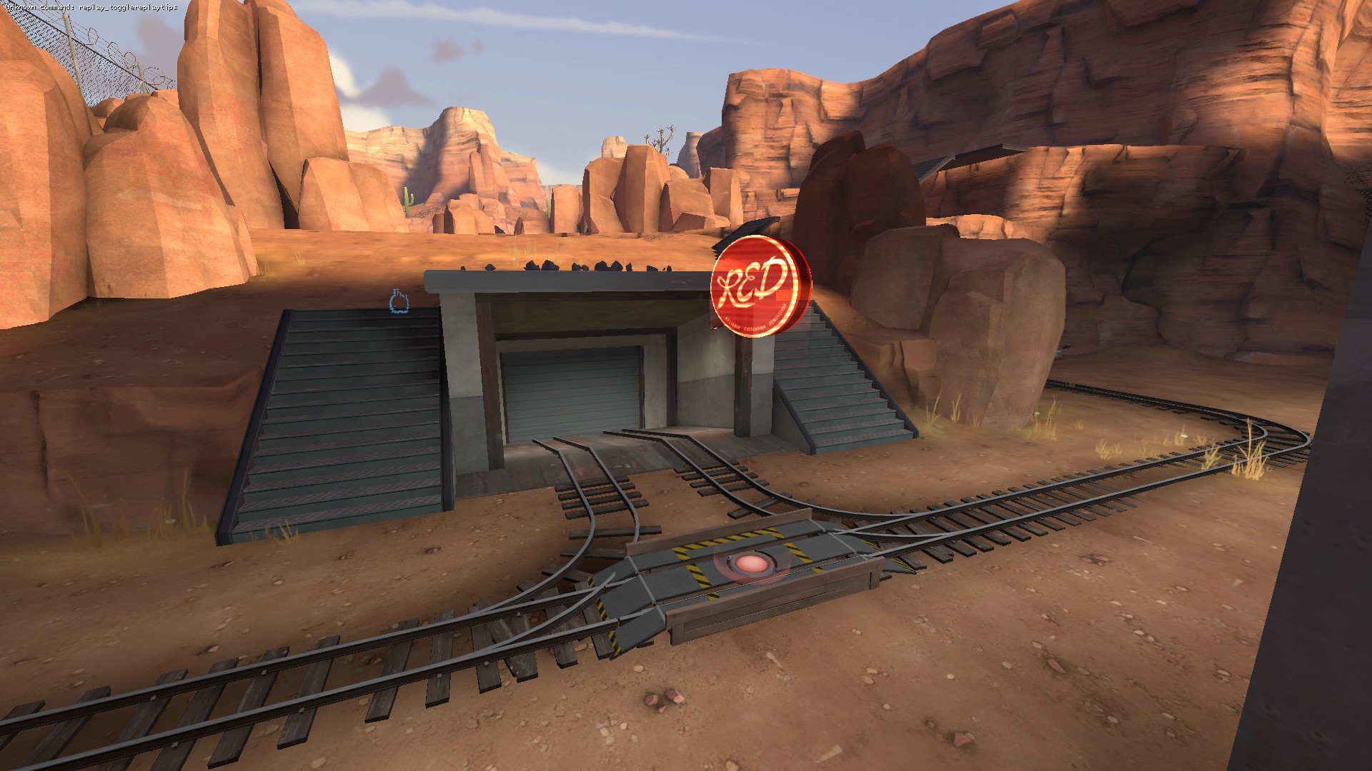
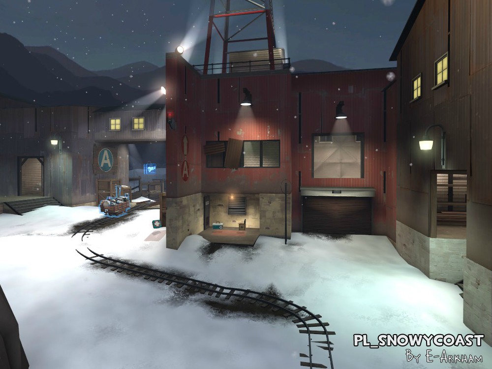
But I think you're actually trying to make it more like this Snowycoast part:
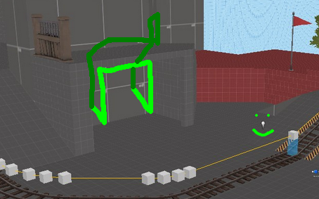
Either way,we'll see how it works. If it goes bad,MAYBE add a small path right here so people can escape/have another way to sneak attack the enemy team? (the dark green door leads to the RED platform.)
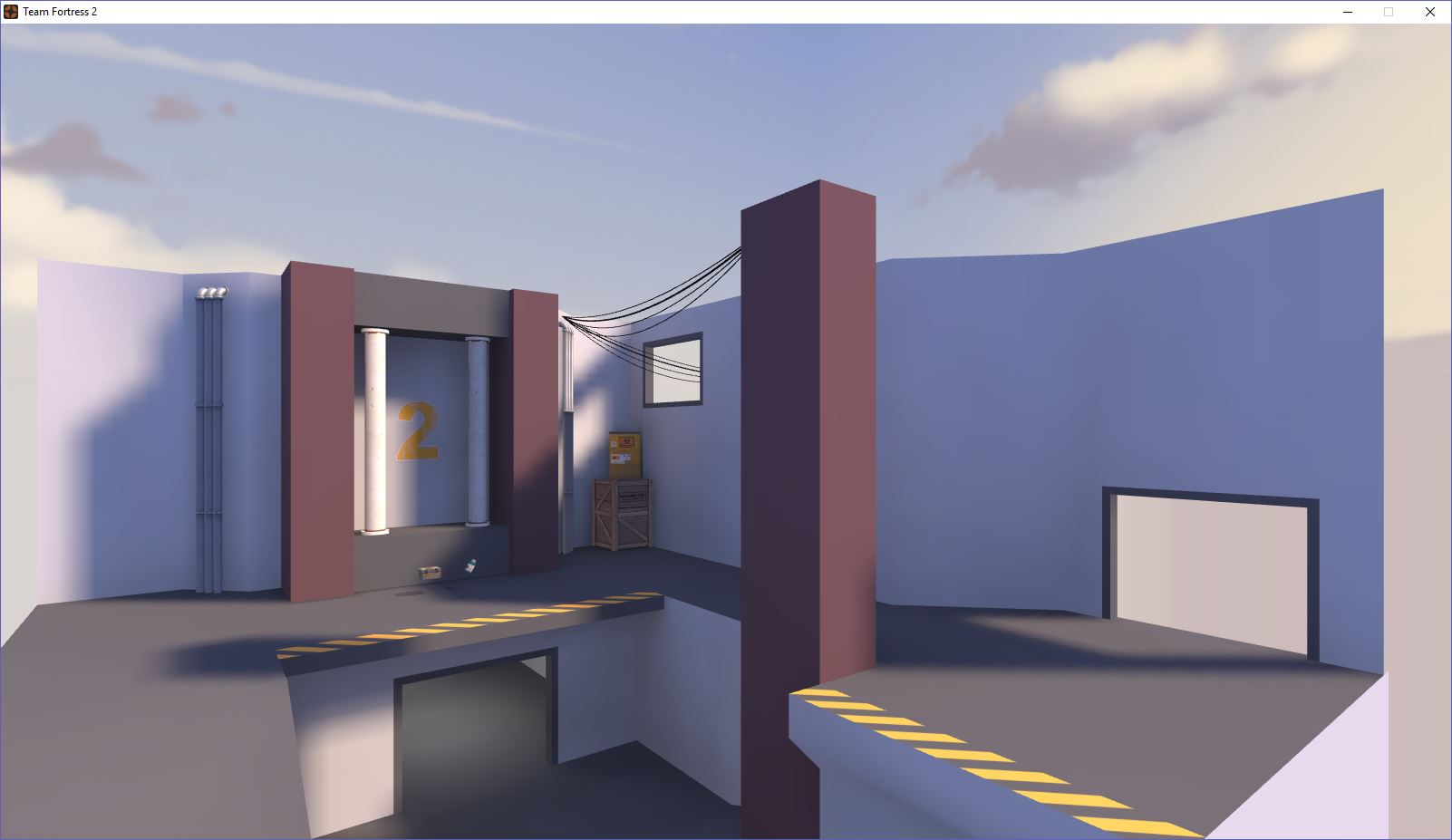
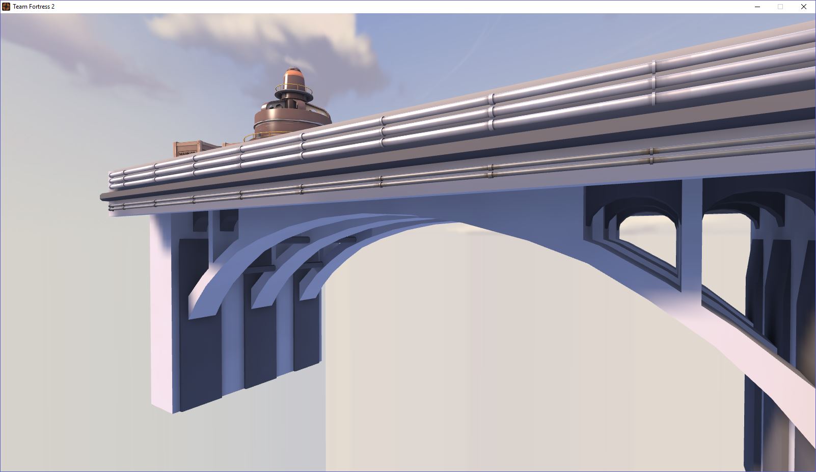
Very early of Shoreleave's new last
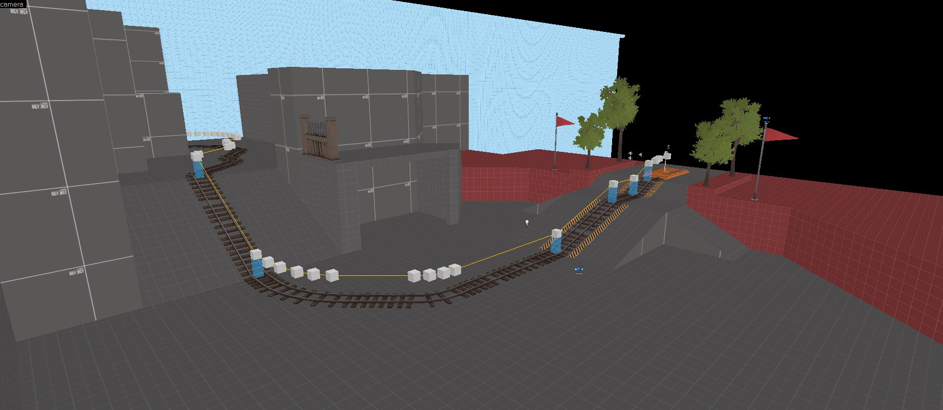
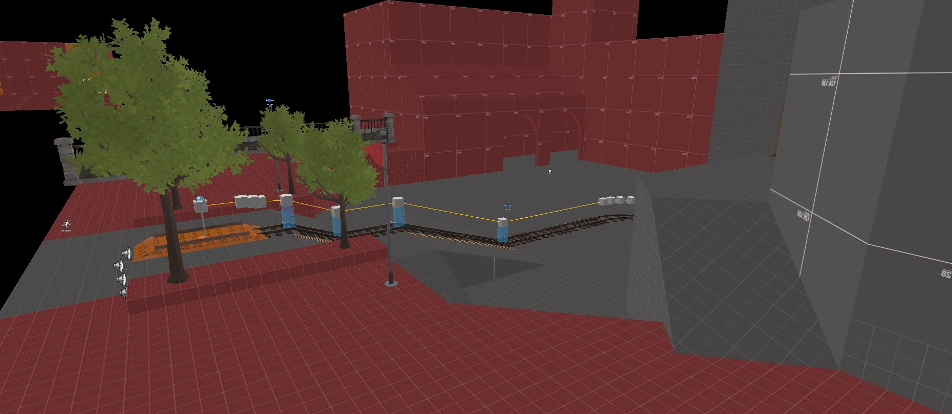
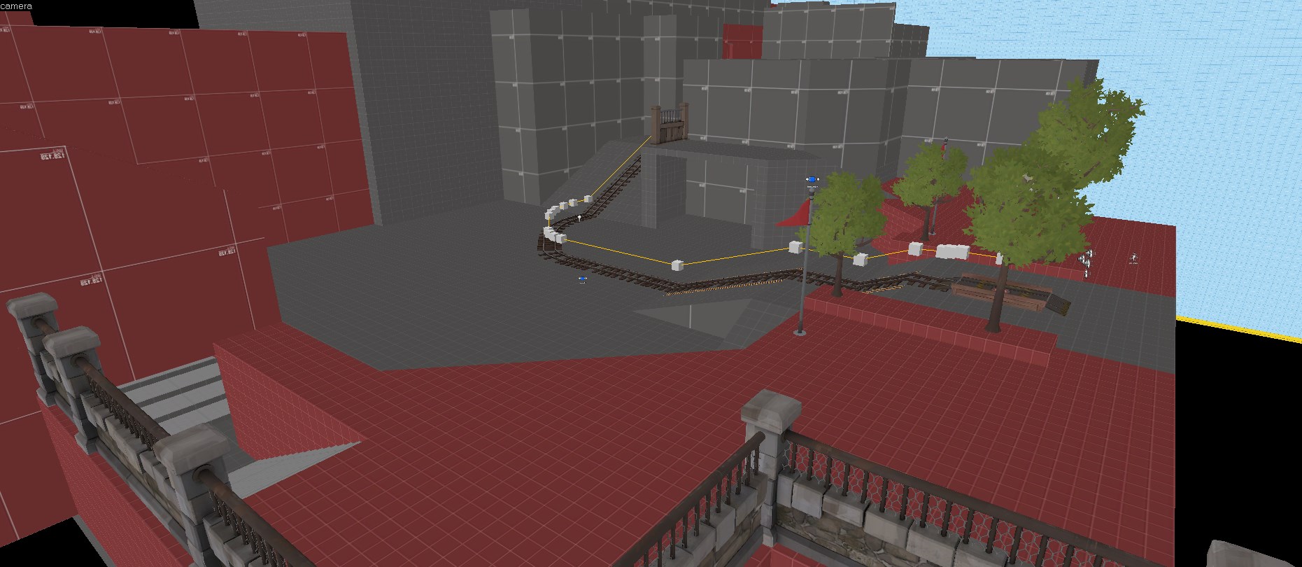
Still need to do the actual spawn room for red, but it's getting there.
Last time I saw a pic of Shoreleave's new last it was completely indoors and 'nearly finished'. You sure do iterate between versions.
Working in Ixem A24, im not getting much ideas of a better map design/sighlight
Your detailing is really good, TMB! But If you don't have any ideas for separating signlines, I suggest, you lower the spawns and but the middle building on a hill. Around 64-128 hammer units with a ramp about 1.5x that long should do it.
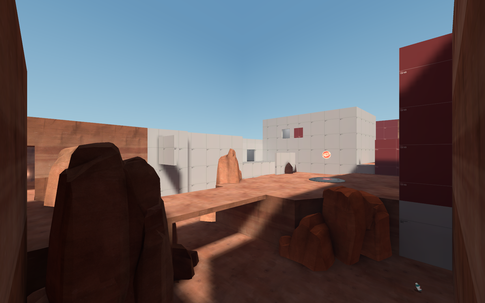
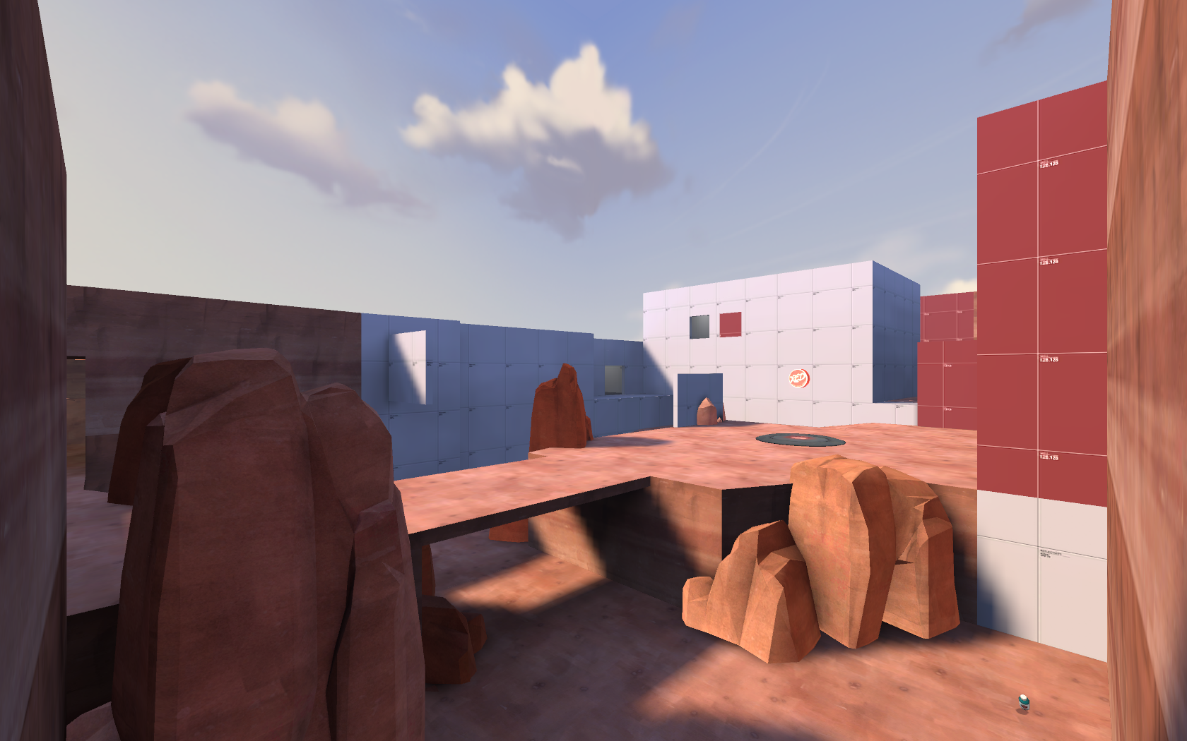
I made a demonstration of this on a tiny version of your map I quickly made in Hammer. (Or it would be tiny, if I didn't go overboard on the detailing.)
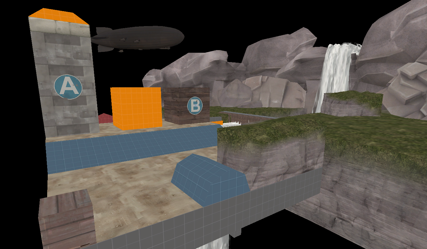
Wow, that little version of my map looks better than my map! Anyways i made that but the truth is that i feel like the map still empty... anyways thanks for that, that even gave me an idea...Your detailing is really good, TMB! But If you don't have any ideas for separating signlines, I suggest, you lower the spawns and but the middle building on a hill. Around 64-128 hammer units with a ramp about 1.5x that long should do it.
I made a demonstration of this on a tiny version of your map I quickly made in Hammer. (Or it would be tiny, if I didn't go overboard on the detailing.)

I'm (finally) working on Cruise again. The upcoming version (Beta 2) has 100% less Tom Cruise, and 250% more detailing. It even has a skybox now! All I need to do is add optimizations and a little more detailing, and It'll be done! But I won't finish it tonight. It's 2 am and I have things to do tomorrow.
Here's a quick isometric screenshot I took.

Here's a quick isometric screenshot I took.

Malachite Man
L6: Sharp Member
- Oct 16, 2015
- 392
- 250
I wish you the best of luck with that.I'm (finally) working on Cruise again. The upcoming version (Beta 2) has 100% less Tom Cruise, and 250% more detailing. It even has a skybox now! All I need to do is add optimizations and a little more detailing, and It'll be done! But I won't finish it tonight. It's 2 am and I have things to do tomorrow.
Here's a quick isometric screenshot I took.

THAT LOOKS AWESOME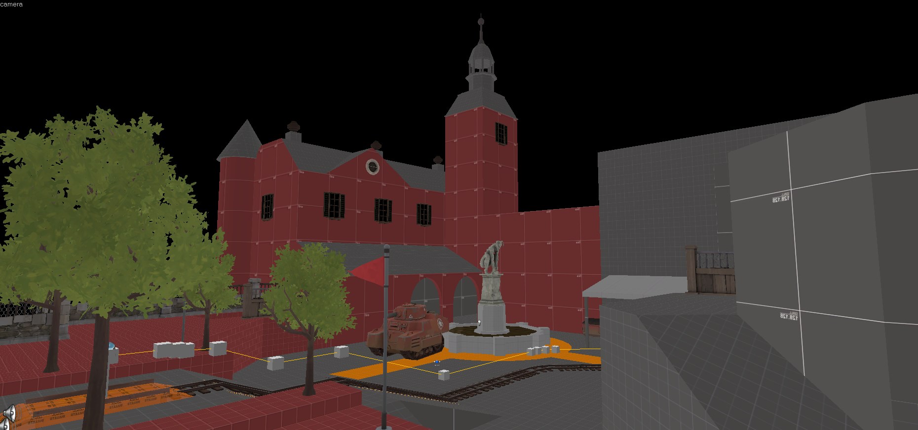
I like this building
- Aug 7, 2014
- 1,241
- 1,025
Looks great, but I never liked this habit of having the B sign split in half like that. There's a neutral-colored overlay you could use instead.
What do you think guys?
? How is called? Cause i never see it... i used that texture like standin did...Looks great, but I never liked this habit of having the B sign split in half like that. There's a neutral-colored overlay you could use instead.
i found it, its ''sign086''It was just called "sign" followed by a number as far as I remember, so you may need to hunt through the texture browser a bit to find it.

