WiP in WiP, post your screenshots!
- Thread starter Arhurt
- Start date
You are using an out of date browser. It may not display this or other websites correctly.
You should upgrade or use an alternative browser.
You should upgrade or use an alternative browser.
So im trying to detail Supplytrack
That displacement bridge does not look good, just keep it as a brush.
I also dont think the uppermost window on the further house in the first screenshot looks great / makes loads of sense - seeing as it just looks over a roof.
Otherwise this is looking pretty good. Nice job.
Edit: looking at it, the bridge doesnt look like its a displacement but multiple brushes - keep it as 1 solid looking bridge because this just doesnt look right.
Last edited:
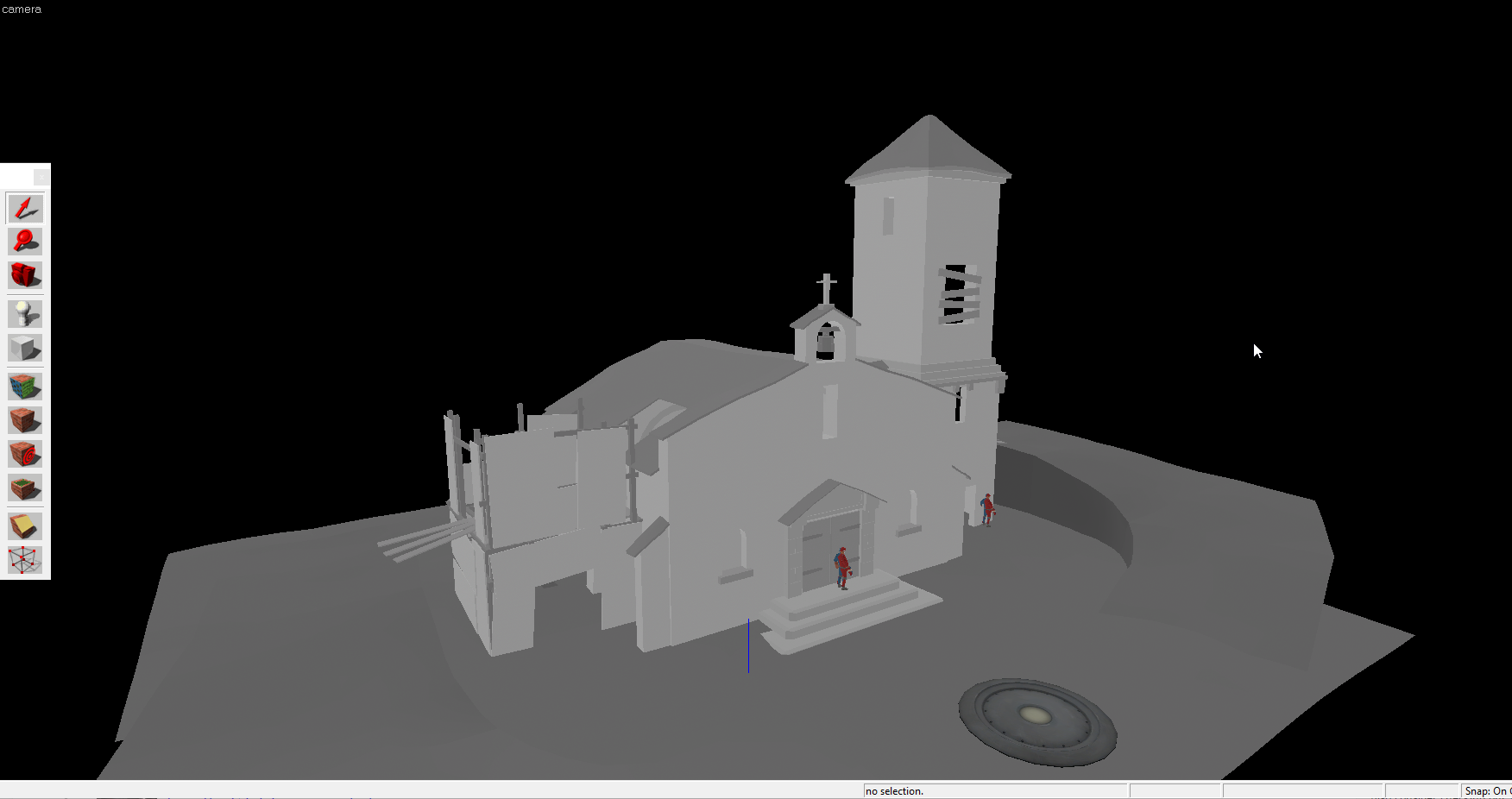
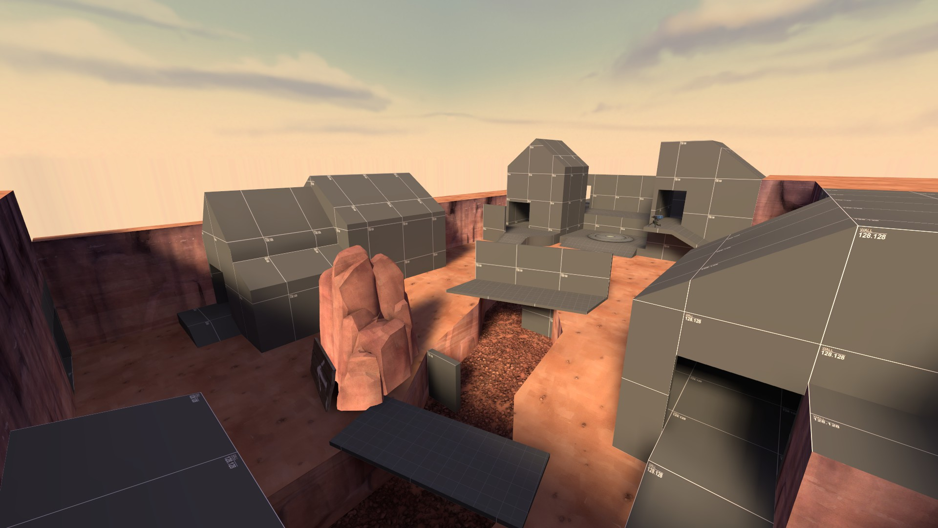
Had a spare few hours to do some mapping yesterday. Started greyboxing a new payload map. Think it's coming along nicely, but there's a killer sight line down the middle that i really don't want to deal with.

something about this screams cs:go, but for the life of me, i can't figure out what it is
something about this screams cs:go, but for the life of me, i can't figure out what it is
It's the lighting. It looks very dx11 hdr.
Soilbleed
L2: Junior Member
- May 7, 2015
- 64
- 246
something about this screams cs:go, but for the life of me, i can't figure out what it is
Could be the Dev Textures. Pretty similar to the CS:GO ones.
Last edited:
I got this building on the BLU side of my map that I'm out of ideas on how to texture and detail:

Here's the same building on RED side for comparison:

For some reason when I'm making RED buildings I got plenty of ideas, but when it comes to BLU... I got very few ideas. Maybe it's just lack of good textures for BLU buildings...

Here's the same building on RED side for comparison:

For some reason when I'm making RED buildings I got plenty of ideas, but when it comes to BLU... I got very few ideas. Maybe it's just lack of good textures for BLU buildings...
For some reason when I'm making RED buildings I got plenty of ideas, but when it comes to BLU... I got very few ideas. Maybe it's just lack of good textures for BLU buildings...
You're going wood for red. Well do what 2fort does and go with metal for blue. Think cold warehouse.
I don't really like these metal textures though - these vertical holes make these textures look very repetitive:

RED has variety of brick and wood textures for their buildings, along with some metal textures.
BLU on the other hand has very few concrete and metal walls...

RED has variety of brick and wood textures for their buildings, along with some metal textures.
BLU on the other hand has very few concrete and metal walls...
RataDeOrdenador
L5: Dapper Member
- Oct 12, 2015
- 230
- 105
I don't really like these metal textures though - these vertical holes make these textures look very repetitive:
RED has variety of brick and wood textures for their buildings, along with some metal textures.
BLU on the other hand has very few concrete and metal walls...
You can always cut the brushes where those vertical holes start and move the textures so there's only metal. Might be "hard",strange-looking.. Who knows? It's the only idea I can think of. D;
- Oct 11, 2013
- 273
- 413
RED architecture has always been more interesting and more fun to detail compared to BLU. Look at 2fort or Well for example.For some reason when I'm making RED buildings I got plenty of ideas, but when it comes to BLU... I got very few ideas. Maybe it's just lack of good textures for BLU buildings...
Maybe you can do something similar to the RED side but with the white brick and blue concrete materials. I don't think metal would fit in this building, mainly because of those holes.
I'll figure something out I guess...
Meanwhile, I made this snow overlay for walls (personally I think it's horrible):

Meanwhile, I made this snow overlay for walls (personally I think it's horrible):

welcome to the future of mapping

IT'S HAPPENING
holy shit how did you manage to automate cubemap generation?
also i never knew you could manually specify the number of light bounces
edit: woo 700th post
holy shit how did you manage to automate cubemap generation?
game launch option abuse mostly


