WiP in WiP, post your screenshots!

seth

aa
May 31, 2013
1,019
851
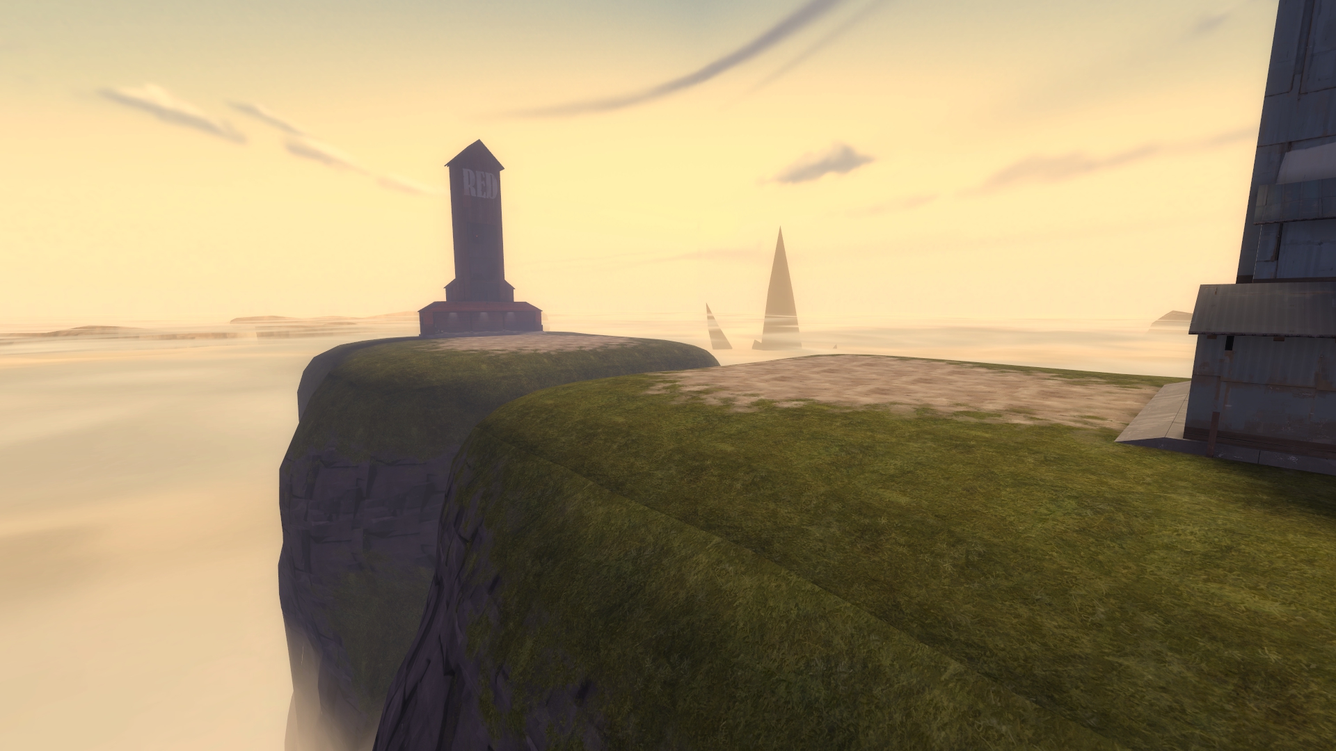
raised my tfdb map about 10,000ft.

due9PGW.jpg
 

Kube

Not the correct way to make lasagna
aa
Aug 31, 2014
1,342
1,850
Yeah, I know. They use the same grass in the blend but I can't figure out how to make the transition seamless.

Is it a texture problem, rather than a geometry problem? If so, have you tried alt+M2 texture alignment?

Skybox/fog looks awesome btw.
 

seth

aa
May 31, 2013
1,019
851
Is it a texture problem, rather than a geometry problem? If so, have you tried alt+M2 texture alignment?

Skybox/fog looks awesome btw.

Yeah, it's the texture. They are two separate textures though, so I can't just do the alt+M2 thing. The cloud cover assets are courtesy of ABS.
 

Idolon

they/them
aa
Feb 7, 2008
2,123
6,137
The problem is that you'd be trying to match the top of your cliff texture to all four sides of the ground texture. I think your best bet is to just ditch the cliff blend and make the seam look like an an obvious switch between textures rather than a graphical glitch.
 

MaccyF

Notoriously Unreliable
aa
Mar 27, 2015
915
1,545
Yeah, it's the texture. They are two separate textures though, so I can't just do the alt+M2 thing. The cloud cover assets are courtesy of ABS.

The problem is that you'd be trying to match the top of your cliff texture to all four sides of the ground texture.
select all the adjacent displacements, face-edit, treat as one, center

that should do it iirc
 

re1wind

aa
Aug 12, 2009
644
588
looks like a smoothing group issue which is caused by, as mentioned above, the textures not lining up correctly. i think you can force them to be smooth and get rid of the lighting line, but that may still leave the misaligned textures.
 

Idolon

they/them
aa
Feb 7, 2008
2,123
6,137
s5QoVJZ.png

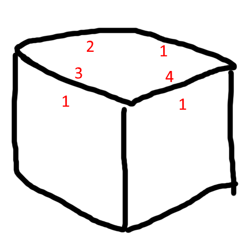
A seamless texture would be made so that 2 lines up with 4 nicely, and 1 lines up with 3 nicely, so the seam to the cliff on the left would look fine. However, the cliff on the right has a seam, since 4 and 1 don't line up with each other. Rotating the cliff texture so that its 2 lines up with the 4 would make the seam disappear, but you'd then have a sideways cliff (and it would also have a seam with the cliff on the left). If it was possible to unwrap a cube without texture seams, you wouldn't be unwrapping it.

You can try experimenting with $seamless_scale. I can't guarantee it'll look nice, but it's worth experimenting with if you want to try and keep the grass. That said, I'd recommend ditching the grass blends on the cliffs anyways, since it's kinda hard to tell what the player can stand on at the moment. Having an obvious and intentional texture seam would differentiate ground from cliff nicely. (You may also want to reshape the cliff top edges to make the "tipping point" between ground and ledge more obvious if you decide to go this route.)
 

seth

aa
May 31, 2013
1,019
851
select all the adjacent displacements, face-edit, treat as one, center

that should do it iirc

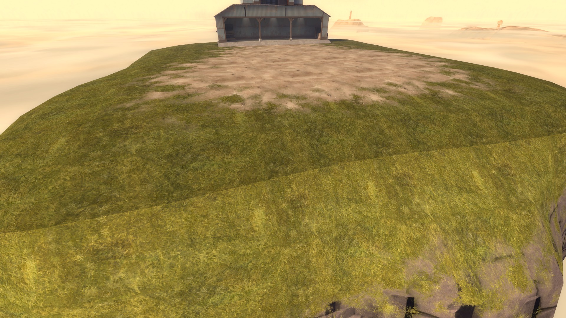
This actually did the trick for the alignment, but the lighting is still wildly different. Smoothing groups do not help.

uuxiyLg.jpg

s5QoVJZ.png

A seamless texture would be made so that 2 lines up with 4 nicely, and 1 lines up with 3 nicely, so the seam to the cliff on the left would look fine. However, the cliff on the right has a seam, since 4 and 1 don't line up with each other. Rotating the cliff texture so that its 2 lines up with the 4 would make the seam disappear, but you'd then have a sideways cliff (and it would also have a seam with the cliff on the left). If it was possible to unwrap a cube without texture seams, you wouldn't be unwrapping it.

You can try experimenting with $seamless_scale. I can't guarantee it'll look nice, but it's worth experimenting with if you want to try and keep the grass. That said, I'd recommend ditching the grass blends on the cliffs anyways, since it's kinda hard to tell what the player can stand on at the moment. Having an obvious and intentional texture seam would differentiate ground from cliff nicely. (You may also want to reshape the cliff top edges to make the "tipping point" between ground and ledge more obvious if you decide to go this route.)

I am planning on refining the shape more, I agree that it is difficult to tell where you can stand with the current roundness and blend. The roundness also greatly reduces the flat area of course, will need to increase the size.
 

AsG_Alligator

qhull precision error
aa
Aug 5, 2016
620
1,223
So, I got this old map I never finished, and I thought: now that Frontline project showed up, why not make it a Frontline map?

upMm5Pb.jpg


Displacement snow-covered rooves ftw.
 

Jusa

aa
May 28, 2013
380
620
This actually did the trick for the alignment, but the lighting is still wildly different. Smoothing groups do not help.

uuxiyLg.jpg

Did you compile with HDR? iirc I had something similar when I did not compile with HDR, no idea why that would affect it at all tho.