WiP in WiP, post your screenshots!

UKCS-Alias

Mann vs Machine... or... Mapper vs Meta?
aa
Sep 8, 2008
1,264
817
Hey, a couple screenshots of my updated map.

5H5I6Fa.png

IV7esX0.png

usYicbP.png

0NNx3Y0.png

cV9gsGZ.png

LO955F6.png

OxAIKpx.png
tcHVl9F.png

8WPUnZa.png

DMJZWaw.png

gEIRCke.png
Although it looks good i also have the feeling its slightly overdetailed. Everywhere i look it shows details. That might be because you only made screenshots of focus areas. But its something worth noting as overdetailing has negative effects on gameplay. I just hope im wrong at it being overdetailed though as the screenshots look excelent.
 

Flower_Shop_Guy

♪ -- ♫ -- ♪
aa
Mar 10, 2015
200
495
Although it looks good i also have the feeling its slightly overdetailed. Everywhere i look it shows details. That might be because you only made screenshots of focus areas. But its something worth noting as overdetailing has negative effects on gameplay. I just hope im wrong at it being overdetailed though as the screenshots look excelent.
With the full optimization (Areapotals, Hints, Model draw distance and etc.), FPS at ~10-15% less than on detailed and large Valve maps.
For instance, аt hard detaled Valve maps i get around ~170-230FPS average, at my map (b1) I get around ~160-210(220)FPS. With 32 Bots ~110-150(valve), mine ~90-150FPS.
Also my PC spects: i5 4690K @4.5Ghz/8GB/GTX660 2GB.
 

TyeZenneth

L6: Sharp Member
May 31, 2014
340
294
That's not the negative effects we're getting at. Too much clutter can make it hard to draw the eye where you want it to go. We'll have to play the map to see how it works out, though.
 

Shogun

L6: Sharp Member
Jan 31, 2014
260
221
My internet died last night so I made this just for fun.

0Y1RuW0.jpg

1zIGWXs.jpg

It's de_nuke from Counter-Stike for those who are unfamiliar with the game.

EDIT: page 666, neato :pyro::pyro:
 

hutty

aa
Mar 30, 2014
547
446
I am curious as to how you plan to get the door working.
Otherwise, looks decent, some directional light coming from the windows wouldn't hurt though.
 
Oct 6, 2008
1,965
450
This page number is evil - Pure Evil!!!!
 

Vel0city

func_fish
aa
Dec 6, 2014
1,947
1,589
I don't understand what all the fuzz is about with the whole page 666 ting. We're at 267... Ooooooooooooooooooh riiiiiiiight #50postperpagemasterrace.
 

Zed

Certified Most Crunk™
aa
Aug 7, 2014
1,241
1,025
I don't understand what all the fuzz is about with the whole page 666 ting. We're at 267... Ooooooooooooooooooh riiiiiiiight #50postperpagemasterrace.
#elitismoverpettyandunimportantthings
 

tyler

aa
Sep 11, 2013
5,100
4,621
This thread has been going for over 7 years. Have fun celebrating all the fun page numbers alone in 2019-2023.
 

Shogun

L6: Sharp Member
Jan 31, 2014
260
221
I am curious as to how you plan to get the door working.
Otherwise, looks decent, some directional light coming from the windows wouldn't hurt though.

This wasn't really meant to be a playable map, just something to waste time on. I might make the rest of the map if I get bored.
 

grazr

Old Man Mutant Ninja Turtle
aa
Mar 4, 2008
5,441
3,814
Agreed, at the risk of criticising what has otherwise turned out to be quite pretty, in the application of actual gameplay you have a lot of visual noise. It's next to impossible to tell where the important areas are and it should also be noted players tend to focus on doorways and stuff that lays at a player horizontal plane, so details above and beyond will be 90% ignored by a player focusing on threats such as other players in the play area. So a lot of your details on the roofs are superfluous.

Another consideration to make is that static detail is only a portion of the detail that will be rendered and will not perform the same with 23-31 more players all shooting rockets and grenades at each other; and performance spikes that occur when moving between areas will be an issue.
 

YM

LVL100 YM
aa
Dec 5, 2007
7,158
6,079
Detailing Honeyville
6F888723FAF5201B72560711235B22D7E95D5A2C

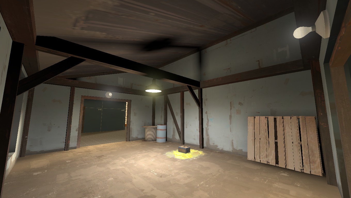
Stop putting light entities underneath lampshades. Stop.

Everybody stop.

A light like this casts down. There shouldn't be a shadow of the shade on the ceiling because it should be on the walls, light from that fixture is going to go no higher than dead horizontal and most of it will be going down.

If you have to light your ceilings artificially, do it way more subtly!
 
Oct 6, 2008
1,965
450
Couldn't they just make the props non-shadow to stop that?
 

Muddy

Muddy
aa
Sep 5, 2014
2,581
4,597
In koth_viaduct the cone lights in the spawnrooms are light entities (not light_spot entities) and just above them are disc-shaped brushes with the blocklight texture applied to them. Fun fact.
 

tyler

aa
Sep 11, 2013
5,100
4,621
In koth_viaduct the cone lights in the spawnrooms are light entities (not light_spot entities) and just above them are disc-shaped brushes with the blocklight texture applied to them. Fun fact.
Yep, actually plenty of Valve maps do this.
 

YM

LVL100 YM
aa
Dec 5, 2007
7,158
6,079
That works if the light is pretty close to the blocklight, if it's significantly below you still get the unusual looking circle on the ceiling
 

ExtraCheesyPie

L420: High Member
Jan 29, 2015
485
151
The most interesting spawnroom i've came up with so far:

Isn't that one of the spawns from cp_snowplow? Granted I only played it 3 times, but I seem to remember one of the spawns being just like this.
 
Last edited:
S

saph

jSBXMK9.jpg

This is one of the cabins (or a shack with love put into it) I've been working on for over an hour. The invisible is actually a block. This is totally not for the Dynamic CP Contest....