WiP in WiP, post your screenshots!
- Thread starter Arhurt
- Start date
You are using an out of date browser. It may not display this or other websites correctly.
You should upgrade or use an alternative browser.
You should upgrade or use an alternative browser.
- Sep 5, 2009
- 912
- 684
I recommend not using the Well water. Geez, I knew it was blue (as in, it had blue fog as opposed to the brownish that all the other water materials have), but I had no idea it was literally tinted like that.
What's wrong with Well's water..? I like it.
I recommend not using the Well water. Geez, I knew it was blue (as in, it had blue fog as opposed to the brownish that all the other water materials have), but I had no idea it was literally tinted like that.
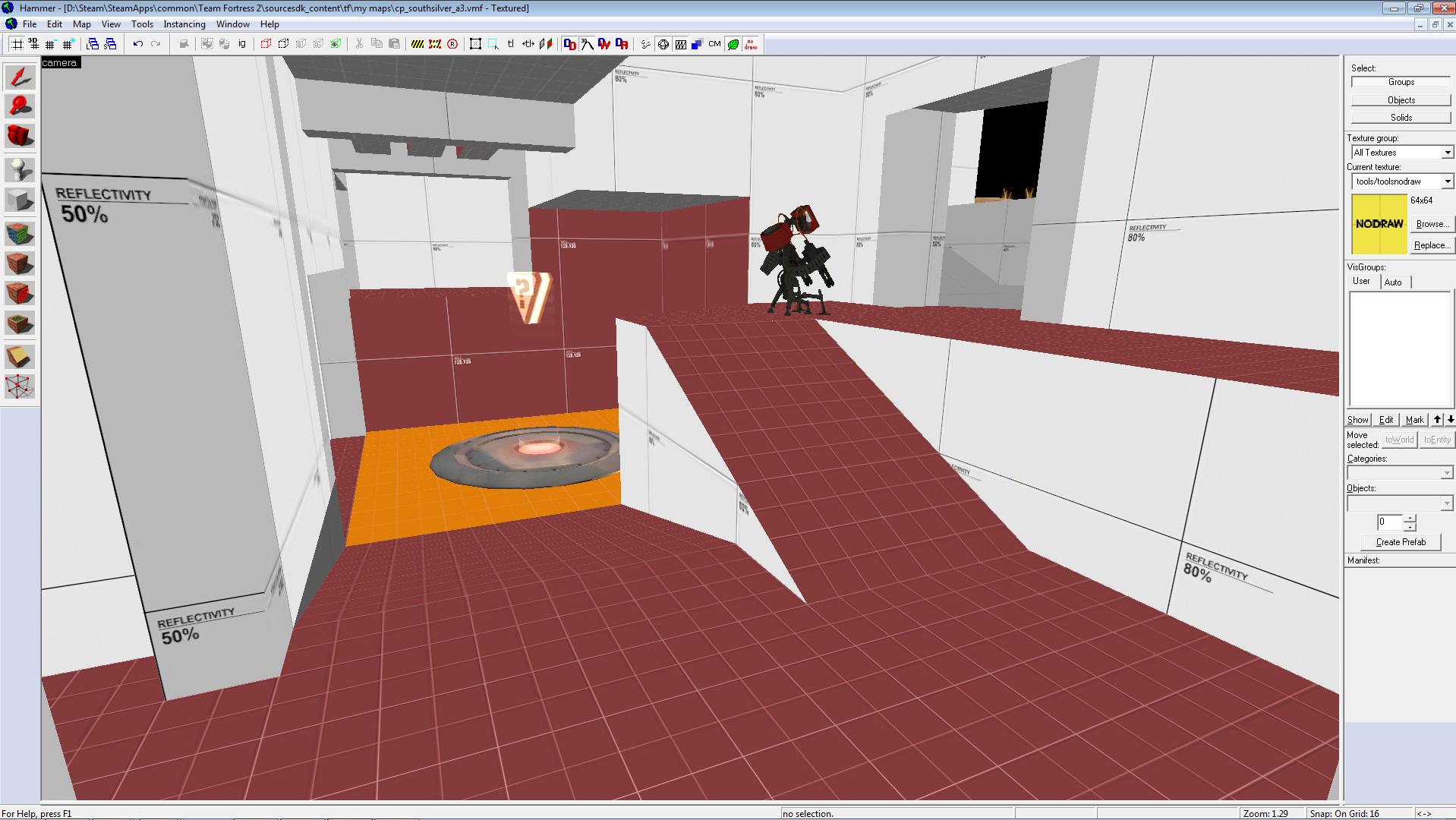
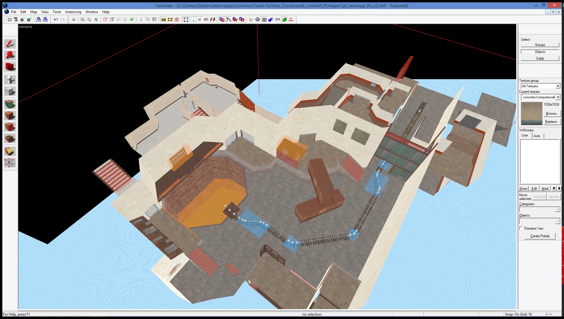
Actually, this isn't the Well water, but the Hydro water! If I get complaints during testing (when people are running about and interacting with it), I'll see about changing it. Personally, I think it looks pretty good, minus the brown band right across it (see the first screenshot). The Hydro water texture is the only one that shows as translucent in the 3D viewport, and the cart track below needs to be visible. I'm not exactly sure how other water textures handle visibility.
Who knows, maybe I'll completely get rid of the water there. I know comp dislikes it (even though I wouldn't say that the maps is the most rocketjump-friendly).
Thematically, the map is designed around a facility to change an artificial lake's water level. I wouldn't imagine the water in a lake set next to a Hydro-style facility would be too murky.
I'm rambling here; you should hopefully see the map out tomorrow.
Hydro water is considered ugly because it doesn't reflect or refract which makes it look like it's solid and you're playing on ultra low settings with a DX8 config. The cart track will be visible in shallow water that reflects and/or refracts and if it doesn't I recommend copying the .vmt from Well's or 2Fort's water and edit the fog values to make it look clearer and then using that edited water. Don't forget to pack it though.
Today I managed to flip the normals of a brush in hammer (and it's still a valid solid)
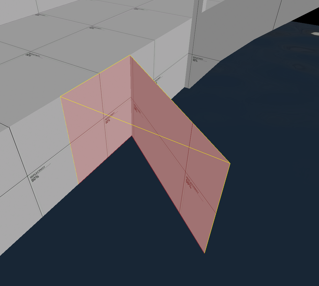
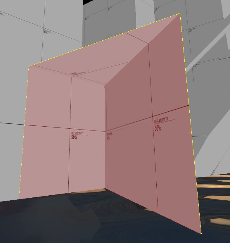
The map compiles file, vbsp reports no errors, however the map doesn't run in game because:
"Host_EndGame: Map coordinate extents are too large!!
Check for errors!"
And thus concluded my adventure in hammer for the day.


The map compiles file, vbsp reports no errors, however the map doesn't run in game because:
"Host_EndGame: Map coordinate extents are too large!!
Check for errors!"
And thus concluded my adventure in hammer for the day.
Unh3lpful
L2: Junior Member
- May 6, 2015
- 95
- 50
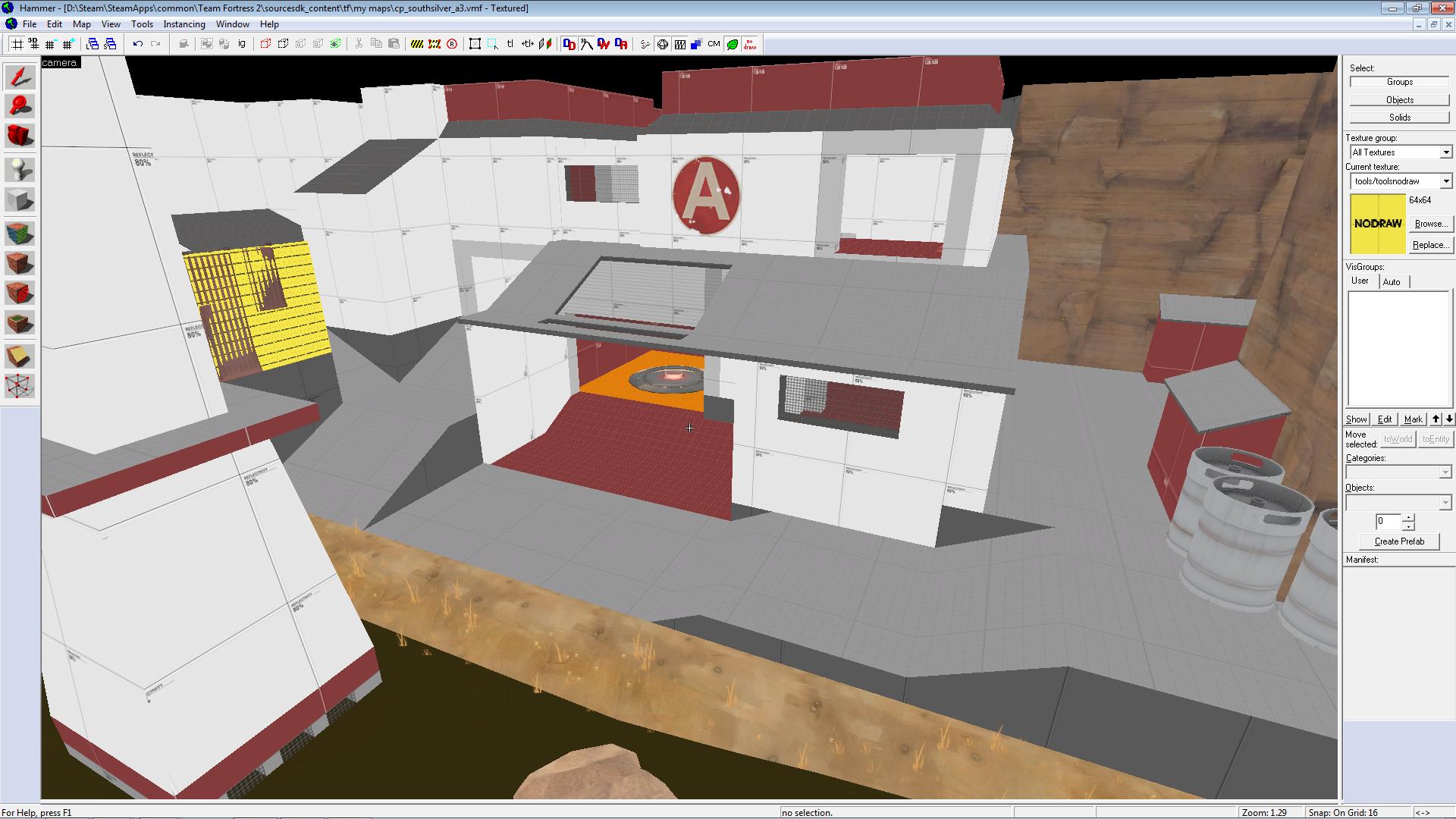
Some detailing practice I've been doing:
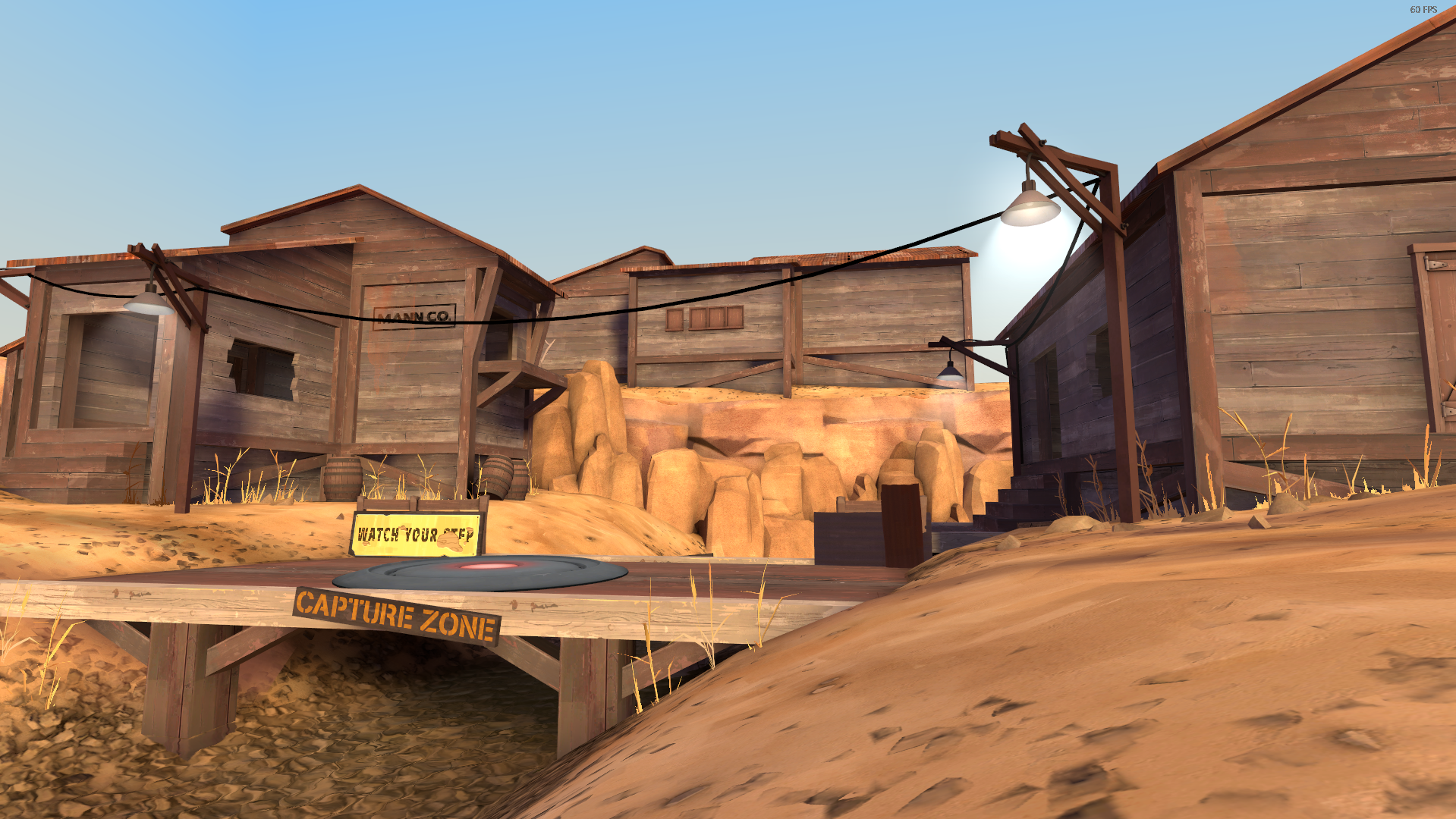
I love that jagged wooden window but I think the capture zone sign could be a little less slanted, it looks kind of silly.
Today I managed to flip the normals of a brush in hammer (and it's still a valid solid)
I'm not even going to ask how you managed that...
quite easy actually.
describing this is quite challenging actually.
make a square/cube. On the top(xy) view window clip the top right part off to leave a 45/45/90 triangle, or the bottom left part of the square.
Now enter vertex-editing mode and move the top vertex 'downwards', relative to the top(xy) view window. Voilà.
Sadly, you cannot carve or hollow the inverted block, hammer doesn't crash either, which is really strange.
edit:
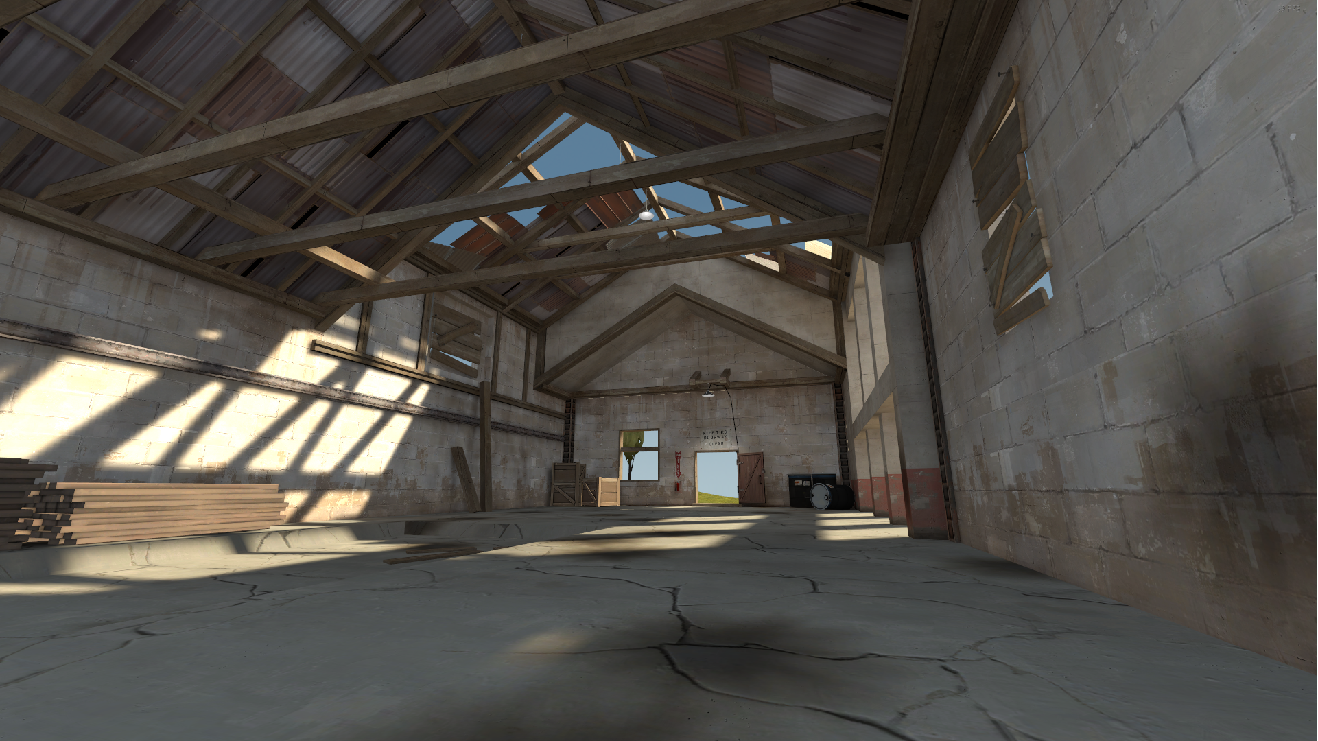
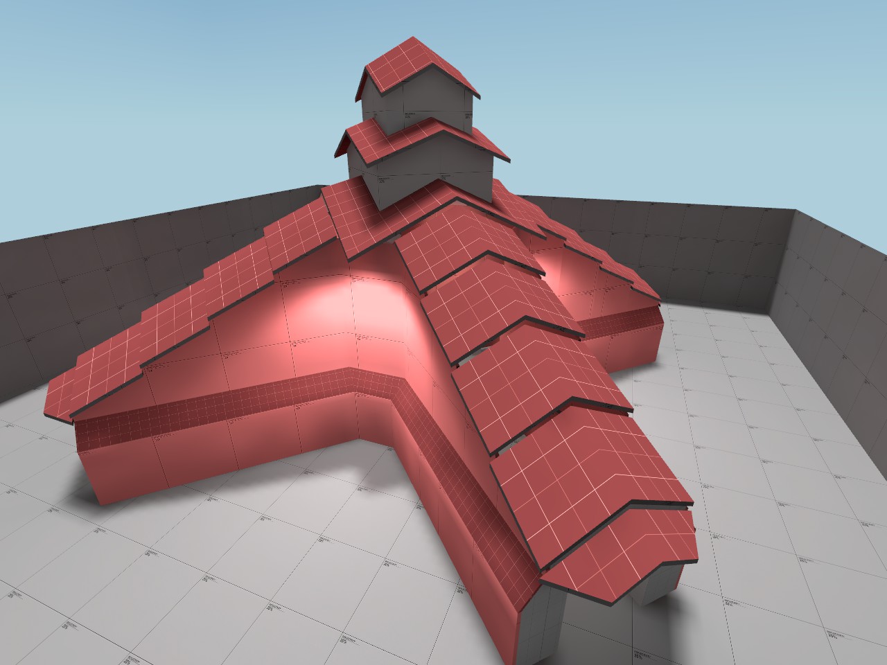
Some kind of wacky hybrid between western barns and asian pagodas... built completely at 45° to the grid for additional challenge.

Last edited:
Kill_the_Bug
aa
- Oct 6, 2008
- 1,969
- 451
For the space theme i ran against a wall called valve.
Im quite poor at creating new styles. I generaly need a resource to use as base for styling. From that i am able to create my own styles. rd_asteroid on that was a pain as the map was mostly prop based. And without them it just didnt look good. it was just a basic flat shape. At the distance of the screenshots it might look good, but standing close and you noticed it wasnt.
Look at my mpl_losthorizon map - does that re-inspire you pick the space theme back up?
I already looked at it but it didnt re-inspire me. And probably in the current state its going to be very hard to get me back into the space theme unless valve suddenly has asteroid completely detailed.Look at my mpl_losthorizon map - does that re-inspire you pick the space theme back up?
The problem lies in the style of your map. Its space for sure, thats something i wont deny, it fits the space theme well, but its too far from the style i would expect it to be (i find that map having a quite high contrast). Even if i tried i probably couldnt get it to look the way i want it to be.
I would expect it far closer to how asteroid looks at its middle which still is very close to the usual tf2 style. The textures are just metalic textures similar to the concrete version. And that is a style i prefer more.
For the egypt style i currently use, i look at egypt more than lakeside because i like the egypt geometry much more than lakeside. Although the displacement work on egypt is somewhat lacking.
Dont give the map a name too early. Wait until you got a style for the map. Most of my maps went to multiple names before even the first version was released. Only once you have a target on the style you can come up with a good name.
"Just industrial" is not a refined enough style. Is it a factory, is it a warehouse, what is being made/transported, what are you protecting/trying to blow up, what are they trying to achieve? These are all questions you should ask. And by answering those you can start creating a name. And sometimes that needs a finished map.
For sake of it you can just call it pl_paulmega_industrial_a1 while the name is unknown. And that name might even be suitable for testing since im quite sure no one would take such name for a map.
Also for a payload map i find the spawn entrance too close to the capture area. It will very likely make it easy to defend which is something that might be very dangerous and boring. Would you want the defenders standing in the spawn doorway as they are harder to be hit there? Ensure that the capture area is out of the direct view from the spawn. Idealy most of the payload track even should be. And if they can see it, then they should be able to recieve the focus of the attackers without it instantly turning into spawn killing.


