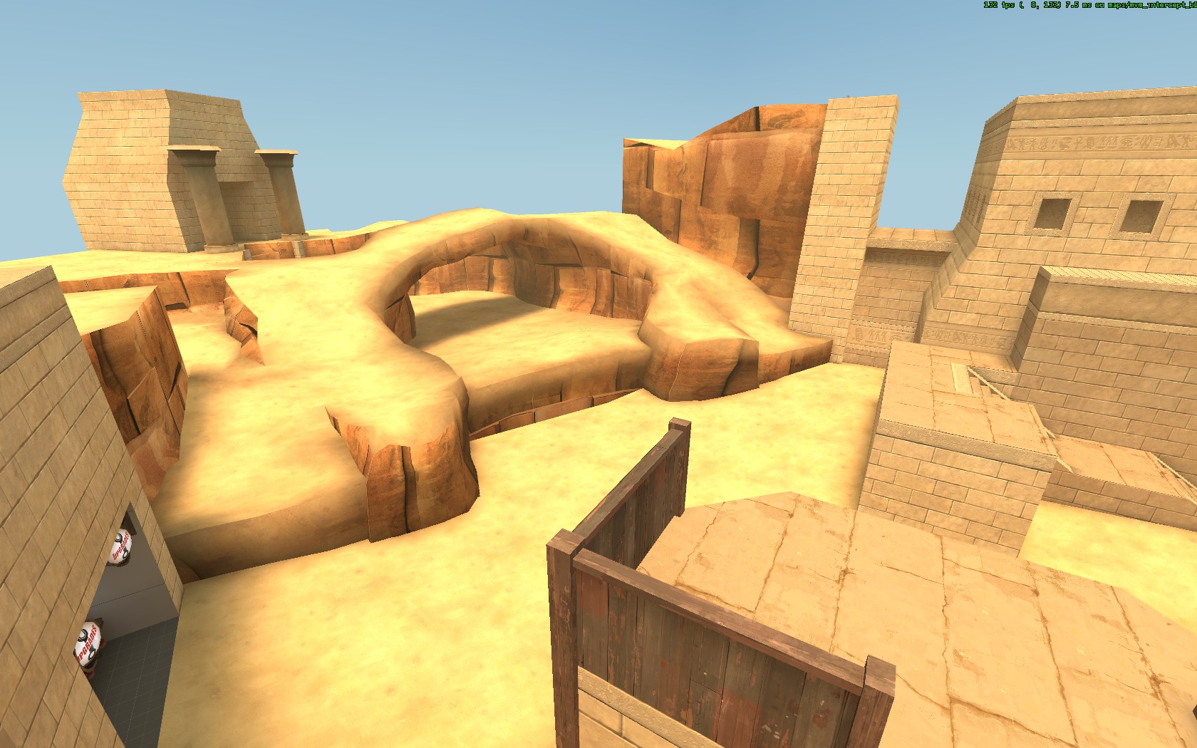
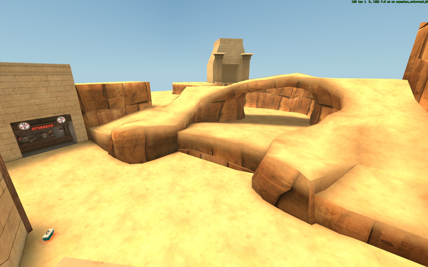
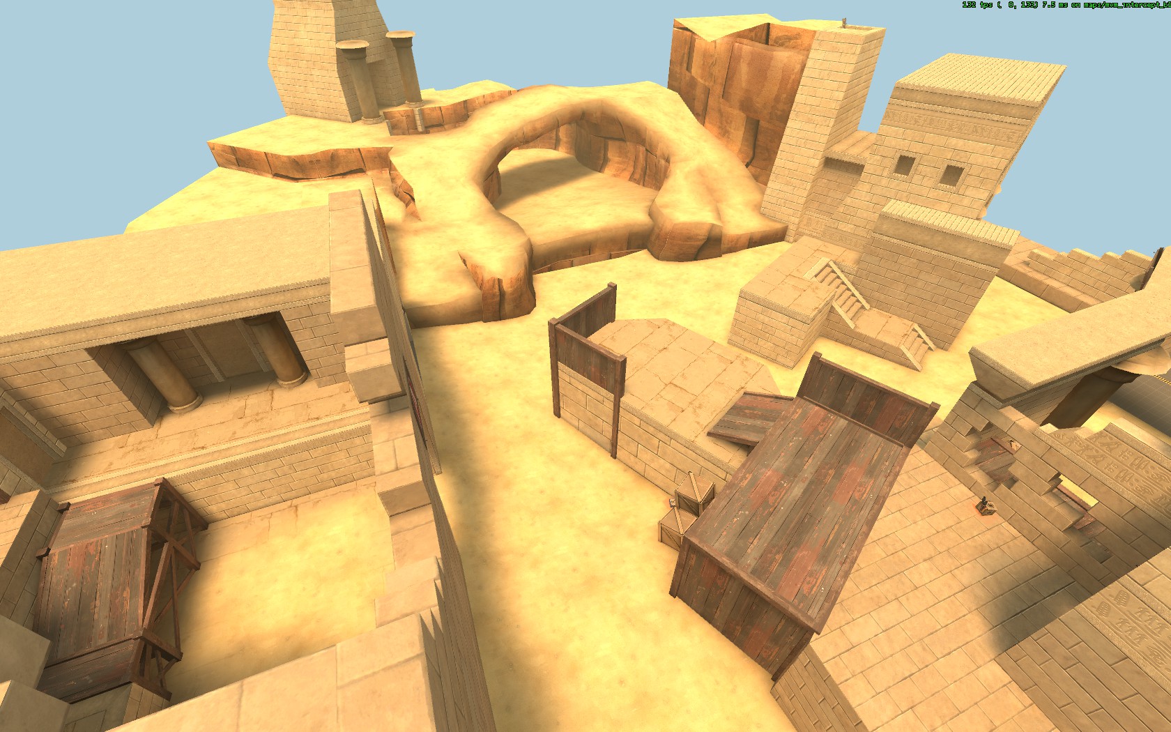
WiP in WiP, post your screenshots!
- Thread starter Arhurt
- Start date
You are using an out of date browser. It may not display this or other websites correctly.
You should upgrade or use an alternative browser.
You should upgrade or use an alternative browser.
Bull
L4: Comfortable Member
- Aug 30, 2011
- 193
- 144
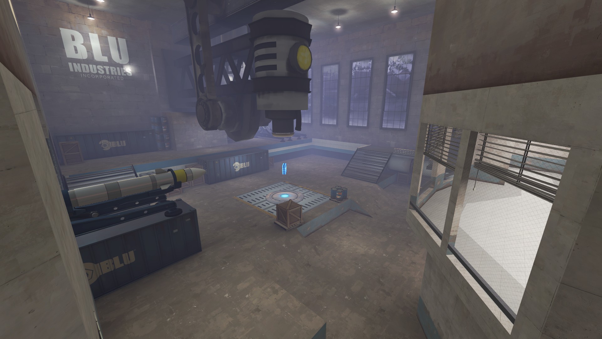
Dont give the map a name too early. Wait until you got a style for the map. Most of my maps went to multiple names before even the first version was released. Only once you have a target on the style you can come up with a good name.
Fair enough, I'll think of a name when I get a theme down.
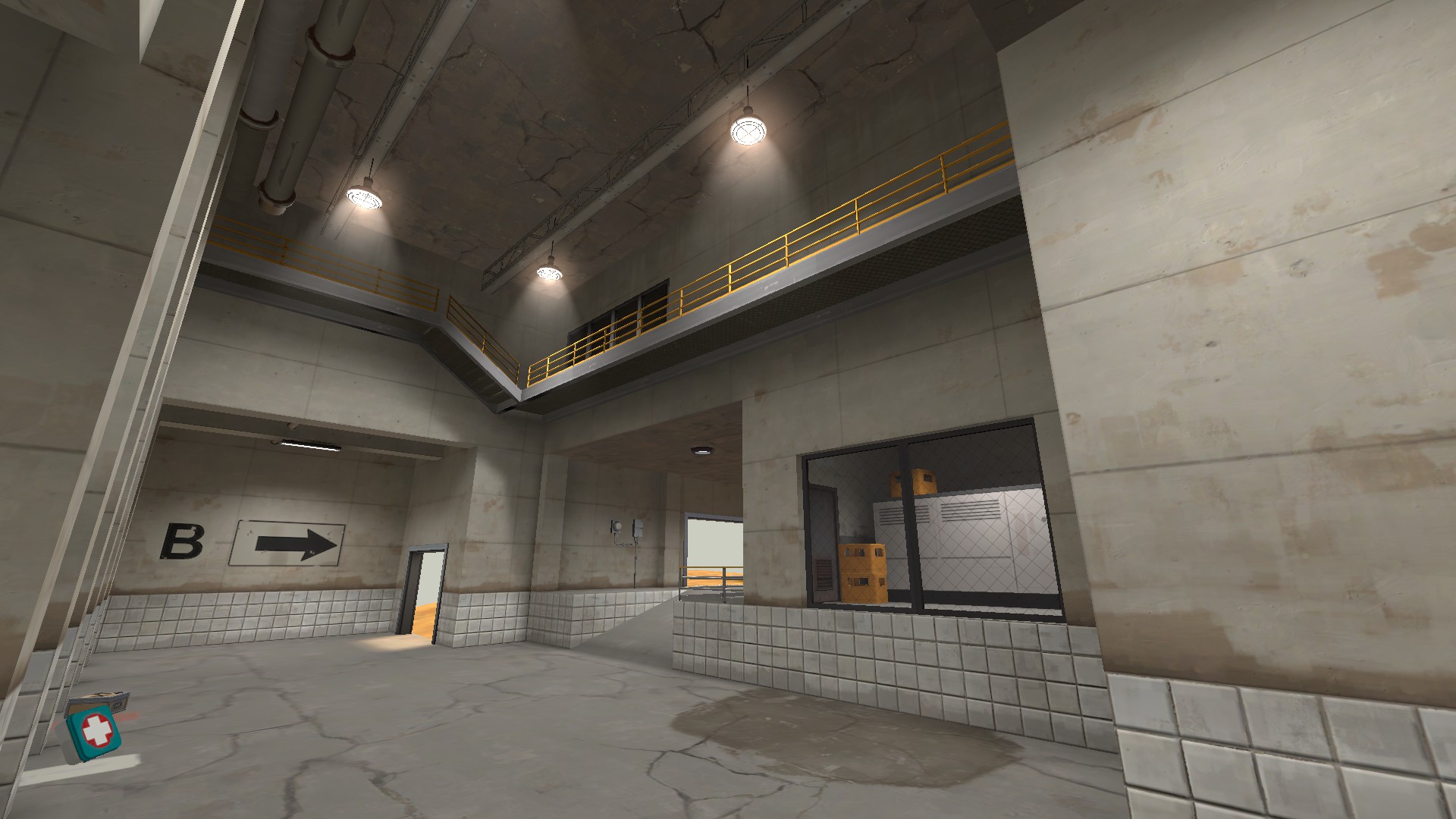
"Just industrial" is not a refined enough style. Is it a factory, is it a warehouse, what is being made/transported, what are you protecting/trying to blow up, what are they trying to achieve? These are all questions you should ask. And by answering those you can start creating a name. And sometimes that needs a finished map.
Yeah I'll be thinking that over a bit more when I've got the layout settled. Good advice though!
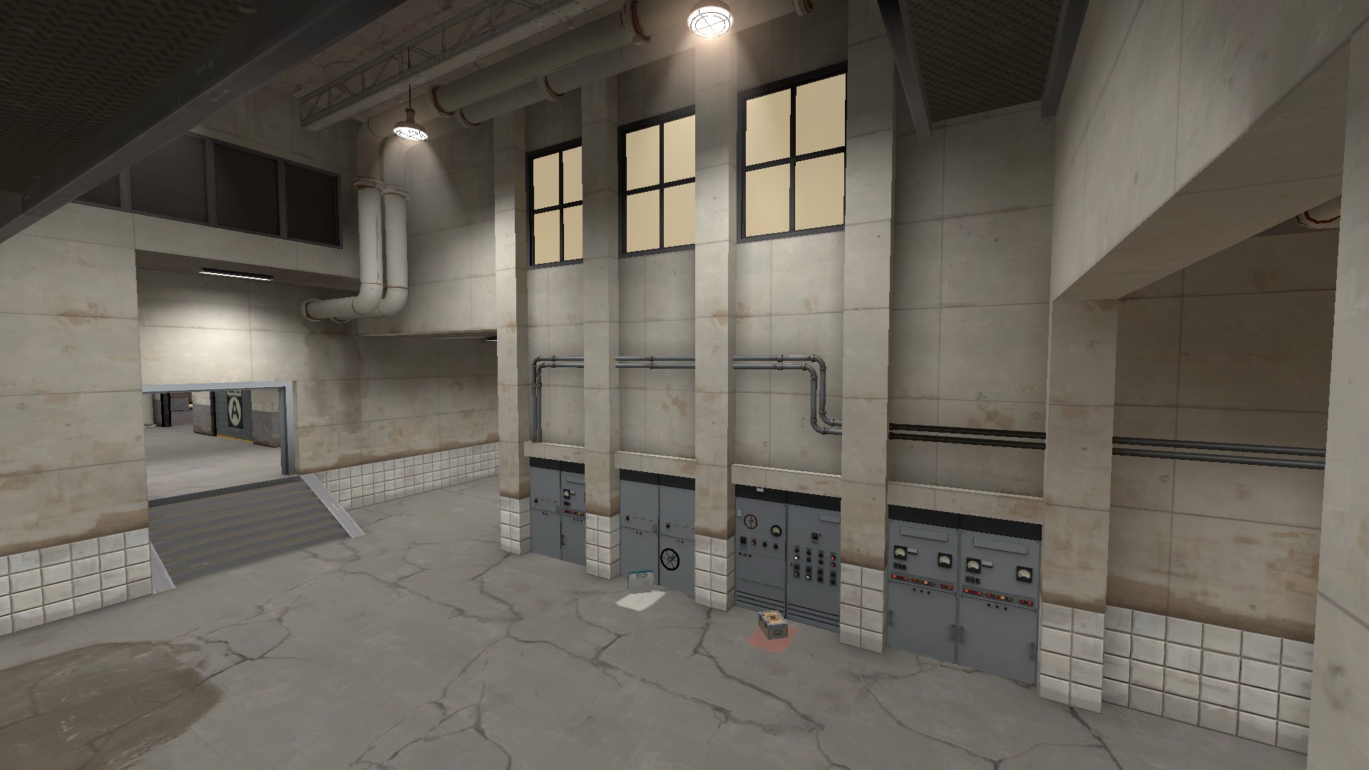
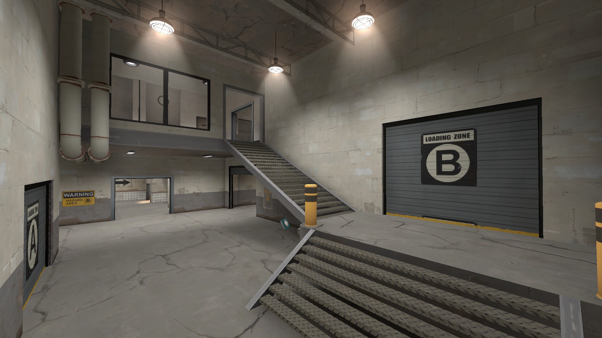
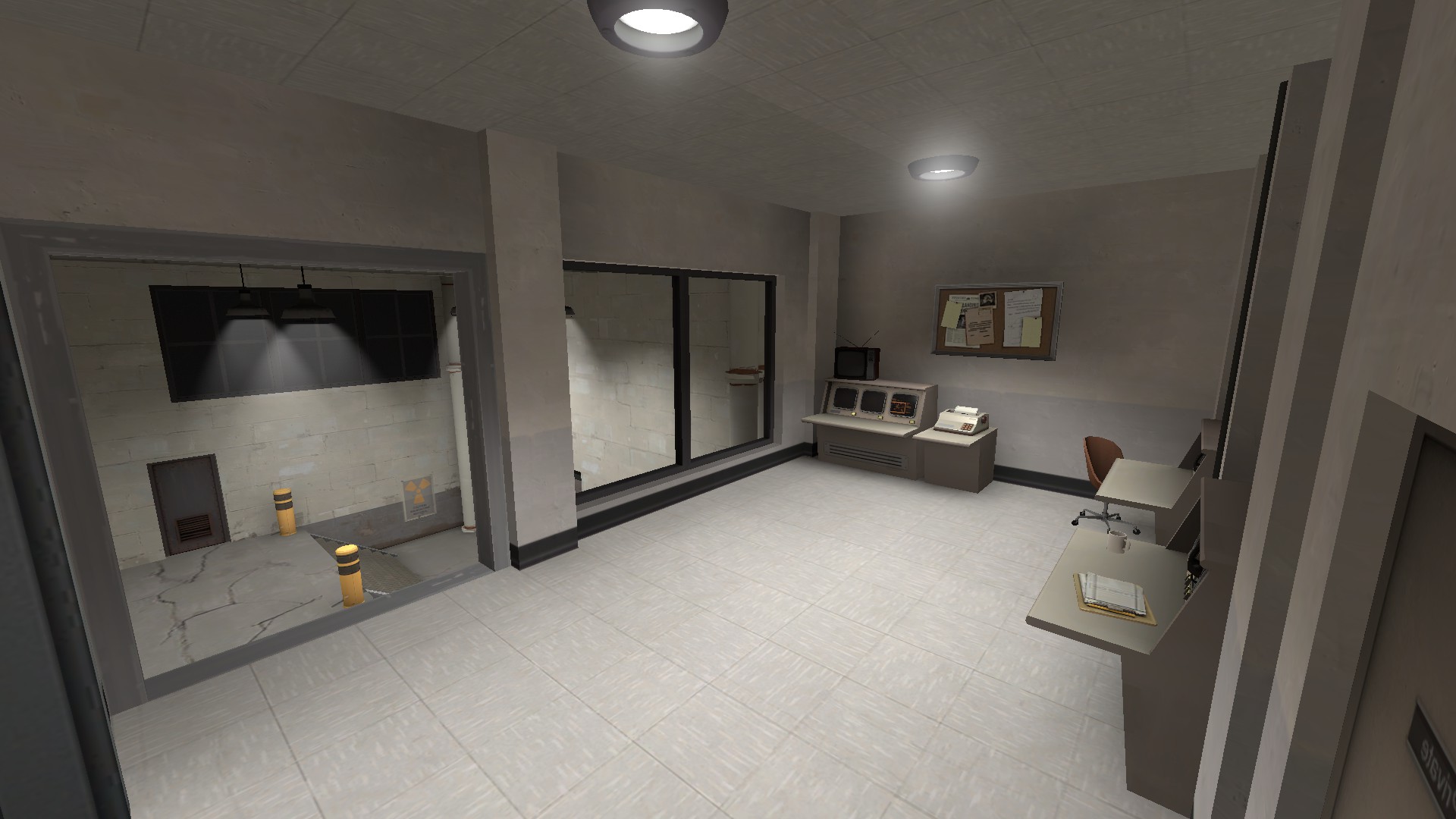
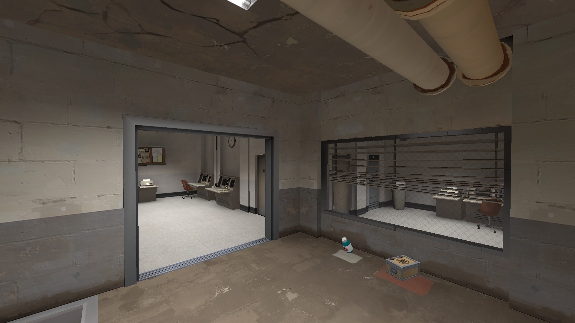
Also for a payload map i find the spawn entrance too close to the capture area. It will very likely make it easy to defend which is something that might be very dangerous and boring. Would you want the defenders standing in the spawn doorway as they are harder to be hit there? Ensure that the capture area is out of the direct view from the spawn. Idealy most of the payload track even should be. And if they can see it, then they should be able to recieve the focus of the attackers without it instantly turning into spawn killing.
Oh yeah, I see what you mean. The door you see in the screenshot isn't actually the door to the spawn itself, it leads to the back hallways which then lead to the spawn room. Sort of Upward's idea. Still, I might have to rearrange the battlements a little. Thanks for the advice!
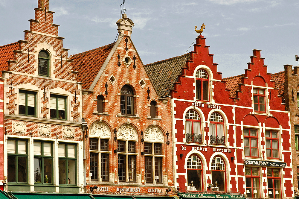
Inspired by Freyja to do some European. Specifically, Belgium. Sorry about the lightning.
Rotate the building/sun so the front facade is lit, it'll look better
Inspired by Freyja to do some European. Specifically, Belgium. Sorry about the lightning.
-snip-
Cool! I really dig the atmosphere you're inciting.
One fickle complaint, though. The tile texture would probably look a bit better if the horizontal lines lined up with the top of the roof rather than the bottom.
Still, this is incredible work, and I'm excited to see more mappers incorporate new themes into their work.
Inspired by Freyja to do some European. Specifically, Belgium. Sorry about the lightning.
http://i.imgur.com/QbyyWTD.jpg
Source:
https://scottandsoonjeong.files.wordpress.com/2011/03/belgium_brugge_old_houses-sml.jpg
Looks like the style used in Genk actually. note the sides of those buildings. exactly, no sides.
SSX
aa
- Feb 2, 2014
- 392
- 411
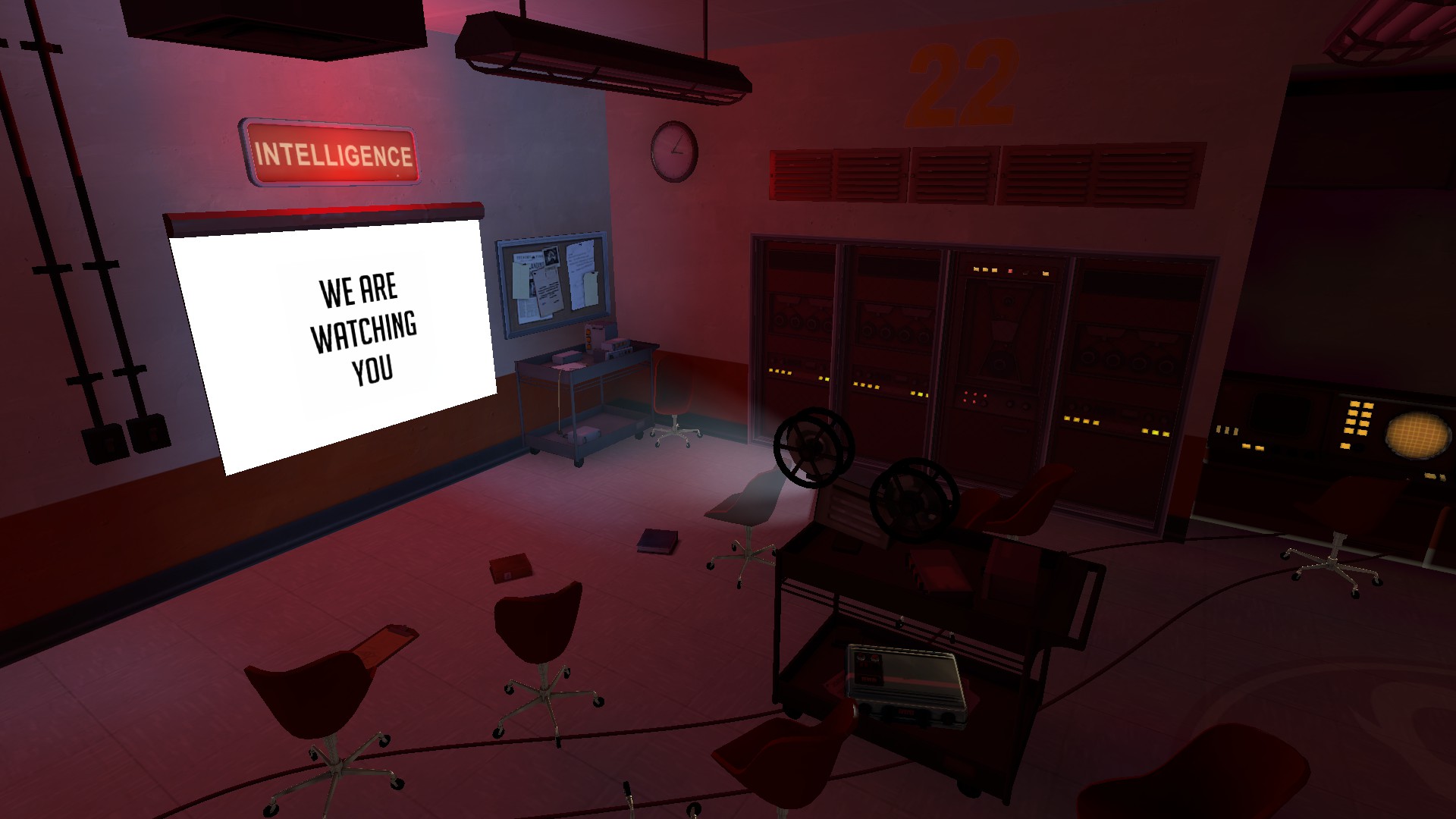
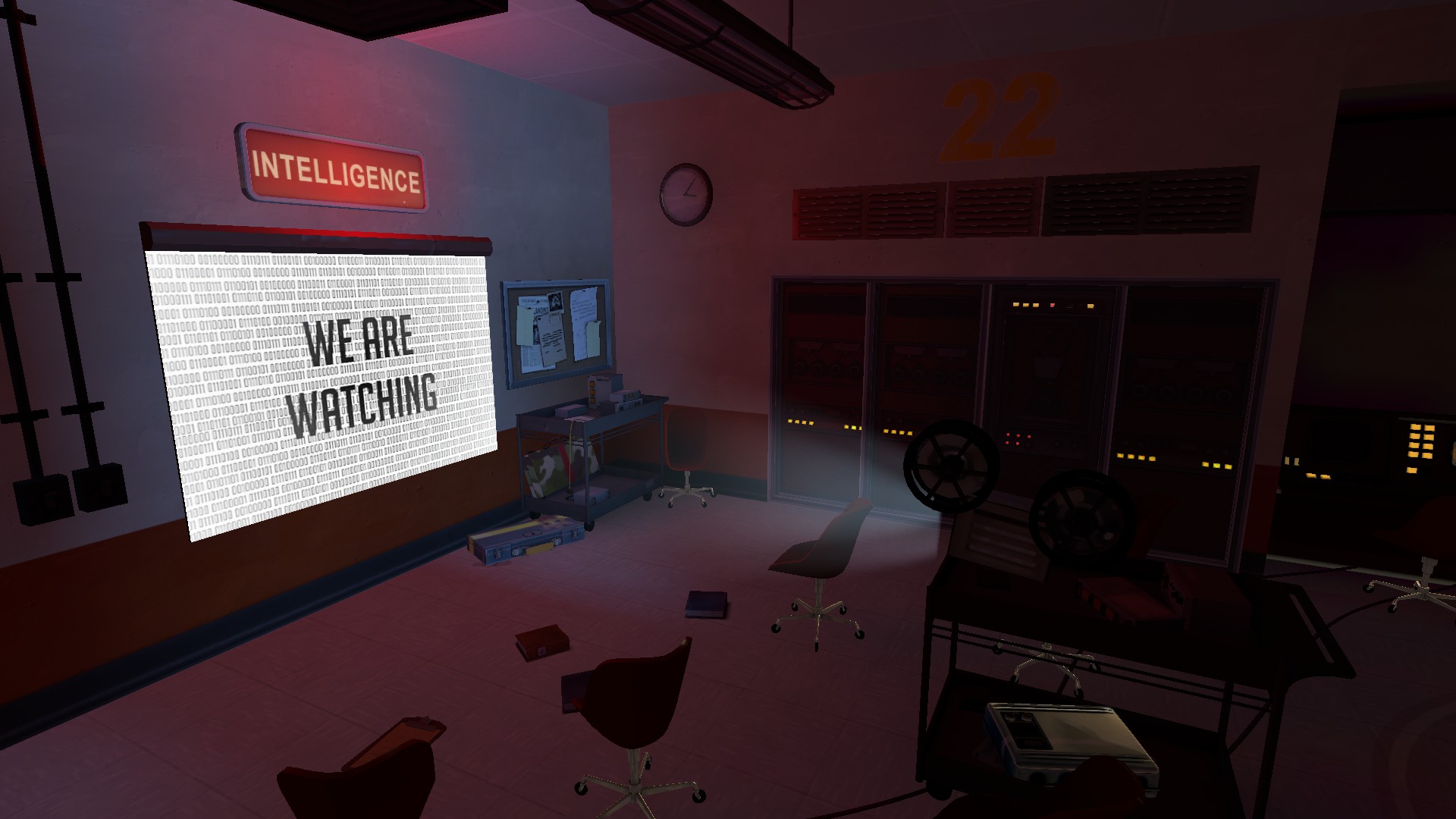
A recommendation: Add a border on the texture for the slide using the alpha channel (I assume the texture is $selfillum and not UnlitGeneric?) to make it look like it doesn't exactly perfectly fill the screen.
See here's the funny part, I know jack shit on how do any of that! :O
Snowbat
L4: Comfortable Member
- Apr 23, 2013
- 165
- 74
You do that by adding an alpha channel to the texture. Everything in the alpha channel that is black will be transparent, everything white will be visible. I use photoshop for that.See here's the funny part, I know jack shit on how do any of that! :O
See here's the funny part, I know jack shit on how do any of that! :O
Just make part of the outer edge transparent (since that's what Photoshop expects alpha channels to be used for) and pick DTX5 when you save the VTF; the plugin should take care of the rest.
SSX
aa
- Feb 2, 2014
- 392
- 411
Just make part of the outer edge transparent (since that's what Photoshop expects alpha channels to be used for) and pick DTX5 when you save the VTF; the plugin should take care of the rest.
Ok? And what if I don't use photoshop?
I use Paint.NET to make the image, then I use Gimp 2 to do anything else I might need.
SSX
aa
- Feb 2, 2014
- 392
- 411
What's that projector model from? Is it custom?
It's from Dustbowl's final red spawn point in the right spawn room windowed area.


