- Mar 6, 2013
- 1,044
- 627
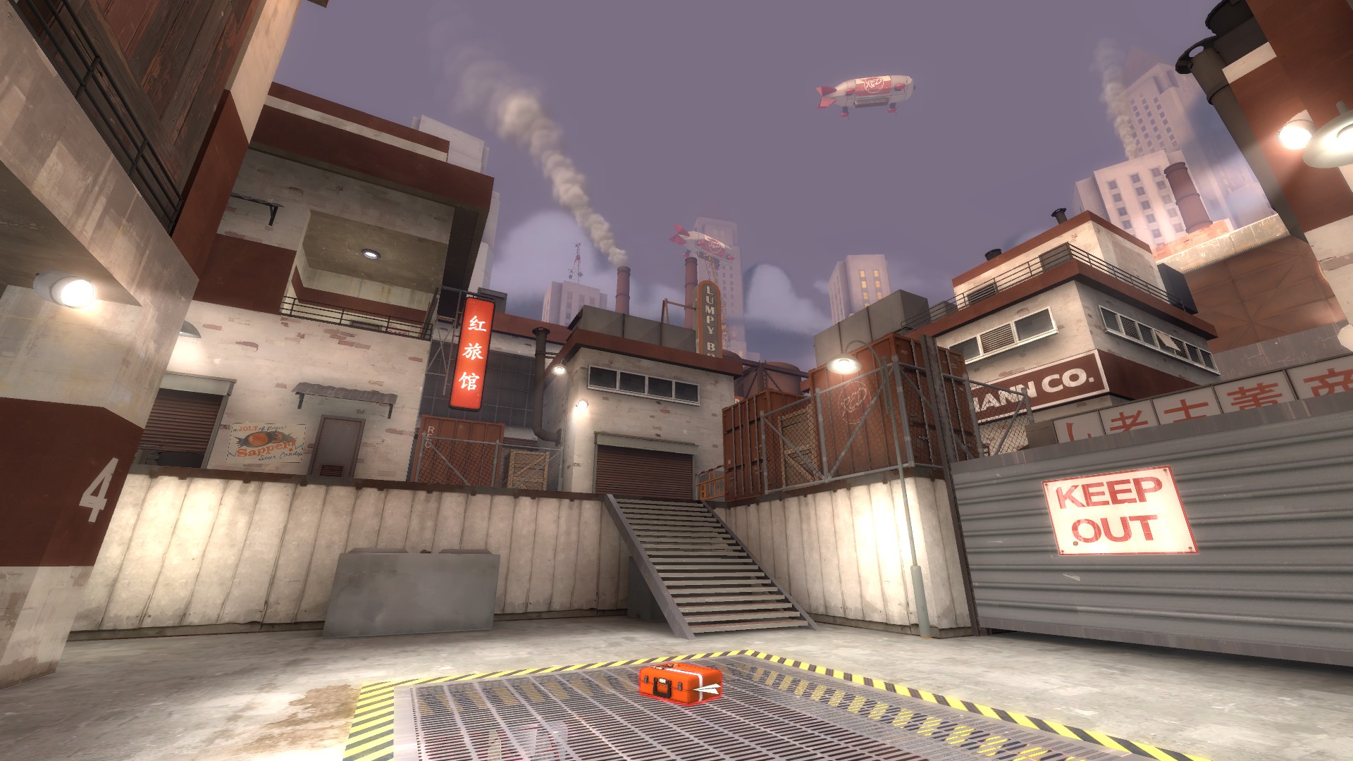
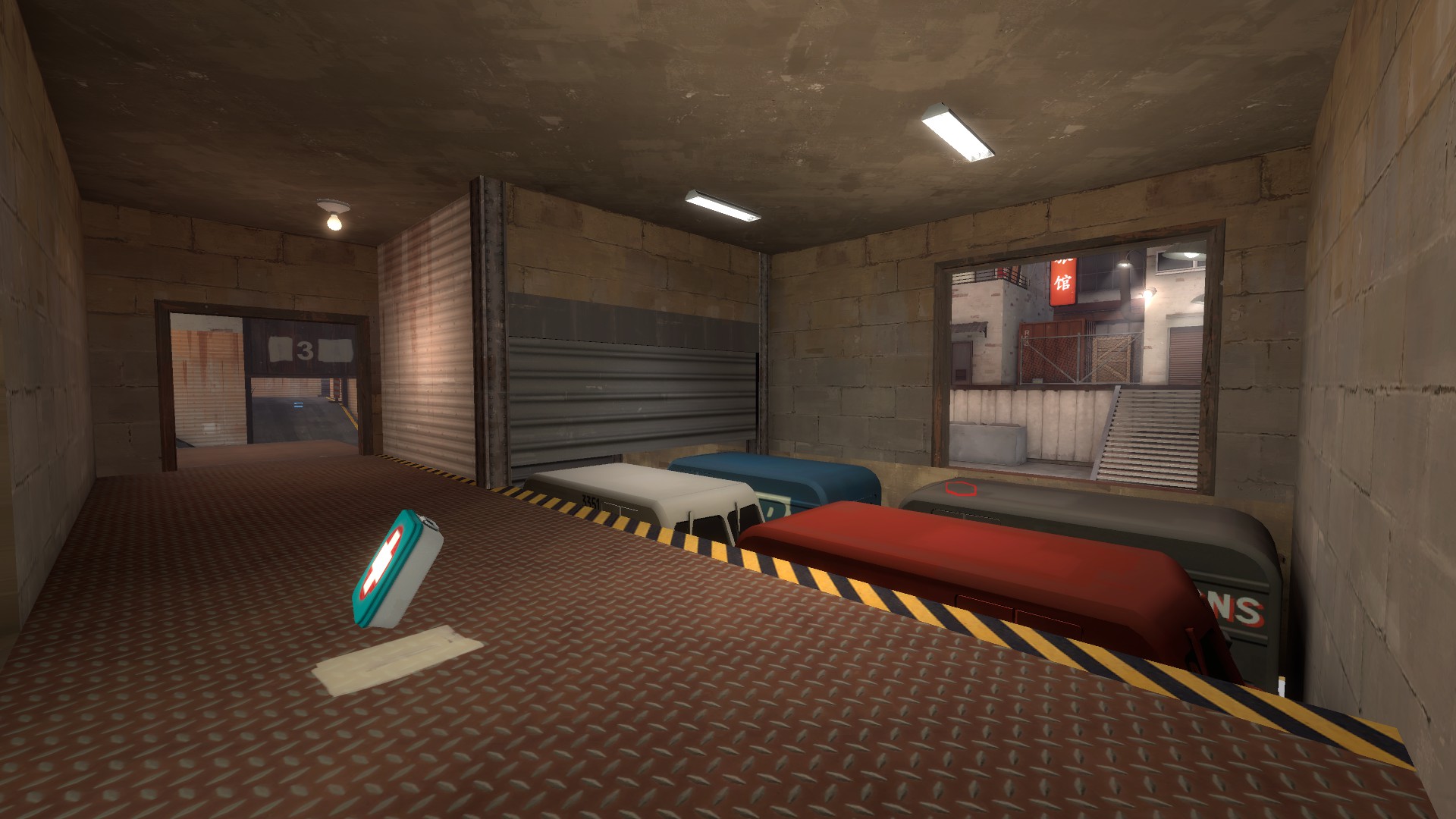
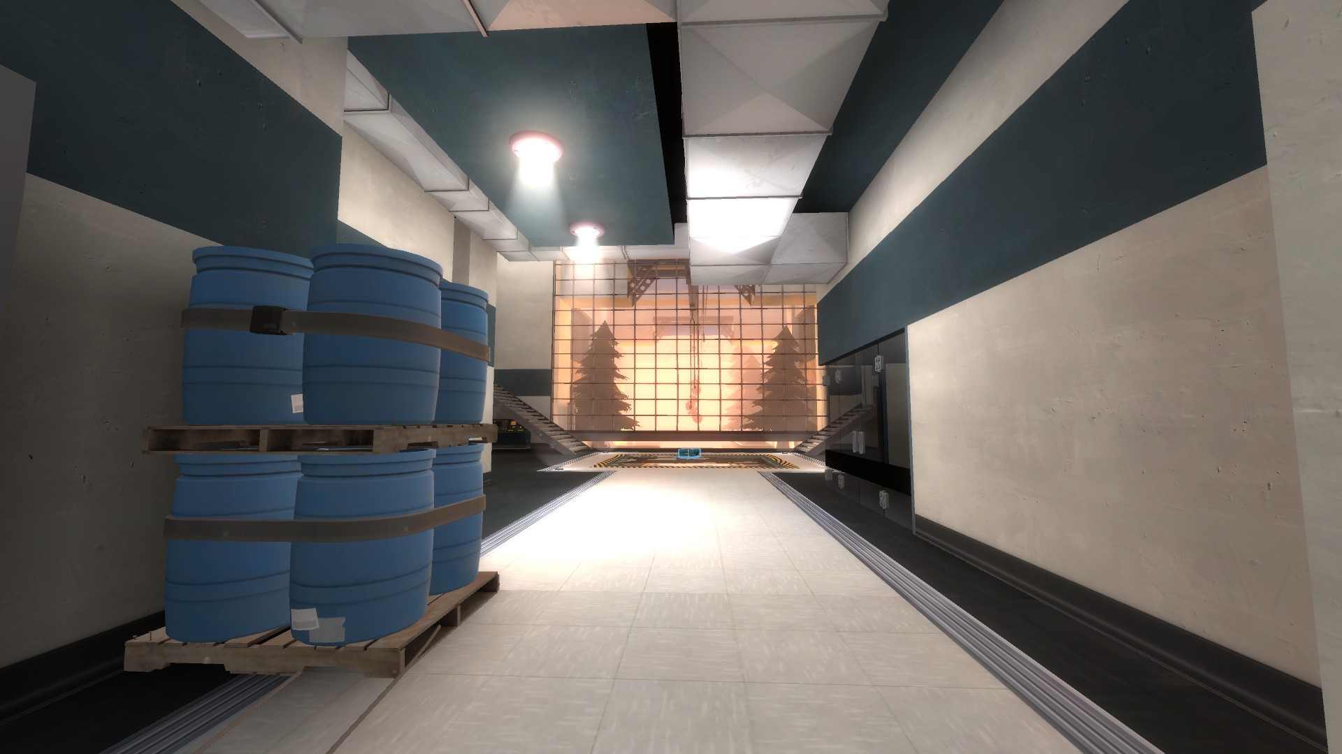
It's from Dustbowl's final red spawn point in the right spawn room windowed area.
Also shows up in the projector room in Doomsday. It's a combination of brushes and handle models.
It's from Dustbowl's final red spawn point in the right spawn room windowed area.
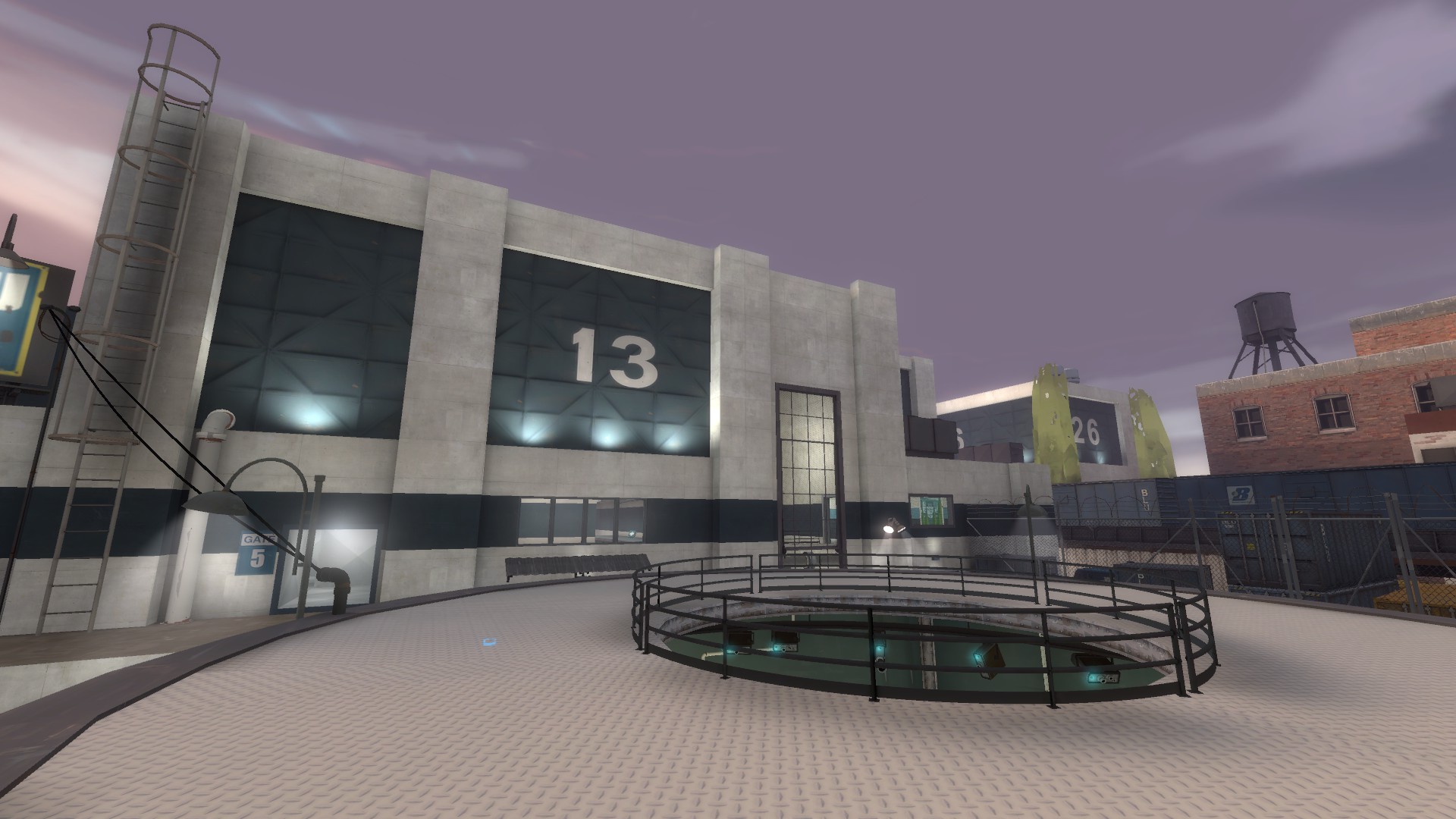
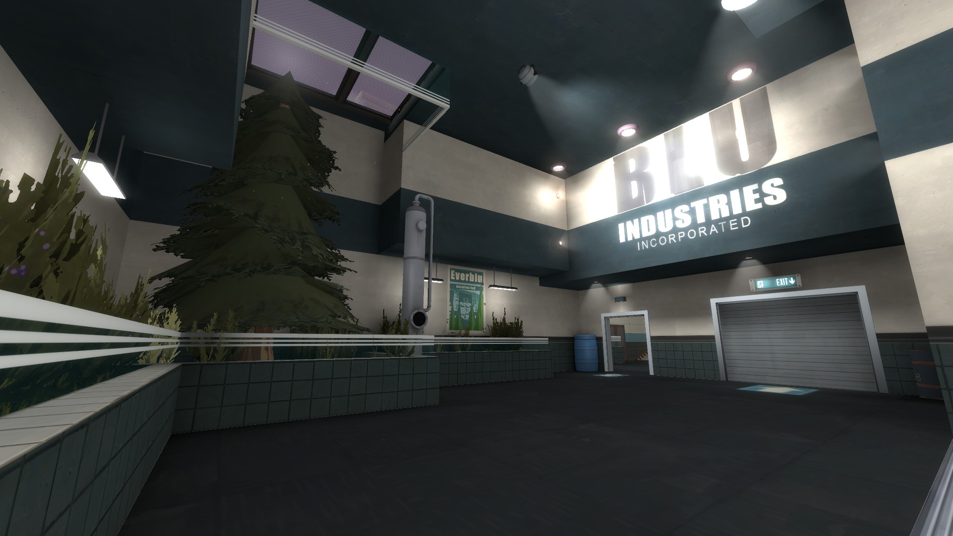
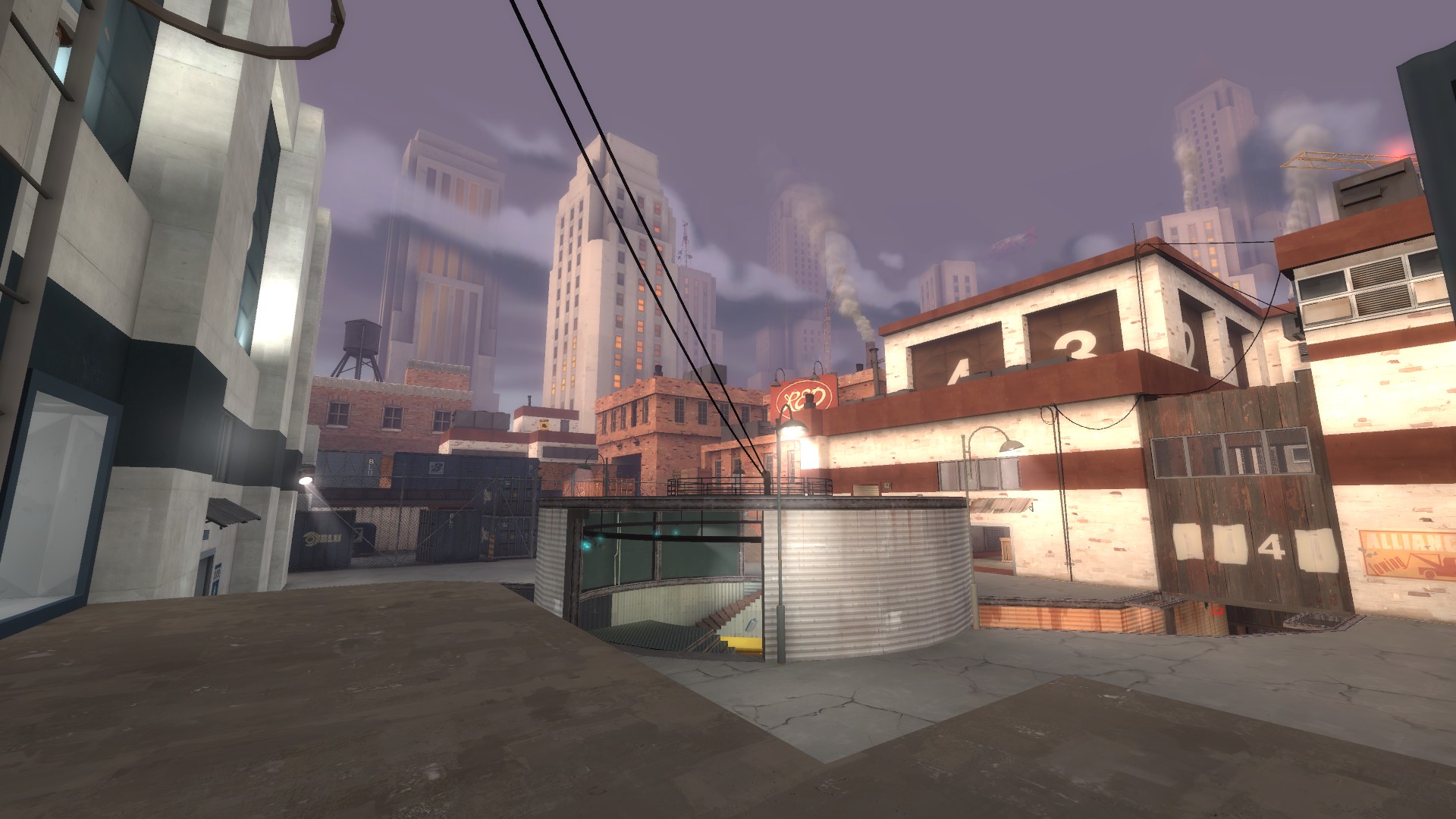
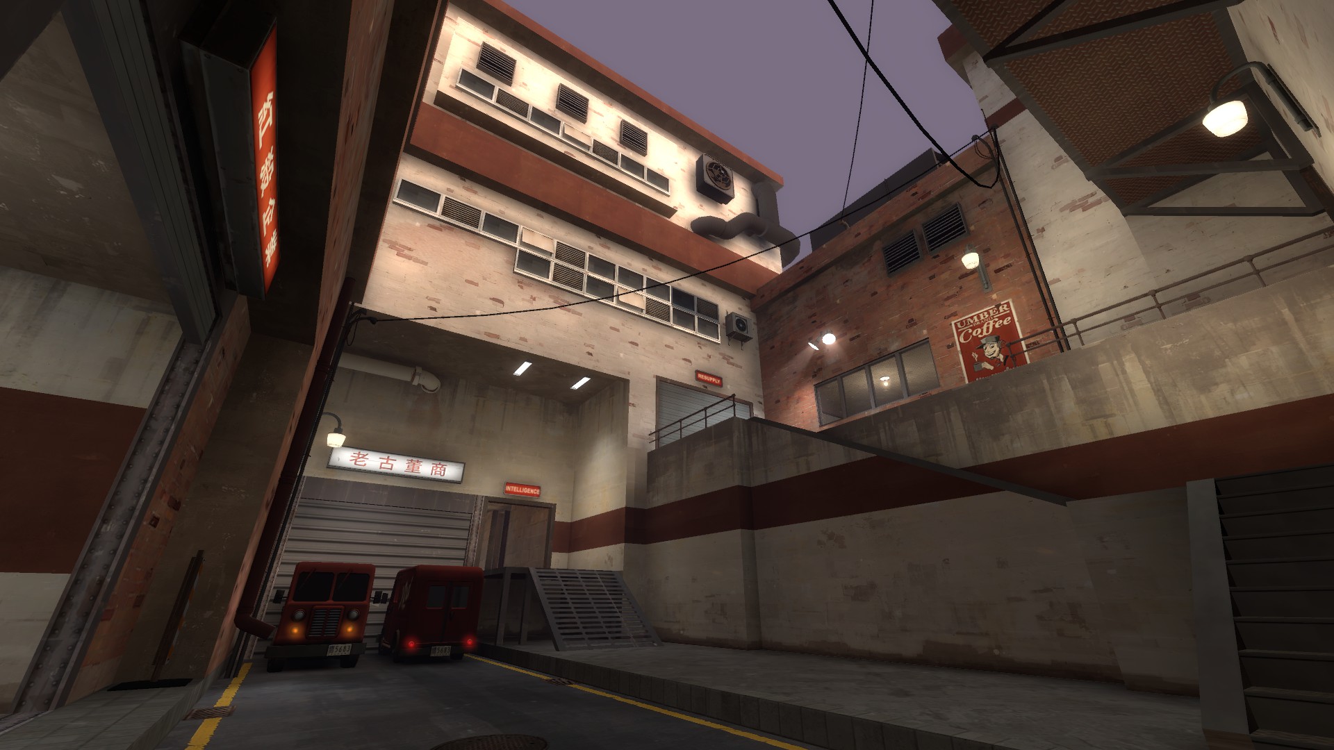
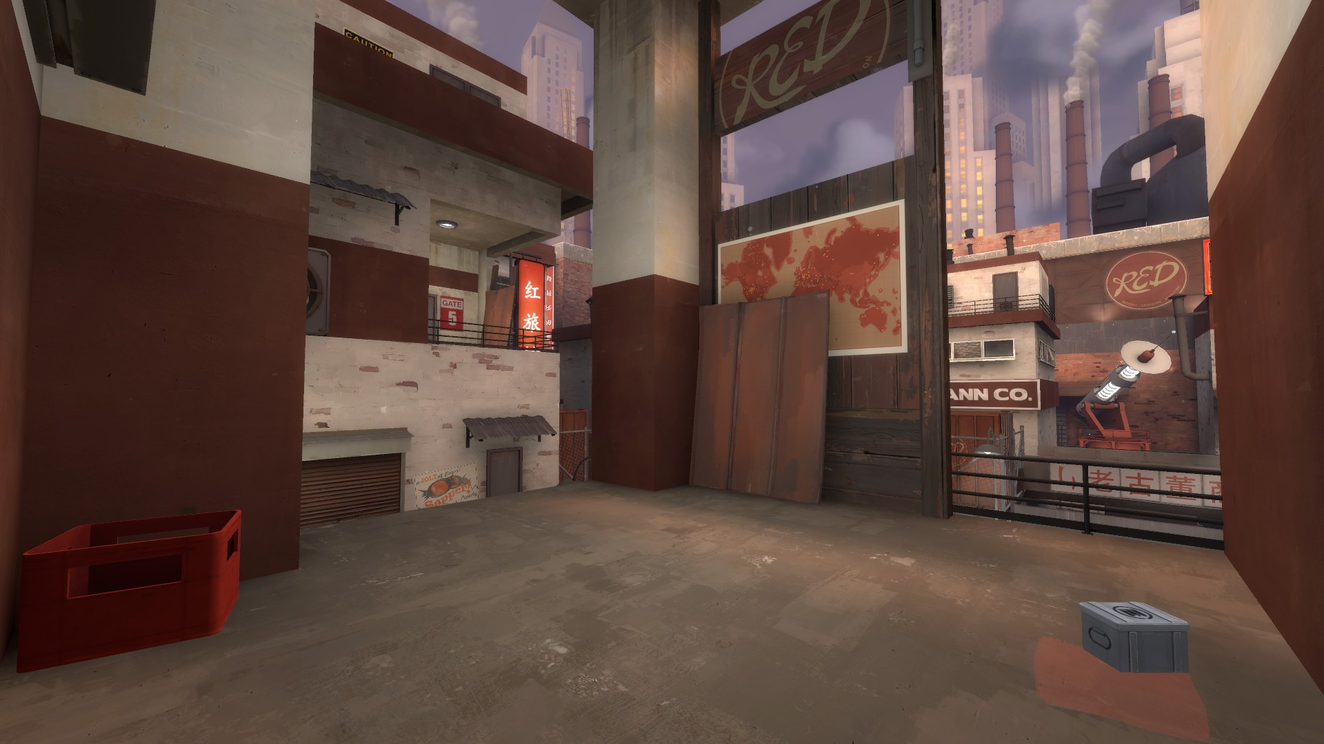
Some images from Kombu (the connector building of 1st and 2nd for anyone who knows the layout)
I think lighting may still need a bit of work though.
-kombu pics-
GIMP can also do alpha channels, but damned if I can figure out how to edit one without affecting the content of the others, which is kind of important here.You can download a vignette plugin for paint.net and create an alpha channel from that.
WIP detailing:
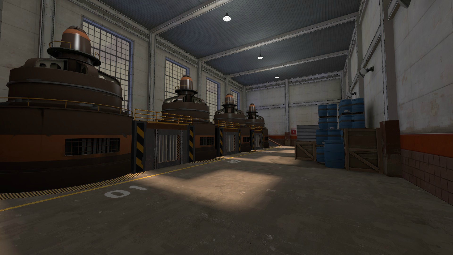
Everything you can't see is nodrawed.
WIP detailing:

Everything you can't see is nodrawed.
WIP detailing:

Everything you can't see is nodrawed.
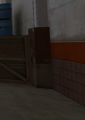

this concrete block here looks a bit odd
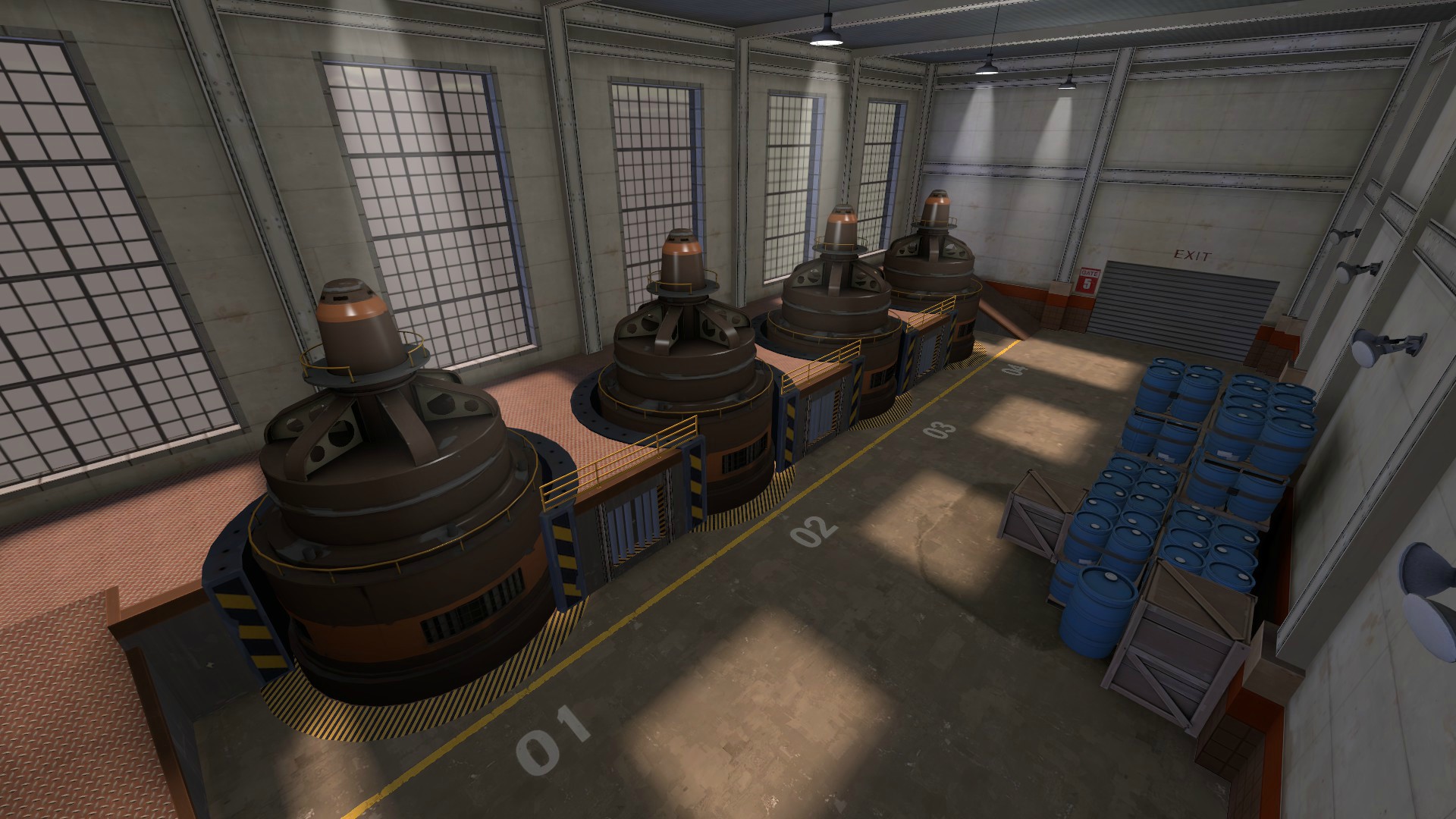
Looks very nice, but that is gonna be really hard to cap without dying since its all surrounded by height
Well I aim the competitive audience with this map, we'll see how it works but it could be a lot of fun :thumbup1:
Could this be a sneak peak of my HL2 puzzle mod? I think it might be.
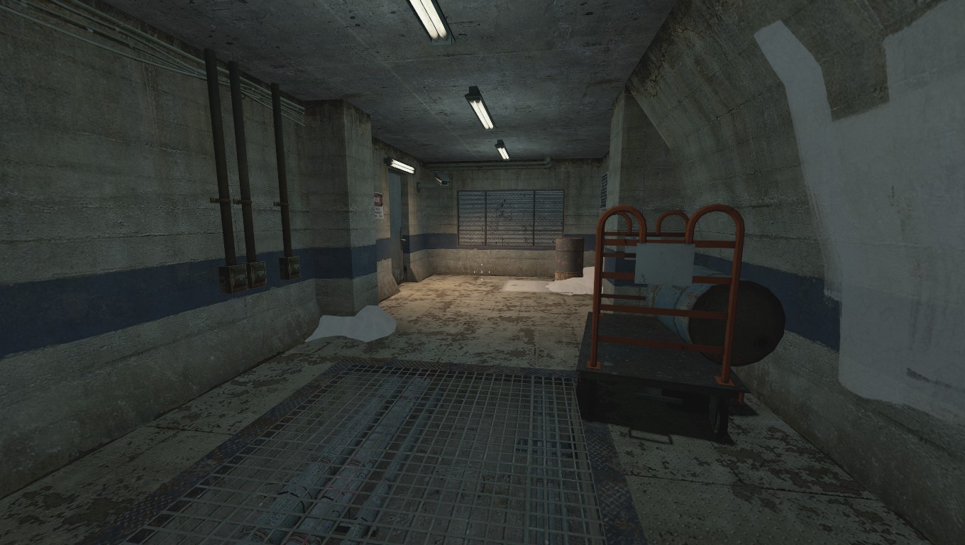
And this crap puzzle which took me a weekend to make.
Just a word of advice, competitive players generally don't like snow or night skyboxes in maps, and your map has both. Night skyboxes make it very hard to see rocket jumping soldiers or demomen, and seeing that that's a key part of competitive TF2 I'd predict you'll get requests from competitive players to change the skybox. Snow apparently can result in low fps (although I've never experienced it myself), and also makes it hard to distinguish between players for colorblind players.
That's just my two cents. Maybe you'll want to talk to Scorpio or someone else with a lot of competitive mapping experience under their belt.
