WiP in WiP, post your screenshots!

Inqwel

L6: Sharp Member
Jun 2, 2008
308
59
Then what am I supposed to do exactly? There's not a ton I can do without it feeling too cluttered.

Too cluttered? Lets not add more then:

screenshot4_zps93c6c95c.jpg


Drop the point to where the blue box is.
I'd keep the ramp up to where the white box is, this will cover it from the 3 areas (marked with white x's)
EDIT: Add a taller* rock to where the red blob is (and that should prevent sniper line from red x)
 
Last edited:

SSX

aa
Feb 2, 2014
392
411
Too cluttered? Lets not add more then:

screenshot4_zps93c6c95c.jpg


Drop the point to where the blue box is.
I'd keep the ramp up to where the white box is, this will cover it from the 3 areas (marked with white x's)
EDIT: Add a taller* rock to where the red blob is (and that should prevent sniper line from red x)

Ya...not doing that, taller rock I can do, control point I won't.
 

Inqwel

L6: Sharp Member
Jun 2, 2008
308
59
Well, you specified that you didn't want to clutter up the area, so I changed/removed things instead of adding more. So, whatever.

Otherwise, I'd make that bridge, capture point have a roof over it - having wall supports for the roof be where those rocks are to help against sight lines.
 
Last edited:

littleedge

L1111: Clipping Guru
aa
Mar 2, 2009
986
605
Taller rocks. And from the looks of thing, you could just raise the current rocks up from the ground. Also, add a platform outside that door like Frozen suggested. It's always annoying to open a door and immediately drop outside it.
 

Harribo

aa
Nov 1, 2009
871
851
@Nerdbot
I know you have just started working on it but the amount of flat open plain space frightens me. I'd suggest not using props to define a playing space too but people do that all the time so take my advice with a grain of salt perhaps
 

evanonline

L420: High Member
Mar 15, 2009
485
273
@Nerdbot
I know you have just started working on it but the amount of flat open plain space frightens me. I'd suggest not using props to define a playing space too but people do that all the time so take my advice with a grain of salt perhaps

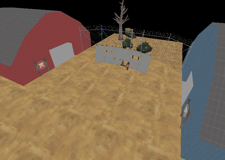
Don't worry I know what I'm doing!!! I'm using Nightfall Stage 2's intersection as a point of reference; the center area you see in the above screenshot is roughly the same size, just nothing to break sightlines up just yet (and the barns create more open space as well but I'm working on it)

I'm guilty of overusing the Hydro barriers to break up sightlines in past maps but I put those in there to give the impression of a hastily-erected barricade in the face of THE ALIEN MENACE

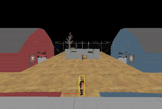
This screenshot might give you a sliiightly better idea of the scale than the last one, I feel like the angle makes it look worse than it really is.

59d8b38391e44ef53641d2de51ea08ba.png
 

xzzy

aa
Jan 30, 2010
815
531
I'd consider breaking up that blinding white with some dirt, solid white is really annoying to play on especially if HDR is enabled. It's totally fine in the shadows but under the sun it's painful.

Other than that I really liked how that spawn room was laid out when I played it, you did a good job making fun geometry to fight in.
 

SSX

aa
Feb 2, 2014
392
411
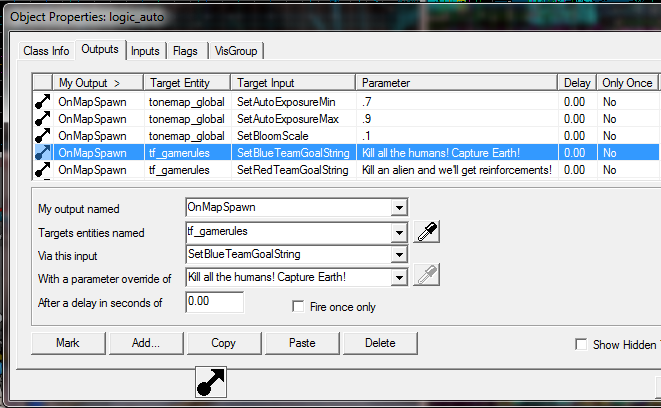
Anyone know how to change this to say 2 instead of 3?

p1WqFcq.png
 

Idolon

they/them
aa
Feb 7, 2008
2,123
6,137
Also note that you should never put quotes into any text field in Hammer ever, because it will break your .vmf. (You can fix it with notepad, don't worry)
 
Last edited:

Fruity Snacks

Creator of blackholes & memes. Destroyer of forums
aa
Sep 5, 2010
6,394
5,573
Who knows. I get inspiration for small areas and then they just sit on my PC.

2014-07-07_00001.jpg

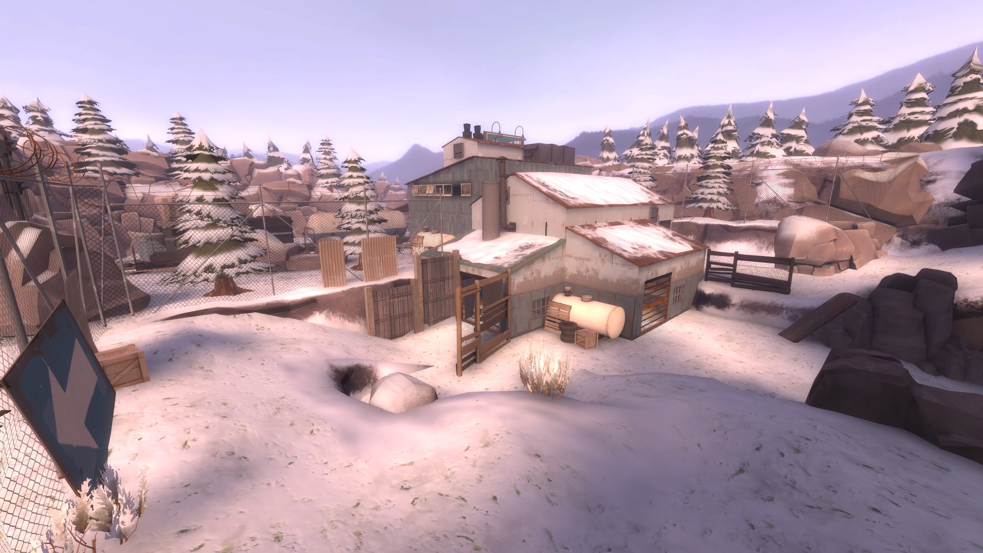
That point doesn't feel like it's the center of attention. You should throw that thing 'up on a pedastle,' if you catch my drift. Make it the focal point of the area!
 

Sergis

L666: ])oo]v[
aa
Jul 22, 2009
1,874
1,258
@Nerdbot
I know you have just started working on it but the amount of flat open plain space frightens me. I'd suggest not using props to define a playing space too but people do that all the time so take my advice with a grain of salt perhaps

welcome to the multibanner club :)

edit - it was good while it lasted
 
Last edited:

xzzy

aa
Jan 30, 2010
815
531
That point doesn't feel like it's the center of attention. You should throw that thing 'up on a pedastle,' if you catch my drift. Make it the focal point of the area!

Building a platform would also give a reason to turn that rock wall into some kind of facade for a building, which would aid in making the area a focal point.

I suspect play testing would mandate that more area around the point get opened up but as it is it's a pretty unique layout and I'd like to see it attempted in a live game before changing it.

That is, assuming one team approaches from the viewpoint of the camera, and the other team comes from around the corner to the left.
 
T

The Asylum

if only yyler was still with us

Qn8BdQk.png


Who else would be telling me not to fucking think about it?