I mean that the cylinder is an octagonal prism; that's not enough sides to make it look like a proper cylinder, especially with all the extra detail of the rings.I'm not quite sure what you mean by that.
WiP in WiP, post your screenshots!
- Thread starter Arhurt
- Start date
You are using an out of date browser. It may not display this or other websites correctly.
You should upgrade or use an alternative browser.
You should upgrade or use an alternative browser.
Beetle
L9: Fashionable Member
- Aug 17, 2008
- 627
- 178
especially with all the extra detail of the rings.
that part, fair enough. I'll increase it to 16 and take the advice on the hard/soft edges as well as work on the wood texture (the texturing was really just a first pass)
Last edited:
Thorval
L1: Registered
- Feb 15, 2014
- 38
- 68
That rock texture is for walls, not floors.
It looks really weird underfoot.
Yeah I noticed I fixed it after the screen shots I'll maby make some new ones
seth
aa
- May 31, 2013
- 1,021
- 852
What's that model underneath the shack? I don't think I've seen that before.
The supports seem like they should be a lot thicker. Also, maybe have them at a slant, so the base is wider than the top. The actual structure of it looks fine though, good work!Some work on my entry (cp_bridges)
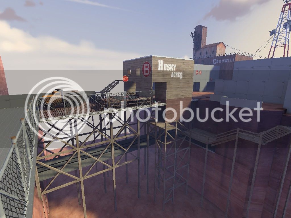
Did I make the wooden supports detailed enough?
Do I need to make it more detailed/broken looking?
EDIT: The pathway on the far right seems like it would have the wood supports embedded into the cliffside, rather than brought all the way down to the canyon floor - it'd be a waste of lumber and/or time to build it that way in reality, and also just looks weird.
- Feb 18, 2012
- 246
- 407
What's that model underneath the shack? I don't think I've seen that before.
It's a chemical container by Rexy
seth
aa
- May 31, 2013
- 1,021
- 852
Awesome, thanks. Speaking of Rexy, is he still around? I know he was quite the model maker for some time.
takabuschik
aa
- Apr 14, 2013
- 662
- 344
Contest entry:
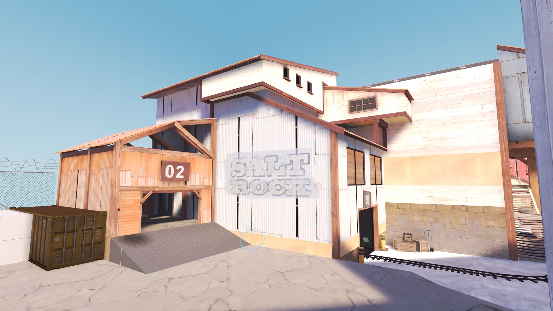
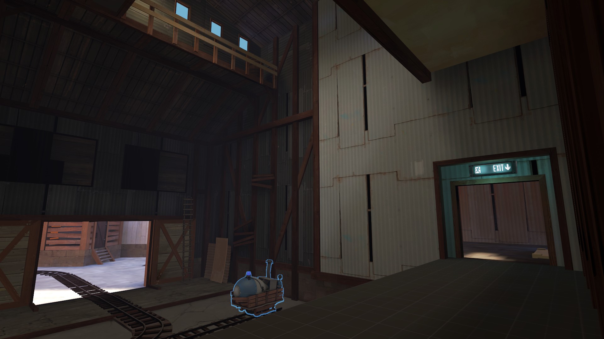
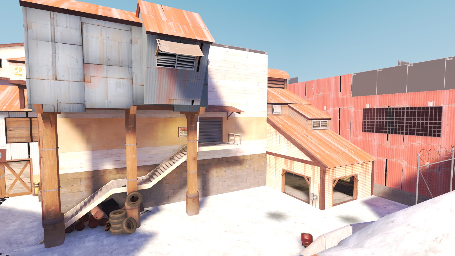
I really like the colors of the map. Is the white metal in the salt rock building in 1st picture an custom texture?
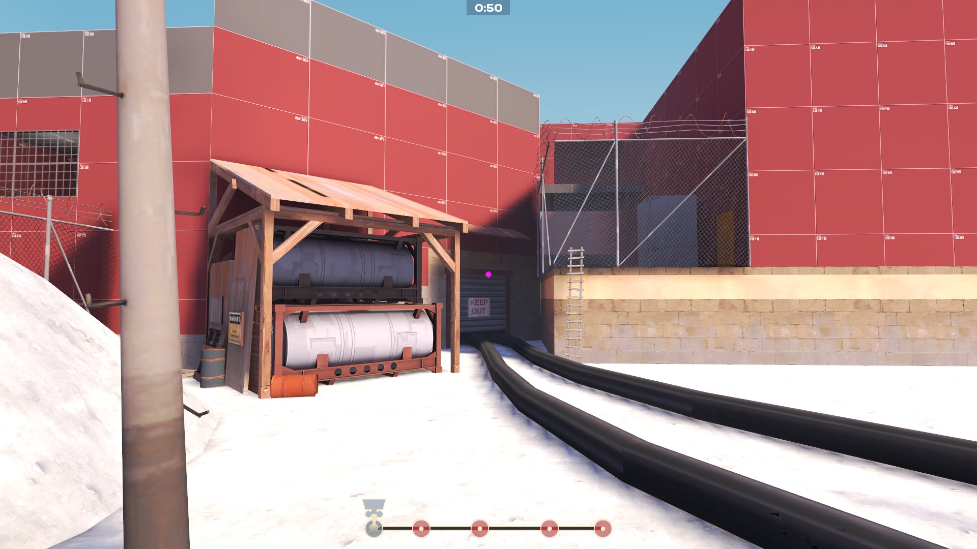
Also, the wooden door seems to be blocked by a ladder. maybe move the ladder more to the right?
seth
aa
- May 31, 2013
- 1,021
- 852
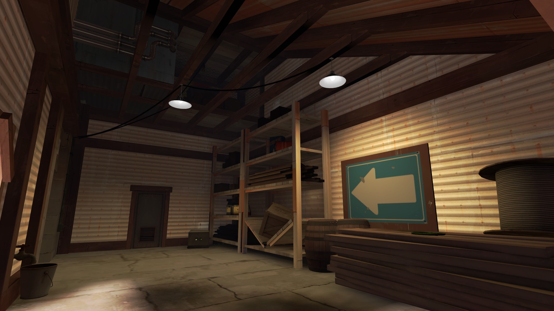
Cool concept Woozlez, but I feel like an underground cavern of that size would definitely need loads of support to not collapse. Maybe instead of capping the buildings with angular roofs, you could extend them into the ceiling to give the impression of supports or add some network of beams on top of the existing buildings. Just looks a little weird as is in that respect.
- Feb 18, 2012
- 246
- 407
I really like the colors of the map. Is the white metal in the salt rock building in 1st picture an custom texture?
Also, the wooden door seems to be blocked by a ladder. maybe move the ladder more to the right?
There's nothing special about that texture... It's just a plain ol' "metal/metalwall014". It appears white because of the bright enverioment lighting.
The wooden door slides to the side, once the setup is finished, so itsn't blocked by the ladder
Last edited:
Snowbat
L4: Comfortable Member
- Apr 23, 2013
- 165
- 74
So, still working on my MvM map, that should hopefully be playable and testable very soon. I tried out a sample popfile, but the bots did things they weren't supposed to do so I have to try and fix that (probably with Alias' help  )
)
Here are a few screenshots. Keep in mind: there is no 3D skybox yet, which I plan to use to make it look prettier and hide some of the geometry you shouldn't be seeing. There is also no decent fog settings (just took something standard) and I have not placed any props yet (except a few to narrow the path). I obviously plan to place vegetation and more small, broken ruins stuff to give it more of a Maya temple in the jungle.
Screenies!
https://www.dropbox.com/s/8cns6qa8icysye9/2014-04-29_00001.jpg
https://www.dropbox.com/s/oy7t9spf6c0jjba/2014-04-29_00002.jpg
https://www.dropbox.com/s/e5uul0a116yia2u/2014-04-29_00003.jpg
https://www.dropbox.com/s/0a75v2dtc4mh0yy/2014-04-29_00004.jpg
By the way, I really like how Woozlez' map looks. The scenery looks very interesting. I'd definitely want to play it with my usual team of MvM players
Woozlez
L3: Member
- Jul 28, 2010
- 129
- 287
More MVM_Underground :
I'm looking for some help designing lore that matches Coaltown, as this is the mine referenced in the museum. Also, this is the same mine as referenced in the Meet the Director comic in the Replay Update, hence all the corpse-grade quicklime and the board with the missing person picture of the director.
If anyone is wondering, the skybox is four separate layers plus a background skybox. Here is a wallpaper of it if you like the look of it and want to get hyped! http://i.imgur.com/wkagf.png
The skybox is meant to be similar to Portal 2 in both having a neutral blue color fog and general hue, and being huge in scale underground. I didn't want to be constrained by needs for wooden supports and smaller scale in this map, so I used those sparingly and stuck with roofed buildings (Cave/mine systems drip a bit of water you know).
If you'd like to see more or discuss helping me with this map, please PM me. I will be creating a separate thread shortly, but wanted to put some screenshots here first to figure out how I could do a few more improvements before I submit it for more critique.
Thorval
L1: Registered
- Feb 15, 2014
- 38
- 68
That skybox is so underused, looking good so far!
Thanks, I really like this skybox with these light effects ^^


