WiP in WiP, post your screenshots!
- Thread starter Arhurt
- Start date
You are using an out of date browser. It may not display this or other websites correctly.
You should upgrade or use an alternative browser.
You should upgrade or use an alternative browser.
kureidosniper
L1: Registered
- Dec 16, 2013
- 5
- 2
Garuda112
L1: Registered
- Sep 4, 2013
- 38
- 36
Remember that Alpine/Highlands/Snowy Desert/Whatever the Heck it is theme I posted earlier? Well, I'm making progress on the accompanying KotH map. Its not yet playable, as I have a little more alpha detailing/tweaks and some nasty sight lines to address (maybe lengthening the map too) Also, I'm taking displacements with a new angle (pun intended) as I want to make more natural formations without molding them from perfect squares, like I used to.
http://imgur.com/zvPbFxb
http://imgur.com/zvPbFxb
Last edited:
Kill_the_Bug
aa
- Oct 6, 2008
- 1,969
- 451
first impression is that it's quite open and overly complex, route wise. re-using space is fine but thunder mountain's final stage isn't particularly fun to play on.
It doesn't looks as bad as TM's final stage gets though.
I cant be the only one who thinks that particular stage would be fine as a single stage PL map, right?
Kill_the_Bug
aa
- Oct 6, 2008
- 1,969
- 451
Kill_the_Bug
aa
- Oct 6, 2008
- 1,969
- 451
Not sure what it is yet, but I'm enjoying it.

Make it that temple from the movie 300 < the one on top of the hill
takabuschik
aa
- Apr 14, 2013
- 662
- 344
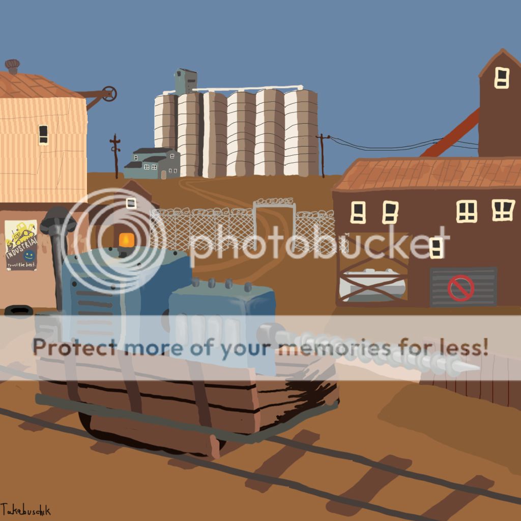
1460. The number of dynamics a map safely can haveHow many ragdolls are we proposing can stack up before it stops working?
How far into that number will 99% of all clients start complaining about significantly reduced performance? I say 1.
0. Nothing will ever stop TF2 players from complaining about lag. TF2 players should stop using computers built in the 90s.
Gamemaster1379
L1: Registered
- Mar 7, 2010
- 17
- 11
I hope you're all ready for some hilariously crappy mspaint sketch art of a map in 2D design.
For my Team Fortress Historical museum concept, I may have found a mapmaker willing to do the hammer work if I can come up with some layout designs. Right now I'm only concerning myself with top-down perspective to see how the map will flow. Nothing here is concrete, anything (and possibly everything) is subject to change. Bear in mind, that nothing is necessarily to proportion.
Link to map layout
So, with all of that in mind, the idea here is that this is a large museum-esque map. Indoors (with high ceiling). No tanks. The "stage" and flank spawns are one large amphitheater room. Only small bots can come from the flanks, but the stage is going to be for all large bot spawns. The grand hallway and whatever path they take will of course accommodate their enormous size.
Instead of going conventional walls and buildings that block and segregate paths. The museum concept will focus on using "exhibits" to instead differentiate pathways. Exhibits are planned to be a mixture of "paintings" (walls with gallery photos hung on them, easy way to create solid, low-poly structures to separate the map at little cost), and static RED bots in various poses and positions as "exhibits".
The final area will have four types of approach. The two lower pathways on each side, and each pathway will also have stairways to a second floor. The second floor will have a catwalk that's above the players spawn (think cp_process), that bots can drop down from.
The red fenced off area is something I was simply toying with, and possibly a gimmick I'll remove. Think velvet rope, separating an entryway off. Players and bots won't be able to use it to walk through (maybe it will be accessible to higher jumping classes such as Solly, Scout, Demo, Detonator Pyro), but the main attraction to it is that is simply a sightline to see what's coming and actually combat through. For a pushed back team, a sniper could be perched behind the ropes and get his picks.
I have never designed a map before, and quite frankly, I never intended to either. This isn't my specialty, but I don't have much of a choice. I've made this into a team project and already have several contenders in other areas--but mapmakers are a harder specialty to come by. I can't keep waiting, so I'm trying to get this off the ground myself. So, please, be gentle.
Last edited:


