WiP in WiP, post your screenshots!
- Thread starter Arhurt
- Start date
You are using an out of date browser. It may not display this or other websites correctly.
You should upgrade or use an alternative browser.
You should upgrade or use an alternative browser.
- Mar 11, 2013
- 892
- 1,050
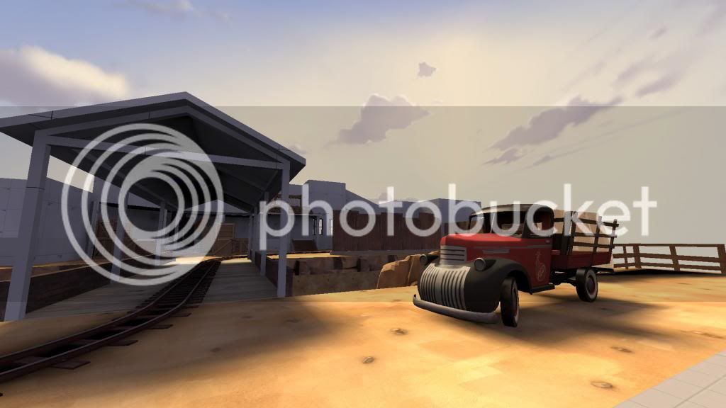
why do people compile with hdr when they are using dev textures .-.
oh yeah i luv me sum of dat hdr oh looks so sexc with that bright and dark orange
Skybox maybe? and some of the models
Fish 2.0
L6: Sharp Member
- Nov 22, 2012
- 324
- 262
Skybox maybe? and some of the models
sorry
i forgot how good containers look in hdr
mint onion
L3: Member
- Jul 18, 2013
- 101
- 45
ThePhlubs: i like seeing how you're using the dev textures here, thanks for sharing.
do you feel there is an advantage to lining up wall corners with texture dimensions? does that help in the detailing phase?
is there any rhyme or reason to how you're using wall texture colors? does, for example, the gray, red, and white wall textures represent something different in your mind?
thx
do you feel there is an advantage to lining up wall corners with texture dimensions? does that help in the detailing phase?
is there any rhyme or reason to how you're using wall texture colors? does, for example, the gray, red, and white wall textures represent something different in your mind?
thx
ThePhlubs
L1: Registered
- Oct 7, 2011
- 19
- 11
ThePhlubs: i like seeing how you're using the dev textures here, thanks for sharing.
do you feel there is an advantage to lining up wall corners with texture dimensions? does that help in the detailing phase?
is there any rhyme or reason to how you're using wall texture colors? does, for example, the gray, red, and white wall textures represent something different in your mind?
thx
Lining the textures definitely does help me personally, just to map and lay things out faster. The textures represent playable area. Red/Blue are playable key buildings, orange and white are neutral, gray is non-playable areas that I haven't clipped yet.
I personally use the 64 unit grid box and pre-plan areas because I personally hate cramped areas that aren't flank routes. Laying out areas ahead of time really helps me with flow and planning out key areas.
Last edited:
Beetle
L9: Fashionable Member
- Aug 17, 2008
- 627
- 178
MyNameIsNotPa
L1: Registered
- Aug 7, 2013
- 7
- 3
- Jun 1, 2013
- 201
- 45
I'm making map but i have a problem http://forums.tf2maps.net/showthread.php?t=21594 Help if you can!


