WiP in WiP, post your screenshots!
- Thread starter Arhurt
- Start date
You are using an out of date browser. It may not display this or other websites correctly.
You should upgrade or use an alternative browser.
You should upgrade or use an alternative browser.
Beetle
L9: Fashionable Member
- Aug 17, 2008
- 627
- 178
i cant 3d models
i have the dumb
How hard can making a model of a ball and a model of a pipe be?
mint onion
L3: Member
- Jul 18, 2013
- 101
- 45


mint onion
L3: Member
- Jul 18, 2013
- 101
- 45
Whats the goal, try to reach the door next the hill ? I wouldn't be the attackers in this map.
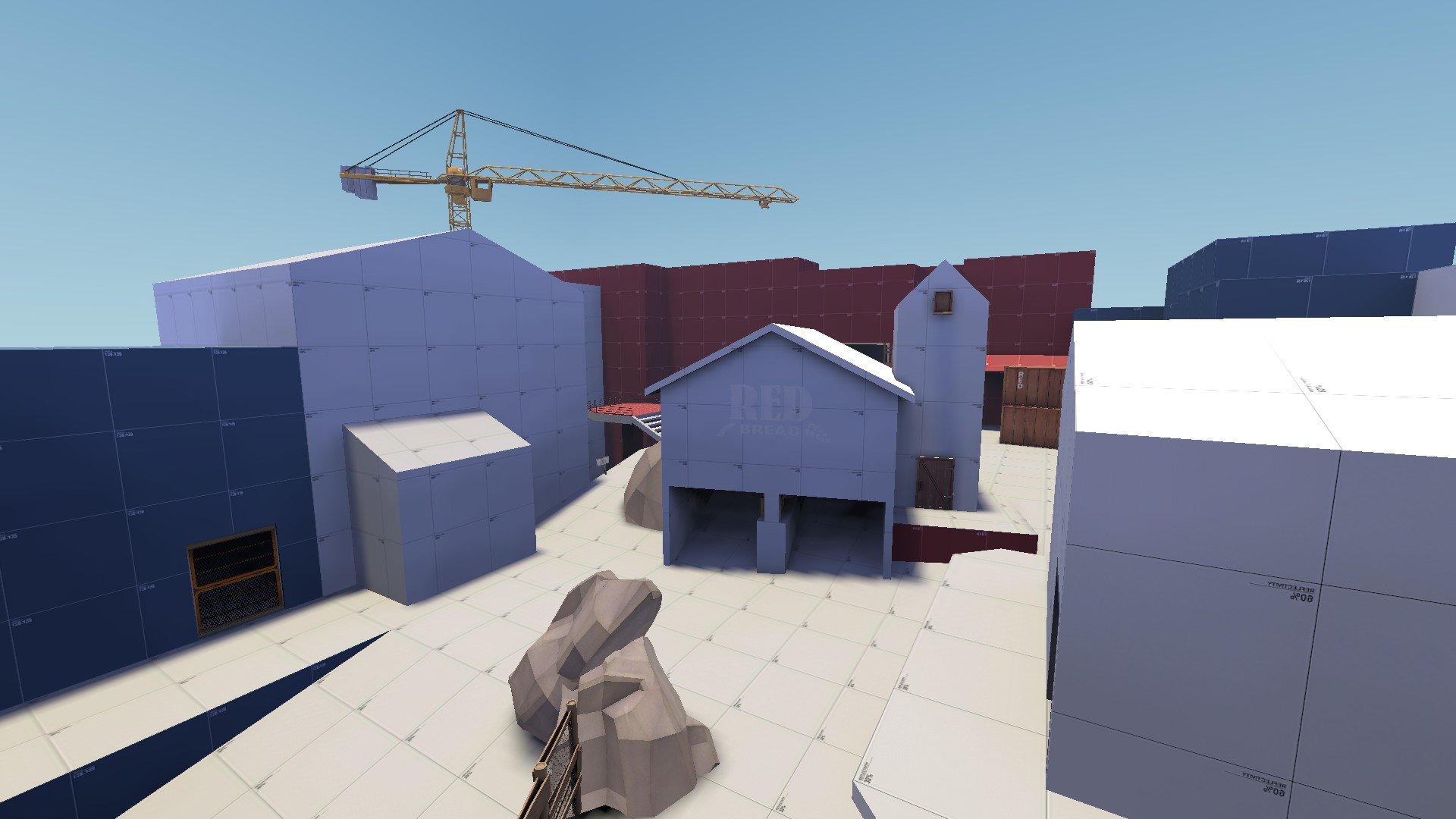
i'm not really happy with the results to be honest. i started building without any game plan. i didn't even have a game type in mind. the weekend was almost over and i wanted to build something.
i had never used displacements, fog, or skip/hint brushes before. i tried keeping my vis leaves clean while building this space. i also tried using sentry props to help with scaling, which was really useful. i had started out with the intention for it to turn into a map but, i suppose it was more exploratory than anything.

That explains alot. Many times you need a good idea to be able to make a good map. Building for the sake of building can sometimes end up with good results but many times its just trash.i'm not really happy with the results to be honest. i started building without any game plan. i didn't even have a game type in mind. the weekend was almost over and i wanted to build something.
Still, its not like its totaly useless. By random creations you can turn up with nice blueprints for a map. For example i like the first screen. Which although its simply could be a nice midsection between 2 cps.
For hill sections you need a good idea and instead of instantly starting with displacing anything just build the base shape keeping displacements as possible result. This comes down to aligning brushes in a cleaner way. Displacements take alot of time compared to normal geometry and if the area itself is bad its just a waste.
However, if you want such hill section the most important part is that you can flank effectively. This means a side path which is hard for red to overtake. But obviously isnt going to make blue steamroll it. And i do see the room for such path on your screens. Still, what i would do there is to have the hill be a bit more diagonal so on 1 side you can get on the top area while at the lower end you go under a bridge.

mint onion
L3: Member
- Jul 18, 2013
- 101
- 45

mint onion
L3: Member
- Jul 18, 2013
- 101
- 45
You could have added waldo at least then so we realy were able to test it out.
On a side note, the map looks like its getting a better shape. However, on screen 3 there is still a tunnel to some glass that doesnt make sense to me. I think it would be better to place the glass closer to the spawn and have the tunnel as a health/ammo source. That way it adds to the gameplay.
On a side note, the map looks like its getting a better shape. However, on screen 3 there is still a tunnel to some glass that doesnt make sense to me. I think it would be better to place the glass closer to the spawn and have the tunnel as a health/ammo source. That way it adds to the gameplay.
mint onion
L3: Member
- Jul 18, 2013
- 101
- 45
i feel like having the large glass window is very important actually. a major problem i had with my first map, was its layout, making players easily lost and confused.
it will be the first thing the player will see when they step out of spawn. what i hope it will achieve, is establishing the map's goal, remind the player what team they're on (admit it, it happens to the best of us), and lastly, update the state of the capture area, each time a player spawns.
hopefully that gives you an idea of my intentions there.
It does that well to me. Its just that its a dead end and people are very likely to walk into it.
This was the idea that i had:

This keeps the glass as it is but removes the ability to walk into it as if its a tunnel.
What many would normaly do is walk straight forward. They except a side path at the end anyway. Except it isnt there so its a useless dead end to them. In my example its not longer a path you can walk into yet still a dead end. On the other side however it became a tunnel. It might on that part be a useless dead end but by adding a little health and/or ammo it no longer is useless and can add to the gameplay.
This was the idea that i had:
This keeps the glass as it is but removes the ability to walk into it as if its a tunnel.
What many would normaly do is walk straight forward. They except a side path at the end anyway. Except it isnt there so its a useless dead end to them. In my example its not longer a path you can walk into yet still a dead end. On the other side however it became a tunnel. It might on that part be a useless dead end but by adding a little health and/or ammo it no longer is useless and can add to the gameplay.

not sure if its dev textures or
just shitty lighting but
i dont like the lighting
The white textures are for reflectivity, so it brightens everything up by quite a bit. Use the basic grey texture (the one without numbers) for the ground and it should help tone things down a bit.
The colour of the brushes is important due to Radiosity. I'm rather poor at explaining things so i hope that answers any potential questions relating to why the colour/texture of brushes is important. ")
tip: don't try to understand the language and mathematics if they're not your thing. the pictures should be self-explanatory.
tip: don't try to understand the language and mathematics if they're not your thing. the pictures should be self-explanatory.
mint onion
L3: Member
- Jul 18, 2013
- 101
- 45
It does that well to me. Its just that its a dead end and people are very likely to walk into it.
This was the idea that i had:
This keeps the glass as it is but removes the ability to walk into it as if its a tunnel.
What many would normaly do is walk straight forward. They except a side path at the end anyway. Except it isnt there so its a useless dead end to them. In my example its not longer a path you can walk into yet still a dead end. On the other side however it became a tunnel. It might on that part be a useless dead end but by adding a little health and/or ammo it no longer is useless and can add to the gameplay.
thank you for taking the time to write up a suggestion and create a diagram, wow! so you know, your prediction and suggestion was 100% correct. at first encounter, 90% of the ENTIRE TEAM ran directly into the window like a flock of confused birds. it was a horrifying sight.
it was interesting to note that when the player forging ahead makes a navigational mistake, the group behind him falls in tow, which ultimately makes a small navigational error feel much more punishing than i had anticipated. ಠ_ಠ
i think the solution you've offered is fantastic and would allow for that layout to work while padding the confusion.
considering the concerns you've raised now and previously about this area, it adds weight to suggestions made by some others and have decided to go ahead and remove the windows entirely, roots and all, and i think it is the right choice. unfortunately, doing so creates a direct line-of-sight between red and blu spawn doors which is something i will have to address at some point.
thx!
Last edited:
The colour of the brushes is important due to Radiosity. I'm rather poor at explaining things so i hope that answers any potential questions relating to why the colour/texture of brushes is important.
tip: don't try to understand the language and mathematics if they're not your thing. the pictures should be self-explanatory.
yeah im not stupid
radiosity isn't a new idea for me
just never realized there is a functional difference
You could add some cover in the middle of the cp. This cover can act as a wall to prevent a direct sightline. Any direct sightline from the spawns is a bad thing. Even when during a test it doesnt go wrong eventualy it will when other players play it. Its fully depending on the sniper behaviour.considering the concerns you've raised now and previously about this area, it adds weight to suggestions made by some others and have decided to go ahead and remove the windows entirely, roots and all, and i think it is the right choice. unfortunately, doing so creates a direct line-of-sight between red and blu spawn doors which is something i will have to address at some point.
I however still think that your glass idea wasnt bad at all and i rather dont see you remove it at first unless you already tested the change i did. If people still think they can walk through just add some props near that window that indicate its a wall. For example some wooden boardings on the lower part of the glass, or some fence. Still, i think glass does enough.

