These are my favorites. They aren't in any particular order.
Koth_King: It's a genuinely beautiful map that perfectly illustrated 1960s/70s hong kong and it guides my eye right exactly where it wants me to look. The Lighting is masterful and overall beautiful on how the surrounding lights from buildings and lamps light the map as opposed to the environment light. The center cap's traditional Chinese architecture blends perfectly with the surrounding buildings and doesn't become an eye sore. The lower levels show that there was activity and life there with all the closed shops and businesses. Also the color balance and general palette of the map is really cool. In a lot of places white wash tile is the perfect backdrop for all these colors. Sort of how the one upper room near mid across the bridge gets away with color lighting, a lot of white tile lets the light color what it wants to. I have a lot to say about this one but I'll keep it short for now.
Thunder Mountain:The main thing about this that does it over for me is lighting. Oh god all of the lights are just wonderful. The first time it came out I was won over on how they used that one tiny section of the rainy alpine skybox as the source of the environment light. It casts such a warm and bright tone on what would be otherwise a gloomy and dark map. The massive lumberyards and wood buildings are cold on the outside but the walls are always painted with really nice beige tones or dark wood that is illuminated by a lot of warm lighting. On every level there is some really cool vista they want the player to experience. The cliff with the train bridge outside of blue spawn on the first stage, red's courtyard around last out of the tunnel, and the really cool waterfall canyon outside of that larger building. The constant sense of release after leaving the choke points is really rewarding in itself. Thunder Mountain also keeps it very simple in some places. You can look outside of the map and only see a small cliff and a few trees, it's minimal as all hell but it works perfectly where it is an isn't trying to draw your eye there too much. The architecture in general is downright cool as hell too. It uses enough wood and metal to have a nice industrial feel. Again I'll try to keep this short but overall it has wonderful use of tone and lighting. It makes its own atmosphere.
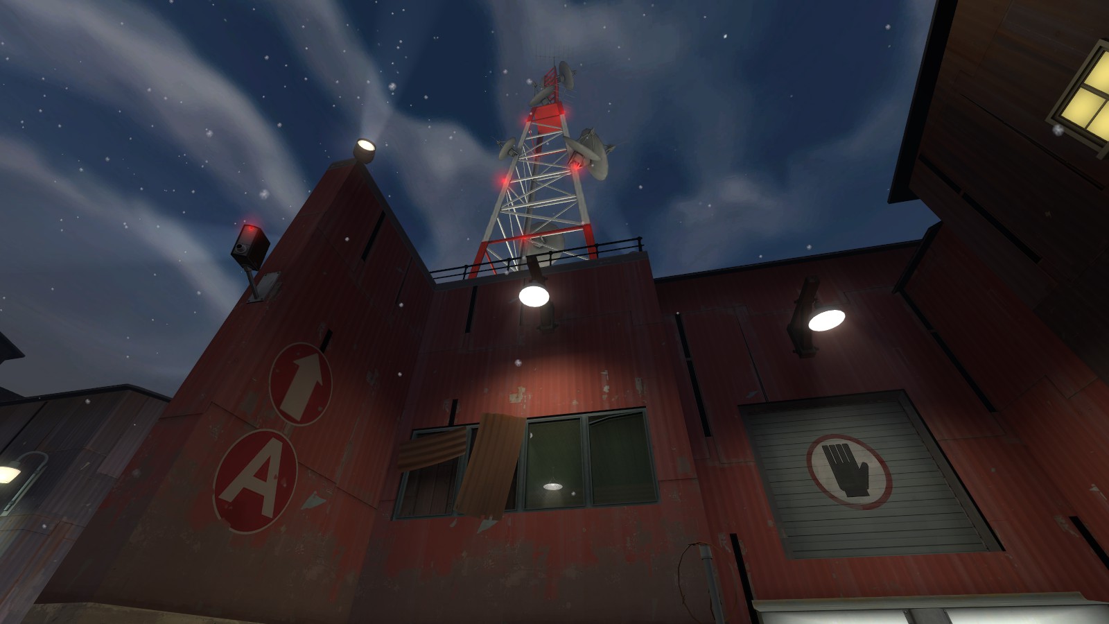
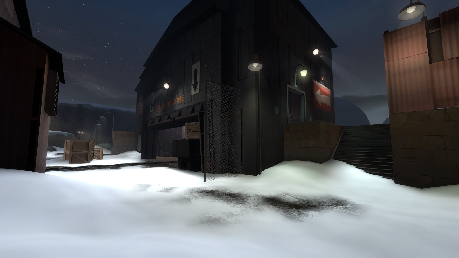
Pipeline:This is one of few maps that feels genuinely classic for tf2. It could have been released on launch day and fit right it. I think it's one of the last maps that gave this impression for me. I really like how they used the night in this map. Anything they don't really need you to look at is black and not even visible. It's really elegant and simple of a solution to get players to feel closed in by so much industry and shit. It has a nice 'painted' feel and sort of makes me feel like I'm in a postcard or something like that. Lighting is very nice and warm, it just is a nice experience over all.
Upland:I cannot praise the detailing (and gameplay) on this map enough. It's colorful, it's fun, more condensed and easy to navigate than Steel and it in general is overall very pleasing to walk around in. The outdoor and indoor parts are perfectly integrated into each other and have a very nice seem-less transition. I like a lot of the prop usage in this too, I think there's the barn door from 2fort used as a basement door around B (maybe?) and it just such a nice touch in general. Overall I think what I like most is the 3D skybox. Example of the perfect way to layout a Skybox. It has color, action, a story, it's minimal but has just enough detailing to make me look around.
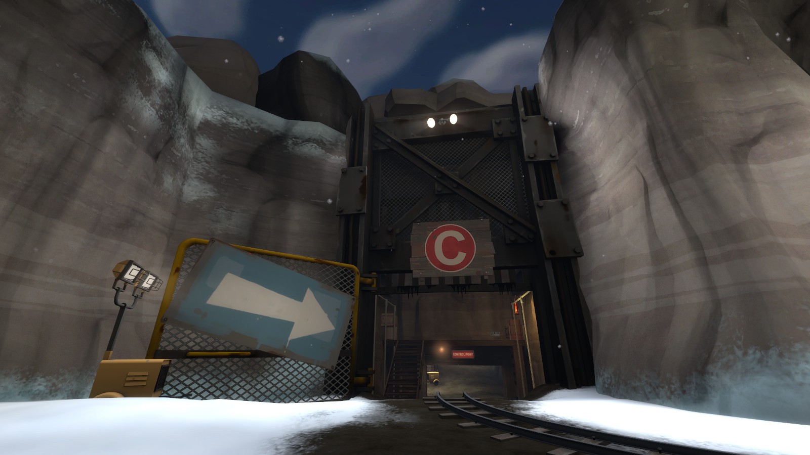
Glacier: I haven't honestly played this map since I hardly ever see it in rotation for any server, but it's an early snow map that really nails down the atmosphere and tone. It does a good job of naturally damage to buildings from wind and snow and the way it's 'brushed' with snow is interesting. I wish more people would do these sorts of maps that involved ice and water. Nice toning of the map in general too.
Dusk:Overall my most favorite map to play on and favorite to look at. Two stage CP was waaay more fun than I thought it would be and the map uses a variety of wood textures and other props I haven't really considered using in a way they all sew into each other. The warm lighting against the rocks and skybox makes for a lot of cool scenes and interiors. I think the second cap on the first stage, there's a light casting onto a factory pipe prop near spawn and the shadow it casts is so crisp and cool to look at it's just..
ugh. I sort of thought the mix of rusty and wood textures didn't make sense at first but the orange/red/grey combo of all of these makes for some nice atmosphere and toning especially with the lighting.
Dropdown: Mostly why I love this map is the 'hazy' feel overlaid on the whole map that sort of ties everything together. This damp, white overlay over everything makes colors seem more faded and washed out but let players pop out much more. Another map with a super 'classic' feel as well. The architecture is present but doesn't really interfere with player movement and just guides players around. There's a flank route from the spawnroom courtyard that goes to the back of mid that's really pleasing to look at since I don't feel closed in and the trip seems much sorter even though it's a bit longer to get to the point than other routes. Lighting is alright, it's not terribly special but the environment light does most of the work honestly.
WildFire:Really really cool environment. I honestly miss the maps that involved something happening actively outside of the map. Like it's just really awesome to see those sorts of things and makes me as a player feel more incorporated with the game. There's some areas where the red glow on the clouds is causing a red glow in another place in the map and that's just
such a cool detail mechanic. I'd like to see more of that 'world' for wildfire. Something more close to the fire or along those lines. Also those doors that have the 'Top secret' glass replaced with actual glass are awesome.
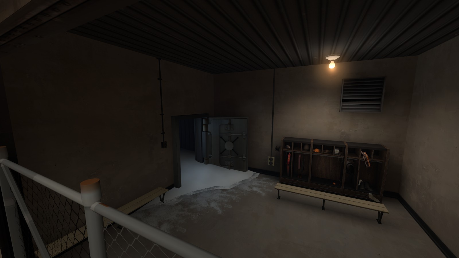
Barnblitz: I mostly enjoy the architecture of buildings in this. Even though a majority of the buildings have that gross red wood texture that's completely overused, it's really enjoyable since it's used on a variety of things with the white snow as a nice base. The warm but cool lighting conflicts to have a nice 'morning' feel that it captures effortlessly. The interior spaces are just downright cool and very atmospheric in general. The dark wood walls have a great background for the painfully bright windows that light up the whole space. It makes whatever outdoor area or window just pop out and really draws the player in general. Also it has a bunch of cozy little spaces that make camping or something less suckish. I also enjoy how there are sort of unspoken spaces that are implied through props or just general layouts. Like the locker room near last, or the hay lofts in the upper levels around the third cap. The ridiculously long and bent ladder up to that one roof is comical but ties that space together in my opinion.
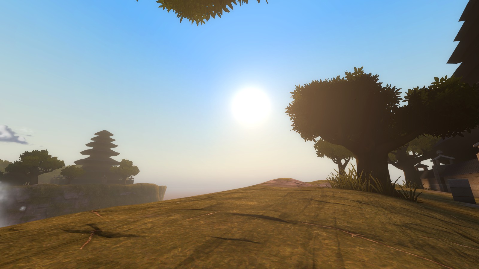
Borneo: Finally, a map that isn't afraid to use copious amounts of cool colors for a red-sided map! Another map with a 'hazy' feel that makes me feel like I'm swimming through dense jungle air. More in love with the tone and lighting of this map more than the architecture. The courtyard outside of Red base is cool, especially that tower it's really rad. It's one of few maps where the custom assets are always there and aren't overbearing. (as opposite, I don't like Zink but that's for another time) I love the trees and just the feel of it all. The jungle isn't surrounding me and completely making me feel trapped. The hills in the skybox with the clouds are super cool and just awesome to stare at in general.
Hydro: It's so classic it's painful. It's
the tf2 in my opinion. Anyone that is trying to understand how gameplay and detailing go hand in hand, please spend an hour or two on hydro by yourself or on a server just walking around. The amount of time they invested in hydro itself is really evident just in the detailing in general. Each area's unique theme or structure is perfectly blended into its environment. Around the Dam the desert walls are almost as high as the dam itself! It makes the point looks miniature in comparison but all of the sight lines and
lighting that falls into the point's lap makes a great area to play in. I'd kill to see more maps that don't just slap a spotlight onto the point and call it a day. I enjoy being guided into a space and having the point lit up. Sort of like it was lit up for me almost. Just the impression I get. Quick notes: Interior spaces are really nice and fun to run around, the outdoor 'backlot' feel is super evident and are pretty flawless.
RottenBurg: So German, it's painful! I think it's pretty fun seeing valve add splashes of color to maps where the red team/blue thing doesn't matter exactly. Also the idea of turning the 'medieval german town' theme up to 10 proves to make a successful urban alpine map of sorts. The whole outer castle wall near where bots spawn is awesome. Perfect as a landmark and just in general a different way of looking at how to utilize assets. The big tower in the middle of the town is cool since you can walk through it, That's a big plus since it isn't just something pretty in the map, it has purpose and is drawing me toward it! The spawn rooms are pretty atmospheric as well, Kinda used too many custom assets imo but it isn't too big of a deal. An area I wasn't exactly... expecting was the canyon/ravine on the side near the bomb pit with the super blue water. It provides a nice vista and just a nice area to look at in general.
That's about it for my list, I'll update it if I feel like it.
Overall what I think makes a beautiful map:
-Toning of a map that is intelligently used and incorporates colors of the map or provides a backdrop for the map's palette
-Let environmental lighting do the work! Just like in real life, natural lighting can only improve your mood.
-Architecture that incorporates itself with the map and environment. Get an idea of what kind of landscape your map is in and how buildings would be built in and around the area.
-Mix up themes and try something different, it doesn't hurt unless it's something painfully dumb then I'm going to call you dumb for being a dumb nerd.
-A 3D skybox that is present but not overbearing and not too minimal. You don't have to go all out just make something interesting that makes a backdrop for the map and adds context to what you're making. (also incorporation of elements from the skybox is a plus)
-Contrasts. Night-time map with a lot of white?
That's pretty neat! Mostly a red map with a lot of blue? Also neat! this is up for interpretation but I guess just experiment
-Speaking of experiment, try things out you don't think would work.


