- Mar 11, 2013
- 892
- 1,050
So, the questionnaire is done! The results are locked in! Wanna see some juicy stuff, you’ve come to the right place!
The results!
Graphs and summaries:
https://docs.google.com/forms/d/15oYAwG60wfqULeKQ-K8SeSO2B4ozYO2TN1CEXgj4vnQ/viewanalytics
Raw Data
Inside the Zip file attached!
Correlations analysis
Inside the zip file attached!
What does the color coding in the file mean?
I’ve highlighted the Pearson correlation and significance within the excel document, this will serve as a guide to finding where significant links are. I’ve provided a brief explanation below as to what these values mean. Basically though the deeper the color, the more confident or stronger the correlation.
Confidence:
If you've completed statistics at university level, you can skip this.
I did some quick analysis of quantitative variables against each other. Before I dump it all on you I feel as though it’s important to explain what exactly is going on for those unfamiliar with stats.
Correlation: This means the DIRECTION and STRENGTH of the correlation.
There is a 90% confidence that the variables have a weak negative relationship.
Confused? I sure am, I have an exam in two weeks. Anyways, here’s a table of some juicy bits.
Some interesting correlations:

There's more to checkout in the excel file in the zip folder if you want to get into the nitty gritty of it, unfortunately it'd be too much for me to get into one image unfortunately (if someone can, send me the picture and i'll ad it here).
Other tidbits
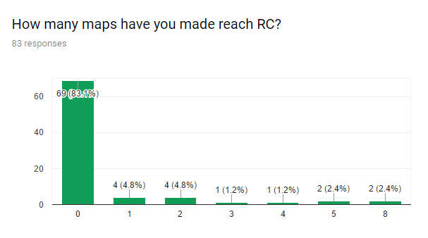
Before I’m asked if I can do more analysis on the data, for more correlations. I’ve decided I’m going to leave it at this for a few reasons:
If you found something interesting in the data, I will add it to this post.
The results!
Graphs and summaries:
https://docs.google.com/forms/d/15oYAwG60wfqULeKQ-K8SeSO2B4ozYO2TN1CEXgj4vnQ/viewanalytics
Raw Data
Inside the Zip file attached!
Correlations analysis
Inside the zip file attached!
What does the color coding in the file mean?
I’ve highlighted the Pearson correlation and significance within the excel document, this will serve as a guide to finding where significant links are. I’ve provided a brief explanation below as to what these values mean. Basically though the deeper the color, the more confident or stronger the correlation.
Confidence:
- Yellow: >10% Confidence
- Orange: > 90% Confidence
- Red > 99% Confidence
- Blue > 0.25 Correlation
- Deeper blue > 0.5 correlation
If you've completed statistics at university level, you can skip this.
I did some quick analysis of quantitative variables against each other. Before I dump it all on you I feel as though it’s important to explain what exactly is going on for those unfamiliar with stats.
Correlation: This means the DIRECTION and STRENGTH of the correlation.
- -1 is a negative correlation (The higher one variable goes, the lower the other goes)
- -0.5 is a moderate negative correlation
- 0 is no correlation
- 0.75 is a strong positive correlation
- 1 is a positive correlation (The higher one variable goes, the higher the other one goes)
- 0.10 would mean we are 90% confident in the correlation
- 0.05 would mean we are 95% confident in the correlation
- 0.01 would mean we are 99% confident in the correlation
There is a 90% confidence that the variables have a weak negative relationship.
Confused? I sure am, I have an exam in two weeks. Anyways, here’s a table of some juicy bits.
Some interesting correlations:
There's more to checkout in the excel file in the zip folder if you want to get into the nitty gritty of it, unfortunately it'd be too much for me to get into one image unfortunately (if someone can, send me the picture and i'll ad it here).
Other tidbits
Before I’m asked if I can do more analysis on the data, for more correlations. I’ve decided I’m going to leave it at this for a few reasons:
- It will take a long time for something that I’m pretty inexperienced doing
- In a lot of instances inference can’t be performed because the sample sizes aren’t large enough
- Some questions were misunderstood, making it unfair to make inference on TF2Maps as a whole
If you found something interesting in the data, I will add it to this post.