You are using an out of date browser. It may not display this or other websites correctly.
You should upgrade or use an alternative browser.
You should upgrade or use an alternative browser.
Changelog:
Added more distance between first and second
Added new way up from lower second area
Added new route on left Sphinx paw that drops down into the death pit flank side going into last
Changed route next to first cap so it now connects to flank going into lower second, widened it out, and removed the middle structure that was dumb and never good
Added scaffolding-styled cover to right sphinx paw to improve sentry nest position
Added some height variation leading into first
Widened some doorways
Narrowed some walls to make more room around cart/ through choke points
Added some more palm trees
Fixed some of minor bugs
Did not make it good yet
Read the rest of this update entry...
Changelog:
Remade last from scratch, hopefully much less bad.
Removed clipping from upper area next to second and created a new door connecting red side to it, and a small platform for blu. This change was not that good.
Adjusted some health and ammo, I think.
Dramatically lowered red spawn timer after capturing first to make up for not having the time to make a proper forward spawn for them, oops.
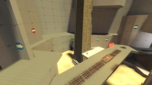
Officially brought on Jukebox as a contributor by having him modify the sphinx prop for us.
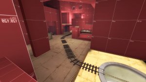
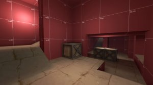
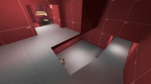
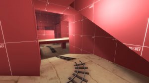
Read the rest of this update entry...
Remade last from scratch, hopefully much less bad.
Removed clipping from upper area next to second and created a new door connecting red side to it, and a small platform for blu. This change was not that good.
Adjusted some health and ammo, I think.
Dramatically lowered red spawn timer after capturing first to make up for not having the time to make a proper forward spawn for them, oops.
Officially brought on Jukebox as a contributor by having him modify the sphinx prop for us.


Read the rest of this update entry...
Added new forward spawn for Red coming out in front of Sphinx that opens into new route after Second is captured.
Adjusted Spawn timers to take new forward spawn into account
Gave second more defendable locations, oops I might've went too far
Added new "guard post" style lookout next to entrance to second to slow down attackers momentum after capping first
Moved Blu's first foward spawn back around the corner a bit
Fixed some clipping bugs, introduced some more clipping bugs, ngl
Read the rest of this update entry...
Changelog:
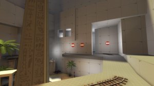
Added new window/ balcony overlooking second for attackers
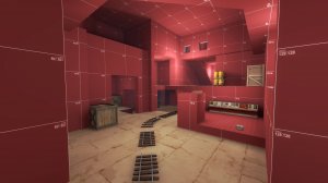
Added/ adjusted health and ammo, especially around last
Added finale explosion damage
Adjusted spawn timers
More time is now added to the clock on cap to account for the longer distances between cap points.
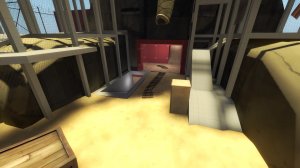
Adjusted clipping on fence behind last to allow it to be jumped up
Fixed a bunch of missing clipping, whoops
Fixed a few exploits/ ledges
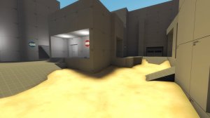
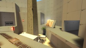
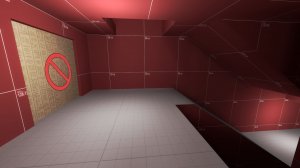
Read the rest of this update entry...
Added new window/ balcony overlooking second for attackers
Added/ adjusted health and ammo, especially around last
Added finale explosion damage
Adjusted spawn timers
More time is now added to the clock on cap to account for the longer distances between cap points.
Adjusted clipping on fence behind last to allow it to be jumped up
Fixed a bunch of missing clipping, whoops
Fixed a few exploits/ ledges


Read the rest of this update entry...
massacre master
L2: Junior Member
- Feb 2, 2018
- 88
- 20
this map is fun. but when I as blue ran to these doors I saw this. these spawn doors might need to be fixed
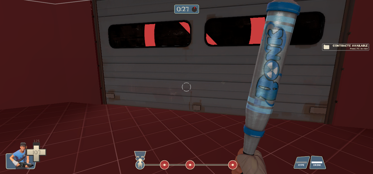


ran around this to try and get ideas because i, too, am making a 3cp payload. heres some nitpicks:
can't tell what's covered in water and what isn't. either use a blend to show me visually or just cover the whole thing in water
chickenwire is hard to see on its own and it becomes hard to determine what's open or closed. use more opaque surfaces and/or remove some of the structure. removing the columns in the middle would reduce the visual complexity and also just make sense for detailing (columns shouldn't come down on top of the archeology you want to preserve), and you could keep the size of the space the same through some props
the cheekiest of sightlines
this whole route is kinda disorienting, but this part might be the wost - i assume the path will bend around the wall to the right, but instead i walk into a dead end where enemies might be coming in behind me
(regarding the balcony in the back of the image) i personally think its best when snipers have to exit an interior space to get their good vantage point since it better exposes them to flankers/bombers. move the doorway to the left and snipers will have to make themselves marginally less safe to get a pick at the main choke where this image is taken from. (funnily enough this makes that cheeky sightline i pointed out even worse but you could make it work if you wanted to) also i appreciate that the balcony extends further to the left purely so snipers can get a shot even deeper into the choke
another cheeky position - snipers and heavies both could abuse this pretty readily. i think this mostly exists because the ground is bumped up a bit, if you flatten the ground to make the cover a proper 96 units then this shouldnt be an issue
you can also do something similar because of the ramp. easily fixable by moving the ramp elsewhere but also less of an issue imo
this wall serves as a pretty important sightline blocker but i think it also feels totally awkward. one thing ive learned about blue spawn design from other maps is that you can block sightlines by using height differences and it makes for spawns that feel more open but still don't exposure blue too much.
the fact that B is in the middle of the space rather than at the far end of it seems to indicate to me that the challenge for blue is less about taking control of the space and more about pushing into it at all, which seems less fun. as someone who hasn't played the map yet i am almost certainly reading into it too much, but it's what my intuition tells me. (also pushing B further back would make the HUD look a little less lopsided)
Changelog:
Pushed second capture point back some
Adjusted routes into second
Added space to the opening area
Adjusted health/ ammo
Broke the first forward spawn door for red
Changed palm models
Added new custom materials (and somehow didn't pack one of them?!)
Widened some doorways
Added a terrible jump route onto sniper perch thing going into second, it's bad
Still didn't get the explosion damage to work
Stuff, I dunno
Read the rest of this update entry...
Changelog:
Added one way door going into last
Added new door coming out of blu's second forward spawn
Lowered sniper perch windows overlooking last slightly
Maybe fixed the finale explosion finally? Probably not.
Fixed some bugs/ exploits
Adjusted spawn timers
Cleaned up jump routes just past first going into second
Changed ramp going into last into a drop down
Did some more optimization
Read the rest of this update entry...
Changelog:
Made Blu's first forward spawn have two way doors (why did I make them one way before?)
Adjusted/ added health/ ammo on the map
Fixed one way door that traps you (theoretically?)
Adjusted spawn timers to favor blu slightly more
Read the rest of this update entry...
Made Blu's first forward spawn have two way doors (why did I make them one way before?)
Adjusted/ added health/ ammo on the map
Fixed one way door that traps you (theoretically?)
Adjusted spawn timers to favor blu slightly more
Read the rest of this update entry...
-snip-
I'm guessing that this doorway uses a func_areaportalwindow, which can be enabled and disabled based on optimization needs.
I could be very wrong, though.
~Roxelle~
L1: Registered
- Apr 19, 2018
- 1
- 0
Hey crash Didn't now if you knew this already but there are some missing textures on some of the doors and columns, me and my Friend Have played oasis and are amazed at your progress keep up the good work I'd love to see this shipped into casual or comp.

Oops we went through 4 versions before I updated it here.
Changelog:
Full artpass of the map, reoptimized and clipped
Adjusted timers further
I dunno it's basically a brand new map from what it was besides the rough shape.
Freyja OP pls nerf
Read the rest of this update entry...
Changelog:
Full artpass of the map, reoptimized and clipped
Adjusted timers further
I dunno it's basically a brand new map from what it was besides the rough shape.
Freyja OP pls nerf
Read the rest of this update entry...
G.bo
L4: Comfortable Member
- Sep 24, 2017
- 180
- 195


 They will, but it'll take 470 days to do so.