-
This map is featured! Our best maps, all together in one place for your viewing pleasure.
You are using an out of date browser. It may not display this or other websites correctly.
You should upgrade or use an alternative browser.
You should upgrade or use an alternative browser.
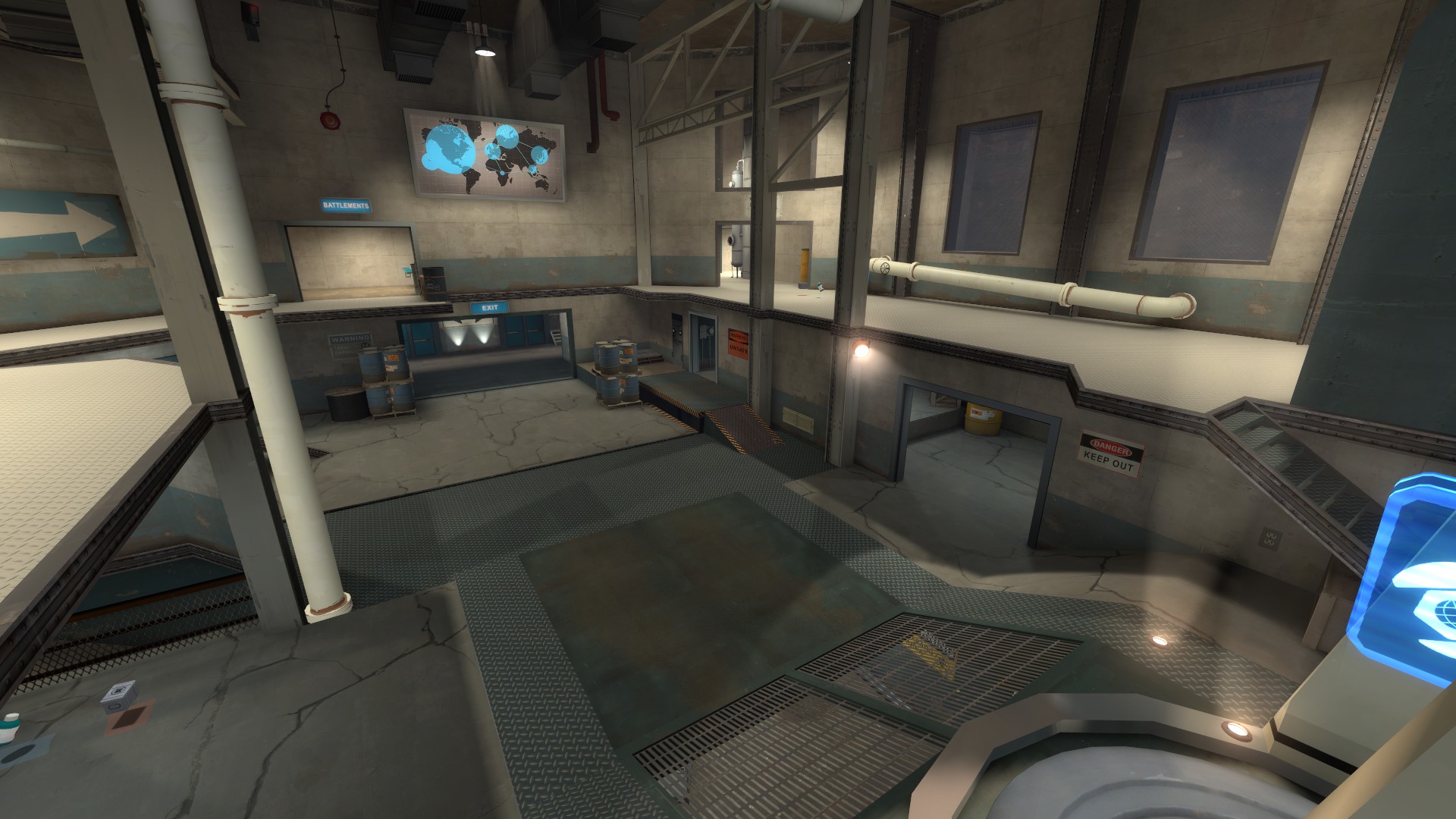
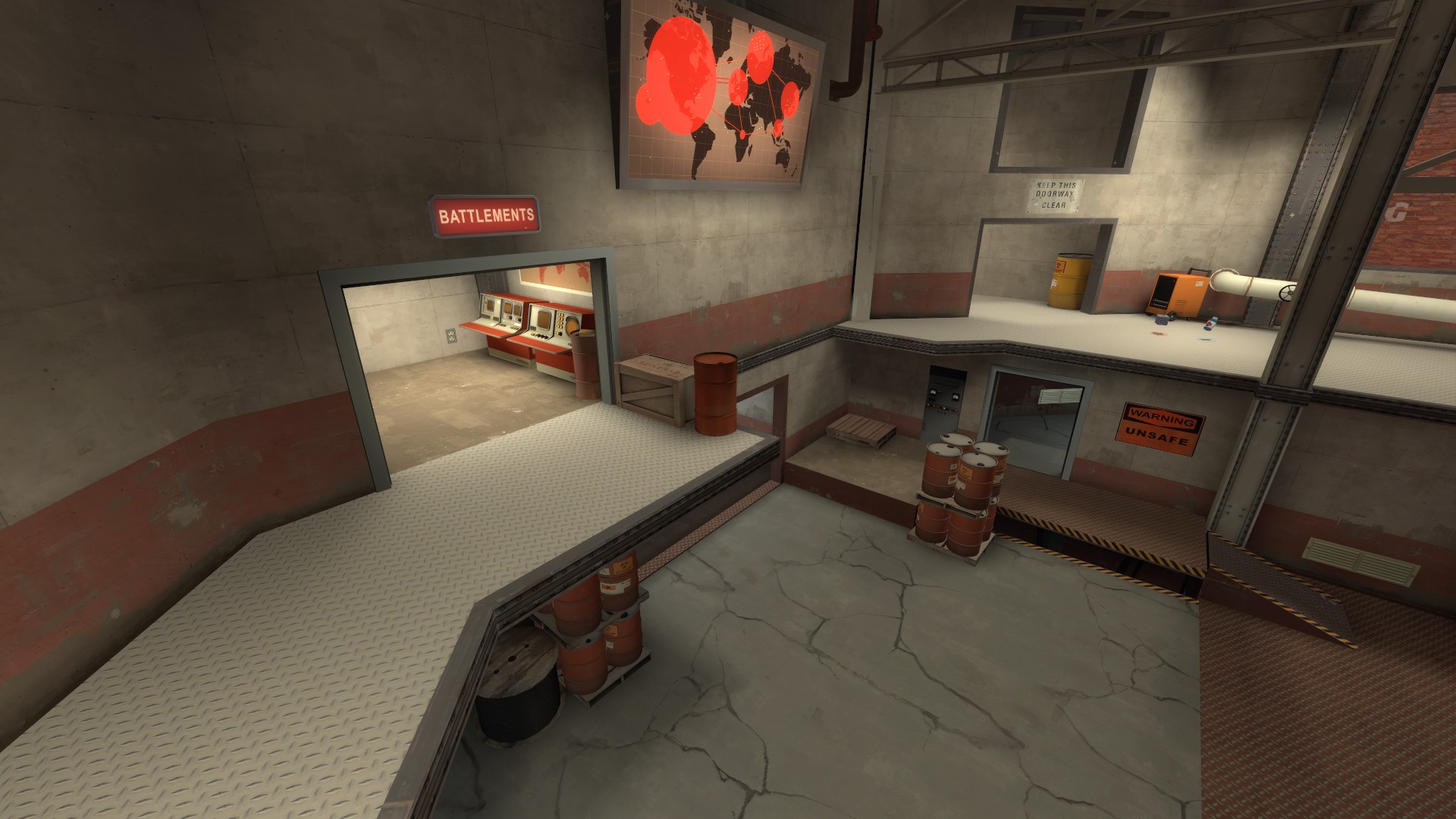
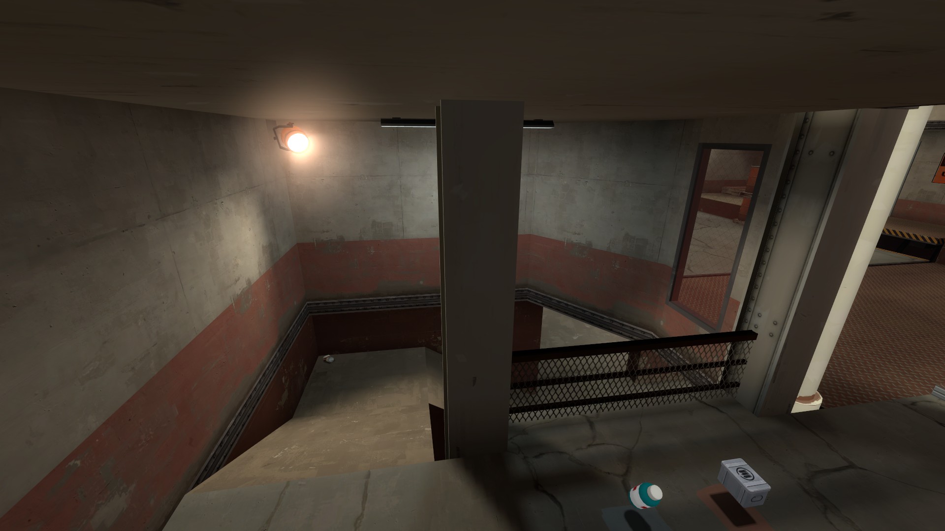
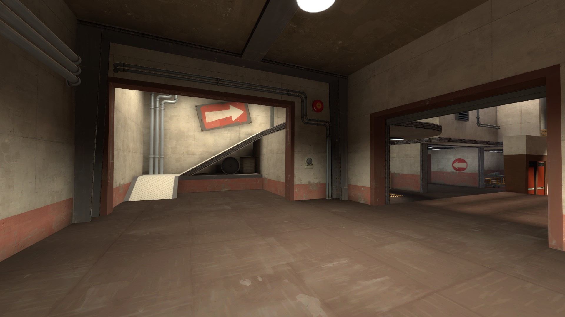
Updated to a pre-rc6 build, rc6test to test out some big changes to the last area of the map. I'll probably update it fully to rc6 in the coming weeks. Downloads in OP, I'll take some new screenshots soon.
Changelog:
Changelog:
Release Candidate 6-
Removed barrel/ crate jumping path from lower lobby to left platform
Replace above path with a new staircase leading up from Toxic
Changed cover around basement exit on last (thanks Kresnik for getting the feedback to me!)
Added "pit" behind final capture point
Removed crate jump on one side of last and replaced it with a ramp (thanks Dr. Alto H. Clef!)
Adjusted some of the health and ammo packs, notably reducing both in places (thanks Dr. Alto H. Clef & Xenith!)
Slightly adjusted crates on mid to make the jump impossible* for most classes
Adjusted second point capture triggers to prevent capturing behind sheet metal (thanks Martyy!)
Fixed areaportal/ reflection popping issue on the water in the basement
Fixed sticky exploit in tunnel between second and mid (thanks Dr. Alto H. Clef!)
Cleaned up a few unintended sightlines
Adjusted clipping to fix a few various issues around the map
Further optimized to improve FPS all over map
Adjusted detailing/ texture usage in a few places
Small lighting tweaks
*I am going to regret saying this
Tiny things:
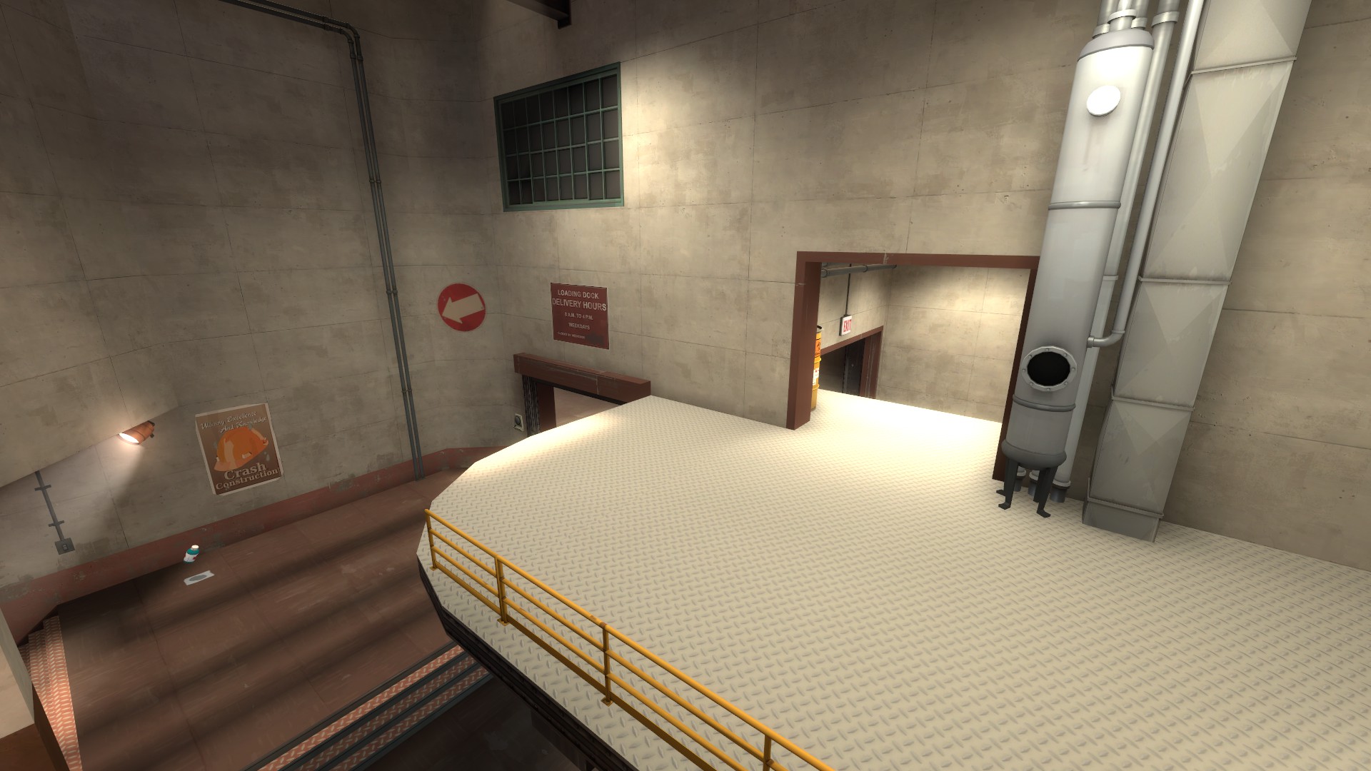
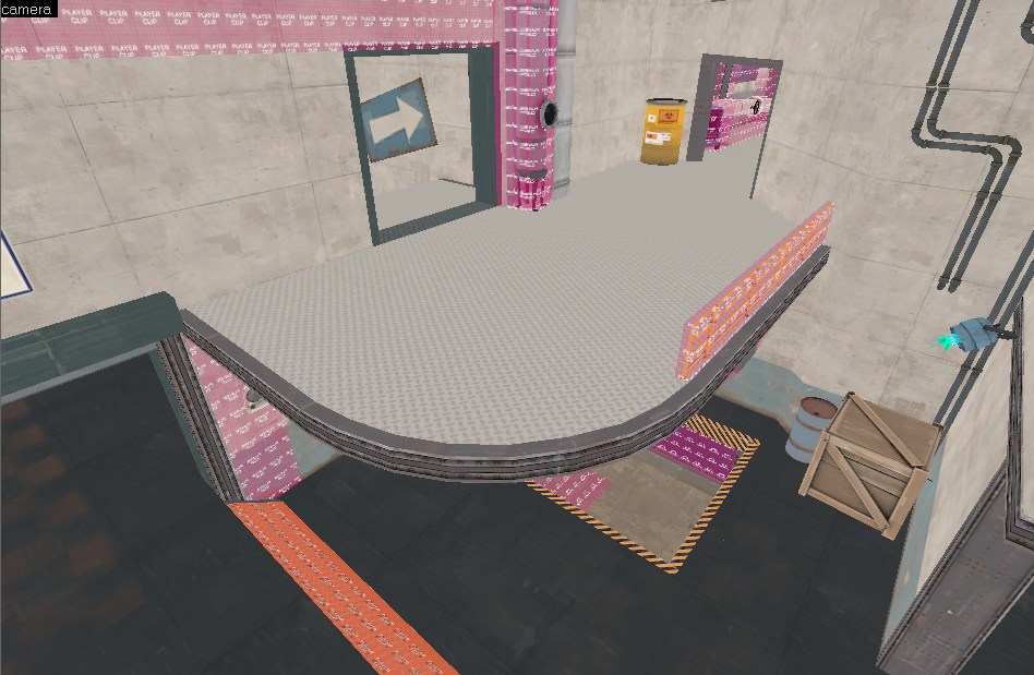
Add some trim to this, and use a higher-sided curve for that corner + smoothing groups to smooth that out and look extra sexy. Probably will have to adjust lightmaps a bit on the sides. It also looks like you just took that white platform and rammed it through the wall. It's a bit too continuous, make it look like it belongs there, not just that you forced it in.
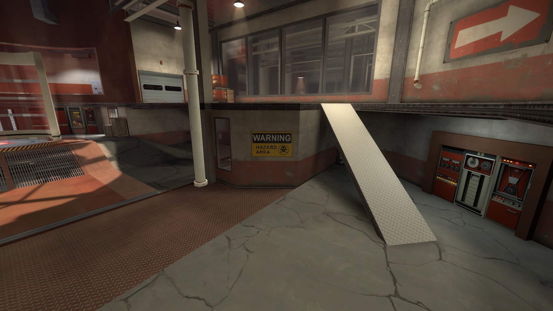
Totally get that this ramp is supposed to be here, but it looks REALLY out of place and totally awkward visually. If you can smush in a stair or something there, it could look a lot better.
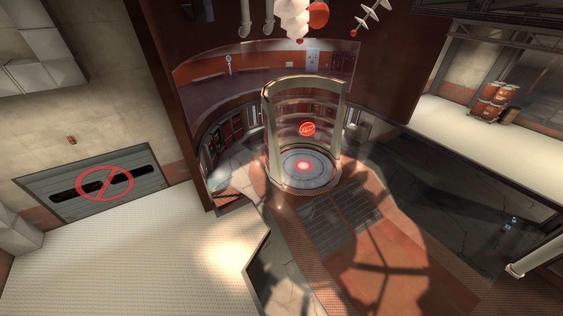
Trim on the bottom left isn't even and is rather noticable/ugly. Try your best to get that thickness equal everywhere, or have a better transition between the sizes (not just a brush that starts small and ends bigger).
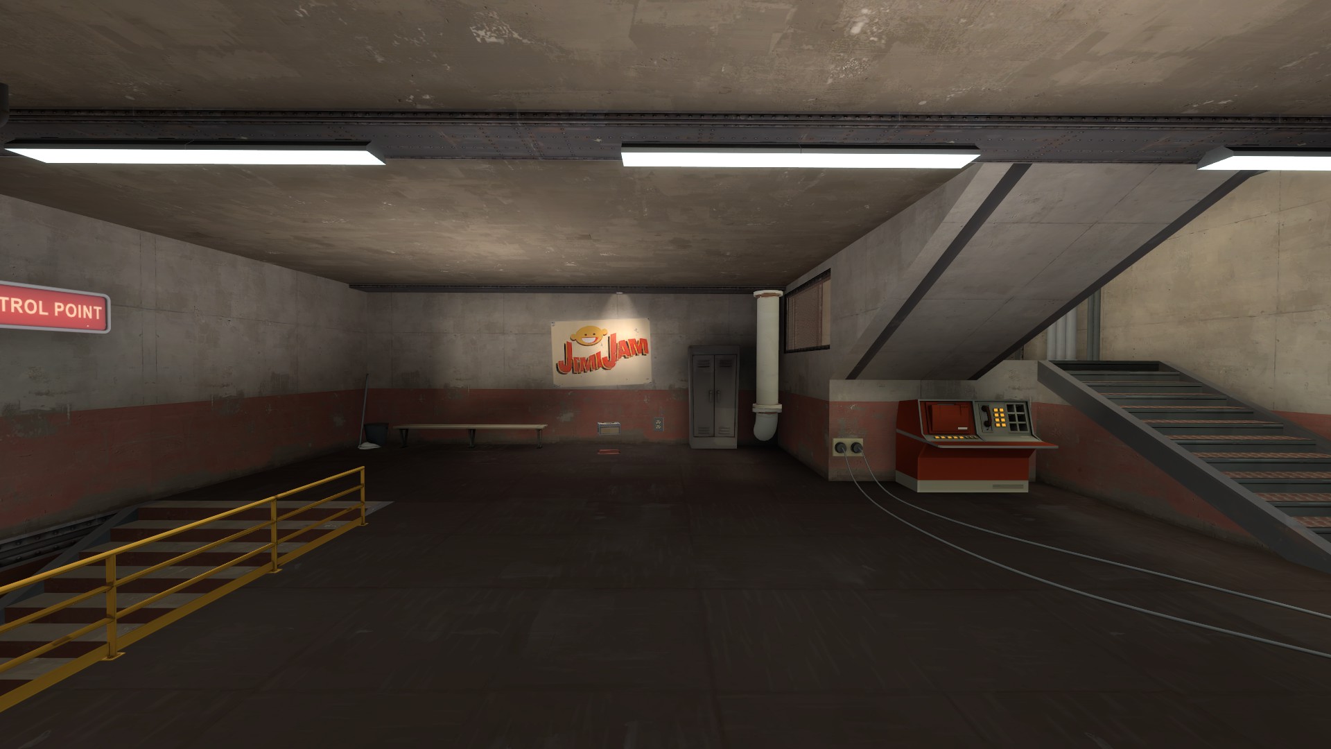
These I-Beams (?) are way to thin looking to be even remotely structurally sound, they also look really out of place in a concrete environment. Either chuck 'em and do something else with that ceiling, or make the ibeams look more like they're actual support features, than just a piece of metal on the ceiling.
EDIT: Also, last image, the lighting on that pipe is too bright for the area it's in, should be darker. Maybe use a lighting origin?

Add some trim to this, and use a higher-sided curve for that corner + smoothing groups to smooth that out and look extra sexy. Probably will have to adjust lightmaps a bit on the sides. It also looks like you just took that white platform and rammed it through the wall. It's a bit too continuous, make it look like it belongs there, not just that you forced it in.

Totally get that this ramp is supposed to be here, but it looks REALLY out of place and totally awkward visually. If you can smush in a stair or something there, it could look a lot better.

Trim on the bottom left isn't even and is rather noticable/ugly. Try your best to get that thickness equal everywhere, or have a better transition between the sizes (not just a brush that starts small and ends bigger).

These I-Beams (?) are way to thin looking to be even remotely structurally sound, they also look really out of place in a concrete environment. Either chuck 'em and do something else with that ceiling, or make the ibeams look more like they're actual support features, than just a piece of metal on the ceiling.
EDIT: Also, last image, the lighting on that pipe is too bright for the area it's in, should be darker. Maybe use a lighting origin?
Yeah that ramp has been bugging me for awhile but between being on an awkward angle and just barely being able to fit it in place as is, and not having enough good ideas for it, I've just been putting it off.
Now, while you're (assumably) coming to a close with development, would be a good time to rework that area a tiny bit to look less awkward. If I remember right, it was weird to fight around too.
Addressing the two biggest detailing things I've been putting off:
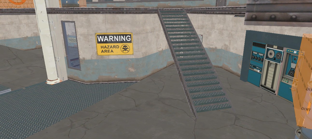
I'm really digging your style of doing metal stairs, I always found them awkward to put together (wood represent)


