- Sep 10, 2016
- 636
- 481
If you really wanna make CP1 defendable all you'd need to do is something like this:
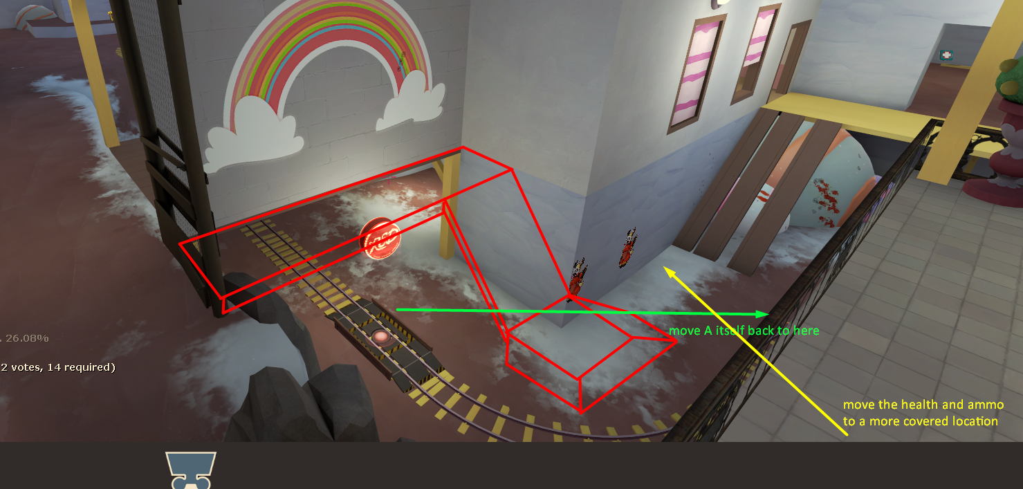
This'd give RED an obvious and strong sentry spot, really fast rotate and retreat times, and the ability to actually rotate past the main route without getting obliterated by spam and snipers, which as the map is now requires RED to backtrack almost to their spawn. Although I see a new displacement which shortens that a little.
If you're worried that this would make CP1 too easy to defend, I reckon you shouldn't be, since points with a really easy forward hold and hard backward hold tend to work out as pretty easy for BLU in the end, since it really only takes them one medigun right-click to capture.
By the way, the new sentry cubby on CP1 is a good addition at heart, but it doesn't leave engineers who set up in it any retreat option, and it's not big enough to escape a rocket's splash damage, so actually building in there is a doomed venture.
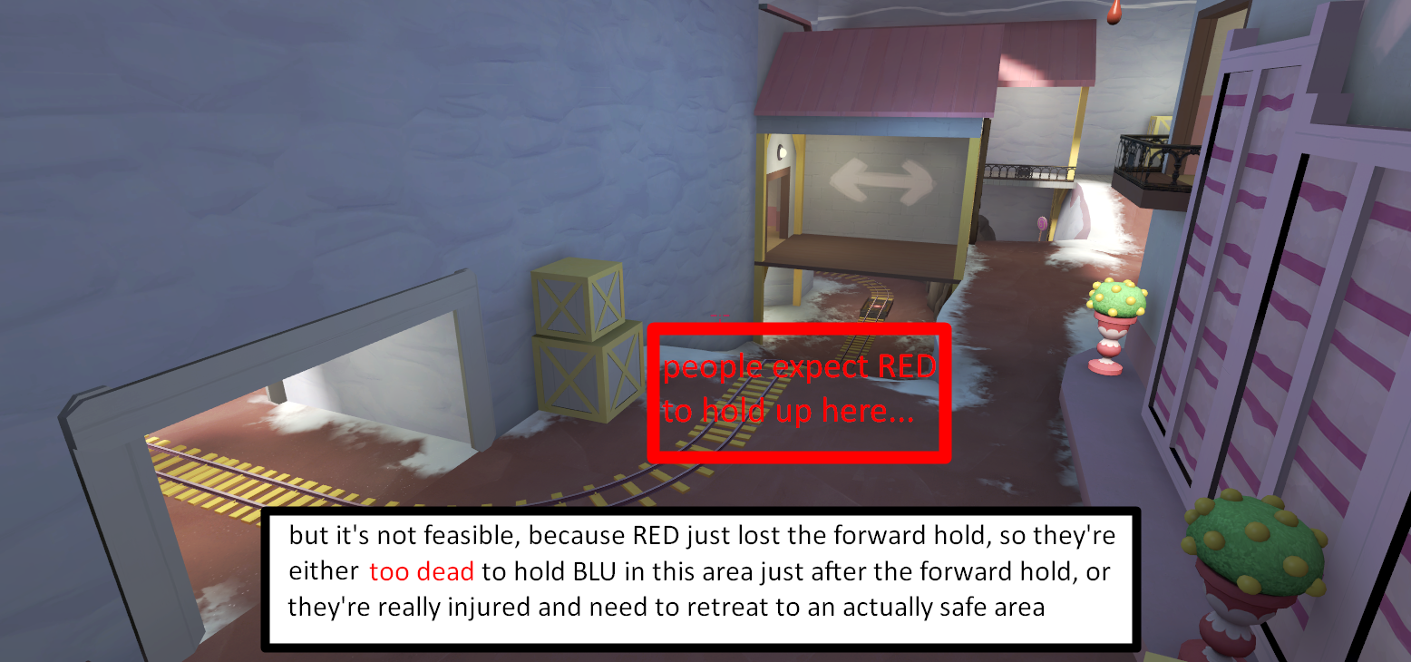
I think the main thing about A is that I think people have a very different vision of the A backward hold compared to what I always experienced playing the map:
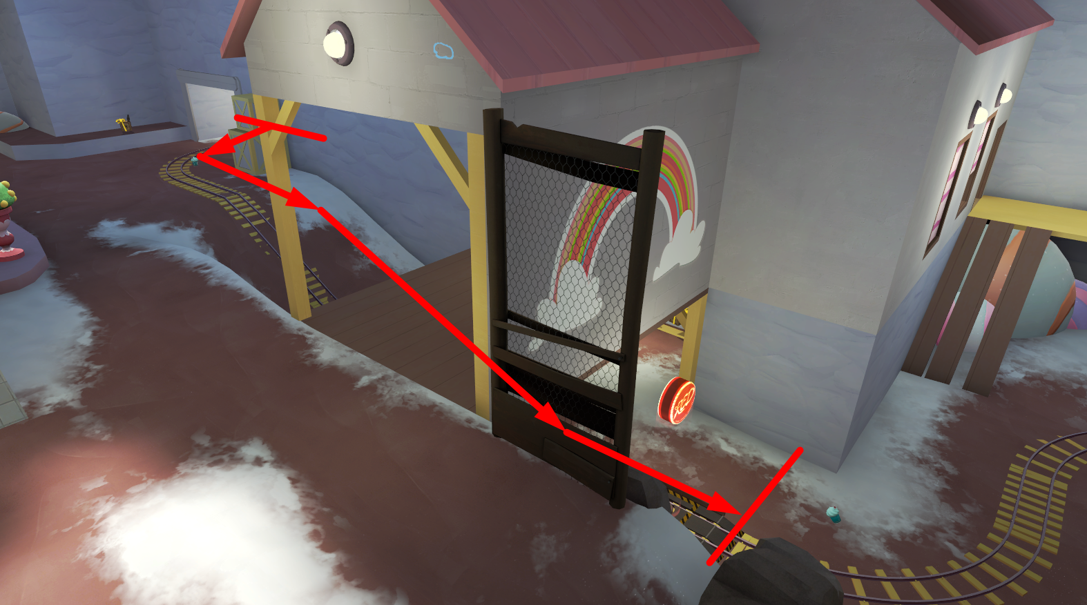
After making several A/D and Payload maps, I have learned time and time again that I can't just put the forward hold and backward hold 512 units away from each other. So, as a rule, I now always have 5 seconds of walk time between the forward and backward hold.
If on this map, I walk 5 seconds from the furthest-back part of the forward hold, this is where I end up:
Extrapolating that, I can even draw the bounds of the forward and backward hold areas:
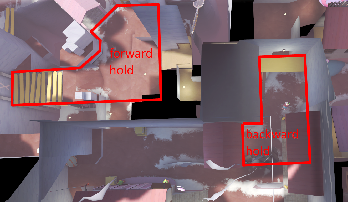
Now, I can't say for sure whether you think the backward hold is where I think other people think it is, or whether you think it is where I've drawn it.
But I have a pretty good idea that you think it's the former, because the area I've drawn as the backward hold looks a lot like it's designed as BLU's lobby to attack B.
Saying that RED losing is some kind of skill issue because they're trying to hold that area is really not fair in my eyes, because like I said in an earlier screenshot, after the forward hold is lost, the surviving RED players really just want to retreat to an area where they won't immediately have to fight BLU, and by the time they've healed up, BLU is already knocking on the doors of the area RED retreated to.
There's also one thing that always bugged me about the CP1 forward hold:
How is BLU supposed to avoid a sniper who uses this angle?
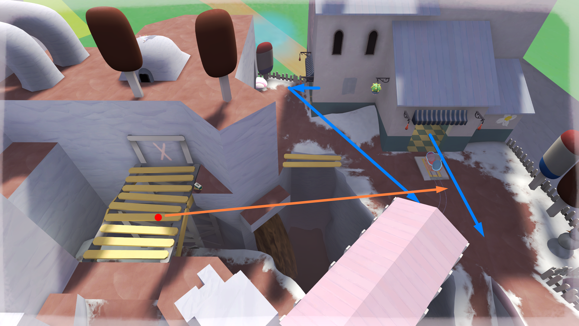
I reckon you should add a third spawn exit and make it look like this:
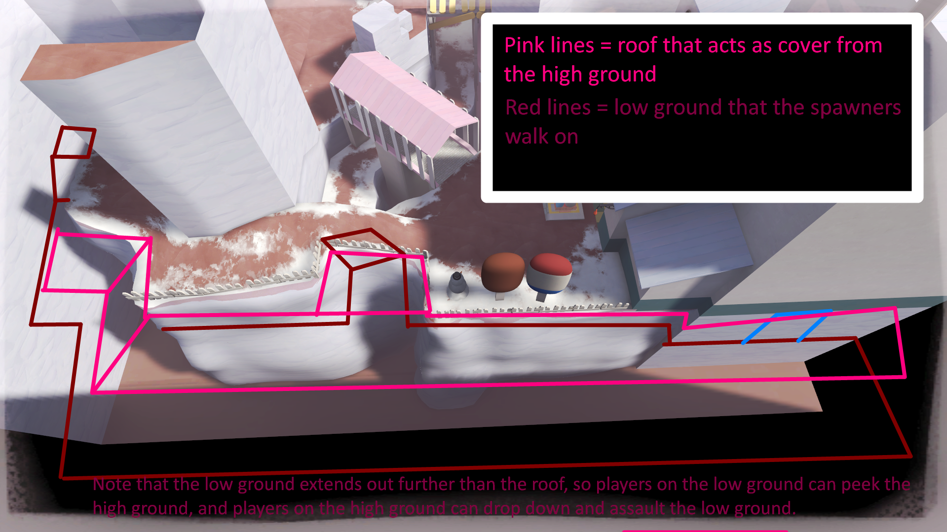
Also, what is this map's obsession with placing these sentry/health cubbies in major sightlines so they're not safe to enter at all?
This whole area feels back-to-front somehow, like it'd be way more fun to defend if BLU was actually coming from the current RED spawn area.
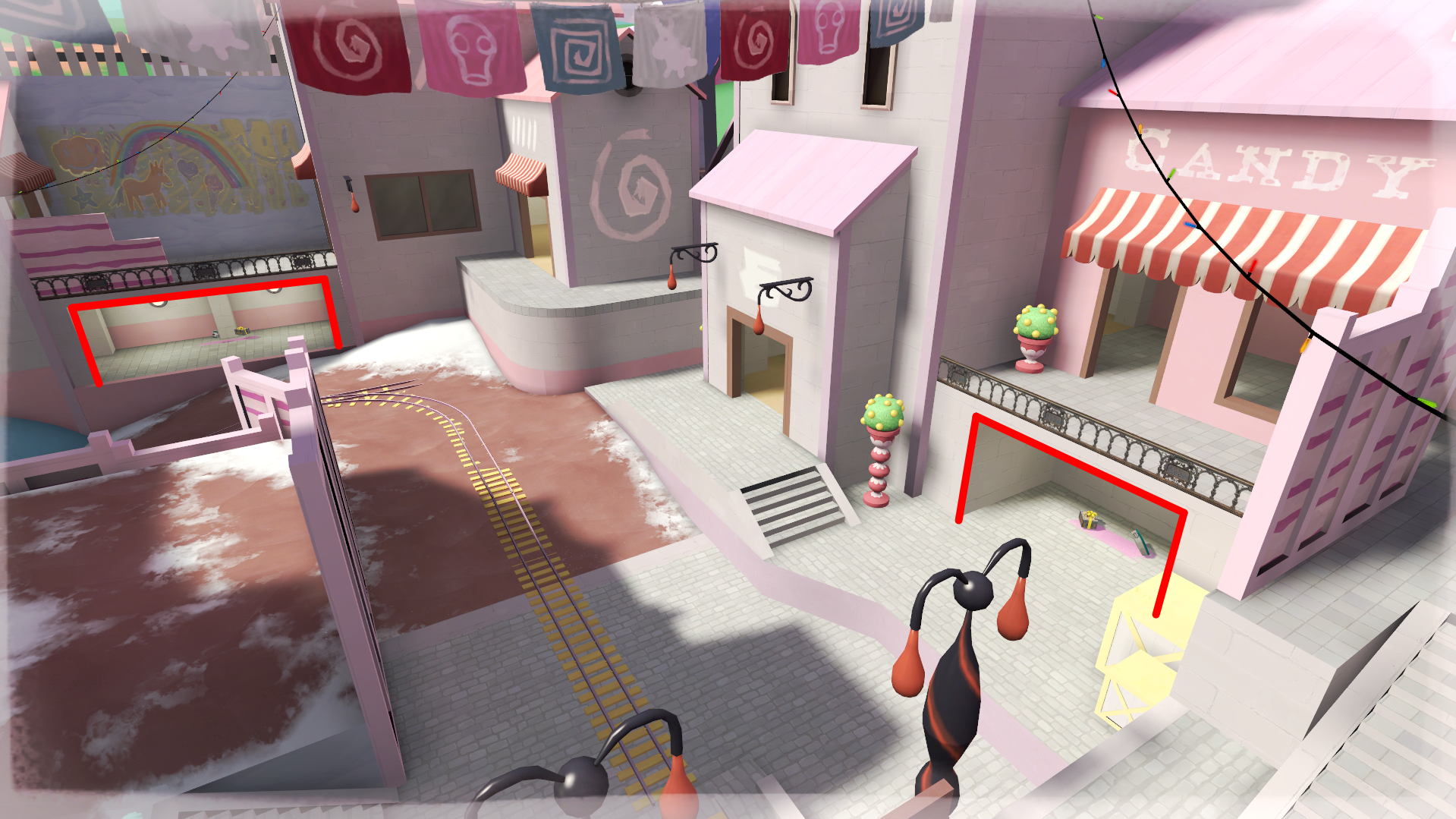
And that's about all the gameplay feedback I have for now.
I might eventually make another post about the map's aesthetic.
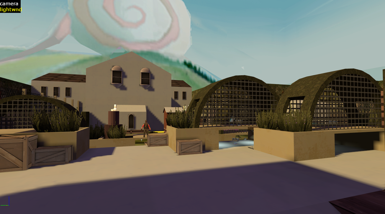
The tl;dr for that I can give you straight away is that I would like to see the sunlight made more yellowish.
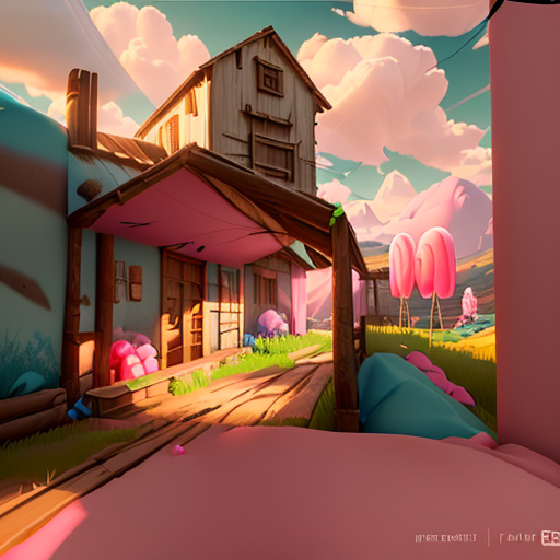
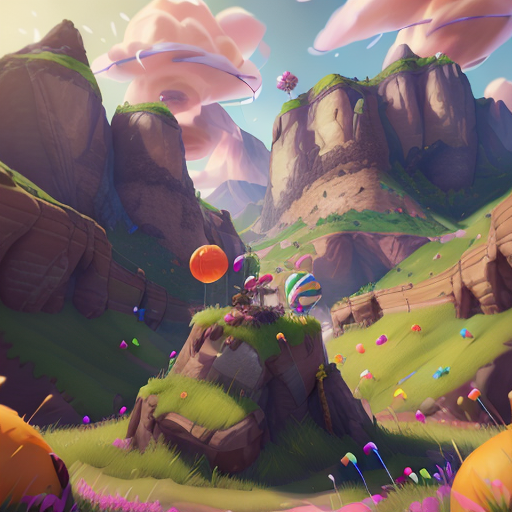
I tried to AI-generate a bunch of images with better colours as examples but somehow they all turned out looking pretty horrible.
I have a basic idea of how this community feels about AI art, so I didn't want to worsen its reputation by posting any but the best images it can create.
Still, here are a couple of the images I made:
And here's a quick modification of pl_mysteriousvmf_test1:
This'd give RED an obvious and strong sentry spot, really fast rotate and retreat times, and the ability to actually rotate past the main route without getting obliterated by spam and snipers, which as the map is now requires RED to backtrack almost to their spawn. Although I see a new displacement which shortens that a little.
If you're worried that this would make CP1 too easy to defend, I reckon you shouldn't be, since points with a really easy forward hold and hard backward hold tend to work out as pretty easy for BLU in the end, since it really only takes them one medigun right-click to capture.
By the way, the new sentry cubby on CP1 is a good addition at heart, but it doesn't leave engineers who set up in it any retreat option, and it's not big enough to escape a rocket's splash damage, so actually building in there is a doomed venture.
I think the main thing about A is that I think people have a very different vision of the A backward hold compared to what I always experienced playing the map:
After making several A/D and Payload maps, I have learned time and time again that I can't just put the forward hold and backward hold 512 units away from each other. So, as a rule, I now always have 5 seconds of walk time between the forward and backward hold.
If on this map, I walk 5 seconds from the furthest-back part of the forward hold, this is where I end up:
Extrapolating that, I can even draw the bounds of the forward and backward hold areas:
Now, I can't say for sure whether you think the backward hold is where I think other people think it is, or whether you think it is where I've drawn it.
But I have a pretty good idea that you think it's the former, because the area I've drawn as the backward hold looks a lot like it's designed as BLU's lobby to attack B.
Saying that RED losing is some kind of skill issue because they're trying to hold that area is really not fair in my eyes, because like I said in an earlier screenshot, after the forward hold is lost, the surviving RED players really just want to retreat to an area where they won't immediately have to fight BLU, and by the time they've healed up, BLU is already knocking on the doors of the area RED retreated to.
There's also one thing that always bugged me about the CP1 forward hold:
How is BLU supposed to avoid a sniper who uses this angle?
I reckon you should add a third spawn exit and make it look like this:
Also, what is this map's obsession with placing these sentry/health cubbies in major sightlines so they're not safe to enter at all?
This whole area feels back-to-front somehow, like it'd be way more fun to defend if BLU was actually coming from the current RED spawn area.
And that's about all the gameplay feedback I have for now.
I might eventually make another post about the map's aesthetic.
The tl;dr for that I can give you straight away is that I would like to see the sunlight made more yellowish.
I tried to AI-generate a bunch of images with better colours as examples but somehow they all turned out looking pretty horrible.
I have a basic idea of how this community feels about AI art, so I didn't want to worsen its reputation by posting any but the best images it can create.
Still, here are a couple of the images I made:
And here's a quick modification of pl_mysteriousvmf_test1:
Last edited:


