WiP in WiP, post your screenshots!
- Thread starter Arhurt
- Start date
You are using an out of date browser. It may not display this or other websites correctly.
You should upgrade or use an alternative browser.
You should upgrade or use an alternative browser.
Oatmeal
L2: Junior Member
- May 17, 2014
- 71
- 40
This detailing contest is awesome
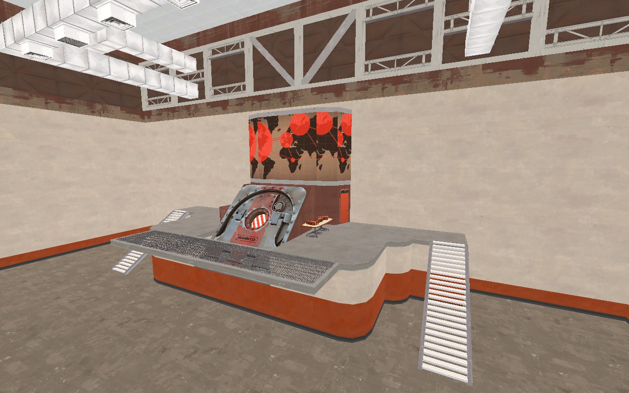
I'm almost finished with my spawnroom. I wish it wouldn't take until mid of April, as I know myself, I will probably forget to submit it.
- Nov 25, 2008
- 782
- 851
Use the gametype library from this pack. Take a look at how it works and recreate it in your map. I'd highly suggest not copy/pasting it until you've done it one time yourself though.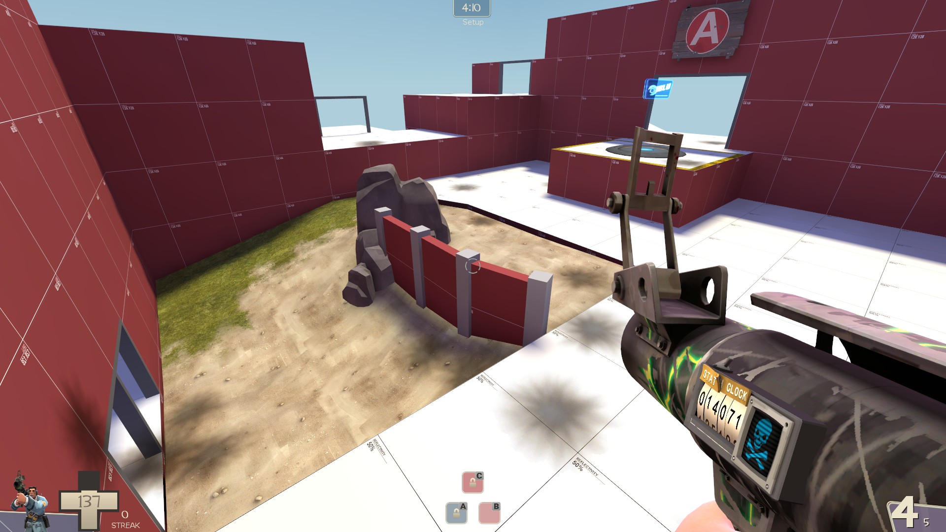
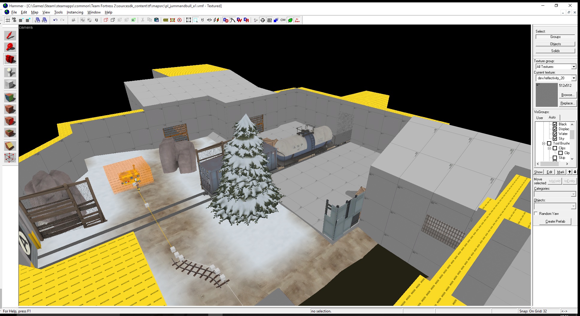
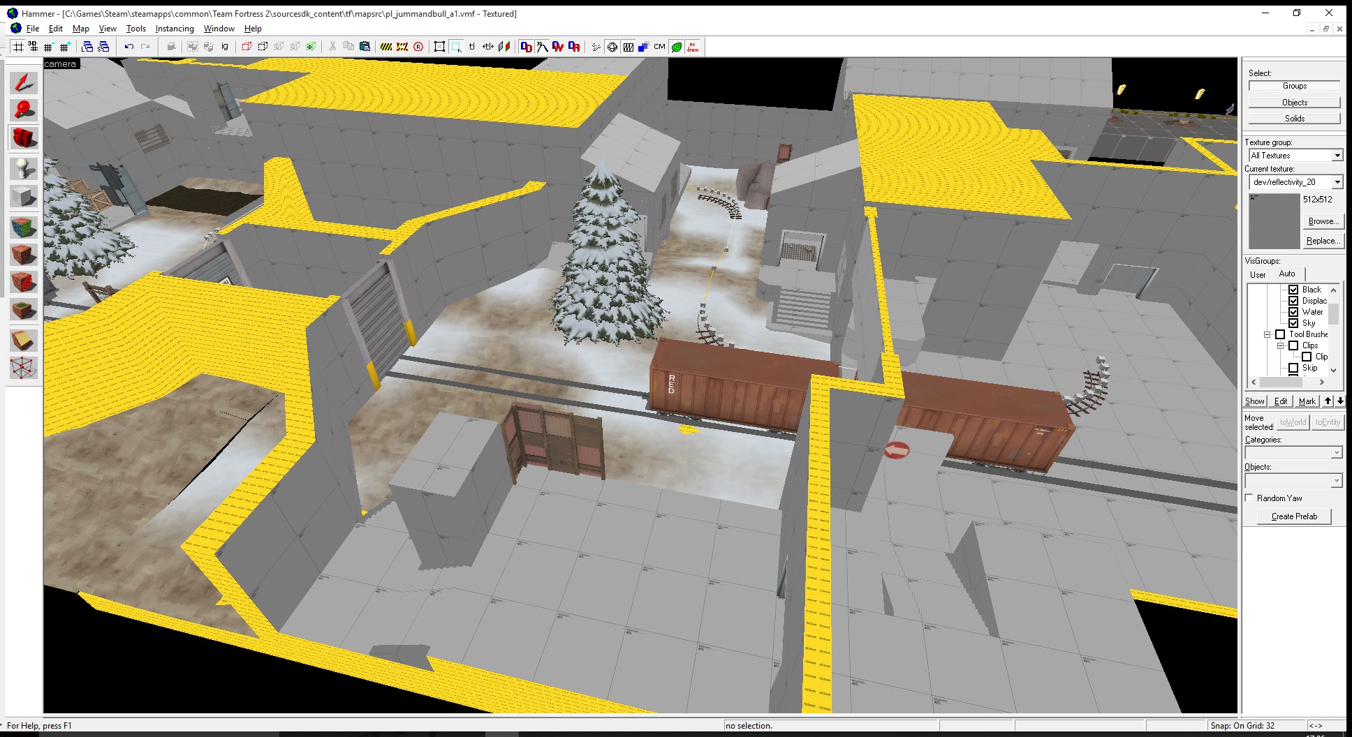
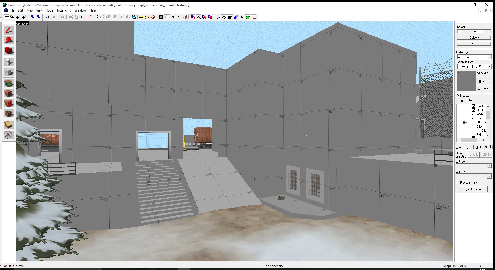
Early A site for a steel-type level i'm working on while I try to fix Uptown (btw if anyone knows how to work staged payload logic hmu thanks)
http://tf2maps.net/threads/ultimate-mapping-resource-pack.4674/
He did but it makes it differently. Also I have heard that looking into goldrush doesnt help eitherUse the gametype library from this pack. Take a look at how it works and recreate it in your map. I'd highly suggest not copy/pasting it until you've done it one time yourself though.
http://tf2maps.net/threads/ultimate-mapping-resource-pack.4674/
- Nov 25, 2008
- 782
- 851
wowowow that sightline on A in the last picture (going from a to the upper windowed area)
fix eet
fix eet
wowowow that sightline on A in the last picture (going from a to the upper windowed area)
fix eet
Sightlines aren't inherently bad. This doesn't even look as advantageous as Badwater's sniper window.
nah i'm not talking about the windows themselves, i'm talking about the corridor underneathSightlines aren't inherently bad. This doesn't even look as advantageous as Badwater's sniper window.
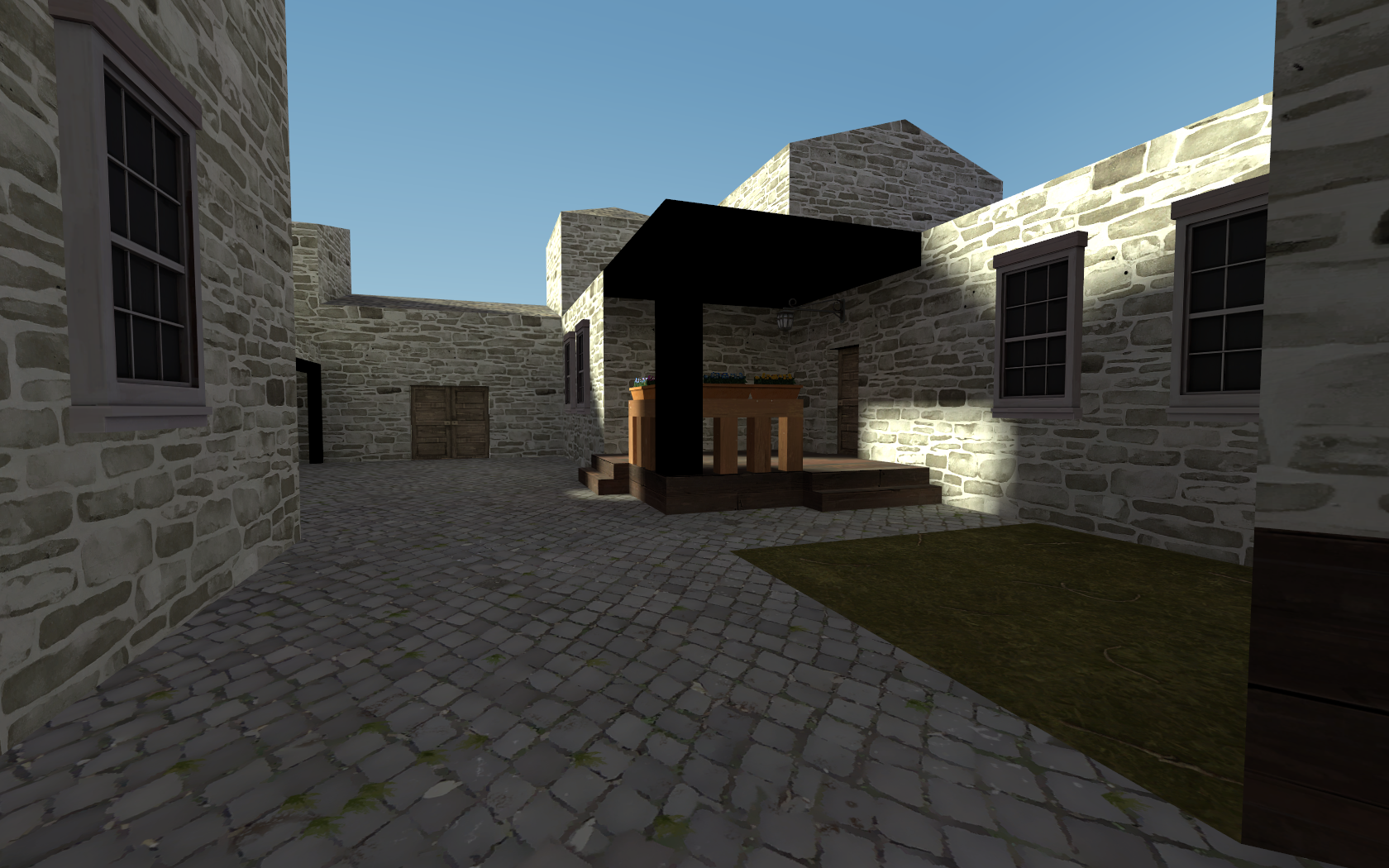
Barring the odd lighting glitch on that wood shit, what do you guys think of this early WIP? I'm thinking it needs color, but ehh.
looking really bland right now, not enough variety in detailing, every house still looks like 64 grid hammer blocks, one solid color across everything, the lighting is poor and doesn't give the textures enough light.

Barring the odd lighting glitch on that wood shit, what do you guys think of this early WIP? I'm thinking it needs color, but ehh.
Everything in the middle (the table, support and top bit) look so chunky, and the stairs could use being about half the size vertically (so having 4 steps instead of 2). They also look like 1:1 stairs which is a bad thing to get into generally (can't remember the desirable ratio but it's something like 2:3 or 3:5; experimenting is best as it is case-by-case). Also is that a lighting bug on the black thing in the middle?
Some variations on the brick texture for different buildings would be good as someone mentioned, you should also play about with more height variation on the floor (steps, cellars etc.) and add displacement to the grass.
I have no idea what the lighting on the porch is doing. It updates based on player location, as when I entered a differently lit area, it'd change lighting aswell..Everything in the middle (the table, support and top bit) look so chunky, and the stairs could use being about half the size vertically (so having 4 steps instead of 2). They also look like 1:1 stairs which is a bad thing to get into generally (can't remember the desirable ratio but it's something like 2:3 or 3:5; experimenting is best as it is case-by-case). Also is that a lighting bug on the black thing in the middle?
Some variations on the brick texture for different buildings would be good as someone mentioned, you should also play about with more height variation on the floor (steps, cellars etc.) and add displacement to the grass.
It's a func_detail, and I've never seen this happen in one of my maps before.
looking really bland right now, not enough variety in detailing, every house still looks like 64 grid hammer blocks, one solid color across everything, the lighting is poor and doesn't give the textures enough light.
I'm planning on adding trims and other messy details to take away from the blandness, and some overlays and such to add color into it.


