Zinkenite

CP Zinkenite B3a

  • This map is featured! Our best maps, all together in one place for your viewing pleasure.

Rexy

The Kwisatz Haderach
aa
Dec 22, 2008
1,798
2,533
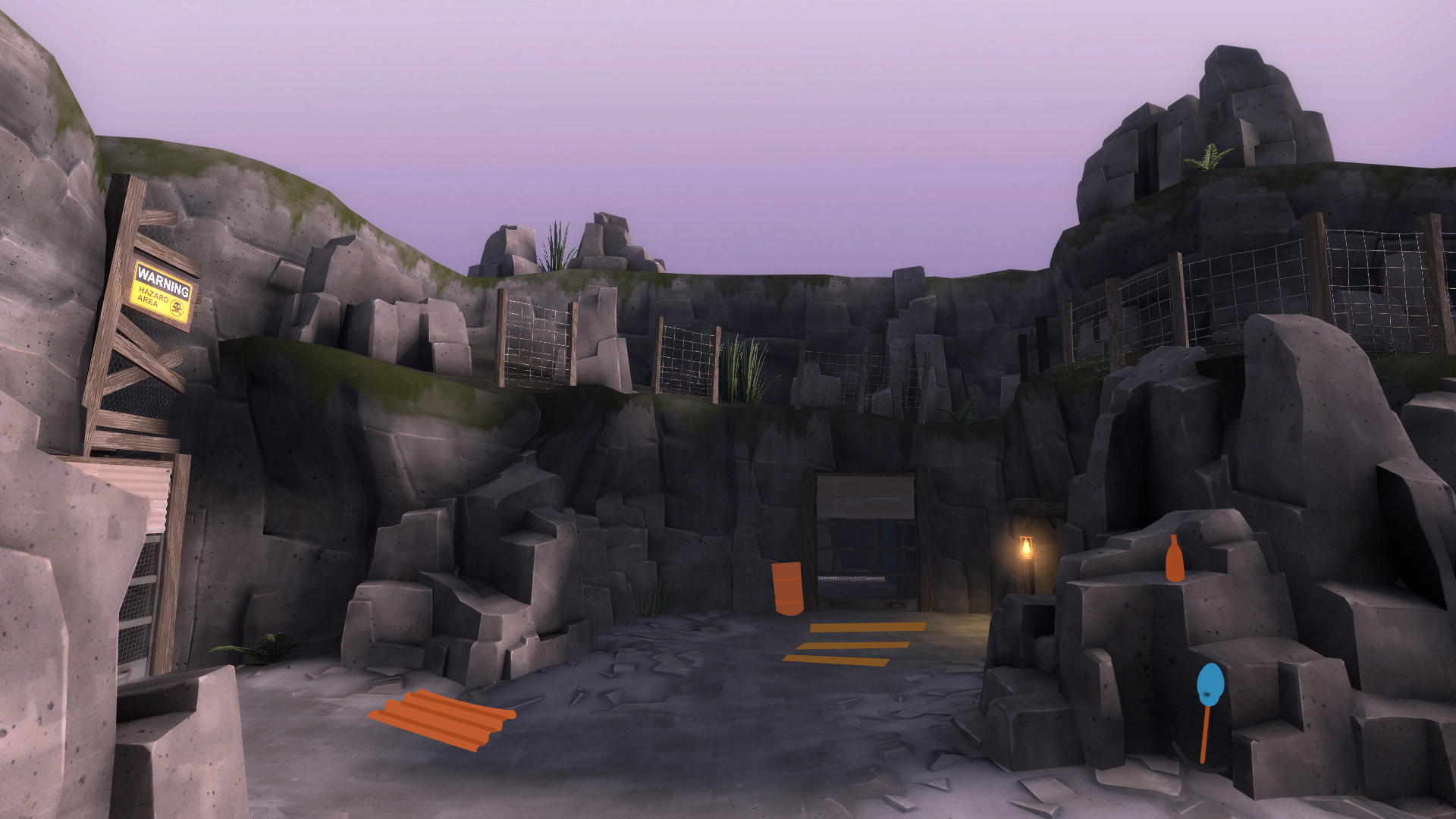
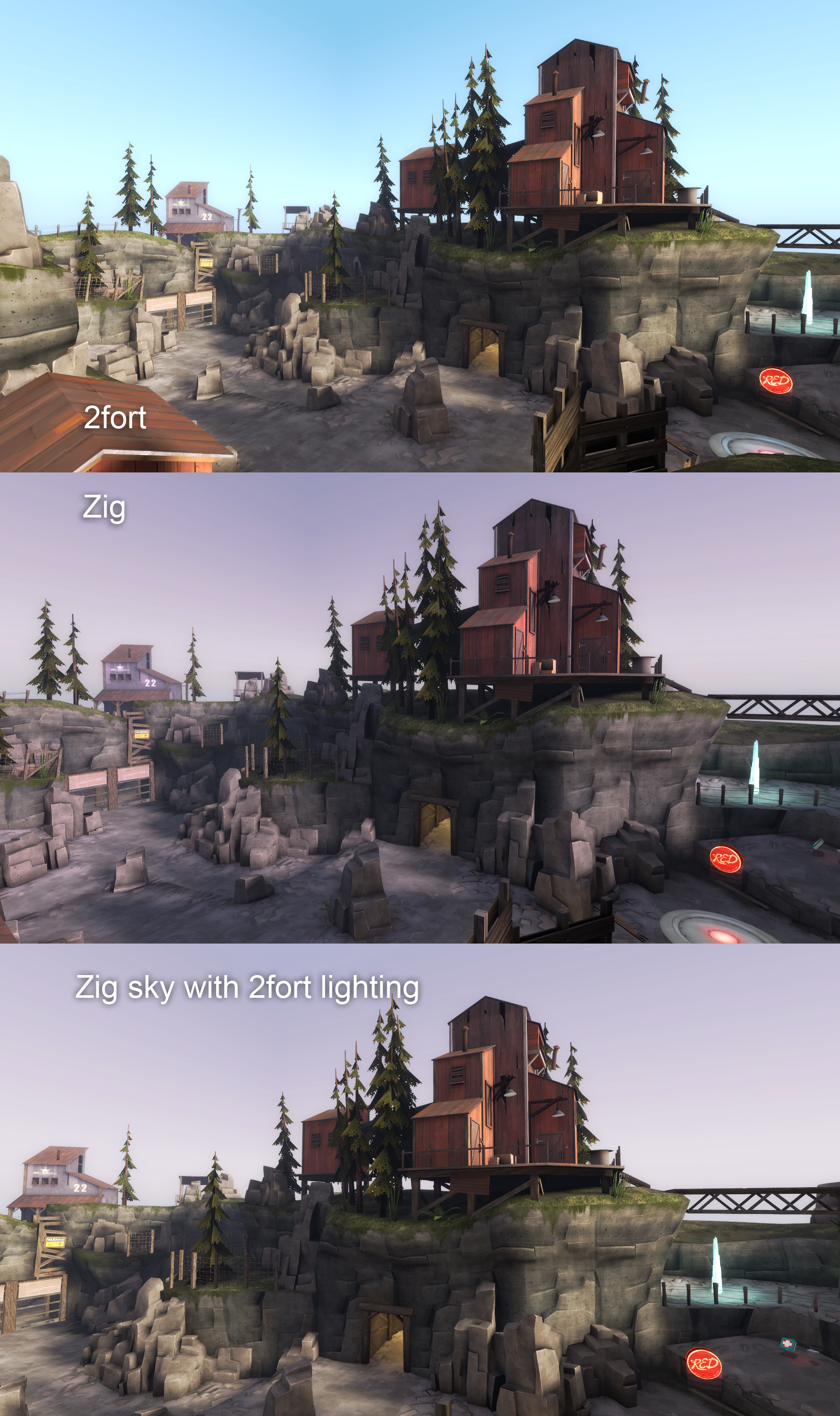
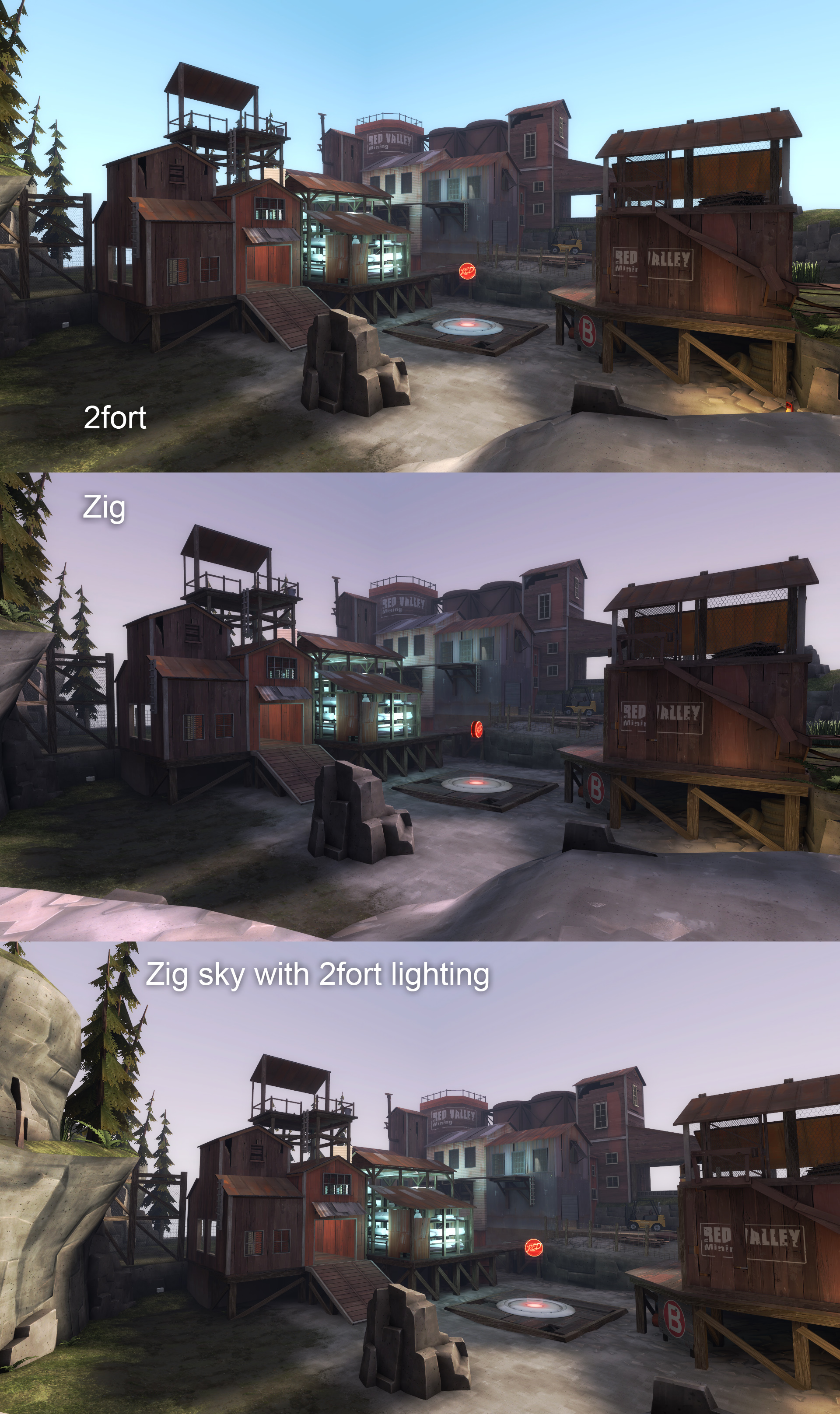
I agree with the people saying it needs more splashes of colour. I really dont like that picture seba linked, because its three dozen shades of grey rock, plus grey-green tress, and a grey-pink sky. It reminds me of britain. Which isnt good. Some lights, or more green greenery, or something to break up the (admittedly quite nice) greyscale feel.

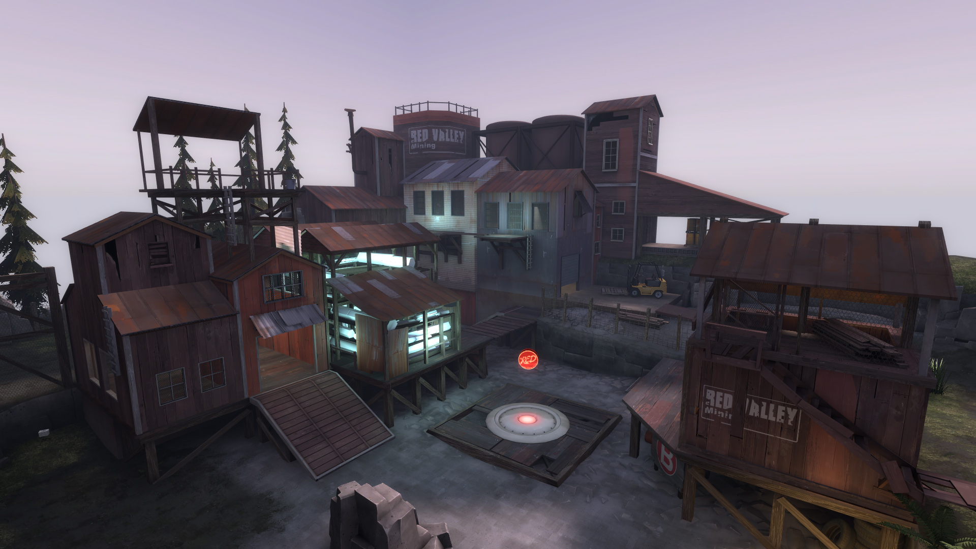
This concerns me, I don't want it feel like this. Whether this is an isolated opinion, maybe shared with 3-4 people, I don't know. Personally, when I'm examining builds of the level, the last thing I think is that the map is grey, desaturated. I've done several experiments to increase the color saturation of both the lighting and rock textures, adding lights, foliage, and my eventual conclusion was that there was too much color in some cases, so things like the skybox and env_lighting was lowered in color saturation.

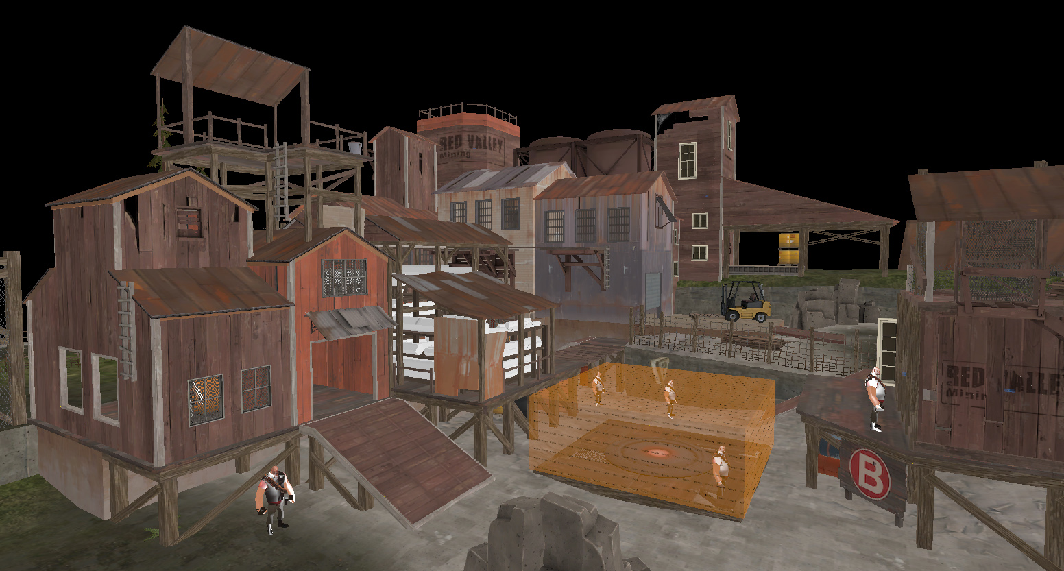
What I'm afraid is going on (and it's just a suspicion), is a lack of overall information and generalization from the screenshots. The one seba posted can easily be taken out of context for this, as right behind the rock there is a bright yellow forklift, and to the right is a series of high-saturation red-wood buildings, and a storehouse for bright blue-white crystals.

This puts me in a pickle, because I honestly don't get the concerns about the map being so grey--comparatively to the alphas before the detail pass, it was VERY grey. But I know better than to just assume I'm right about this. It's important for me to have a clear head about what's really going on here, so I've decided to release a current build to some select individuals (very wip, non-sealed, no clipping, still some dev textures, materials still wip) and get some feedback on the overall color and current direction. This way I feel I can get a very clear consensus if it's a screenshot biased assumption or if it's a legitimate concern. I'll get back to you with the results.
 
Last edited:

Rexy

The Kwisatz Haderach
aa
Dec 22, 2008
1,798
2,533
Screenshot bias does seem likely, but even in the three larger ones the rocks all seem to blend into the background almost. Maybe i should clarify: the map overall has enough colour, but the rock-heavy areas dont?

Look, dont mind me, i'm an arse. Certainly dont get majorly worried on my account.

If it was just you saying it or just one other person saying it I wouldn't be concerned about it. But it's been said a few times again and again by a few other people, and that doesn't bother me as much as why it's being said. I want to understand the issue, I want to understand the cause so that I have the option to try to fix it. But to accurately understand, I need to let people get their hands on it and look for themselves, and then give me honest thoughts about the color issue.
 

tyler

aa
Sep 11, 2013
5,102
4,621
I don't mind the grayness. Not every map must be a rainbow ride. Besides, in an actual match you'll have players and explosions bringing extra colorfulness anyway.

Like I just told Rexy, Badlands is really red and Dustbowl is really brown. I think it's kind of a superficial comment to make, and some people will always make it even after they've seen the final product in game. The screenshots don't really do the accent colors justice, I think, which is part of the problem.

Having just taken a look at Rexy's WIP, it seems 98% fine to me, barring areas that he obviously hasn't touched.
 

Rexy

The Kwisatz Haderach
aa
Dec 22, 2008
1,798
2,533
Thanks a billion @ supertoaster and yyler for giving some honest, helpful feedback--I'm still open to more feedback, maybe I'll ask for some more a little later. Now onto some other issues that I thought I fixed ages ago...
 

Goombac

L4: Comfortable Member
Mar 27, 2010
172
84
I'm mostly fine with the color. Sure it's a bit gray, but as said before other maps are really red or orange. But before making too many drastic changes, I'd wait until the entire map is closer to finished, just in case you decide to make other changes on your own. And I don't know what your plans for each stage of the map is, but the first stage is in the rocks (like the majority of the screenshots), and the second (and third?) stages are underground? Or do they alternate between above and below ground?

But, I don't know if you've considered or thought of it, but I was curious how it might look at night, with moonlight and more lamps. Just that it might help fix your color, with the lighting from the lamps and zig. Of course, that's probably major design decision. Just food for thought.
 

Vincent

&#128296 Grandmaster Lizard Wizard Jedi &#128296
aa
Sep 5, 2009
912
684
As I had said early with just a bit more green, what you've done was pretty much what I was thinking. Just contributing to what everyone else has said about that.

Also just for experimental fun, I have a feeling this is one of the few maps that would actually look nice in a night time setting. I have a pretty nice visualization in my head-- Few tall wooden poles with lights, small bugs whizzing around them, the zig radiating its dull blue color off the grayish rocks and surrounding foliage.

Although like Goombac said that's a pretty huge lighting change from what you have, and is totally up to you of course (Especially with your limited fixed amount of time left). The current lighting looks a tad standard (kinda bland) when you look hard at it, but most players are just gonna focus on combat and explosions more than anything of course.
 

Rexy

The Kwisatz Haderach
aa
Dec 22, 2008
1,798
2,533
I'm certainly not against experimenting with the environment lighting. It's probably something I'll do before the end.
 

grazr

Old Man Mutant Ninja Turtle
aa
Mar 4, 2008
5,441
3,814
My observation is that there's usually more colour contrast in the ground blends in existing maps which tend to range from orange, red, brown and yellow. Here we have (as already mentioned) different shades of grey.

Whilst adhering to realism, ie there are places (quarry's) that are naturally like this and it has to be translated well to a video game environment that's also aesthetically acceptable. In areas of dominating grey try using more "junk" props and reder wood textures for wooden beams:

detail_pass_011.jpg
 
Last edited:

littleedge

L1111: Clipping Guru
aa
Mar 2, 2009
986
605
That's one of the first times I have Thanked somebody for feedback on somebody else's map. What Grazr said is brilliant. A couple simple junk props here and there should do it for you, Rexy. While it's very grey, the green at the top of cliffs and the buildings you have around contrast it, so those couple areas lacking buildings could be given a couple props.
 

Rexy

The Kwisatz Haderach
aa
Dec 22, 2008
1,798
2,533
So here's my crude sketchover that solved some design questions, really bad looking,

cp_zig_stage_a_cp2.jpg


And here's what I came up with from it.

detail_pass_028.jpg


The lighting is still pretty bad given that it's in the shadow of the environment lighting, and the glow color isn't really working the way I wanted it to. The main thing is that model textures won't emit their own light the way lights listed in the .rad will do. Which is really depressing as that means I can't really have my cake and eat it to in a sense--meaning either I compromise model design and just go for the old zig's hexagonal tube brush with texture lights, or I compromise lighting quality by using light entities here and there, which isn't as good as I'd like it to be.

I've tried several variations of a combination of brushes to light an area with a transparent or translucent model, none are really doing the trick. In that screencapture, the models are untextured, flat white with an AO layer, but it makes me think I should rework the way these models are looking--just at an impasse right now.

The last solution is to maybe change the skybox + environment lighting. That could clear up a lot of the sticky lighting issues. I think it would also help to have the background/skybox in place. I can't tell if I'm not please with the results because of one issue or the other, I just have no idea right now.

Edit: Ok, I think I'm going to try compiling with other skyboxes/light options and post the images here, and get your thoughts on the best environment setup. I've got no attachments to the current one, as it was nice to develop with, but a better solution is always in my best interests. I'll have some more later.
 
Last edited:

Seba

DR. BIG FUCKER, PHD
aa
Jun 9, 2009
2,364
2,728
Have you tried using a non-solid, non-rendered func_brush covered with a light texture placed around the zig crystals? If that'll work the way I think it will, then it should give you a nice glowy effect that looks like it's coming from the crystals themselves.
 

Rexy

The Kwisatz Haderach
aa
Dec 22, 2008
1,798
2,533
detail_pass_028.jpg

Presumably that warehouse area's going to be made deeper? The roof looks really odd shaped for such a narrow building.

Nope.

Have you tried using a non-solid, non-rendered func_brush covered with a light texture placed around the zig crystals? If that'll work the way I think it will, then it should give you a nice glowy effect that looks like it's coming from the crystals themselves.

That's not a bad idea. I have tried a variation of that with light emitting non-rendered brushes, but I can't remember exactly why this either didn't work or didn't produce satisfactory results. This I will have to try again.
 

Rexy

The Kwisatz Haderach
aa
Dec 22, 2008
1,798
2,533
skybox_choice_01.jpg


skybox_choice_02.jpg


A few options. Someone wanted a night version, I'll do that now.

Tell me which one you like the best.
 
Apr 13, 2009
728
309
2forts true and tested lighting works really well. You can keep your skybox though, gives it a nice touch. With this in mind you may want to lower the light_env brightness a tad so that it matches the skybox better.