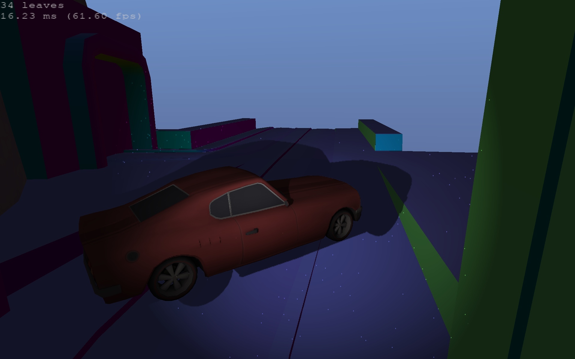
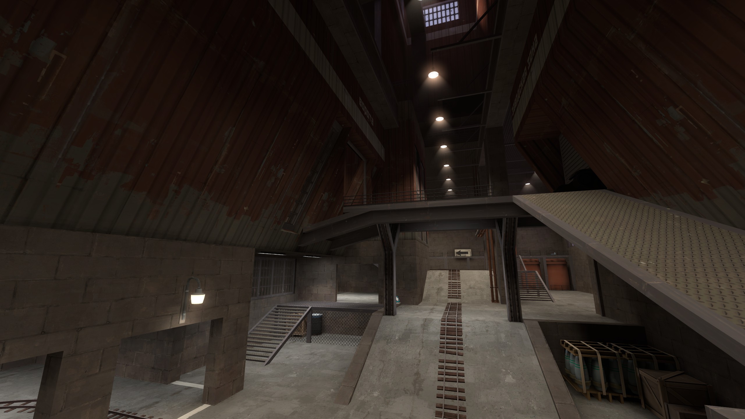
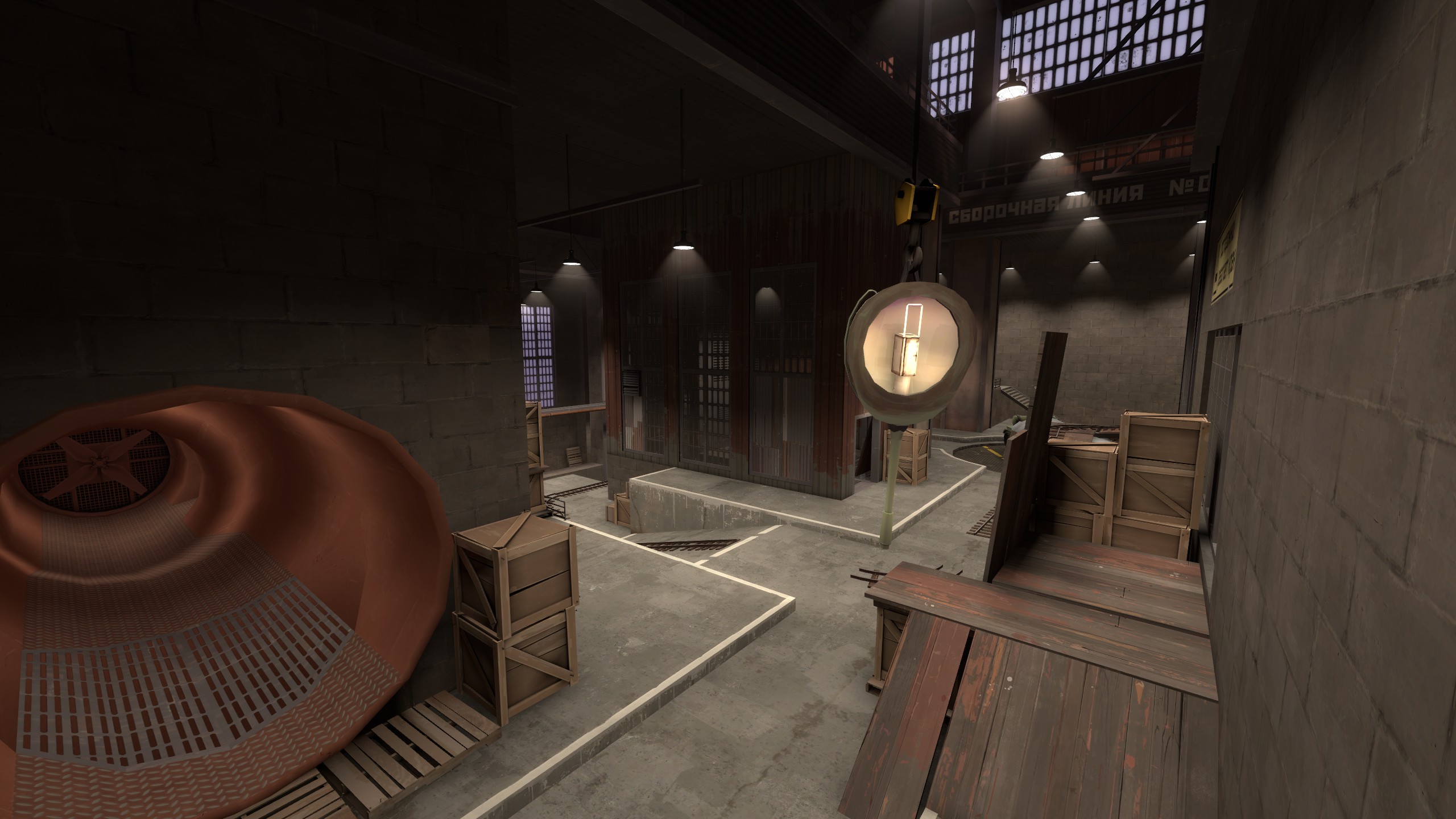
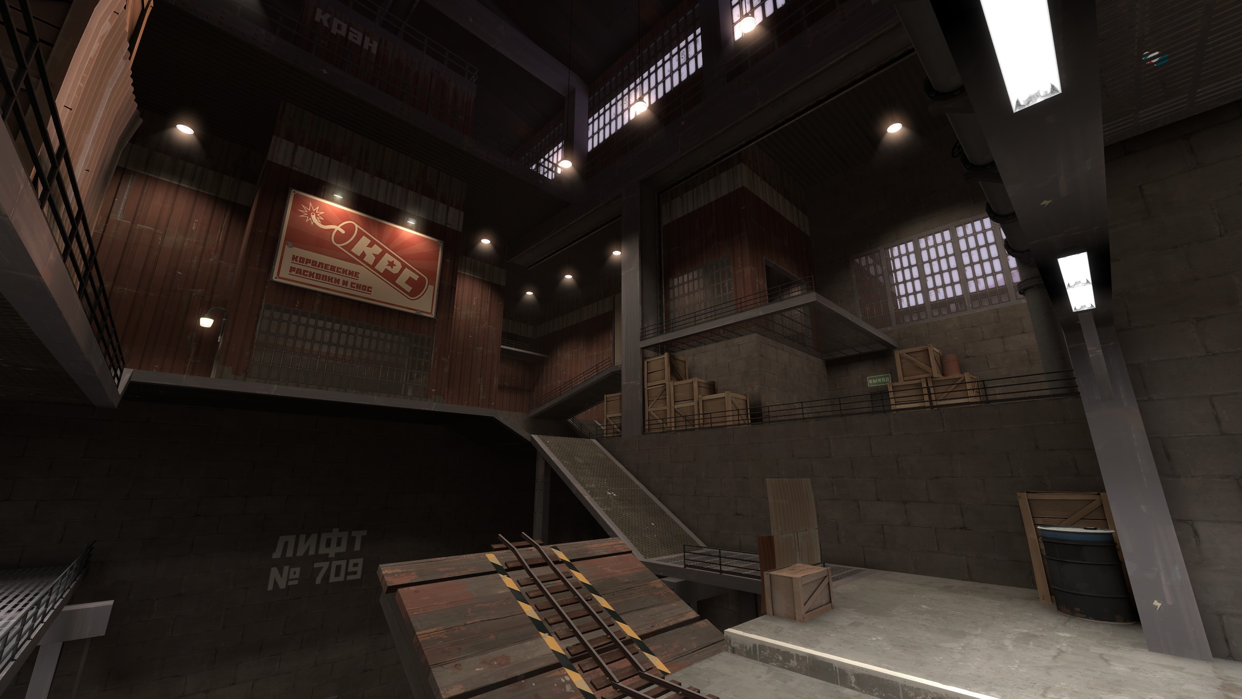
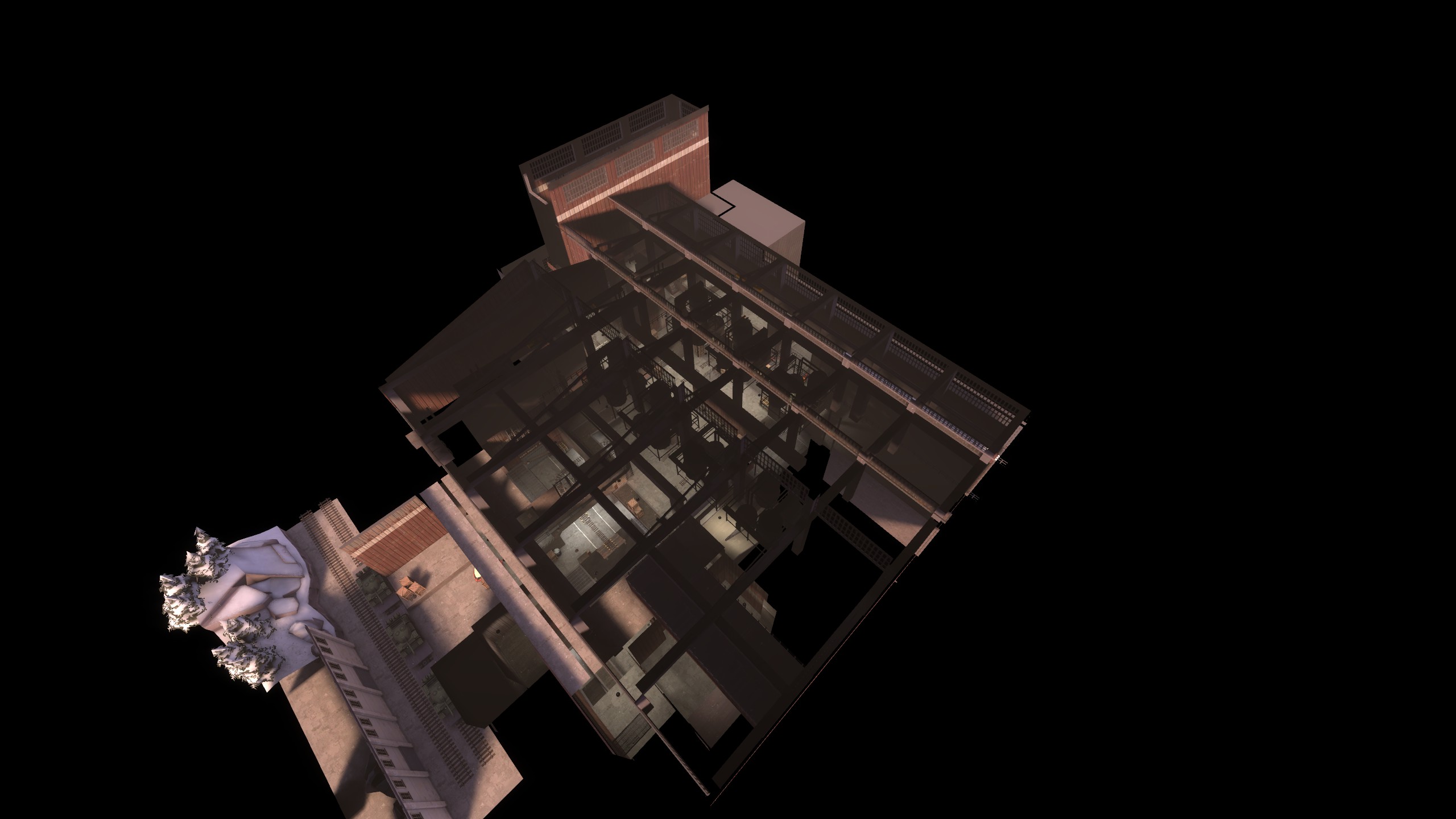
What's up! It's been a month and I think we've got a working solution for visibility determination in our game engine. What you see here will remind most mappers of the contents of a portalfile, but it's hardly that: it's an octree, which subdivides more where there are many polygons, and less in emptier areas. It has a very simple and intuitive implementation, easy to get up and working. But I love the other spatial data structures I have been learning about, such as R-trees, and the usage of space-filling curves. You can get really clever if you want.
Anyway, this follows the philosophy that props are for things that are common and same, such as a street lamp or railing, and unique geometry should belong to the actual world. *But* the world geometry can and should be modelled just like the props are, with no additional limitations, and rendered in the same way - visually, you shouldn't be able to tell the difference, as you easily can in Source.
The map would define certain "occlusion planes". These resemble Source's world brushes in that they block visibility. But rather than serving as an input for a total precalculation, they are instead rendered into a depth buffer for the tree to test against (don't enter the branches whose cuboids are occluded entirely).
So you can actually see what's going on in the scene. Yes, I acknowledge the fact that most things fall behind Hammer when it comes to actually making maps...
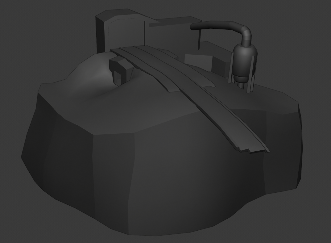
Also please warn me if you think the relevance is insufficient...
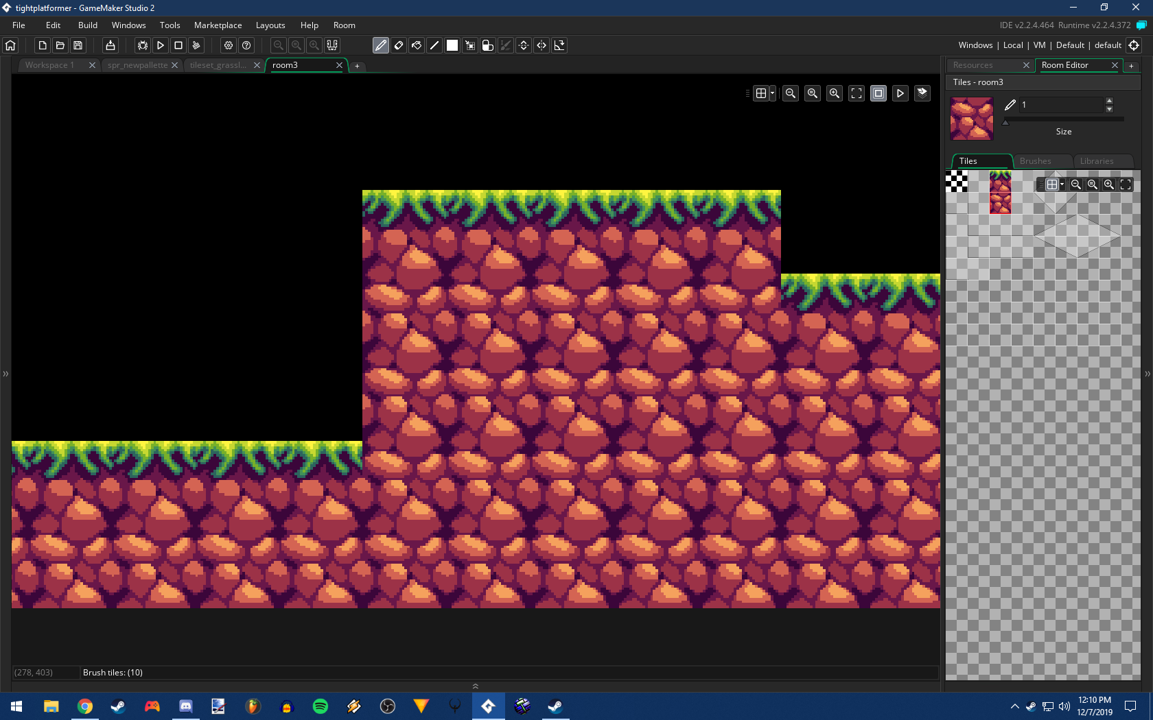
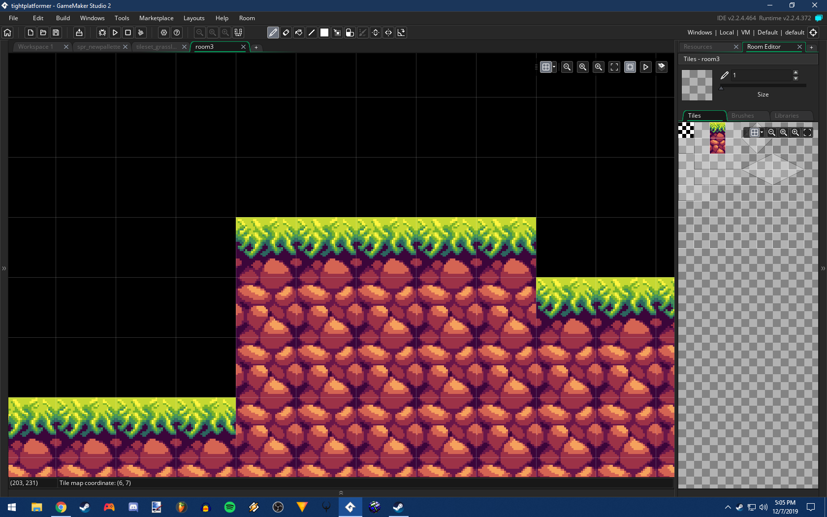
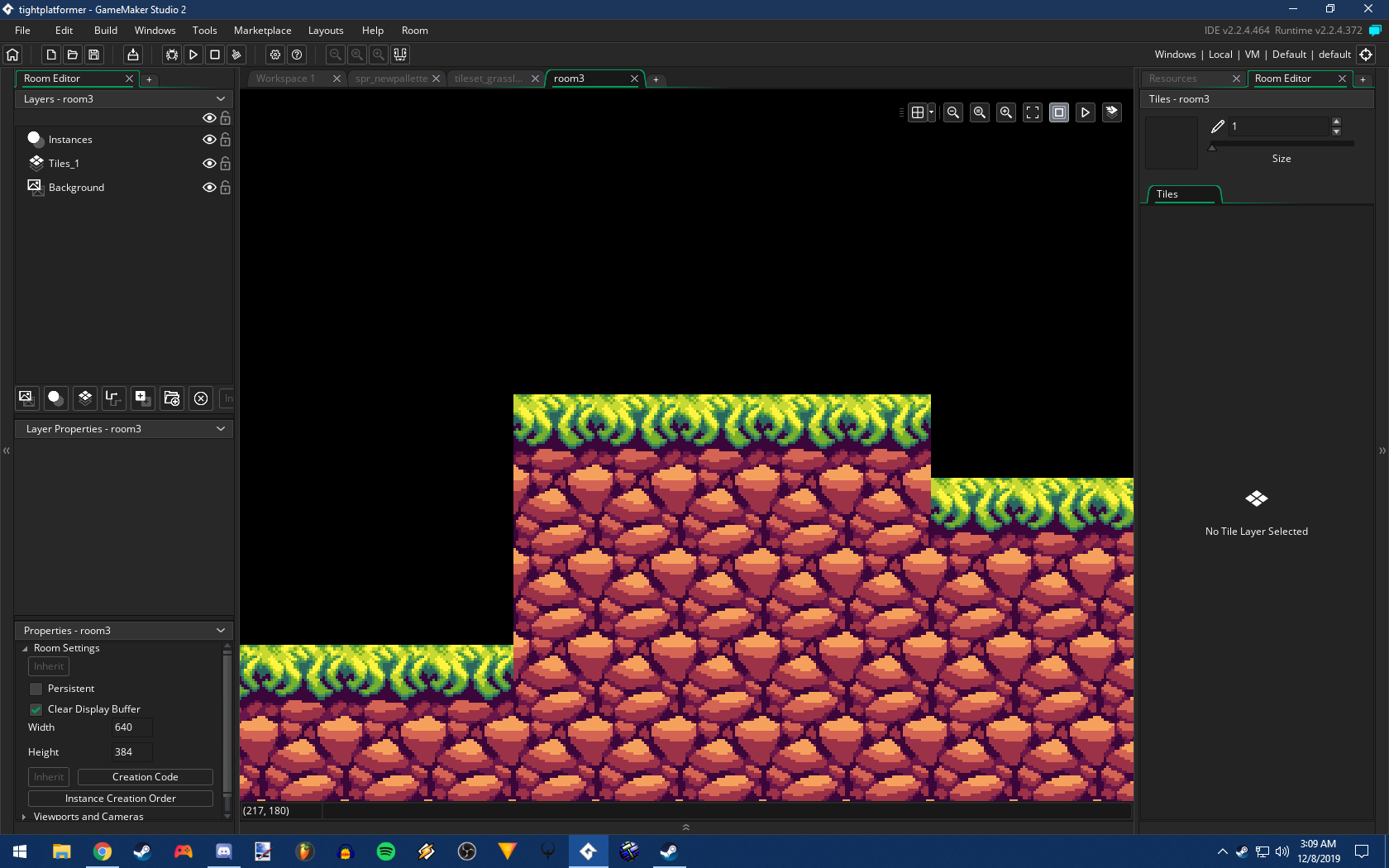
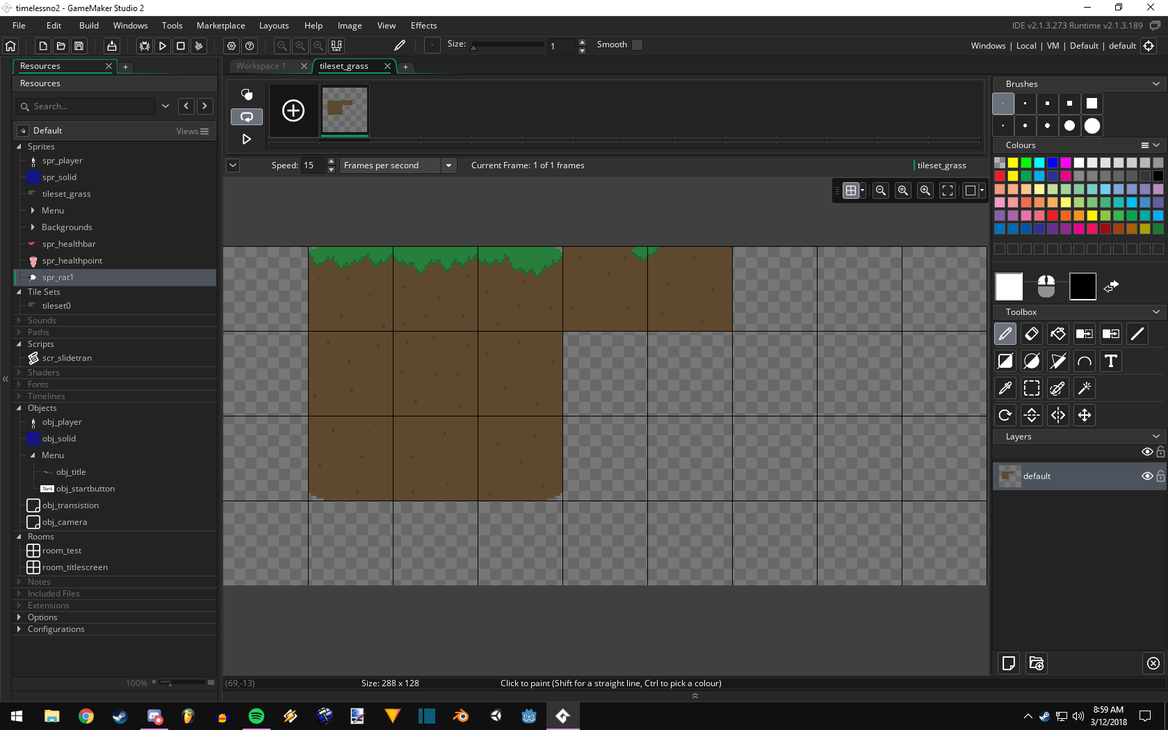
Working on a game again, but this time going with a much higher level of detail on the sprites. Been working on a tileset for the past day but had a lot of trouble getting it to look right. I finally got a good one, but heres the attempts I made.
This was the first one. it's alright but the grass was way too small for my liking, and the rocks were a bit off.
Try #2 kept the rocks, but reiterated the grass. It's a bit better, but still off, especially in the detail department. I got mad at this so I decided to sleep on it.
And for this morning, I went back in and nailed it first try. Whadda you know. But I'm happy with how this came out, it's a far prettier tileset than anything I've made previously with it's fun detail and expansive 10 colors.
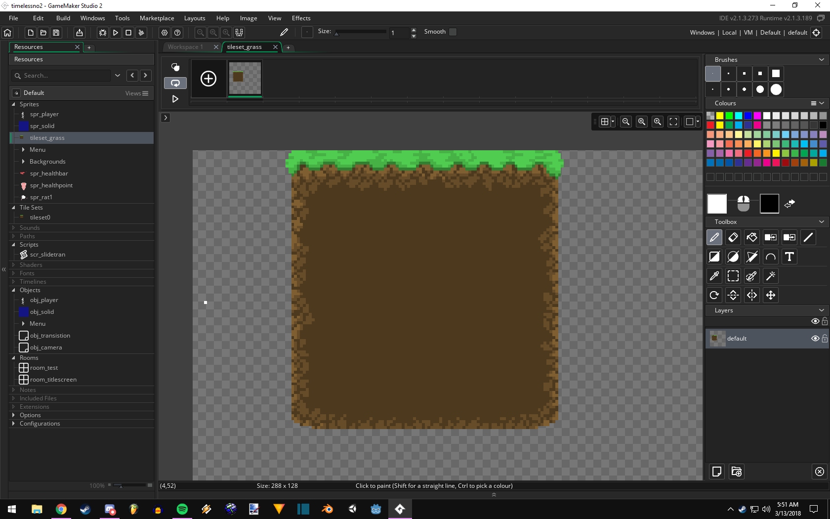
and just for laughs, here is 2 tilesets I made a long time ago.
This mediocre one is from last year. It's not awful, but it could certainly be better. Some really boring color choices and symmetrical grass details make it look flat and boring.
This one is from around Summer 2017. Do I even need to say anything about it. It's awful lmao
I'd sure be thrilled to mow my grass one day and find that said grass is indeed Cthulhu.
Just kidding, really nice job and a sure improvement since last years in the color department!
Actual lighting using shadow mapping and the VSM technique to improve the accuracy and quality. Supports normal maps, possibly generated procedurally right in the user shader.
Been soulsucking so far, and a lot yet to be done for this to work properly.
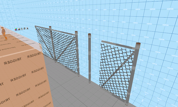
Wish these had existed back in the day, whoever made the custom fence that was just 1 instead of 2 pieces was good but like, this would've been so much better
About a year ago I drafted a CP map, but I didn't do anything with it because some key features seemed too complex for me to tackle.
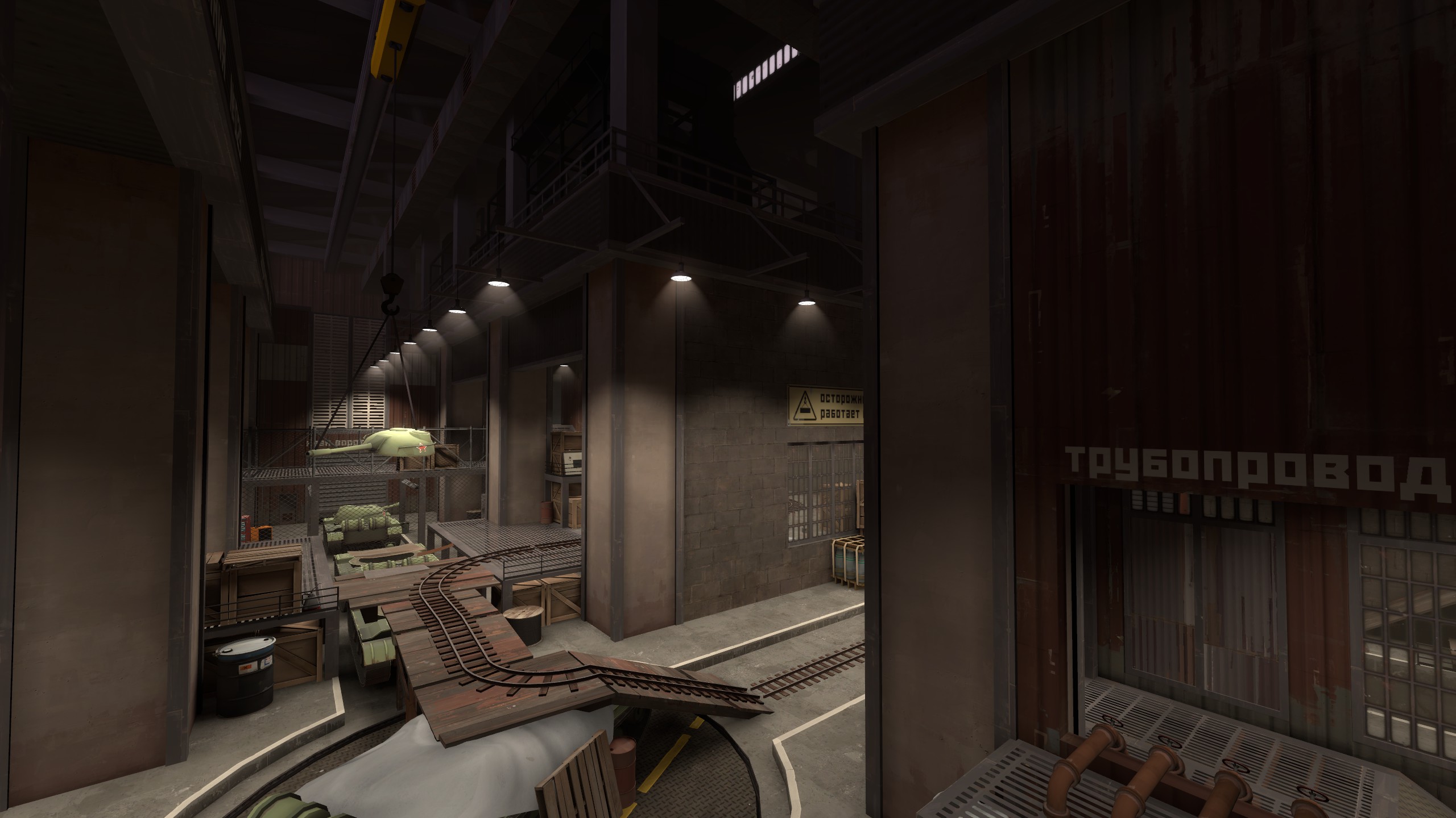
Yesterday I learned about instances, and the idea became miles more possible. Here's one of the areas I once thought would be impossible for me to make. It's still pretty barebones, but that's because most of my time in Hammer was just marveling at how I never heard about instances before. These things are so useful, and I'm not even using them right yet!
Looks like way to much of a reliance on props for that amount of space. Try to focus most of your geometry on brushwork, be it buildings or ground features. Makes it all around less messy and run better due to the lack of prop spam.
If this is your first time logging in after the migration (Feb 8, 2022), you must reset your password to log in. Follow this guide if you're having trouble