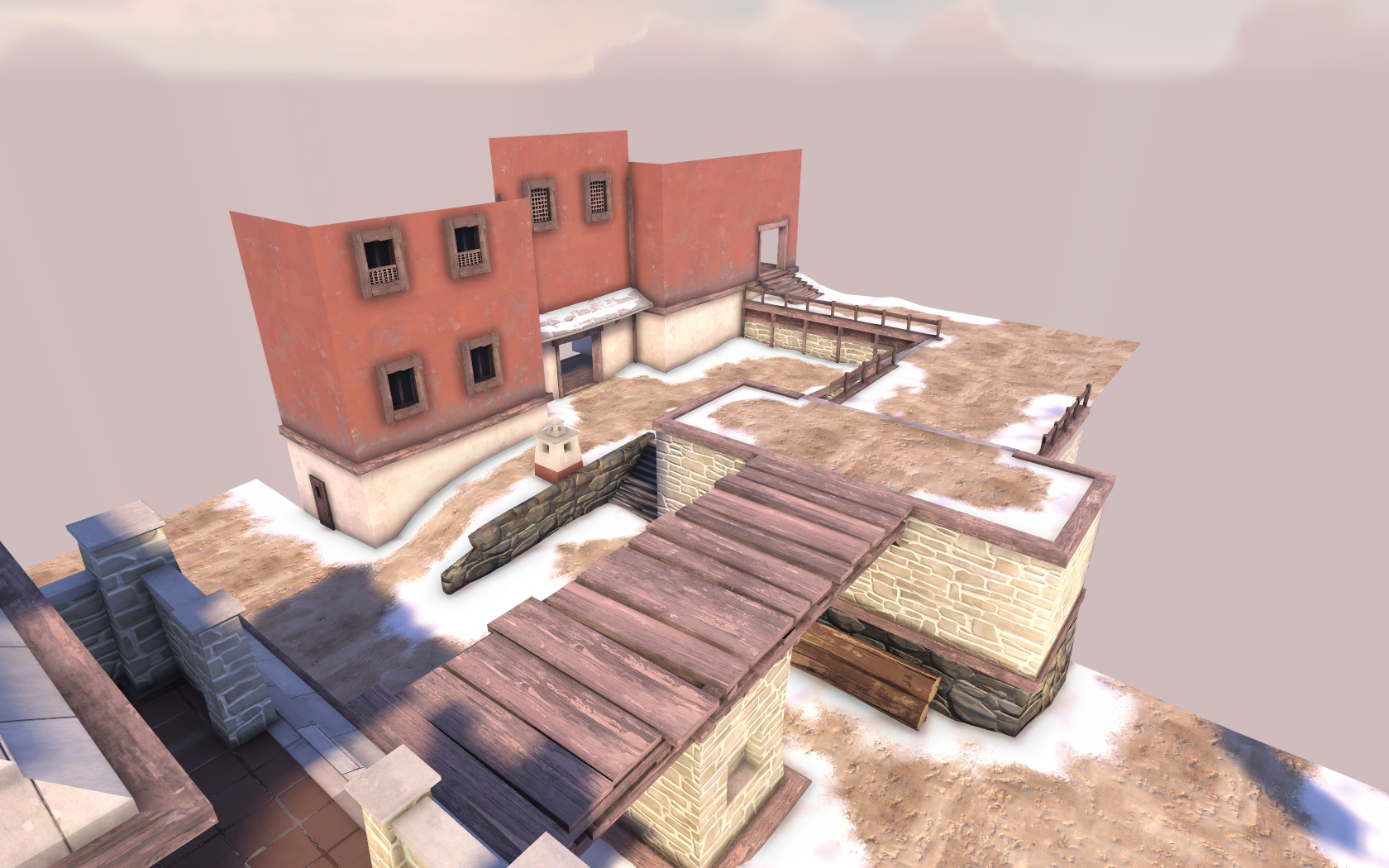
WiP in WiP, post your screenshots!
- Thread starter Arhurt
- Start date
You are using an out of date browser. It may not display this or other websites correctly.
You should upgrade or use an alternative browser.
You should upgrade or use an alternative browser.
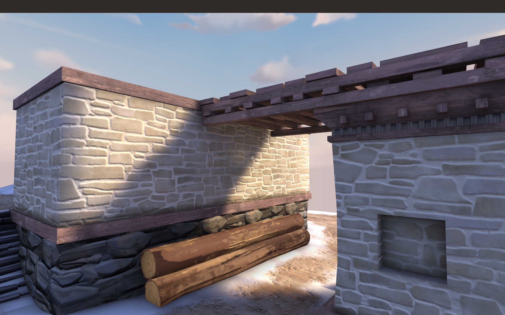
I was showing off bumpmaps that I've made.Bumpy maps
What are you trying to accuse me in?
Are those mario 64 textures?Madness Continues...
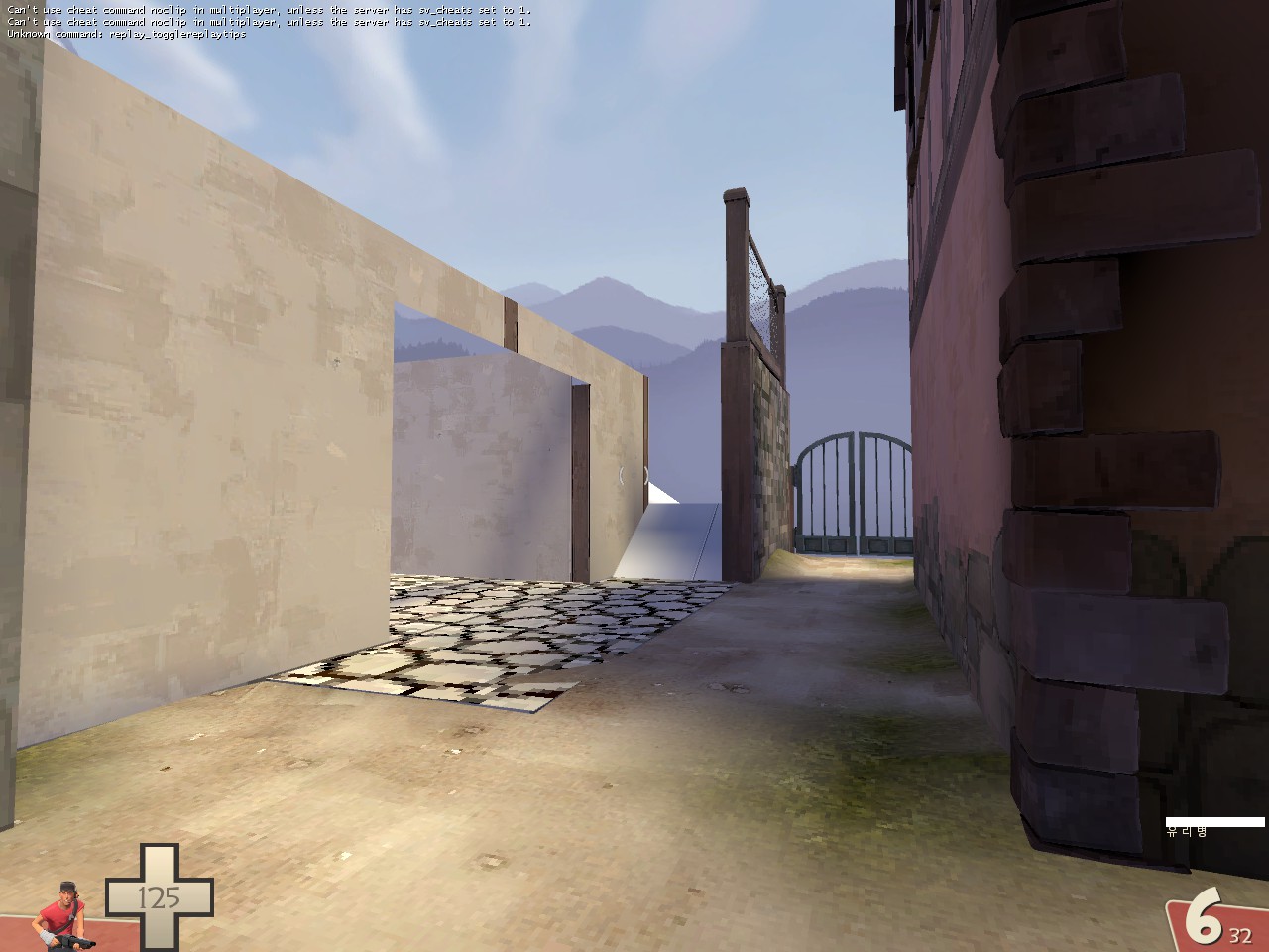
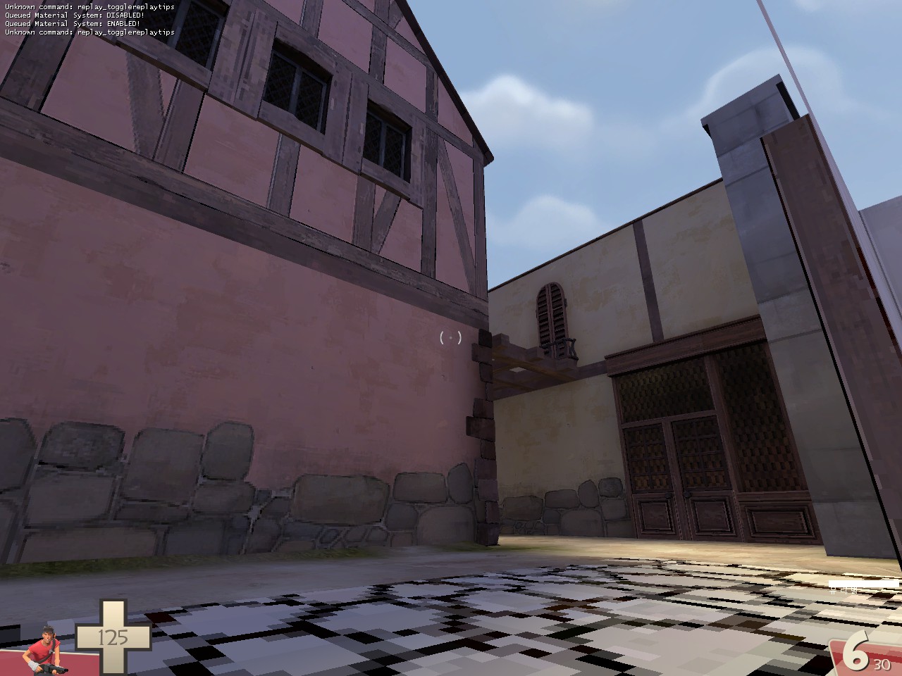
I really want to make this work
Lampenpam
aa
- Mar 23, 2013
- 1,013
- 347
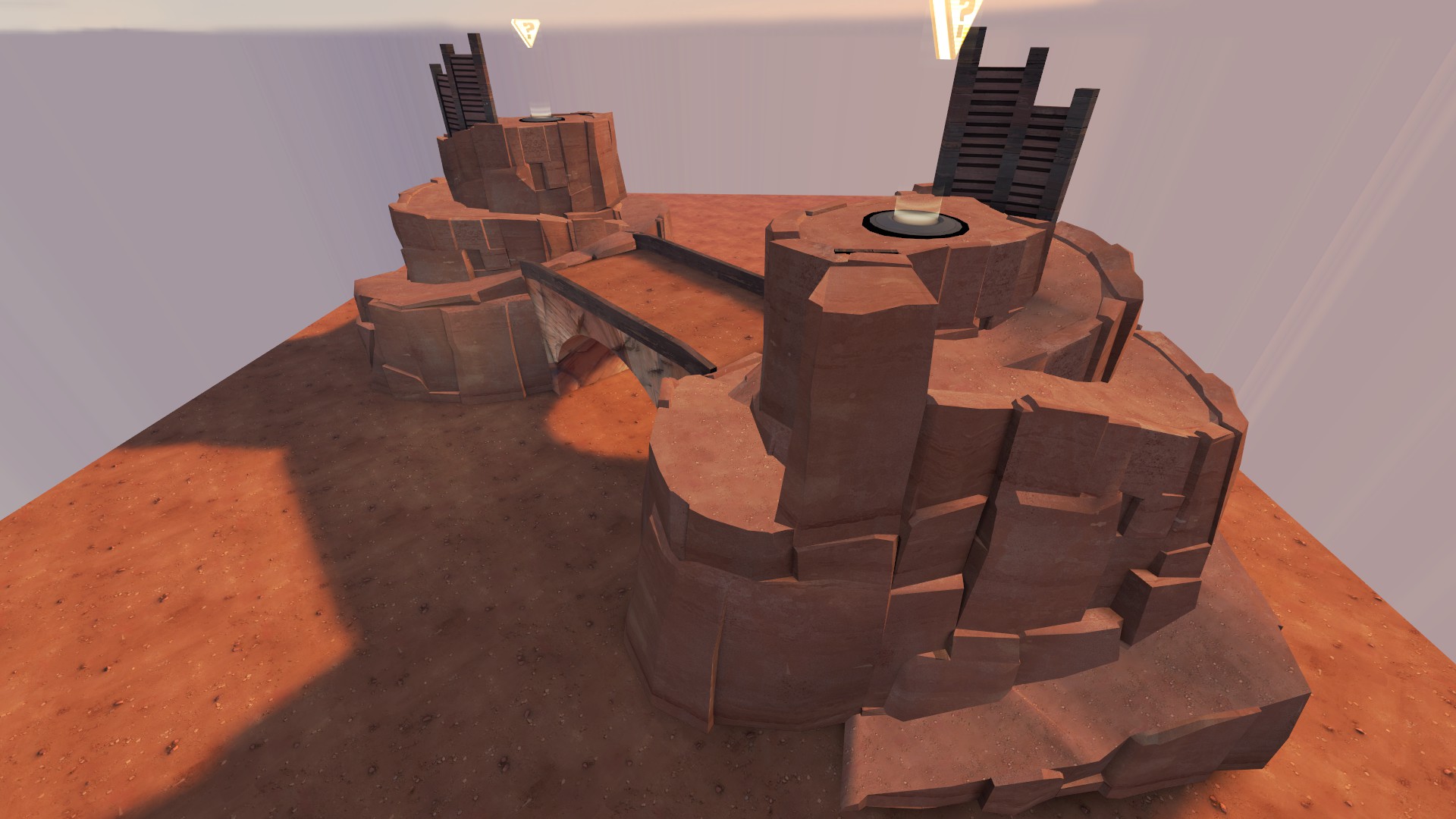
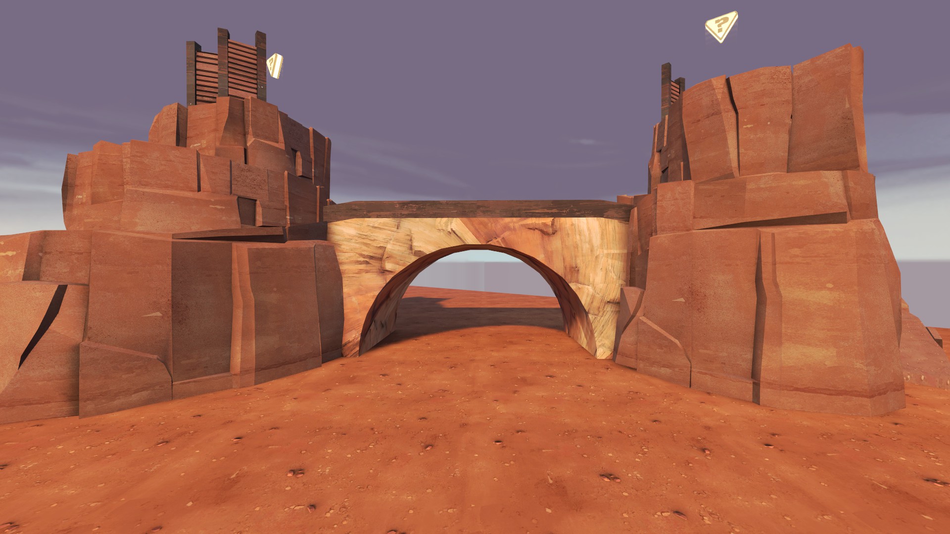
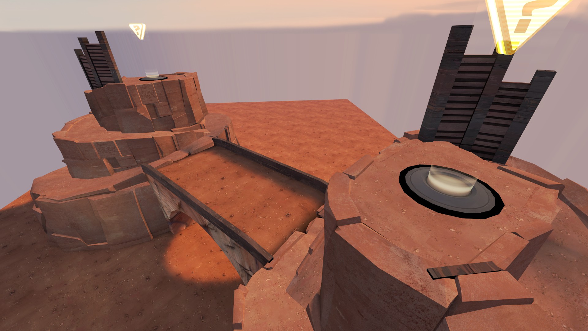
Something random I thought of for 2cp arena,
how will it work? Do both cps need to be capped?
Yup, just like in Byre.how will it work? Do both cps need to be capped?
Something random I thought of for 2cp arena, lol. Might even flesh out a full layout.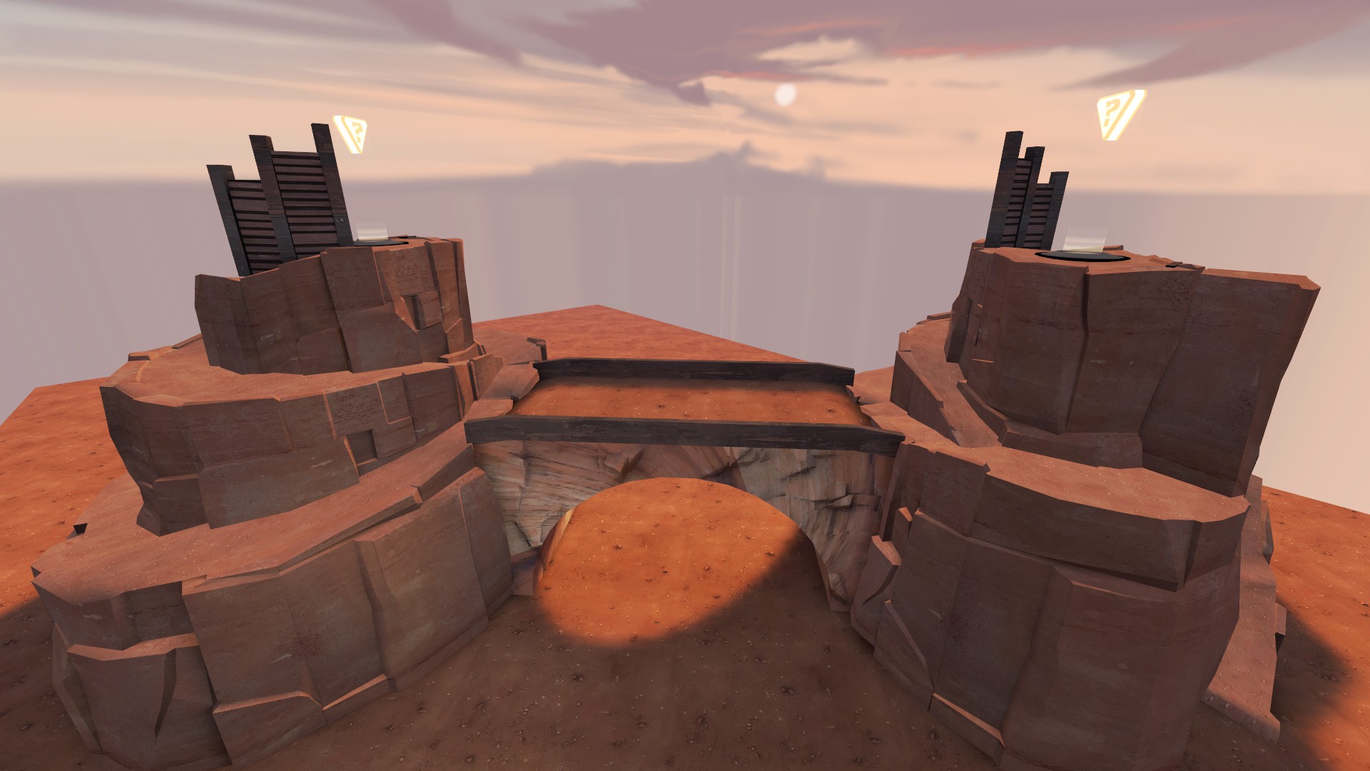
arena_bad2lands
arena_2bad2furious
arena_2bad4u
arena_kappa2cap
It's sad that this can be but one map when so many names write themselves.
challenge acceptedi think a map that's just two badlands spires connected by a bridge is like the platonic ideal of mapping
EDIT: make it the 2fort bridge and we're in business
put both spires on bigger spires. and put the bigger spires on even bigger spires. and the even bigger spires on even biggerer spires. and thSomething random I thought of for 2cp arena, lol. Might even flesh out a full layout.


Oh hey, @fuzzymellow, if you're looking for more stuff to retexture, how about doing a paintover of that lower stonework texture there? I've always hated the stock one; it's so clearly a photorealistic one they ran through Photoshop's Posterize filter.Bumpy maps

What's so bad about methods being clear if it works and looks fine, especially in the not so demanding artstyle of TF2?a photorealistic one they ran through Photoshop's Posterize filter.
What's so bad about methods being clear if it works and looks fine, especially in the not so demanding artstyle of TF2?
I don't think it does "look fine" though. I've never seen the texture be used properly or in a way that doesn't look weird.
You're probably right; still, a part of my point was that you can make a texture look good with such a simple method.I don't think it does "look fine" though. I've never seen the texture be used properly or in a way that doesn't look weird.
Never heard of Competitive Arena beforeput both spires on bigger spires. and put the bigger spires on even bigger spires. and the even bigger spires on even biggerer spires. and th
the room for red side has 2 doorways then that entrance at the top, you only have 1 doorway there.This takes longer than I expected
