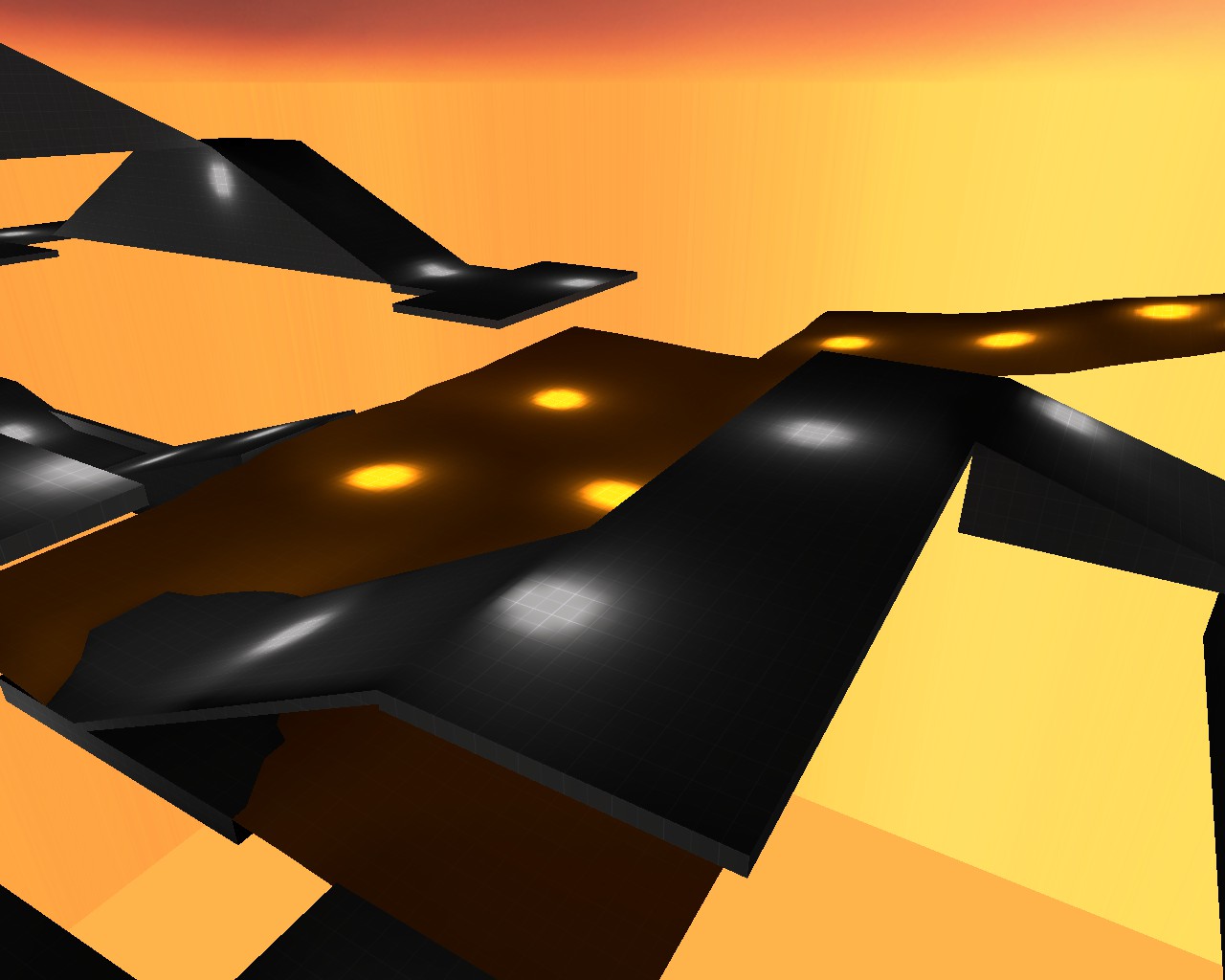
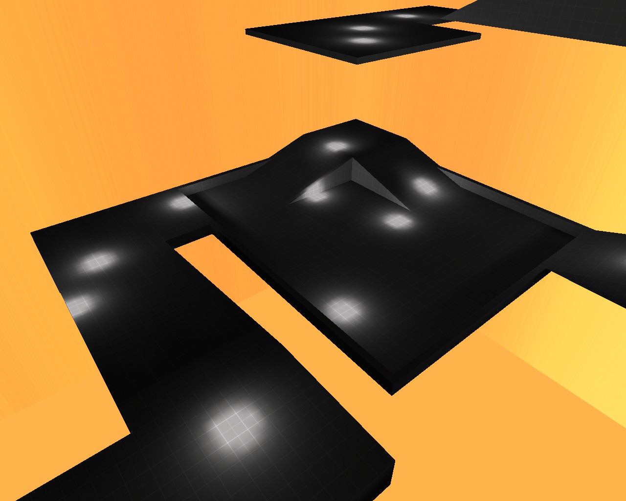
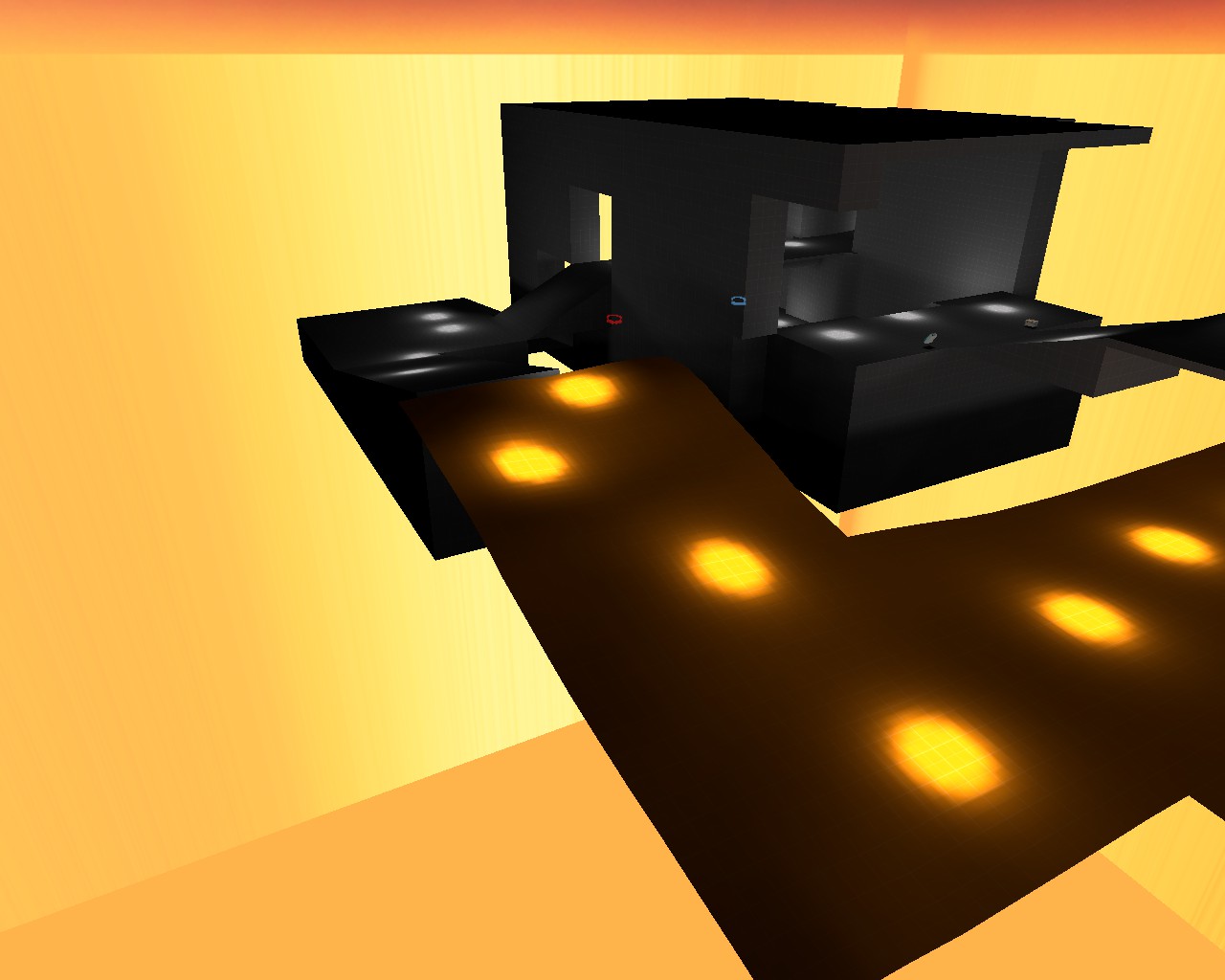
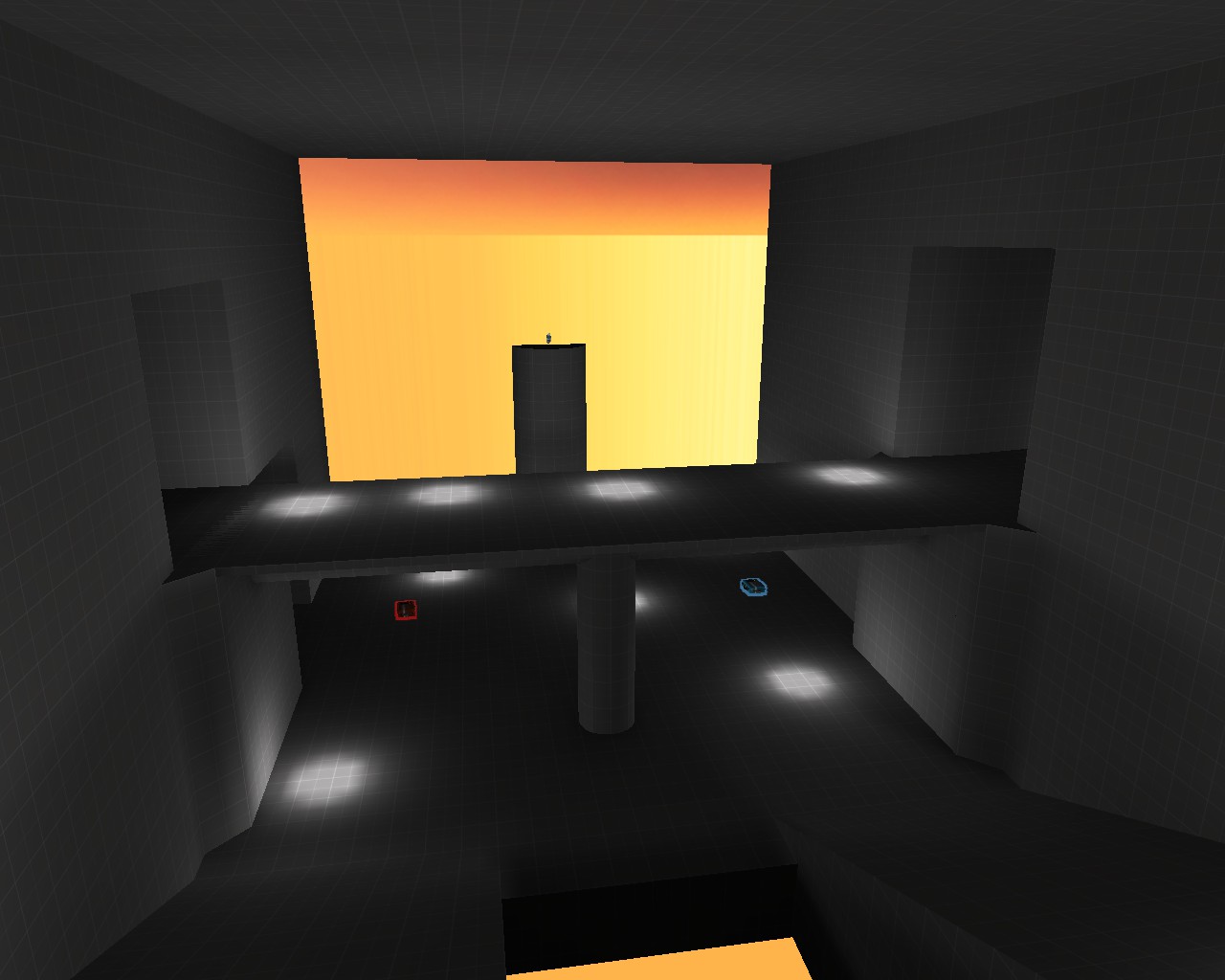
WiP in WiP, post your screenshots!

Etasus

L420: High Member
Jul 24, 2016
463
251
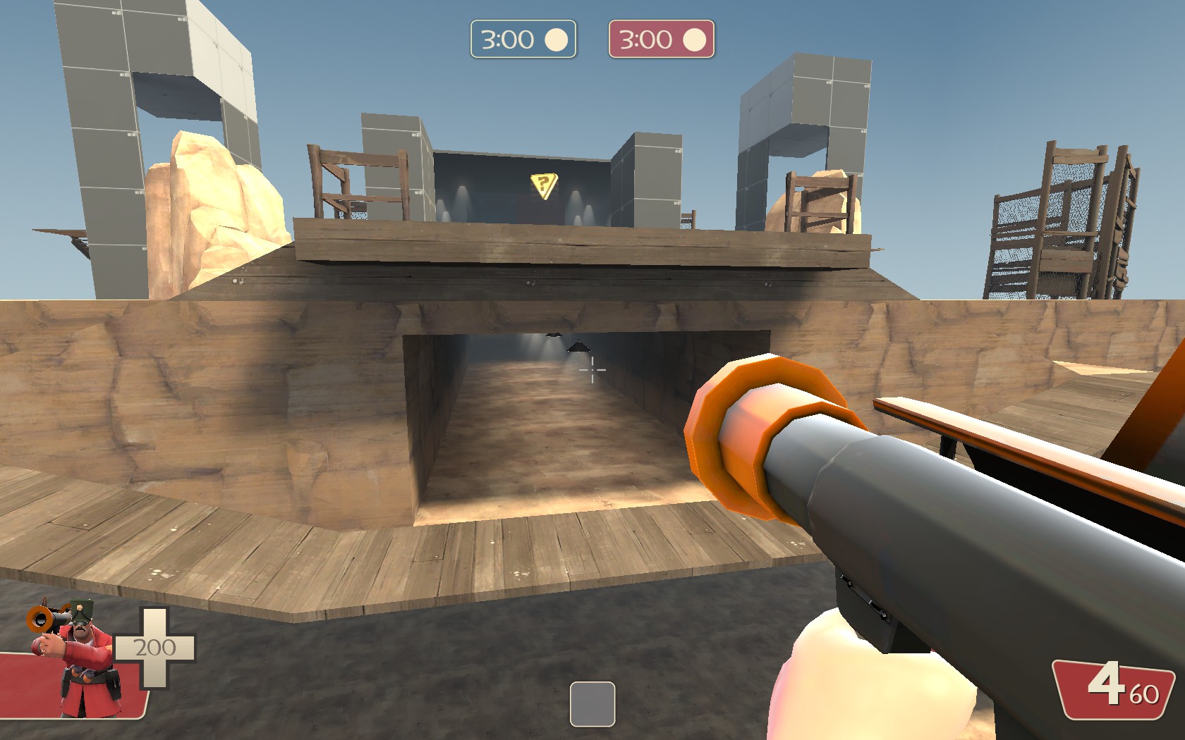
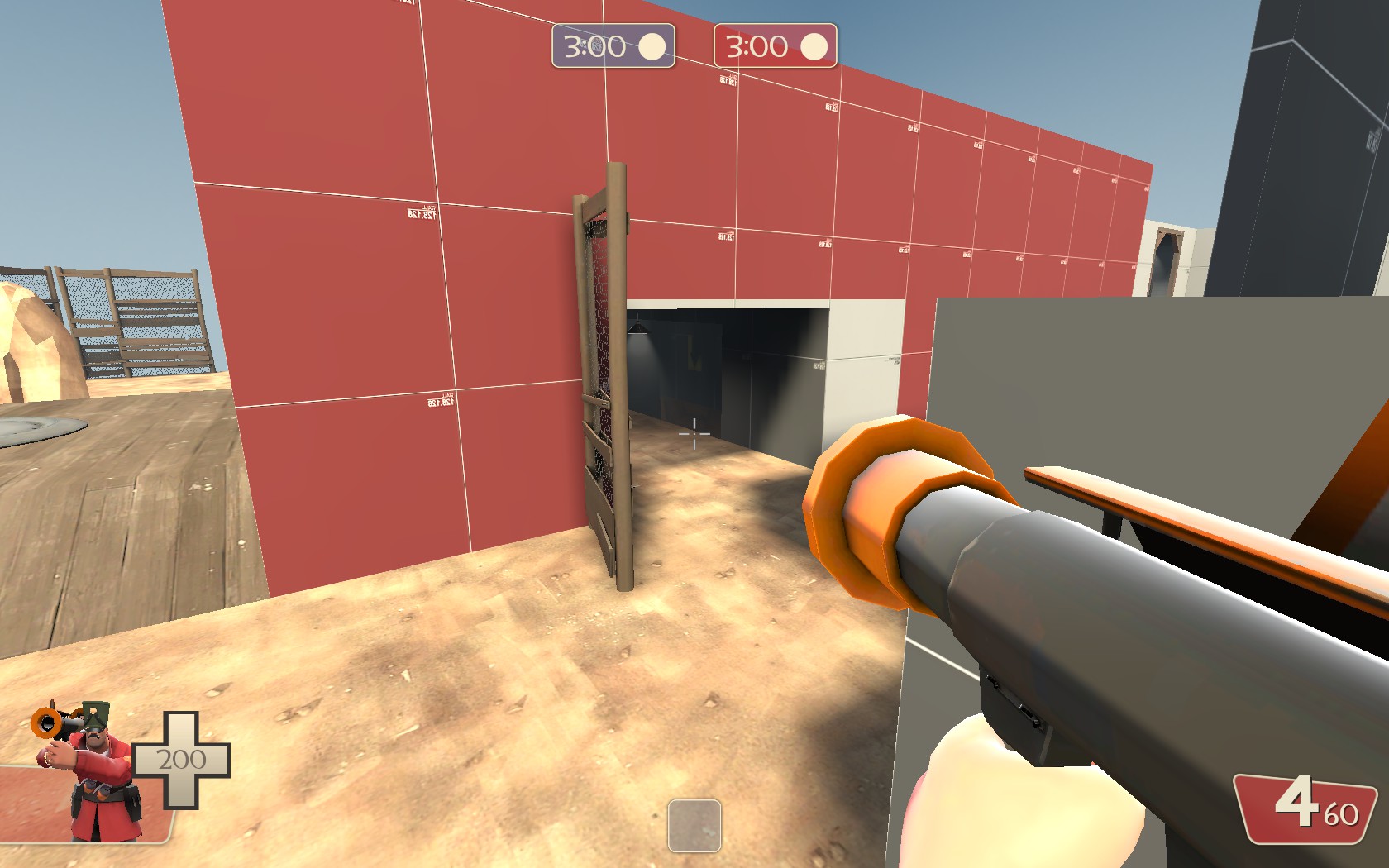
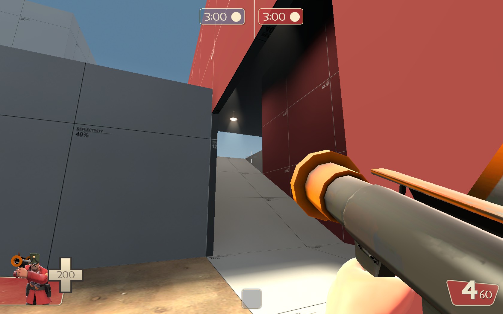
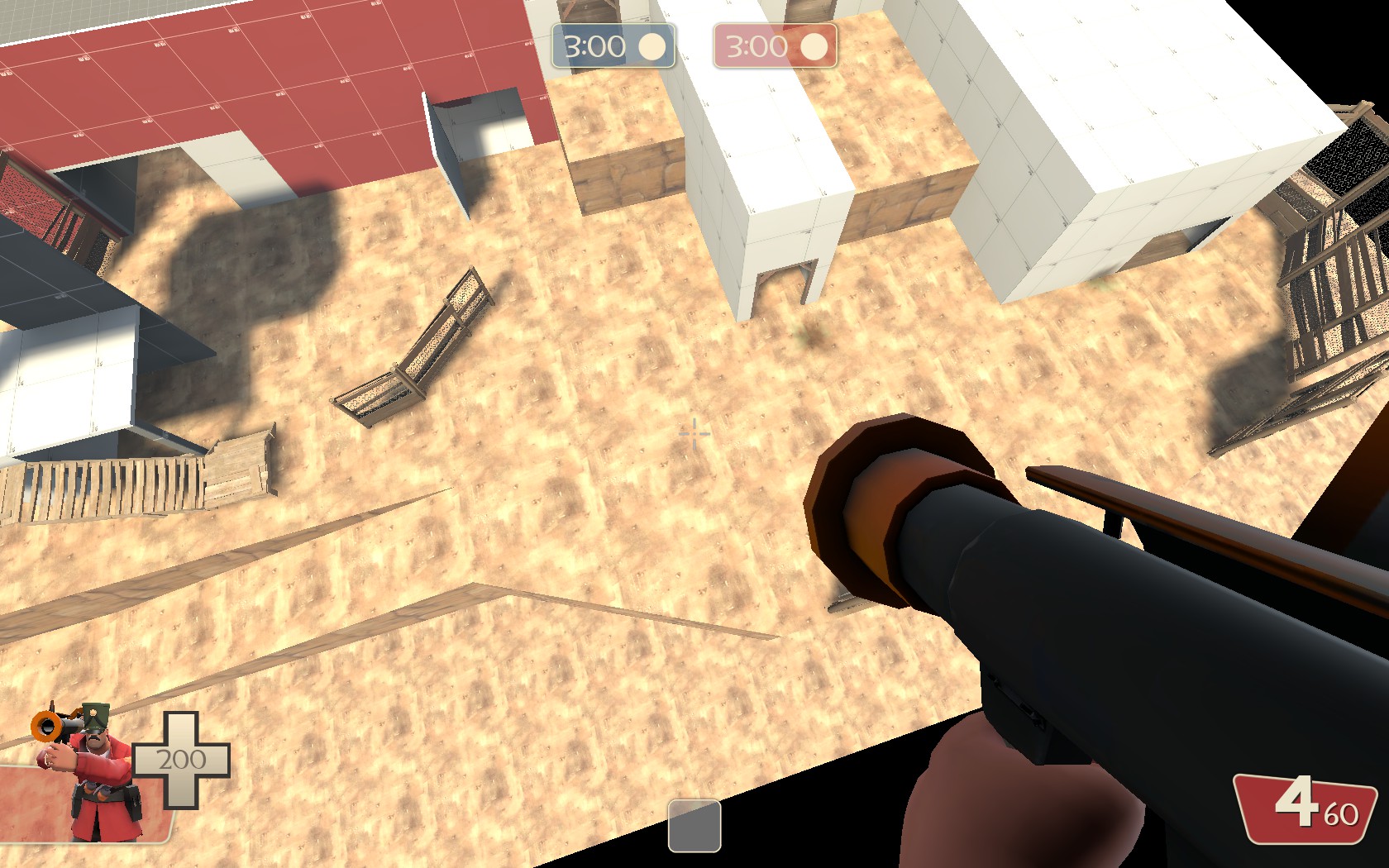
i fixed the displacement, and added a VERY rough skeleton of some pathways and the spawn room... planning on retackling it tomorrow... but i'm done mapping for the night...
ctf_pumpstation_v20007.jpg
ctf_pumpstation_v20006.jpg
ctf_pumpstation_v20005.jpg
ctf_pumpstation_v20004.jpg
ctf_pumpstation_v20003.jpg

the lights are in terrible positions, but were overly rushed, and were deleted shortly after the screenshots were taken... as well as the skybox... DONT JUDGE ME ON THOSE TWO ASPECTS... judge me on everything else though, please!
 

Sheltr

L3: Member
Feb 24, 2011
107
73
It looks like your grid size is quite low on this map just seeing by the small little sizes on the ramps and what not. when mapping id say to work in a different way, your seem to have overly simplified the process. In mapping and anything in life in my mind is keeping a good balance, you are still new so don't worry this balance can take some learning, but id focus alittle more on one area then build out from there. what I tend to do is focus on the middle point then go outward. of course this process can be started from any place second first or even spawn. but focusing on a smaller area to focus on the theming of the map, I don't mean visual but more of how the map will feel. the map also seems over scaled and id not focus on just the paths as the walls and things are just as important as the rest of the map. ;)
 

Tumby

aa
May 12, 2013
1,087
1,196
the lights are in terrible positions, but were overly rushed, and were deleted shortly after the screenshots were taken... as well as the skybox... DONT JUDGE ME ON THOSE TWO ASPECTS... judge me on everything else though, please!
Why even use such low brightness lights all over the place at all? Two or three constant lights would have lit up the entire place. That means set quadratic to 0 and constant to 1 and also lower brightness to about 20 too.
https://developer.valvesoftware.com/wiki/Constant-Linear-Quadratic_Falloff
 

Etasus

L420: High Member
Jul 24, 2016
463
251
It looks like your grid size is quite low on this map just seeing by the small little sizes on the ramps and what not. when mapping id say to work in a different way, your seem to have overly simplified the process. In mapping and anything in life in my mind is keeping a good balance, you are still new so don't worry this balance can take some learning, but id focus alittle more on one area then build out from there. what I tend to do is focus on the middle point then go outward. of course this process can be started from any place second first or even spawn. but focusing on a smaller area to focus on the theming of the map, I don't mean visual but more of how the map will feel. the map also seems over scaled and id not focus on just the paths as the walls and things are just as important as the rest of the map. ;)
i feel like my grid size is good for the time being, as im still roughing out the edges, but im getting there...

yeah, i built up pretty much all of the middle area, and then moved on to the outer courtyard and so on... i just need the rough skeleton of everywhere else to get me to know what im doing, and where im placing things...

i actually spent a while on scaling... i dont think its perfect yet, and it does still need some work, but i think that its where i want it to be for a1...

thanks for the help Manoman!
 

Asd417

Sample Text
aa
Mar 20, 2016
1,461
1,035
`
i fixed the displacement, and added a VERY rough skeleton of some pathways and the spawn room... planning on retackling it tomorrow... but i'm done mapping for the night...
ctf_pumpstation_v20007.jpg
ctf_pumpstation_v20006.jpg
ctf_pumpstation_v20005.jpg
ctf_pumpstation_v20004.jpg
ctf_pumpstation_v20003.jpg

the lights are in terrible positions, but were overly rushed, and were deleted shortly after the screenshots were taken... as well as the skybox... DONT JUDGE ME ON THOSE TWO ASPECTS... judge me on everything else though, please!
1. My eyes are burning.
2. Too tight for anything.
3. My eyes are burning
 

Etasus

L420: High Member
Jul 24, 2016
463
251
I broke something... anyone have any ideas on how to fix it? its specifically in the intel room... also, i fixed the skybox, so your eyes wont burn...
ctf_pumpstation_v20014.jpg
ctf_pumpstation_v20013.jpg
ctf_pumpstation_v20012.jpg
ctf_pumpstation_v20011.jpg
ctf_pumpstation_v20010.jpg
the problem has to do with the water... all it is is a nodraw brush with powerhous water on top... nothing else... the problem also happens in the first room, inbetween the stairs... there are no entities tied to the water...
 

Asd417

Sample Text
aa
Mar 20, 2016
1,461
1,035
So that's a nodraw brush with water texture on one side right? Check if the brush is leaking because there's no ground under it
(Chill guys it was a joke...)
 

Asd417

Sample Text
aa
Mar 20, 2016
1,461
1,035
hmmm
did you func detail the water? I had similar problem when I made portal 2 maps
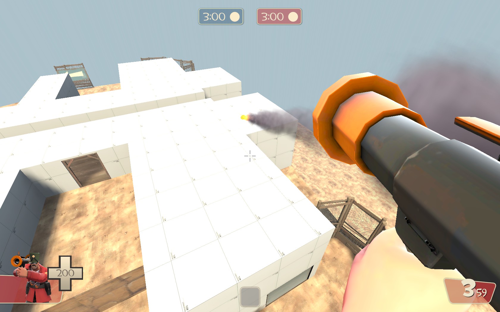
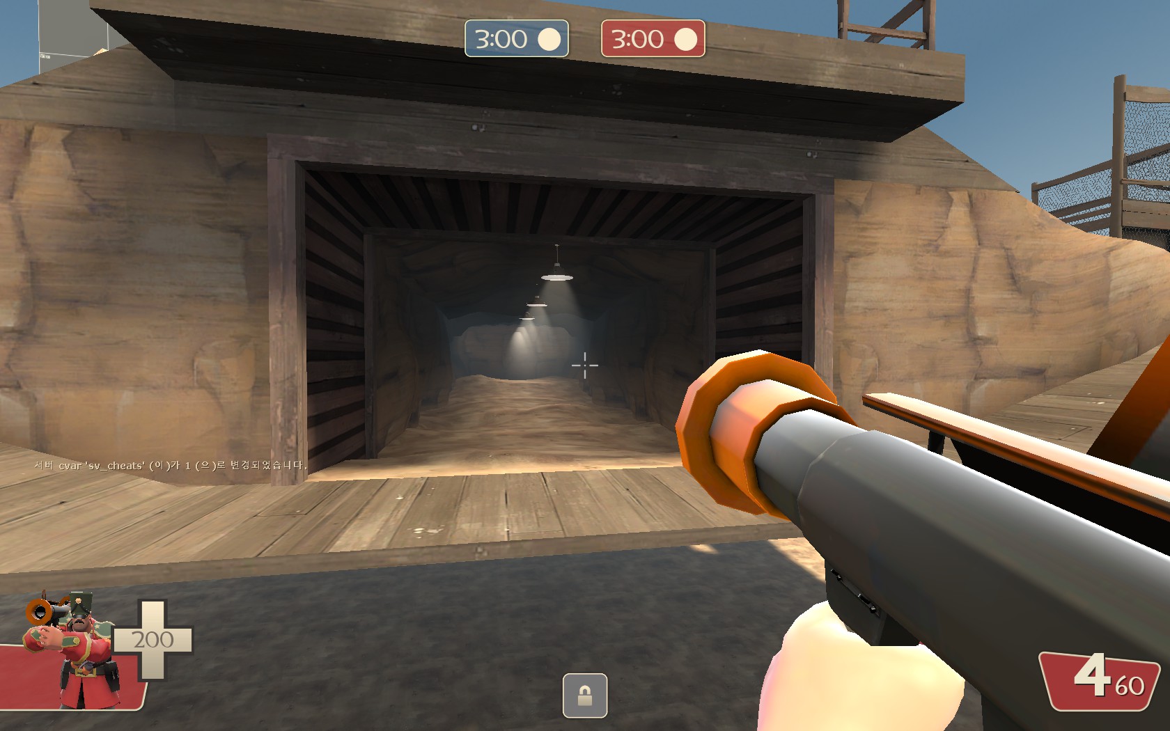
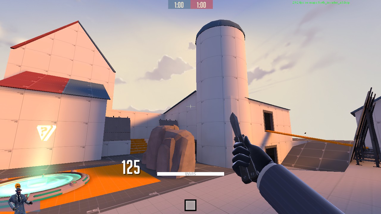
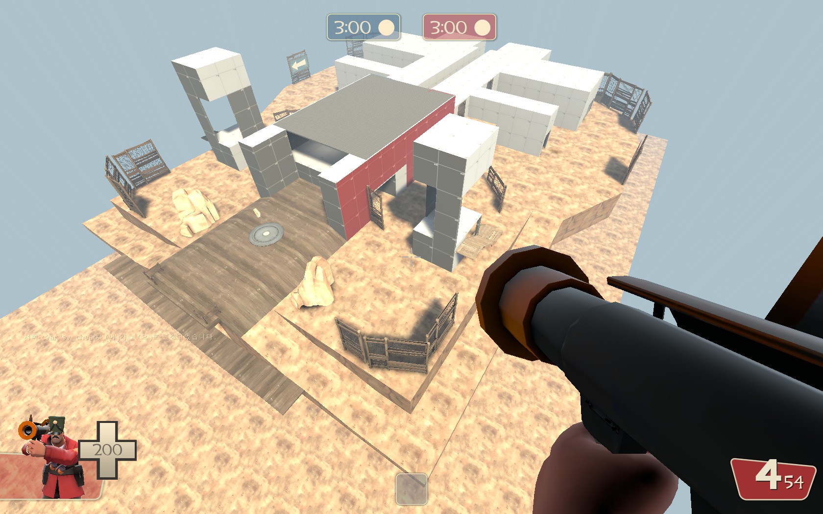
Btw working on a koth map I planned long time ago
3uIFJ3Z.jpg

Z4j1xDV.jpg

gHnGYRU.jpg

dF1LcH9.jpg

kCUsfXx.jpg

vg8D6A4.jpg

There is a spawn where my rocket is heading
Loads of flanks. (3 I think) So it should allow some 'push and pull' action
 

zahndah

professional letter
aa
Jul 4, 2015
764
647
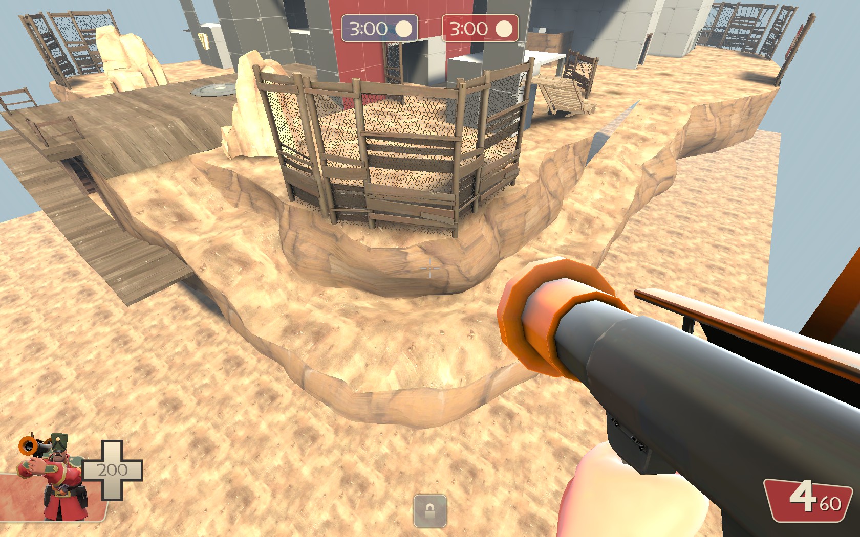
200ish hour into hammer and I finally learned the basic of displacement

Those displacements look unnaturally bumpy. Were you using a large edit amount with a small edit size when making them? really you should use a larger edit size with a very small edit amount as that way you can make it look natural much easier.
 

Asd417

Sample Text
aa
Mar 20, 2016
1,461
1,035
Those displacements look unnaturally bumpy. Were you using a large edit amount with a small edit size when making them? really you should use a larger edit size with a very small edit amount as that way you can make it look natural much easier.
I assume you are talking about the second picture? Yeah I agree now that I look at it again. The floor can go more smoothly.
 

AsG_Alligator

qhull precision error
aa
Aug 5, 2016
620
1,223
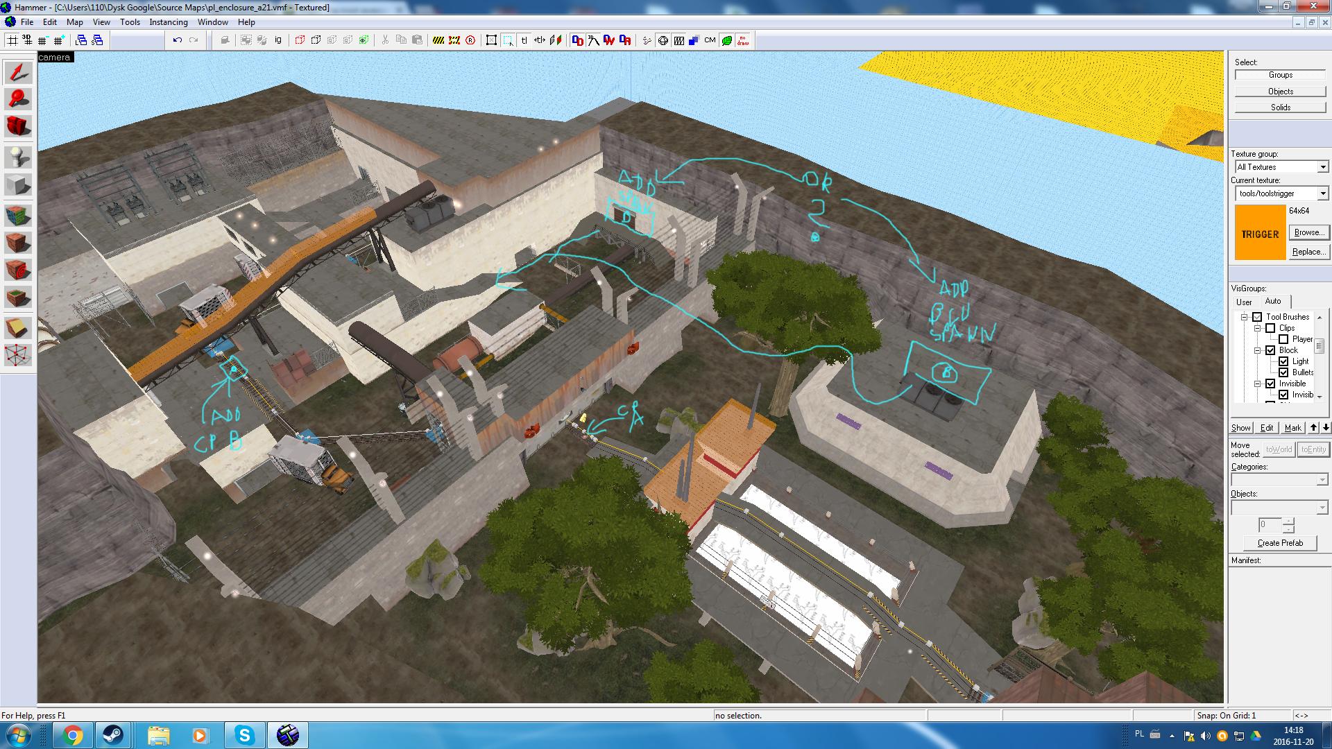
So im thinking about adding a 2nd mind point in stage 3 of pl_enclosure:
OSAndl8.jpg

But i dunno where to put blu forward spawn tied to that B point.
 

BenCo

L5: Dapper Member
Dec 30, 2015
242
135
I quickly made a concept art of a map that I'm working. It's set around a lake during winter and there's a house in the middle of the lake a.k.a the CP. It will be a 1 CP arena map. Now what else should I put on the map. I really don't know what should be around the lake. How the flank routes should look. Any ideas?

Névtelen.png
 
Last edited: