WiP in WiP, post your screenshots!

RataDeOrdenador

L5: Dapper Member
Oct 12, 2015
230
105
That voice is just...

OABhnkN.jpg


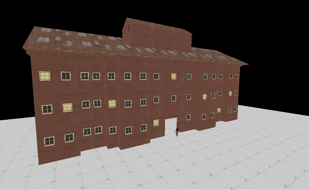
BTW,this does NOT look like a hotel... for now. ;V

sandman-hotel-quesnel-exterior-01-465x300_1.jpg

bVXPEeV.png


And yes,the hotel is going to be called "SandMann Hotel"
 
Last edited:

YM

LVL100 YM
aa
Dec 5, 2007
7,158
6,079
Lovely waterfall @fubarFX, the bottom level seems to have a little harsh of a transition though.
For the dangling leaves, have you disabled using surface normal for vertex lighting? if that on it's own doesn't do it, I'd recommend also disabling self shadowing and the combination of those two should give a much nicer lighting for that type of prop.
 
Nov 2, 2010
356
1,050
More Genesis detailing and more ugly lighting

12C3E3AB8F7E2878A8D5B89156FB6D3DB559C5E0


Fairly happy with this building but I suspect it will look 100 times better when it isn't surrounded by grossness

A4CAC5F3DA45C42DA9E6F03B03EC304950FD6B71


Inside that building

74D6390F1AD45C833598E066DBD1E33E70A5972E


And a cheeky hitchiker on the payload:

E87E41C7559CBBDB7B876EA7EFCA4E40F2C4E8FE
 

Berry

resident homo
aa
Dec 27, 2012
1,056
1,898
Looks fancy pancy, but..


There's something off about that staircase on the right. It looks really flat. Might look better as a slope instead.

It looks really long, it might be better shortened and the top flat piece being longer
 

Skullio

L1: Registered
Mar 29, 2016
48
54
I made a big goofy dragon head statue thing for rolling the PL into. Maybe try and do a big explosion and temple collapsing effect.

Stupid Mayans didnt know how to make arches though apparently so I'm gonna redo this whole thing with straight pillars and make it more of a cylinder than a dome, thought I may as well post it before i delete it because I thought the arches were fun. Stupid Mayans

tulum10000.jpg
 

Hinur

L1: Registered
Apr 26, 2016
9
0
My first map in Hammer. its called mvm_oilrig. Very WIP
EDIT: sorry for the weapons blocking view, forgot to go spectate mode...

211mng6.jpg

vxm0hu.png

2lvlo93.png
 

Empyre

L6: Sharp Member
Feb 8, 2011
309
187
Having the map dark looks good, but plays very poorly because a player can't see what team another player is on.
 

RataDeOrdenador

L5: Dapper Member
Oct 12, 2015
230
105
Having the map dark looks good, but plays very poorly because a player can't see what team another player is on.

"Very WIP". He'll definetly add more light... I hope.

Yet it looks really good for your first map... and going with MvM? I failed so hard with a PL map. Hopefully you don't go the same way as me. xD
 

Pocket

Half a Lambert is better than one.
aa
Nov 14, 2009
4,701
2,583
Stupid Mayans didnt know how to make arches though apparently so I'm gonna redo this whole thing with straight pillars and make it more of a cylinder than a dome, thought I may as well post it before i delete it because I thought the arches were fun. Stupid Mayans
Abraham Lincoln didn't invent stairs either. I don't think historical accuracy is all that critical in this game.
 

Hinur

L1: Registered
Apr 26, 2016
9
0
@Hinur There is already an established MvM map called Oilrig: https://steamcommunity.com/sharedfiles/filedetails/?id=463499205
I would suggest finding a new name to avoid confusion.

I will change the name then, something like foundry.

Having the map dark looks good, but plays very poorly because a player can't see what team another player is on.

yeah, I'll look into adding more light, this was just a rough draft of light so I could see where I was going. #

Thanks for the feedback guys, I'll continue working and post an update soon.
 

Vel0city

func_fish
aa
Dec 6, 2014
1,947
1,589
I will change the name then, something like foundry.

yeah, I'll look into adding more light, this was just a rough draft of light so I could see where I was going. #

Thanks for the feedback guys, I'll continue working and post an update soon.
FYI, Foundry's also already taken by a Valve map already in the game.