WiP in WiP, post your screenshots!
- Thread starter Arhurt
- Start date
You are using an out of date browser. It may not display this or other websites correctly.
You should upgrade or use an alternative browser.
You should upgrade or use an alternative browser.
Bucake
L1: Registered
- Jun 22, 2015
- 18
- 1
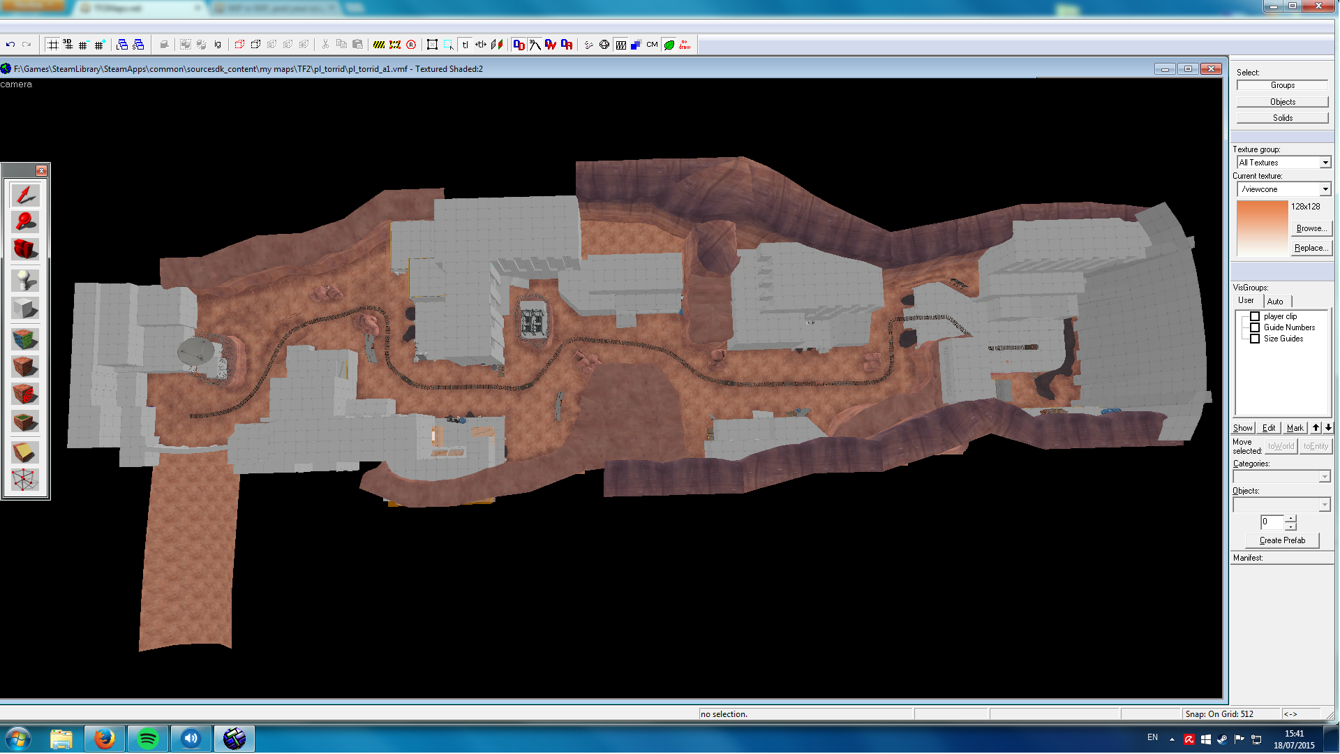
since it's 8 screenshots, i'll just link the imgur album rather than flooding the thread with images:
http://imgur.com/a/QPmJk
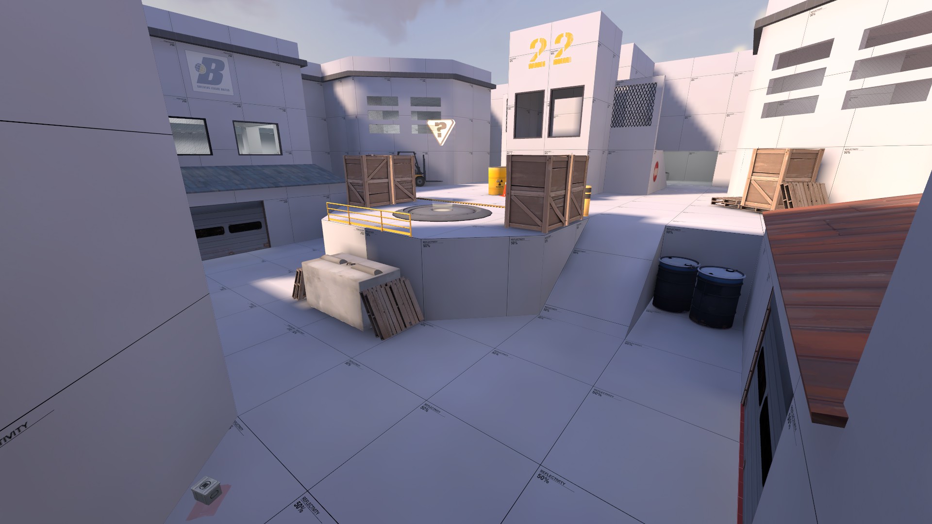
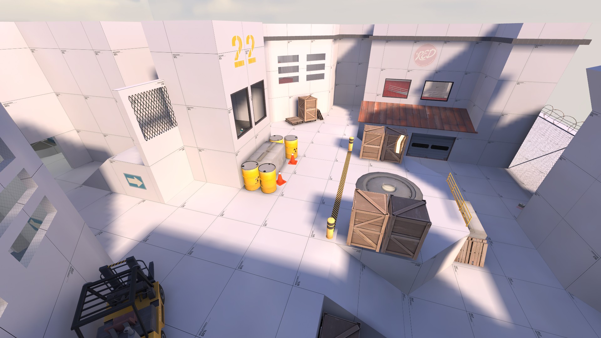
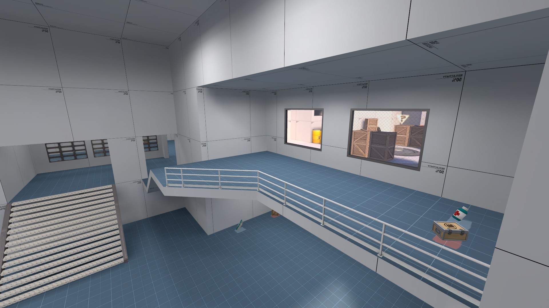
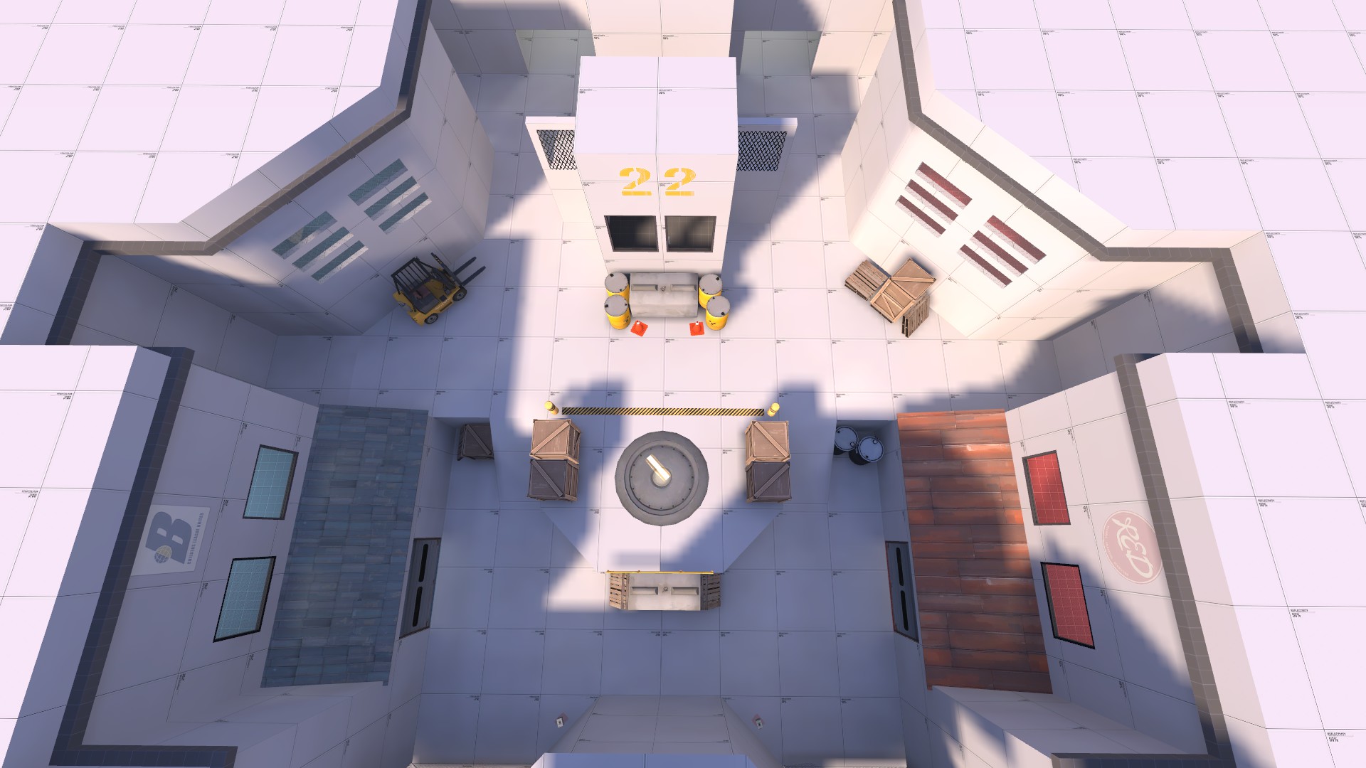
i'm trying to make a koth map. it's my first map. originally i was going for a map designed for 6s, but i'm not too confident i've ended up with something suitable.
i could really use some feedback/criticism on the current layout. i want the map to actually be fun to play, before i start my attempt at making the map look pretty.
in case anyone's willing to have a look in-game for some constructive criticism, i've uploaded the .bsp to tinyupload: http://s000.tinyupload.com/?file_id=73494471525481914528
(i wouldn't mind uploading it somewhere else if that's preferable.)
if you do, please keep in mind that many things like lighting, textures, clipping and optimization are all very much lacking. (don't expect anything to be complete or polished!)
i'm currently concerned about things like sight-lines, areas that are too easy to hold or too easy to push through, ammo- and healthpacks, height of the map, height of buildings, too open or too narrow areas, etc..
I think it looks cool, especially for a first map! I would say if you aren't sure about the layout it is time to test. Enter a gameday (Events subforum) or hang out in chat and try to get your map in an impromptu test there. If you're specifically looking for competitive feedback you might be better off trying to attract the attention of some 6s teams that are willing to test it.
You can upload your map to the downloads section of this site, by the way.
You can upload your map to the downloads section of this site, by the way.
Bucake
L1: Registered
- Jun 22, 2015
- 18
- 1
thanks a lot for your reply : )
i actually didn't realize that the site offered such an evolved system for playtesting.
it's incredibly helpful that given feedback can include coordinates of player-positions and coordinates of what they're pointing at.
i also didn't realize i can actually upload maps directly to the site. i guess i should've scouted around a bit before i started posting - sorry about that!
i'm still a bunch of hours of mapping away from having it ready for test-playing, but i suppose that's what i'll be going for : )
so thanks a lot for the suggestion, hopefully i'll have something ready within two weeks!
- Sep 5, 2009
- 912
- 684
Last edited:


Now ingame
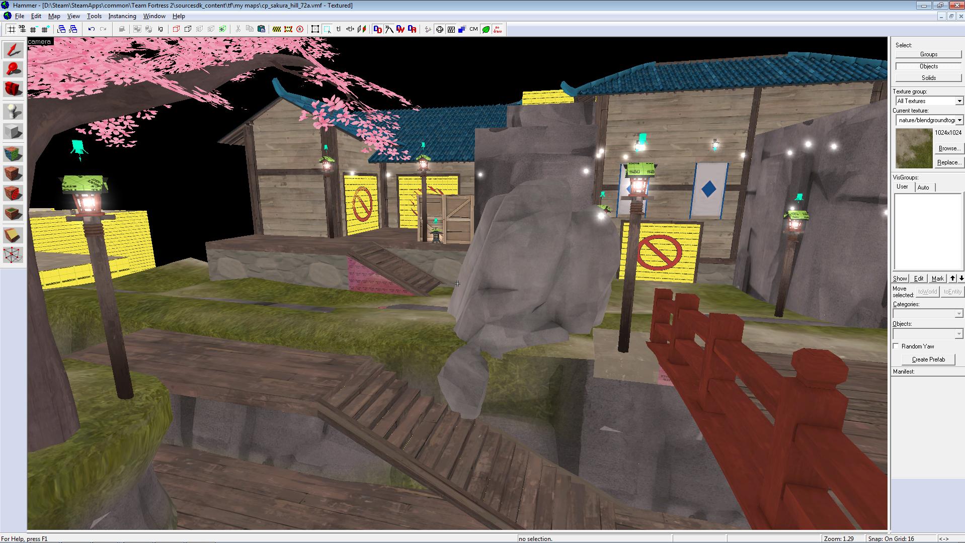
If you're doing the egypt theme, it'd be really cool if the hole at that one control point was a quicksand slide.
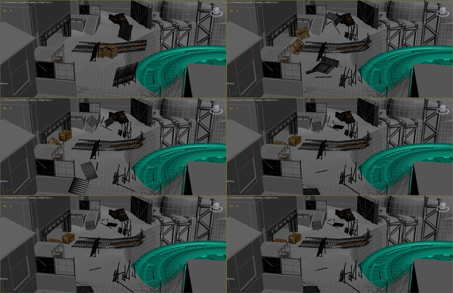
Kaaabooom. WIP cinematics for snowycoast.
I dunno why the gif is choppy like that. The animation is smooth, but whatever.
How much effort goes into an animation like this?
Most of the effort is probably just setting it up. The actual animation is just physics doing what physics does.How much effort goes into an animation like this?
How much effort goes into an animation like this?
It's a mix of physics simulation and rigged props. The bits that go flying are physics, the bits that bend & twist are rigged. The rigged models process is basically position the bones, weightmap everything, start keyframing.
The physics props are easy to set up (I use a plugin called PullDownIt), but it requires several takes before you get a physics result that works well enough. And sometimes you get in this loop where you endlessly fiddle with the settings over and over to avoid jitter or bad collisions, etc, etc.
Grindstone says I've spent 18 hours so far on the cinematic, but most of that was spent trying to figure out how to do the main ramp. I ended up modeling the damage, rigging it, and animating it by hand because I couldn't simulate it with physics. Twisted metal is kinda tricky to simulate unless you have Houdini or some other high end plugin.
[edit] The small barrier in the middle hasn't been animated yet, btw -- it'll need to twist/bend as the crates clip past it.
Right now the different props are a little out of sync with one another, but that might not be noticeable in the final result. And if it is noticeable, it's relatively easy to fix by just shifting the keyframes a little. The gif is about 1/2 speed.
Last edited:
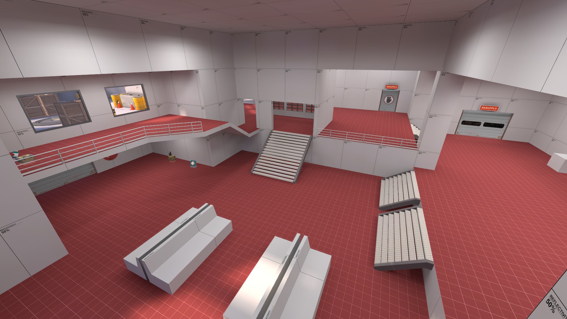
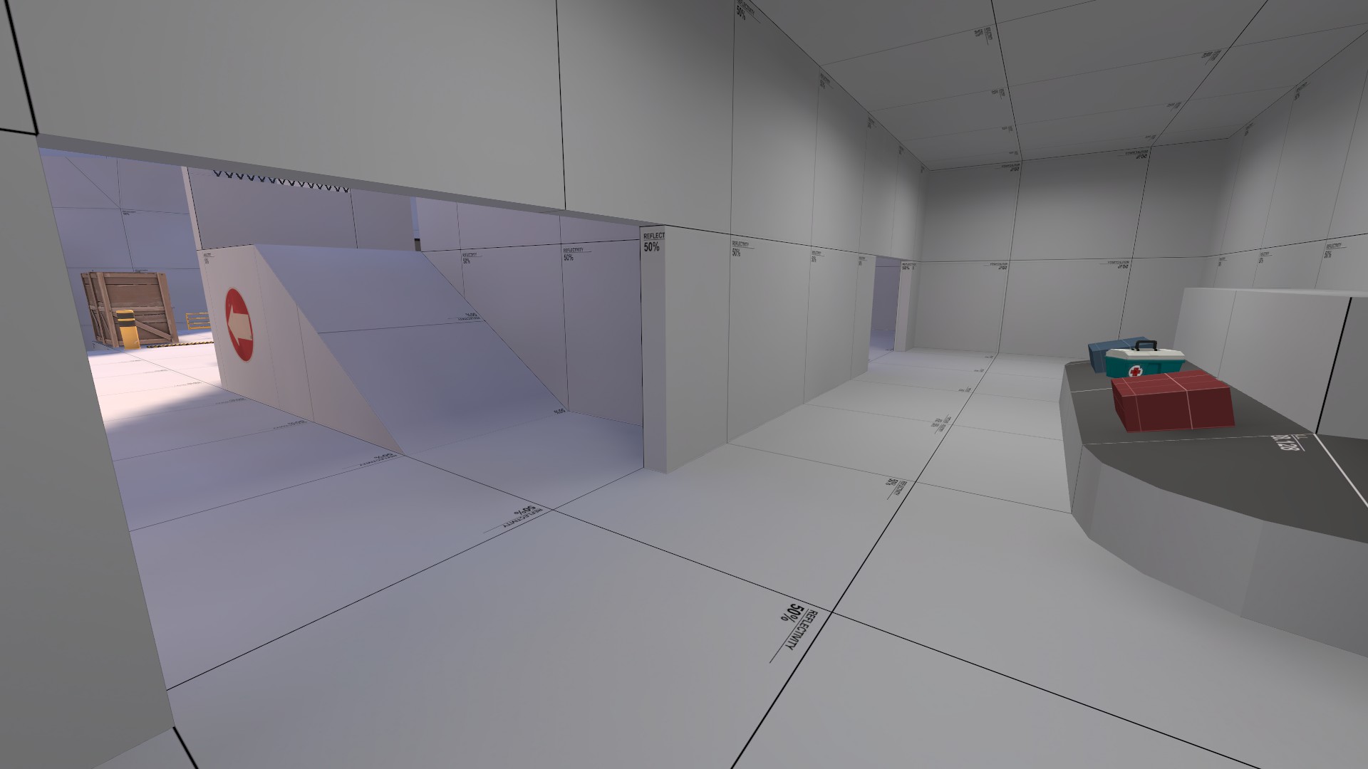
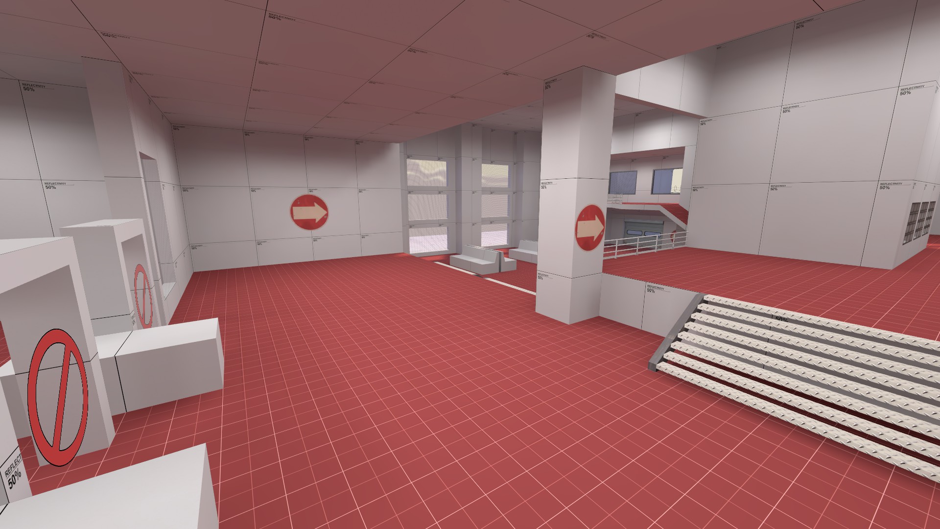
Can we see more of the spawns? Because based on what's in the screenshots it looks like a bad time.
I'm compiling the final version now, but I can say that those security gates are in the essence of the top spawn exit on koth_suijin, in the way that they aren't in the spawn, but enemies can't go back there.
Here you can see the other two exits, one being a no entry.
