WiP in WiP, post your screenshots!

xzzy

aa
Jan 30, 2010
815
531
Based off just that screenshot, it looks an awful lot like Crash's map from the alien 72 hour contest. Is that intentional or just random chance?
 

Shogun

L6: Sharp Member
Jan 31, 2014
260
220
Looking good Clam! Although what's up with the tilted fences on the roofs? They look like they're about to fall off.
 

RubbishyUser

L7: Fancy Member
Feb 17, 2013
414
488
Looking good Clam! Although what's up with the tilted fences on the roofs? They look like they're about to fall off.

My guess is that he wanted a line-of-sight blocking prop but at the same time was dedicated to a tilted roof. Hence, something to block the sight but was necessarily at an angle. I would reccomend having something with a wider base, like crates, or restructure the building so a flat roof is possible and building on that. TF2 really only has a single vent prop that actually makes sense on roofs and blocks sightlines, so you may want to find a creative solution.
 

Harribo

aa
Nov 1, 2009
871
851
Based off just that screenshot, it looks an awful lot like Crash's map from the alien 72 hour contest. Is that intentional or just random chance?

We've played previous versions of this, the similarity is just a general koth thing
 

Seba

DR. BIG FUCKER, PHD
aa
Jun 9, 2009
2,364
2,728
EqIuKIc.jpg

CxckY1Z.jpg

QMIkJvH.jpg


progress

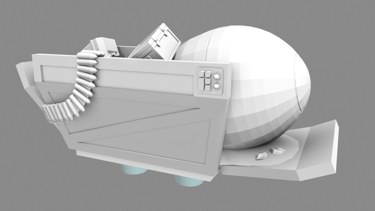
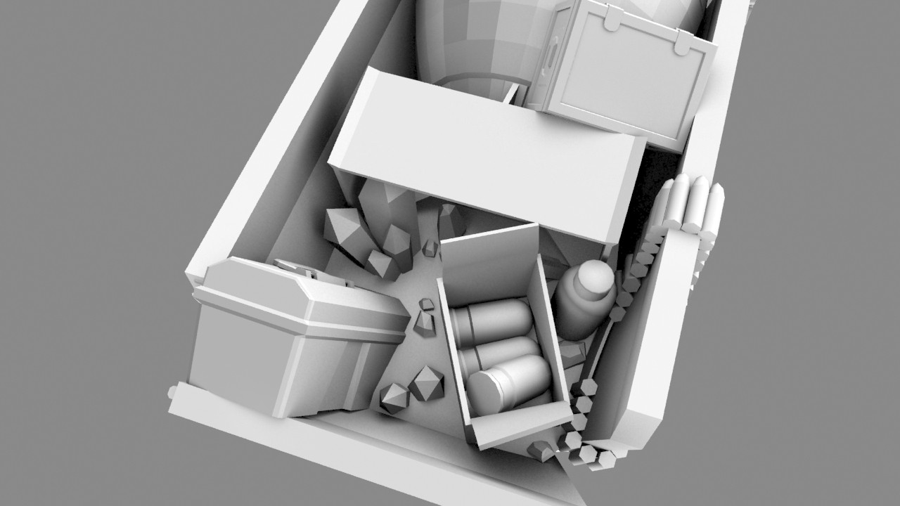
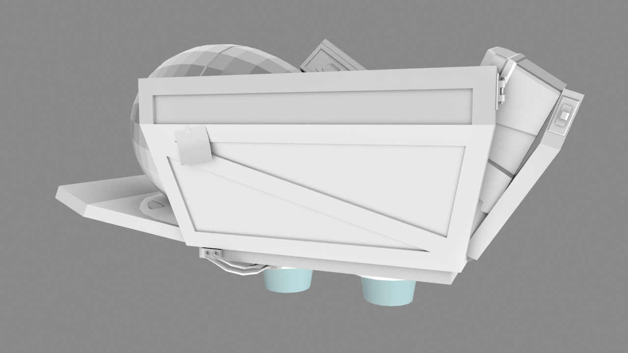
The back feels very empty, what other stuff should I throw in there? I might add some nails and other rusty scrap, like the default kart has.
 

Seba

DR. BIG FUCKER, PHD
aa
Jun 9, 2009
2,364
2,728
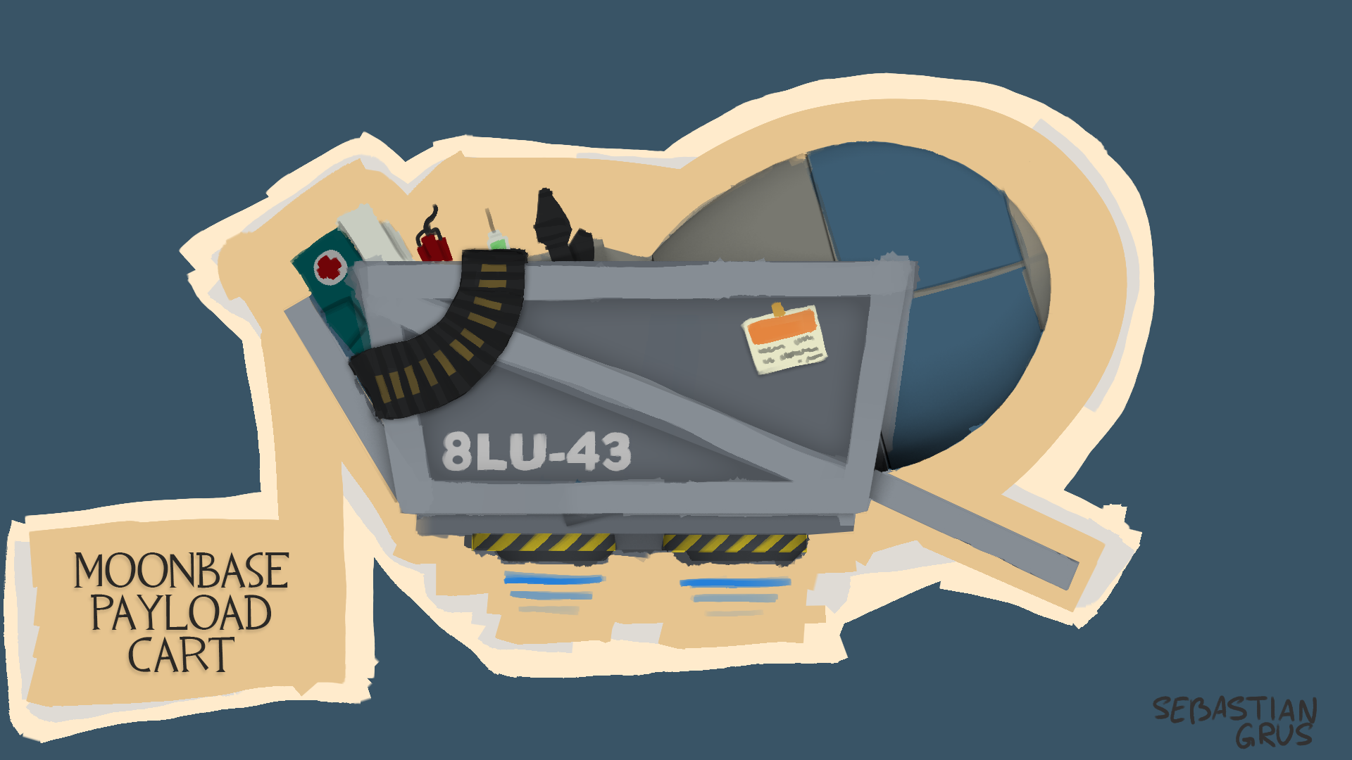
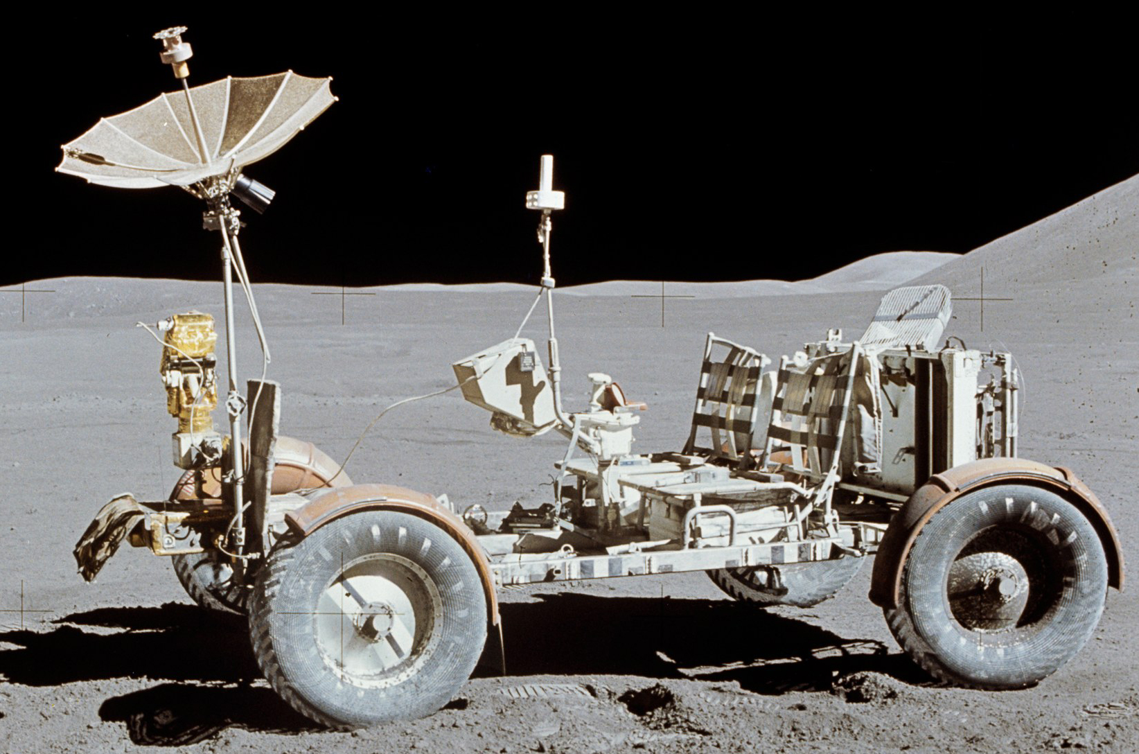
oh there's also this I made for sorta reference (except I didn't follow it at all go me)

6eun8uJ.png
 

Moonfixer

L5: Dapper Member
Aug 23, 2014
229
81
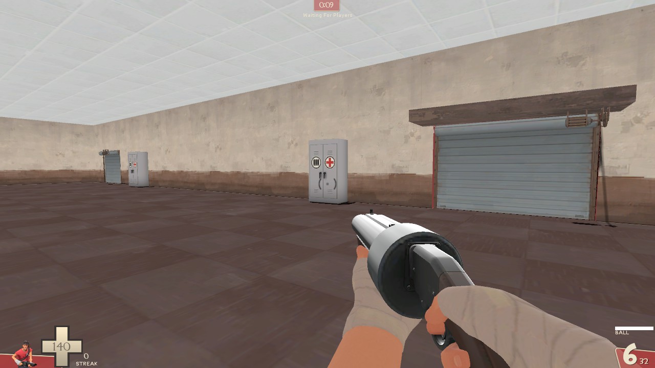
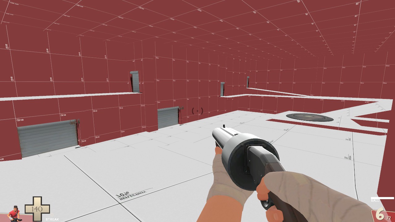
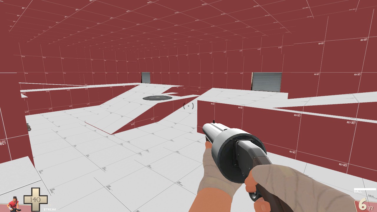
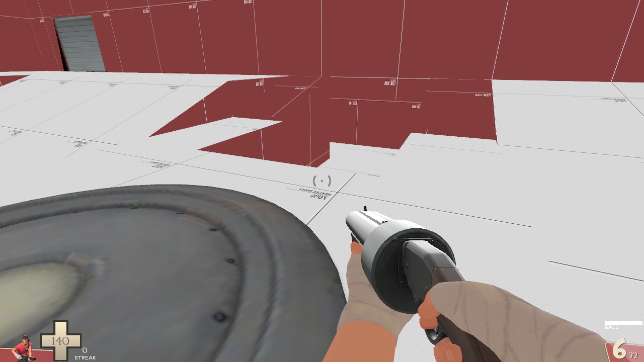
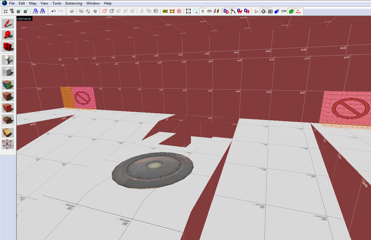
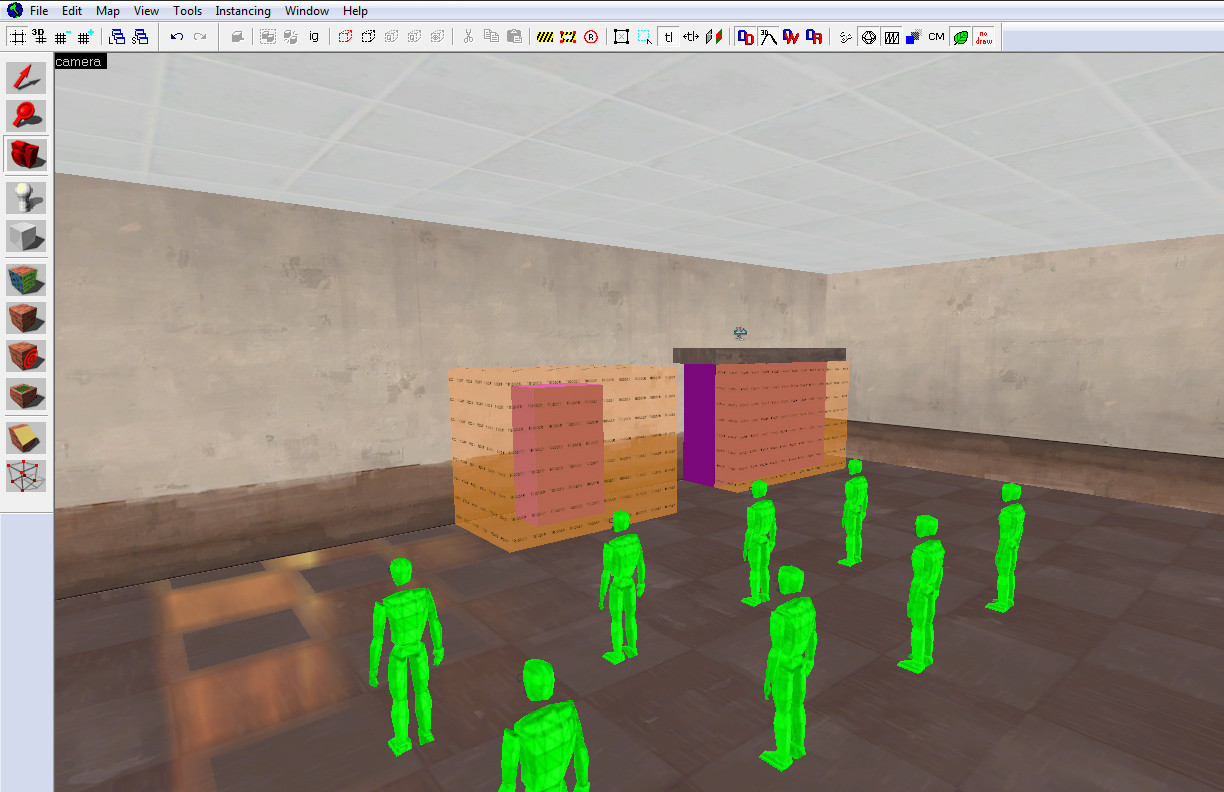
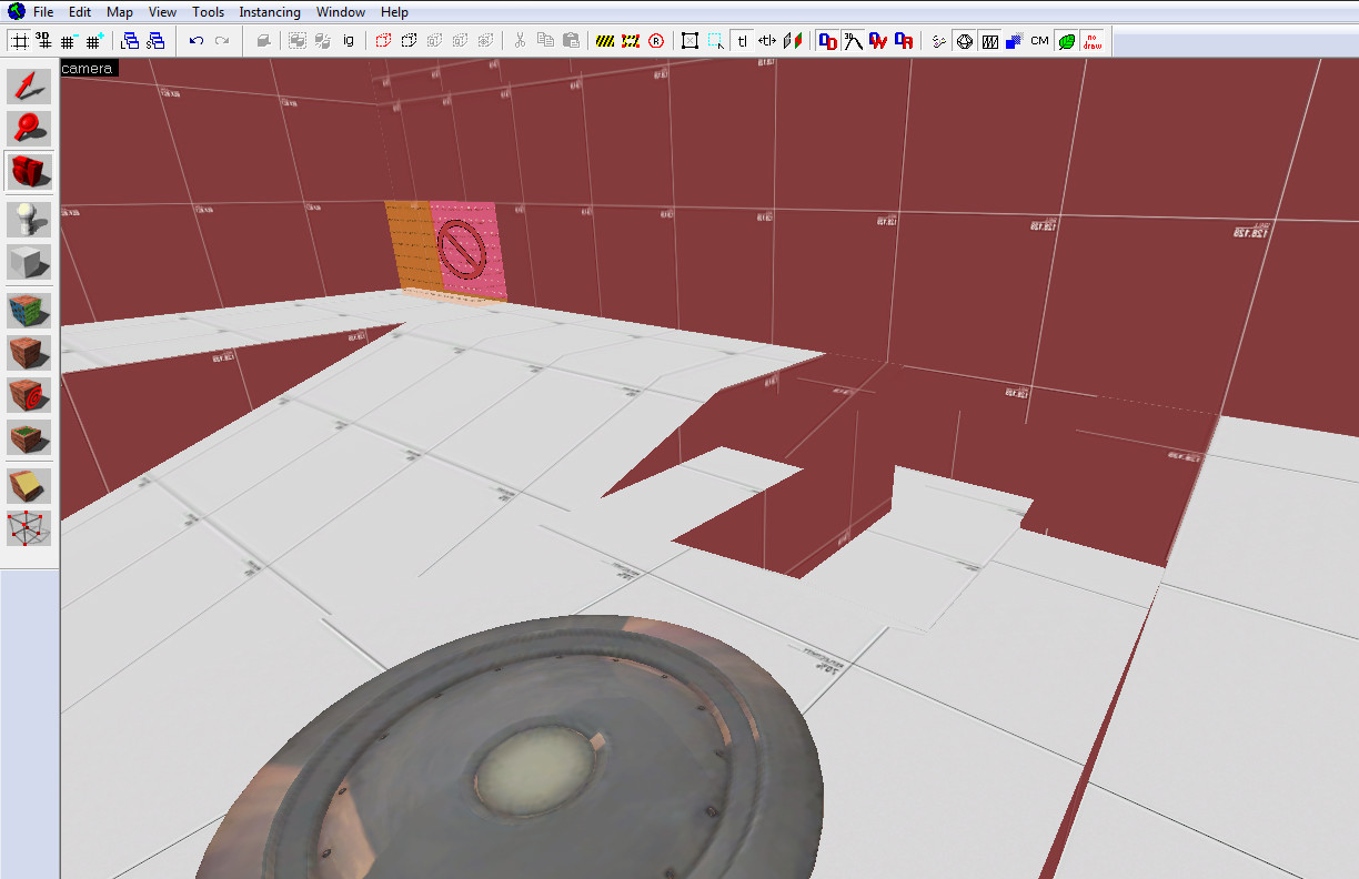
Figured I would post pics of my progress.

e2FtOxs.jpg

Mlz1eyn.jpg

xKI3yGG.jpg

xLftWWV.jpg

GzcetPc.jpg

bryfkK1.jpg

2PNo9gC.jpg
 
Last edited:

Moonfixer

L5: Dapper Member
Aug 23, 2014
229
81
that's a nice scattergun

Lol. In hindsight I should have turned off the view model when I took the screen shots of my map but since I don't play with view models off I forgot to do so. Ah well, I'm still learning.
 

Dain

L3: Member
Oct 21, 2009
106
43
Figured I would post pics of my progress.

[lots of pics]

Even though it's an alpha, you should use a slightly greater variety of textures just so that people aren't faced with a sea of red and blue squares wherever they look. It'll break the monotony and help them orient themselves.
 

Moonfixer

L5: Dapper Member
Aug 23, 2014
229
81
Even though it's an alpha, you should use a slightly greater variety of textures just so that people aren't faced with a sea of red and blue squares wherever they look. It'll break the monotony and help them orient themselves.
I'll do that, thank you.
 

Berry

resident homo
aa
Dec 27, 2012
1,056
1,898
Enhanced Version

5Jz1Fbb.png

That wear is nice, but try doing it ala the official overlays. (I'm not at home so I don't have any references for you, but I'll try to describe it the best I can).

Make a few of those with different scratches in different places and one with no scratches, set them all transparent then lay them all over eachother. But make sure the transparency % you used multiplied by the amount of layers is not more than 100. (ie so no layers get obscured).

You could probably do this with one scratched layer and one unscratched, both at 50%.

Obviously you don't have to do this, I'm just describing how Valve (and etc) do wear without taking anything from the lettering itself.

Edit: Some of the lettering is also quite well-kept compared to the rest of it.