WiP in WiP, post your screenshots!
- Thread starter Arhurt
- Start date
You are using an out of date browser. It may not display this or other websites correctly.
You should upgrade or use an alternative browser.
You should upgrade or use an alternative browser.
-snip-
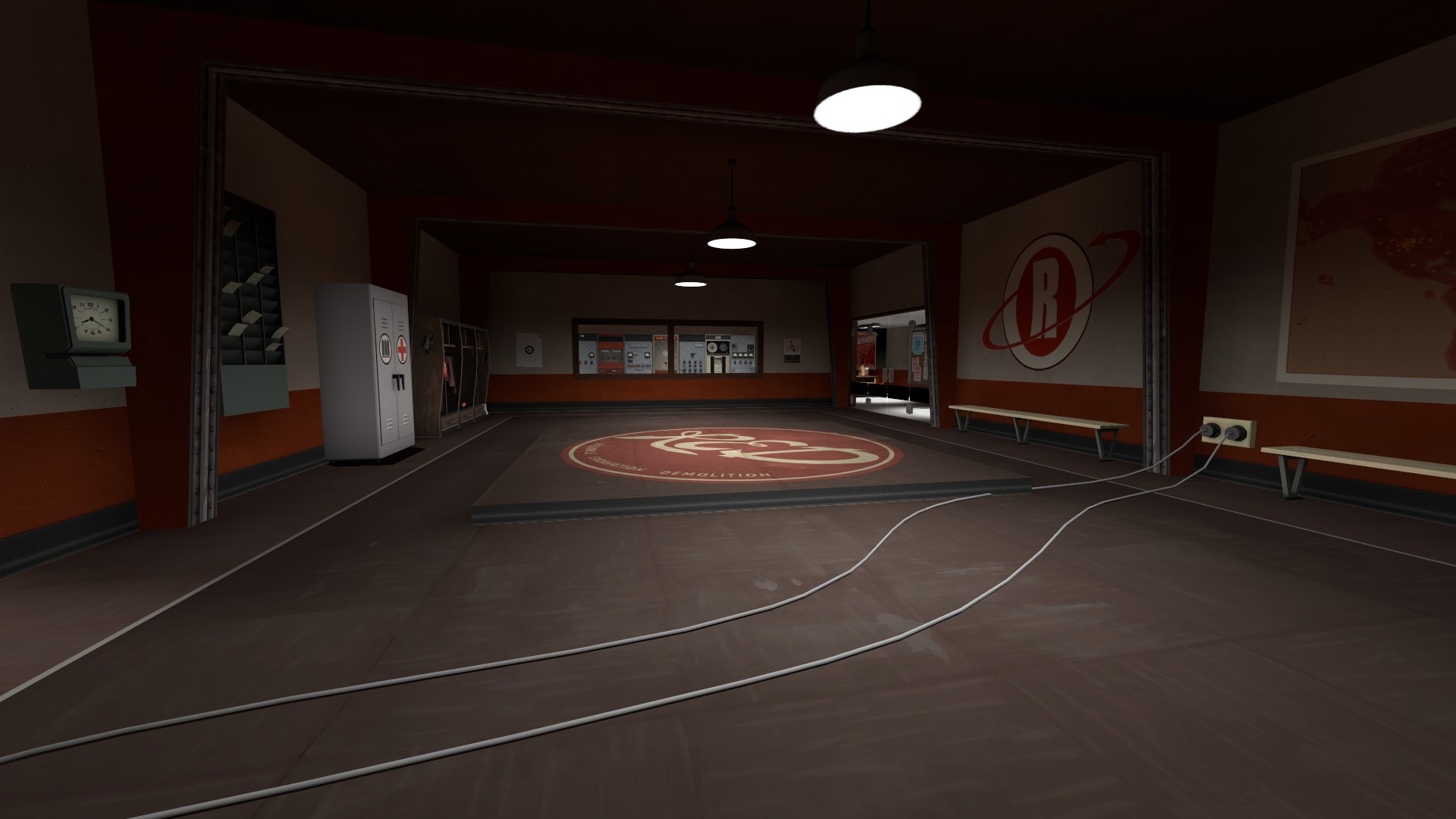
Just messing around a bit with spytech.
Looks very 2fort-basement inspired.
Some things though: wires cutting through middle bevel, floating resupply cabinet, these things look kinda weird.
Good practise though, if you can do these detail things well then it will stick into your mind and you can do your own variations of it whenever you want.
Ice Crystal
L2: Junior Member
- Feb 28, 2013
- 78
- 91
Last edited:
3 possible fixes:wires cutting through middle bevel.
- The lazy mans way: move the cable so it no longer clips
- The other lazy mans way: move the middle bevel so the cable no longer clips
- The hard, ultra original but not recommended way: make it so the bevel shows some holes where the cables had to go though because some person was lazy to move the cables as if a tf2 class was trying to solve that same solution.
It however could be me but to me that roof looks a bit low on that screen and makes the area quite flat. If the map has the room for it i would try to make that area a bit higher in total. On this current level it looks good but that roof is just dull.
Kill_the_Bug
aa
- Oct 6, 2008
- 1,969
- 451

Just messing around a bit with spytech.
Thought I was looking at the turbine map spawn rooms but with solid walls.
Good effort though if this is your first.
Ice Crystal
L2: Junior Member
- Feb 28, 2013
- 78
- 91


