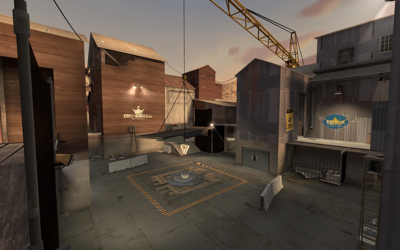
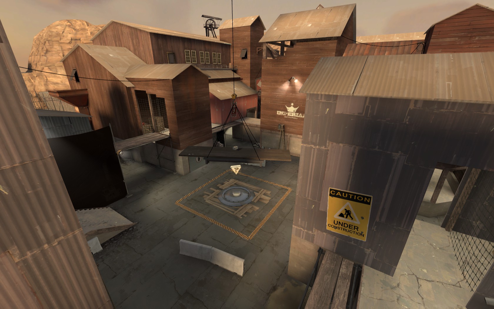
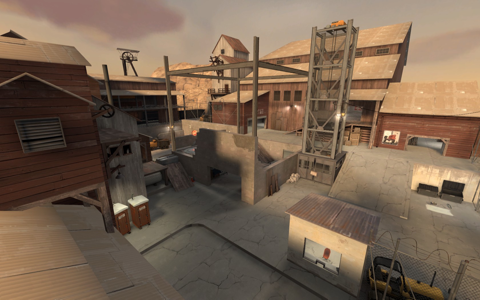
I think your middle point looks a bit bland compared to the other points which are interesting and have good use of construction pack. The cap point seems to been just added on top of some planks. I've personally have always thought those cap point models to be inmobile and some way bolted on the ground. Maybe this is why I find the middle so odd, how could you bolt it on some random planks.
My suggestion would be make the planks to look like they cover some hole on the ground or somehow make the point more visible. Make it more interesting to watch. Make it something that players memorize like middle on Foundry.
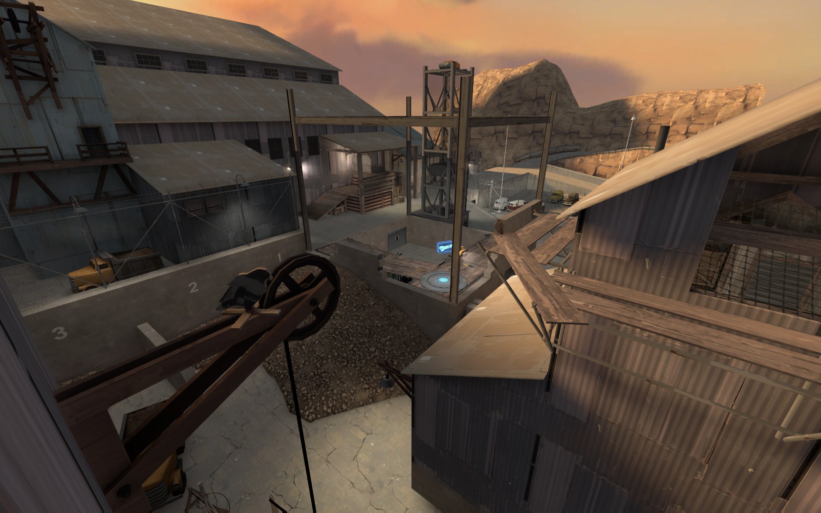
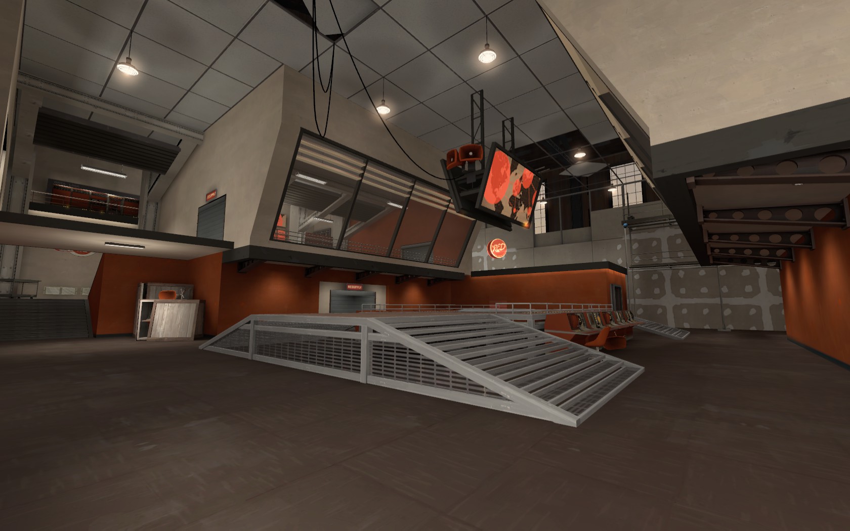
It also seems to be hard to tell from these images where the player should be going or where the enemy is coming (this might be becouse I haven't played your map, giving my opinions from images or haven't run through it as a player from player hight).
Hopefully my post is clear enough and hopefully helpfull.