CP wetstone

Bermuda Cake

L9: Fashionable Member
Feb 20, 2009
679
480
The cracks on the ground don't look very good, they're too straight imo - you'd be better of with an overlay probably
 

re1wind

aa
Aug 12, 2009
644
588
those cracks in the ground are made from temporary func_details, smarty pants. :p

and out of all the images i posted, you just *had* to pick out something that hasn't changed from a1b... ;)


I also have no idea how an overlay would help in this situation, but maybe you know something i don't.
 

re1wind

aa
Aug 12, 2009
644
588
No idea why the images are so blurry. some cvar somewhere or steam.

Light and prop tweaking, nothing remotely close to detail.

A5E81CE919B2E104370824A9233B0C69FE4BC8AB

6A1257E23A85B520A7D3FE8CDE58E5D11CA4F906

0C2628C12292A7128385BB015B25DB844C0DD701

09925DFDD0382E5A49CD3B79F611F20998EB3EFF
 

re1wind

aa
Aug 12, 2009
644
588
its actually a blend texture, and after doing a replace texture operation, i was equally surprised to see all the wavy sand ingame. So yeah, its not particularly intentional.

I forgot to check that side of the map. herpa derp. :p
 

Silverus

L3: Member
Jun 19, 2011
120
7
Looking really sweet!
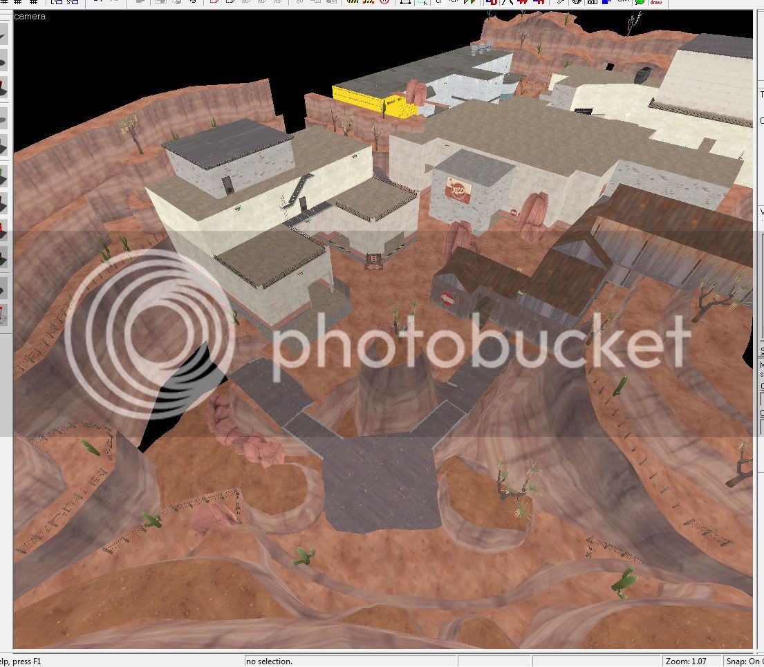
The only problem is that the first point seems like it should be the second point if you look at the detailing, due to the wood textures being at B and concrete textures being at A. It makes it feel more natural in a sense for level progression. You'd expect to have more solid textures (such as concrete) as you penetrate deeper into enemy territory, instead of wood. It would immerse the player more into your level, just adding that extra.... Wow factor to make the final point seem more epic, instead of an older building of lesser importance than the big concrete building that contains the A point. You know what I mean?
 

re1wind

aa
Aug 12, 2009
644
588
Alpha 4 wip screenshots. going for a more cohesive hydro/gorge theme, redesigned point B a lot, and largely remade the red spawn. I just fubard the lighting in the process. go me.

258B1D899E8A9041EE27BD485D5C773CCF6A0515

2FF687164533A386ADB0D5145173265733AA55B9

36327B6963C3FDB3B3E79D52E822701924B27660

5A1934E05587C9F6BB2B13ABDB359DB67BBF1AA9
 

re1wind

aa
Aug 12, 2009
644
588
alpha 4 released.

redid all the lights in the map using lighting preview tool. I love it.

2011-12-07_00003.jpg
 

bob+M|M+

L6: Sharp Member
Mar 31, 2008
346
394
played this gameplay and it was quite fun overall. I didn't like the paths to/from A/B though. They were very unintuitive and I feel could be reworked. Especially coming from red side. Usually when you look at the outside of a building, you can imagine where the main door/entrance is, but I didn't feel that AT ALL from your curret setup. Also it felt odd why you have to go up and down stairs to get to the other side, instead of a main lower ground path.

visually I think it all comes together well. maybe a little less wood, like the A/B signs which don't seem to match with the concrete imo. otherwise lookin good!
 

grazr

Old Man Mutant Ninja Turtle
aa
Mar 4, 2008
5,441
3,814
Players can get onto the roof that overlooks RED spawn, opposite B. This was particularly problematic when snipers got up there and would snipe people as they went to use a teleporter. Though any situation where players can snipe at the spawn exit is bad. There's almost no LoS to the roof from the rest of the map as it's protected by rocks from the CP and there is very little other high ground, so it's very hard to spot anyone on the roof or accessing the roof.

The A/B divide was quite wide, in that it was very difficult for BLU to hold any map control over A. This could be improved by having a ledge on the far path so only rocket/sticky jumpers could flank that path. You should also remove the room with the crates and barrel stacks. having a nook or cranny for spies or surprise SG can be interesting but it didn't feel necassery and was largely detrimental to the balance/flow of combat towards B.

The main path up to A is just a shooting gallery for RED and there's no real area around the point for RED to set up. the entire area seems really unintuitive. Make the rooms on the left flank smaller and you'll be able to create some chokes and viable sentry spots. At the moment it's just BLU rocket and sticky jumping onto the point to avoid the predictable sniper and wrangler SG play.
 

re1wind

aa
Aug 12, 2009
644
588
Good feedback you two, and i'm aware of the problems. part of me just wants to dump the map into the garbage and forget about it while walking away as a slightly better mapper.

sadly, that won't be happening and I've started to restructure all the buildings to, not only be more visually interesting, but have a better flow. i hope.
 

grazr

Old Man Mutant Ninja Turtle
aa
Mar 4, 2008
5,441
3,814
Well there's no reason you can't reconstruct the map from scratch. The only places with moderate detail are places you have to rework anyway. I don't know about you but i find it faster whacking out a fresh layout than reworking something i've already produced.

Plus it's better to decide such a thing sooner rather than later otherwise you just waste more time.

At least that way you're kinda doing both leaving the map a better mapper and still working on the project. Plus there's nothing stopping you improving on your layout.