I made a post with some advice about what I consider to make maps "fun" in this thread here. @Asd417 recommended that I should post a thread about it so more people can see it and be informed, so here it is. I know I'm not the best mapper, but here is some general pointers I can think of that can help make your map more enjoyable by the general player:
-Lots of height variation, don't make your map all on just one flat brush, but also have some breathing room where it's decently flat so players aren't constantly on a slope.
-Balanced run times. What I mean by this is how long it takes to run from spawn to the objective/main fight. It depends on your gamemode, but remember that having a 15 run time is no fun, as all you're doing in that time is pressing w. For this you might have to look at distances in official maps to get your scale correct. Also remember that having distance between your spawn and objective is good, you will need some run time, but not too much (refer to official maps to see what's a good run time)
-Many times in TF2 (mainly in pubs), you may think the game is just one big team fight. This may be true in some cases, like when both teams get to mid on a 5cp map and duke it out, but many times the game plays in smaller fights against just a few players. These may be a spy trying to fight an engineer to destroy their buildings, a soldier fighting another soldier, a spy trying to backstab a sniper, or maybe a sniper fighting a heavy. These smaller fights can be more than just 1v1s, like if there was a medic, or just one or two more teammates that happened to be there for the fight.
These smaller fights will require parts of the map that are a little separated from the main choke, yet they still feel like they belong in the map. One of them I like to reference a lot is the back area on Badwater B.
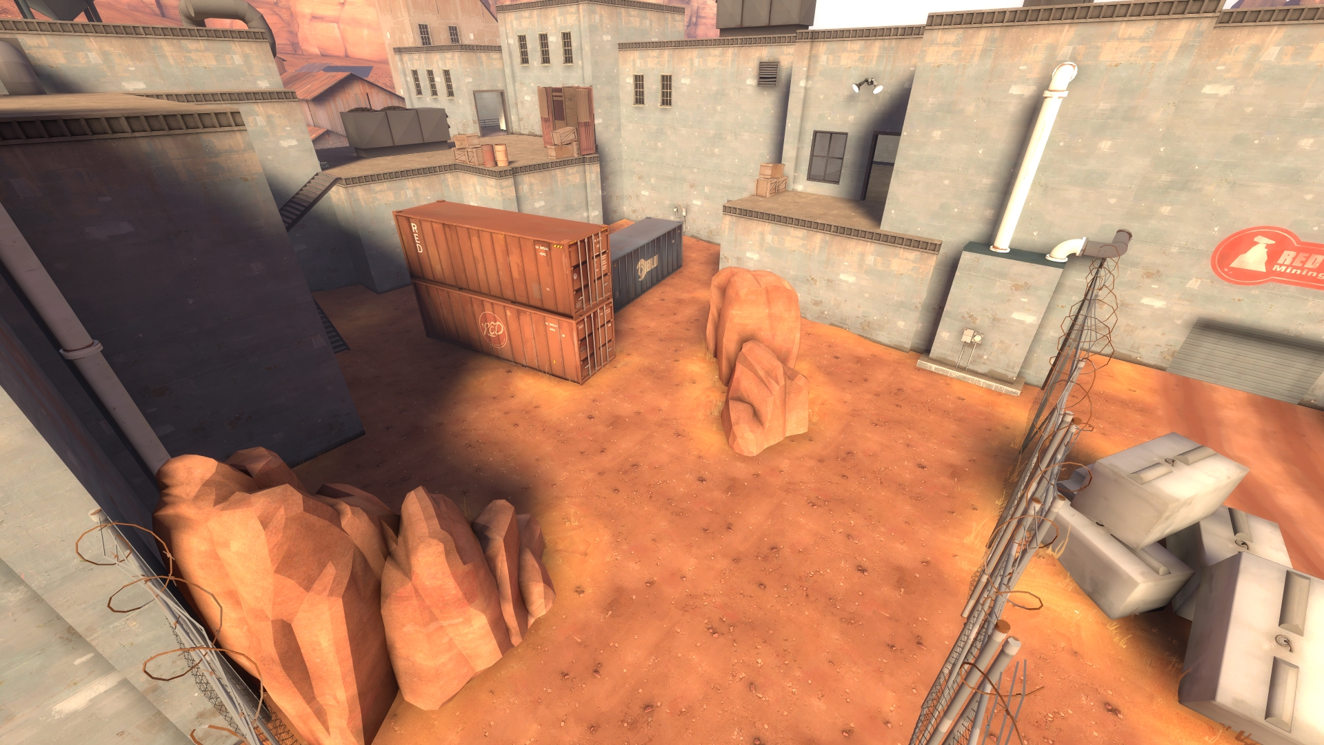
This area, though it may feel flat and boring, adds a sort of "calm spot" where smaller fights, and flanking classes can be at and utilize. It's away from the point, though it still feels connected as the point is pretty easily accessible from here.
-Don't let the map determine the fight/outcome. The map is there to guide players, and maybe reward players with good positioning and using the layout to their advantage. The map should open up player creativity instead of limiting it. Having your map in tiny, enclosed spaces and hallways limits player creativity, as they are specifically made to go a certain way. Maps do this with a good amount of open, and natural-feeling landscapes/designs.
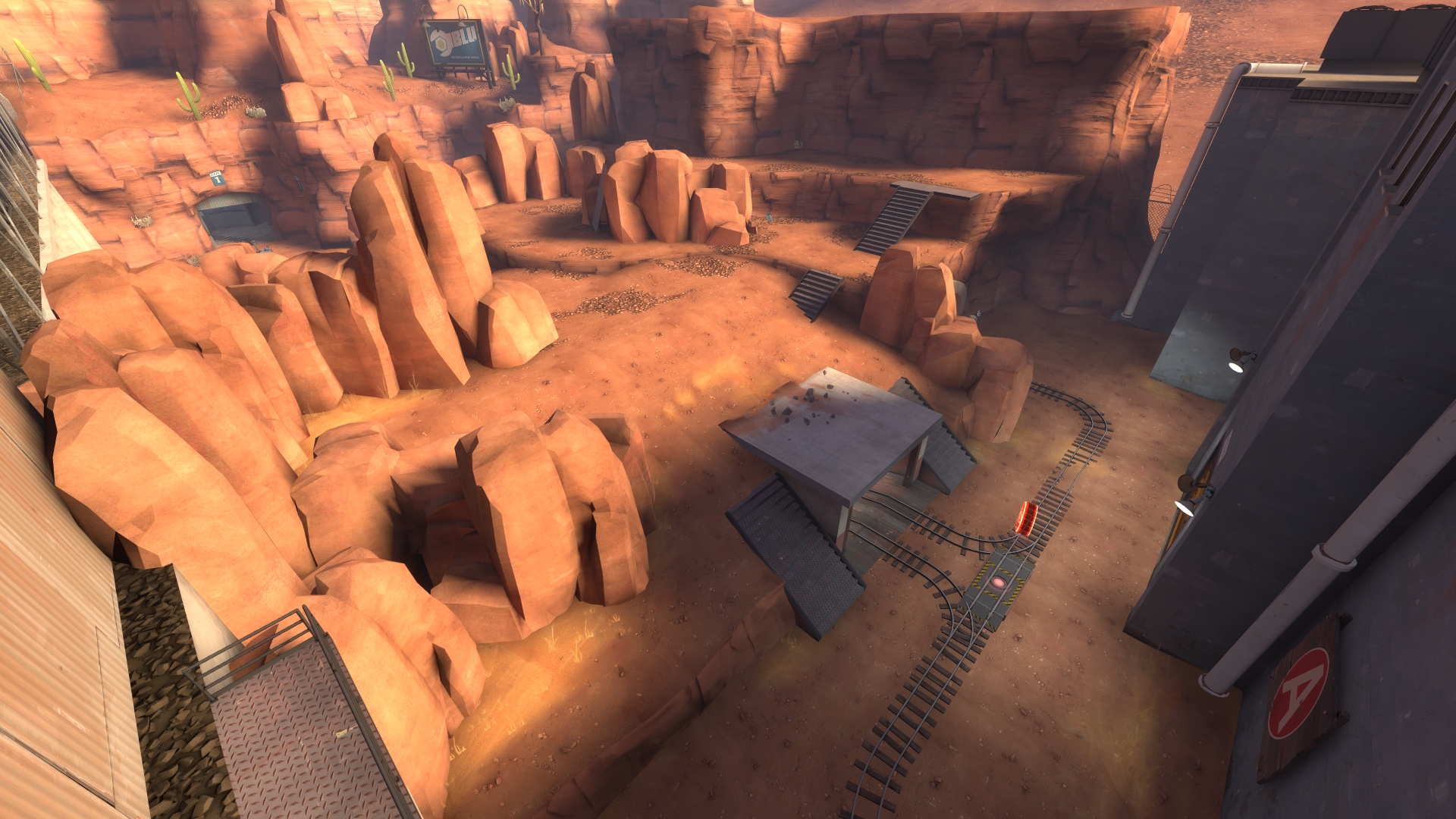
I'll reference Badwater again, this time looking at it's A point. Notice how it seems open, yet still creates a layout through interesting rock formations, using displacements and props.
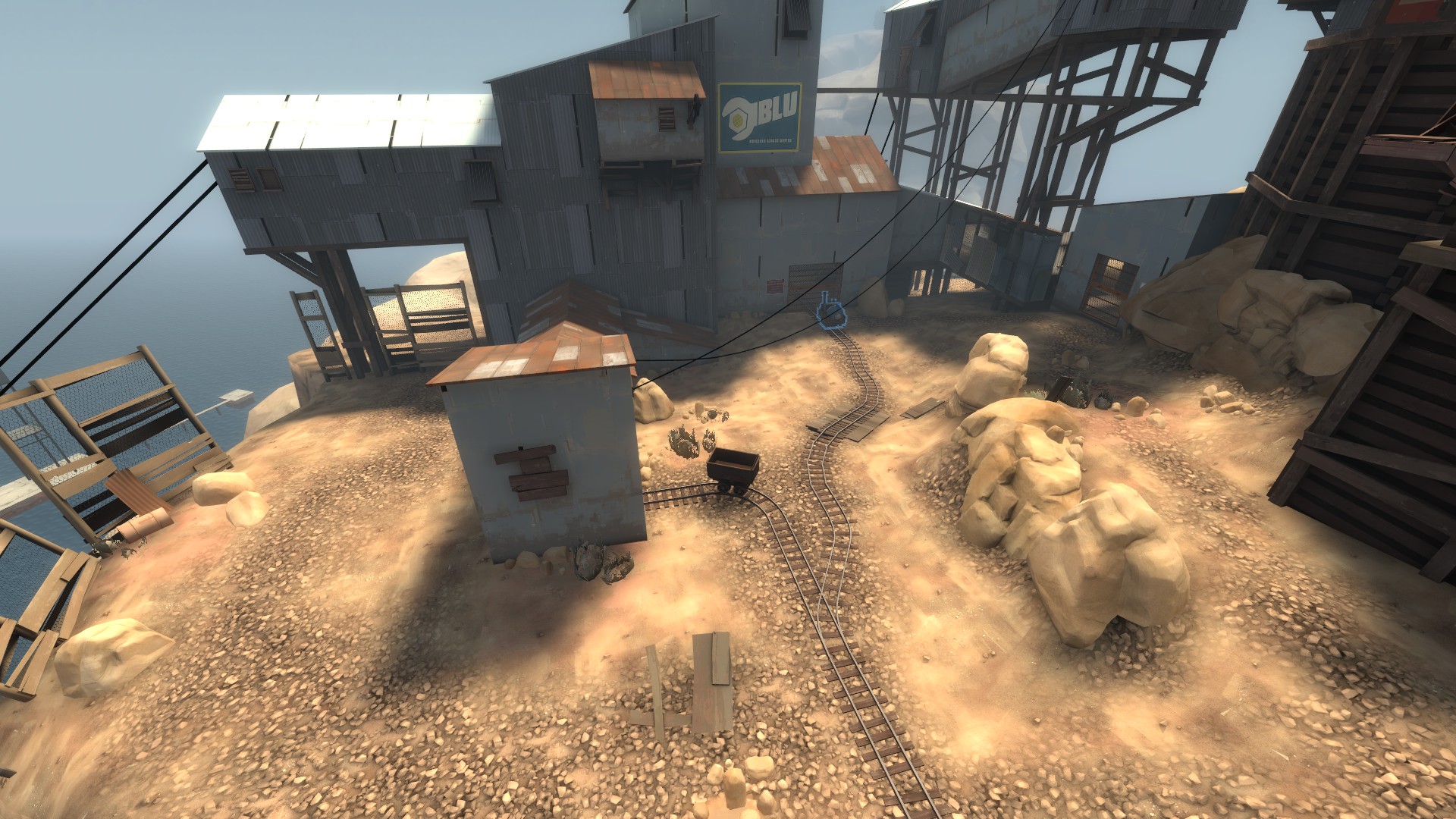
I'll look at another very popular map, Upward, which I think has one of the best designs in the game that incorporates all these ideas. I'll be looking at it's first point also. On the left of the image, we have this side area that is also a "calm spot", where smaller fights can happen. On the middle/right we have the main fighting area, whilst still open, it has a design by using the displacements to create height differences on the far right of the image.
How about a map that isn't payload? Sure, lets look at Sunshine. Whilst 5cp may be more linear and hallway-y than payload, these ideas still apply. Its still rather open, with the buildings being used as obstacles that create a layout, and add height differences. On the left, this can be considered a calm spot, though maybe less then the payload maps, as it is more connected to the main fighting area. Displacements here also create height differences that add variation, and reward players for good positioning, as high-ground often gives players an advantage. 5cp maps tend to get more "hallway-y" in its connectors between the points, but the lobbies still manage to be open while providing a divider between points.

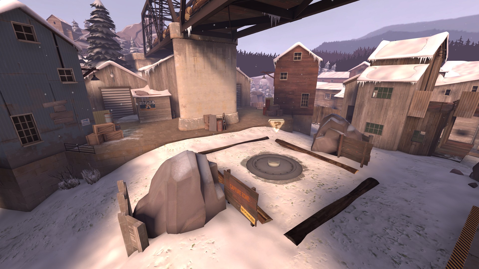
Even on a King of the Hill map, lets say Viaduct, these ideas are applied. I'll see if you can find them yourself (screenshot is just for reference, but these ideas can be found in many places other than just the middle point)!
Now you may look at older maps, such as Dustbowl, or maybe even Goldrush, and think that they are a lot smaller, and maybe a little more hallway-y than today's attack/defend and payload maps. The style of gameplay of TF2 was much different back then, and as more weapons got introduced, and other weapons got changed and rebalanced, the way people play has changed. I feel now-a-days TF2 maps side with larger areas that provide the players with a landscape they can work on and form their own formations on, rather than telling them they have to go through this door or this hallway to get to the next point. Allow players to make their own decisions, don't let the map decide for themselves. Of course you still need a layout to guide the players on how it plays, so don't forget that.
I hope this was informative, and I wish you the best of luck with mapping! Note that I'm obviously not a professional at these sort of things, so I may be wrong on some bits. This is just stuff I've noticed really differentiate "cool, fun, and unique" maps from "hi this is my first time using Hammer" maps, and its stuff I've noticed after playing this game for a couple years.
Sometimes watching maps be developed helps you get a sense of how they are designed. This has helped me learn the meaning behind certain developers' choices behind changes in their projects. Many people enjoy @Crash 's maps, and he does a pretty good job at documenting the changes of his maps and his thought process behind them on his YouTube channel. Right now I believe he is working on his King of the Hill map; Trenchfoot. It may be a smart idea to watch the changelog videos when they are released, but he also has many videos about Shoreleave and Glassworks.
Sorry for the big message and lots of images, but I hope it helps you and any others reading! I spent like 45 minutes writing this so I really hope you like it.
-Lots of height variation, don't make your map all on just one flat brush, but also have some breathing room where it's decently flat so players aren't constantly on a slope.
-Balanced run times. What I mean by this is how long it takes to run from spawn to the objective/main fight. It depends on your gamemode, but remember that having a 15 run time is no fun, as all you're doing in that time is pressing w. For this you might have to look at distances in official maps to get your scale correct. Also remember that having distance between your spawn and objective is good, you will need some run time, but not too much (refer to official maps to see what's a good run time)
-Many times in TF2 (mainly in pubs), you may think the game is just one big team fight. This may be true in some cases, like when both teams get to mid on a 5cp map and duke it out, but many times the game plays in smaller fights against just a few players. These may be a spy trying to fight an engineer to destroy their buildings, a soldier fighting another soldier, a spy trying to backstab a sniper, or maybe a sniper fighting a heavy. These smaller fights can be more than just 1v1s, like if there was a medic, or just one or two more teammates that happened to be there for the fight.
These smaller fights will require parts of the map that are a little separated from the main choke, yet they still feel like they belong in the map. One of them I like to reference a lot is the back area on Badwater B.

This area, though it may feel flat and boring, adds a sort of "calm spot" where smaller fights, and flanking classes can be at and utilize. It's away from the point, though it still feels connected as the point is pretty easily accessible from here.
-Don't let the map determine the fight/outcome. The map is there to guide players, and maybe reward players with good positioning and using the layout to their advantage. The map should open up player creativity instead of limiting it. Having your map in tiny, enclosed spaces and hallways limits player creativity, as they are specifically made to go a certain way. Maps do this with a good amount of open, and natural-feeling landscapes/designs.
I'll reference Badwater again, this time looking at it's A point. Notice how it seems open, yet still creates a layout through interesting rock formations, using displacements and props.

I'll look at another very popular map, Upward, which I think has one of the best designs in the game that incorporates all these ideas. I'll be looking at it's first point also. On the left of the image, we have this side area that is also a "calm spot", where smaller fights can happen. On the middle/right we have the main fighting area, whilst still open, it has a design by using the displacements to create height differences on the far right of the image.

How about a map that isn't payload? Sure, lets look at Sunshine. Whilst 5cp may be more linear and hallway-y than payload, these ideas still apply. Its still rather open, with the buildings being used as obstacles that create a layout, and add height differences. On the left, this can be considered a calm spot, though maybe less then the payload maps, as it is more connected to the main fighting area. Displacements here also create height differences that add variation, and reward players for good positioning, as high-ground often gives players an advantage. 5cp maps tend to get more "hallway-y" in its connectors between the points, but the lobbies still manage to be open while providing a divider between points.

Even on a King of the Hill map, lets say Viaduct, these ideas are applied. I'll see if you can find them yourself (screenshot is just for reference, but these ideas can be found in many places other than just the middle point)!

Now you may look at older maps, such as Dustbowl, or maybe even Goldrush, and think that they are a lot smaller, and maybe a little more hallway-y than today's attack/defend and payload maps. The style of gameplay of TF2 was much different back then, and as more weapons got introduced, and other weapons got changed and rebalanced, the way people play has changed. I feel now-a-days TF2 maps side with larger areas that provide the players with a landscape they can work on and form their own formations on, rather than telling them they have to go through this door or this hallway to get to the next point. Allow players to make their own decisions, don't let the map decide for themselves. Of course you still need a layout to guide the players on how it plays, so don't forget that.
I hope this was informative, and I wish you the best of luck with mapping! Note that I'm obviously not a professional at these sort of things, so I may be wrong on some bits. This is just stuff I've noticed really differentiate "cool, fun, and unique" maps from "hi this is my first time using Hammer" maps, and its stuff I've noticed after playing this game for a couple years.
Sometimes watching maps be developed helps you get a sense of how they are designed. This has helped me learn the meaning behind certain developers' choices behind changes in their projects. Many people enjoy @Crash 's maps, and he does a pretty good job at documenting the changes of his maps and his thought process behind them on his YouTube channel. Right now I believe he is working on his King of the Hill map; Trenchfoot. It may be a smart idea to watch the changelog videos when they are released, but he also has many videos about Shoreleave and Glassworks.
Sorry for the big message and lots of images, but I hope it helps you and any others reading! I spent like 45 minutes writing this so I really hope you like it.


