I would assume you could lower the hologram prop a little so the circle where it intersects with the point is the right size.
You could still see the cone coming from the circle which is now lowered.
I would assume you could lower the hologram prop a little so the circle where it intersects with the point is the right size.
The hologram shifts from the radius of the light, to the outline of the logo above it, that is to say: it doesn't get wider and what you're describing couldn't work.I would assume you could lower the hologram prop a little so the circle where it intersects with the point is the right size.
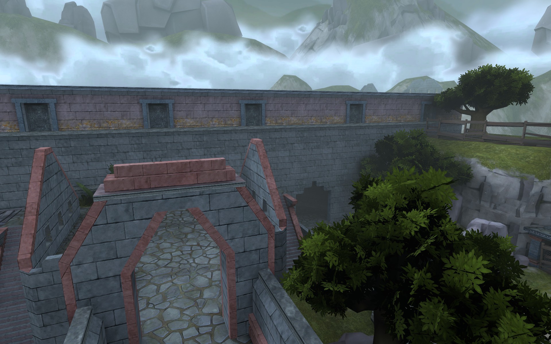
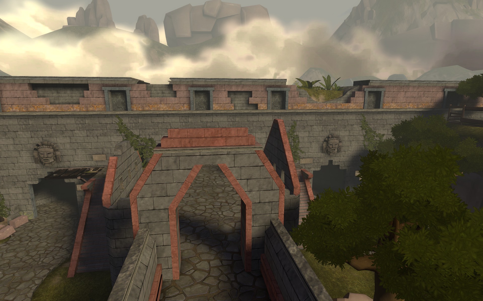
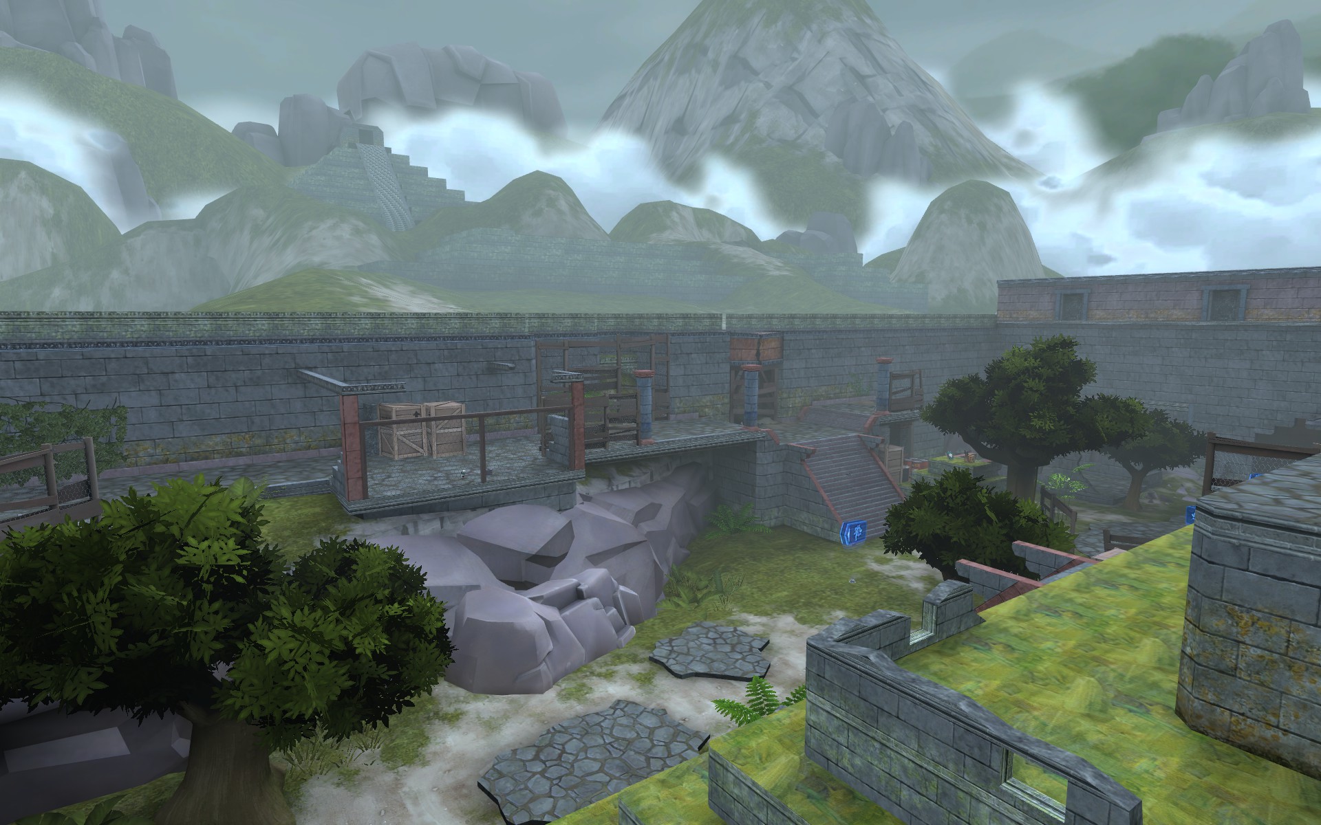
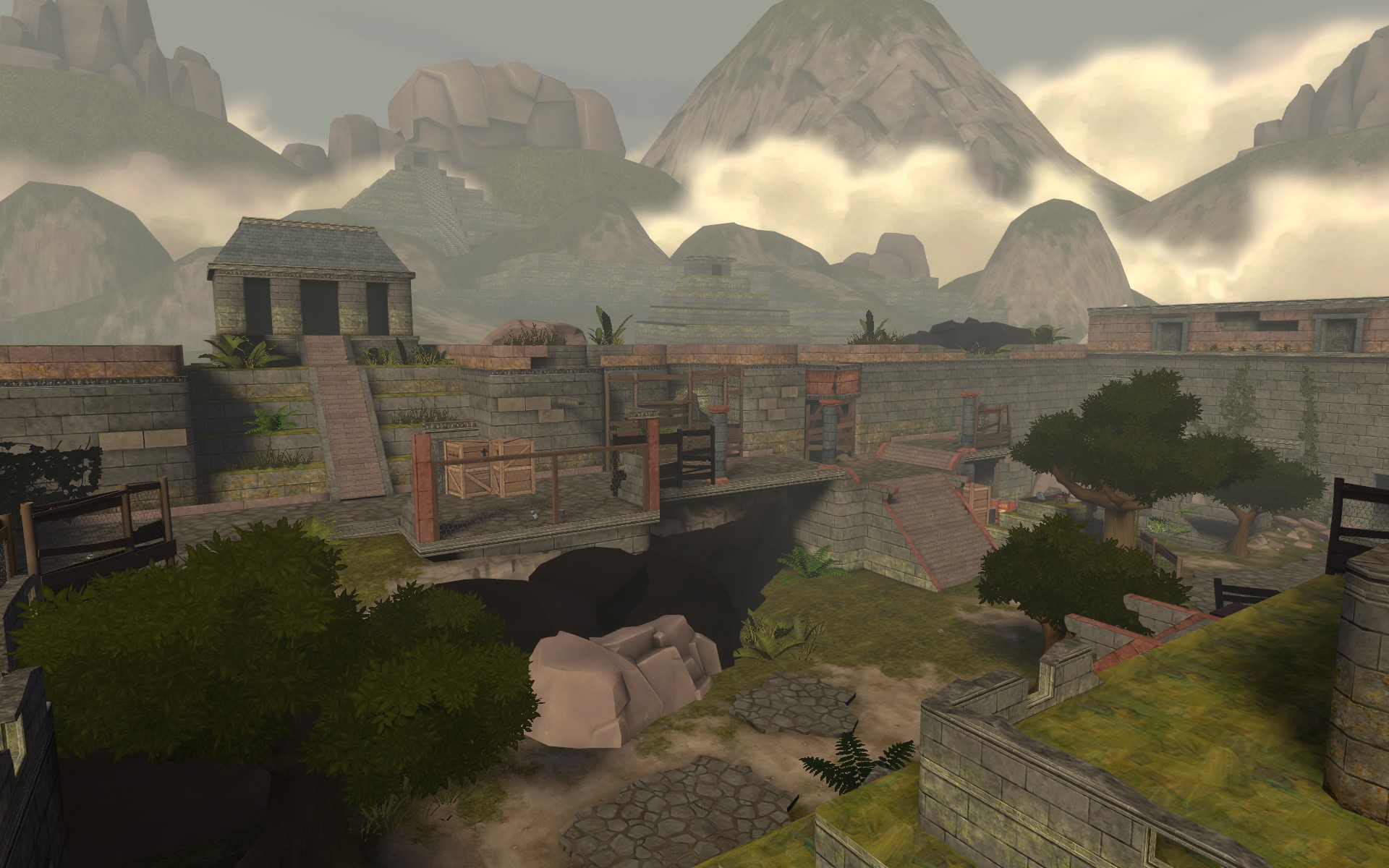
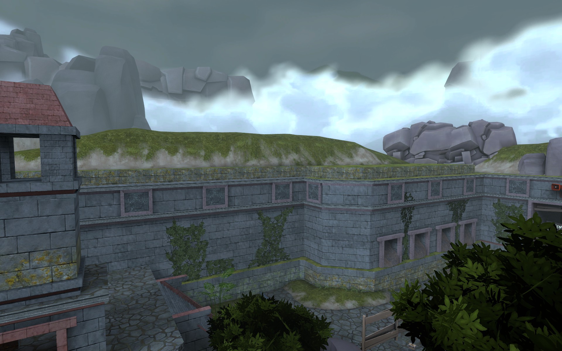
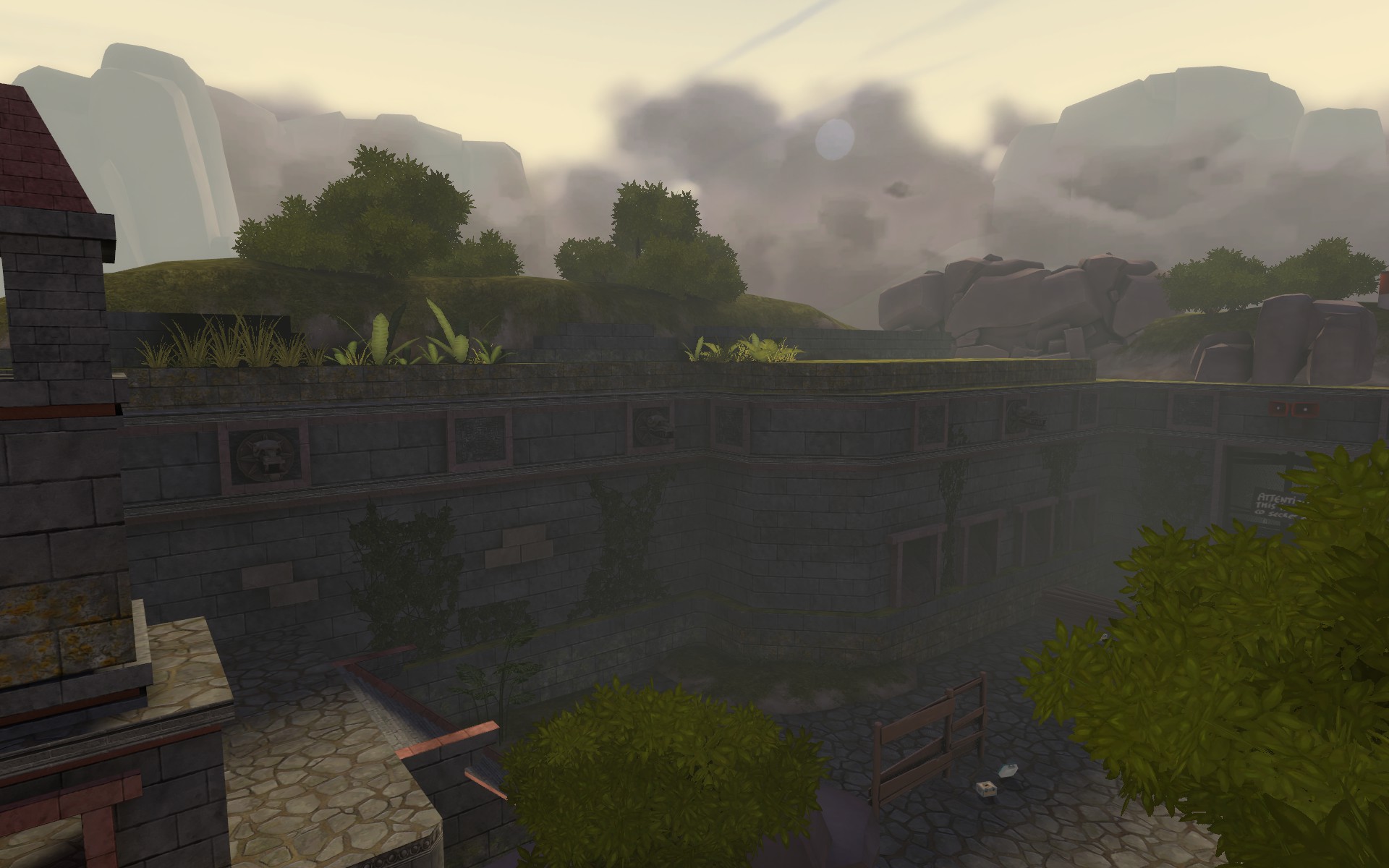
I LOVE the changes to the lighting, it really makes stuff pop imo. Keep uo the good work!I followed your advice and added more destruction and detail.
This is the old one:

This is the new one:

Old one:

New one:

Old:

New:

I know, the shadows are a little fucked up in the new screens. I didn't do a full compile. I also am not happy with the intensity of the fog in the 3D Skybox. I'll have to fuck around it a bit. But at least, I added some detail.
like if you agreethat's how ym has so many positive ratings
agree if you agree
Why not bothNeed to all to vote on something.
These are unfinished, so you're voting on the direction I'm working in, rather than the final result.
With regards to the leaves:
Rate thanksfor A


Rate likefor B


