You are using an out of date browser. It may not display this or other websites correctly.
You should upgrade or use an alternative browser.
You should upgrade or use an alternative browser.
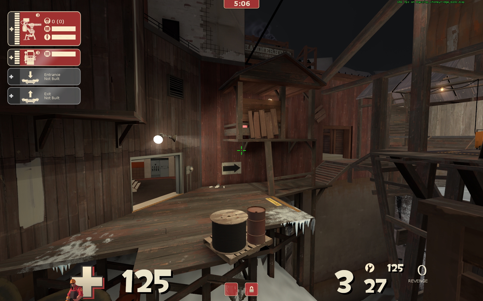
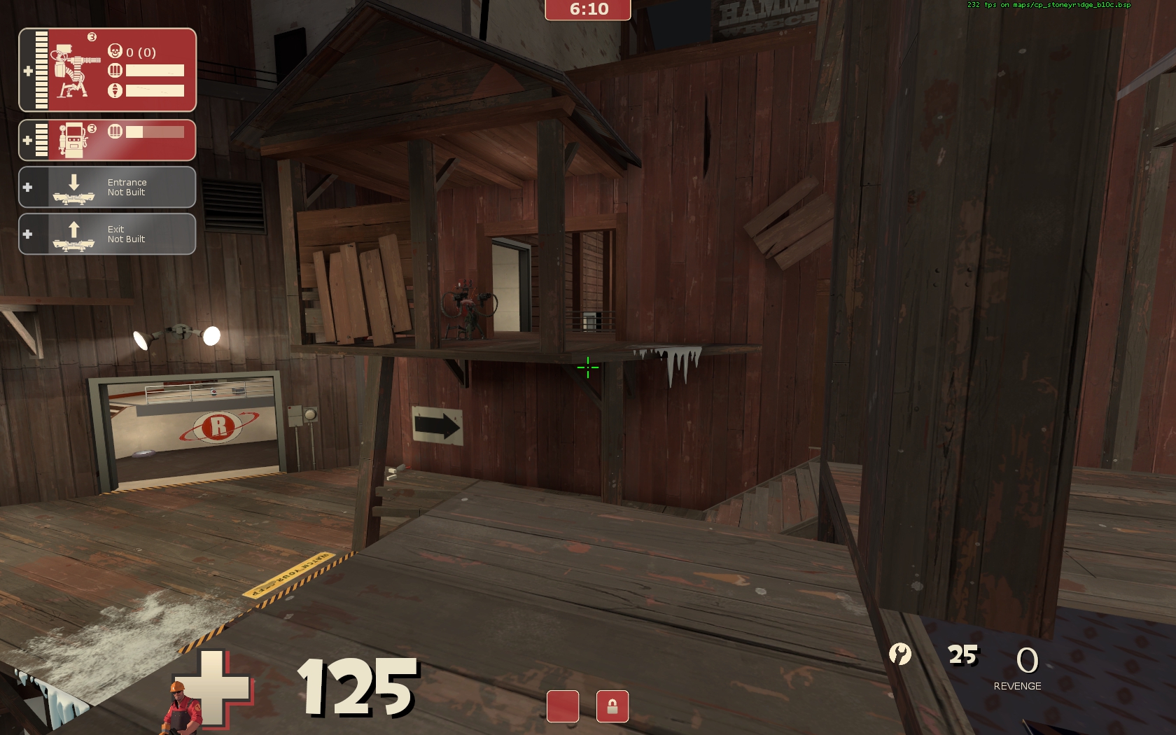
I'm really not "feeling" that giant board that's propping up the sentry ledge.
I mean, it's technically a viable support structure, it just isn't working aesthetically. Does it look okay if you straight up delete it?
But maybe on the other hand I'm just staring at it too hard.
I mean, it's technically a viable support structure, it just isn't working aesthetically. Does it look okay if you straight up delete it?
But maybe on the other hand I'm just staring at it too hard.
It is pushing the boundaries, but I like to think it's not as schizophrenic as mountain lab.
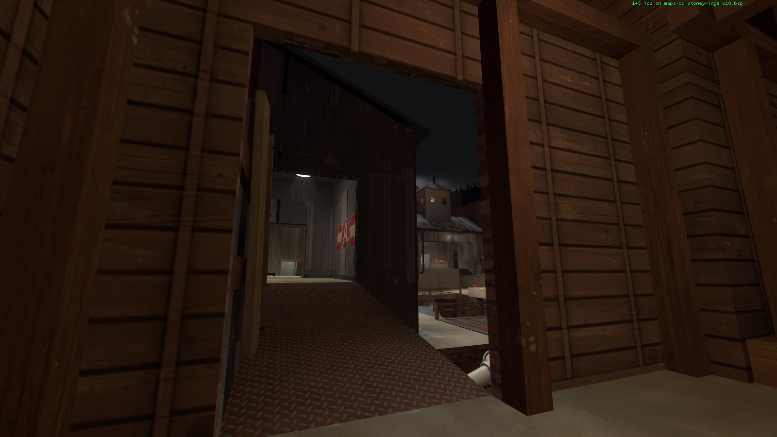
But I do think it has a fairly clear (and somewhat logical) progression. From red's perspective, it's a weapons factory in the process of being disguised as a mining operation. From blu's, it starts out as a fairly innocent courtyard. Then they capture A and notice some huge missiles with a train depot, along with some hints of spytech. Then they get to B and see a giant and heavily defended bomb along with even more spytech stuff. Clearly red must be stopped!
Our texture selection doesn't jump around too much I don't think.. wood is the main component for most of the map with only a couple exceptions near point A.
Prop spam might still be a little too high, but every release seems to tone it down a little more.
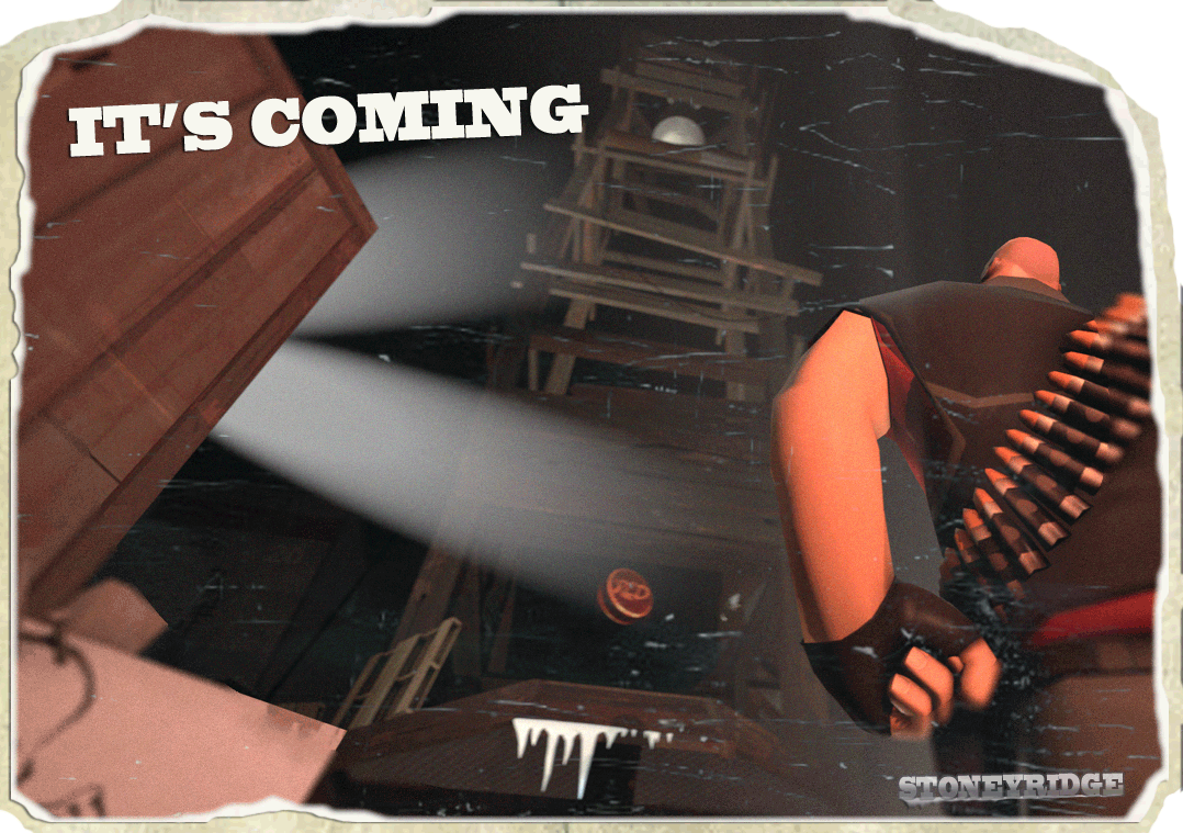
Yeah it was originally a different camera angle and it didn't look bad but then I decided to bring it in closer and more from the front and it showed off my lack of skill with posing.
That scout was the first thing I've ever tried posing in SFM though, so I'll definitely go back and clean it up now that I have a better feel of things.
I am a fan of his pinky.
That scout was the first thing I've ever tried posing in SFM though, so I'll definitely go back and clean it up now that I have a better feel of things.
I am a fan of his pinky.
- Jul 31, 2011
- 872
- 1,021
- Jul 31, 2011
- 872
- 1,021


