Feedback:
http://i.imgur.com/PjjFkcB.jpg http://i.imgur.com/HP4nb7c.jpg
These are REALLY big and look really out of place. Why is there a massive furnace on a wood floor, surrounded by wood? Most of the time, these have at least stone around them. The christmas tree is nice, but it feels REALLY weird not being the center of attention. The mid area here also REALLY misses out on a lot of the festive spirit. I think you could do better with that.
Suggestion: Remove the furnace, move the tree to the capture point (is that even active. If so, then this is even better) and play up the tree/gift thing. Make this area feel like the crazy over-the-top christmas parties that no one at the office goes to. Let the tree be the center of attention. Dress up that tree! Also, I would be careful with how you place the tree. Right now it just looks like a tree in the middle of a floor, not a christmas/holiday tree. (Also shadows down below the tree are really blotchy).
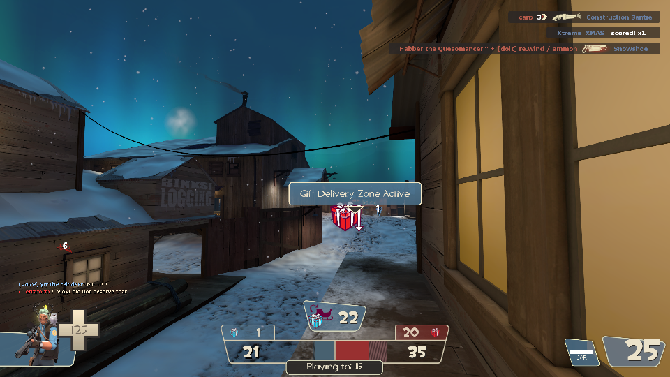
http://i.imgur.com/MS2qNaP.jpg this looks kind of bland and unexciting, good start though.. It can be better, and easily! You have a BEAUTIFUL blue ambient backdrop, you have a lot you can work with with lighting, and accents. Most important thing to keep in mind is gameplay elements need to stand out. So, in this case, you'll want a couple of the routes to be highlighted more. The next most important thing is providing some realism/aesthetic pleasure. I'll explain both of these quickly, but if you aren't sure, or want a better explaination, let me know.
So on a lot of your windows, you seem to have omni lights doing some phantom lighting in front of them. It looks REALLY out of place. Why are these windows so bright with light, when they don't even look like they are emitting light towards themselves and the walls IMMEDIATELY next to them, but no where else. Tone back the omni light, leave it at maybe, quadratic 1, luminosity 5. Play with 0 and 50% falloff too, if that helps. THEN, use light_spots to simulate lights coming out from the windows. I think for most of those windows, the inner angle will be ~40 and the outer angle can be 50-60. This way, you can get more focused light effects on the ground/rooves (When applicable). REALLY cool lighting effects. Check out doublecross for this effect.
Also, where the fun lighting is being cast, you can lower the lightmap scale to maybe 8/4 for a more resolved effect. Really neat.
Bonus points if you use block_light to simulate the bars on the windows.
http://i.imgur.com/lispaW6.jpg
See, there's a window here, theres like next to it, and there is no light on the roof? That looks a bit weird.
I would also add some brushwork sills to those windows. Maybe a better border on them.
http://i.imgur.com/IWxtI2y.jpg
Lightmap error here. Check to make sure they are aligned/same value.
http://i.imgur.com/xqPgbC5.jpg
Common mistake, so if you're new to lighting (whoever did this) don't worry. There is NO SUCH THING AS A WHITE LIGHT. NEVER EVER USE WHITE LIGHTS IN THIS. (Actually, very rarely can you use a white light, but even then, it's closer to blue). For this whole map, you'll want to use yellow lights, kind of like the one in the background. You can probably add 5 degrees to the outer angle too.
http://i.imgur.com/qX4y41d.jpg
This is not very clear that this is a place that players can be coming from. It's dark, it's weird. There'snothing there to show that it's deep and players might be coming from here. Additionally, there's no lighting on it, which makes it feel less important. This is an exit, and an important one. Use it!
http://i.imgur.com/ouNdoEk.jpg
This has probably close to a 1000 lbs of coal behind it, but it looks like it'd fall over if I closed the door too quickly. Toughen the look of this up! add a bean across the bottom maybe an angled bracket between the posts.


