You are using an out of date browser. It may not display this or other websites correctly.
You should upgrade or use an alternative browser.
You should upgrade or use an alternative browser.


Cool ideas on this and I look forward to the next versions! I wasn't using !gf a lot when playing, so I'll repeat what I said.
Last is a bit simple and both side exits feel really samey. The entire area is kind of bland--just a cube with symmetrical visbility blockers. 2nd is neat, but having one way onto it is really unbalanced. You can do a cool jump onto the ramp side, but if you're spending time doing trick jumps during a fight you're losing the fight. Mid felt really small but maybe I'm just used to every mid being a bridge.
Please add more forward spawns. This will necessitate building more actual connectors between the point arenas though. I think you already planned that anyway.
Can't wait to see steelpit (forgot the name you chose for it) based on this.
- redid a lot of last
- added lobby between second and last
- added forward spawns for capping mid
- rotated mid and added sniper window
not every piece of feedback has been addressed yet, i kinda rushed this out
Read the rest of this update entry...
- added lobby between second and last
- added forward spawns for capping mid
- rotated mid and added sniper window
not every piece of feedback has been addressed yet, i kinda rushed this out
Read the rest of this update entry...
I really like the ideas behind the changes to last. They are great, right now they just need a little bit of polishing. Grats on making a straight line 5CP that doesn't suck though. That seems to be one of the biggest problems when making a layout like that, people fall into Granary syndrome. Anyways on with the critique.
lobby is a bit too convoluted, teams wouldn't want to hold here because everywhere they hold will open another leak to let players through, and with the speed that your last caps you wouldn't want that. Also the amount of small walls and nooks and crannies it makes it hard to sweep last for people hiding when leaving, this is crucial one again because of how fast last caps on 5cp.
I don't like this exit, its gives a really dumb sight line to the defenders pushing out of last and a sneaky enemy sniper who gets behind while the enemy is capping second. I don't know if you watched my cam while watching the demo but I think you should. I abused a few sight lines which I'm probably forgetting right now, and giving this perch just makes things worse.
speaking of sight lines, this is also a new thing that didn't really need to be added. When I said 'snipers aren't that strong on mid' that was a positive not a negative. Because they do so much work on last and second that I was glad that I didn't destroy face on middle.
I don't know about this one either, I don't really like the fact that 2 snipers can cover every entrance to mid.
There isn't really a place for teams to hold last without standing in a sight line. In almost every popular 5cp a sniper on last has to completely show themselves to take a shot, but here almost every entrance is miles away and only requires to the sniper to peak. removing the entrance to the right of the leftmost one would help a bit imo.
Another issue with lobby that I couldn't screenshot was this. It seems very hard to completely clear last of players in a good time, even as scout. With all the small walls and rooms people can hide in a scout could hide in, say, that room at the top left that is very dark, and then cap last behind the enemy.
For example, here is me clearing Yrrzy and Sunshine. it takes aprox 8 seconds to clear Sunshine and 21 to clear Yrzzy.
Also keep in mind this isn't me voicing my opinions on a map I hate or whatever. I only do these write ups on maps I see great potential in.
- replaced circular mid structure with more traditional building
- moved one mid route a bit
- removed the other route and sniper window and made a new route there
- added new area behind second
- slight changes to lobby
- changed entrances to last
- added more pickups
- added signage
- fixed lighting and resupply issues
- changed skybox
- optimisation
Read the rest of this update entry...
Last edited:
- new spawnroom
- changed entrances to last again
- changed mid point into a two-storey tower
Read the rest of this update entry...
- changed entrances to last again
- changed mid point into a two-storey tower
Read the rest of this update entry...
- remade mid
- tweaked connectors
- added more pickups
- rotated second forward spawn 45 degrees
- slight changes to other areas
Read the rest of this update entry...
- tweaked connectors
- added more pickups
- rotated second forward spawn 45 degrees
- slight changes to other areas
Read the rest of this update entry...
- fiddled with the cap times slightly
- skybox/lighting change
- texture tests
- some detailing around mid
Read the rest of this update entry...
- skybox/lighting change
- texture tests
- some detailing around mid
Read the rest of this update entry...
- remade last entirely
- remade second entirely
- remade a bunch of connectors
- moved forward spawns around
- tweaked mid a ton
- changed a lot of pickup placements and added new ones
- some detail tests
- lots of miscellaneous changes
Read the rest of this update entry...
- remade second entirely
- remade a bunch of connectors
- moved forward spawns around
- tweaked mid a ton
- changed a lot of pickup placements and added new ones
- some detail tests
- lots of miscellaneous changes
Read the rest of this update entry...
Quick round of feedback with paintovers.
Apologies for the brevity, I'm sick and exhausted and I can't muster up the energy to write paragraphs right now. If you need any elaboration on my reasoning please respond in the thread or message me on steam. Everything here has a reason behind it, I am just much too tired to type it all out right now.
LAST

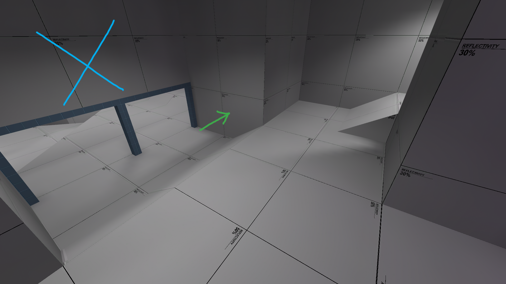
Delete the wall. Cut down the pillars and make some sort of high ground for defending scouts/soldiers maybe?


Widen this door. Let people peeking in from that easily spammable route have at least some visibility.


Make this area wider; as well as

moving this end of last back a touch. Make it a little more spacious. Could use with pulling the point a little farther away from spawn, too.

This would be a great angle for both teams to spam and peek if it weren't for that wall. Take it down and bam, last gets so much better.
LOBBY


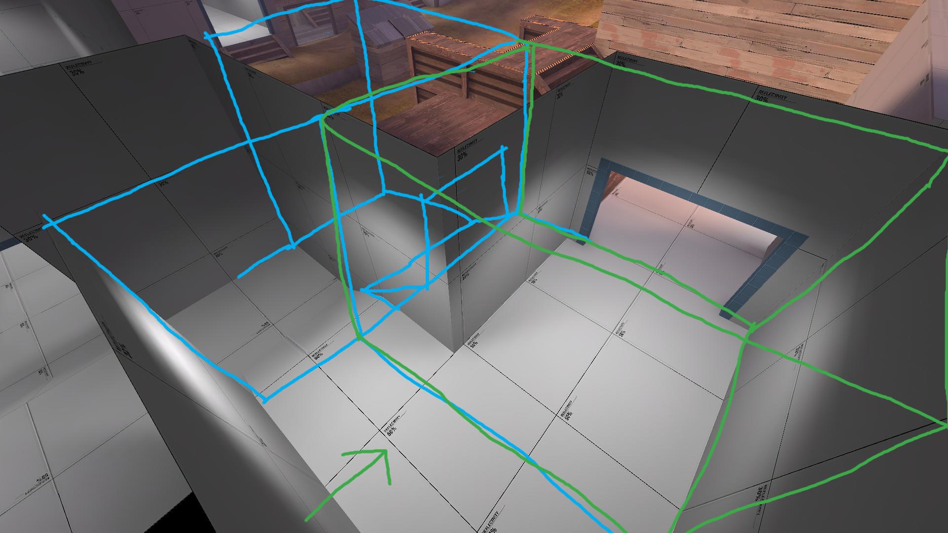
Do something like this for this area of lobby; open up the wall like in the first two pictures and add some sort of stair route. Get rid of that medium health in that location in the third/fourth pics and put it in either one of the circled yellow areas.


Probably don't need this health here. Move it back to the circled yellow area in the second picture, and raise the ground.

This route as it is now may become impossible to push onto second with, raise the path inside the building behind it (like in the second pic of the previous note)

Put small health here for people peeking these routes


Do this, the shutter right now is at a huge height disadv and it's not advisable to push out through
SECOND

Put some sort of health in the area with the yellow circle, maybe medium maybe small

Get rid of these barriers that only really block defending team's visibility and nothing else

Get rid of those barriers too, maybe replace with some sort of rock. Put a barrier further back maybe, one of those ones on sunshine that you can see through

Rebuild second, maybe, try to make it more interesting: maybe double layer like gully, have some sort of height building where the yellow structure is, small health (or med?) in yellow circle, etc
CONNECTORS

Switch these, would make things easier

Get rid of that medium health (there's already two near mid) and extend that shack a little

This path needs more variance and height differences maybe

This needs something to make it interesting
MID

End the room here and make it come out into an outside area

Something like this?

Change mid up a bit, don't need those obstructing barriers around it, don't limit vis and give people options to fight over highground

More highground options maybe
Apologies for the brevity, I'm sick and exhausted and I can't muster up the energy to write paragraphs right now. If you need any elaboration on my reasoning please respond in the thread or message me on steam. Everything here has a reason behind it, I am just much too tired to type it all out right now.
LAST
Delete the wall. Cut down the pillars and make some sort of high ground for defending scouts/soldiers maybe?
Widen this door. Let people peeking in from that easily spammable route have at least some visibility.
Make this area wider; as well as
moving this end of last back a touch. Make it a little more spacious. Could use with pulling the point a little farther away from spawn, too.
This would be a great angle for both teams to spam and peek if it weren't for that wall. Take it down and bam, last gets so much better.
LOBBY
Do something like this for this area of lobby; open up the wall like in the first two pictures and add some sort of stair route. Get rid of that medium health in that location in the third/fourth pics and put it in either one of the circled yellow areas.
Probably don't need this health here. Move it back to the circled yellow area in the second picture, and raise the ground.
This route as it is now may become impossible to push onto second with, raise the path inside the building behind it (like in the second pic of the previous note)
Put small health here for people peeking these routes
Do this, the shutter right now is at a huge height disadv and it's not advisable to push out through
SECOND
Put some sort of health in the area with the yellow circle, maybe medium maybe small
Get rid of these barriers that only really block defending team's visibility and nothing else
Get rid of those barriers too, maybe replace with some sort of rock. Put a barrier further back maybe, one of those ones on sunshine that you can see through
Rebuild second, maybe, try to make it more interesting: maybe double layer like gully, have some sort of height building where the yellow structure is, small health (or med?) in yellow circle, etc
CONNECTORS
Switch these, would make things easier
Get rid of that medium health (there's already two near mid) and extend that shack a little
This path needs more variance and height differences maybe
This needs something to make it interesting
MID
End the room here and make it come out into an outside area
Something like this?
Change mid up a bit, don't need those obstructing barriers around it, don't limit vis and give people options to fight over highground
More highground options maybe
Last edited:
- replaced some routes with stairs between second and mid
- added pipe over mid
- various major changes everywhere (huge thanks to phi)
Read the rest of this update entry...
- added pipe over mid
- various major changes everywhere (huge thanks to phi)
Read the rest of this update entry...
JMaxchill
L5: Dapper Member
- Jan 21, 2015
- 215
- 69
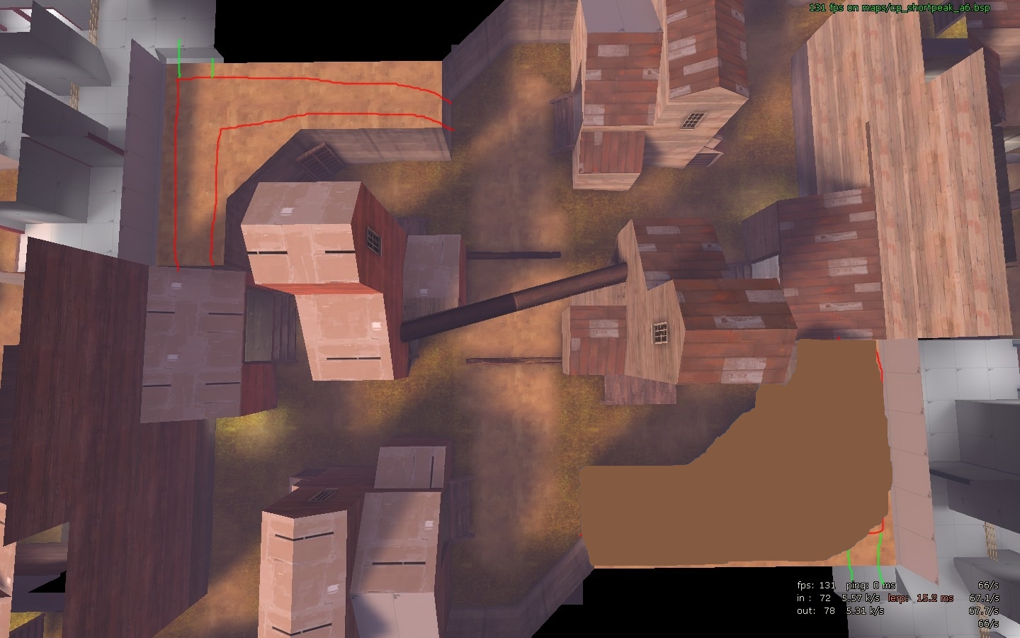
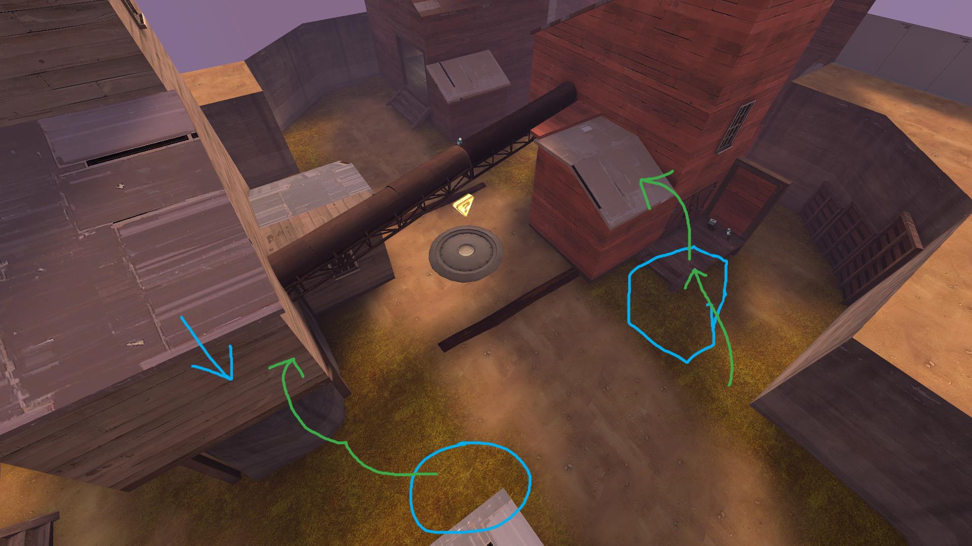
The bits in red are the alternate routes I was thinking of around the sides of mid, and the green bits are a possibility but they essentially let you bypass 2nd, so I'm not sure how well that'd work.
e: The brown bit you could just remove to open it up
Last edited:
- remade connectors between second and mid
- some other tweaks i probably made and forgot
Read the rest of this update entry...
- some other tweaks i probably made and forgot
Read the rest of this update entry...
Carn
L1: Registered
- May 17, 2014
- 12
- 10
Here's that feedback I said I was going to write:
These spawn doors could be separated from each other a bit more so that they aren't so close together, and so that they're closer to their respective positions of flank and choke routes. Also, it'd be a good idea to lower them so that they're more level with the ground. Elevation near spawn doors isn't always the most fun, and this gives spawners an advantage over the point the instant they come out. Also try removing the corner edges of the walls that are sticking out. These create a hallway to the spawn doors, which makes it hard to fall back into, since you're more likely to get trapped if you want to retreat back into spawn.
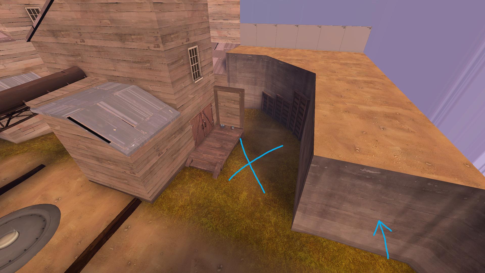
This catwalk currently makes a weird transition between holding spots in lobby, and is actually pretty detrimental to the attacking team. This gives defenders the opportunity to get into attackers very easily, and also gives defenders an easier way to spam at the attackers. It also removes the viability that this last has right now, where it separates flank and choke in a very nice way.
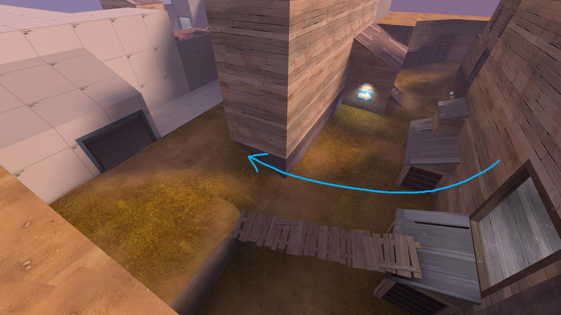
The orientation of the ramp would be a bit better on this side. This gives players holding around this area a nice place to hold on and retreat back from while looking at the entrance to the right of here.
Raising this point a little should help give players on the point a little bit more holding ground, while still making it so that the point can be shot at from the other holding positions around last. Also making the cap area more of a square should help get rid of the feeling to hug the used-to-be pillar.
These rails have collision.
This health and ammo placement is a little bit too far into a fighting area to make use of it.
A lot of your entrances have these pillars in the middle of them which creates some weird movement when trying to get through them. Maybe try decreasing the entrance's width and removing the pillar. It should give the same effect as having a separation in the middle of it. Removing this middle pillar on the entrances that have it should make going through them feel a bit nicer.
Except on this entrance. I think it's an interesting element here because it acts like a shutter, in the sense that it makes it easier to spam and harder to get through, but it doesn't remove the vision of the entrance.
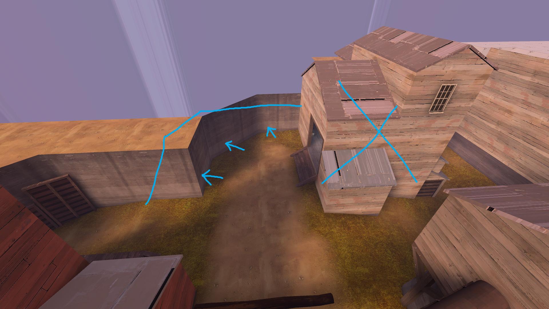
The flow of this area has players walking around that L-shaped wall-bit that sticks out.
This entrance is kind of out of the way where it currently is, and is a little wide. The middle bar allows for some weird spam/traps, so you might want to remove that, too.
To open this room up a little more, try moving the left-most wall back a bit.
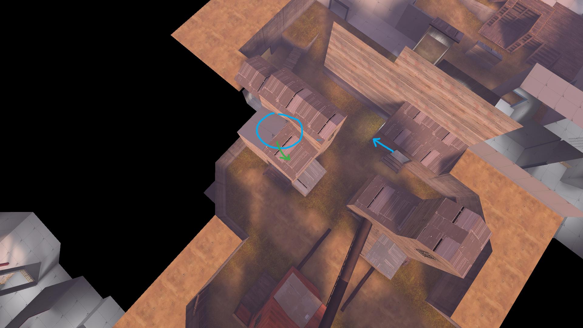
This pillar and the rails get a little in the way of the fighting area/ramp.
The health and ammo packs here give a pretty big advantage to players who also have high ground.
Widening this door here and moving it more center should help with people trying to peak into this room and fighting around this entrance.

This area here feels like it adds a bit of weird bend when walking to the higher ground. Expanding the ramp out and removing that wall-bit should help that a little.
Try opening this area up a bit, right now it feels a little small.
Removing the walls/entrance on the left and pushing back the corner a little will probably make this spot feel a little more open.
Sorry if this is a little hard to understand; I couldn't think of any easy ways to draw this. Basically, the space usage here seemed like it made these play areas a bit too much into hallways, which are not fun to fight in. If you change how entering into lobby works at this spot, where there's a room separating between lobby and outside, this might feel/play nicer.
The health and ammo here are fairly close to the other bits of health and ammo, and are very close to a fighting area. The general amount of health and ammo around this lobby is kind of large. One medium and one small of each is really all you'll probably need.
I know you said you were going to completely redo second, so I won't go over it too much. The gist of seconds is that they should be a nice buffer area between points. As for the holding position on second, keep in mind that it should be safe, and in between the route to the point, and the choke. It should also have an easy escape route, a path to the objective, and a path to the choke. And when it comes to entrances, the flank should be the most direct to the point, and the choke should be the most direct to the area.
The flow of this area is a bit too straight on into mid, even though mid's fighting style is at more of a 45 degree angle, than straight on.
To help that, you could try moving choke over here, and putting the flank entrance to somewhere around where the circle is.
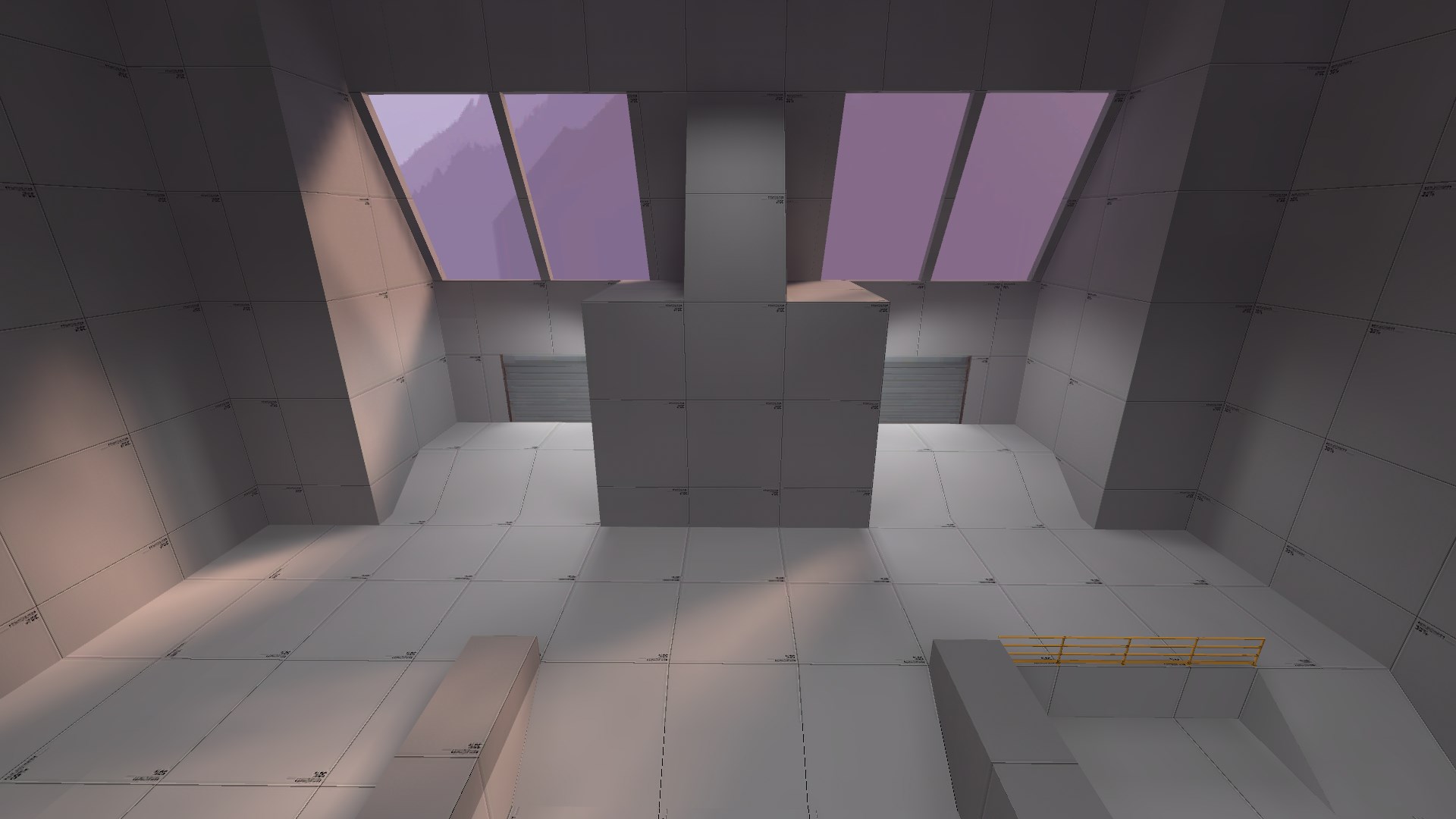
Mid's play-space is currently pretty small. Removing the house and pushing back everything a bit will give it a little bit more play-space/area to work with.
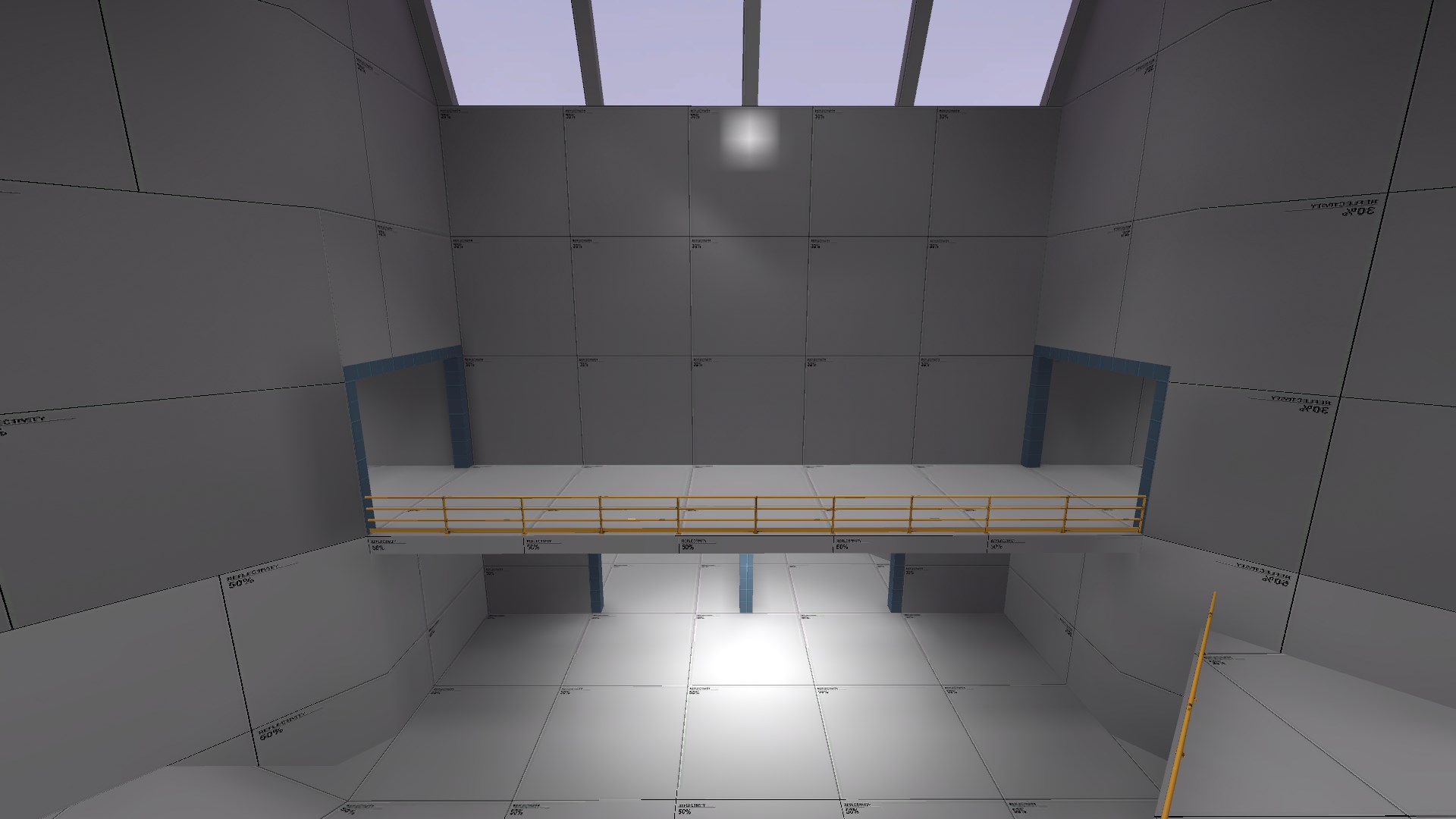
Mid really only gives the high ground to explosion-jumping classes, right now, and there's only one option to jump from. If you lower the roof on the left, and put things to jump onto in order to get up onto both sides of the high ground from the lower area, it would add a bit more options on how to attack this point.
This flank route will probably cause some weird plays to happen, and really cuts into the fights on mid, as it is. If you remove it and push the wall back here, it should keep this play-space fairly open, and a little bit more focused towards the point.
Currently this choke has two separate chokes inside it. Try making it into a bend, instead of multiple doorways, that'll also remove any vis problems that might be caused by moving the choke.
The health and ammo here might cause some weird plays/holds since it's in the middle of a fighting area/choke.
That's pretty much everything I had, though. I really like where the map's going, and I wish ya the best with it!
These spawn doors could be separated from each other a bit more so that they aren't so close together, and so that they're closer to their respective positions of flank and choke routes. Also, it'd be a good idea to lower them so that they're more level with the ground. Elevation near spawn doors isn't always the most fun, and this gives spawners an advantage over the point the instant they come out. Also try removing the corner edges of the walls that are sticking out. These create a hallway to the spawn doors, which makes it hard to fall back into, since you're more likely to get trapped if you want to retreat back into spawn.
This catwalk currently makes a weird transition between holding spots in lobby, and is actually pretty detrimental to the attacking team. This gives defenders the opportunity to get into attackers very easily, and also gives defenders an easier way to spam at the attackers. It also removes the viability that this last has right now, where it separates flank and choke in a very nice way.
The orientation of the ramp would be a bit better on this side. This gives players holding around this area a nice place to hold on and retreat back from while looking at the entrance to the right of here.
Raising this point a little should help give players on the point a little bit more holding ground, while still making it so that the point can be shot at from the other holding positions around last. Also making the cap area more of a square should help get rid of the feeling to hug the used-to-be pillar.
These rails have collision.
This health and ammo placement is a little bit too far into a fighting area to make use of it.
A lot of your entrances have these pillars in the middle of them which creates some weird movement when trying to get through them. Maybe try decreasing the entrance's width and removing the pillar. It should give the same effect as having a separation in the middle of it. Removing this middle pillar on the entrances that have it should make going through them feel a bit nicer.
Except on this entrance. I think it's an interesting element here because it acts like a shutter, in the sense that it makes it easier to spam and harder to get through, but it doesn't remove the vision of the entrance.
The flow of this area has players walking around that L-shaped wall-bit that sticks out.
This entrance is kind of out of the way where it currently is, and is a little wide. The middle bar allows for some weird spam/traps, so you might want to remove that, too.
To open this room up a little more, try moving the left-most wall back a bit.
This pillar and the rails get a little in the way of the fighting area/ramp.
The health and ammo packs here give a pretty big advantage to players who also have high ground.
Widening this door here and moving it more center should help with people trying to peak into this room and fighting around this entrance.
This area here feels like it adds a bit of weird bend when walking to the higher ground. Expanding the ramp out and removing that wall-bit should help that a little.
Try opening this area up a bit, right now it feels a little small.
Removing the walls/entrance on the left and pushing back the corner a little will probably make this spot feel a little more open.
Sorry if this is a little hard to understand; I couldn't think of any easy ways to draw this. Basically, the space usage here seemed like it made these play areas a bit too much into hallways, which are not fun to fight in. If you change how entering into lobby works at this spot, where there's a room separating between lobby and outside, this might feel/play nicer.
The health and ammo here are fairly close to the other bits of health and ammo, and are very close to a fighting area. The general amount of health and ammo around this lobby is kind of large. One medium and one small of each is really all you'll probably need.
I know you said you were going to completely redo second, so I won't go over it too much. The gist of seconds is that they should be a nice buffer area between points. As for the holding position on second, keep in mind that it should be safe, and in between the route to the point, and the choke. It should also have an easy escape route, a path to the objective, and a path to the choke. And when it comes to entrances, the flank should be the most direct to the point, and the choke should be the most direct to the area.
The flow of this area is a bit too straight on into mid, even though mid's fighting style is at more of a 45 degree angle, than straight on.
To help that, you could try moving choke over here, and putting the flank entrance to somewhere around where the circle is.
Mid's play-space is currently pretty small. Removing the house and pushing back everything a bit will give it a little bit more play-space/area to work with.
Mid really only gives the high ground to explosion-jumping classes, right now, and there's only one option to jump from. If you lower the roof on the left, and put things to jump onto in order to get up onto both sides of the high ground from the lower area, it would add a bit more options on how to attack this point.
This flank route will probably cause some weird plays to happen, and really cuts into the fights on mid, as it is. If you remove it and push the wall back here, it should keep this play-space fairly open, and a little bit more focused towards the point.
Currently this choke has two separate chokes inside it. Try making it into a bend, instead of multiple doorways, that'll also remove any vis problems that might be caused by moving the choke.
The health and ammo here might cause some weird plays/holds since it's in the middle of a fighting area/choke.
That's pretty much everything I had, though. I really like where the map's going, and I wish ya the best with it!
Last edited:
So I've made a ton of changes to last as well as prettying it up a bit and I'd really like to get feedback from various people about how it is now before I move on to the rest of the map.
Here is a bsp of just last and lobby, terminating in the routes toward second (since I literally deleted the rest of the map for now and don't know yet what will be beyond those points).
Here are some [OUTDATED] screencaps of the new version:
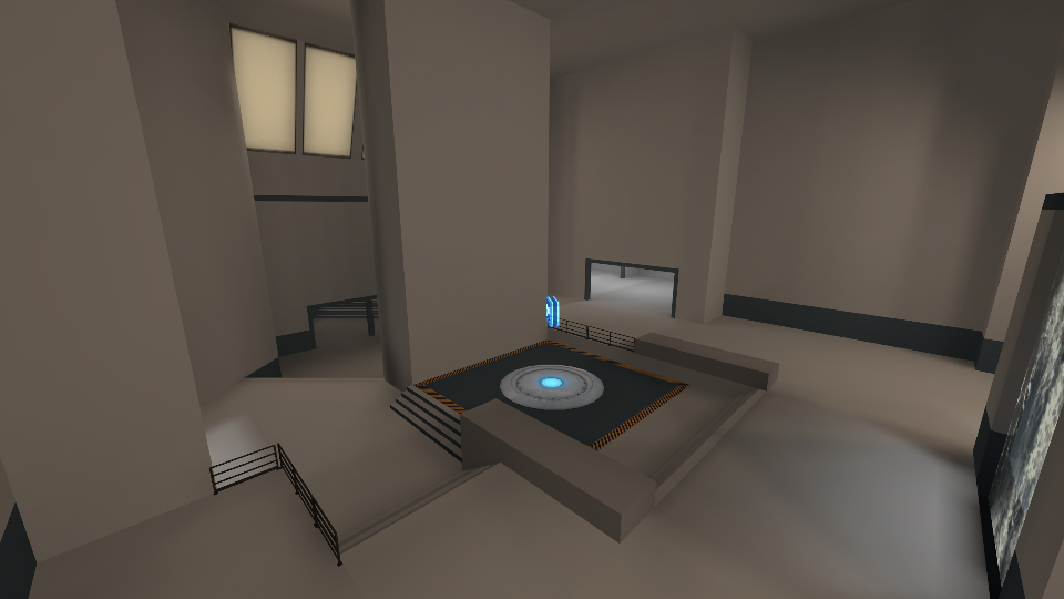
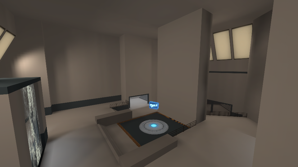
EDIT: newest preview
Here is a bsp of just last and lobby, terminating in the routes toward second (since I literally deleted the rest of the map for now and don't know yet what will be beyond those points).
Here are some [OUTDATED] screencaps of the new version:
EDIT: newest preview
Last edited:
I'll stick to direct links to avoid spamming your thread with more images.
http://i.imgur.com/wEpJWvc.jpg
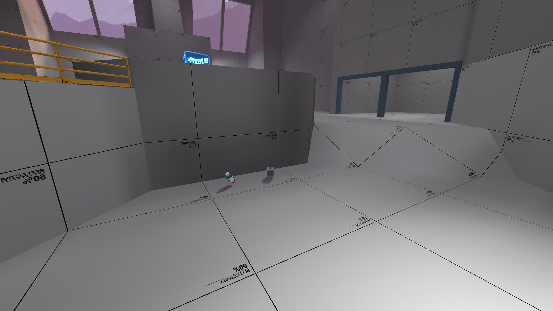
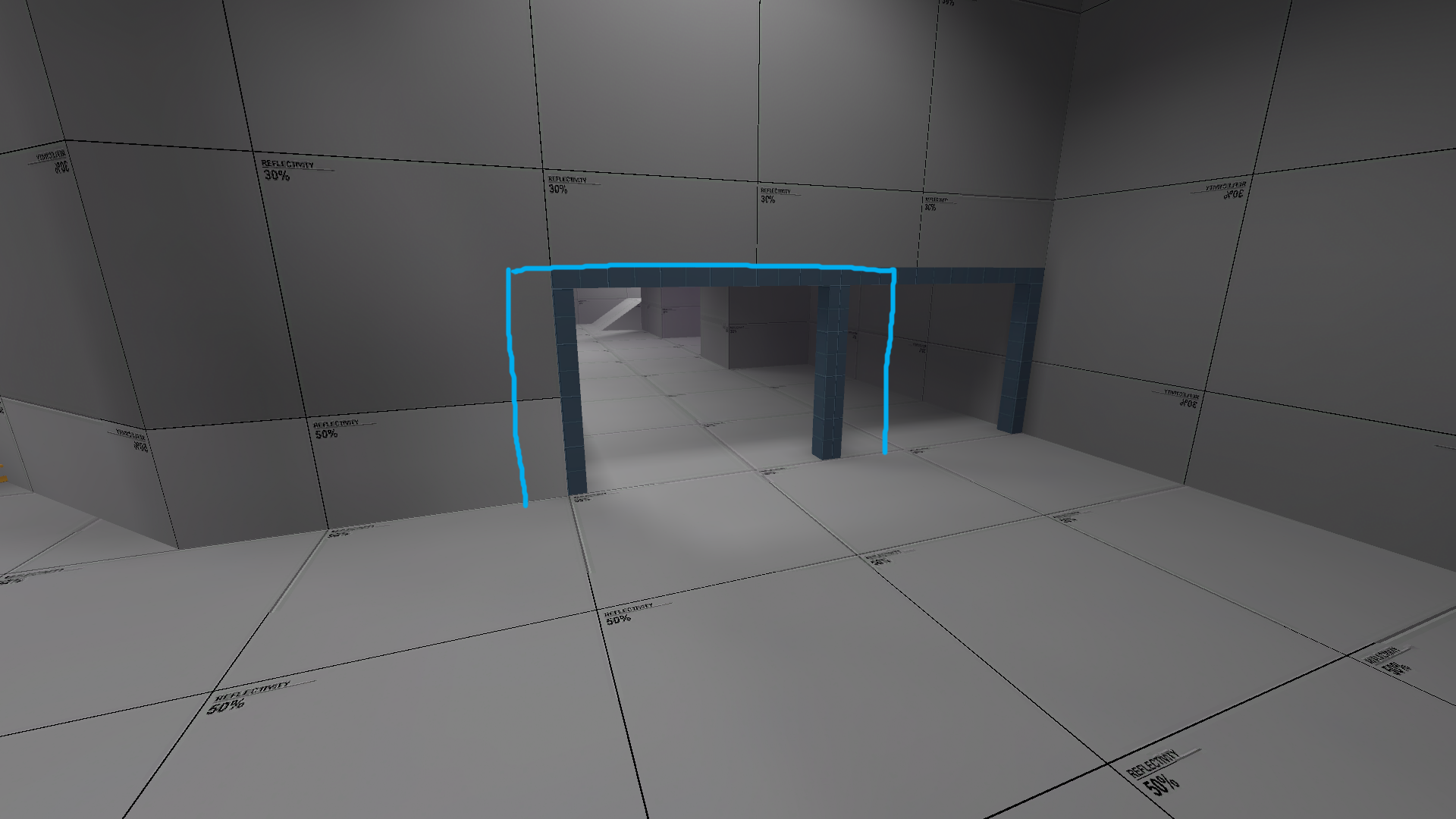
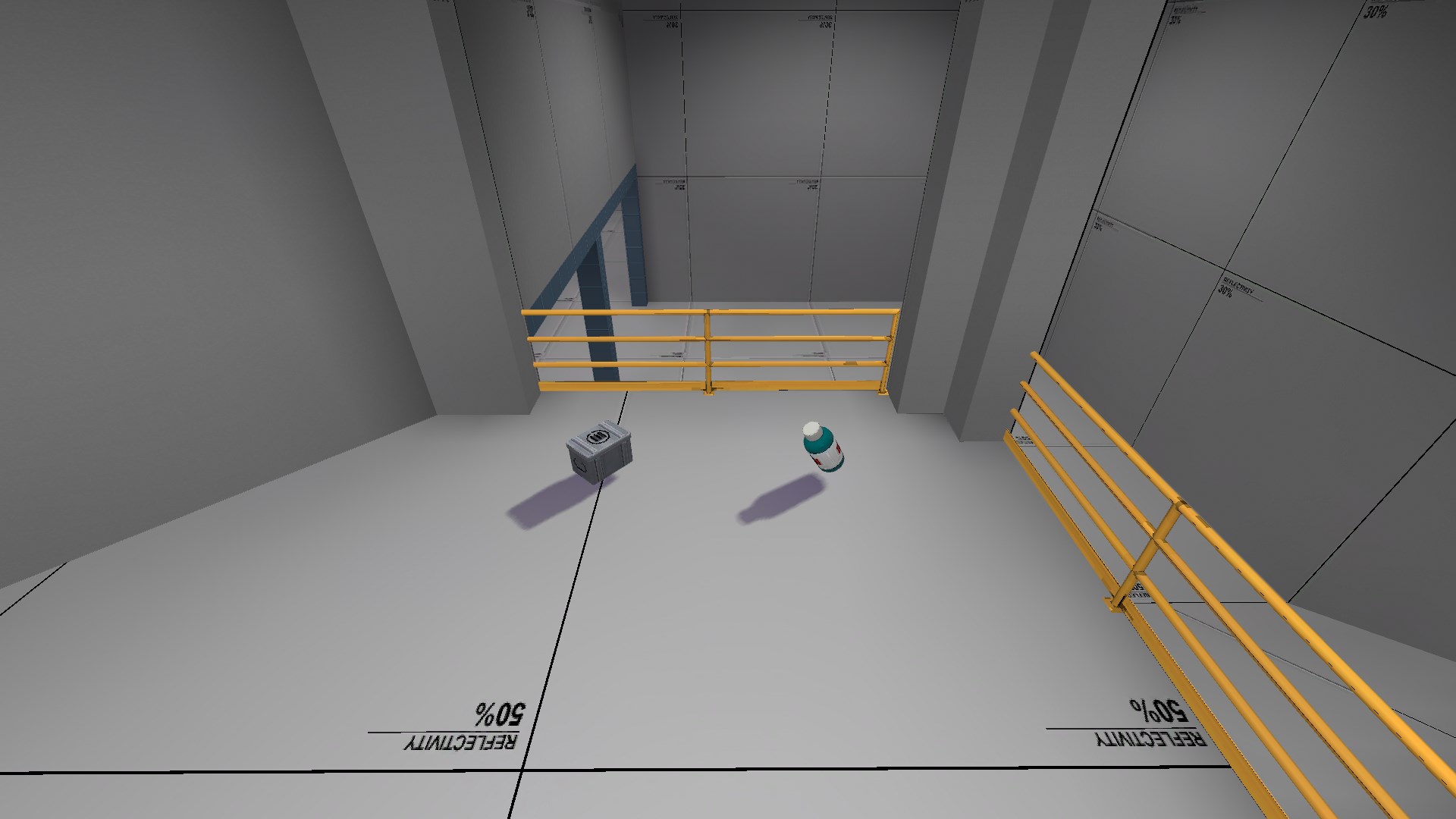
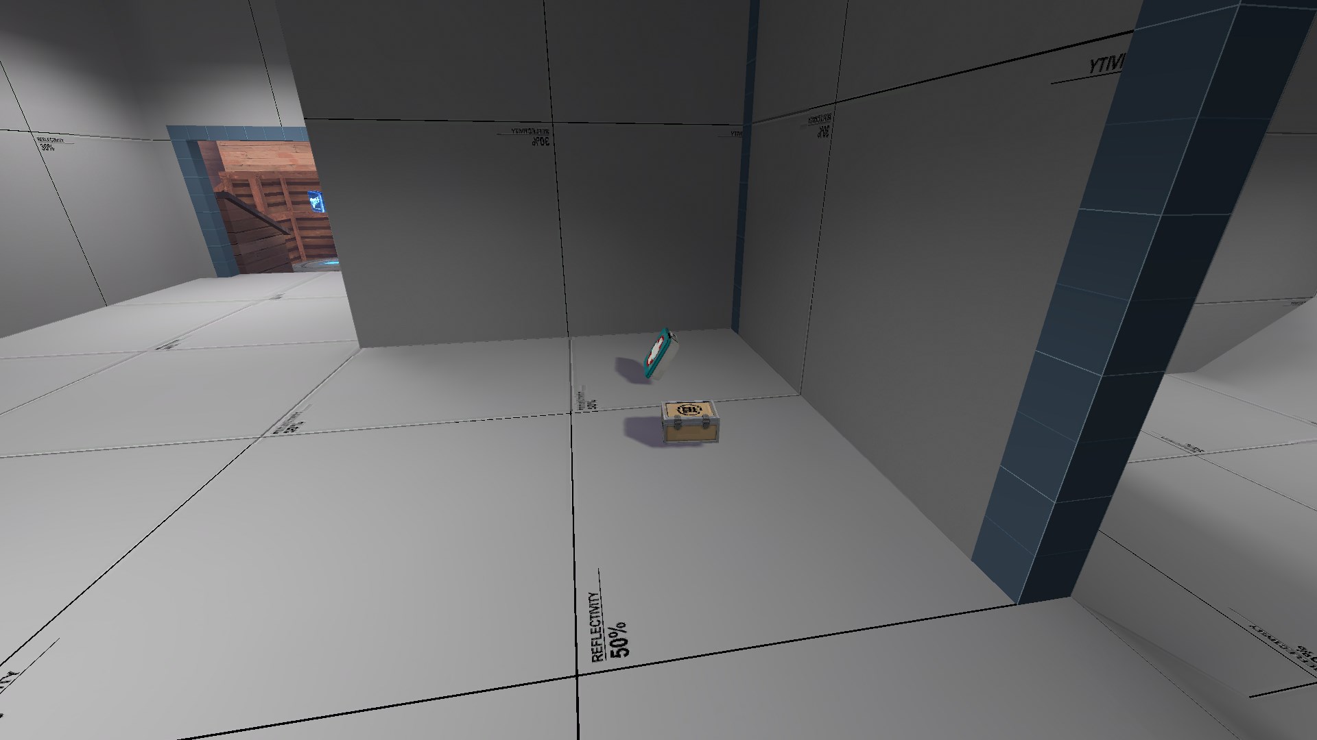
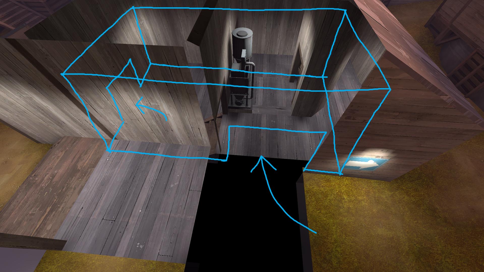
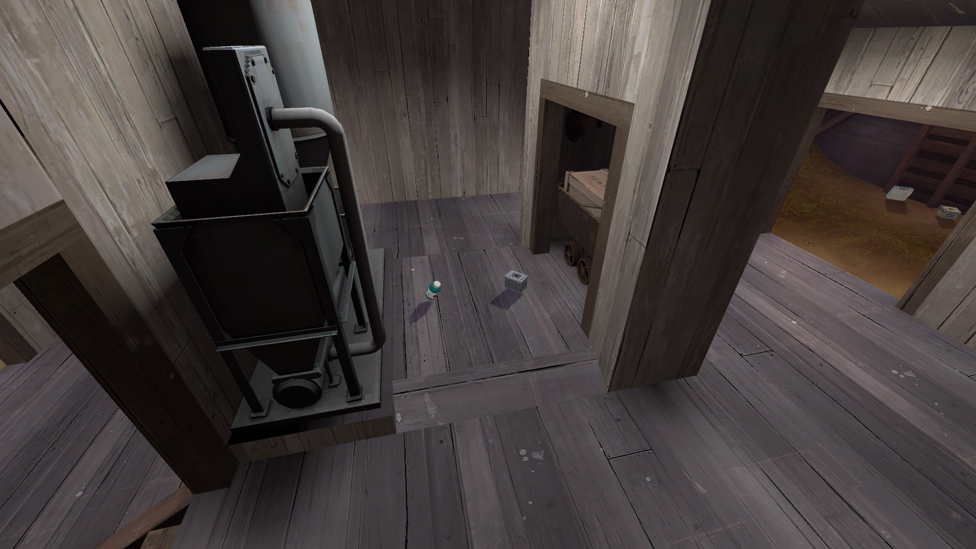
First thing I want to point out is this little cover room, I can see it being useful for defensive holds since there isn't much else between the point and spawn, but you could probably lose the pickups since they're within a 3 second walk from the spawn door.
http://i.imgur.com/2epQ1sW.jpg
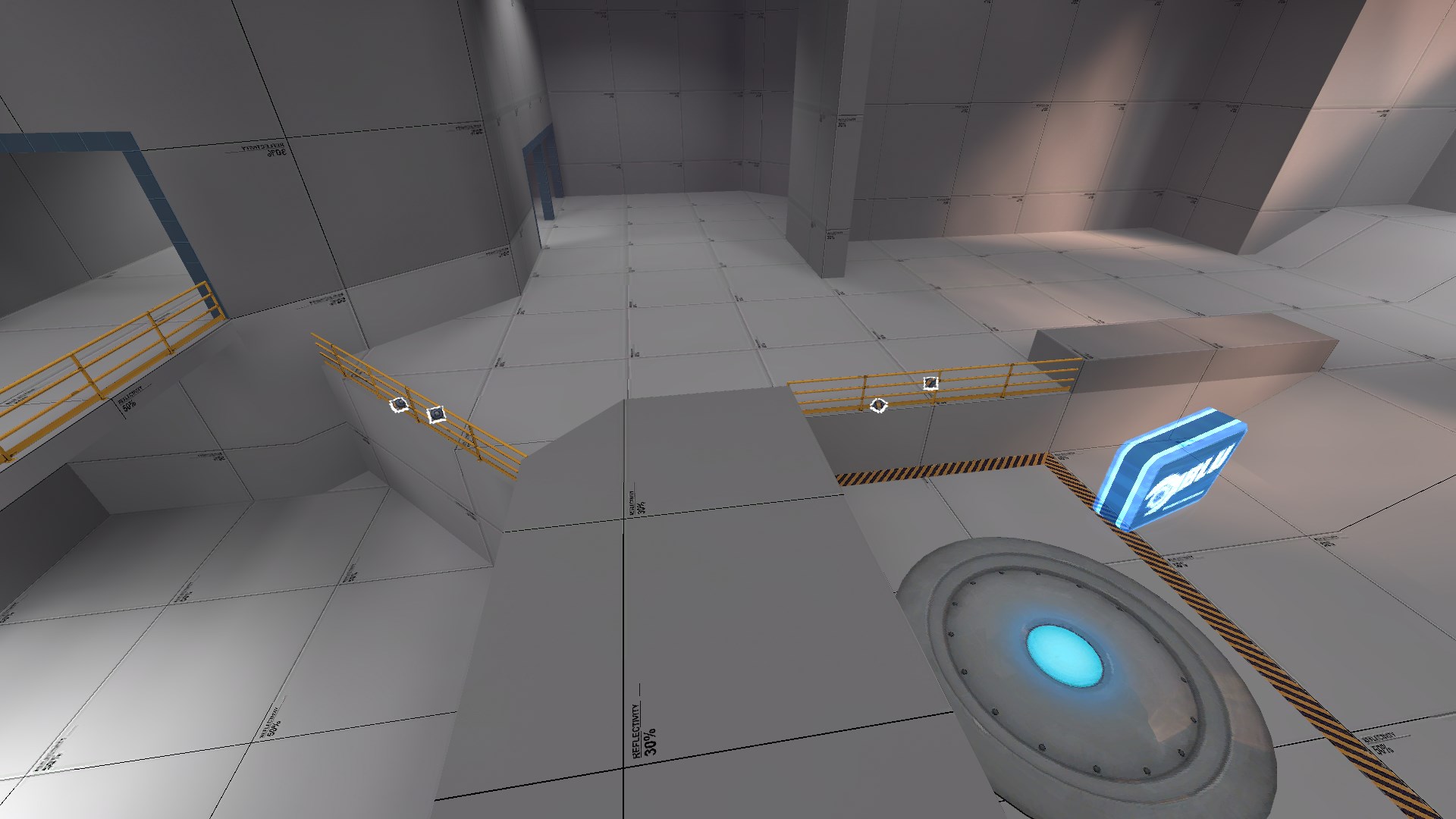
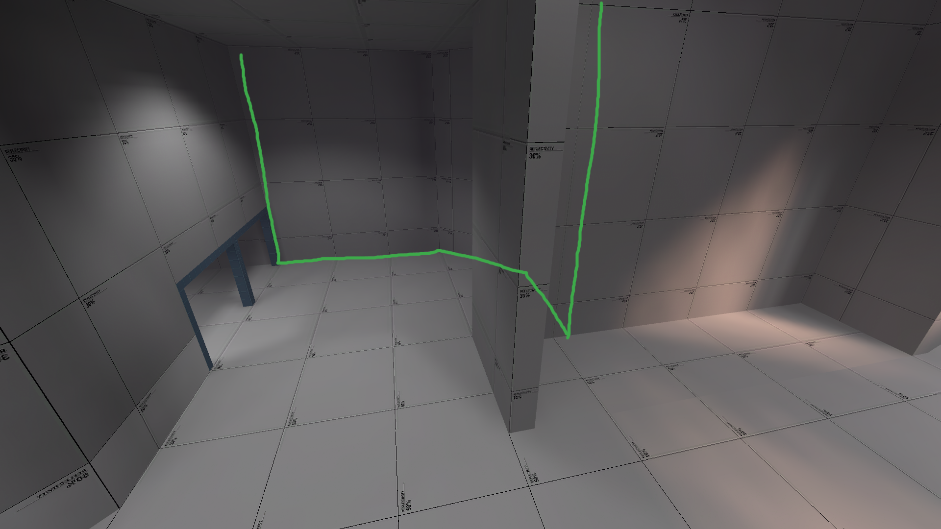
This sightline might be problematic because it looks directly into the aforementioned cover room, which I'm sure defenders will be using extensively. It might not be so bad if you lit the corner better, but I understand that this is just a test compile so I'll let you decide how to deal with it.
http://i.imgur.com/WQSkCTb.jpg
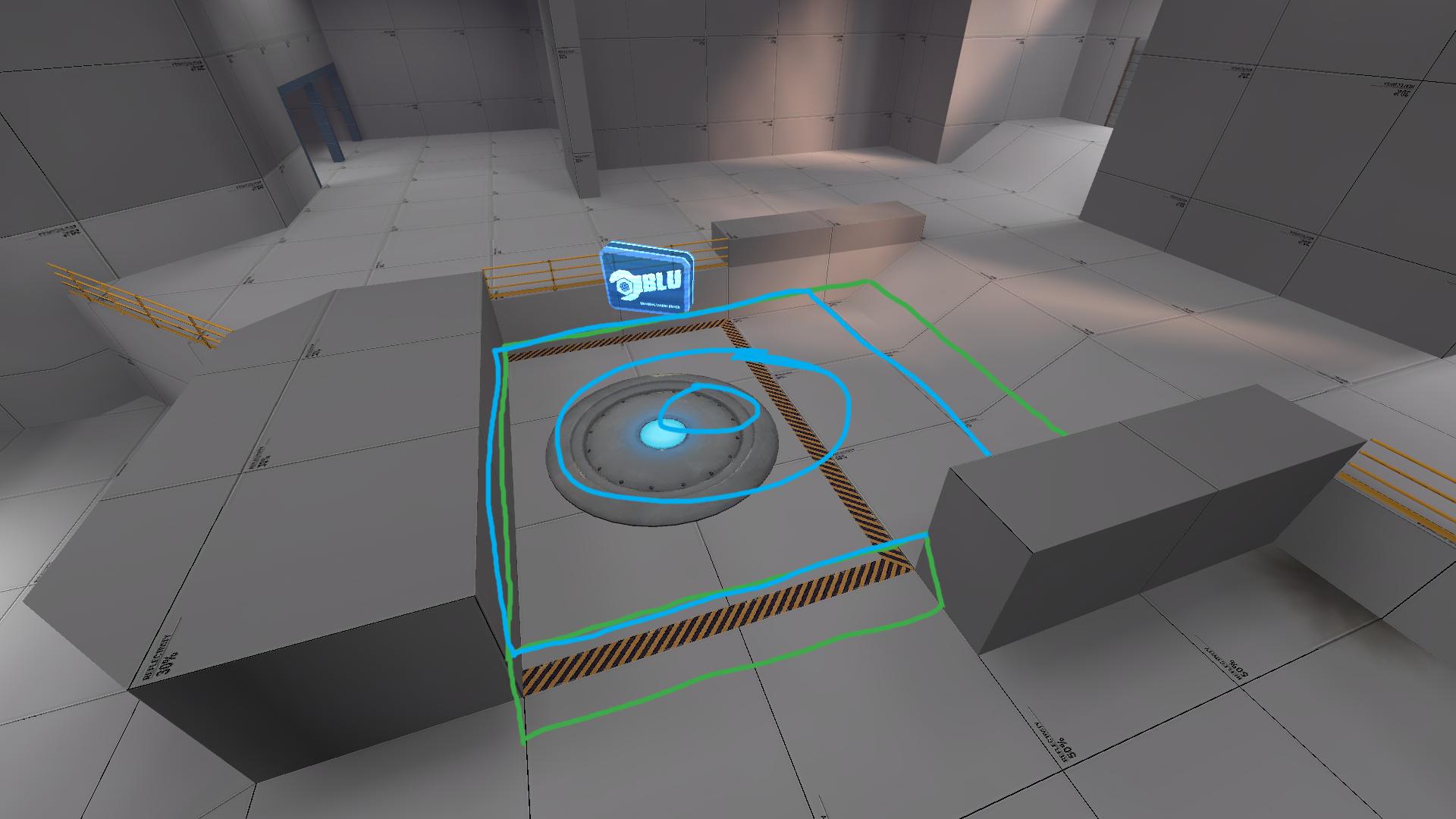
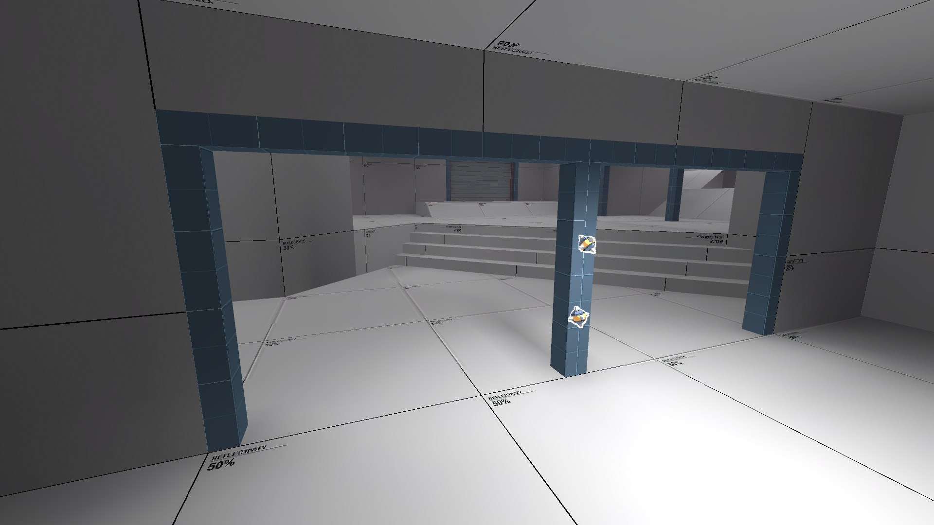
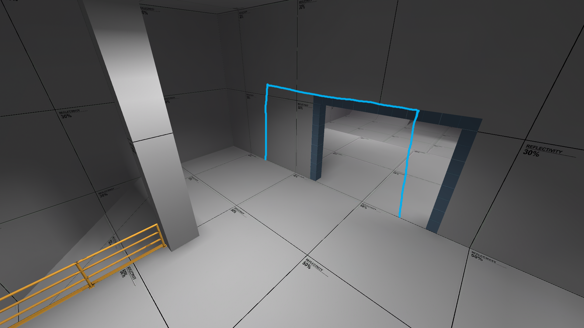
This is just speculation, but I'm concerned this staircase's height advantage offers a hold position that's too close to the point. It might end up being the most favorable route because of this.
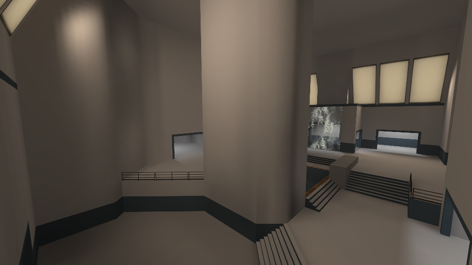
http://i.imgur.com/aZhYjAO.jpg
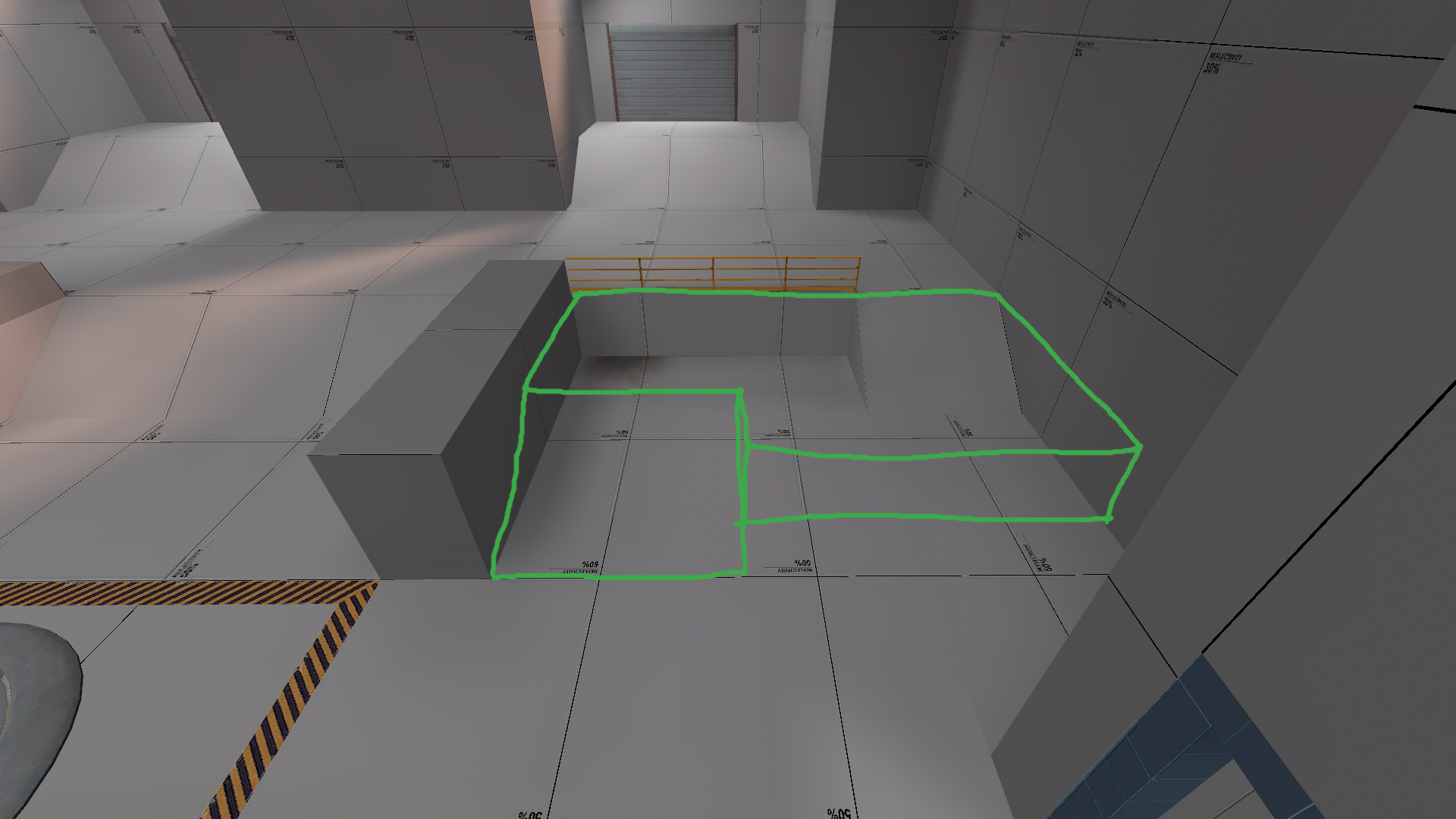
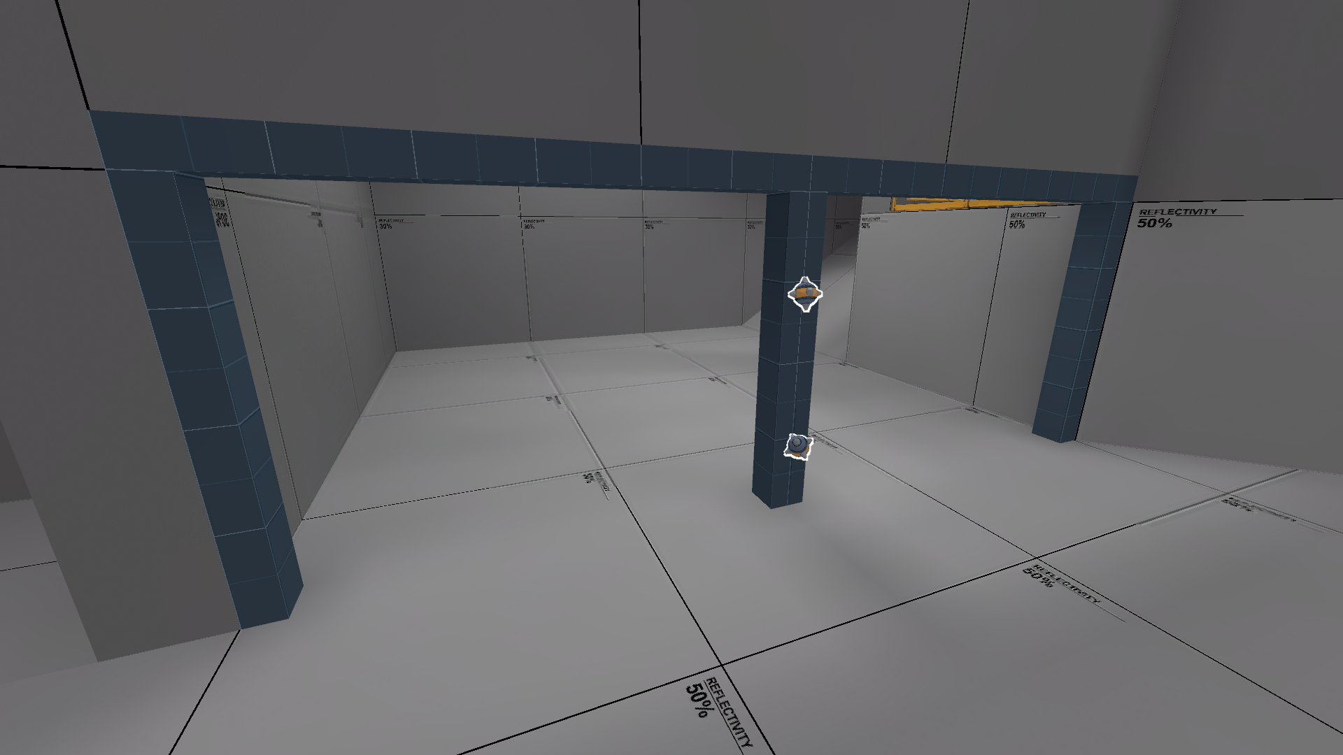
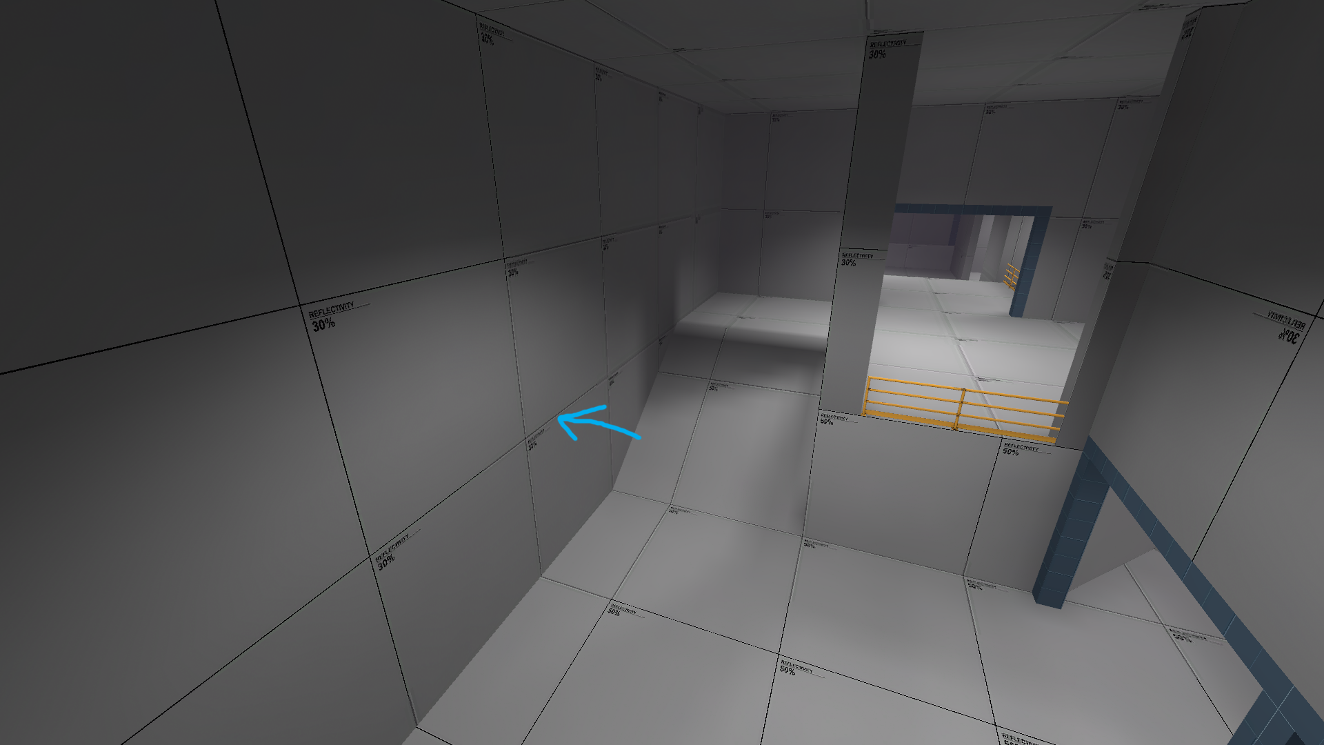
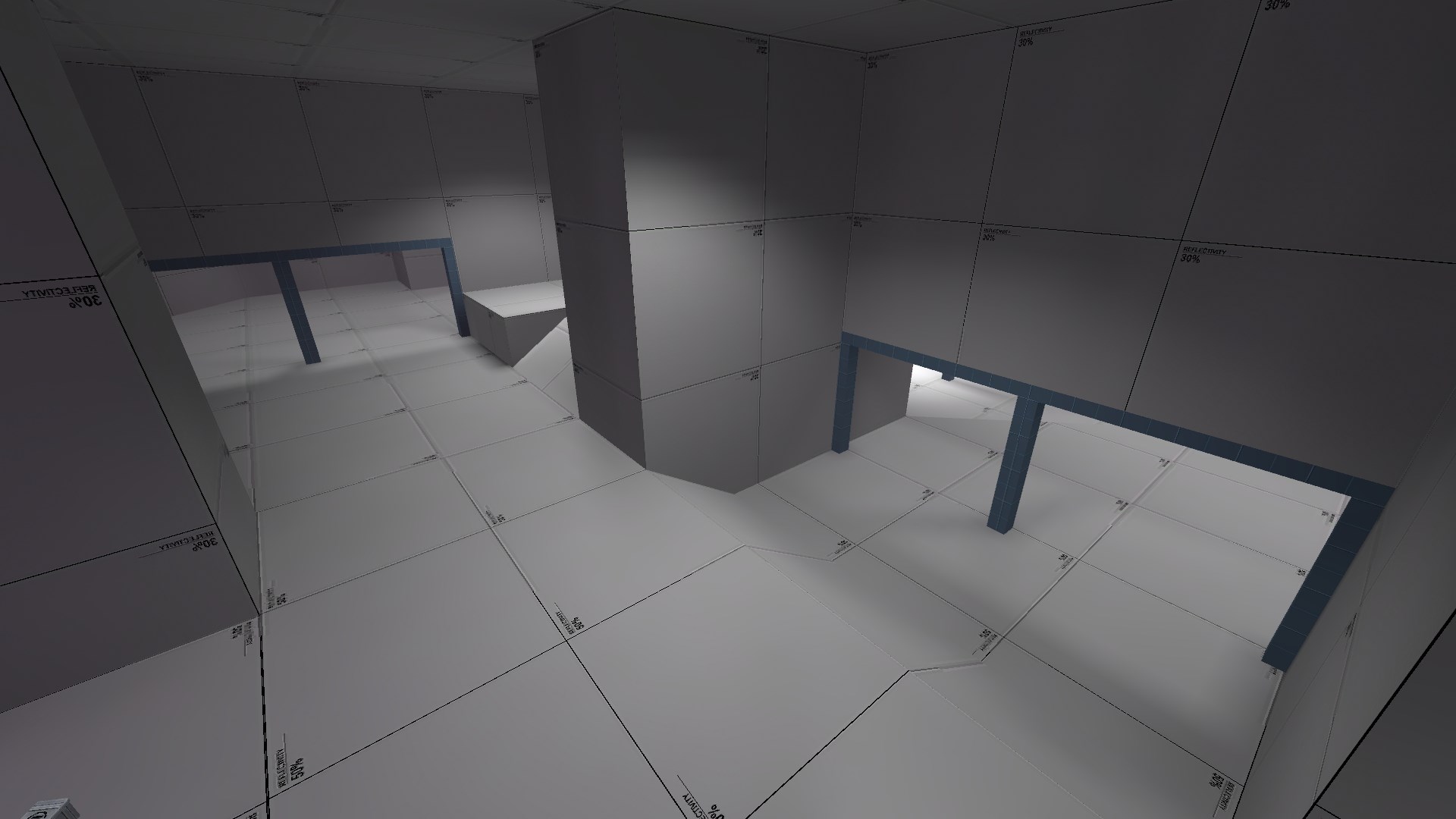
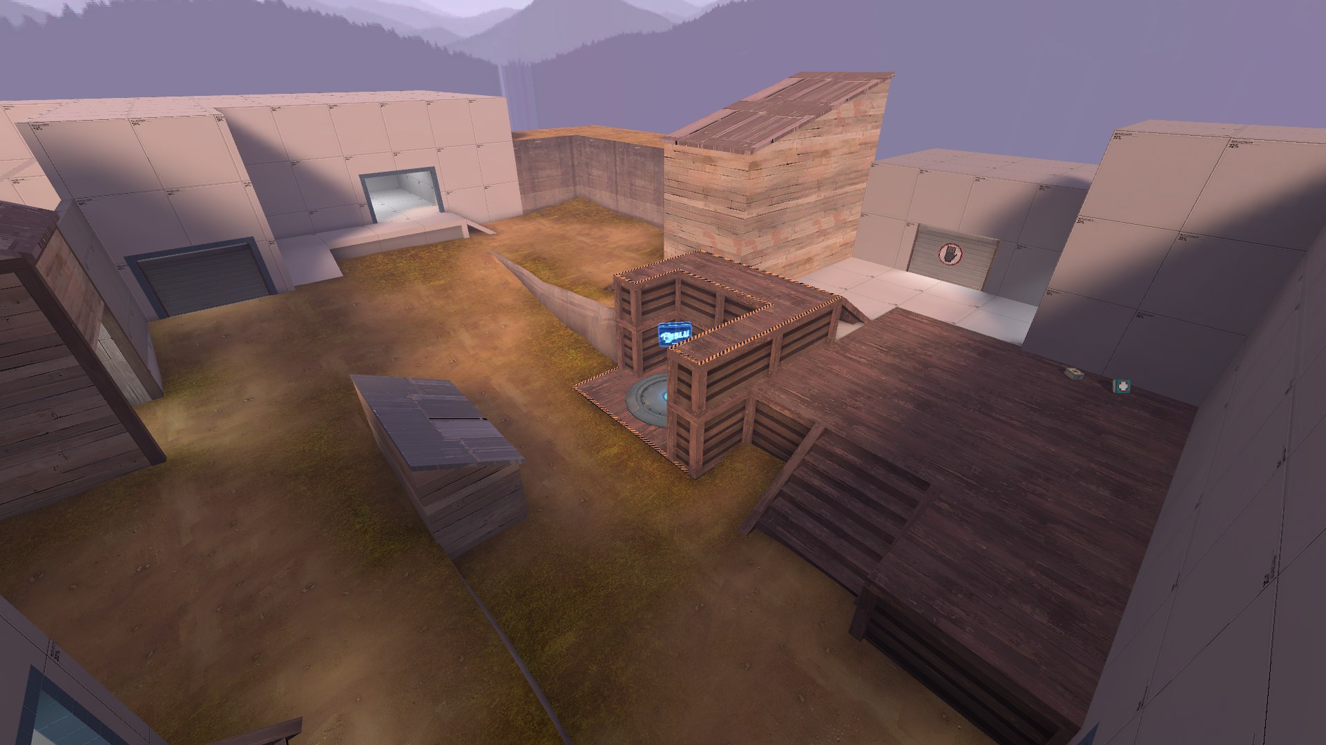
Lastly, I think I would feel deterred from taking this central route because I'm immediately faced with a height disadvantage on both sides, a huge pillar blocking my view in front, and no indication of where the point is located in the room. In fact, none of the three routes offer much visibility into the area without exposing yourself too much, which I think is important for gauging the defense and choosing an appropriate way to push in.
http://i.imgur.com/wEpJWvc.jpg
First thing I want to point out is this little cover room, I can see it being useful for defensive holds since there isn't much else between the point and spawn, but you could probably lose the pickups since they're within a 3 second walk from the spawn door.
http://i.imgur.com/2epQ1sW.jpg
This sightline might be problematic because it looks directly into the aforementioned cover room, which I'm sure defenders will be using extensively. It might not be so bad if you lit the corner better, but I understand that this is just a test compile so I'll let you decide how to deal with it.
http://i.imgur.com/WQSkCTb.jpg
This is just speculation, but I'm concerned this staircase's height advantage offers a hold position that's too close to the point. It might end up being the most favorable route because of this.
http://i.imgur.com/aZhYjAO.jpg
Lastly, I think I would feel deterred from taking this central route because I'm immediately faced with a height disadvantage on both sides, a huge pillar blocking my view in front, and no indication of where the point is located in the room. In fact, none of the three routes offer much visibility into the area without exposing yourself too much, which I think is important for gauging the defense and choosing an appropriate way to push in.