Ok, new post to bump the thread with this advice.
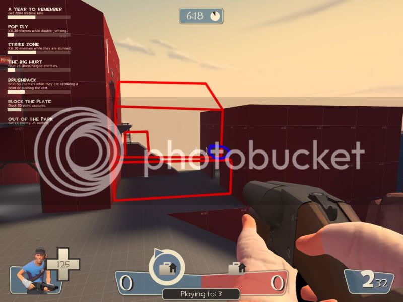
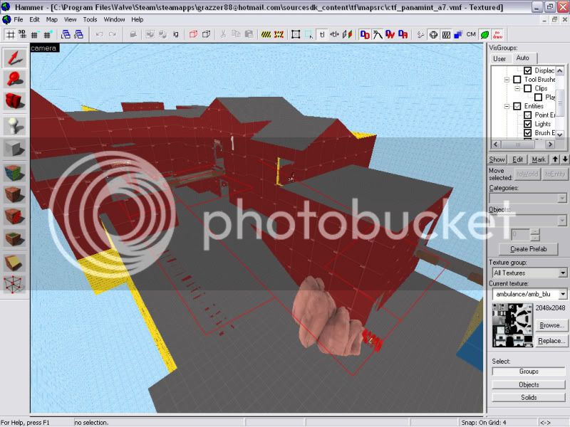
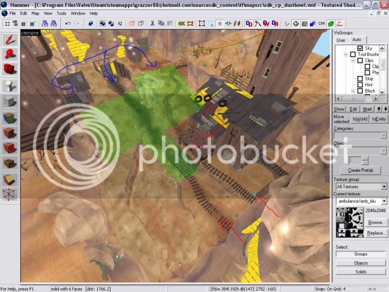
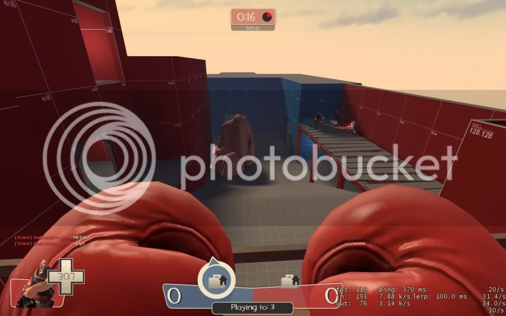
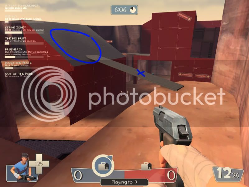
Conjoin these buildings. This provides an inside scene and outside scene of attack. All the ramps get old pretty fast in your map and hopefully this will reduce the thought that some ramps were placed in simply to allow you to get to the objective, and improve immersion.
Also having a balcony where i showed with the blue circle as a sentry position may allow for some defencive oppotunity on the right flank, covering the middle. Rather than generic spam from doorways by defenders on the point.
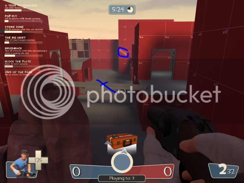
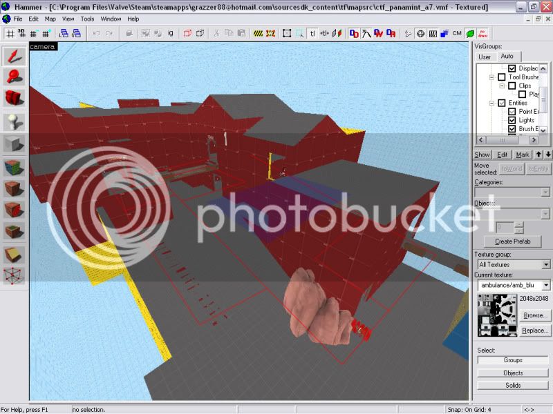
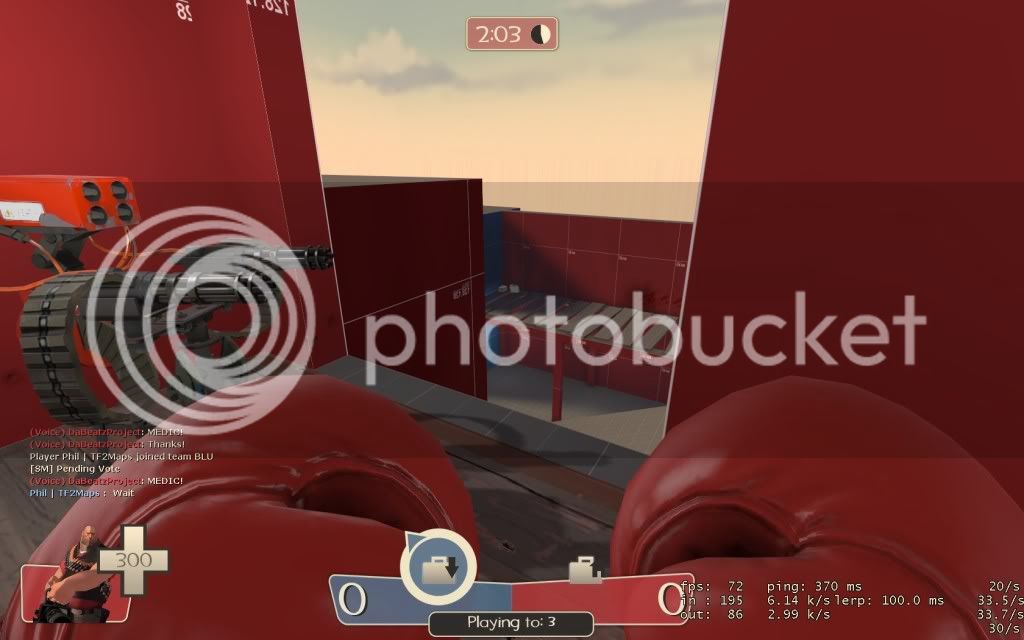
I think this area could be widened to provide more of an impressive scene. Right now it's not particularly cramped but i believe you could do more with more space at your disposal. As it is, remove the plank. Allowing players to constantly change direction of attack loosens assualt attempts and splits the team up when they panic in the face of more than one defender. It confuses players as to what tactics to employ in assaults and is what gave the spy's a particularly happy run of the map. You need to give players specific choices, not free run of the map from any position like a death match map.
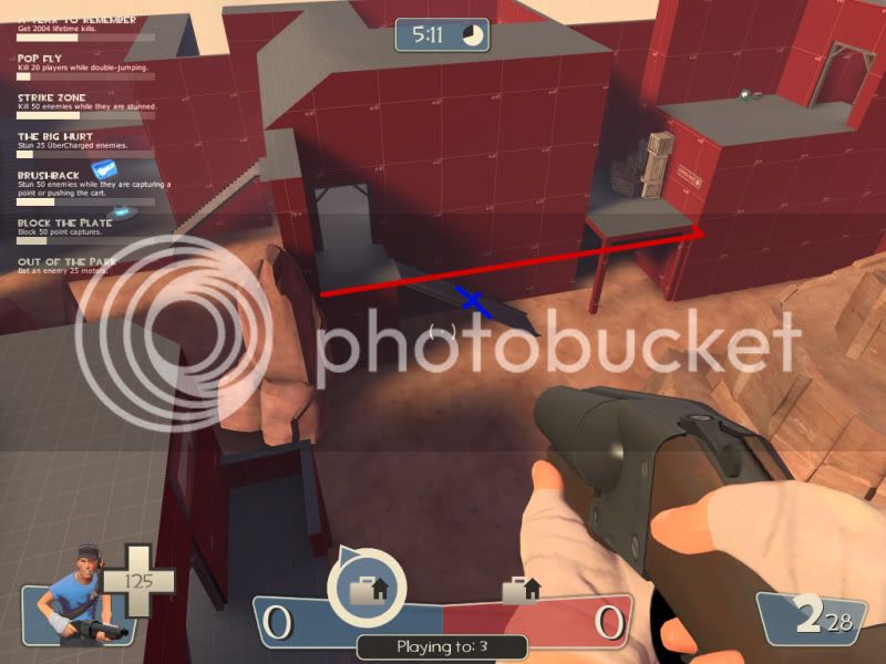
Remove the model sign you have used (circled) and put in an arrow overlay instead, perhaps on a wooden sign at floor level. As it is (regardless of being red on a red background) it is small and insignificant, and you already have two others around this entrance.
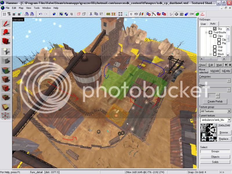
Lower the level of the raised passage on the left. It seemed to high.
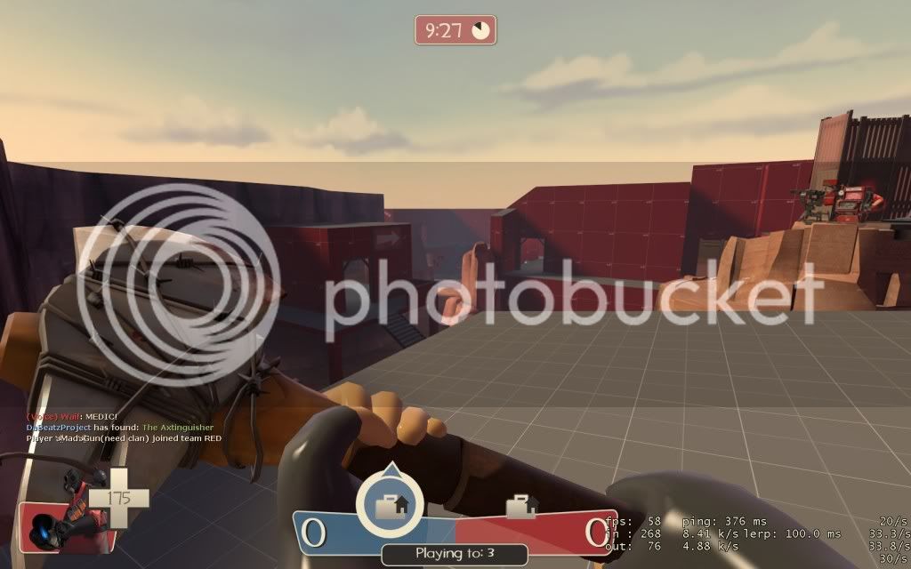
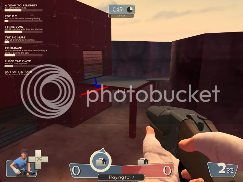
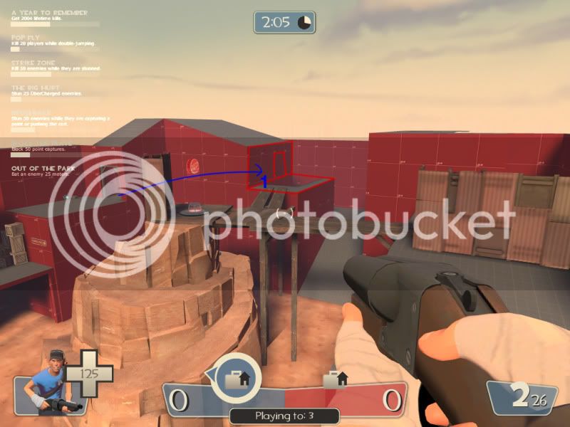
Simplify this area. You're in alpha and you're already making some messy complicated geometry here. Remove the platform and simply extend the clif to the spawn exit. I would recommend a smaller entrance at placement 1 or a larger exit at placement 2. Placement 2 is a prefered choice on my part as it allows atleast one exit with a view of part of the battlefield. Right now each exit only looks into a pit of doom.
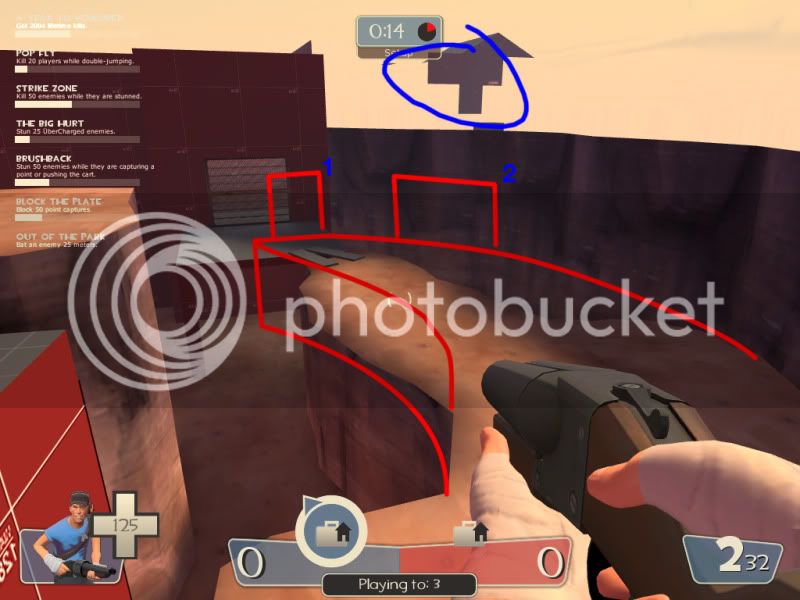
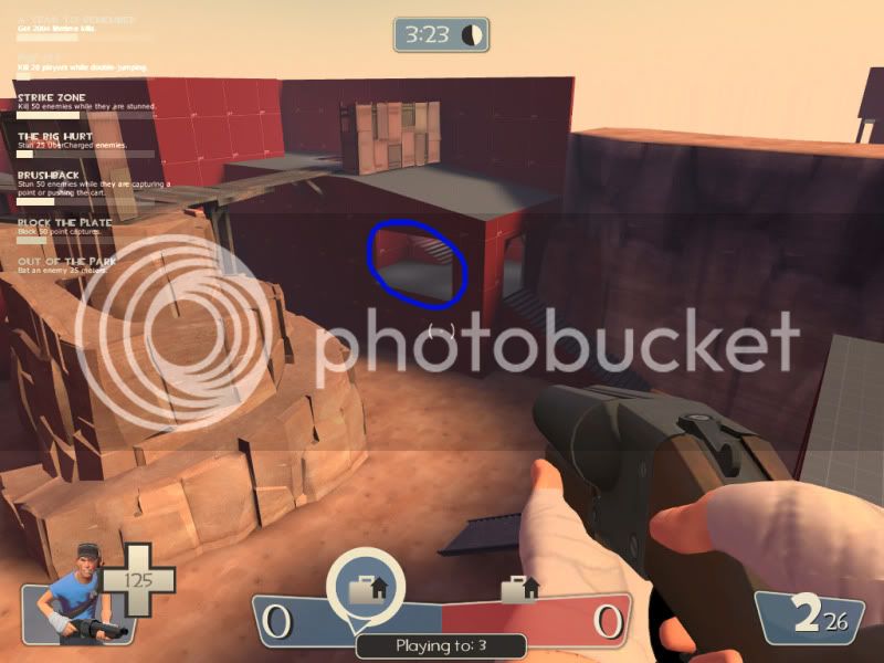
Remove the plank. It always seems like a cool idea to allow people to walk ontop of roofs. But it breaks immersion when not done properly (which is incredibly hard to do as it is) as it puts it into the players head that they can jump onto any roof they feel like in this map (which obviously they cannot). Giving the circled roof a regular "^" shaped roof will hopefully deter the idea that they can get onto it when removing the plank.
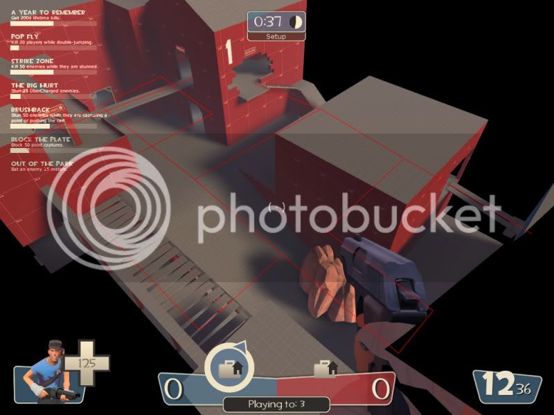
One of the issues i had with this map was there there were always atleast 3 different directions i could be attacked from and i was constantly paranoid (especially what with all the spy's), let alone always watching the sky (when players should be focusing on the objective). Having accessable roofs did not help this gameplay aspect.
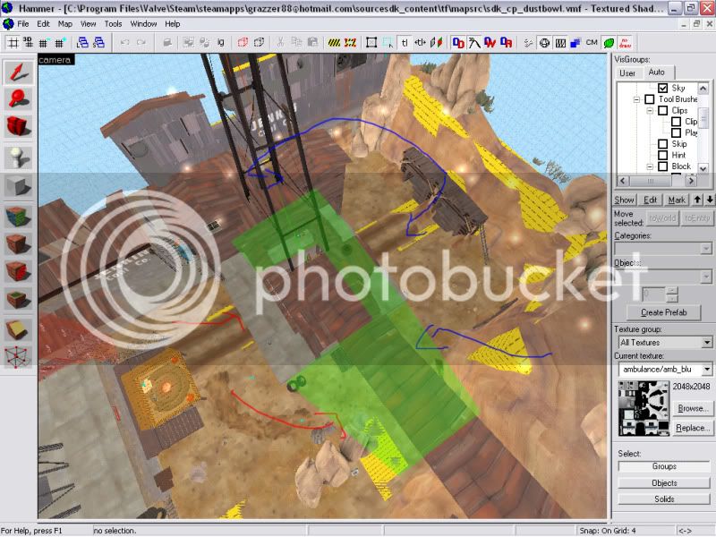
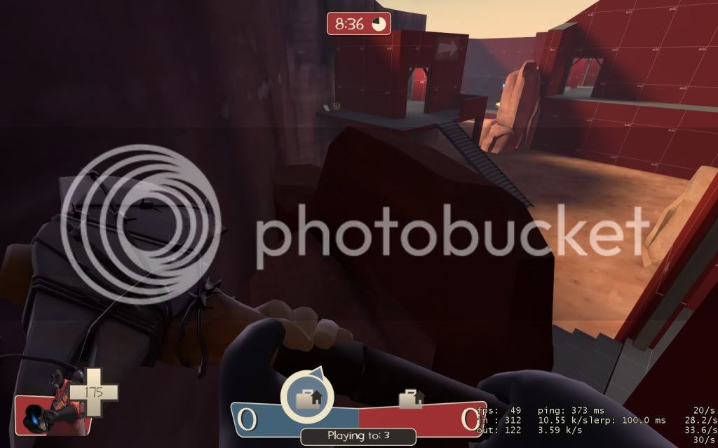
Remove these stairs and either extend the building out more to provide more space inside the building in question or provide a balcony as shown. Allowing defenders direct access to every position in the map meant there were no positions for attackers to move up to. It was a constant struggle to get from spawn to CP2 without A) getting killed by a spy jumping down onto you, or B) taking enough spam damage from rockets and spammy heavies overlooking from planks above, that any chance of you surviving more than a second when you eventually do reach the objective was.. well it wasn't going to happen.
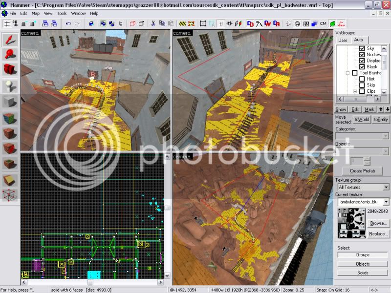
I see too much of this. Every room seems to be seen into or out of. No cover is real cover in your map. Which was frustrating, for both teams. Close this. and reduce the general number of doors throughout your map. Each time you transist between one building to another you have a doorway, this isn't necassery. Open up some of you buildings with larger passageways and rooms, thinking of your buildings more like shells than houses. Unfortunately i can't get into a good position to take relavent screenshots for suggestions for this but use your imagination.
To assualt from the left, here, meant passing the enemy spawn. This is just generally bad level design. It either results in spawn camping or no assault ever getting past, depending on how the teams are stacked.
Once again defenders can access all area's from anywhere at this location. When a player spawns he must be given a decision on where to go defend. Left, right, the middle, objective, or counter attack. This dictates where he travels, what tactics he employs, the dangers he will encounter, what class he should choose, and from experience the chances of making a lasting defence. In opening up most of your map how you have, you remove these focused choices and players get lost for what to do.
Remove the ramp that allows defenders direct access to the CP, and put a passageway to the balcony from the left, to allow Blu to still assault from this direction. You'll need to provide seom cover for Red however as this balcony does overlook their spawn.
This will focus the defence somewhat to the right, though i leave the decision to completely cut off the left from defenders up to you. Due to the insta cap nature of this mode defenders get a hard time getting caught off gaurd just once.
Conjoin these buildings. This provides an inside scene and outside scene of attack. All the ramps get old pretty fast in your map and hopefully this will reduce the thought that some ramps were placed in simply to allow you to get to the objective, and improve immersion.
Also having a balcony where i showed with the blue circle as a sentry position may allow for some defencive oppotunity on the right flank, covering the middle. Rather than generic spam from doorways by defenders on the point.
I think this area could be widened to provide more of an impressive scene. Right now it's not particularly cramped but i believe you could do more with more space at your disposal. As it is, remove the plank. Allowing players to constantly change direction of attack loosens assualt attempts and splits the team up when they panic in the face of more than one defender. It confuses players as to what tactics to employ in assaults and is what gave the spy's a particularly happy run of the map. You need to give players specific choices, not free run of the map from any position like a death match map.
Remove the model sign you have used (circled) and put in an arrow overlay instead, perhaps on a wooden sign at floor level. As it is (regardless of being red on a red background) it is small and insignificant, and you already have two others around this entrance.
Lower the level of the raised passage on the left. It seemed to high.
Simplify this area. You're in alpha and you're already making some messy complicated geometry here. Remove the platform and simply extend the clif to the spawn exit. I would recommend a smaller entrance at placement 1 or a larger exit at placement 2. Placement 2 is a prefered choice on my part as it allows atleast one exit with a view of part of the battlefield. Right now each exit only looks into a pit of doom.
Remove the plank. It always seems like a cool idea to allow people to walk ontop of roofs. But it breaks immersion when not done properly (which is incredibly hard to do as it is) as it puts it into the players head that they can jump onto any roof they feel like in this map (which obviously they cannot). Giving the circled roof a regular "^" shaped roof will hopefully deter the idea that they can get onto it when removing the plank.
One of the issues i had with this map was there there were always atleast 3 different directions i could be attacked from and i was constantly paranoid (especially what with all the spy's), let alone always watching the sky (when players should be focusing on the objective). Having accessable roofs did not help this gameplay aspect.
Remove these stairs and either extend the building out more to provide more space inside the building in question or provide a balcony as shown. Allowing defenders direct access to every position in the map meant there were no positions for attackers to move up to. It was a constant struggle to get from spawn to CP2 without A) getting killed by a spy jumping down onto you, or B) taking enough spam damage from rockets and spammy heavies overlooking from planks above, that any chance of you surviving more than a second when you eventually do reach the objective was.. well it wasn't going to happen.
I see too much of this. Every room seems to be seen into or out of. No cover is real cover in your map. Which was frustrating, for both teams. Close this. and reduce the general number of doors throughout your map. Each time you transist between one building to another you have a doorway, this isn't necassery. Open up some of you buildings with larger passageways and rooms, thinking of your buildings more like shells than houses. Unfortunately i can't get into a good position to take relavent screenshots for suggestions for this but use your imagination.
To assualt from the left, here, meant passing the enemy spawn. This is just generally bad level design. It either results in spawn camping or no assault ever getting past, depending on how the teams are stacked.
Once again defenders can access all area's from anywhere at this location. When a player spawns he must be given a decision on where to go defend. Left, right, the middle, objective, or counter attack. This dictates where he travels, what tactics he employs, the dangers he will encounter, what class he should choose, and from experience the chances of making a lasting defence. In opening up most of your map how you have, you remove these focused choices and players get lost for what to do.
Remove the ramp that allows defenders direct access to the CP, and put a passageway to the balcony from the left, to allow Blu to still assault from this direction. You'll need to provide seom cover for Red however as this balcony does overlook their spawn.
This will focus the defence somewhat to the right, though i leave the decision to completely cut off the left from defenders up to you. Due to the insta cap nature of this mode defenders get a hard time getting caught off gaurd just once.
Last edited:


")