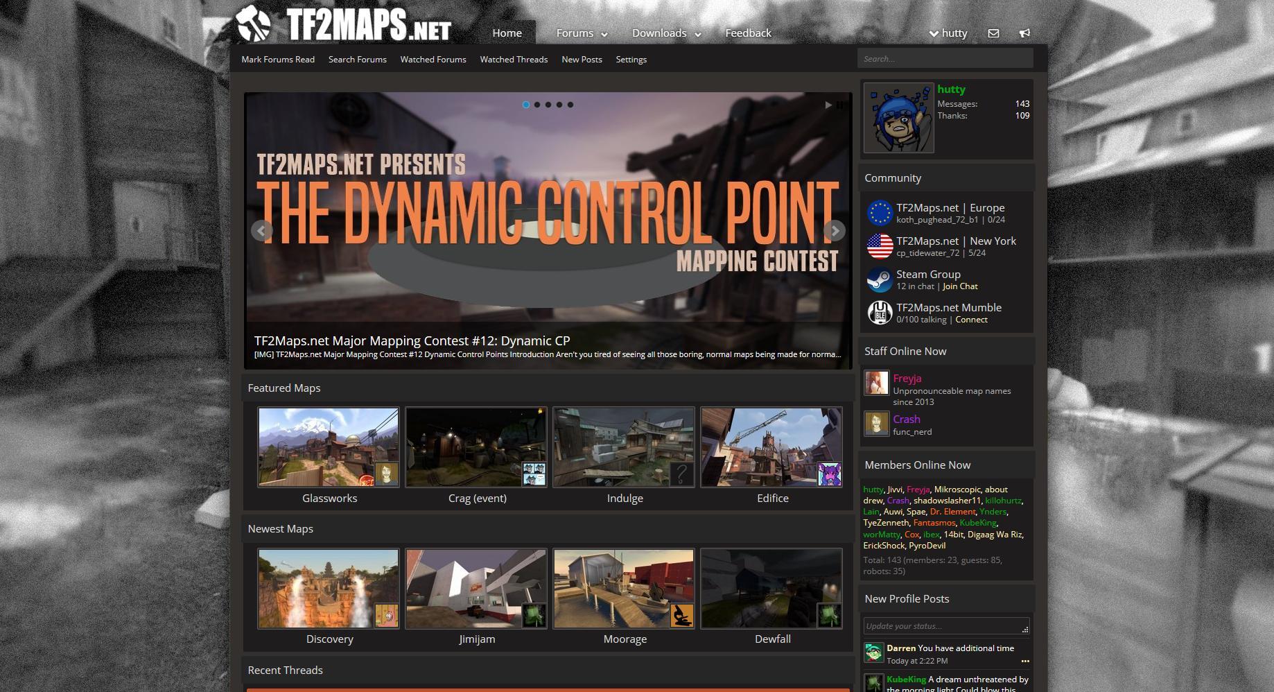
I'm liking the new website so far (especially from a functionality standpoint) , but I can't help but feel that we lost something when we converted everything to a flat style.
So, tonight I made some mockups of something that might make the site feel better.
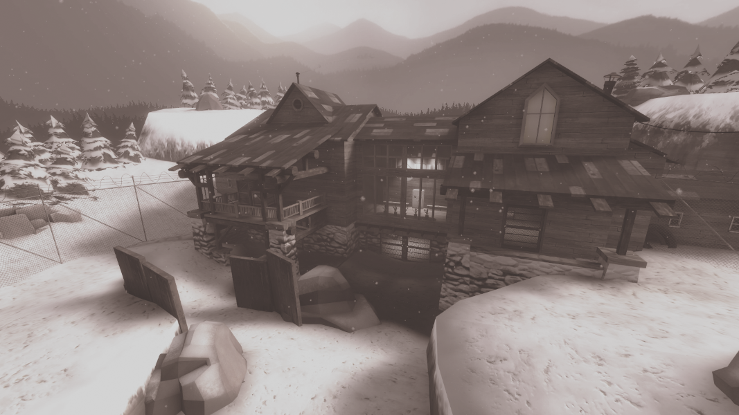
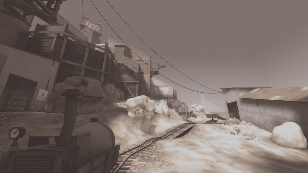
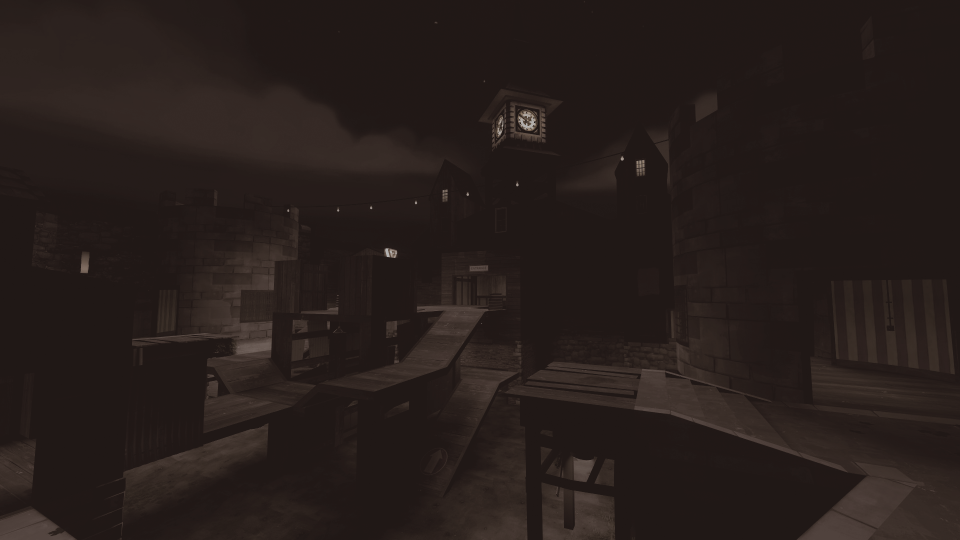
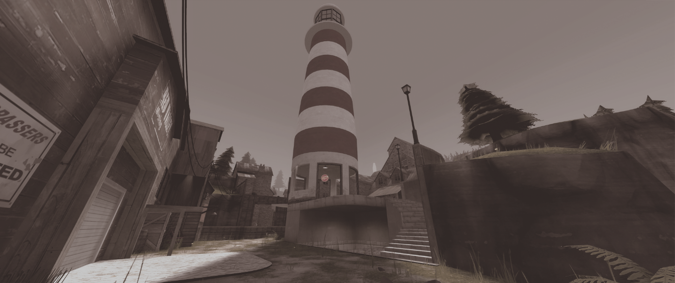
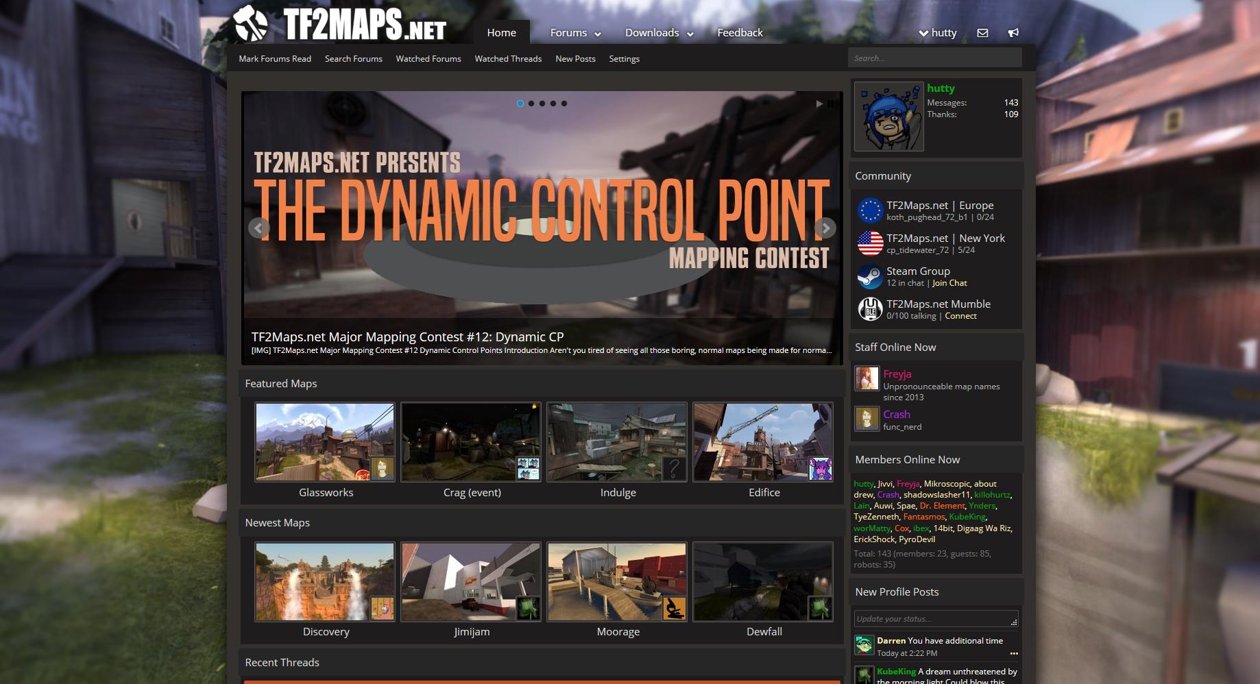
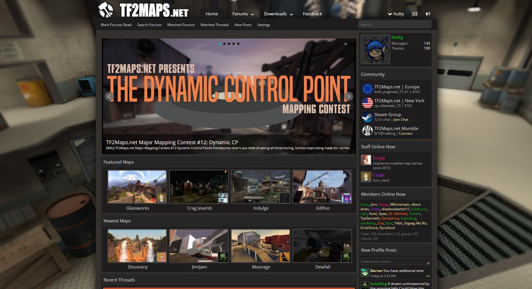
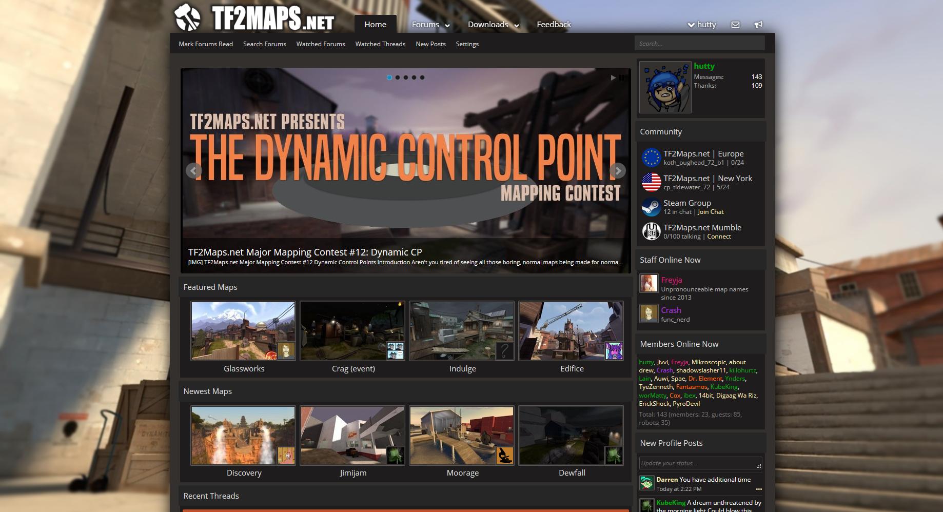
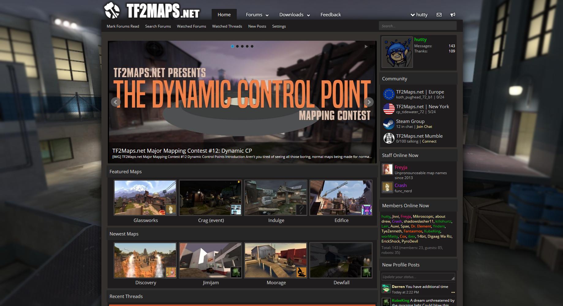
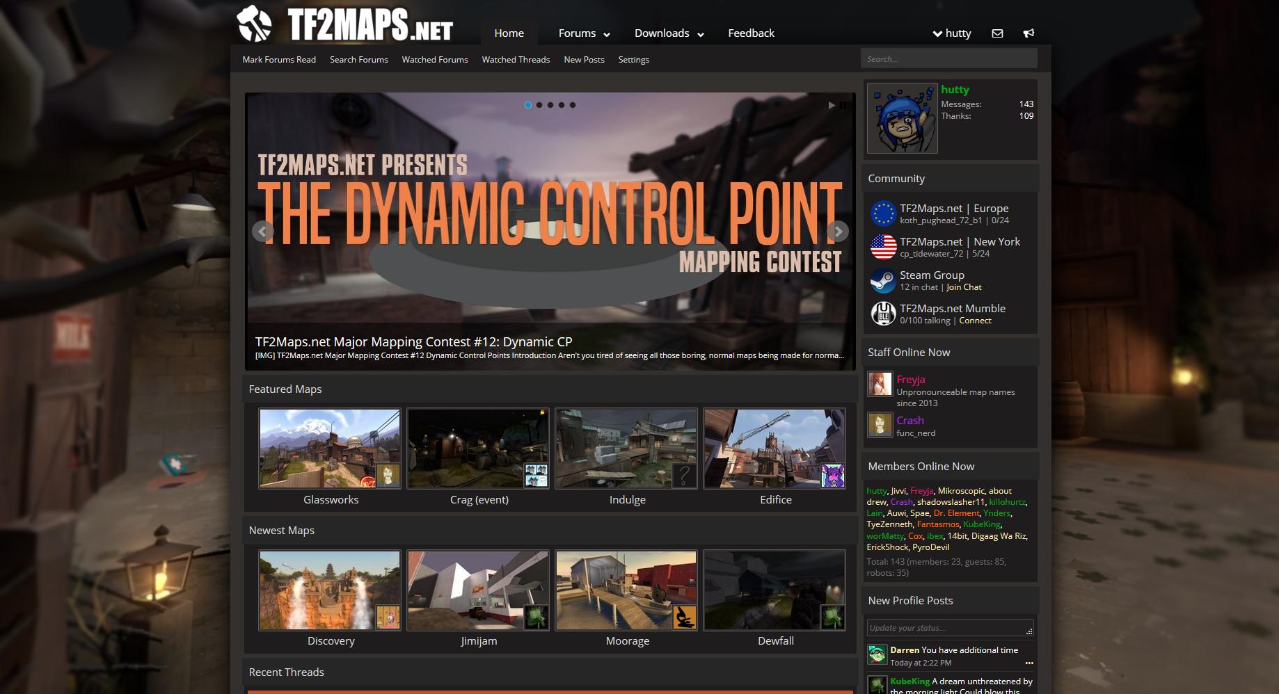
The general gist, is replace the background gradient with a static image of a map.
Also getting rid of that red square in the upper left. (note that I don't have a good selection of fonts on my computer, so logo I wouldn't consider final)
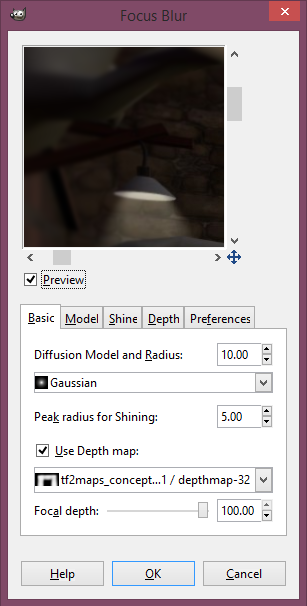
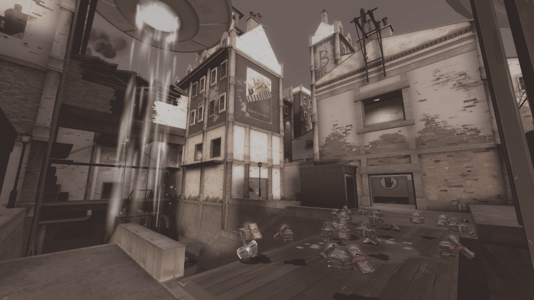
In the examples below I took some images from our featured maps section and tossed them through gimp's focal blur plugin. (Not all map screenshots look that good as backdrops, only about 10% of them have interesting content on the edges)
I'm assuming this would be the kind of thing that is swapped out every month or so (like a sub-reddit banner)
The homepage is still a more chaotic then I would prefer, but I think that this is a step in the right direction.
So, tonight I made some mockups of something that might make the site feel better.
The general gist, is replace the background gradient with a static image of a map.
Also getting rid of that red square in the upper left. (note that I don't have a good selection of fonts on my computer, so logo I wouldn't consider final)
In the examples below I took some images from our featured maps section and tossed them through gimp's focal blur plugin. (Not all map screenshots look that good as backdrops, only about 10% of them have interesting content on the edges)
I'm assuming this would be the kind of thing that is swapped out every month or so (like a sub-reddit banner)
The homepage is still a more chaotic then I would prefer, but I think that this is a step in the right direction.