EDIT May 25th 2021: I'm going to leave this guide up because I think it has some good info, but the idea of "leading lines" in level design has been fairly thoroughly debunked and isn't great advice to follow. Read this guide with a grain of salt. I might write a new one some day. In the mean time, I would recommend watching this GDC talk for more info on composition in level design.
---
Level design is a form of art. Much like traditional art, level design is, at its very core, the arrangement of objects in a particular pattern to accomplish a certain goal. There's a term that's used to describe how the objects are arranged - Composition. It's a bit more challenging to use composition well in level design as compared to other arts, as your viewer can be looking at your scene from a technically infinite number of viewpoints, whereas most other arts involve just one viewpoint. However, we can still learn from composition, and apply it to our works.
An important part of composition is leading the viewer's eye. Generally, you want to use detailing to highlight areas where gameplay is going to be happening. You can use lighting and detail density to accomplish this. They're both techniques of composition! However, there's also a few other compositional tool you can use to guide the player's eye.
Lines are a very important part of composition. The arrangement, orientation, and emphasis of various lines can be used to create certain moods, either on their own or in conjunction with other lines. For example, suppose you have two lines that intersect each other. Where are you going to look? Your eye is naturally lead to the point of intersection, because it's the most interesting thing to look at. You can use this intersection of lines quite effectively in your environment design.
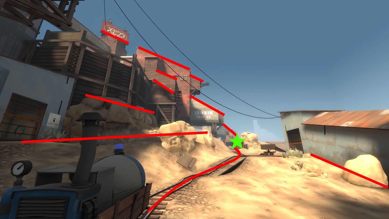
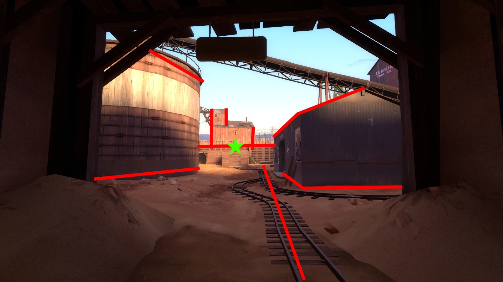
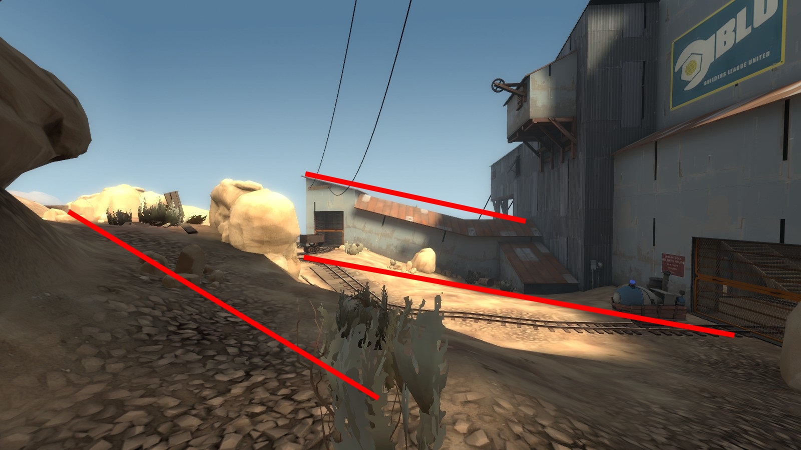
Here's a screenshot of the beginning area of Upward. Notice how many lines point directly towards the point at which the cart track disappears into the background? Note that the lines aren't always exact parts of the geometry, and can be suggested by how the geometry flows.
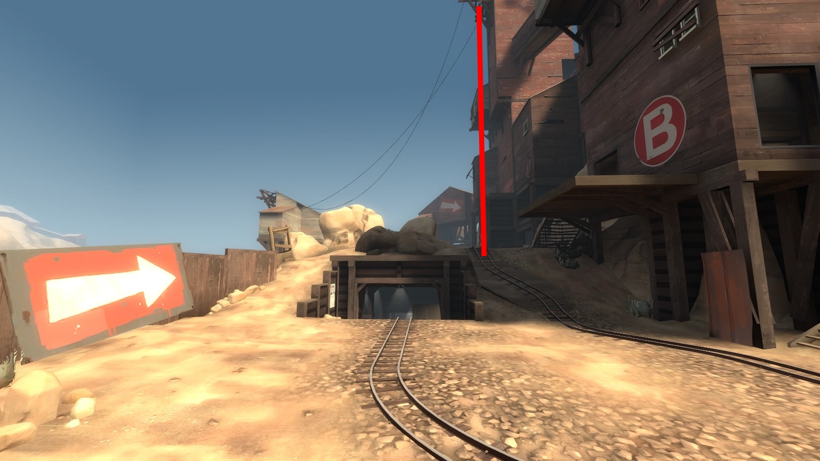
Here's Dustbowl 2-1, from the perspective of the attacking team. Notice how all of the lines point towards the one vertical line that sits right on the point. Also, note how the truck tracks in the ground are parallel in the real world, but not in the photo: this is because of something called linear perspective.
The same point, from the perspective of RED. Again, everything goes towards the point.
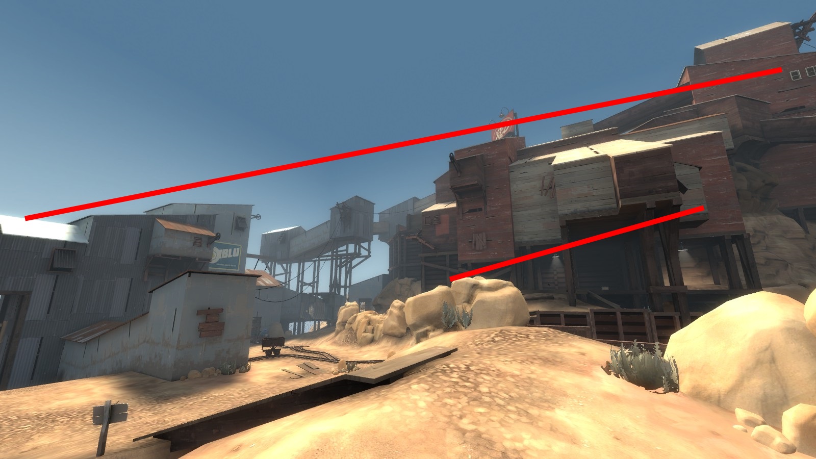
Dustbowl 2-2. The lines of the tower over spawn don't point towards the point from this perspective, but the landmark does let the player subtly know that something important is over in that direction. Also note how the spotlight doesn't obviously shed any light on the point itself, but the shape of the spotlight effect directs the eye right at it.
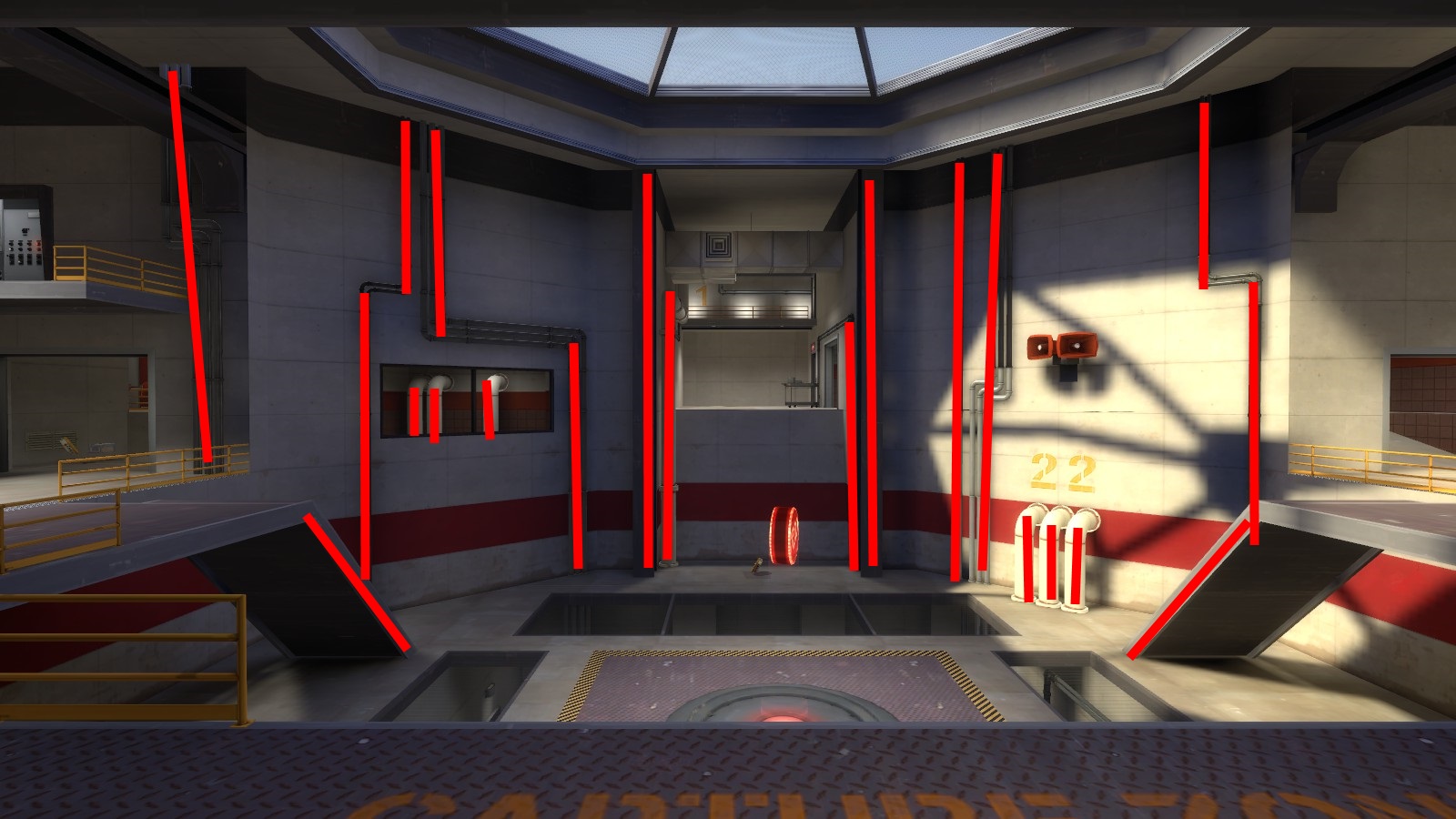
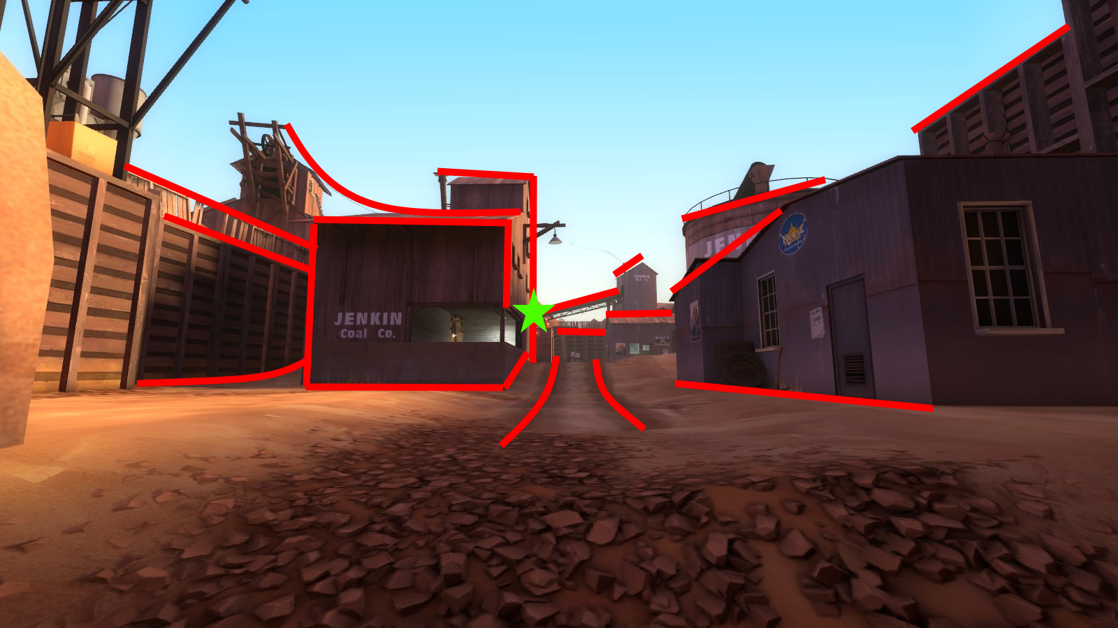
Lines don't have to point directly at the target. In this example from the last point of Gorge, you can see how the vertical pipes all point down towards the point. They're all parallel and don't meet at a given point, but the huge amount of vertical elements in this view tells the player that the important stuff isn't to the sides.
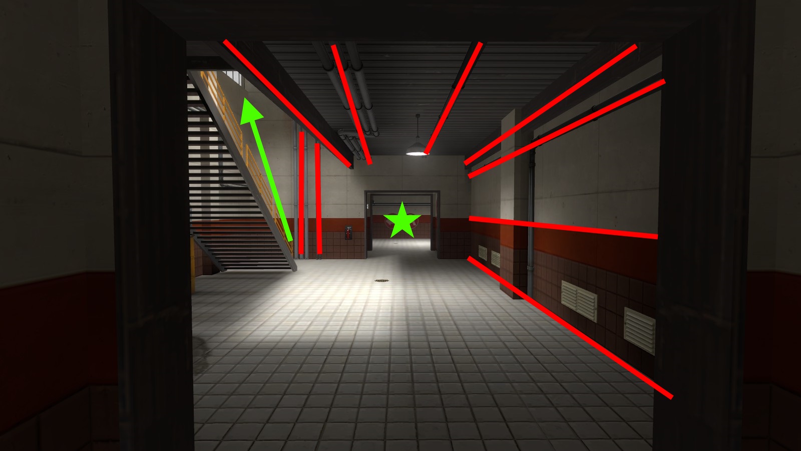
Another example of how the pipes in Gorge are used to lead the player's eye to important spots. The pipes in the main hall all lead to the room in the back, while the two vertical pipes tell the player that there's a path that goes up there.
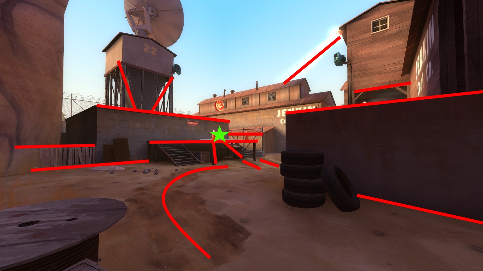
In this example from the beginning area of Upward, you can see how the viewer's eye is drawn to the left. These lines aren't defined very strongly, but everything is arranged to give the idea of "hey, go left."
Another element of composition is space. There's two types of space: Positive space, which is the space of a view that is taken up by objects, and negative space, which is empty. In our examples, empty space is usually going to be the sky. However, a large blank surface can also act as negative space. Detailed space is positive, and un-detailed space is negative.
In this example from Upward, take a look at the red building in the upper right. It serves absolutely no practical purpose in a gameplay sense. However, by having it there, it simplifies the form of the positive space, and creates a large vertical thrust directly down towards a passageway that players might be attacking from. If the building wasn't there, that passageway wouldn't be quite as obvious.
Another example of useless buildings that are added to create a more cohesive form. The roof lines all combine to form one long path across the entire view. Also note the line below, which actually continues from the ceilings through the tops of the rocks and right to the spawn exit. It's not an example of positive or negative space, but I thought it was worth mentioning.
So now that we've got all this information, how do we use it all? In traditional art, composition is the tool that pretty much defines how an entire drawing is done. Level design is not quite the same, as the layout of your elements is going to be first and foremost defined by your level design. Composition, in our case, is just a tool we can use to better guide the player's eye around the level. Let's go through a quick example of what you might do when detailing an area.
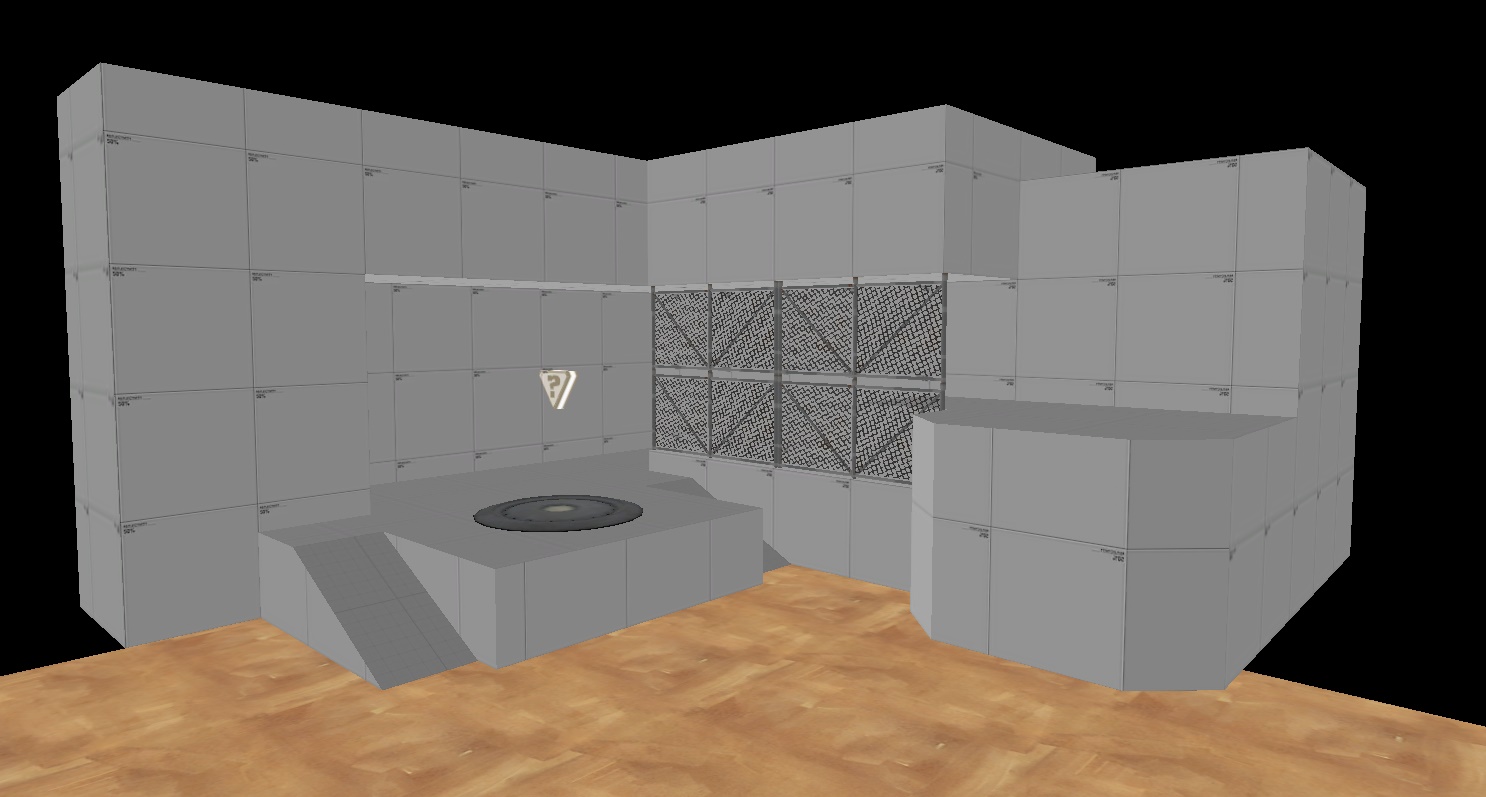
Here's the layout of our cap. Pretty bland and uninteresting to look at! Let's resize some stuff to make it feel more like a real building.
More believable. Now let's use what we know about composition to add some more detailing.
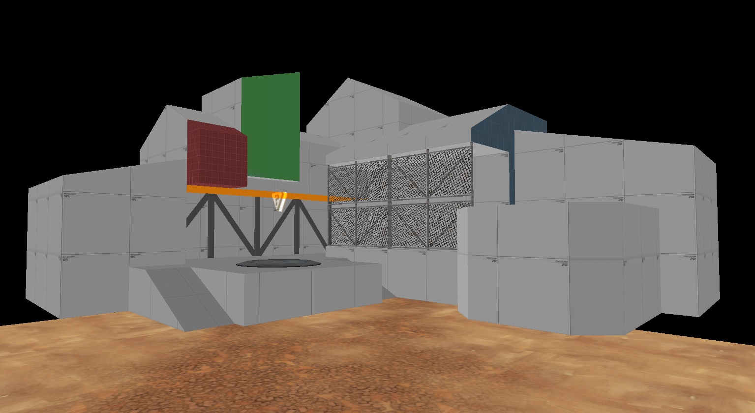
I colored various parts of the building to point out some important things. Look at the orange ceiling - I brought it down so that there wasn't a continuous line of ceiling from one end of the interior to the other. Instead, it meets at the inner edge of the fence wall, and leads down to the CP. Also note the beams in the background that create a vertical thrust towards the point.
Another cool thing about the lowered ceiling - players who would be coming out from under that ceiling will actually feel safer when defending, because they can see the ceiling easily within their view. Really tall rooms feel less safe, because it's another place enemies can come from. (Thanks to Yacan for pointing that out to me!)
The green portion of the building creates two vertical lines that point down at the CP. It isn't entirely necessary, but I felt it broke up the long horizontal roof line well, while still not completely disrupting the form of the building. The vertical thrusts become more apparent from another viewpoint.
The red bit was added because of something I haven't covered yet about composition. Having two forms share an edge is almost always a bad idea in composition, because it confuses the eye. The red addition here keeps the two edges from meeting each other.
The blue face does the same thing. If the rightmost form of the building had been brought up to be flush with the other wall, it would imply that the two forms were a part of each other. Whether or not you want to imply that is up to you, but I decided I wanted to keep them separated.
The last step is to start detailing.
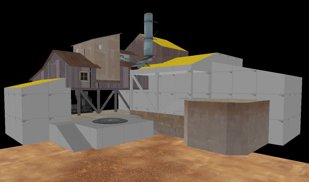
Remember that you can use models to create compositional lines too! I tried to do that with the grain elevator, but I'm not sure how well it's working out.
In conclusion, there's one thing that you should always keep in mind when detailing, and that's how the map looks from various spots. Position yourself at places where players are going to be traveling a lot, and look where you think they'll be looking. Then, try to make things look as nice as possible from those spots. If it all turns out ok, then you'll end up with detailing that looks nice from almost anywhere.
---
Level design is a form of art. Much like traditional art, level design is, at its very core, the arrangement of objects in a particular pattern to accomplish a certain goal. There's a term that's used to describe how the objects are arranged - Composition. It's a bit more challenging to use composition well in level design as compared to other arts, as your viewer can be looking at your scene from a technically infinite number of viewpoints, whereas most other arts involve just one viewpoint. However, we can still learn from composition, and apply it to our works.
An important part of composition is leading the viewer's eye. Generally, you want to use detailing to highlight areas where gameplay is going to be happening. You can use lighting and detail density to accomplish this. They're both techniques of composition! However, there's also a few other compositional tool you can use to guide the player's eye.
Lines are a very important part of composition. The arrangement, orientation, and emphasis of various lines can be used to create certain moods, either on their own or in conjunction with other lines. For example, suppose you have two lines that intersect each other. Where are you going to look? Your eye is naturally lead to the point of intersection, because it's the most interesting thing to look at. You can use this intersection of lines quite effectively in your environment design.
Here's a screenshot of the beginning area of Upward. Notice how many lines point directly towards the point at which the cart track disappears into the background? Note that the lines aren't always exact parts of the geometry, and can be suggested by how the geometry flows.
Here's Dustbowl 2-1, from the perspective of the attacking team. Notice how all of the lines point towards the one vertical line that sits right on the point. Also, note how the truck tracks in the ground are parallel in the real world, but not in the photo: this is because of something called linear perspective.
The same point, from the perspective of RED. Again, everything goes towards the point.
Dustbowl 2-2. The lines of the tower over spawn don't point towards the point from this perspective, but the landmark does let the player subtly know that something important is over in that direction. Also note how the spotlight doesn't obviously shed any light on the point itself, but the shape of the spotlight effect directs the eye right at it.
Lines don't have to point directly at the target. In this example from the last point of Gorge, you can see how the vertical pipes all point down towards the point. They're all parallel and don't meet at a given point, but the huge amount of vertical elements in this view tells the player that the important stuff isn't to the sides.
Another example of how the pipes in Gorge are used to lead the player's eye to important spots. The pipes in the main hall all lead to the room in the back, while the two vertical pipes tell the player that there's a path that goes up there.
In this example from the beginning area of Upward, you can see how the viewer's eye is drawn to the left. These lines aren't defined very strongly, but everything is arranged to give the idea of "hey, go left."
Another element of composition is space. There's two types of space: Positive space, which is the space of a view that is taken up by objects, and negative space, which is empty. In our examples, empty space is usually going to be the sky. However, a large blank surface can also act as negative space. Detailed space is positive, and un-detailed space is negative.
In this example from Upward, take a look at the red building in the upper right. It serves absolutely no practical purpose in a gameplay sense. However, by having it there, it simplifies the form of the positive space, and creates a large vertical thrust directly down towards a passageway that players might be attacking from. If the building wasn't there, that passageway wouldn't be quite as obvious.
Another example of useless buildings that are added to create a more cohesive form. The roof lines all combine to form one long path across the entire view. Also note the line below, which actually continues from the ceilings through the tops of the rocks and right to the spawn exit. It's not an example of positive or negative space, but I thought it was worth mentioning.
So now that we've got all this information, how do we use it all? In traditional art, composition is the tool that pretty much defines how an entire drawing is done. Level design is not quite the same, as the layout of your elements is going to be first and foremost defined by your level design. Composition, in our case, is just a tool we can use to better guide the player's eye around the level. Let's go through a quick example of what you might do when detailing an area.
Here's the layout of our cap. Pretty bland and uninteresting to look at! Let's resize some stuff to make it feel more like a real building.
More believable. Now let's use what we know about composition to add some more detailing.
I colored various parts of the building to point out some important things. Look at the orange ceiling - I brought it down so that there wasn't a continuous line of ceiling from one end of the interior to the other. Instead, it meets at the inner edge of the fence wall, and leads down to the CP. Also note the beams in the background that create a vertical thrust towards the point.
Another cool thing about the lowered ceiling - players who would be coming out from under that ceiling will actually feel safer when defending, because they can see the ceiling easily within their view. Really tall rooms feel less safe, because it's another place enemies can come from. (Thanks to Yacan for pointing that out to me!)
The green portion of the building creates two vertical lines that point down at the CP. It isn't entirely necessary, but I felt it broke up the long horizontal roof line well, while still not completely disrupting the form of the building. The vertical thrusts become more apparent from another viewpoint.
The red bit was added because of something I haven't covered yet about composition. Having two forms share an edge is almost always a bad idea in composition, because it confuses the eye. The red addition here keeps the two edges from meeting each other.
The blue face does the same thing. If the rightmost form of the building had been brought up to be flush with the other wall, it would imply that the two forms were a part of each other. Whether or not you want to imply that is up to you, but I decided I wanted to keep them separated.
The last step is to start detailing.
Remember that you can use models to create compositional lines too! I tried to do that with the grain elevator, but I'm not sure how well it's working out.
In conclusion, there's one thing that you should always keep in mind when detailing, and that's how the map looks from various spots. Position yourself at places where players are going to be traveling a lot, and look where you think they'll be looking. Then, try to make things look as nice as possible from those spots. If it all turns out ok, then you'll end up with detailing that looks nice from almost anywhere.
Last edited: