KotH Dewm rc1
- Thread starter Invalid nick
- Start date
You are using an out of date browser. It may not display this or other websites correctly.
You should upgrade or use an alternative browser.
You should upgrade or use an alternative browser.
Nice brushwork, I hope it is all func_detailed? I am also afraid it might make layout hard to edit, but that's not to judge.
Also, this seems to be almost an X-symmetrical map. I don't really like the idea, but we'll all see.
thanks, ye think everything that will be replaced with props is func_detail,
it is currently a 100% symmetrical map,
The distance from the spawns to the control point is probably way way too long tbh.
Cool brushwork doe (good luck texturing this effectively lel)
currently 12-14 seconds to checkpoint with scout, but can easily be changed to 8-10 seconds,
not really sure why the brushwork would be hard to texture but ill try my best
JeanPaul
L6: Sharp Member
- Aug 5, 2010
- 295
- 284
My comment about texturing stems from how a lot of the current brushwork details look great because they are covered in a single dev texture and nothing competes for attention. It can easily get too spammy later down the road. Just an initial thought when I saw the map.
Also I misread your overhead shot earlier but I think it get it now. Spawn to point distance is probably fine
Also I misread your overhead shot earlier but I think it get it now. Spawn to point distance is probably fine
On the topic of texturing, you might find it worthwhile to make your dev textures easier to read. The finished map will most likely have contrasting colors between walls and floors, making it easy to see the contours of geometry. You can imitate that without just fully texturing the map by using varying dev textures, like greys for floors and white/red/blue for walls. It takes some more time than just texturing everything the same, but a nicer looking alpha will get you better feedback.
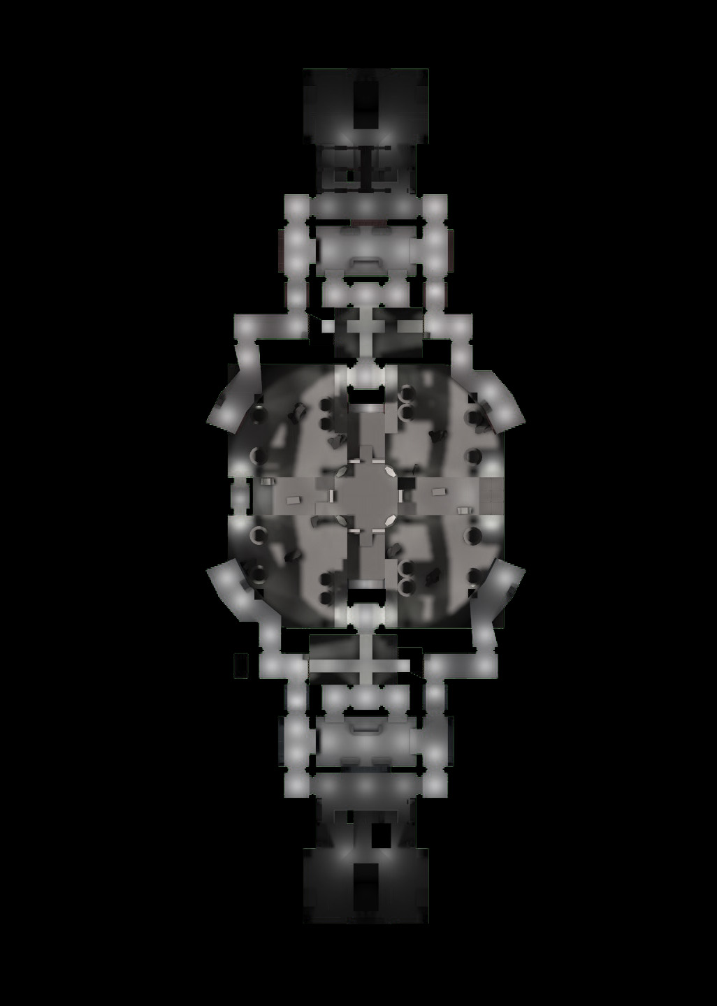
My main concern is with the layout. The map appears to be almost (if not exactly) symmetrical in 2 axis, meaning that when leaving spawn, the left and right paths lead to areas that function identically.
TF2 relies on creating multiple paths through an area not just so that players can avoid firefights and not be funneled into a single area, but also so that the map can have variety in what areas work best for certain classes. While having two identical areas doesn't mean that classes don't have an area that "works" for them, I would argue that it's always a less interesting design than one that makes the areas different. Without having any idea of which teammates/enemies are already in either area, players have no reason to pick one over the other.
Again, I don't know that this kind of design is inherently flawed, but it does make your map more generic, and I don't think TF2 does well with generic gameplay spaces. (Other games do! Halo 2 had deathmatch maps that were symmetrical on 2 axis and they played pretty well.)
The map is also very wide, which may make it difficult for teams to have a structured push/pull over the point, since players can flank the enemy team quite handily. Wide KotH points aren't inherently bad, but I think the ones that work best (Lakeside!) try to segment the middle axis space into multiple sections so that fighting happens mostly between the team sides of the map instead of the left and right.
On a positive note, I dig the setting. The new Doom did a really good job of making a sci-fi setting that isn't washed out in greys, and replicating that in TF2 is a good fit.
Good luck!
My comment about texturing stems from how a lot of the current brushwork details look great because they are covered in a single dev texture and nothing competes for attention. It can easily get too spammy later down the road. Just an initial thought when I saw the map.
Also I misread your overhead shot earlier but I think it get it now. Spawn to point distance is probably fine
On the topic of texturing, you might find it worthwhile to make your dev textures easier to read. The finished map will most likely have contrasting colors between walls and floors, making it easy to see the contours of geometry. You can imitate that without just fully texturing the map by using varying dev textures, like greys for floors and white/red/blue for walls. It takes some more time than just texturing everything the same, but a nicer looking alpha will get you better feedback.
My main concern is with the layout. The map appears to be almost (if not exactly) symmetrical in 2 axis, meaning that when leaving spawn, the left and right paths lead to areas that function identically.
TF2 relies on creating multiple paths through an area not just so that players can avoid firefights and not be funneled into a single area, but also so that the map can have variety in what areas work best for certain classes. While having two identical areas doesn't mean that classes don't have an area that "works" for them, I would argue that it's always a less interesting design than one that makes the areas different. Without having any idea of which teammates/enemies are already in either area, players have no reason to pick one over the other.
Again, I don't know that this kind of design is inherently flawed, but it does make your map more generic, and I don't think TF2 does well with generic gameplay spaces. (Other games do! Halo 2 had deathmatch maps that were symmetrical on 2 axis and they played pretty well.)
The map is also very wide, which may make it difficult for teams to have a structured push/pull over the point, since players can flank the enemy team quite handily. Wide KotH points aren't inherently bad, but I think the ones that work best (Lakeside!) try to segment the middle axis space into multiple sections so that fighting happens mostly between the team sides of the map instead of the left and right.
On a positive note, I dig the setting. The new Doom did a really good job of making a sci-fi setting that isn't washed out in greys, and replicating that in TF2 is a good fit.
Good luck!
thanks for the write up!
was hoping to get this baby fresh level tested the other night, wanted to see if there was the slightest smidgen of fun or if it belongs in the gutter - might have resulted in a slight premature first version, even so; there wasn't time on the server to reach my map, so will spend some time updating the textures and do some other adjustments before it get tested!
the map has a 180° rotational symmetric-layout compare to (the more popular?) line symmetrical-layout, don't really have any personal preference what I enjoy the most, must be well over 10 years since I made something symmetrical for a fps and recently got struck by the sudden urge of making something sci fi; not sure if it fits tf2, nor if the map will be fun...I will at least use this newly found motivation to practice some new workflows
layout:
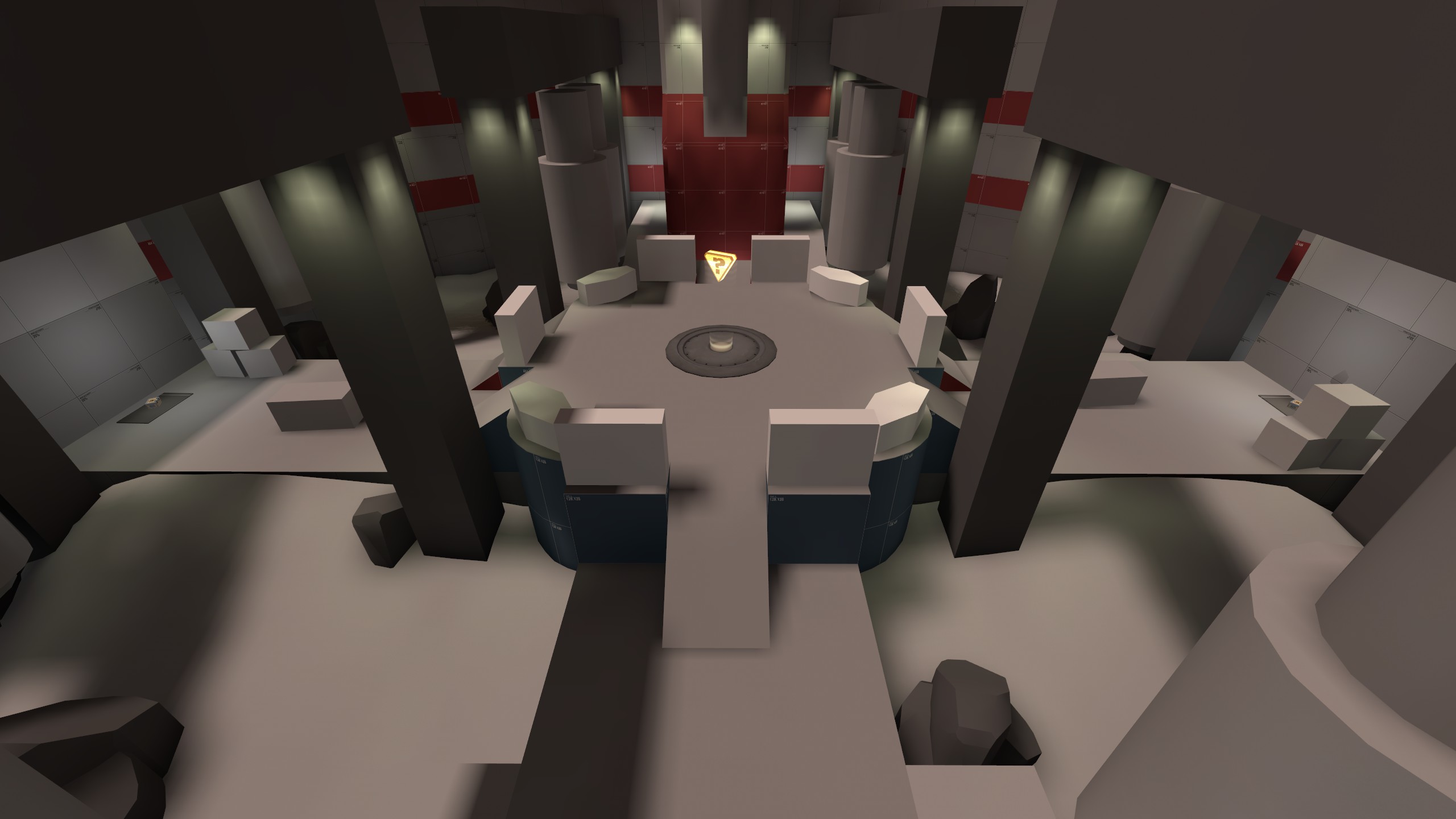
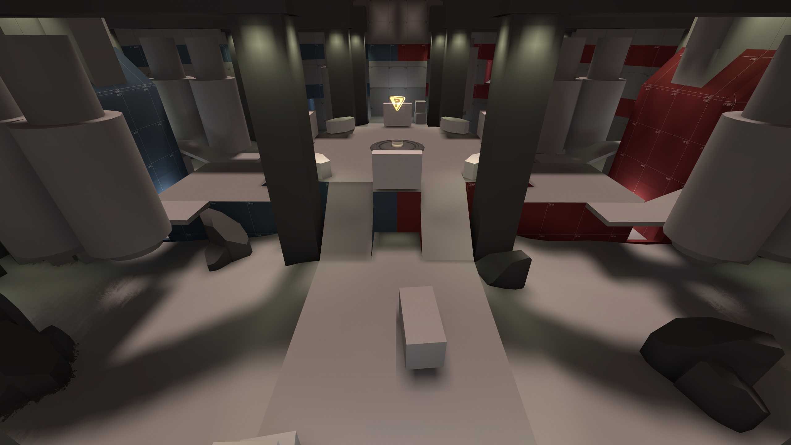
middle area:
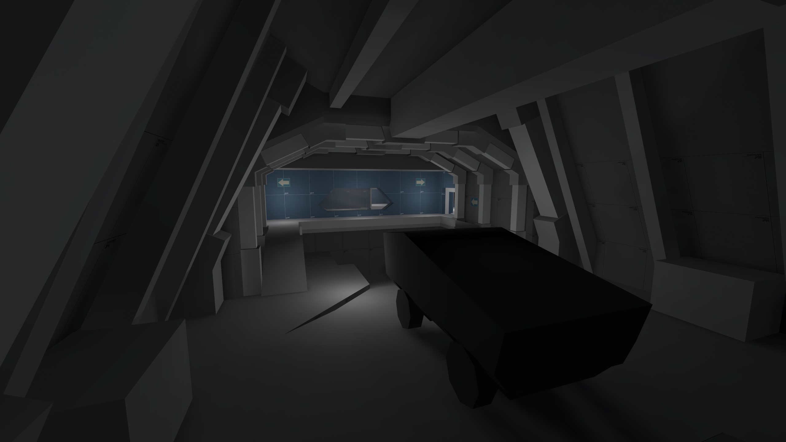
garage (team spawn):
reception:
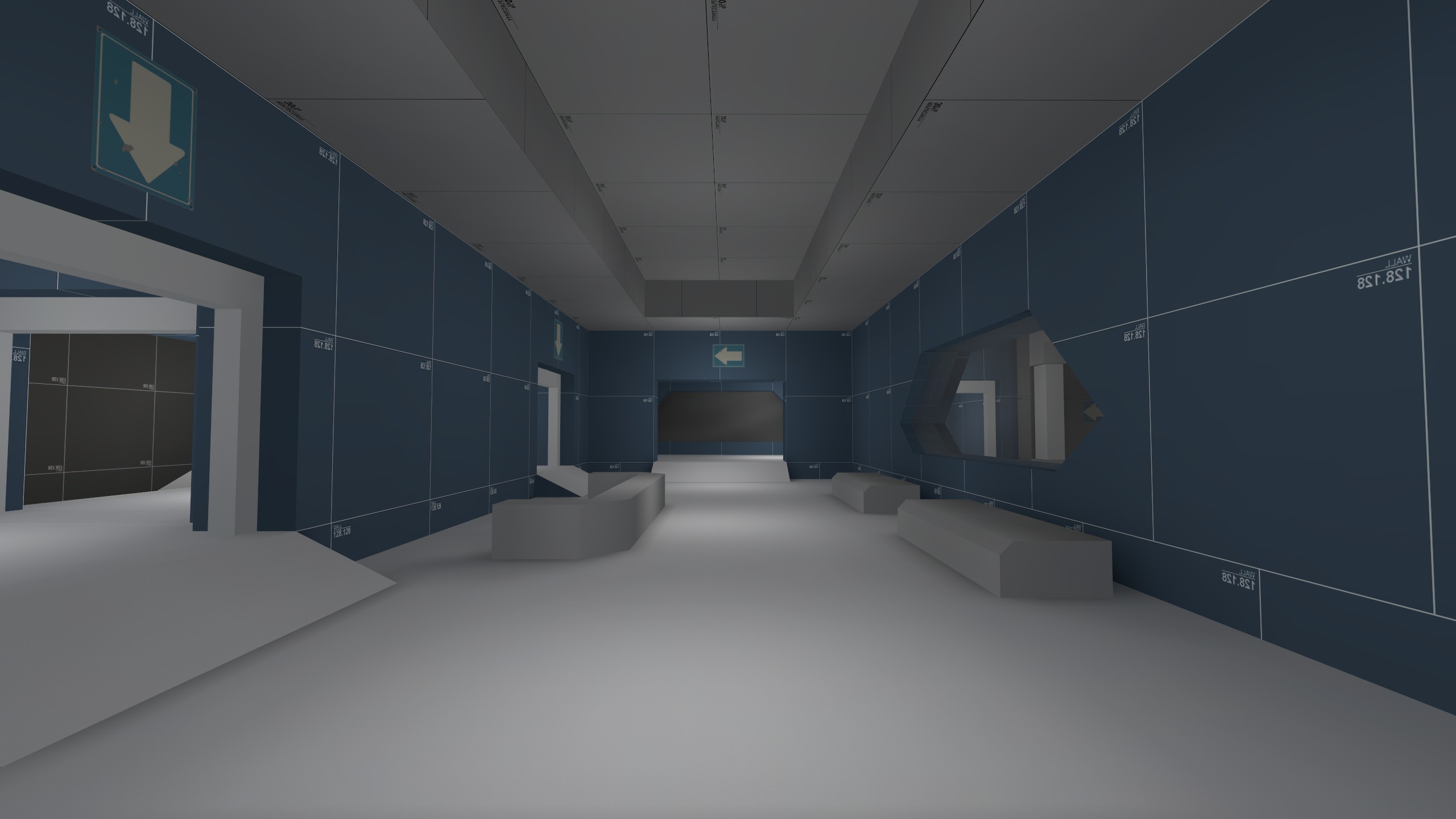
ventilation (new area since a1):
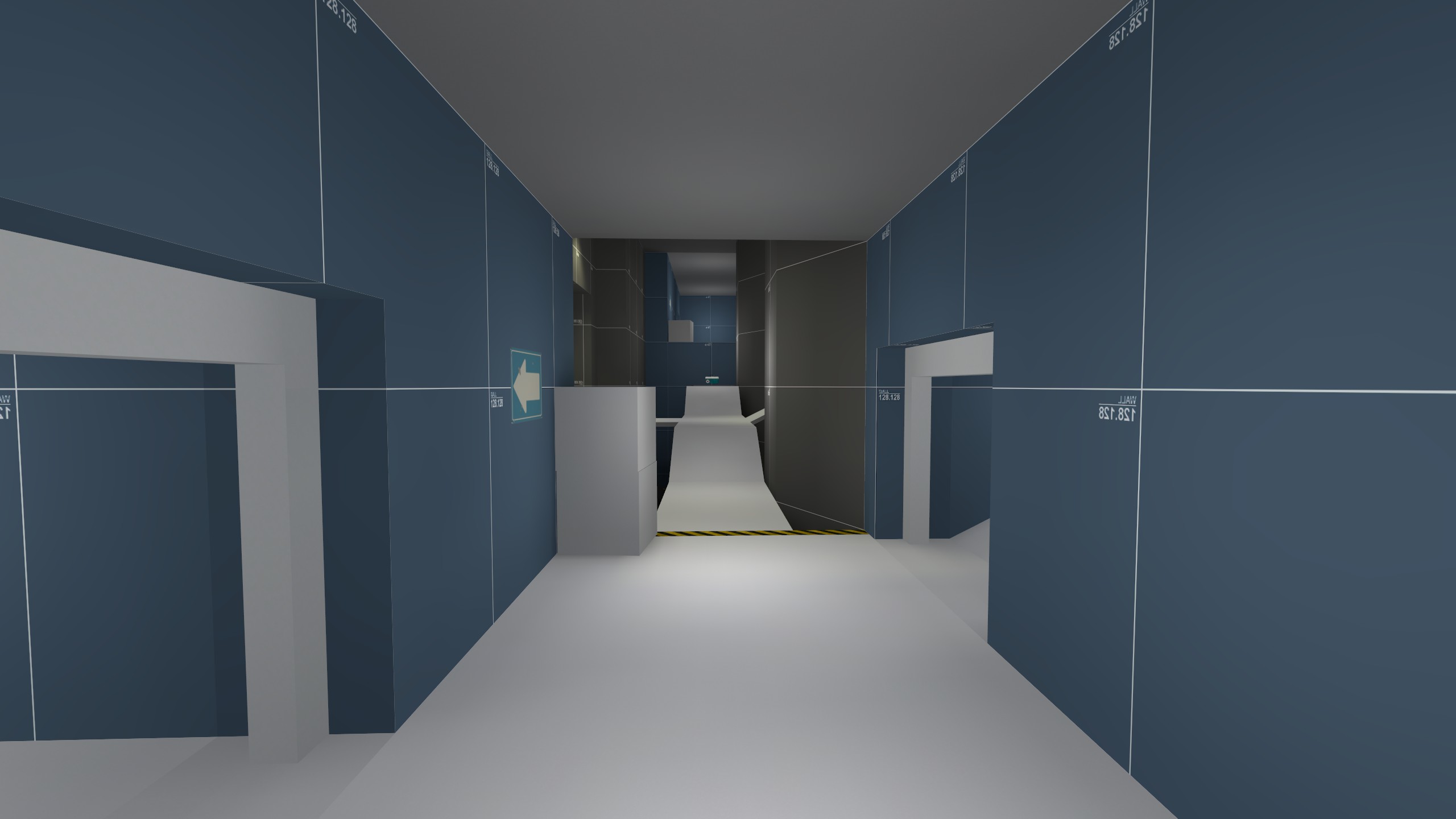
Read the rest of this update entry...

middle area:


garage (team spawn):

reception:

ventilation (new area since a1):

Read the rest of this update entry...
- made capture point larger
- switched medium hp/ammo pickup to small
- switched small hp/ammo pickup to medium
- added passage under the capture point
- removed some cover at capture point
- added fog
- changed the map env light
- made overall light less bright
- made killbox trigger larger
Read the rest of this update entry...
- made capture point larger
- switched medium hp/ammo pickup to small
- switched small hp/ammo pickup to medium
- added passage under the capture point
- removed some cover at capture point
- added fog
- changed the map env light
- made overall light less bright
- made killbox trigger larger
Read the rest of this update entry...
Did you base this map off of the actual level?
Did you base this map off of the actual level?
sorry missed your post from before,
doom 2016 (and previous installations) is a amazing game, this level is not based of any doom level, dewm simply has a similar theme, i.e. mars, space station, etc,
For a second I thought somebody found out a way to copy paste maps from idstudio to hammer.sorry missed your post from before,
doom 2016 (and previous installations) is a amazing game, this level is not based of any doom level, dewm simply has a similar theme, i.e. mars, space station, etc,
And the reason why it had blank / clear textures was because there was no wad or vpk files
- removed full health from map
- added tonemap
- clipped windows
- changed water texture (to a tf2 one)
- added second chance for players that falls into death-pit
- added wip-3d skybox
- tweaked a few lights
Read the rest of this update entry...
- added tonemap
- clipped windows
- changed water texture (to a tf2 one)
- added second chance for players that falls into death-pit
- added wip-3d skybox
- tweaked a few lights
Read the rest of this update entry...
dewm b1 update,
first pass large props and light, next thing will be to add some textures, will play around with the map brightness by changing reflection on materials,
garage,
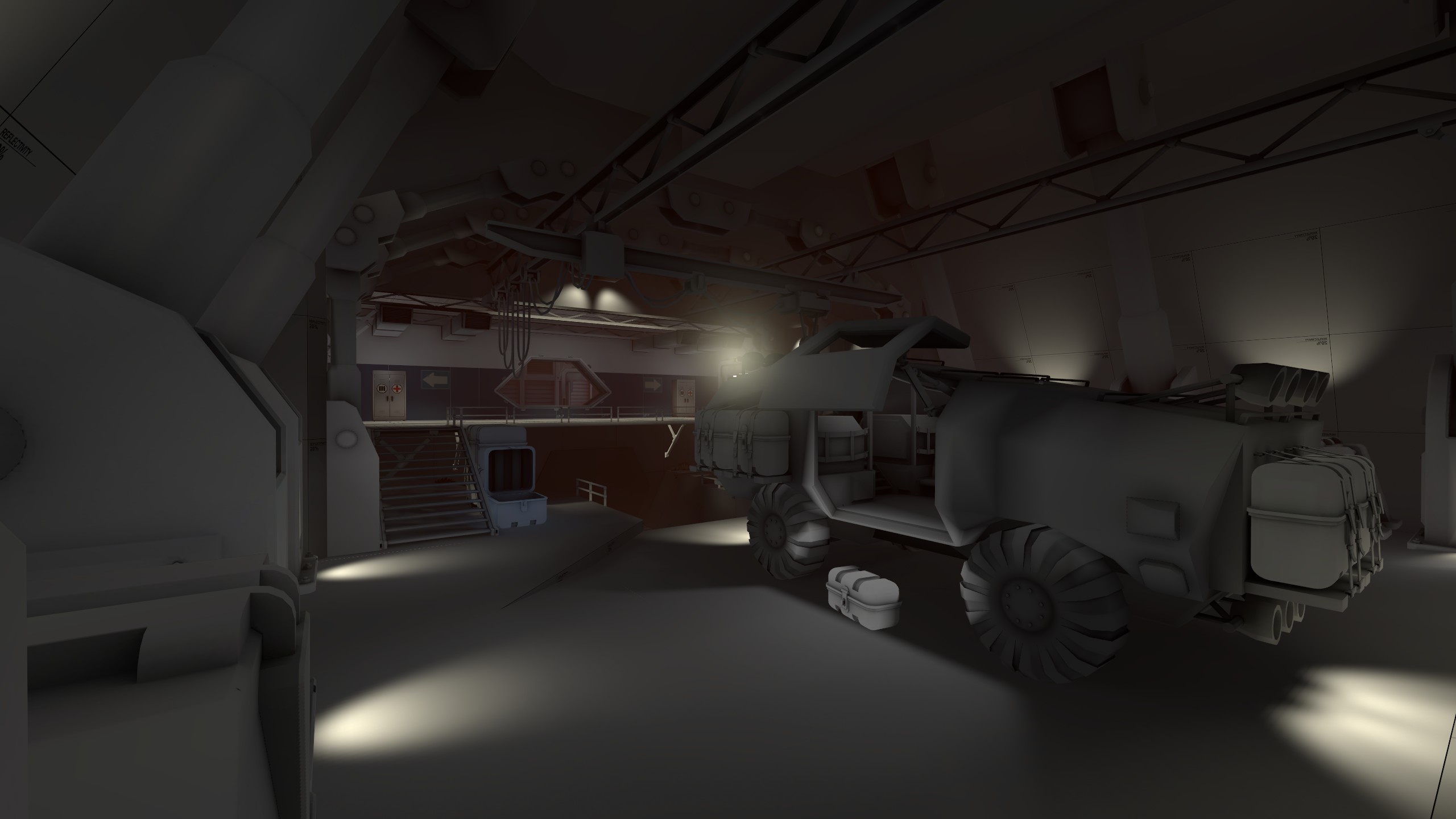
spawn shelf
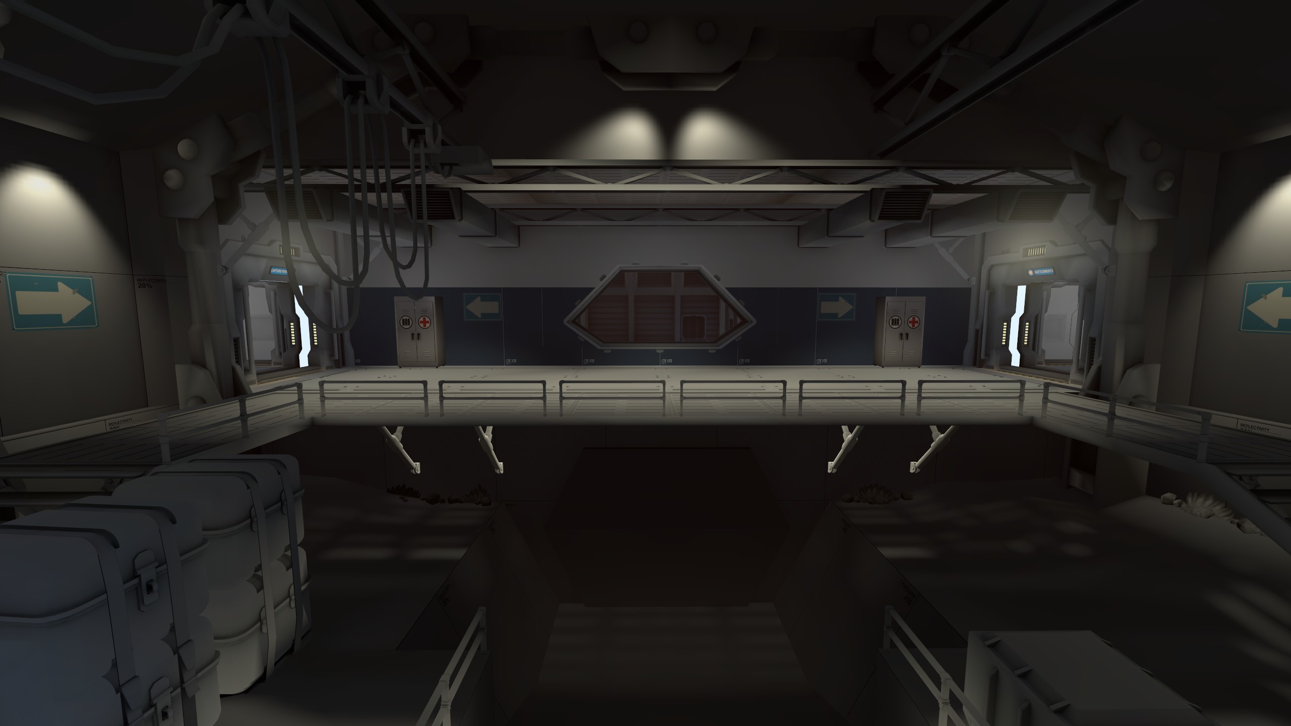
lobby
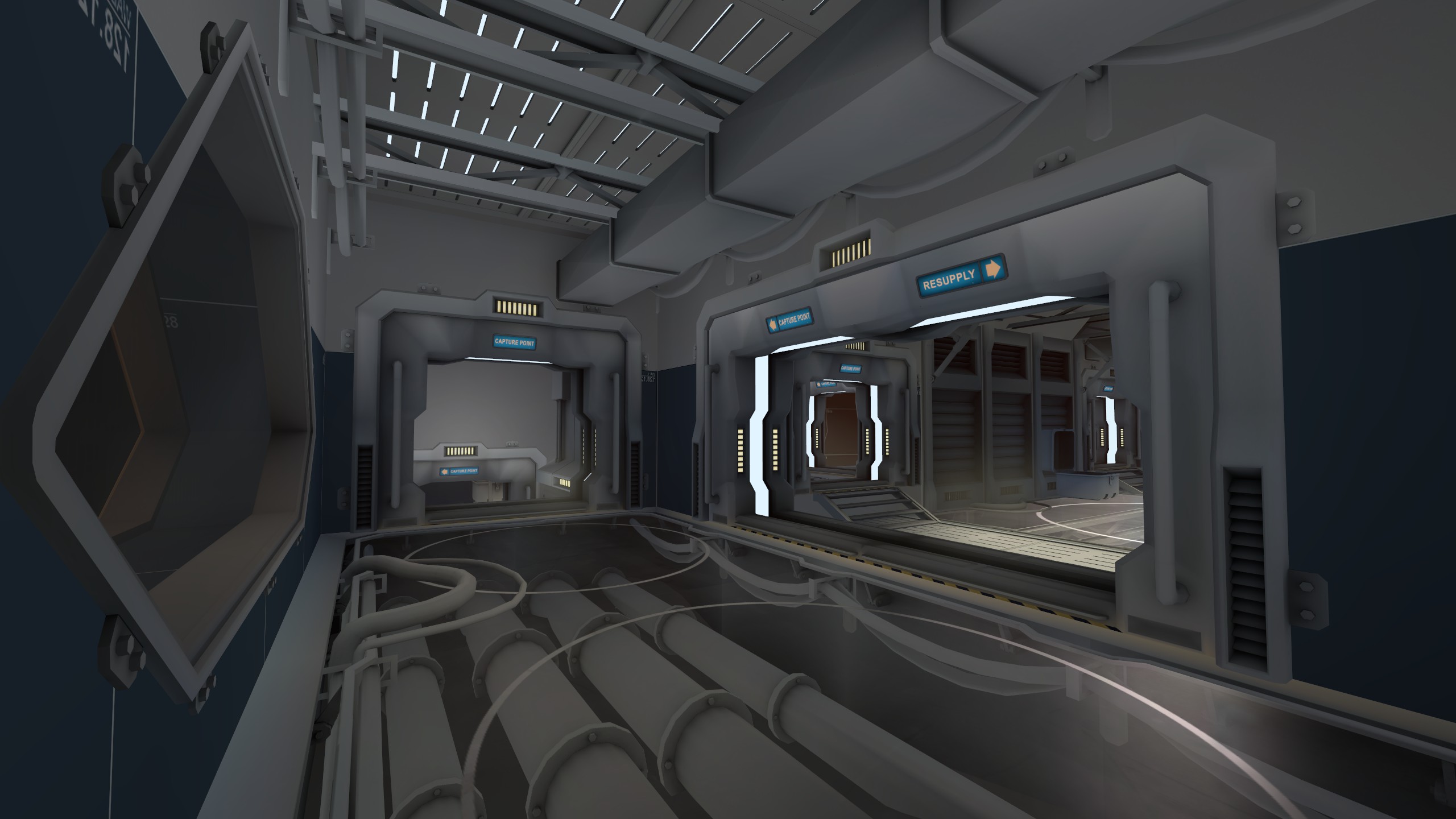
vent lower
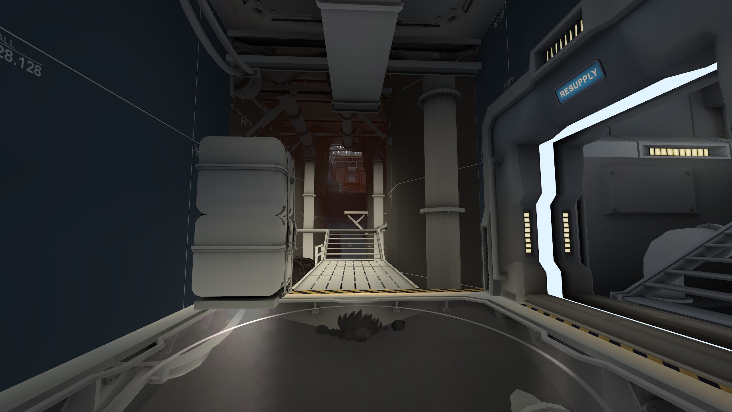
vent upper
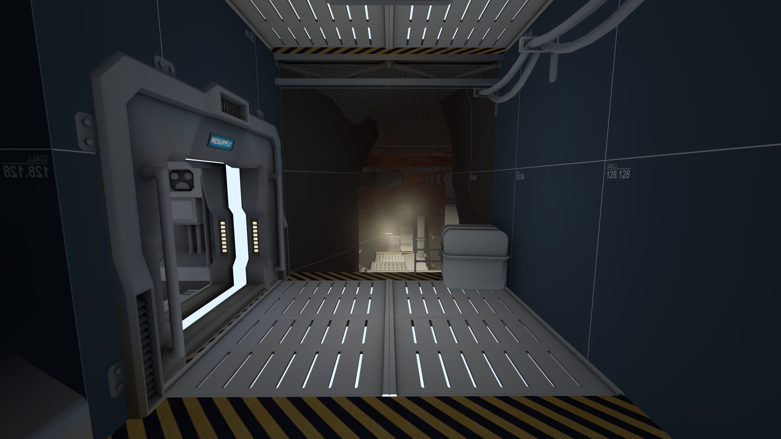
middle, still some models missing here,
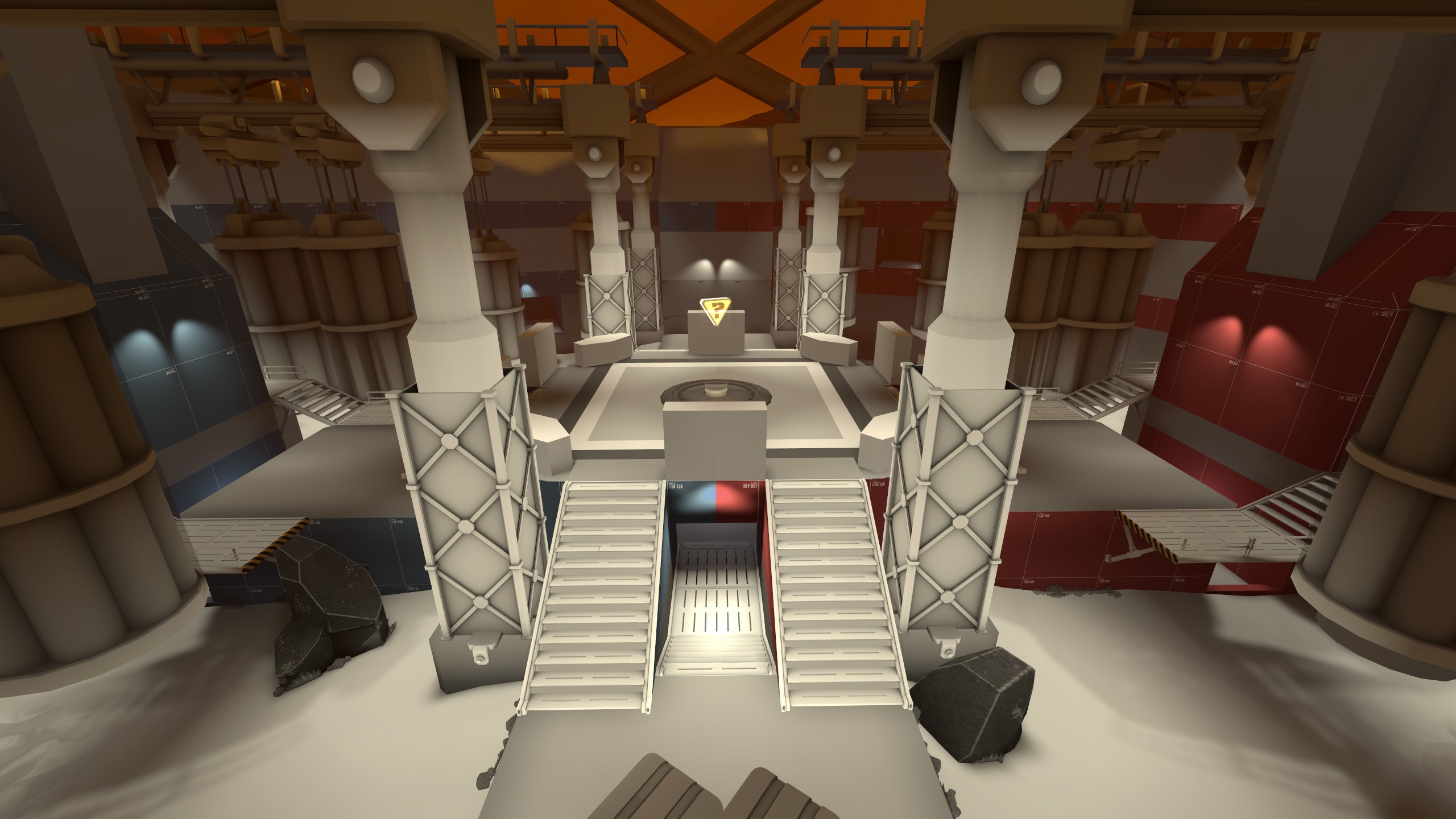
Read the rest of this update entry...
first pass large props and light, next thing will be to add some textures, will play around with the map brightness by changing reflection on materials,
garage,

spawn shelf

lobby

vent lower

vent upper

middle, still some models missing here,

Read the rest of this update entry...


